PrimeVue auto-increments a per-key z-index counter, so later-opened
PrimeVue dialogs reliably cover earlier ones. Reka, however, uses a
static z-1700 class — which lost to any PrimeVue modal already on the
counter. Concretely: open Save As (PrimeVue, z-1801) then trigger the
Overwrite confirm (Reka, z-1700) and the confirm rendered behind Save
As's mask, so Playwright clicks on the Overwrite button were absorbed
by .p-dialog-mask.

Register every Reka DialogOverlay + DialogContent with PrimeVue's
ZIndex.set('modal', el, 1700) on mount via a v-reka-z-index directive,
and ZIndex.clear on unmount. Both renderers now share one stacking
sequence — whichever dialog opened last wins, regardless of which
library owns it.
Reka's DismissableLayer fires both pointer-down-outside and focus-outside
when a sibling element gains focus. For non-modal Settings the previous
fix only guarded pointer-down-outside, so opening a nested PrimeVue Edit
Keybinding or Reka confirm dialog moved focus to a body-portaled element
and Reka treated that as 'focus left my layer' → emitted dismiss → the
Settings dialog vanished mid-test (and mid-interaction).

Add an onRekaFocusOutside guard that mirrors the pointer-down handler:
preventDefault when the focus target is inside any known portal
(PrimeVue overlay/dialog or a Reka role=dialog/menu/listbox/tooltip
portal). Also widen the pointer-down selector list to include those
Reka portal markers so a click on a sibling Reka layer doesn't dismiss
the parent either.

Tests cover both pointer-down and focus-outside paths plus the
non-portal control case.
Reka's modal DialogContent sets body { pointer-events: none } via
DismissableLayer while the dialog is open. Body-portaled PrimeVue
overlays (Select, ColorPicker, Popover, Autocomplete) inherit that and
become unclickable, so Settings entries like Language or Model library
name format break after the Phase 3 flip. Reka also fires
pointer-down-outside for clicks on those overlays and would auto-dismiss
the Settings dialog mid-interaction.

- design-system: opt PrimeVue overlay classes back into pointer-events
- GlobalDialog: prevent dismiss when pointer-down originates inside any
  PrimeVue overlay, extracted as rekaPrimeVueBridge for unit tests
- Tests cover each overlay class plus the dismissableMask fallback
## Summary

Migrate the default combo widget select from the PrimeVue `SelectPlus`
wrapper to a Reka `Combobox` implementation while preserving the
existing Comfy combo widget contract and the node-canvas dropdown
behavior.

## Changes

- **What**: Rewrites `WidgetSelectDefault.vue` on top of Reka
`ComboboxRoot`, `ComboboxTrigger`, `ComboboxInput`, `ComboboxContent`,
and `ComboboxItem`.
- **What**: Preserves the default combo widget surface: `v-model`,
`widget` prop, `aria-label` from the widget name/label,
`data-capture-wheel`, disabled state, placeholder/filter placeholder,
default slot controls, invalid current value display, array values,
dynamic/factory values, and `getOptionLabel` fallback behavior.
- **What**: Keeps dynamic `values` compatibility by refreshing
function-backed options when the dropdown opens, without re-evaluating
the factory on every search keystroke.
- **What**: Deletes the now-unused PrimeVue `SelectPlus.vue` wrapper and
removes the PrimeVue test plugin/stub path from the default widget
select tests.
- **What**: Updates App Mode dropdown clipping coverage and combo-widget
browser coverage to target the new Reka overlay/viewport structure.
- **Breaking**: No breaking change is intended for the documented Comfy
combo widget contract. This migration does not preserve incidental
PrimeVue `Select` prop pass-through from `widget.options`; that was a
side effect of wrapping PrimeVue rather than a stable widget API.
- **Dependencies**: No new dependencies.

## Review Focus

### Compatibility choices

The goal of this PR is a migration PR, not a broad behavior redesign.
The new implementation keeps the Comfy-specific combo contract rather
than attempting to emulate PrimeVue internals. In particular:

- `values` still accepts arrays and functions, and function values are
re-read on open to support dynamic/custom node option sources.
- `getOptionLabel(value) || value` is intentionally preserved to match
the sibling dropdown path and avoid turning an empty-string label into a
blank rendered option.
- Invalid/current values that are not present in the option list are
still rendered in the trigger instead of disappearing.
- `WidgetWithControl` continues to render its default slot in the
control area, with trigger text truncation preserved.
- App Mode `OverlayAppendToKey='body'` continues to map to a body portal
to avoid panel clipping.

### Visual alignment and screenshot updates

The previous PrimeVue implementation passed `size="small"`, which
injected internal `.p-select-sm .p-select-label` styling. That internal
PrimeVue style used its own small-select font size and padding,
overriding the surrounding widget sizing intent and making the select
trigger subtly taller with slightly larger text than nearby inline node
widget controls.

The Reka implementation intentionally keeps the normal widget styling
path instead of recreating that PrimeVue-specific internal override.
This means the trigger follows the same inline widget sizing direction
as neighboring controls rather than preserving the incidental PrimeVue
height/text-size delta. Because this is an expected visual difference
from the migration, the affected E2E screenshots should be recaptured
instead of treating the old PrimeVue select height as the target.

### Scrollbar and focus behavior

Reka provides the combobox/listbox semantics we want, including search,
arrow navigation, highlighted items, and Enter selection. The tricky
part is the canvas dropdown scrollbar behavior. The native Reka viewport
path hides/owns scrollbar behavior in a way that made it hard to
preserve the previous widget dropdown affordances, especially visible
scrollbars and mouse wheel capture over the node canvas.

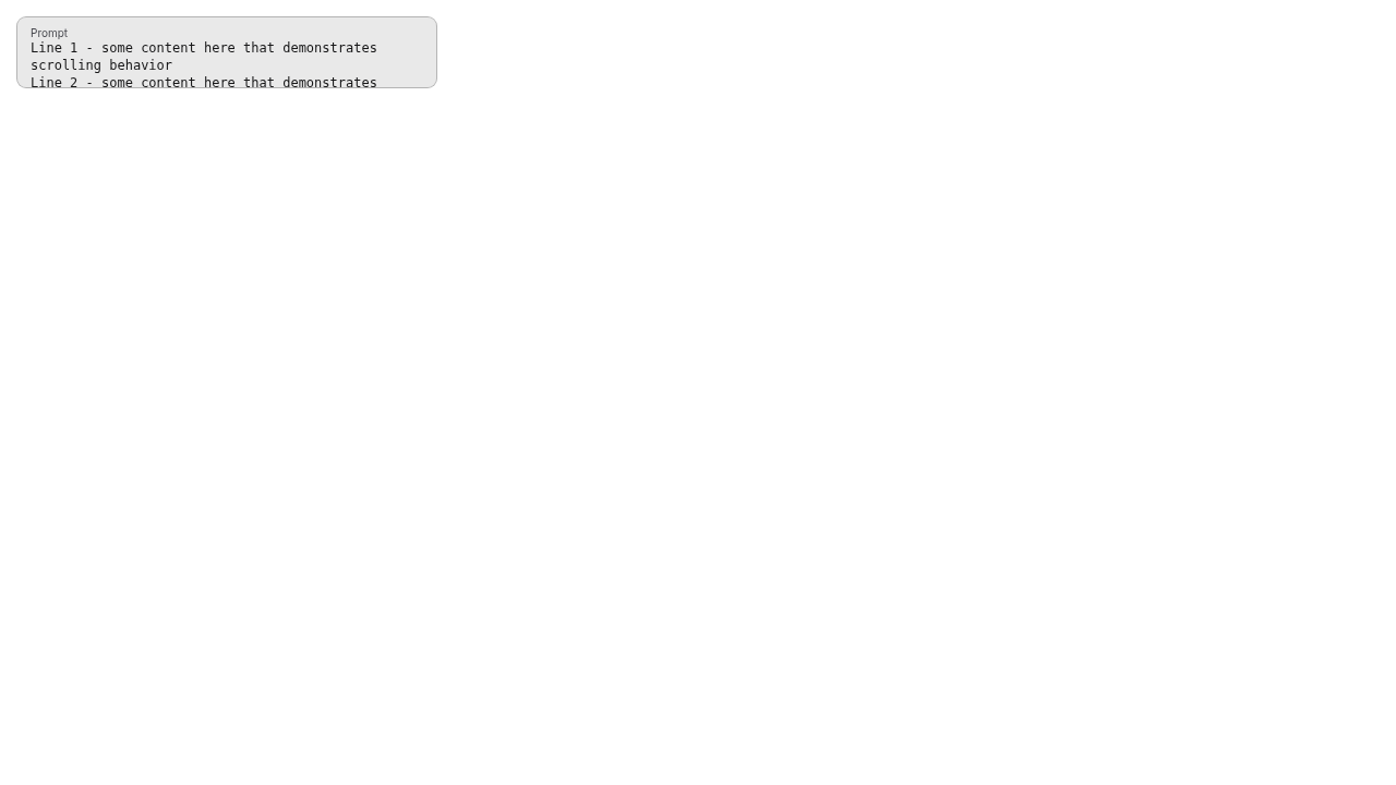
To keep the previous behavior, this PR renders a dedicated scrollable
viewport inside `ComboboxContent` with the project scrollbar utilities
(`scrollbar-thin`, stable gutter, transparent track). That preserves
visible scroll affordance and allows wheel events over the dropdown to
scroll the list instead of zooming the canvas.

There was one Reka interaction to account for: pressing the native
scrollbar can be treated as a focus-outside event from the search input,
which previously closed the dropdown on mouse down or caused subsequent
wheel events to leak back to the canvas. The new
`useRestoreFocusOnViewportPointer` composable handles only that short
pointer gesture:

- viewport pointerdown marks a short-lived scrollbar/viewport
interaction,
- the next focus-outside event is prevented only if the search input can
be restored,
- the guard is cleared by `pointerup`, `pointercancel`, and a timeout so
normal outside clicks still close the dropdown.

### Tests and regression coverage

Unit coverage was updated around the new Reka implementation:

- option sources from arrays and functions,
- dynamic values refreshed on open but not on each search keystroke,
- selection updates and blank/undefined Reka emissions being ignored,
- search filtering and Reka keyboard selection behavior,
- disabled state, invalid current values, `getOptionLabel`, empty
results status, and WidgetWithControl slot preservation,
- composable coverage for pointerup, pointercancel, repeated pointerdown
listener cleanup, and no-input/no-op behavior.

Browser regression coverage now checks the canvas-specific interaction
surface:

- opening and selecting default combo widget options,
- wheel over the dropdown scrolls the list instead of zooming the
canvas,
- pressing the scrollbar does not close the dropdown,
- wheel capture still works after pressing the scrollbar,
- opening another node widget closes the previous dropdown,
- switching between node widgets preserves dropdown scroll capture,
- serialize/reload retains selected combo values.

## Screenshots (if applicable)
New
<img width="527" height="753" alt="스크린샷 2026-05-18 오전 1 36 27"
src="https://github.com/user-attachments/assets/2293d510-6965-4b84-9b12-b8528f8a734f"
/>

Old
<img width="496" height="473" alt="스크린샷 2026-05-18 오전 1 35 57"
src="https://github.com/user-attachments/assets/47c0e28a-27df-44a6-81a8-14fcc1f3bd8f"
/>

Reka Supports Auto highlight top item on search (Search -> Enter ->
Select 👍)


https://github.com/user-attachments/assets/9d633dfc-c23a-4e7a-8d39-b044c219f1f3

The default combo widget trigger has a small intentional visual delta
from the old PrimeVue path because the Reka implementation does not
recreate PrimeVue's internal `size="small"` label override.


https://github.com/user-attachments/assets/a9053a14-e39e-4d5e-a846-dcf9aeb0caed


## Validation

- `pnpm format`
- `pnpm lint` (passes; existing warning-only lint output remains in
unrelated tests)
- `pnpm typecheck`
- `pnpm typecheck:browser`
- `pnpm test:unit`

- `PLAYWRIGHT_LOCAL=1 PLAYWRIGHT_TEST_URL=http://127.0.0.1:5174 pnpm
exec playwright test
browser_tests/tests/vueNodes/widgets/combo/comboWidget.spec.ts
--project=chromium`

┆Issue is synchronized with this [Notion
page](https://www.notion.so/PR-12288-refactor-migrate-default-combo-widget-select-to-Reka-3616d73d365081fd8742c038a7dc7851)
by [Unito](https://www.unito.io)

---------

Co-authored-by: GitHub Action <action@github.com>
Co-authored-by: github-actions <github-actions@github.com>
## Summary

Model Library sidebar now refreshes automatically when an upload
completes, and the `r` keybinding refreshes the library in addition to
refreshing combo widgets inside graph nodes.

## Changes

- **What**:
- `modelStore`: new `refreshModelFolder(name)` for surgical reset+reload
of one folder, and `refresh()` that re-loads any folders that had been
loaded
- `ModelLibrarySidebarTab.vue`: watches
`assetDownloadStore.lastCompletedDownload` and refreshes the affected
folder; the in-panel refresh button now routes through `refresh()`
- `Comfy.RefreshNodeDefinitions` (`r` key): also calls
`modelStore.refresh()` so the keyboard fallback actually refreshes the
Model Library list

## Review Focus

- Both `modelStore` and `assetsStore` exist; the upload wizard was only
refreshing the latter, which is what caused the bug. Confirm the new
watcher path is the right hook (rather than wiring it inside the wizard)
— chose this so it also covers completions that happen after the wizard
has been closed.
- `refreshModelFolder` falls back to `refresh()` (not raw
`loadModelFolders()`) for unknown folder types, to avoid dropping other
folders' loaded contents.
- Generated tab half of the ticket is intentionally **deferred** until
BE-885 (cursor pagination on `GET /api/jobs`) lands — AC items around
"no duplicates" and "cursor state maintained" depend on it.

Fixes FE-695 (Model Library half).

## Screenshots (if applicable)

N/A — behavior change verified by unit tests.

┆Issue is synchronized with this [Notion
page](https://www.notion.so/PR-12257-fix-model-library-auto-refresh-after-upload-plus-r-key-fallback-3606d73d3650811a8895ef6e3ef2b4b8)
by [Unito](https://www.unito.io)
## Summary

Follow-up to #12183: move the debounced, searcher-driven search input
out of `src/renderer/...` and into the shared primitives folder, so both
the graph (form dropdown node widget) and the shell UI (templates
dialog, right side panel tabs) can use it without crossing the renderer
layer.

## Changes

- **What**: Renamed and relocated `FormSearchInput` → `AsyncSearchInput`
at `src/components/ui/search-input/AsyncSearchInput.vue`, joining the
existing `SearchInput` / `SearchAutocomplete` siblings.
- **What**: Updated all 9 callers (graph form dropdown, right side panel
tabs, templates dialog) to import from the new path/name. Test file
moved alongside the component.
- **Breaking**: None — pure rename + relocate, behavior is identical.

## Review Focus

- New name reflects the component's distinguishing feature (the async
`searcher` lifecycle: debounce + cancellation + loading state); see
Slack thread.
- Slack thread captured the discussion — splitting from #12183 so the
perf fix can backport cleanly to the release line.

┆Issue is synchronized with this [Notion
page](https://www.notion.so/PR-12185-refactor-promote-FormSearchInput-to-shared-ui-as-AsyncSearchInput-35e6d73d365081c585d8d421ea4353fa)
by [Unito](https://www.unito.io)

Co-authored-by: Christian Byrne <cbyrne@comfy.org>
*PR Created by the Glary-Bot Agent*

---

## Summary

Bump `tailwindcss` and `@tailwindcss/vite` from `^4.2.0` to `^4.3.0` in
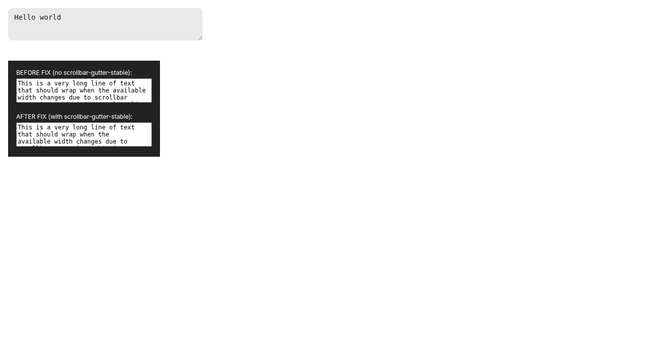
the workspace catalog so the new first-class scrollbar utilities
(notably `scrollbar-gutter-stable`) are available — the missing utility
behind the FE-697 workaround. Release notes:
https://tailwindcss.com/blog/tailwindcss-v4-3.

## Changes

- **What**:
- `pnpm-workspace.yaml` catalog: `tailwindcss` and `@tailwindcss/vite` →
`^4.3.0` (lockfile resolves to `4.3.0` for `tailwindcss`,
`@tailwindcss/vite`, `@tailwindcss/node`, and all `@tailwindcss/oxide-*`
native packages).
- Auto-fix 21 lint errors that `eslint-plugin-better-tailwindcss` now
reports because the new utilities have canonical forms:
- `VirtualGrid.vue`: `[scrollbar-gutter:stable]` →
`scrollbar-gutter-stable` (the FE-697 case)
- `VirtualGrid.vue` + `RightSidePanel.vue`: `scrollbar-thin` class-order
fix
    - `TopBarHeader.vue`: `h-6.25 w-6.25` → `size-6.25` (6 button cells)
- `Dialogue.vue`: `translate-x-[-50%] translate-y-[-50%]` →
`translate-[-50%]`
- Minor `-mx-[…]`, `-inset-[…]`, `-ml-[…]` arbitrary-value reorderings
in `NodeSearchFilterBar.vue`, `LGraphNode.vue`,
`CloudNotificationContent.vue`
- All 21 are auto-fixes; all existed on `main` and would have started
failing CI on next merge.
- **Breaking**: None. v4.3 is purely additive; existing config
(CSS-first `@theme`/`@utility`/`@plugin`, custom `lucideStrokePlugin`,
`tailwindcss-primeui`, `@iconify/tailwind4`, `tw-animate-css`) is
unchanged.

## Review Focus

- Confirmed `scrollbar-gutter: stable` compiles into
`dist/assets/index-*.css` from `VirtualGrid.vue` after the
canonicalization.
- Runtime probe via Playwright (preview build) confirmed
`scrollbar-gutter-stable`, `scrollbar-thin`, `tab-4`, and `zoom-100` all
apply.
- `pnpm typecheck`, `pnpm lint`, `pnpm build`, `pnpm knip` all pass.
- `pnpm test:unit`: 10687/10696 pass. 1 failure in `GraphView.test.ts`
("reconnect wiring") confirmed to fail identically on `main` (flaky
`toHaveBeenCalledTimes(1)` getting `3`/`4`) — unrelated to this change.
- Oracle code review: 0 findings.

Refs FE-697.

┆Issue is synchronized with this [Notion
page](https://www.notion.so/PR-12275-chore-upgrade-tailwindcss-to-4-3-3606d73d3650813185cece1c7315e1c2)
by [Unito](https://www.unito.io)

---------

Co-authored-by: Glary-Bot <glary-bot@users.noreply.github.com>
Switch v-model handling from defineProps + emit('update:modelValue') + computed
wrapper to defineModel<boolean>, matching SecretFormDialog and VideoHelpDialog
in this PR and the project convention in AGENTS.md.
## Summary
Replaces #12164.
Right-clicking a Vue node, using the selection toolbox More Options
menu, or clicking the selection toolbox Node Info button now opens the
right-side Info tab only when the new-menu UI makes that panel
available. Legacy-menu contexts hide the no-op action even when the
legacy node library design is selected; node-library help remains
isolated to the node library itself. The existing
`selection_toolbox_node_info_opened` telemetry fires only after the
toolbox button successfully opens node info. No new context-menu
telemetry event is added in this PR.
## Changes
- **What**: Share the node-info availability/action path across the
context menu and selection toolbox, keep legacy-menu state out of the
right-side panel public store API, tighten node-info settings tests, and
add unit plus E2E regression coverage for new-menu and legacy-menu
modes.
- **Dependencies**: None
## Review Focus
Confirm the node context menu, selection toolbox direct Info button, and
selection toolbox More Options entry all respect right-side panel
availability, including legacy menu + legacy node library mode, while
node-library help behavior remains isolated to the node library.
## Validation
- Self-review: checked production path, unit mocks, and Playwright
coverage; only gap found was weak E2E coverage for the toolbox direct
Info path, now strengthened.
- `pnpm test:unit -- src/composables/graph/useSelectionState.test.ts
src/components/graph/SelectionToolbox.test.ts
src/components/graph/selectionToolbox/InfoButton.test.ts`
- `pnpm test:browser:local -- --project=chromium
browser_tests/tests/selectionToolboxActions.spec.ts
browser_tests/tests/selectionToolboxSubmenus.spec.ts
browser_tests/tests/vueNodes/interactions/node/contextMenu.spec.ts
--grep "info button opens the right-side info tab|info button is
hidden|hides Node Info|should open node info"`
- `pnpm typecheck:browser`
- `pnpm exec oxlint --type-aware
browser_tests/tests/selectionToolboxActions.spec.ts`
- `pnpm exec eslint --cache --no-warn-ignored
browser_tests/tests/selectionToolboxActions.spec.ts`
- `pnpm exec oxfmt --check
browser_tests/tests/selectionToolboxActions.spec.ts`
- `git diff --check`
- Commit hooks: lint-staged + `pnpm typecheck` + `pnpm
typecheck:browser`
- Push hook: `knip --cache` (existing tag hint only)
## Screenshots (if applicable)
Before
https://github.com/user-attachments/assets/4b1f6ddb-a01c-4958-81ab-36167f434e59https://github.com/user-attachments/assets/83433f0d-24f1-46b7-a81d-f0f065812496
After
https://github.com/user-attachments/assets/30bd61e5-f8d4-48b7-97e0-26c93e3cb362https://github.com/user-attachments/assets/afce9f51-a43d-434f-a006-6b357a61ac8f
---------
Co-authored-by: github-actions <github-actions@github.com>
- Adds functions to SubgraphHelper to perform widget promotion by
standard user means
  - Right Click -> Promote
  - Properties Panel
- Adds new slot fixture code that works with simple `locator.dragTo`
operations.
- Adds multiple subgraph tests with a focus on historically difficult
operations.
- Fixes a bug where the litegraph `node.selected` state would not be
unset when switching graphs. This made it so 'Selecting a node ->
leaving subgraph -> re-enter subgraph -> right click on node' would fail
to select the node because it is marked as already selected.

┆Issue is synchronized with this [Notion
page](https://app.notion.com/p/PR-11806-Add-helper-functions-for-widget-promotion-3536d73d365081f58dd9cd730c1a91a9)
by [Unito](https://www.unito.io)

---------

Co-authored-by: Alexander Brown <drjkl@comfy.org>
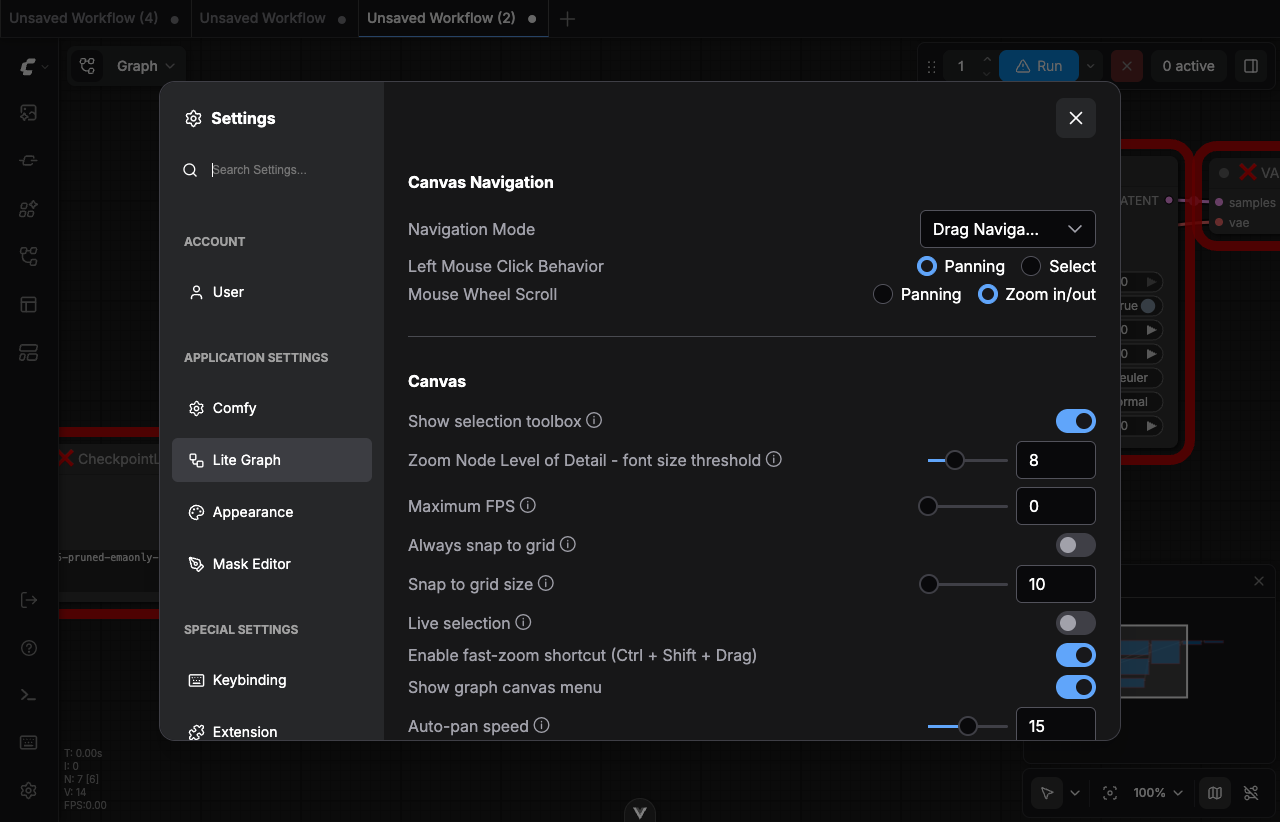
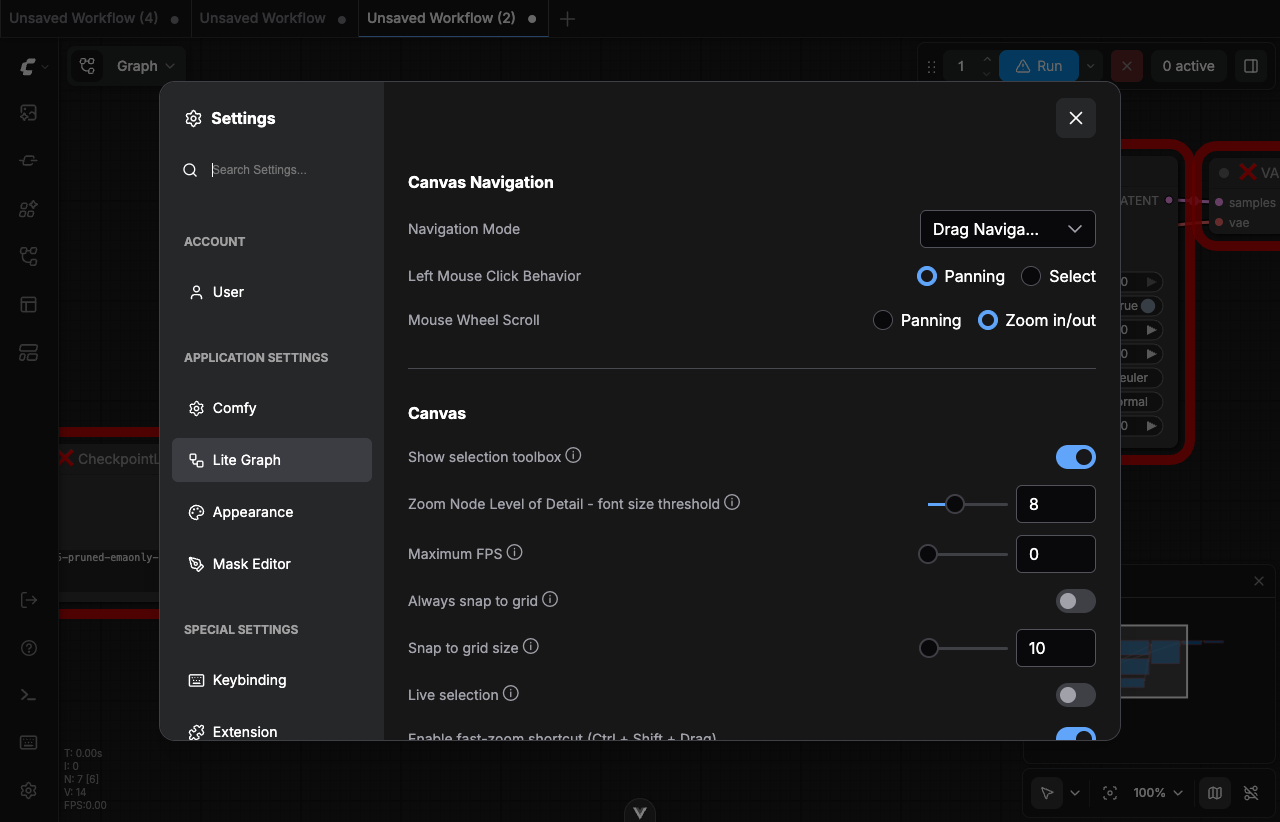
Settings dialog (now Reka, z-1700 in Phase 3) blocked clicks on nested
PrimeVue Selects/dialogs and the KeybindingPanel context menu (z-1200)
because they rendered below it.

- PrimeVue zIndex modal/overlay/menu/tooltip -> 1800 (above Reka 1700)
- KeybindingPanel ContextMenuContent z-1200 -> z-1800
## Summary

Route the templates dialog search through `FormSearchInput`'s debounced
searcher so per-keystroke work no longer trips the heavy filter/render
path.

## Changes

- **What**: `WorkflowTemplateSelectorDialog` now uses `FormSearchInput`
instead of `SearchInput`. The raw input is bound to a local ref; the
actual `searchQuery` consumed by `useTemplateFiltering` is only written
after the input debounce settles, so dependent computeds (notably
`shouldUsePagination`, which used to flip on every keystroke and force a
full grid rebuild) stay stable while typing.
- **What**: `FormSearchInput` gains optional `debounceMs` (default
`250`) and `debounceMaxWaitMs` (default `1000`) props. Existing callers
are unchanged; the templates dialog passes `400` / `4000` to match the
feel tuned in this PR.

## Review Focus

- Reset path: `searchQuery` is still owned by `useTemplateFiltering` and
cleared by `resetFilters`; a watch syncs the visible input back to empty
when that happens.
- `FormSearchInput` is currently under `src/renderer/...` but already
imported by workbench-level components (rightSidePanel tabs). This PR
follows that existing precedent rather than relocating the component.

┆Issue is synchronized with this [Notion
page](https://www.notion.so/PR-12183-perf-debounce-template-search-input-to-keep-typing-responsive-35e6d73d365081b7a11ec4a84323095f)
by [Unito](https://www.unito.io)
Closes the parity gap in the Reka renderer (maximize affordance,
headless layout mode, overlay class plumbing), then flips
useSettingsDialog onto the Reka path.

- dialog.variants: new `maximized` variant (centered+sized vs.
  inset-2 fullscreen) plus a DialogMaximize button wired through
  GlobalDialog when `maximizable` is set
- GlobalDialog: when `headless: true`, skip the inner padding
  wrapper so layout dialogs control their own chrome; forward
  `overlayClass` to DialogOverlay
- useSettingsDialog: renderer 'reka', size 'full', explicit
  contentClass matching BaseModalLayout sm (960px x 80vh),
  overlayClass 'p-8' when isCloud + teamWorkspacesEnabled
- Drop the now-dead workspace mask special-case + orphan
  .settings-dialog-workspace CSS from GlobalDialog
- VideoHelpDialog: call event.preventDefault() in escape handler so Reka does
  not auto-dismiss in parallel with the v-model close path
- Collapse :open + @update:open to v-model:open across migrated dialogs
- SecretFormDialog.test: reset captured handler via beforeEach
*PR Created by the Glary-Bot Agent*

---

Enables the oxlint rule `vitest/consistent-each-for` (configured to
prefer `.for` for `test`, `it`, `describe`, and `suite`) and migrates
every `.each` parameterized test in the repo to `.for`. Using `.for`
avoids accidentally splatting tuple elements into separate callback
arguments and exposes `TestContext` as the second callback argument.

The first commit covers the 38 lint-detected files (88 callsites):
renames `.each` → `.for` and updates callback signatures to destructure
when the data is an array of tuples (objects/primitives already work
unchanged with `.for`).

The follow-up commit addresses code review feedback: oxlint's rule does
not recognize `test.each` on extended test bases
(`baseTest.extend(...)`) and skips files in `ignorePatterns`
(`src/extensions/core/*`). These were converted manually so the policy
is uniform across the codebase.

## Verification

- `node_modules/.bin/oxlint src` — 0 errors, 0 `consistent-each-for`
violations
- `pnpm typecheck` — passes
- `pnpm test:unit` — all modified test files pass; pre-existing
environmental flakes (`GraphView.test.ts`, `ColorWidget.test.ts`, etc.,
unchanged here and flaky on `main` in this sandbox) are unrelated
- `pnpm lint` / `pnpm knip` — clean
- Manual verification: 362 tests across 6 representative converted
suites re-run in an interactive shell — all passing

Manual UI verification (Playwright/screenshots) is not applicable:
changes are test-file-only refactors with no production runtime or UI
behavior change.

## Notes on `.for` semantics

- Array-of-tuples (`[[a, b], ...]`) passes the tuple as a single arg, so
callbacks were changed from `(a, b) => …` to `([a, b]) => …`.
- Array-of-objects (`[{a}, …]`) already used destructuring — unchanged.
- Array-of-primitives (`['a', …]`) — callback signature unchanged.
- A handful of complex cases use a small `type Case = [...]` alias plus
`it.for<Case>([...])` to preserve tuple inference where TS narrowed
unions otherwise broke parameter types.

┆Issue is synchronized with this [Notion
page](https://www.notion.so/PR-12161-test-enable-vitest-consistent-each-for-and-migrate-each-for-35e6d73d3650810c9417e07bdd9f27a2)
by [Unito](https://www.unito.io)

---------

Co-authored-by: Glary-Bot <glary-bot@users.noreply.github.com>
## Summary
Replace `nodeId: string` with canonical `NodeId` type in right-side
panel parameters tab components, eliminating redundant `String()`
conversions at call sites.
## Changes
- `TabNodes.vue`: `isSectionCollapsed` and `setSectionCollapsed` now
accept `NodeId` instead of `string`; callers updated to pass `node.id`
directly (removing `String()` wrapping)
- `TabNormalInputs.vue`: same pattern
## Notes
The other 6 files listed in the issue use `nodeId` parameters that carry
execution IDs (`NodeExecutionId = string`), not graph node IDs (`NodeId
= number | string`). Changing those to `NodeId` would be semantically
incorrect. The two files changed here are the clear-cut cases where
`node.id` (a `NodeId`) was being unnecessarily stringified before being
passed.
## Testing
### Automated
- `pnpm typecheck` — passes
- `pnpm lint` — passes (0 warnings, 0 errors)
- `pnpm format:check` — passes
### E2E Verification Steps
1. Open ComfyUI frontend
2. Load a workflow with multiple nodes
3. Open the right side panel (Parameters tab)
4. Verify node sections collapse/expand correctly per node
5. Verify "Collapse All" / "Expand All" toggle works correctly
6. Repeat with both TabNodes and TabNormalInputs views
Fixes#11843
┆Issue is synchronized with this [Notion
page](https://www.notion.so/PR-12014-chore-11843-replace-bare-string-NodeId-typings-in-parameters-tab-components-3586d73d365081ed84caf560277f0553)
by [Unito](https://www.unito.io)
The popover hosts an inner PrimeVue Dialog (filter panel) that teleports to
body. Reka's DismissableLayer treats clicks on the inner panel as outside the
outer dialog and dismisses it mid-interaction, tearing down the panel before
the next click in the test sequence can land. preventDefault'ing
pointer-down-outside on overlay targets does not seem to take effect in CI
(filter tests still time out at the same locator). Migrating the inner Dialog
together (so there is no PrimeVue overlay teleporting to body) is a larger
change than fits this PR.

Restore NodeSearchBoxPopover.vue and its test to origin/main and pursue the
search box migration in a follow-up PR (FE-574 stays open for it).

Refs FE-574
Same root cause as NodeSearchBox: PrimeVue ColorPicker overlay teleports to
body, Reka pointer-down-outside fires for clicks on it, would dismiss the
folder customization dialog mid-color-pick. Block dismissal when the
pointer-down target is inside a PrimeVue overlay.

Refs FE-574
Filter panel is a nested PrimeVue Dialog teleported to body. With Reka modal
disabled, the outer dialog stays interactive but Reka's pointer-down-outside
still fires for clicks inside the teleported PrimeVue panel — which would
auto-dismiss the outer search box and tear down the panel mid-interaction
(filter type/value clicks then timeout because the elements are gone).

Block dismissal whenever the original pointer-down target is inside any
PrimeVue overlay (.p-dialog, .p-overlay, .p-autocomplete-overlay,
.p-select-overlay, .p-popover and their masks). The 300ms initial-open guard
is preserved.

Refs FE-574
Root cause of the e2e click timeouts: Reka DialogContent in modal mode sets
document.body.style.pointerEvents = 'none' via DismissableLayer
(disableOutsidePointerEvents: true). Any element teleported to body by an
inner widget — PrimeVue Dialog (NodeSearchBox filter panel), PrimeVue
ColorPicker overlay (CustomizationDialog) — inherits pointer-events: none and
becomes unclickable.

Set :modal="false" on the affected dialogs. Outside-click dismissal still
works via DismissableLayer's pointerDownOutside; we lose focus trap and inert
on the canvas, which is acceptable here (NodeSearchBox lives over the canvas
and is dismissed on outside click; CustomizationDialog is small enough that
focus trap is non-essential).

Other Phase 2 dialogs keep modal=true:
  - ErrorDialogContent: no teleported overlays
  - VideoHelpDialog: pure video
  - SecretFormDialog: Reka Select uses disable-portal

Refs FE-574
The wrapper DialogContent's cva variants bake fixed positioning, padding,
background and border into the base. Overriding all of those via tailwind
merge for the transparent popover-style search dialog produced subtle layering
that intercepted clicks on .filter-button in CI.

Drop the wrapper here and use raw reka-ui primitives the same way ImageLightbox
does. The transparent overlay still emits pointer-down-outside; we keep the
300ms dismissable timer via @pointer-down-outside as before. DialogContent gets
an explicit z-1701 (one above the overlay) to make the stacking unambiguous.

Refs FE-574
Migrates five medium-complexity dialogs from PrimeVue Dialog to the Reka-UI
primitives landed in Phase 0 (#11719) and continued in Phase 1 (#12041).

- Error dialogs: flip dialogService.showExecutionErrorDialog / showErrorDialog
  to renderer 'reka', size 'lg'; drop PrimeVue Divider/ScrollPanel from
  ErrorDialogContent in favor of <hr>/overflow-auto.
- CustomizationDialog: replace PrimeVue Dialog with Reka primitives; drop
  PrimeVue Divider.
- VideoHelpDialog: replace PrimeVue Dialog with Reka primitives; preserve
  ESC capture-phase semantics by stopping propagation on escape-key-down.
- SecretFormDialog: replace PrimeVue Dialog with Reka primitives; keep
  v-model:visible, autofocus on provider trigger, submit/validation flow.
- NodeSearchBoxPopover: replace PrimeVue Dialog with Reka primitives;
  preserve dismissable 300ms timer via @pointer-down-outside, route
  @hide-equivalent through @update:open.

Public API of useDialogService / dialogStore is unchanged.

Refs FE-574
## Summary

The help icon (lucide circle-help) next to the credits balance in the
cloud user popover was a bare `<i>` with `v-tooltip` and `cursor-help`.
PrimeVue tooltip on a bare `<i>` did not fire reliably and the icon had
no focus/keyboard semantics, so users saw "no hover action and not
clickable".

Wrap the icon in `<Button variant="muted-textonly" size="icon-sm">`,
matching the existing pattern in `InfoButton.vue` and
`MissingPackGroupRow.vue`. Same change applied to
`CurrentUserPopoverLegacy.vue` and `CurrentUserPopoverWorkspace.vue`,
which shared the broken pattern.

- Fixes FE-617
-
https://comfy-organization.slack.com/archives/C0A4XMHANP3/p1778191473621829

## Red-Green CI Verification

The branch was force-pushed back to the test-only commit so CI could run
against it, then restored to the fix commit.

| Commit | CI: Tests Unit | Outcome |
|--------|---------------|---------|
| `test:` (e7c83abd0) — adds the regression test only |
https://github.com/Comfy-Org/ComfyUI_frontend/actions/runs/25532935842 |
failed — `Unable to find an element by:
[data-testid="credits-info-button"]` |
| `fix:` (64ec4cda4) — wraps the icon in `<Button>` |
https://github.com/Comfy-Org/ComfyUI_frontend/actions/runs/25533224195 |
passed |


<img width="434" height="364" alt="Screenshot 2026-05-08 at 5 32 47 PM"
src="https://github.com/user-attachments/assets/d3088b90-813f-4a0f-ba35-0f040fc79a6a"
/>

## Test Plan

- [x] Component test asserts the icon renders as an interactive
`<button>` with the unified-credits tooltip text as `aria-label`
- [x] Red CI failed with the expected error on the test-only commit
- [x] Green CI passed on the fix commit
- [ ] Manual verification on `pnpm dev:cloud` — hover the help icon next
to the credits balance and confirm the unification tooltip appears
## Summary

The dirtyClose modal had three buttons (`Cancel | No | Save`) and the
sign-out flow collapsed two distinct outcomes (deny vs. dismiss) into a
single early return — so today clicking "No" *cancels* sign-out instead
of signing out without saving, and clicking "Save" never actually saves
before logging out. This PR drops `Cancel` for `dirtyClose`, gives each
caller a context-specific deny label, and fixes the sign-out 3-state
handling.

- Fixes
[FE-419](https://linear.app/comfyorg/issue/FE-419/unsaved-changes-modal-uses-confusing-button-labels)

## Changes

- **What**:
- `ConfirmationDialogContent.vue`: hide `Cancel` for
`type='dirtyClose'`; add `denyLabel?: string` prop; autofocus `Save`
(preserves work on Enter).
  - `dialogService.confirm()`: accept and forward `denyLabel`.
- `useAuthActions.logout`: handle `null` (cancel) / `false` (sign out
anyway, no save) / `true` (save each modified workflow, then logout)
distinctly. Pass `denyLabel: 'Sign out anyway'`.
  - `workflowService.closeWorkflow`: pass `denyLabel: 'Close anyway'`.
- i18n: add `auth.signOut.signOutAnyway` and
`sideToolbar.workflowTab.closeAnyway`.
- **Breaking**: none. The `denyLabel` prop is optional and falls back to
`g.no`.

## Review Focus

- The "Save" branch in `useAuthActions.logout` now iterates
`workflowStore.modifiedWorkflows` and awaits
`useWorkflowService().saveWorkflow(workflow)` for each before calling
`authStore.logout()`. The close-tab path
(`workflowService.closeWorkflow`) was already correct — only the
sign-out path needed the same shape.
- `ConfirmationDialogContent` autofocus moves from `Cancel` (gone for
`dirtyClose`) to `Save`. The dialog is still dismissable via ESC /
outside-click, which routes through `dialogComponentProps.onClose →
resolve(null)` — sign-out and close-tab both treat `null` as cancel.
- Out of scope: the native browser `beforeunload` warning
(`UnloadWindowConfirmDialog.vue`) is a separate flow and never reaches
the in-app modal.

## Tests

- Unit (`useAuthActions.test.ts`, new): logout handles `null` / `false`
/ `true` / no-modified-workflows; saves *every* modified workflow before
`authStore.logout`; passes `denyLabel='Sign out anyway'`.
- Unit (`ConfirmationDialogContent.test.ts`): Cancel hidden for
`dirtyClose`; custom `denyLabel` rendered; falls back to `g.no` when
omitted.
- E2E (`workflowTabs.spec.ts`): modified-tab close shows `Close anyway`
(not `No`) and no `Cancel`; clicking `Close anyway` removes the tab; ESC
keeps the tab.

## screenshot

### AS IS

<img width="816" height="379" alt="Screenshot 2026-04-27 at 5 40 19 PM"
src="https://github.com/user-attachments/assets/a8e39403-bf72-455a-8d86-6ceb1f94ac85"
/>

<img width="923" height="396" alt="Screenshot 2026-04-27 at 5 40 38 PM"
src="https://github.com/user-attachments/assets/08031c7c-b3a6-45d7-a4dc-5dcb4e63cfa0"
/>


### TO BE

<img width="1661" height="872" alt="Screenshot 2026-04-27 at 5 43 40 PM"
src="https://github.com/user-attachments/assets/b89d160b-be66-450e-981e-32b1591f6841"
/>


<img width="1488" height="584" alt="Screenshot 2026-04-27 at 5 44 21 PM"
src="https://github.com/user-attachments/assets/b3a141a7-1f3b-4f25-85a9-49529229c28b"
/>


┆Issue is synchronized with this [Notion
page](https://www.notion.so/PR-11669-fix-clarify-unsaved-changes-modal-buttons-and-fix-sign-out-3-state-34f6d73d365081bf8afad8e146b3b990)
by [Unito](https://www.unito.io)
*PR Created by the Glary-Bot Agent*

---

## Summary

PR #10890 routed the legacy action bar feedback button and the Help
Center feedback item to the nightly Typeform survey, but the **default
topbar feedback button** in `WorkflowTabs.vue` still called
`buildFeedbackUrl()` and opened Zendesk. Since `Comfy.UI.TabBarLayout`
defaults to `Default` (not `Legacy`), most Cloud/Nightly users were
clicking the WorkflowTabs button and never reaching the Typeform survey
— explaining the lack of survey responses.

## Changes

- Added a shared `buildFeedbackTypeformUrl(source)` helper in
`platform/support/config.ts` that tags the survey URL with:
- `distribution`: `ccloud` / `oss-nightly` / `oss` (preserves the
build-tagging the old `buildFeedbackUrl()` sent to Zendesk so responses
stay segmented)
- `source`: `topbar` / `action-bar` / `help-center` (identifies which UI
entry point launched the survey)

Tags are passed via the URL fragment (Typeform's hidden-field
convention), so they reach the survey but are never sent to the server
in the request line.
- `WorkflowTabs.vue`: replaced `buildFeedbackUrl()` with
`buildFeedbackTypeformUrl('topbar')`.
- `cloudFeedbackTopbarButton.ts` and `HelpCenterMenuContent.vue`: use
the shared builder with their respective source labels instead of inline
URL literals.
- Removed the now-unused `buildFeedbackUrl()` and
`ZENDESK_FEEDBACK_FORM_ID` (knip-clean). `buildSupportUrl()` is
preserved — `Comfy.ContactSupport` (the Help Center "Help" item) still
routes to Zendesk as before.
- Added unit tests for the builder, the WorkflowTabs feedback button,
the legacy action bar button, and the Help Center feedback item
(covering both the Cloud/Nightly Typeform path and the OSS
`Comfy.ContactSupport` fallback).

## Verification

- `pnpm format`, `pnpm lint`, `pnpm typecheck`, `pnpm knip`: clean (one
pre-existing unrelated lint warning in `useWorkspaceBilling.test.ts`)
- `pnpm test:unit` (impacted scope): 506/506 passing, including 13 new
tests

## Review Focus

- Cloud/Nightly gating in `WorkflowTabs.vue` (`v-if="isCloud ||
isNightly"`) is unchanged and matches PR #10890's gating philosophy.
- The Help Center "Help" item and `Comfy.ContactSupport` command
intentionally still route to Zendesk — feedback ≠ support.

┆Issue is synchronized with this [Notion
page](https://www.notion.so/PR-11863-fix-route-default-topbar-feedback-button-to-Typeform-3556d73d3650815fb446dac33095d4be)
by [Unito](https://www.unito.io)

---------

Co-authored-by: Glary-Bot <glary-bot@users.noreply.github.com>
## Summary

Replace `useMouseInElement` in `CompareSliderThumbnail` with a local
`@mousemove` handler to eliminate ~1s of forced layout per keystroke in
the templates dialog search.

## Changes

- **What**: Profiling the templates dialog search (4× CPU throttle,
cloud distribution) showed a single `getClientRects` block at 977ms
inside Vue's `flushPostFlushCbs → update` path on every keystroke. The
call traces back to VueUse's `useMouseInElement`, which (a) shares a
global `mousemove` listener via `useMouse`, and (b) runs
`el.getBoundingClientRect()` inside a `watch([targetRef, x, y], …, {
immediate: true })`. Every template card with `thumbnailVariant ===
'compareSlider'` mounts one instance — when search filters change and
the page's compareSlider cards re-mount, each instance's `immediate`
watch fires a rect read against freshly-inserted DOM, forcing
synchronous layout of the entire new subtree. With many cards on screen
the costs stack into the ~977ms block. Replaced with a native
`@mousemove` listener bound directly to the slider container; the rect
is read from `event.currentTarget` only when the mouse is actually over
that one card, so the work no longer scales with mounted instance count
and is gated by real pointer activity.
- **Breaking**: None
- **Dependencies**: None

## Review Focus

- UX is unchanged: `sliderPosition` still follows the mouse during hover
and keeps its last value on mouseleave (matches previous behaviour where
`if (!isHovered) return` simply stopped updates without resetting).
- The same `useMouseInElement` pattern still exists in
`src/platform/workflow/sharing/composables/useSliderFromMouse.ts` (used
by `ComfyHubThumbnailStep` in the publish dialog). That path is
single-instance and off the templates hot path, so it's left untouched
to keep this PR scoped — happy to fix it in a follow-up.
- New tests use `userEvent.pointer({ coords })` with a stubbed
`getBoundingClientRect` to lock in the native mousemove path and the
zero-width guard.

## E2E coverage

No `browser_tests/` changes. The `fix:` commit is a defensive clamp
inside `updateSliderPosition`; the overshoot it guards against comes
from subpixel rounding and stale rects observed during hover-in, neither
of which can be deterministically reproduced under Playwright. The perf
change itself is verified via the DevTools profiler (forced-layout block
disappears) — also not assertable as a stable e2e signal across CI
hardware. Both the mousemove-driven slider behavior and the clamp guard
are covered by unit tests in
`src/components/templates/thumbnails/CompareSliderThumbnail.test.ts` (8
cases, including out-of-range pointer coordinates and zero-width
containers).
## Summary
Temporarily patch FE-569 by keeping the affected portaled Reka dropdowns
and menus above their containing PrimeVue dialogs when PrimeVue auto
z-index state has been elevated.
## Changes
- **What**: Added a small compatibility helper,
`usePrimeVueOverlayChildStyle`, that returns an anchor ref plus a
computed inline style for child popover content. The helper finds the
nearest PrimeVue dialog mask (`.p-dialog-mask` / `.p-overlay-mask`) from
the parent surface and, only when found, applies `parent z-index + 1` to
the affected Reka overlay content.
- **What**: Applied that helper at the exact PrimeVue parent surfaces
where the issue was found. This PR does not add a global overlay policy
and does not change every Reka select/dropdown in the app.
- **What**: Added optional `contentStyle`/`selectContentStyle` plumbing
only where needed so the style reaches the actual portaled Reka overlay
root.
- **What**: Added focused unit coverage for the helper contract: no
PrimeVue parent preserves existing stacking, PrimeVue dialog/overlay
masks render child content above the parent, low parent z-index values
respect the Reka floor, and invalid z-index values do not inject an
inline override.
- **Approach**: This is intentionally a minimal, parent-scoped band-aid.
It avoids a global PrimeVue overlay scanner because global sampling can
be polluted by unrelated persistent PrimeVue roots such as Toast and
would turn this fix into a broader layering policy.
- **Approach**: The patch targets the confirmed failure mode: a Reka
child overlay rendering below its owning PrimeVue dialog after PrimeVue
autoZIndex has been elevated. It does not attempt to solve PrimeVue
z-index globally.
- **Lifecycle**: This is temporary migration compatibility. PrimeVue
dialogs and controls are being incrementally migrated to Reka UI, so
`usePrimeVueOverlayChildStyle` and the optional style props added for
FE-569 should be removed once the affected parent surfaces move to Reka.
- **Breaking**: None. New props are optional and no public API contract
is changed.
- **Dependencies**: None.
## Patched Entry Points
This PR pinpoints the six affected user-facing surfaces below. Each
patch is applied from the PrimeVue dialog parent and passed only to the
Reka child overlay content that can render underneath that parent.
https://github.com/user-attachments/assets/d0d1522a-ffc7-4934-9e7a-06b83e20f809
1. **Workflow Template Library filters**
- **How to enter**: click the Templates button in the left sidebar, or
open the Comfy menu and choose **Browse Templates**.
- **Affected elements**: the template filter popovers in
`WorkflowTemplateSelectorDialog`: **Model**, **Use case**, **Runs on**,
and **Sort by**.
- **Patch point**: `WorkflowTemplateSelectorDialog.vue` anchors to the
template dialog content filter area and passes `selectContentStyle` to
the affected `MultiSelect` / `SingleSelect` controls.
https://github.com/user-attachments/assets/3641fa24-da51-4392-a904-9085f8a5a2f4
2. **Manager dialog header controls**
- **How to enter**: open Manager from the top/menu Manager entry when
the new Manager UI is available.
- **Affected elements**: the Manager header controls in `ManagerDialog`:
search mode `SingleSelect`, search autocomplete suggestions, and
**Sort** `SingleSelect`.
- **Patch point**: `ManagerDialog.vue` anchors to the dialog header and
passes `selectContentStyle` to those three Reka overlays.
https://github.com/user-attachments/assets/cf25cc06-f851-48ef-9d9c-9ec2da8afc06
3. **Asset Browser filter bar**
- **How to enter**: open the Asset Browser from an eligible model widget
browse action, the Model Library flow, or another
`useAssetBrowserDialog` caller.
- **Affected elements**: `AssetFilterBar` controls: **File formats**,
**Base models**, **Ownership**, and **Sort by**.
- **Patch point**: `AssetBrowserModal.vue` anchors to the PrimeVue
dialog header and passes the style through `AssetFilterBar` to its
`MultiSelect` / `SingleSelect` controls.
https://github.com/user-attachments/assets/e27bd805-10c0-4b3b-97f3-9e11faa47021
4. **Asset Browser model info panel**
- **How to enter**: open Asset Browser, select an asset, then use the
right-side model info panel.
- **Affected element**: the **Model type** select in `ModelInfoPanel`.
- **Patch point**: `AssetBrowserModal.vue` reuses the same parent-scoped
style and passes it to `ModelInfoPanel` as `selectContentStyle`.
https://github.com/user-attachments/assets/5e9f7ef0-ebd7-4987-ba1b-2137c034086f
5. **Upload Model confirmation step**
- **How to enter**: open Asset Browser, click **Upload**, enter/fetch
model metadata, then proceed to the confirmation step.
- **Affected element**: the **Model type** `SingleSelect` in
`UploadModelConfirmation`.
- **Patch point**: `UploadModelConfirmation.vue` anchors within the
upload dialog content and passes `selectContentStyle` to the model type
selector.
https://github.com/user-attachments/assets/ec145f26-8621-455b-915e-bedee47e1cbd
6. **Settings > Keybinding panel controls**
- **How to enter**: open Settings from the sidebar/menu, then select the
**Keybinding** panel.
- **Affected elements**: the keybinding preset select, the preset
overflow dropdown menu, and the row context menu inside
`KeybindingPanel`.
- **Patch point**: `KeybindingPanel.vue` anchors to the settings dialog
panel and passes `keybindingOverlayContentStyle` only to those Reka
overlay roots.
## Review Focus
- Confirm the patch stays narrowly scoped to the six known PrimeVue
parent + Reka child overlay surfaces above.
- Confirm `contentStyle` reaches the actual portaled Reka overlay
content in each patched path.
- Confirm the fallback behavior preserves existing stacking when no
PrimeVue parent overlay is found; in that case the helper returns an
empty style object and leaves existing Tailwind z-index classes alone.
- Please avoid expanding this into a larger overlay refactor. The goal
is a clean, backport-friendly compatibility patch while the Reka
migration continues.
Validation performed:
- `pnpm exec vitest run src/composables/usePopoverSizing.test.ts`
- `pnpm typecheck`
- `pnpm lint` (passes with existing unrelated warnings only)
- `pnpm format:check`
- commit hook lint-staged checks (`oxfmt`, `stylelint`, `oxlint`,
`eslint --fix`, `pnpm typecheck`)
- pre-push `pnpm knip`
Linear: FE-569
## Bug Screenshots
https://github.com/user-attachments/assets/e73761af-9867-4c50-ab0d-4e32e59011e1https://github.com/user-attachments/assets/145daf4d-3268-428b-9987-1e1afd0b866f
┆Issue is synchronized with this [Notion
page](https://www.notion.so/PR-12038-fix-keep-Reka-overlays-above-PrimeVue-dialogs-3596d73d365081e7af49dbc4d3905962)
by [Unito](https://www.unito.io)
Replace PrimeVue components in 3D node viewer controls with the
project's Reka UI equivalents across 7 files.

## Changes

| File | Replaced |
|------|---------|
| `AnimationControls.vue` | `Select` × 2 (speed + animation) |
| `ViewerModelControls.vue` | `Select` × 2 (up direction + material
mode) |
| `ViewerCameraControls.vue` | `Select` + `Slider` (camera type + FOV) |
| `ViewerExportControls.vue` | `Select` (export format) |
| `PopupSlider.vue` | `Slider` |
| `ViewerLightControls.vue` | `Slider` |
| `ViewerSceneControls.vue` | `Checkbox` → native `<input
type="checkbox">` |

## Implementation notes

- `Select` uses `@/components/ui/select/*` compound components. Numeric
model values (animation speed index) are stringified at the binding
boundary and converted back on update, matching Reka `SelectRoot`'s
`string`-only `modelValue` contract.
- `Slider` uses `@/components/ui/slider/Slider.vue`. Single-number
`defineModel` values are wrapped in a `computed` array and unwrapped in
the update handler, following the pattern established in
`LightControls.vue`.
- No new Reka UI wrapper components were created — existing ui/select
and ui/slider primitives were used directly.

## Test

https://github.com/user-attachments/assets/afca0fc8-a7b6-49ee-b221-ee5725bd127e
1. AnimationControls.vue
- **Add Load3D node** → Upload an animated GLB file (e.g., a character
model).
- **Node preview top bar:** Play/Pause button, speed dropdown, animation
name dropdown, and progress bar.

2. PopupSlider.vue
- **Hover over Load3D preview:** Icon buttons appear in the left
toolbar.
- **"Light Intensity" button (bulb icon)** → Slider pops up on the
right.
- **"FOV" button (view icon)** → Slider pops up on the right.

3. ViewerCameraControls.vue
- **Load3D node** → Settings panel (top-right) → **"Camera"** tab.
- **Features:** Camera type dropdown (Perspective / Orthographic), FOV
slider (visible in Perspective mode).

4. ViewerExportControls.vue
- **Settings panel** → **"Export"** tab.
- **Features:** Format dropdown (GLB / OBJ / STL), Export button.

5. ViewerLightControls.vue
- **Settings panel** → **"Light"** tab.
- **Features:** Light intensity slider.

6. ViewerModelControls.vue
- **Settings panel** → **"Model"** tab.
- **Features:** "Up direction" dropdown, Material mode dropdown
(Wireframe / Normal, etc.).

7. ViewerSceneControls.vue
- **Settings panel** → **"Scene"** tab.
- **Features:** Background color picker, "Show grid" checkbox, upload
background image button.


<!-- CURSOR_SUMMARY -->
---

> [!NOTE]
> **Medium Risk**
> UI component swap touches multiple interactive viewer controls
(selects/sliders/checkbox), so small binding/typing differences (string
vs number, array slider values) could cause subtle regressions despite
test updates.
>
> **Overview**
> Replaces PrimeVue `Select`, `Slider`, and `Checkbox` usages across
Load3D viewer controls with the project’s Reka UI-based primitives
(`@/components/ui/select/*`, `@/components/ui/slider/Slider.vue`) and a
native checkbox.
>
> Updates v-model wiring to match the new components’ contracts: selects
now bind via string `modelValue` with explicit number casting where
needed, and sliders now wrap single numeric values into `[number]`
arrays with corresponding update handlers. Unit tests are updated to
mock the new UI components and their updated event/value shapes.
>
> <sup>Reviewed by [Cursor Bugbot](https://cursor.com/bugbot) for commit
46f99db256. Bugbot is set up for automated
code reviews on this repo. Configure
[here](https://www.cursor.com/dashboard/bugbot).</sup>
<!-- /CURSOR_SUMMARY -->


┆Issue is synchronized with this [Notion
page](https://www.notion.so/PR-12020-refactor-load3d-replace-PrimeVue-Select-Slider-Checkbox-with-Reka-UI-3586d73d365081f58601d93031016afd)
by [Unito](https://www.unito.io)
*PR Created by the Glary-Bot Agent*

---

## Summary

Adds 22 Playwright E2E tests for the keybinding settings panel
(`KeybindingPanel.vue`), covering all 15 previously-untested functions
identified via coverage analysis.

## Test Groups

| Group | Tests | Functions Covered |
|---|---|---|
| Row Expansion | 2 | `handleRowClick`, `toggleExpanded`, `expandedRows`
|
| Double-Click | 2 | `handleRowDblClick`, `addKeybinding`,
`editKeybinding` |
| Context Menu | 7 | `handleRowContextMenu`, `clearContextMenuTarget`,
`ctxChangeKeybinding`, `ctxAddKeybinding`, `ctxResetToDefault`,
`ctxRemoveKeybinding` |
| Action Buttons | 7 | `editKeybinding`, `resetKeybinding`,
`removeSingleKeybinding`, `handleRemoveAllKeybindings`,
`handleRemoveKeybindingFromMenu` |
| Expanded Row Actions | 2 | `editKeybinding` (expansion),
`removeSingleKeybinding` (expansion) |
| Reset All | 2 | `resetAllKeybindings` (confirm + cancel) |
| Search Filter | 1 | `watch(filters, ...)` clears expansion |

## Flake Prevention Measures

- Deterministic test command
(`TestCommand.KeybindingPanelE2E.NoBinding`) registered via
`app.registerExtension()` for 0-binding scenarios — avoids flaky
pagination-dependent row scanning
- `pressComboOnInput()` asserts input focus before pressing key combos
in the edit dialog
- `saveAndCloseKeybindingDialog()` waits for dialog teardown to complete
before proceeding
- `openContextMenu()` waits for Reka UI menu items to be visible before
interacting
- Resets `Comfy.Keybinding.NewBindings` and
`Comfy.Keybinding.UnsetBindings` in `afterEach`

## Note on Selectors

Some locators use Tailwind utility classes (`.pl-4`,
`.icon-[lucide--chevron-right]`) because the expansion template and
chevron icon in `KeybindingPanel.vue` lack `data-testid` attributes.
Adding test IDs would be a follow-up to this test-only PR.

┆Issue is synchronized with this [Notion
page](https://www.notion.so/PR-11455-test-add-E2E-tests-for-keybinding-settings-panel-coverage-3486d73d365081d7a902fc68091552f2)
by [Unito](https://www.unito.io)

---------

Co-authored-by: Glary-Bot <glary-bot@users.noreply.github.com>
Co-authored-by: Benjamin Lu <benjaminlu1107@gmail.com>
## Summary

Use resized preview URLs for floating QPO row thumbnails so the expanded
overlay does not load full-size image assets while the canvas is being
navigated.

Linear: FE-538

## Changes

- **What**: Pass `ResultItemImpl.previewUrl` into `AssetsListItem` for
completed image/video job rows.
- **Dependencies**: None.

## Review Focus

Confirm this only changes the row thumbnail source; full asset viewing
still flows through the existing job/task preview output.

┆Issue is synchronized with this [Notion
page](https://www.notion.so/PR-11946-fix-use-resized-QPO-thumbnails-3576d73d365081b68682d1b7b109af30)
by [Unito](https://www.unito.io)
## Summary
Use ShadCN-style Reka popover primitives for the live queue job list
after the unused legacy queue row implementation is removed in #11621.
This is the first step in migrating popovers toward the ShadCN UI
pattern: local design-system wrappers over Reka UI, rather than ad hoc
direct Reka or PrimeVue popovers at each call site.

## Changes
- **What**: Added the minimal ShadCN-style popover primitives needed by
this fix: `Popover`, `PopoverAnchor`, and `PopoverContent`.
- **What**: Migrated `JobAssetsList` job details from manual fixed
positioning to these popover primitives with viewport collision
handling.
- **What**: Removed the obsolete manual hover-position helper after
`JobAssetsList` stopped using it.
- **Dependencies**: No new dependencies; the primitives wrap the
existing `reka-ui` package.
- Added browser coverage for bottom-row job details clipping in the
queue overlay.

## Review Focus
- This PR is stacked on #11621.
- The live queue surfaces are `JobAssetsList` consumers: expanded queue
progress overlay and job history sidebar.
- The new `src/components/ui/popover` files intentionally seed the
ShadCN-style migration path, but only include the pieces used here to
keep the first PR small.
- Follow-up PRs can add `PopoverTrigger` and migrate existing
PrimeVue/direct-Reka popovers once there is an actual caller.
… (issue #11092 phase 4b)

## Summary

Part of #11092 — Phase 4b: remove 2 `@ts-expect-error` suppressions from
`CustomizationDialog.vue`.

## Changes

`selectedIcon` ref initialisation and `resetCustomization` assignment
both suppressed a type error on `Array.find()` returning `T |
undefined`.

**Why**

`Array.find()` has no way to statically guarantee a match, so its return
type is always `T | undefined`. Both usages were searching `iconOptions`
— a literal array of 8 entries declared in the same scope — and
TypeScript could not prove that the searched value would always be
found, even though at runtime it always is (the default icon value is
defined from `iconOptions[0]`).

**How**

Added `iconOptions[0]` as a final fallback via `??` in both places.
Because `iconOptions` is a non-empty literal array, `iconOptions[0]` is
provably non-null to TypeScript, which makes the overall expression type
`T` and satisfies the assignment. The explicit generic on `ref<{ name:
string; value: string }>` was also dropped — TypeScript infers the type
correctly from the non-nullable initialiser. In `resetCustomization`,
`||` was replaced with `??` since the values being null-coalesced are
objects (never falsy), making `??` the semantically precise operator for
this case.

<!-- CURSOR_SUMMARY -->
---

> [!NOTE]
> **Low Risk**
> Low risk: UI-only refactor that adds explicit fallbacks for
`Array.find()` results and introduces a small unit test suite; behavior
should remain the same except for safer handling of unexpected icon
values.
>
> **Overview**
> Removes two `@ts-expect-error` suppressions in
`CustomizationDialog.vue` by making `selectedIcon` initialization and
`resetCustomization` use a guaranteed fallback (`iconOptions[0]`) via
`??`, ensuring the selected icon is never `undefined`.
>
> Adds `CustomizationDialog.test.ts` to verify `confirm` emits the
expected icon/color for default, provided initial values, and an invalid
`initialIcon` fallback.
>
> <sup>Reviewed by [Cursor Bugbot](https://cursor.com/bugbot) for commit
f77addf713. Bugbot is set up for automated
code reviews on this repo. Configure
[here](https://www.cursor.com/dashboard/bugbot).</sup>
<!-- /CURSOR_SUMMARY -->

┆Issue is synchronized with this [Notion
page](https://www.notion.so/PR-11339-refactor-remove-ts-expect-error-suppressions-in-CustomizationDialog-3456d73d36508165865ac569e047db2e)
by [Unito](https://www.unito.io)