mirror of
https://github.com/Comfy-Org/ComfyUI_frontend.git
synced 2026-05-13 09:16:20 +00:00
8108967d496b60fbd496ff1e09d51780e0d2d218
1793 Commits
| Author | SHA1 | Message | Date | |
|---|---|---|---|---|
 Dante
Dante
|
8108967d49 |
feat(dialog): migrate Prompt + Confirmation dialogs to Reka-UI (Phase 1) (#12041)
## Summary Phase 1 of the dialog migration kicked off in #11719. Migrates the two simplest production dialogs — `PromptDialogContent` and `ConfirmationDialogContent` — from PrimeVue `Dialog` onto the Reka-UI primitives landed in Phase 0. Public API of `useDialogService` / `dialogStore` is unchanged. Parent: [FE-571](https://linear.app/comfyorg/issue/FE-571/dialog-system-migration-primevue-reka-ui-parent) This phase: [FE-573](https://linear.app/comfyorg/issue/FE-573/phase-1-migrate-promptdialog-confirmationdialog-closes-11688) Predecessor: #11719 (merged at `0788e7139`) Refs #11688 (closed manually after Phase 0; the actual user-visible max-width fix ships in this PR) ## Changes ### `src/services/dialogService.ts` | Call site | Renderer | Size | Width override | | --- | --- | --- | --- | | `prompt()` | `'reka'` | `md` | — | | `confirm()` | `'reka'` | `md` | — | | `showBillingComingSoonDialog()` | `'reka'` | `sm` | `contentClass: 'max-w-[360px]'` | ### `src/components/dialog/content/ConfirmationDialogContent.vue` - Drops `import Message from 'primevue/message'` — the only PrimeVue dependency in the component - Replaces `<Message>` with a Tailwind `role="status"` alert keeping the `pi pi-info-circle` icon and muted-foreground severity ### `src/stores/dialogStore.ts` + `src/components/dialog/GlobalDialog.vue` - Adds `contentClass?: HTMLAttributes['class']` on `CustomDialogComponentProps` - Forwards it to `<DialogContent :class="...">` on the Reka branch (PrimeVue path keeps using `pt`) ## Why this scope 1. **Smallest content surface** — `PromptDialogContent` is 43 LOC; the only PrimeVue dependency in `ConfirmationDialogContent` is the `<Message>` info banner. 2. **Closes #11688 ergonomics** — Reka's `md` size = `max-w-xl` (576px / 36rem), exactly the max-width the issue reporter asked for. 3. **Three known callers** — all in `dialogService.ts`. No other callers needed to change. 4. **Renderer branch is already proven by Phase 0**; this PR just flips the flag. ## Visual proof Verified live in Storybook (`Components / Dialog / Dialog → Default` and `… → All Sizes`) at viewport `1920×1080`. DOM inspection confirms the rendered widths match the design intent: | Story | size | Rendered width | Computed `max-width` | | --- | --- | --- | --- | | `Default` | `md` | **576 px** | **576 px (= 36rem)** | | `All Sizes` (sm slot) | `sm` | 384 px | 384 px (= 24rem) | The `md` measurement directly answers the #11688 reporter screenshot (1558 px wide PrimeVue dialog → 576 px Reka dialog on the same display). Local screenshot artifacts (not committed): `temp/screenshots/phase1-md-576px-1920w.png`, `temp/screenshots/phase1-md-allsizes-1920w.png`, `temp/screenshots/phase1-sm-384px-1920w.png` — drag-drop into the PR body before marking ready for review. ## Quality gates - [x] `pnpm typecheck` — clean - [x] `pnpm lint` — clean - [x] `pnpm format` — applied (oxfmt) - [x] `pnpm test:unit` (touched files): **26/26 passed** - `ConfirmationDialogContent.test.ts` (9 tests, no longer needs PrimeVue plugin) - `PromptDialogContent.test.ts` (5 tests, unchanged) - `GlobalDialog.test.ts` (9 tests, Phase 0 coverage still passes after the contentClass forwarder addition) - `dialogService.renderer.test.ts` **new** — 3 tests asserting each call site sets `renderer: 'reka'` (regression net) - [ ] `pnpm test:browser:local --grep "@mobile confirm dialog"` — **could not run locally** (no ComfyUI Python backend on `localhost:8188` in this session); CI will gate the existing fixture, which is already renderer-agnostic (`getByRole('dialog')` + `getByRole('button', ...)` in `browser_tests/fixtures/components/ConfirmDialog.ts`). ## Public API impact None. `useDialogService().prompt(...)` / `confirm(...)` / `showBillingComingSoonDialog(...)` keep their existing signatures. Custom-node extensions calling `app.extensionManager.dialog.*` continue to work. ## Out of scope (later phases) - `ErrorDialogContent`, `NodeSearchBox`, `SecretFormDialog`, `VideoHelpDialog`, `CustomizationDialog` — Phase 2 (FE-574) - Settings dialog — Phase 3 (FE-575) - Manager dialog — Phase 4 (FE-576) - `ConfirmDialog` callers (`SecretsPanel`, `BaseWorkflowsSidebarTab`) — Phase 5 (FE-577) - Removing PrimeVue `Dialog` imports + `<style>` cleanup in `GlobalDialog.vue` — Phase 6 (FE-578) - Legacy `ComfyDialog` (`src/scripts/ui/dialog.ts`) - Deduplicating `Dialogue.vue` / `ImageLightbox.vue` ## Screenshot <img width="865" height="497" alt="Screenshot 2026-05-08 at 4 35 45 PM" src="https://github.com/user-attachments/assets/6aead2ad-2e0b-478a-9154-bb632a6bf3d1" /> <img width="1363" height="964" alt="Screenshot 2026-05-08 at 4 38 16 PM" src="https://github.com/user-attachments/assets/10647752-a063-4901-a206-842799cc5d7a" /> <img width="889" height="486" alt="Screenshot 2026-05-08 at 4 46 57 PM" src="https://github.com/user-attachments/assets/81899a81-205a-46f2-bddd-7639624607f6" /> ## Test plan - [x] Unit: 26/26 pass on touched files - [ ] CI: `@mobile confirm dialog` spec on the migrated path - [ ] Manual (post-CI on a real backend): open prompt and confirm dialogs on 1920×1080 viewport, verify ≤ 36rem max-width, ESC closes, backdrop click closes, Enter submits prompt, focus trap holds - [ ] Manual: open Billing Coming Soon dialog — verify it stays at the existing `max-w-[360px]` width |
||
|
Dante
|
0ef98de8eb |
fix: make credits help icon a tooltip button in cloud user popover (FE-617) (#12072)
## Summary The help icon (lucide circle-help) next to the credits balance in the cloud user popover was a bare `<i>` with `v-tooltip` and `cursor-help`. PrimeVue tooltip on a bare `<i>` did not fire reliably and the icon had no focus/keyboard semantics, so users saw "no hover action and not clickable". Wrap the icon in `<Button variant="muted-textonly" size="icon-sm">`, matching the existing pattern in `InfoButton.vue` and `MissingPackGroupRow.vue`. Same change applied to `CurrentUserPopoverLegacy.vue` and `CurrentUserPopoverWorkspace.vue`, which shared the broken pattern. - Fixes FE-617 - https://comfy-organization.slack.com/archives/C0A4XMHANP3/p1778191473621829 ## Red-Green CI Verification The branch was force-pushed back to the test-only commit so CI could run against it, then restored to the fix commit. | Commit | CI: Tests Unit | Outcome | |--------|---------------|---------| | `test:` ( |
||
|
Dante
|
0bc951fd12 |
fix: clarify unsaved-changes modal buttons and fix sign-out 3-state (#11669)
## Summary The dirtyClose modal had three buttons (`Cancel | No | Save`) and the sign-out flow collapsed two distinct outcomes (deny vs. dismiss) into a single early return — so today clicking "No" *cancels* sign-out instead of signing out without saving, and clicking "Save" never actually saves before logging out. This PR drops `Cancel` for `dirtyClose`, gives each caller a context-specific deny label, and fixes the sign-out 3-state handling. - Fixes [FE-419](https://linear.app/comfyorg/issue/FE-419/unsaved-changes-modal-uses-confusing-button-labels) ## Changes - **What**: - `ConfirmationDialogContent.vue`: hide `Cancel` for `type='dirtyClose'`; add `denyLabel?: string` prop; autofocus `Save` (preserves work on Enter). - `dialogService.confirm()`: accept and forward `denyLabel`. - `useAuthActions.logout`: handle `null` (cancel) / `false` (sign out anyway, no save) / `true` (save each modified workflow, then logout) distinctly. Pass `denyLabel: 'Sign out anyway'`. - `workflowService.closeWorkflow`: pass `denyLabel: 'Close anyway'`. - i18n: add `auth.signOut.signOutAnyway` and `sideToolbar.workflowTab.closeAnyway`. - **Breaking**: none. The `denyLabel` prop is optional and falls back to `g.no`. ## Review Focus - The "Save" branch in `useAuthActions.logout` now iterates `workflowStore.modifiedWorkflows` and awaits `useWorkflowService().saveWorkflow(workflow)` for each before calling `authStore.logout()`. The close-tab path (`workflowService.closeWorkflow`) was already correct — only the sign-out path needed the same shape. - `ConfirmationDialogContent` autofocus moves from `Cancel` (gone for `dirtyClose`) to `Save`. The dialog is still dismissable via ESC / outside-click, which routes through `dialogComponentProps.onClose → resolve(null)` — sign-out and close-tab both treat `null` as cancel. - Out of scope: the native browser `beforeunload` warning (`UnloadWindowConfirmDialog.vue`) is a separate flow and never reaches the in-app modal. ## Tests - Unit (`useAuthActions.test.ts`, new): logout handles `null` / `false` / `true` / no-modified-workflows; saves *every* modified workflow before `authStore.logout`; passes `denyLabel='Sign out anyway'`. - Unit (`ConfirmationDialogContent.test.ts`): Cancel hidden for `dirtyClose`; custom `denyLabel` rendered; falls back to `g.no` when omitted. - E2E (`workflowTabs.spec.ts`): modified-tab close shows `Close anyway` (not `No`) and no `Cancel`; clicking `Close anyway` removes the tab; ESC keeps the tab. ## screenshot ### AS IS <img width="816" height="379" alt="Screenshot 2026-04-27 at 5 40 19 PM" src="https://github.com/user-attachments/assets/a8e39403-bf72-455a-8d86-6ceb1f94ac85" /> <img width="923" height="396" alt="Screenshot 2026-04-27 at 5 40 38 PM" src="https://github.com/user-attachments/assets/08031c7c-b3a6-45d7-a4dc-5dcb4e63cfa0" /> ### TO BE <img width="1661" height="872" alt="Screenshot 2026-04-27 at 5 43 40 PM" src="https://github.com/user-attachments/assets/b89d160b-be66-450e-981e-32b1591f6841" /> <img width="1488" height="584" alt="Screenshot 2026-04-27 at 5 44 21 PM" src="https://github.com/user-attachments/assets/b3a141a7-1f3b-4f25-85a9-49529229c28b" /> ┆Issue is synchronized with this [Notion page](https://www.notion.so/PR-11669-fix-clarify-unsaved-changes-modal-buttons-and-fix-sign-out-3-state-34f6d73d365081bf8afad8e146b3b990) by [Unito](https://www.unito.io) |
||
|
Christian Byrne
|
0446ca7a18 |
fix: route default topbar feedback button to Typeform (#11863)
*PR Created by the Glary-Bot Agent* --- ## Summary PR #10890 routed the legacy action bar feedback button and the Help Center feedback item to the nightly Typeform survey, but the **default topbar feedback button** in `WorkflowTabs.vue` still called `buildFeedbackUrl()` and opened Zendesk. Since `Comfy.UI.TabBarLayout` defaults to `Default` (not `Legacy`), most Cloud/Nightly users were clicking the WorkflowTabs button and never reaching the Typeform survey — explaining the lack of survey responses. ## Changes - Added a shared `buildFeedbackTypeformUrl(source)` helper in `platform/support/config.ts` that tags the survey URL with: - `distribution`: `ccloud` / `oss-nightly` / `oss` (preserves the build-tagging the old `buildFeedbackUrl()` sent to Zendesk so responses stay segmented) - `source`: `topbar` / `action-bar` / `help-center` (identifies which UI entry point launched the survey) Tags are passed via the URL fragment (Typeform's hidden-field convention), so they reach the survey but are never sent to the server in the request line. - `WorkflowTabs.vue`: replaced `buildFeedbackUrl()` with `buildFeedbackTypeformUrl('topbar')`. - `cloudFeedbackTopbarButton.ts` and `HelpCenterMenuContent.vue`: use the shared builder with their respective source labels instead of inline URL literals. - Removed the now-unused `buildFeedbackUrl()` and `ZENDESK_FEEDBACK_FORM_ID` (knip-clean). `buildSupportUrl()` is preserved — `Comfy.ContactSupport` (the Help Center "Help" item) still routes to Zendesk as before. - Added unit tests for the builder, the WorkflowTabs feedback button, the legacy action bar button, and the Help Center feedback item (covering both the Cloud/Nightly Typeform path and the OSS `Comfy.ContactSupport` fallback). ## Verification - `pnpm format`, `pnpm lint`, `pnpm typecheck`, `pnpm knip`: clean (one pre-existing unrelated lint warning in `useWorkspaceBilling.test.ts`) - `pnpm test:unit` (impacted scope): 506/506 passing, including 13 new tests ## Review Focus - Cloud/Nightly gating in `WorkflowTabs.vue` (`v-if="isCloud || isNightly"`) is unchanged and matches PR #10890's gating philosophy. - The Help Center "Help" item and `Comfy.ContactSupport` command intentionally still route to Zendesk — feedback ≠ support. ┆Issue is synchronized with this [Notion page](https://www.notion.so/PR-11863-fix-route-default-topbar-feedback-button-to-Typeform-3556d73d3650815fb446dac33095d4be) by [Unito](https://www.unito.io) --------- Co-authored-by: Glary-Bot <glary-bot@users.noreply.github.com> |
||
|
Terry Jia
|
653ee48444 |
FE-557: fix(painter): responsive label layout + correct resize min-height (#12025)
## Summary - WidgetPainter: stack label above widget when controls width < 350px, side-by-side otherwise; labels are always rendered (no longer hidden when narrow). - useNodeResize: re-measure the node's intrinsic min content height on every pointermove instead of capturing it once at drag start, so the height clamp tracks widgets whose controls reflow taller as width shrinks (e.g. painter switching to compact layout). Without this, the node visually sticks at its current height and the user has to release and grab the corner again to free it. - Add unit tests for both changes. ## Screenshots (if applicable) before https://github.com/user-attachments/assets/74889ad5-63a7-439f-b8e4-0185ed95327f after https://github.com/user-attachments/assets/bca77c36-2f90-4685-8603-f8f9c02abe77 ┆Issue is synchronized with this [Notion page](https://www.notion.so/PR-12025-FE-557-fix-painter-responsive-label-layout-correct-resize-min-height-3586d73d365081cf9036f7d52bfabe6c) by [Unito](https://www.unito.io) |
||
|
Rizumu Ayaka
|
f4358cb161 |
perf: drop useMouseInElement to fix templates search lag (#12023)
## Summary

Replace `useMouseInElement` in `CompareSliderThumbnail` with a local
`@mousemove` handler to eliminate ~1s of forced layout per keystroke in
the templates dialog search.

## Changes

- **What**: Profiling the templates dialog search (4× CPU throttle,
cloud distribution) showed a single `getClientRects` block at 977ms
inside Vue's `flushPostFlushCbs → update` path on every keystroke. The
call traces back to VueUse's `useMouseInElement`, which (a) shares a
global `mousemove` listener via `useMouse`, and (b) runs
`el.getBoundingClientRect()` inside a `watch([targetRef, x, y], …, {
immediate: true })`. Every template card with `thumbnailVariant ===
'compareSlider'` mounts one instance — when search filters change and
the page's compareSlider cards re-mount, each instance's `immediate`
watch fires a rect read against freshly-inserted DOM, forcing
synchronous layout of the entire new subtree. With many cards on screen
the costs stack into the ~977ms block. Replaced with a native
`@mousemove` listener bound directly to the slider container; the rect
is read from `event.currentTarget` only when the mouse is actually over
that one card, so the work no longer scales with mounted instance count
and is gated by real pointer activity.
- **Breaking**: None
- **Dependencies**: None

## Review Focus

- UX is unchanged: `sliderPosition` still follows the mouse during hover
and keeps its last value on mouseleave (matches previous behaviour where
`if (!isHovered) return` simply stopped updates without resetting).
- The same `useMouseInElement` pattern still exists in
`src/platform/workflow/sharing/composables/useSliderFromMouse.ts` (used
by `ComfyHubThumbnailStep` in the publish dialog). That path is
single-instance and off the templates hot path, so it's left untouched
to keep this PR scoped — happy to fix it in a follow-up.
- New tests use `userEvent.pointer({ coords })` with a stubbed
`getBoundingClientRect` to lock in the native mousemove path and the
zero-width guard.

## E2E coverage

No `browser_tests/` changes. The `fix:` commit is a defensive clamp
inside `updateSliderPosition`; the overshoot it guards against comes
from subpixel rounding and stale rects observed during hover-in, neither
of which can be deterministically reproduced under Playwright. The perf
change itself is verified via the DevTools profiler (forced-layout block
disappears) — also not assertable as a stable e2e signal across CI
hardware. Both the mousemove-driven slider behavior and the clamp guard
are covered by unit tests in
`src/components/templates/thumbnails/CompareSliderThumbnail.test.ts` (8
cases, including out-of-range pointer coordinates and zero-width
containers).
|
||
|
jaeone94
|
1ab9752af8 |
fix: keep Reka overlays above PrimeVue dialogs (#12038)
## Summary Temporarily patch FE-569 by keeping the affected portaled Reka dropdowns and menus above their containing PrimeVue dialogs when PrimeVue auto z-index state has been elevated. ## Changes - **What**: Added a small compatibility helper, `usePrimeVueOverlayChildStyle`, that returns an anchor ref plus a computed inline style for child popover content. The helper finds the nearest PrimeVue dialog mask (`.p-dialog-mask` / `.p-overlay-mask`) from the parent surface and, only when found, applies `parent z-index + 1` to the affected Reka overlay content. - **What**: Applied that helper at the exact PrimeVue parent surfaces where the issue was found. This PR does not add a global overlay policy and does not change every Reka select/dropdown in the app. - **What**: Added optional `contentStyle`/`selectContentStyle` plumbing only where needed so the style reaches the actual portaled Reka overlay root. - **What**: Added focused unit coverage for the helper contract: no PrimeVue parent preserves existing stacking, PrimeVue dialog/overlay masks render child content above the parent, low parent z-index values respect the Reka floor, and invalid z-index values do not inject an inline override. - **Approach**: This is intentionally a minimal, parent-scoped band-aid. It avoids a global PrimeVue overlay scanner because global sampling can be polluted by unrelated persistent PrimeVue roots such as Toast and would turn this fix into a broader layering policy. - **Approach**: The patch targets the confirmed failure mode: a Reka child overlay rendering below its owning PrimeVue dialog after PrimeVue autoZIndex has been elevated. It does not attempt to solve PrimeVue z-index globally. - **Lifecycle**: This is temporary migration compatibility. PrimeVue dialogs and controls are being incrementally migrated to Reka UI, so `usePrimeVueOverlayChildStyle` and the optional style props added for FE-569 should be removed once the affected parent surfaces move to Reka. - **Breaking**: None. New props are optional and no public API contract is changed. - **Dependencies**: None. ## Patched Entry Points This PR pinpoints the six affected user-facing surfaces below. Each patch is applied from the PrimeVue dialog parent and passed only to the Reka child overlay content that can render underneath that parent. https://github.com/user-attachments/assets/d0d1522a-ffc7-4934-9e7a-06b83e20f809 1. **Workflow Template Library filters** - **How to enter**: click the Templates button in the left sidebar, or open the Comfy menu and choose **Browse Templates**. - **Affected elements**: the template filter popovers in `WorkflowTemplateSelectorDialog`: **Model**, **Use case**, **Runs on**, and **Sort by**. - **Patch point**: `WorkflowTemplateSelectorDialog.vue` anchors to the template dialog content filter area and passes `selectContentStyle` to the affected `MultiSelect` / `SingleSelect` controls. https://github.com/user-attachments/assets/3641fa24-da51-4392-a904-9085f8a5a2f4 2. **Manager dialog header controls** - **How to enter**: open Manager from the top/menu Manager entry when the new Manager UI is available. - **Affected elements**: the Manager header controls in `ManagerDialog`: search mode `SingleSelect`, search autocomplete suggestions, and **Sort** `SingleSelect`. - **Patch point**: `ManagerDialog.vue` anchors to the dialog header and passes `selectContentStyle` to those three Reka overlays. https://github.com/user-attachments/assets/cf25cc06-f851-48ef-9d9c-9ec2da8afc06 3. **Asset Browser filter bar** - **How to enter**: open the Asset Browser from an eligible model widget browse action, the Model Library flow, or another `useAssetBrowserDialog` caller. - **Affected elements**: `AssetFilterBar` controls: **File formats**, **Base models**, **Ownership**, and **Sort by**. - **Patch point**: `AssetBrowserModal.vue` anchors to the PrimeVue dialog header and passes the style through `AssetFilterBar` to its `MultiSelect` / `SingleSelect` controls. https://github.com/user-attachments/assets/e27bd805-10c0-4b3b-97f3-9e11faa47021 4. **Asset Browser model info panel** - **How to enter**: open Asset Browser, select an asset, then use the right-side model info panel. - **Affected element**: the **Model type** select in `ModelInfoPanel`. - **Patch point**: `AssetBrowserModal.vue` reuses the same parent-scoped style and passes it to `ModelInfoPanel` as `selectContentStyle`. https://github.com/user-attachments/assets/5e9f7ef0-ebd7-4987-ba1b-2137c034086f 5. **Upload Model confirmation step** - **How to enter**: open Asset Browser, click **Upload**, enter/fetch model metadata, then proceed to the confirmation step. - **Affected element**: the **Model type** `SingleSelect` in `UploadModelConfirmation`. - **Patch point**: `UploadModelConfirmation.vue` anchors within the upload dialog content and passes `selectContentStyle` to the model type selector. https://github.com/user-attachments/assets/ec145f26-8621-455b-915e-bedee47e1cbd 6. **Settings > Keybinding panel controls** - **How to enter**: open Settings from the sidebar/menu, then select the **Keybinding** panel. - **Affected elements**: the keybinding preset select, the preset overflow dropdown menu, and the row context menu inside `KeybindingPanel`. - **Patch point**: `KeybindingPanel.vue` anchors to the settings dialog panel and passes `keybindingOverlayContentStyle` only to those Reka overlay roots. ## Review Focus - Confirm the patch stays narrowly scoped to the six known PrimeVue parent + Reka child overlay surfaces above. - Confirm `contentStyle` reaches the actual portaled Reka overlay content in each patched path. - Confirm the fallback behavior preserves existing stacking when no PrimeVue parent overlay is found; in that case the helper returns an empty style object and leaves existing Tailwind z-index classes alone. - Please avoid expanding this into a larger overlay refactor. The goal is a clean, backport-friendly compatibility patch while the Reka migration continues. Validation performed: - `pnpm exec vitest run src/composables/usePopoverSizing.test.ts` - `pnpm typecheck` - `pnpm lint` (passes with existing unrelated warnings only) - `pnpm format:check` - commit hook lint-staged checks (`oxfmt`, `stylelint`, `oxlint`, `eslint --fix`, `pnpm typecheck`) - pre-push `pnpm knip` Linear: FE-569 ## Bug Screenshots https://github.com/user-attachments/assets/e73761af-9867-4c50-ab0d-4e32e59011e1 https://github.com/user-attachments/assets/145daf4d-3268-428b-9987-1e1afd0b866f ┆Issue is synchronized with this [Notion page](https://www.notion.so/PR-12038-fix-keep-Reka-overlays-above-PrimeVue-dialogs-3596d73d365081e7af49dbc4d3905962) by [Unito](https://www.unito.io) |
||
|
Kelly Yang
|
5ebf5e03ae |
refactor(load3d): replace PrimeVue Select/Slider/Checkbox with Reka UI (#12020)
Replace PrimeVue components in 3D node viewer controls with the
project's Reka UI equivalents across 7 files.
## Changes
| File | Replaced |
|------|---------|
| `AnimationControls.vue` | `Select` × 2 (speed + animation) |
| `ViewerModelControls.vue` | `Select` × 2 (up direction + material
mode) |
| `ViewerCameraControls.vue` | `Select` + `Slider` (camera type + FOV) |
| `ViewerExportControls.vue` | `Select` (export format) |
| `PopupSlider.vue` | `Slider` |
| `ViewerLightControls.vue` | `Slider` |
| `ViewerSceneControls.vue` | `Checkbox` → native `<input
type="checkbox">` |
## Implementation notes
- `Select` uses `@/components/ui/select/*` compound components. Numeric
model values (animation speed index) are stringified at the binding
boundary and converted back on update, matching Reka `SelectRoot`'s
`string`-only `modelValue` contract.
- `Slider` uses `@/components/ui/slider/Slider.vue`. Single-number
`defineModel` values are wrapped in a `computed` array and unwrapped in
the update handler, following the pattern established in
`LightControls.vue`.
- No new Reka UI wrapper components were created — existing ui/select
and ui/slider primitives were used directly.
## Test
https://github.com/user-attachments/assets/afca0fc8-a7b6-49ee-b221-ee5725bd127e
1. AnimationControls.vue
- **Add Load3D node** → Upload an animated GLB file (e.g., a character
model).
- **Node preview top bar:** Play/Pause button, speed dropdown, animation
name dropdown, and progress bar.
2. PopupSlider.vue
- **Hover over Load3D preview:** Icon buttons appear in the left
toolbar.
- **"Light Intensity" button (bulb icon)** → Slider pops up on the
right.
- **"FOV" button (view icon)** → Slider pops up on the right.
3. ViewerCameraControls.vue
- **Load3D node** → Settings panel (top-right) → **"Camera"** tab.
- **Features:** Camera type dropdown (Perspective / Orthographic), FOV
slider (visible in Perspective mode).
4. ViewerExportControls.vue
- **Settings panel** → **"Export"** tab.
- **Features:** Format dropdown (GLB / OBJ / STL), Export button.
5. ViewerLightControls.vue
- **Settings panel** → **"Light"** tab.
- **Features:** Light intensity slider.
6. ViewerModelControls.vue
- **Settings panel** → **"Model"** tab.
- **Features:** "Up direction" dropdown, Material mode dropdown
(Wireframe / Normal, etc.).
7. ViewerSceneControls.vue
- **Settings panel** → **"Scene"** tab.
- **Features:** Background color picker, "Show grid" checkbox, upload
background image button.
<!-- CURSOR_SUMMARY -->
---
> [!NOTE]
> **Medium Risk**
> UI component swap touches multiple interactive viewer controls
(selects/sliders/checkbox), so small binding/typing differences (string
vs number, array slider values) could cause subtle regressions despite
test updates.
>
> **Overview**
> Replaces PrimeVue `Select`, `Slider`, and `Checkbox` usages across
Load3D viewer controls with the project’s Reka UI-based primitives
(`@/components/ui/select/*`, `@/components/ui/slider/Slider.vue`) and a
native checkbox.
>
> Updates v-model wiring to match the new components’ contracts: selects
now bind via string `modelValue` with explicit number casting where
needed, and sliders now wrap single numeric values into `[number]`
arrays with corresponding update handlers. Unit tests are updated to
mock the new UI components and their updated event/value shapes.
>
> <sup>Reviewed by [Cursor Bugbot](https://cursor.com/bugbot) for commit
|
||
|
Dante
|
0788e71394 |
feat(dialog): introduce Reka-UI dialog primitives + opt-in renderer branch (Phase 0) (#11719)
## Summary Lands the renderer infrastructure for migrating ComfyUI Frontend's central dialog system from PrimeVue to Reka-UI. **Phase 0 of a phased migration.** No production dialog migrates in this PR — every existing dialog continues to render through PrimeVue exactly as before. ## Motivation GitHub issue #11688 surfaced a PrimeVue Dialog `max-width` design limitation that is awkward to address through PrimeVue's pass-through styling. ADR 0004 (Rejected, 2025-08-27) explicitly endorses **selective component replacement with shadcn/Reka-UI** as the path forward for problematic PrimeVue components, and `AGENTS.md` already directs contributors to "Avoid new usage of PrimeVue components." The dialog system is a strong first candidate: clean public API boundary (`useDialogService` / `dialogStore`), bounded surface (~12 dialogs), and Reka-UI is already in use elsewhere in the codebase. The #11688 fix arrives naturally in Phase 1 once `prompt`/`confirm` migrate to the new primitive's `md` default (`max-width: 36rem`). ## Phased migration plan This PR is **Phase 0 only**. Each subsequent phase is shipped as its own PR. | Phase | Scope | Approx LOC | | ----- | ----- | ---------- | | **0 (this PR)** | Reka-UI primitive set under `src/components/ui/dialog/` + opt-in renderer branch in `GlobalDialog.vue` + tests + Storybook | ~600 | | 1 | Migrate `PromptDialogContent` + `ConfirmationDialogContent`; closes #11688 | ~250 | | 2 | Migrate `ErrorDialogContent`, `NodeSearchBox(Popover)`, `SecretFormDialog`, `VideoHelpDialog`, `CustomizationDialog` | ~400 | | 3 | Migrate Settings dialog (workspace + non-workspace variants) — designer review | ~300 | | 4 | Migrate Manager dialog — designer review | ~300 | | 5 | Migrate `ConfirmDialog` callers (`SecretsPanel`, `BaseWorkflowsSidebarTab`) | ~150 | | 6 | Remove PrimeVue Dialog/ConfirmDialog imports + clean up CSS overrides | ~200 | Full plan in `temp/plans/dialog-migration-phase-0.md` and ADR draft at `temp/plans/adr-0009-dialog-reka-migration-DRAFT.md` (will move to `docs/adr/` after team review). ## Changes - **What**: - New shadcn-style primitives at `src/components/ui/dialog/` wrapping Reka-UI's `Dialog*` components: `Dialog`, `DialogPortal`, `DialogOverlay`, `DialogContent`, `DialogHeader`, `DialogFooter`, `DialogTitle`, `DialogDescription`, `DialogClose`. Variants via `cva` with sizes `sm | md | lg | xl | full`. - `dialogStore.CustomDialogComponentProps` gains opt-in `renderer?: 'primevue' | 'reka'` (default `'primevue'`) and `size?: 'sm' | 'md' | 'lg' | 'xl' | 'full'`. - `GlobalDialog.vue` branches the per-stack-item template based on the `renderer` flag. PrimeVue path is byte-identical to before. - Storybook stories: `Default`, `LongContent`, `Headless`, `AllSizes`. - Unit tests verifying branch selection and that the opt-in flag is preserved on the dialog stack item. - **Breaking**: None. Default renderer is `primevue` and no production dialog opts in. - **Dependencies**: None. Reka-UI is already a workspace dependency. ## Review Focus 1. **API surface**: `useDialogService` / `dialogStore` public API is unchanged. Custom-node extensions calling `app.extensionManager.dialog.*` continue to work. 2. **Renderer branch wiring** in `GlobalDialog.vue` — `escape-key-down` / `pointer-down-outside` map to `closeOnEscape` / `dismissableMask`; `mousedown` calls `dialogStore.riseDialog` to mirror the PrimeVue PT-based behavior. 3. **Primitive defaults** — `md` size = 36rem max-width (chosen to resolve #11688 in Phase 1); `full` = `calc(100vw - 1rem)` escape hatch for Settings/Manager later. 4. **No behavior change**: existing dialogs continue to render unchanged because nothing opts into `renderer: 'reka'` in this PR. ## Quality gates - `pnpm typecheck` — clean - `pnpm lint` — clean (1 pre-existing warning unrelated to this PR) - `pnpm test:unit` — 48 dialog-adjacent tests pass including 3 new tests in `GlobalDialog.test.ts` - `pnpm format` — applied knip pre-push noise (unused deps in workspace packages, unused `types.gen.ts`) is pre-existing on `main` and not introduced by this PR. ## Out of scope (deferred) - Migrating any production dialog — Phase 1+ - Removing PrimeVue dependency — Phase 6 - Touching legacy `ComfyDialog` (`src/scripts/ui/dialog.ts`) — separate cleanup - Deduplicating `Dialogue.vue` / `ImageLightbox.vue` against the new primitives — separate cleanup Refs #11688 ┆Issue is synchronized with this [Notion page](https://www.notion.so/PR-11719-feat-dialog-introduce-Reka-UI-dialog-primitives-opt-in-renderer-branch-Phase-0-3506d73d365081fc8c83ceadbffd276c) by [Unito](https://www.unito.io) # test ## checklist | Scenario | Cloud prod | This PR | Notes | |---|---|---|---| | Confirm dialog (delete/sign‑out) | ✅ | ✅ | OK/Cancel, ESC, backdrop click identical | | Prompt dialog (rename / save as) | ✅ | ✅ | Enter submits, ESC cancels, focus trap intact | | Settings dialog open/close | ✅ | ✅ | Tabs, search, ESC, save persistence unchanged | | Manager dialog | ✅ | ✅ | Tab switching, sub‑confirm stacking, z‑index correct | | Stacked dialog ESC handling | ✅ | ✅ | Only top dialog closes; mousedown raises bottom | | Dialog after route change | ✅ | ✅ | No orphaned overlay, no body scroll lock leak | | `.p-dialog` DOM attrs | clean | clean | No `renderer=` / `size=` attribute leak from new optional fields | ## screenshot <img width="1616" height="927" alt="Screenshot 2026-05-06 at 8 43 10 PM" src="https://github.com/user-attachments/assets/c6f668c2-a537-45ae-bf66-8bb0617502de" /> <img width="1419" height="951" alt="Screenshot 2026-05-06 at 8 43 41 PM" src="https://github.com/user-attachments/assets/d82d4b27-cb05-4185-be4a-bd2fb9503130" /> <img width="1884" height="1001" alt="Screenshot 2026-05-06 at 8 46 31 PM" src="https://github.com/user-attachments/assets/dd13f99f-a11e-4b85-9f27-7d30c55cf266" /> <img width="1876" height="1009" alt="Screenshot 2026-05-06 at 8 47 29 PM" src="https://github.com/user-attachments/assets/f9824b57-4a06-44d6-8f18-e1226c764c83" /> |
||
|
Christian Byrne
|
d29169ff4e |
test: add E2E tests for keybinding settings panel coverage (#11455)
*PR Created by the Glary-Bot Agent* --- ## Summary Adds 22 Playwright E2E tests for the keybinding settings panel (`KeybindingPanel.vue`), covering all 15 previously-untested functions identified via coverage analysis. ## Test Groups | Group | Tests | Functions Covered | |---|---|---| | Row Expansion | 2 | `handleRowClick`, `toggleExpanded`, `expandedRows` | | Double-Click | 2 | `handleRowDblClick`, `addKeybinding`, `editKeybinding` | | Context Menu | 7 | `handleRowContextMenu`, `clearContextMenuTarget`, `ctxChangeKeybinding`, `ctxAddKeybinding`, `ctxResetToDefault`, `ctxRemoveKeybinding` | | Action Buttons | 7 | `editKeybinding`, `resetKeybinding`, `removeSingleKeybinding`, `handleRemoveAllKeybindings`, `handleRemoveKeybindingFromMenu` | | Expanded Row Actions | 2 | `editKeybinding` (expansion), `removeSingleKeybinding` (expansion) | | Reset All | 2 | `resetAllKeybindings` (confirm + cancel) | | Search Filter | 1 | `watch(filters, ...)` clears expansion | ## Flake Prevention Measures - Deterministic test command (`TestCommand.KeybindingPanelE2E.NoBinding`) registered via `app.registerExtension()` for 0-binding scenarios — avoids flaky pagination-dependent row scanning - `pressComboOnInput()` asserts input focus before pressing key combos in the edit dialog - `saveAndCloseKeybindingDialog()` waits for dialog teardown to complete before proceeding - `openContextMenu()` waits for Reka UI menu items to be visible before interacting - Resets `Comfy.Keybinding.NewBindings` and `Comfy.Keybinding.UnsetBindings` in `afterEach` ## Note on Selectors Some locators use Tailwind utility classes (`.pl-4`, `.icon-[lucide--chevron-right]`) because the expansion template and chevron icon in `KeybindingPanel.vue` lack `data-testid` attributes. Adding test IDs would be a follow-up to this test-only PR. ┆Issue is synchronized with this [Notion page](https://www.notion.so/PR-11455-test-add-E2E-tests-for-keybinding-settings-panel-coverage-3486d73d365081d7a902fc68091552f2) by [Unito](https://www.unito.io) --------- Co-authored-by: Glary-Bot <glary-bot@users.noreply.github.com> Co-authored-by: Benjamin Lu <benjaminlu1107@gmail.com> |
||
|
Benjamin Lu
|
f6ddd26cef |
fix: use resized QPO thumbnails (#11946)
## Summary Use resized preview URLs for floating QPO row thumbnails so the expanded overlay does not load full-size image assets while the canvas is being navigated. Linear: FE-538 ## Changes - **What**: Pass `ResultItemImpl.previewUrl` into `AssetsListItem` for completed image/video job rows. - **Dependencies**: None. ## Review Focus Confirm this only changes the row thumbnail source; full asset viewing still flows through the existing job/task preview output. ┆Issue is synchronized with this [Notion page](https://www.notion.so/PR-11946-fix-use-resized-QPO-thumbnails-3576d73d365081b68682d1b7b109af30) by [Unito](https://www.unito.io) |
||
|
pythongosssss
|
6822a6883d |
test: add tests for layout settings (#11692)
## Summary Adds tests for UI layout settings ## Changes - **What**: - add initialFeatureFlags to allow setting feature flags before initial setup to prevent needing to reload page - tests sidebar + topbar settings ┆Issue is synchronized with this [Notion page](https://www.notion.so/PR-11692-test-add-tests-for-layout-settings-34f6d73d36508117b1daedbb68176e04) by [Unito](https://www.unito.io) --------- Co-authored-by: github-actions <github-actions@github.com> |
||
|
Benjamin Lu
|
3637b61fcd |
Use Reka popover for queue job details (#11540)
## Summary Use ShadCN-style Reka popover primitives for the live queue job list after the unused legacy queue row implementation is removed in #11621. This is the first step in migrating popovers toward the ShadCN UI pattern: local design-system wrappers over Reka UI, rather than ad hoc direct Reka or PrimeVue popovers at each call site. ## Changes - **What**: Added the minimal ShadCN-style popover primitives needed by this fix: `Popover`, `PopoverAnchor`, and `PopoverContent`. - **What**: Migrated `JobAssetsList` job details from manual fixed positioning to these popover primitives with viewport collision handling. - **What**: Removed the obsolete manual hover-position helper after `JobAssetsList` stopped using it. - **Dependencies**: No new dependencies; the primitives wrap the existing `reka-ui` package. - Added browser coverage for bottom-row job details clipping in the queue overlay. ## Review Focus - This PR is stacked on #11621. - The live queue surfaces are `JobAssetsList` consumers: expanded queue progress overlay and job history sidebar. - The new `src/components/ui/popover` files intentionally seed the ShadCN-style migration path, but only include the pieces used here to keep the first PR small. - Follow-up PRs can add `PopoverTrigger` and migrate existing PrimeVue/direct-Reka popovers once there is an actual caller. |
||
|
Kelly Yang
|
5e16802832 |
refactor: remove @ts-expect-error suppressions in CustomizationDialog (#11339)
… (issue #11092 phase 4b)
## Summary
Part of #11092 — Phase 4b: remove 2 `@ts-expect-error` suppressions from
`CustomizationDialog.vue`.
## Changes
`selectedIcon` ref initialisation and `resetCustomization` assignment
both suppressed a type error on `Array.find()` returning `T |
undefined`.
**Why**
`Array.find()` has no way to statically guarantee a match, so its return
type is always `T | undefined`. Both usages were searching `iconOptions`
— a literal array of 8 entries declared in the same scope — and
TypeScript could not prove that the searched value would always be
found, even though at runtime it always is (the default icon value is
defined from `iconOptions[0]`).
**How**
Added `iconOptions[0]` as a final fallback via `??` in both places.
Because `iconOptions` is a non-empty literal array, `iconOptions[0]` is
provably non-null to TypeScript, which makes the overall expression type
`T` and satisfies the assignment. The explicit generic on `ref<{ name:
string; value: string }>` was also dropped — TypeScript infers the type
correctly from the non-nullable initialiser. In `resetCustomization`,
`||` was replaced with `??` since the values being null-coalesced are
objects (never falsy), making `??` the semantically precise operator for
this case.
<!-- CURSOR_SUMMARY -->
---
> [!NOTE]
> **Low Risk**
> Low risk: UI-only refactor that adds explicit fallbacks for
`Array.find()` results and introduces a small unit test suite; behavior
should remain the same except for safer handling of unexpected icon
values.
>
> **Overview**
> Removes two `@ts-expect-error` suppressions in
`CustomizationDialog.vue` by making `selectedIcon` initialization and
`resetCustomization` use a guaranteed fallback (`iconOptions[0]`) via
`??`, ensuring the selected icon is never `undefined`.
>
> Adds `CustomizationDialog.test.ts` to verify `confirm` emits the
expected icon/color for default, provided initial values, and an invalid
`initialIcon` fallback.
>
> <sup>Reviewed by [Cursor Bugbot](https://cursor.com/bugbot) for commit
|
||
|
Dante
|
9013102db9 |
fix: use capitalize for keybinding badges (#11810)
## Summary Render keybinding badges in sentence case (`Ctrl + Shift + A`) instead of UPPERCASE (`CTRL + SHIFT + A`) by swapping the `uppercase` Tailwind class for `capitalize` in `KeyComboDisplay.vue`. `KeyComboImpl.getKeySequences()` already returns labels in their canonical form (`Ctrl`, `Alt`, `Shift`, plus the raw key). The badge styling was forcing them all to UPPER, which is what FE-524 calls out. `text-transform: capitalize` cleanly handles every case: lower modifier, upper modifier, and single character keys. - Fixes FE-524 ## Before / After | Before (`uppercase`) | After (`capitalize`) | | --- | --- | | <img src="https://raw.githubusercontent.com/Comfy-Org/ComfyUI_frontend/c6bb96fce/docs/screenshots/fe-524/before.png" width="480"> | <img src="https://raw.githubusercontent.com/Comfy-Org/ComfyUI_frontend/c6bb96fce/docs/screenshots/fe-524/after.png" width="480"> | ## Test plan - [ ] Open Settings → Keybinding panel and confirm modifier badges render as `Ctrl`, `Alt`, `Shift` instead of `CTRL`, `ALT`, `SHIFT` - [ ] Confirm single-letter keys (e.g. `A`, `S`) still render uppercase - [ ] Edit a keybinding and verify the live preview badges in the dialog also render in sentence case |
||
|
Alexander Brown
|
90b3d8a5c6 |
test: add mask editor brush adjustment and layer management browser tests (#11368)
*PR Created by the Glary-Bot Agent* --- ## Summary Adds `browser_tests/tests/maskEditorBrushLayers.spec.ts` covering untested brush settings interaction and tool/layer management in the mask editor. ### Coverage gaps filled - `useBrushDrawing.ts` — brush thickness/opacity/hardness slider interaction - `useToolManager.ts` — tool switching with independent mask data, data preservation across tool switches ### Test cases (5 tests, 2 groups) | Group | Tests | Behavior | |---|---|---| | Brush settings | 3 | Thickness slider changes size, opacity slider changes opacity, hardness slider changes hardness | | Layer management | 2 | Different tools produce independent mask data, switching tools preserves previous mask data | ### References - Reuses patterns from existing `maskEditor.spec.ts` (`loadImageOnNode`, `openMaskEditorDialog`, `drawStrokeOnPointerZone`, `getMaskCanvasPixelData`) - Follows `browser_tests/AGENTS.md` directory structure - Follows `browser_tests/FLAKE_PREVENTION_RULES.md` assertion patterns ### Verification - TypeScript: clean - ESLint: clean - oxlint: clean - oxfmt: formatted ┆Issue is synchronized with this [Notion page](https://www.notion.so/PR-11368-test-add-mask-editor-brush-adjustment-and-layer-management-browser-tests-3466d73d36508170ae24ebea2b73d60d) by [Unito](https://www.unito.io) --------- Co-authored-by: Glary-Bot <glary-bot@users.noreply.github.com> Co-authored-by: Amp <amp@ampcode.com> |
||
|
Christian Byrne
|
b83602fd23 |
feat: hide Google SSO button in embedded webviews (#10699)
Hide the Google SSO login/signup button when the app runs inside an embedded webview (Android WebView, iOS WKWebView, social app in-app browsers), where Google blocks OAuth with a `403 disallowed_useragent` error. Fixes #7017 ┆Issue is synchronized with this [Notion page](https://www.notion.so/PR-10699-feat-hide-Google-SSO-button-in-embedded-webviews-3326d73d365081048e35d9d678fe1a2f) by [Unito](https://www.unito.io) --------- Co-authored-by: Benjamin Lu <benjaminlu1107@gmail.com> |
||
|
Christian Byrne
|
285421a87c |
feat: add queue progress overlay feature survey (#11560)
*PR Created by the Glary-Bot Agent* --- ## Summary Registers a new nightly feature survey for the Queue Progress Overlay using the existing feature-survey registry (same pattern as the merged node-search survey, PRs #8175/#8355/#9934). - New registry entry `queue-progress-overlay` → Typeform `HZ5saxry`, threshold **16**, 5s display delay. - `trackFeatureUsed()` wired at the major user-initiated handlers inside the overlay so the survey triggers regardless of panel location (floating-right v1 or docked-left v2). - Run button and other ActionBar items that the overlay pops over from are deliberately **not** tracked — tracking is scoped to interactions that originate inside the job panel / queue progress overlay itself. ## Tracked interactions Both variants share most sub-components, so tracking is instrumented once at each logical surface: - **`QueueProgressOverlay.vue`** (v1 container): `viewAllJobs`, `interruptAll`, `cancelQueuedWorkflows`, `onClearHistoryFromMenu`, `toggleAssetsSidebar`, `onCancelItem`, `onDeleteItem`, `inspectJobAsset` - **`QueueOverlayExpanded.vue`**: job tab switches - **`JobHistorySidebarTab.vue`** (v2 docked): job tab switches, `clearQueuedWorkflows`, `onClearHistory`, `onCancelItem`, `onDeleteItem`, `onViewItem` - **`JobFilterActions.vue`** (shared): workflow filter + sort mode selections - **`JobHistoryActionsMenu.vue`** (shared): docked-history toggle + run-progress-bar toggle Deliberately **not tracked** to keep the signal clean: - Hover handlers (ambient preview behaviour) - Search-box keystrokes (debounced typing) - Context menu open and menu-item dispatch — menu actions either bubble through already-tracked terminal handlers (e.g. inspect-asset → `onViewItem`) or are secondary operations (copy-id, open-workflow, download). Avoids double-counting per code review feedback. ## How it works (inherits from existing infrastructure) 1. `surveyRegistry.ts` drives `NightlySurveyController` → `NightlySurveyPopover`, which handles the Typeform embed. 2. Eligibility already gated on `isNightly && !isCloud && !isDesktop`, once-per-user, 4-day global cooldown across all surveys, and opt-out. 3. Typeform response routing to #C0ALLT6Q3SQ is handled on the Typeform side. ## Verification - `pnpm typecheck` ✅ - `pnpm lint` ✅ (no new warnings) - `pnpm knip` ✅ - `pnpm test:unit` on `src/components/queue`, `src/components/sidebar/tabs/JobHistorySidebarTab`, `src/platform/surveys` → **123/123 passing** - Pre-commit hooks (stylelint, oxfmt, oxlint, eslint, typecheck) all pass - Manual: dev server + backend boot cleanly, app loads without new runtime errors, `localStorage['Comfy.FeatureUsage']` layout verified to match what `useFeatureUsageTracker` writes ## Notes - Survey key `queue-progress-overlay` covers both v1 (floating-right) and v2 (docked-sidebar) per product guidance: _"This should trigger regardless of the location of the panel (docked from left or floating on right)."_ Both surfaces are the same product feature — the survey is intentionally scoped to the whole job-panel experience. ## Screenshots  ┆Issue is synchronized with this [Notion page](https://www.notion.so/PR-11560-feat-add-queue-progress-overlay-feature-survey-34b6d73d3650819a9a50fd67fd9b5941) by [Unito](https://www.unito.io) --------- Co-authored-by: Glary-Bot <glary-bot@users.noreply.github.com> |
||
|
Dante
|
af70d88860 |
fix: keep finished badge fully opaque in ProgressToastItem (#11542)
## Summary - fix **[slack](https://comfy-organization.slack.com/archives/C0A4XMHANP3/p1776801170742579)** - Move `opacity-50` off the row container onto the asset-name column only, so the contrast badge (white pill, dark label) is not dimmed to gray-on-gray when a download completes. - Matches the Figma intent that the `FINISHED` badge stands out — designer spec uses `base/foreground` for pill, `base/background` for text, which is unreadable when the parent is 50% opacity. <img width="560" height="269" alt="Screenshot 2026-04-23 at 2 46 17 PM" src="https://github.com/user-attachments/assets/fb84aa57-c348-4a86-9a65-9342c12400e1" /> <img width="764" height="332" alt="Screenshot 2026-04-23 at 2 46 41 PM" src="https://github.com/user-attachments/assets/ecbe6a5f-c2e8-4427-9c1d-f8f123009d2e" /> ## Before / After  ## Repro Cloud → trigger a model download → wait for completion → the `FINISHED` badge is the same tone as the toast surface (see Slack thread screenshots). ## Test plan - [ ] Complete a model download in cloud and confirm the `FINISHED` badge is clearly legible in both themes. - [ ] File name + subtitle still appear dimmed to signal the row is completed. - [ ] Running / failed / pending states unchanged. - Fixes [FE-237](https://linear.app/comfyorg/issue/FE-237/fix-honeytoast-badge-text-color-for-finished-job-matches-background) |
||
|
Alexander Brown
|
e4e1546458 |
test: add queue notification banners lifecycle browser tests (#11366)
*PR Created by the Glary-Bot Agent* --- ## Summary - Adds `browser_tests/tests/queueNotificationBanners.spec.ts` covering `useQueueNotificationBanners` composable E2E behavior - Adds `data-testid="queue-notification-banner"` to `QueueNotificationBannerHost.vue` for stable test targeting - Registers the new test ID in `TestIds.queue.notificationBanner` ### Test coverage added (7 tests) | Group | Tests | Behavior | |---|---|---| | Queuing lifecycle | 4 | `promptQueueing` → banner appears, `promptQueued` upgrades to queued, batch plural text, requestId mismatch doesn't upgrade | | Auto-dismiss | 1 | Banner disappears after 4s timeout | | FIFO queue | 1 | Second notification shows after first auto-dismisses | | Direct queued | 1 | `promptQueued` without prior `promptQueueing` shows banner directly | ### Approach Tests dispatch `promptQueueing`/`promptQueued` custom events directly via `window.app.api.dispatchCustomEvent()` inside `page.evaluate()`, matching how `app.ts` triggers these events during real queue operations. This avoids needing a running execution pipeline while exercising the full composable → component → DOM rendering chain. ### Verification - TypeScript: zero errors - ESLint: clean - oxlint: clean - oxfmt: formatted - Playwright execution requires running ComfyUI backend (not available in sandbox) ┆Issue is synchronized with this [Notion page](https://www.notion.so/PR-11366-test-add-queue-notification-banners-lifecycle-browser-tests-3466d73d36508172a7ffd3fe3b4fd925) by [Unito](https://www.unito.io) --------- Co-authored-by: Glary-Bot <glary-bot@users.noreply.github.com> Co-authored-by: Amp <amp@ampcode.com> |
||
|
Kelly Yang
|
004530b23a |
fix: search bar layout and autocomplete clipping on Desktop at small sizes (#11713)
## Summary
Fixes two visual bugs in the Desktop app at small window sizes: the
search bar getting pushed/clipped in modal headers, and autocomplete
suggestion dropdowns being cut off by `overflow-hidden` ancestors.
## Changes
- **`SearchAutocomplete.vue`**: Wrap `ComboboxContent` in
`ComboboxPortal` so the suggestions dropdown teleports to `<body>`,
escaping `overflow-hidden` ancestors (fixes z-index clipping in Manager
dialog and other modals using `BaseModalLayout`)
- **`BaseModalLayout.vue`**: Replace `shrink-0` with `min-w-0` on the
header content container so the search bar can shrink at narrow window
sizes instead of overflowing and being clipped by the modal root's
`overflow-hidden`
- **`GraphCanvas.vue`**: Fix dead code where the native drag
(`app-drag`) div was nested inside a `v-if="workflowTabsPosition ===
'Topbar'"` block with its own mutually exclusive condition — move it
before the block and add `pointer-events-auto` so Desktop window
dragging works when tabs are in Sidebar position
## Why no E2E tests
- **`SearchAutocomplete` portal**: The fix is structural (teleport to
`<body>`). A meaningful regression test would require opening the
Manager dialog with a real or mocked extension list — that is a
substantial standalone effort tracked in #11714.
- **`BaseModalLayout` header shrink**: A viewport-resize assertion would
test CSS layout behaviour, not application logic; it would be fragile
and low-value.
- **`GraphCanvas` app-drag**: Desktop/Electron-only.
`-webkit-app-region: drag` cannot be exercised in headless Chromium.
Unit tests for `SearchAutocomplete` cover the new code paths (portal
rendering, suggestion display, item selection).
<!-- CURSOR_SUMMARY -->
---
> [!NOTE]
> **Low Risk**
> Low risk UI-only changes: adjusts layout CSS and combobox rendering
via `ComboboxPortal`, plus adds unit tests; no business logic or data
flow changes.
>
> **Overview**
> Fixes small-window Desktop UI issues where modal-header search inputs
could be clipped and autocomplete dropdowns could be cut off by
`overflow-hidden` ancestors.
>
> `SearchAutocomplete` now renders its suggestions list inside a
`ComboboxPortal` (teleporting the popper content outside clipping
containers) and adds a focused unit test suite covering empty/non-empty
suggestions, selection behavior, and `optionLabel` handling.
>
> `BaseModalLayout` tweaks header flexbox constraints (`min-w-0` on the
header content container) to allow the search bar to shrink instead of
overflowing.
>
> <sup>Reviewed by [Cursor Bugbot](https://cursor.com/bugbot) for commit
|
||
|
Kelly Yang
|
dafb944c3b |
refactor: replace PrimeVue InputText/Textarea with project UI components (#11324)
## Summary
Fix part of the
#https://github.com/Comfy-Org/ComfyUI_frontend/issues/11092
A total of 4 `// @ts-expect-error` directives were removed across 3
files — all caused by PrimeVue's legacy `$el` access pattern (`const
inputElement = inputRef.value.$el`) — by replacing PrimeVue with
Reka-based UI components. 1 corresponding unit test file was added.
## Changes
### `src/components/ui/input/Input.vue`
- **Exposed APIs**: Extended `defineExpose` to include `blur()` and
`setSelectionRange()`. This allows parent components to programmatically
control input behavior without direct DOM manipulation.
### `src/components/ui/textarea/Textarea.vue`
- **Exposed APIs**: Added `focus()` via `defineExpose`.
- **Cleanup**: Removed redundant attribute spreading (`...restAttrs`) to
lean on Vue’s default `$attrs` inheritance, making the component more
predictable.
---
## Refactored Feature Components
### `WidgetMarkdown.vue` (Note/Markdown Widgets)
- **Dependency Swap**: Replaced `primevue/textarea` with local
`Textarea.vue`.
- **Logic Simplification**: Simplified focus logic from
`textareaRef.value?.$el?.focus()` to a typed
`textareaRef.value?.focus()`.
- **Code Style**: Converted arrow functions to function declarations and
removed redundant section comments.
### `PromptDialogContent.vue` (Generic Prompt Dialogs)
- **Component Update**: Replaced PrimeVue `FloatLabel` and `InputText`
with a native `<label>` and local `Input.vue`.
- **Vue 3.5 Adoption**: Implemented **Reactive Destructuring** for
props.
- **Conflict Resolution**: Renamed internal `onConfirm` handler to
`handleConfirm` to prevent collision with destructured props.
### `EditableText.vue` (Node Titles & Sidebar Items)
- **Style Modernization**: Removed `<style scoped>` block in favor of
**Tailwind CSS** utility classes (e.g., `inline`, `w-full`).
- **Clean Implementation**: Replaced PrimeVue PassThrough (`:pt`) logic
with standard `@blur` and `v-bind` attributes.
---
## Testing & Quality Assurance
### Updated Tests
- **Redundancy Removal**: Cleaned up `EditableText.test.ts` and
`WidgetMarkdown.test.ts` by removing unused PrimeVue global
registrations. All 34 existing behavioral tests remain passing.
### New Coverage
- **`PromptDialogContent.test.ts`**: Added 3 new tests to verify:
1. Correct initialization with `defaultValue`.
2. Value persistence when clicking the Confirm button.
3. Form submission via the `Enter` key.
---
## Manual Test Screenshot
All functions have passed testing.
<img width="594" height="530" alt="test5"
src="https://github.com/user-attachments/assets/46a6b3b2-1855-414e-ac78-65668052ce50"
/>
<img width="1190" height="1074" alt="test4"
src="https://github.com/user-attachments/assets/89aa61ab-9401-44c2-9eae-9ca8761df675"
/>
<img width="1154" height="1028" alt="test3"
src="https://github.com/user-attachments/assets/3f63cfdf-8fbd-4dd3-9e42-dbebe4d8d421"
/>
<!-- CURSOR_SUMMARY -->
---
> [!NOTE]
> **Medium Risk**
> Moderate risk because it swaps underlying input/textarea components
and ref handling (focus/blur/selection) in interactive UI paths
(editable labels, prompt dialogs, markdown editor), which could subtly
change keyboard/blur behavior.
>
> **Overview**
> Refactors several Vue components to stop using PrimeVue
`InputText`/`Textarea` (and `$el` access) in favor of the project’s
`Input`/`Textarea` components, updating bindings/events and Tailwind
classes accordingly.
>
> Extends the shared `Input` to expose `blur`, `setSelectionRange`, and
`selectAll`, and updates `Textarea` to expose `focus`, enabling callers
to manage focus/selection without DOM internals.
>
> Adds a new unit test suite for `PromptDialogContent` and simplifies
existing tests by removing PrimeVue plugin/component setup; the groups
e2e test replaces a screenshot assertion with a functional visibility
check for the new title input.
>
> <sup>Reviewed by [Cursor Bugbot](https://cursor.com/bugbot) for commit
|
||
|
pythongosssss
|
9384beaec6 |
test: Add tests for bounding box widget (#11343)
## Summary Adds coverage for the bounding box widget ## Changes - **What**: - Validates user interactions and functionality on the widget ┆Issue is synchronized with this [Notion page](https://www.notion.so/PR-11343-test-Add-tests-for-bounding-box-widget-3456d73d365081eb8d03f2220a837816) by [Unito](https://www.unito.io) --------- Co-authored-by: bymyself <cbyrne@comfy.org> Co-authored-by: GitHub Action <action@github.com> |
||
|
Alexander Brown
|
ef98ba0e8f |
feat: add plum/ink color primitives and standardize design tokens (#11139)
*PR Created by the Glary-Bot Agent* --- ## Summary Adds new `plum` and `ink` color scales for Comfy Hub branding and standardizes existing tokens to align with current Figma design system. ### Changes **Phase 1 — New primitives** (`_palette.css`) - Added `plum-300/400/500/600` and `ink-100` through `ink-900` **Phase 2 — Token cleanup** (`style.css`) - Removed deprecated `slate-100/200/300` primitives (cool blue-grey, removed from Figma) - Removed duplicate `graphite-400` (identical hex to slate-100) - Dark mode: migrated 6 slate/graphite references to muted-foreground, smoke-700, smoke-800, charcoal-200 - Light mode: replaced 3 `ash-500` references with `smoke-800` per designer alignment ### Token migration detail | Dark mode token | Old value | New value | Rationale | |---|---|---|---| | `--node-component-header-icon` | slate-300 (#5b5e7d) | muted-foreground (smoke-800) | Figma `node/foreground-secondary` | | `--node-component-slot-text` | slate-200 (#9fa2bd) | smoke-700 (#a0a0a0) | Lighter neutral for text contrast | | `--node-component-surface-highlight` | slate-100 (#9c9eab) | smoke-800 (#8a8a8a) | Neutral grey highlight | | `--node-component-tooltip-border` | slate-300 (#5b5e7d) | charcoal-200 (#494a50) | Consistent with dark border tokens | | `--text-secondary` | slate-100 (#9c9eab) | smoke-700 (#a0a0a0) | Adequate contrast on dark surfaces | | `--widget-background-highlighted` | graphite-400 (#9c9eab) | smoke-800 (#8a8a8a) | Removed duplicate, neutral replacement | ### Visual note These changes shift some dark mode colors from cool blue-grey to neutral grey. This is intentional per the design team. The `--node-component-surface-highlight` and `--node-component-tooltip-border` tokens should be QA'd as the designer noted. ### Not included (Phase 3) Hub Dark overlay theme will ship separately once the Hub UI work is ready to validate against. ## Screenshots   ┆Issue is synchronized with this [Notion page](https://www.notion.so/PR-11139-feat-add-plum-ink-color-primitives-and-standardize-design-tokens-33e6d73d365081418e13e0efe6161fb5) by [Unito](https://www.unito.io) --------- Co-authored-by: Glary-Bot <glary-bot@users.noreply.github.com> Co-authored-by: github-actions <github-actions@github.com> Co-authored-by: Amp <amp@ampcode.com> |
||
|
Robin Huang
|
8f9f452c86 |
fix: enable Chrome password autofill on signup form (#11636)
## Summary Add `name` attributes to the signup form's email, password, and confirm-password inputs so Chrome's password manager recognizes the form and offers autofill/save. ## Changes - **What**: Pass `name` through to the underlying `<input>` on the email field (via `pt:root:name`) and on both password fields (via `pt:pc-input-text:root:name`). Without `name`, Chrome can't pair the email with the password and won't surface the save-password / suggest-strong-password prompts. ## Review Focus - The PrimeVue passthrough syntax (`pt:root:*` for `InputText`, `pt:pc-input-text:root:*` for `Password`) lands the attribute on the actual `<input>` element — verified in DevTools. - `confirm-password` is not a standard `autocomplete` token; we keep `autocomplete="new-password"` on both password fields and only differentiate via `name`. ## Screenshots (if applicable) https://github.com/user-attachments/assets/e1e25ab5-8496-4c84-b5f1-630f31956c80 ┆Issue is synchronized with this [Notion page](https://www.notion.so/PR-11636-fix-enable-Chrome-password-autofill-on-signup-form-34e6d73d36508180882cc9ebafb58417) by [Unito](https://www.unito.io) |
||
|
pythongosssss
|
23e48b2140 |
feat: Node search - Improve category tree on mobile with collapse (#11687)
## Summary Improves the search experience on mobile by collapsing the category menu & reogranises the filer buttons ## Changes - **What**: - add toggle button to collapse category selection - auto collapse on mobile - floating panel on mobile - re-order filter buttons - tests ## Screenshots (if applicable) Closed: <img width="415" height="373" alt="image" src="https://github.com/user-attachments/assets/c99cd6cd-eb92-4ce3-9844-591dd1e80769" /> Desktop open: <img width="455" height="328" alt="image" src="https://github.com/user-attachments/assets/df15bdda-f77a-4c12-90e1-8608d67c55b4" /> Mobile open: <img width="427" height="600" alt="image" src="https://github.com/user-attachments/assets/a2b115ad-bce0-4ed1-9d30-126a35263259" /> ┆Issue is synchronized with this [Notion page](https://www.notion.so/PR-11687-feat-Node-search-Improve-category-tree-on-mobile-with-collapse-34f6d73d365081729075e8b0071a3bc1) by [Unito](https://www.unito.io) |
||
|
pythongosssss
|
818e549e8e |
fix: hide blueprint node id in search (#11759)
There is a setting that enables Node IDs to display on the search results. Subgraphs have long non-user friendly IDs which cause this to render badly for the built in blueprints (and user published). This update hides the IDs for blueprint nodes. ## Changes - **What**: - hide if blueprint - add test ## Screenshots (if applicable) Before: <img width="910" height="504" alt="image" src="https://github.com/user-attachments/assets/9eea9fd7-8f72-4e1b-9522-46efba0ef71a" /> After: <img width="797" height="552" alt="image" src="https://github.com/user-attachments/assets/43d6fc62-4102-41c3-b9bb-a3efd244580d" /> ┆Issue is synchronized with this [Notion page](https://app.notion.com/p/PR-11759-fix-hide-blueprint-node-id-in-search-3516d73d365081baa055d12c6a31fadd) by [Unito](https://www.unito.io) |
||
|
Benjamin Lu
|
b3f5f82216 |
Remove unused queue job components (#11621)
## Summary Remove the unused legacy queue job row implementation before changing the live queue popover behavior. ## Changes - Deleted `JobGroupsList` and its test. - Deleted `QueueJobItem` and its Storybook story. - Deleted `QueueAssetPreview`, which was only used by `QueueJobItem`. ## Review Focus - This PR is deletion-only. - `rg` found no remaining references to these components. - `knip` and `typecheck` pass. ┆Issue is synchronized with this [Notion page](https://www.notion.so/PR-11621-Remove-unused-queue-job-components-34d6d73d36508164bf32cb581594cd9f) by [Unito](https://www.unito.io) --------- Co-authored-by: GitHub Action <action@github.com> Co-authored-by: Alexander Brown <drjkl@comfy.org> |
||
|
Dante
|
9df4e02189 |
refactor: unify media asset downloads (#11717)
## Summary Unifies media asset download actions behind a single `downloadAssets(assets?)` API to avoid single and multi asset download path drift. ## Changes - **What**: Replaces `downloadAsset` and `downloadMultipleAssets` with `downloadAssets`, preserving no-arg media context fallback and explicit asset arrays. - **Dependencies**: None. ## Review Focus Download behavior for single-card, context-menu, and sidebar bulk actions should continue to use the same ZIP-export path for cloud multi-output jobs. Fixes #11715 ## Screenshots (if applicable) N/A ┆Issue is synchronized with this [Notion page](https://www.notion.so/PR-11717-refactor-unify-media-asset-downloads-3506d73d3650810d8bcec9c0194e743d) by [Unito](https://www.unito.io) --------- Co-authored-by: Alexander Brown <drjkl@comfy.org> |
||
|
AustinMroz
|
1c541d8577 |
Short circuit asset reuploads, simplify node dnd (#11691)
When an output is dragged from the assets panel onto a node, outputs were being reuploaded. This logic has been simplified to instead reference the existing asset by resolving the annotated path. As part of this change, async drop handlers on nodes are also fixed. Rather than placing obligation of event handling on client code, not respecting async handlers, or completely ignoring return types, the vue drop handler will now simply set `app.dragOverNode` and allow the `document` drop handler to resolve node drag/drop operations without any of the difficulty from propagation. ┆Issue is synchronized with this [Notion page](https://www.notion.so/PR-11691-Short-circuit-asset-reuploads-simplify-node-dnd-34f6d73d36508157af86e6cf09229781) by [Unito](https://www.unito.io) --------- Co-authored-by: Alexander Brown <drjkl@comfy.org> |
||
|
Terry Jia
|
bb74ec94de |
test(load3d): add unit tests for 9 previously-untested controls (#11730)
## Summary Mirror the maskeditor coverage approach for load3d sub-components. Each component gets behavior tests covering rendering, conditional branches, v-model bidirectional sync, and emitted events. - ViewerLightControls: setting-store min/max/step + v-model - ViewerExportControls: format dropdown + click-to-export - ViewerCameraControls: type select, FOV slider visibility - ViewerSceneControls: with/without bg image branches, render mode - PopupSlider: trigger toggle, click-outside dismissal, defaults - CameraControls: switch button, FOV PopupSlider visibility - ExportControls: trigger popup, format selection, click-outside - AnimationControls: empty-list bypass, controls, time formatting - ViewerControls: dialog open routing + onClose wiring ┆Issue is synchronized with this [Notion page](https://www.notion.so/PR-11730-test-load3d-add-unit-tests-for-9-previously-untested-controls-3506d73d365081eaa9e7c5d0b922fc14) by [Unito](https://www.unito.io) |
||
|
Kelly Yang
|
e7640d414b |
test: add E2E tests for ActionBarButtons toolbar component (#11561)
## Summary
- Add E2E tests for the `ActionBarButtons` toolbar component (FE-111)
- Add `data-testid="action-bar-buttons"` to the container div for stable
test targeting
- Register `TestIds.topbar.actionBarButtons` in `selectors.ts`
## Changes
- `browser_tests/tests/actionBarButtons.spec.ts` — 6 tests across 5
scenarios: empty state, button rendering, icon rendering, multiple
buttons, click handler, mobile label hiding
- `src/components/topbar/ActionBarButtons.vue` — adds `data-testid` to
container
- `browser_tests/fixtures/selectors.ts` — registers new test ID
<!-- CURSOR_SUMMARY -->
---
> [!NOTE]
> **Low Risk**
> Primarily adds Playwright coverage and a `data-testid` attribute;
runtime behavior is unchanged aside from an extra DOM attribute.
>
> **Overview**
> Adds a new Playwright spec (`actionBarButtons.spec.ts`) that verifies
the ActionBarButtons container empty state, rendering (label/icon),
multiple buttons, click handler execution, and mobile label-hiding
behavior by registering buttons via `window.app!.registerExtension`.
>
> Updates the UI and test selector plumbing by adding
`data-testid="action-bar-buttons"` to `ActionBarButtons.vue` and
exposing it as `TestIds.topbar.actionBarButtons` for stable E2E
targeting.
>
> <sup>Reviewed by [Cursor Bugbot](https://cursor.com/bugbot) for commit
|
||
|
pythongosssss
|
517da289f6 |
feat: Search - add ghost node following setting and increase opacity (#11365)
## Summary Adds setting to disable the node auto-follow cursor behavior when adding nodes from the search, and increased the visibilty of Vue ghost nodes. ## Changes - **What**: - add setting - increase opacity - add test ## Review Focus <!-- Critical design decisions or edge cases that need attention --> <!-- If this PR fixes an issue, uncomment and update the line below --> <!-- Fixes #ISSUE_NUMBER --> ## Screenshots (if applicable) Before <img width="452" height="517" alt="image" src="https://github.com/user-attachments/assets/369c0d90-5352-482b-a1b3-36180bffb3ee" /> After <img width="440" height="536" alt="image" src="https://github.com/user-attachments/assets/2066fdd4-6eb4-4bfb-ac7c-559fc99de57d" /> ┆Issue is synchronized with this [Notion page](https://www.notion.so/PR-11365-feat-Search-add-ghost-node-following-setting-and-increase-opacity-3466d73d3650811b9c27ed4cc930816d) by [Unito](https://www.unito.io) |
||
|
Terry Jia
|
fc2a4e82cf |
feat(load3d): bind UI capability gating to ModelAdapterCapabilities (#11711)
> Final piece of the PLY / 3D Gaussian Splatting series. Previous PR made `ModelAdapterCapabilities` load-bearing on the engine side; the UI was still gating off `isSplatModel` / `isPlyModel` proxies. This PR routes the viewer and the viewer-mode dialog through the capability fields directly, so the same source of truth that drives `Load3d` behavior also drives what the user sees. Eighth and last in the series splitting up. ## Summary Snapshot `Load3d.getCurrentModelCapabilities()` into 5 Vue refs on each model load and pipe them through the existing `Load3D` / `Load3DControls` / `Load3dViewerContent` / `ModelControls` / `ViewerModelControls` / `Preview3d` props. Replaces the format-specific `:is-splat-model` / `:is-ply-model` props and the hardcoded "splat → drop light/gizmo/export" subtraction with additive capability gates. No engine behavior changes — capability values are what previous PR already produces; UI now consumes them. ## Changes - **`useLoad3d.ts` / `useLoad3dViewer.ts`**: 5 new refs (`canFitToViewer` / `canUseGizmo` / `canUseLighting` / `canExport` / `materialModes`) refreshed on every load via `load3d.getCurrentModelCapabilities()`. `useLoad3dViewer` extracts the snapshot into a single `captureAdapterFlags(source)` helper because it runs in three places (initializeViewer / initializeStandaloneViewer / loadStandaloneModel). - **`Load3D.vue`**: gate the fit-to-viewer button on `canFitToViewer`; pass capability refs to `Load3DControls` instead of `isSplatModel` / `isPlyModel`. - **`Load3DControls.vue`**: build `availableCategories` additively (`['scene','model','camera']` plus `light` / `gizmo` / `export` if their capability is true) rather than subtracting from a fixed list when `isSplatModel` is true. Forwards `materialModes` to `ModelControls`. - **`Load3dViewerContent.vue`**: gate the light / gizmo / export sidebar sections on the capability refs; pass `materialModes` to `ViewerModelControls`. - **`ModelControls.vue` / `ViewerModelControls.vue`**: drop the local `materialModes` computed (which derived its options from `isPlyModel` and a hardcoded mesh list) and accept `materialModes` as a `readonly MaterialMode[]` prop. An empty array hides the dropdown entirely. - **`Preview3d.vue`** (renderer linearMode): mirror the prop swap on the standalone preview path. ## Review Focus - **Capability prop wiring is the only public-API change for child components**. `ModelControls` and `ViewerModelControls` lost `hideMaterialMode` / `isPlyModel` props. Any extension that imported these components directly will need to migrate, but they're internal `src/components/load3d/controls/**` files and not part of the documented extension surface. - **Empty-`materialModes` semantics**: previously hidden via `:hide-material-mode`; now hidden via `materialModes.length === 0`. `SplatModelAdapter` declares `materialModes: []`, so the splat case keeps the same behavior — the dropdown disappears. PLY adds `'pointCloud'` to the array, so the dropdown picks up that mode automatically without the controls needing an `isPlyModel` branch. - **`captureAdapterFlags` runs after every load completes**, so switching between mesh and splat in the same viewer instance updates the chrome correctly. Verified via the new `Load3D.test.ts` / `Load3dViewerContent.test.ts` cases. - **Capability gating is inclusive of `canFitToViewer`** in this PR even though `Load3DControls` has no fit category — the fit-to-viewer floating button on `Load3D.vue` is what reads it. PLY's `fitToViewer: true` means the button stays visible for PLY users. ## Coverage | File | Stmts | Branch | Funcs | |---|---|---|---| | `Load3D.vue` (modified) | 53.3% | **95.5%** | 83.3% | | `Load3DControls.vue` (modified) | 77.5% | **94.8%** | 86.4% | | `Load3dViewerContent.vue` (modified) | 60.6% | 72.1% | 54.5% | | `controls/ModelControls.vue` (modified) | 16.3% | 0% | 0% | | `controls/viewer/ViewerModelControls.vue` (modified) | **100%** | **100%** | **100%** | | `composables/useLoad3d.ts` (modified) | 78.7% | 64.5% | 71.4% | | `composables/useLoad3dViewer.ts` (modified) | 76.0% | 52.1% | 66.7% | Four new test files (`Load3D.test.ts` / `Load3DControls.test.ts` / `Load3dViewerContent.test.ts` / `controls/viewer/ViewerModelControls.test.ts`) cover the new capability gating directly: each component is rendered with capability flags toggled on/off and the appropriate sidebar / dropdown / button visibility is asserted. Capability prop forwarding from `Load3D.vue` → `Load3DControls.vue` and from `Load3dViewerContent.vue` → `ViewerModelControls.vue` is exercised end-to-end. `controls/ModelControls.vue` is the legacy node-side ModelControls — its existing tests live elsewhere and were not in this PR's scope; the diff line covered (the `v-if="materialModes.length > 0"` swap) is exercised by the new `Load3DControls.test.ts` cases that drive a non-empty / empty `materialModes` through. `Preview3d.vue` (renderer linearMode) has no test file in the project; the prop swap there is the same shape as the `Load3D.vue` swap which is covered. `useLoad3d.ts` / `useLoad3dViewer.ts` percentages are roughly the pre-existing baseline. The diff lines (the 5 new refs and the `captureAdapterFlags` helper) are exercised by the existing composable tests via the mock that now stubs `getCurrentModelCapabilities()`. 73 new component unit tests; 393 total load3d-related tests pass on this branch. ┆Issue is synchronized with this [Notion page](https://www.notion.so/PR-11711-feat-load3d-bind-UI-capability-gating-to-ModelAdapterCapabilities-3506d73d365081b3af68f30e3f728e24) by [Unito](https://www.unito.io) |
||
|
Kelly Yang
|
bc11b5ff5e |
test: add E2E tests for LoginButton toolbar component (#11562)
## Summary
- Add E2E tests for the `LoginButton` toolbar component (FE-109)
- Add `data-testid="login-button"` to `LoginButton.vue` for stable
targeting
- Register `TestIds.topbar.loginButton` in `selectors.ts`
## Changes
- `browser_tests/tests/loginButton.spec.ts` — 7 tests covering:
visibility toggled by `show_signin_button` server feature flag, ARIA
label, click → sign-in dialog, hover popover content, popover dismissal
- `src/components/topbar/LoginButton.vue` — adds `data-testid`
- `browser_tests/fixtures/selectors.ts` — registers new test ID
## Notes
`LoginButton` is rendered in `WorkflowTabs` when `flags.showSignInButton
?? isDesktop` is true. Since `isDesktop = false` in the OSS test build
(`DISTRIBUTION=localhost`), tests enable the button by setting
`window.app.api.serverFeatureFlags.value.show_signin_button = true` —
the established pattern used throughout the test suite (e.g.
`nodeLibraryEssentials.spec.ts`, `shareWorkflowDialog.spec.ts`).
<!-- CURSOR_SUMMARY -->
---
> [!NOTE]
> **Low Risk**
> Low risk: changes are limited to adding stable `data-testid` hooks
plus new Playwright E2E coverage, with only a minor adjustment to a
unit-test performance threshold.
>
> **Overview**
> Adds Playwright E2E coverage for the topbar `LoginButton`, including
feature-flag-driven visibility, ARIA labeling, click-to-open sign-in
dialog, and hover popover behavior (including the *Learn more* link and
dismissal).
>
> To make the tests stable, `LoginButton.vue` now exposes `data-testid`
attributes for the button and popover elements, and `selectors.ts`
registers new `TestIds.topbar.*` entries.
>
> Relaxes the `useModelToNodeStore.getCategoryForNodeType` performance
test threshold (from 10ms to 100ms) while clarifying the intent of the
check.
>
> <sup>Reviewed by [Cursor Bugbot](https://cursor.com/bugbot) for commit
|
||
|
pythongosssss
|
52e73f2697 |
test: Expand node search box V2 e2e coverage (#10620)
## Summary Adds additional browser test coverage to the v2 node search ## Changes - **What**: - extend search v2 fixtures - add additional tests - add data-testid for targeting elements - rework tests to work with new menu UI ┆Issue is synchronized with this [Notion page](https://www.notion.so/PR-10620-test-Expand-node-search-box-V2-e2e-coverage-3306d73d365081b6bad3f73daab1194f) by [Unito](https://www.unito.io) --------- Co-authored-by: GitHub Action <action@github.com> |
||
|
jaeone94
|
b4d209b5f6 |
feat: refresh missing models through pipeline (#11661)
## Summary Follow-up to the closed earlier attempt in #11646. This PR keeps the same user-facing goal, but changes the implementation to reuse the existing missing model pipeline for refresh instead of maintaining a separate candidate-only recheck path. Adds a missing model refresh action in the Errors tab by reusing the existing missing model pipeline, so users can re-check models after downloading or manually placing files without reloading the workflow. ## Changes - **What**: - Adds `app.refreshMissingModels()` as a reusable refresh entry point for the current root graph. - Splits node definition reloading into `app.reloadNodeDefs()` so missing-model refresh can pull fresh `object_info` without showing the generic combo refresh success flow. - Reuses the existing missing model pipeline instead of adding a separate candidate-only checker. The refresh path serializes the current graph, reuses active workflow model metadata when available, falls back to current missing-model metadata, and then reruns the same candidate discovery/enrichment/surfacing flow used during workflow load. - Adds missing model refresh state and error handling to `missingModelStore`. - Adds a Refresh button next to Download all in the missing model card action bar. - Moves Download all from the Errors tab header into the missing model card, so the Download all and Refresh actions render or hide together. - Changes Download all visibility from “more than one downloadable model” to “at least one downloadable model.” - Keeps the action bar hidden when there are no downloadable missing models; Cloud still does not render this action area. - Normalizes active workflow `pendingWarnings` updates so resolved missing model warnings do not get revived by stale empty warning objects. - Adds test IDs and coverage for the new action bar, refresh state, refresh delegation, pending warning sync, and E2E refresh behavior. - **Breaking**: None. - **Dependencies**: None. ## Review Focus The main design choice is intentionally reusing the missing model pipeline for refresh instead of implementing a smaller candidate-only recheck. The earlier candidate-only approach was cheaper, but it created a separate source of truth for missing-model resolution and made edge cases harder to reason about. In particular, it could diverge from the behavior used when a workflow is loaded, and it did not naturally handle the case where a model becomes missing after the workflow is already open. This version pays the cost of refreshing node definitions and rerunning the missing-model scan for the current graph, but keeps the refresh behavior aligned with workflow load semantics. Expected behavior by environment: - OSS browser: - The action bar appears when at least one missing model has a downloadable URL and directory. - Download all uses the existing browser download path. - Refresh reloads `object_info`, refreshes node definitions/combo values, reruns missing-model detection for the current graph, and clears the error if the selected model is now available. - OSS desktop: - The same action bar appears under the same downloadable-model condition. - Download all uses the existing Electron DownloadManager path. - Refresh uses the same missing-model pipeline as browser, so manually placed files or desktop-downloaded files can be rechecked without reloading the workflow. - Cloud: - The action bar remains hidden because model download/import is not supported in this section for Cloud. A few boundaries are intentional: - This PR does not add automatic filesystem watching. Browser OSS cannot reliably observe local model folder changes, so the user-triggered Refresh button remains the cross-environment mechanism. - This PR does not redesign the public `refreshComboInNodes` API beyond extracting `reloadNodeDefs()` for reuse. Further cleanup of toast behavior or a more explicit object-info reload API can be follow-up work. - This PR keeps refresh scoped to missing-model validation; missing media and missing nodes continue to use their existing flows. Linear: FE-417 ## Screenshots (if applicable) https://github.com/user-attachments/assets/2e02799f-1374-4377-b7b3-172241517772 ## Validation - `pnpm format` - `pnpm lint` (passes; existing unrelated warning remains in `src/platform/workspace/composables/useWorkspaceBilling.test.ts`) - `pnpm typecheck` - `pnpm test:unit` - `pnpm test:browser:local -- --project=chromium browser_tests/tests/propertiesPanel/errorsTabMissingModels.spec.ts` - `pnpm build` - `NX_SKIP_NX_CACHE=true DISTRIBUTION=desktop USE_PROD_CONFIG=true NODE_OPTIONS='--max-old-space-size=8192' pnpm exec nx build` - Manual desktop verification through `~/Projects/desktop` after copying the desktop build into `assets/ComfyUI/web_custom_versions/desktop_app`: - confirmed the FE bundle is built with `DISTRIBUTION = "desktop"` - confirmed missing model Download uses the desktop download path instead of browser download - confirmed Refresh can clear the missing model error after the model is available - Push hook: `pnpm knip --cache` ┆Issue is synchronized with this [Notion page](https://www.notion.so/PR-11661-feat-refresh-missing-models-through-pipeline-34f6d73d3650811488defee54a7a6667) by [Unito](https://www.unito.io) |
||
|
Christian Byrne
|
b2bba78ce0 |
test: add unit tests for usePanAndZoom composable (#11391)
## Summary Add 29 unit tests for the `usePanAndZoom` composable to improve mask editor test coverage. ## Changes - **What**: New test file `src/composables/maskeditor/usePanAndZoom.test.ts` covering all public API methods ## Review Focus Test coverage spans: - `initializeCanvasPanZoom` — landscape/portrait fit-to-view, panel width accounting, style application - `handlePanStart`/`handlePanMove` — panning state, offset updates, error on missing start - `zoom` — wheel in/out, clamping (0.2–10.0), missing canvas early return, cursor update - `updateCursorPosition` — pan offset application - `invalidatePanZoom` — missing image warning, store container fallback, rgbCanvas dimension sync - Touch handlers — single/two-finger start, double-tap undo, pen blocking, single-touch pan, pinch zoom, touch end states - `addPenPointerId`/`removePenPointerId` — add, dedup, remove, no-op ┆Issue is synchronized with this [Notion page](https://www.notion.so/PR-11391-test-add-unit-tests-for-usePanAndZoom-composable-3476d73d36508104b447d87471ce021b) by [Unito](https://www.unito.io) --------- Co-authored-by: Terry Jia <terryjia88@gmail.com> Co-authored-by: GitHub Action <action@github.com> |
||
|
Dante
|
3340b77908 |
test: add unit tests for value-control widget family (#11440)
## Summary Adds 42 unit tests across 5 files covering the value-control widget family — first batch of a broader effort to raise widget-test coverage. ## Changes - **What**: - `WidgetInputNumber.test.ts` (9) — variant selection by widget.type (int/float/slider/gradientslider), controlWidget wrapping in WidgetWithControl, modelValue forwarding. - `WidgetInputNumberGradientSlider.test.ts` (11) — initial value, min/max/disabled pass-through, default vs custom gradient stops, precision-derived step, WidgetLayoutField wrapping. - `WidgetWithControl.test.ts` (5) — renders passed component with widget/modelValue, initializes ValueControlButton mode from widget.controlWidget.value, calls controlWidget.update on mode change. - `ValueControlButton.test.ts` (11) — i18n aria-label per mode, text vs icon rendering, pointer and keyboard activation, `type="button"` safety. - `ValueControlPopover.test.ts` (6) — BEFORE/AFTER copy from settingStore, four option render, v-model updates on selection. ## Review Focus - Stack follows the existing widget-test pattern (`@testing-library/vue` + PrimeVue + `createI18n` where needed, no `@vue/test-utils`). - `createMockWidget` from `widgetTestUtils.ts` reused; no new helper extracted (YAGNI — per-file `renderComponent` stays ~10 lines). - `WidgetWithControl` watcher test asserts first-arg of `update` since the vue watch callback passes `(newVal, oldVal, onCleanup)`. - No changes to any widget component source — tests-only PR. This is one of several focused PRs in a widget-test-coverage sequence; subsequent PRs cover form-dropdown internals, utility widgets, media/graph/canvas widgets, and e2e value-type specs. ┆Issue is synchronized with this [Notion page](https://www.notion.so/PR-11440-test-add-unit-tests-for-value-control-widget-family-3486d73d3650813891e1fe8d45eaecaf) by [Unito](https://www.unito.io) --------- Co-authored-by: GitHub Action <action@github.com> Co-authored-by: bymyself <cbyrne@comfy.org> |
||
|
pythongosssss
|
4c892341e4 |
feat: Node search UX updates (#9714)
## Summary Addresses feedback from the initial v2 node search implementation for improved UI and UX ## Changes - **What**: - add root filter buttons - remove all extra tree categories leaving only "Most relevant" - replace input/output selection with popover - replace price badge with one from node header - add chevrons and additional styling to category tree - hide empty categories - fix bug with hovering selecting item under mouse automatically - fix tailwind merge with custom sizes removing them - keyboard navigation - general tidy/refactor/test ## Screenshots (if applicable) https://github.com/user-attachments/assets/db798dfa-e248-4b48-bb56-2fa7b6c5f65f ┆Issue is synchronized with this [Notion page](https://www.notion.so/PR-9714-feat-Node-search-UX-updates-31f6d73d365081cebd96c4253ad1ca53) by [Unito](https://www.unito.io) --------- Co-authored-by: GitHub Action <action@github.com> |
||
|
Terry Jia
|
0f66f76b87 |
test: add unit tests for mask editor control components (#11642)
## Summary

Add unit tests for the three mask editor control components
(`DropdownControl`, `SliderControl`, `ToggleControl`), raising each from
partial (20% / 37.5% / 44.4%) to 100% across all coverage dimensions.

## Changes

- **What**: Add three sibling test files under
`src/components/maskeditor/controls/`:
- `DropdownControl.test.ts` (5 tests): label render, normalization of
`string[]` options into `{label,value}`, pass-through of `{label,value}`
options, `modelValue` reflected as the selected option,
`update:modelValue` emitted on change.
- `SliderControl.test.ts` (4 tests): label render,
`min`/`max`/`step`/`modelValue` exposed on `<input type="range">`,
`step` defaults to `1` when omitted, `update:modelValue` emitted as a
`number` (not string) on input.
- `ToggleControl.test.ts` (5 tests): label render, `modelValue`
reflected as `checked`, `update:modelValue` emitted as `true` / `false`
on toggle.

## Review Focus

- Stack matches the project's prevailing Vue test pattern
(`@testing-library/vue` + `@testing-library/user-event`, e.g.
`Badge.test.ts`, `BatchCountEdit.test.ts`).
- `update:modelValue` is asserted via the `'onUpdate:modelValue'`
callback prop rather than `emitted()` — keeps tests focused on
observable behavior and avoids reaching into the wrapper.
- `SliderControl` uses `fireEvent.input` instead of
`userEvent.type/clear`: `<input type="range">` is non-editable for
`userEvent` (`clear() is only supported on editable elements`). The
single eslint-disable for `testing-library/prefer-user-event` is
annotated with the reason.
- `DropdownControl` test guards both branches of the `string` →
`{label,value}` normalization (string array path and pre-normalized
object array path), since that's the only meaningful logic in the file.
- Style aligned with sibling tests: `should ...` naming, per-file
`renderComponent` helper accepting a `props` override and an `onUpdate`
callback parameter.

┆Issue is synchronized with this [Notion
page](https://www.notion.so/PR-11642-test-add-unit-tests-for-mask-editor-control-components-34e6d73d3650812aba2ae34a760489e2)
by [Unito](https://www.unito.io)
|
||
|
Terry Jia
|
7bfbd0d7f3 |
test: add unit tests for mask editor settings panels (#11647)
## Summary

Add unit tests for the five mask editor settings panel components,
raising each from 0–35% to ~98–100% across coverage dimensions.

## Changes

- **What**: Add 5 sibling test files under `src/components/maskeditor/`
(47 tests total):
- `PaintBucketSettingsPanel.test.ts` (4): both sliders bind to / write
through to `setPaintBucketTolerance` / `setFillOpacity`. **100%**.
- `ColorSelectSettingsPanel.test.ts` (8): all 7 controls (4 sliders, 2
toggles, 1 dropdown) bind to and write through to the right store
fields/setters; method dropdown casts to `ColorComparisonMethod`.
**100%**.
- `BrushSettingsPanel.test.ts` (13): shape buttons (Arc/Rect), reset to
default, four numeric inputs (size/opacity/hardness/step), logarithmic
size slider including the cached-raw-value path
(`Math.round(Math.pow(250, x))`), color input v-model, color input ref
forwarded to / cleared from store on mount/unmount.
- `ImageLayerSettingsPanel.test.ts` (17): mask opacity slider + canvas
style sync, blend-mode select with all 3 enum values + default fallback,
three layer-visibility checkboxes (with and without canvas refs),
activate-layer button forwarding to `toolManager.setActiveLayer`,
disabled-when-active and "show paint button only when Eraser" branches,
base image preview src binding.
- `SettingsPanelContainer.test.ts` (5): tool → component routing
(`MaskBucket` → bucket panel, `MaskColorFill` → color panel, anything
else → brush panel).

## Review Focus

- Stack matches sibling control tests (`@testing-library/vue` +
`userEvent` + stub child controls). Each panel's child `SliderControl` /
`ToggleControl` / `DropdownControl` is replaced by a minimal `<button>`
stub that emits `update:modelValue` on click, so panel logic is
decoupled from control internals (already covered by their own tests).
- Two panels (`Brush`, `ImageLayer`) need real reactivity
(`brushSettings.size` changes through a setter must propagate to the
slider's modelValue computed; `currentTool` / `activeLayer` mutations
between tests). They use `reactive()` from Vue at top level + a `let
mockStore` reset in `beforeEach`. Plain object mocks would either
silently no-op or leak state between tests.
- The two reactive panels enable file-level `eslint-disable
testing-library/no-container, testing-library/no-node-access` because
the unlabeled DOM (shape divs, unlabeled `<input type="number">`/`<input
type="color">`/`<input type="checkbox">`/`<select>`) genuinely can't be
queried via `screen.getByRole/Label`. Each disable has a comment
explaining why.
- `BrushSettingsPanel` has a non-trivial cached-value branch in
`brushSizeSliderValue` computed: when `rawSliderValue` and `brushSize`
are in sync, the getter returns the raw float instead of recomputing
`log(size)/log(250)`. Test stubs `setBrushSize` to actually write back
so the next read takes the cached path.
- `ImageLayerSettingsPanel` has a `display: 'block' | 'none'` style
binding. happy-dom doesn't populate `el.style.display` from inline style
strings reliably, so the test asserts via `el.getAttribute('style')`
instead.
- `SettingsPanelContainer` uses inline component stubs that render
unique text — assertion is just `textContent.toContain('brush-panel')`
etc. No need for component-instance probing.
- Style aligned with sibling tests: `should ...` naming, `describe`
grouped by feature (button group, slider, etc.), `vi.hoisted` for mock
state where reactivity isn't required.

┆Issue is synchronized with this [Notion
page](https://www.notion.so/PR-11647-test-add-unit-tests-for-mask-editor-settings-panels-34e6d73d36508117911bc0850ce085e1)
by [Unito](https://www.unito.io)
|
||
|
Terry Jia
|
32b266f3e9 |
test: add unit tests for SidePanel, MaskEditorButton, and BrushCursor (#11648)
## Summary

Add unit tests for three small mask editor Vue components (`SidePanel`,
`MaskEditorButton`, `BrushCursor`), all reaching **100%** across
coverage dimensions.

## Changes

- **What**: Add 3 sibling test files (17 tests total):
- `SidePanel.test.ts` (3): renders both `SettingsPanelContainer` and
`ImageLayerSettingsPanel`; forwards `toolManager` prop through to
`ImageLayerSettingsPanel`; works with the prop omitted.
- `MaskEditorButton.test.ts` (3): renders with localized `aria-label`
when `isSingleImageNode` is true; hidden via `v-show` (style `display:
none`) when false; click executes `Comfy.MaskEditor.OpenMaskEditor`
command.
- `BrushCursor.test.ts` (11): opacity 1 / 0 from `brushVisible`; size =
2 × effective brush size × zoom (with hardness scaling); border-radius
50% / 0% for Arc / Rect; position from `cursorPoint + panOffset -
radius`, with optional `containerRef.getBoundingClientRect` offset;
gradient preview hidden / shown; flat fill at `effectiveHardness === 1`.

## Review Focus

- `SidePanel` test stubs both child panels to bare `<div data-testid>`
so the test verifies wiring (prop forwarding, child rendering) without
being affected by the children's i18n / store dependencies.
- `MaskEditorButton` mocks `useCommandStore.execute` and
`useSelectionState.isSingleImageNode` (as a Vue ref). Real i18n via
`createI18n` + `globalInjection: true` — the template uses `$t(...)`
which requires global injection in composition mode.
- For the v-show hidden case, `getByLabelText('...', { selector:
'button' })` works where `getByRole('button', { hidden: true })` doesn't
reliably resolve through the `<Button>` wrapper component.
- `BrushCursor` uses `reactive()` mock store and queries the brush /
gradient elements by id (`#maskEditor_brush`,
`#maskEditor_brushPreviewGradient`). File-level eslint-disable for
`testing-library/no-node-access` because the component's anchor elements
are styled divs without ARIA roles or labels.
- The `radial-gradient` (hardness < 1) branch of `gradientBackground` is
intentionally **not** asserted via rendered DOM: the computed returns a
multi-line template literal that happy-dom's CSS parser drops entirely.
The math (`getEffectiveBrushSize` / `getEffectiveHardness`) is covered
by `brushUtils.test.ts`. v8 reports 100% branch coverage because Vue
evaluates the computed regardless of whether the resulting style string
is parsed by the DOM.
- Style aligned with sibling tests: `should ...` naming, `describe`
grouped by feature, `vi.hoisted` for command-store / selection-state
mocks, real i18n via `createI18n`.

┆Issue is synchronized with this [Notion
page](https://www.notion.so/PR-11648-test-add-unit-tests-for-SidePanel-MaskEditorButton-and-BrushCursor-34e6d73d365081e38c4afee32ddf2b0b)
by [Unito](https://www.unito.io)
|
||
|
Terry Jia
|
2d4ca9c387 |
test: add unit tests for PointerZone and ToolPanel (#11649)
## Summary

Add unit tests for `PointerZone` and `ToolPanel` mask editor components,
raising each from 0% to **91.89% / 100%** respectively.

## Changes

- **What**: Add 2 sibling test files (24 tests total):
- `PointerZone.test.ts` (13): mount exposes root element to
`store.pointerZone`; pointer events (down/move/up) forward to
`toolManager.handlePointer*`; `pointerleave` hides brush + clears
cursor; `pointerenter` calls `toolManager.updateCursor`; touch events
(start/move/end) forward to `panZoom.handleTouch*`; wheel zooms then
updates cursor with wheel coords; `isPanning` watcher sets cursor to
"grabbing" then back via `updateCursor`; contextmenu's default is
prevented.
- `ToolPanel.test.ts` (11): one container rendered per `allTools`; icon
HTML for each tool; current tool highlighted with
`maskEditor_toolPanelContainerSelected` class while others are not;
clicking a container calls `toolManager.switchTool` with the matching
enum value; zoom indicator rounds `displayZoomRatio * 100`; dimensions
text reflects `image.width × image.height` (or empty when no image);
clicking the zoom indicator calls `store.resetZoom`.

## Review Focus

- `PointerZone` mocks `useToolManager` / `usePanAndZoom` to plain
function bags via factory helpers. The component is mostly forwarding,
so the test's value is in *event mapping* (which event triggers which
handler), not handler internals.
- happy-dom doesn't propagate `clientX` / `clientY` through the
`WheelEvent` constructor; the wheel test sets them via
`Object.defineProperty` after construction. Without this,
`updateCursorPosition` reads `undefined`.
- `PointerZone` ends at 91.89% statements / 70% branch — uncovered lines
are the `onMounted` early-return when `pointerZoneRef.value` is
`undefined` (always set in tests) and the watcher's same guard. Both
unreachable in normal use, intentionally not covered.
- `ToolPanel` mocks `iconsHtml` to `<svg data-testid="icon-${tool}" />`
markers, letting tests assert per-tool rendering via `getByTestId`. Real
i18n via `createI18n` for the reset-zoom tooltip text.
- `getToolContainers` queries by class because tool buttons are
unlabeled `<div>`s with click handlers (no role / aria); a file-level
`eslint-disable testing-library/no-node-access` covers this and the
dimensions-span placeholder query.
- Style aligned with sibling tests: `should ...` naming, `describe`
grouped by feature, `reactive()` mock store + `let mockStore` reset in
`beforeEach`, real i18n where keys are user-visible.

┆Issue is synchronized with this [Notion
page](https://www.notion.so/PR-11649-test-add-unit-tests-for-PointerZone-and-ToolPanel-34e6d73d3650817daf85c0d33d16899d)
by [Unito](https://www.unito.io)
|
||
|
Terry Jia
|
6f6fc88b0f |
test: add unit tests for MaskEditorContent main container (#11651)
## Summary

Add unit tests for `MaskEditorContent` (the mask editor's main
orchestration container), raising coverage from 0% to **94.11% / 83.72%
/ 83.33% / 94.11%** (statements / branches / functions / lines).

## Changes

- **What**: Add `src/components/maskeditor/MaskEditorContent.test.ts`
(12 tests) covering:
- **Mount**: keyboard listeners attached, ResizeObserver observes the
container, all 5 canvas refs assigned to the store before init runs.
- **Init flow**: `loader.loadFromNode` → `imageLoader.loadImages` →
`panZoom.initializeCanvasPanZoom` → `canvasHistory.saveInitialState` →
`brushDrawing.initGPUResources` → `initPreviewCanvas` chain runs in
order; child UI (`ToolPanel` / `PointerZone` / `SidePanel` /
`BrushCursor`) only renders after init succeeds; GPU preview canvas
resolution matches the mask canvas.
- **Init errors**: rejection from `loader.loadFromNode` or
`panZoom.initializeCanvasPanZoom` is caught, logged, and triggers
`dialogStore.closeDialog()`.
- **ResizeObserver**: callback invokes `panZoom.invalidatePanZoom()`
(captured the constructor argument to call it manually).
  - **Drag**: `Ctrl+drag` is preventDefault'd; plain drag is not.
- **Unmount**: cleanup runs `brushDrawing.saveBrushSettings`,
`keyboard.removeListeners`, `canvasHistory.clearStates`,
`store.resetState`, `dataStore.reset`.

## Review Focus

- Heavy mock surface (10 modules): the 3 stores, 5 composables, plus 4
child Vue components and `LoadingOverlay`. All mocks are `vi.hoisted`
module-level. `mockStore` is `reactive()` because the source mutates
`activeLayer` (visible in template binding), `maskCanvas`, etc.; the
rest are plain function bags.
- Child components are stubbed to bare `<div data-testid>` so init
reveal can be asserted via `screen.findByTestId(...)` without engaging
their real implementations (each has its own test file).
- `MockResizeObserver` captures the constructor callback in module-level
`lastResizeCallback`. The "invalidate on resize" test invokes it
manually with empty args — that's enough to exercise the source's `if
(panZoom) { await panZoom.invalidatePanZoom() }` branch since the
callback only consumes `panZoom` from closure.
- happy-dom doesn't propagate `ctrlKey` through the `DragEvent`
constructor, so the drag tests set it via `Object.defineProperty(event,
'ctrlKey', { value })` (same pattern used in `PointerZone.test.ts` for
wheel `clientX/Y`).
- 94.11% line coverage — the two uncovered blocks (`containerRef`
missing, canvas refs missing) are early-return error paths unreachable
when Vue successfully mounts; not worth constructing a fixture to
trigger.
- Style aligned with sibling tests: `should ...` naming, `describe`
grouped by feature, `vi.hoisted` mocks reset via `beforeEach`,
`screen.findByTestId` for async render assertions.

┆Issue is synchronized with this [Notion
page](https://www.notion.so/PR-11651-test-add-unit-tests-for-MaskEditorContent-main-container-34e6d73d365081b38af2e057cb7daf9e)
by [Unito](https://www.unito.io)
|
||
|
Terry Jia
|
492bec28c8 |
test: add unit tests for TopBarHeader (#11650)
## Summary

Add unit tests for `TopBarHeader` mask editor dialog component, raising
coverage from 0% to **100%** across statements, branches, functions, and
lines.

## Changes

- **What**: Add `src/components/maskeditor/dialog/TopBarHeader.test.ts`
(17 tests) covering:
  - Localized title rendering.
  - Undo / Redo buttons forward to `store.canvasHistory.{undo,redo}`.
- Four transform buttons (rotate left / right, mirror horizontal /
vertical) call the matching `canvasTransform` action — parametrized via
`it.each`.
- All four transform error paths: rejected promise is caught, swallowed,
and logged with the right `[TopBarHeader] ... failed:` prefix.
- Invert calls `canvasTools.invertMask`; Clear calls both
`canvasTools.clearMask` and `store.triggerClear`.
- Save: hides brush, awaits `saver.save()`, closes the dialog on
success; switches button text to "Saving" while in-flight; restores
brush + button label and logs on save failure.
  - Cancel: closes the dialog with the `global-mask-editor` key.

## Review Focus

- All five composable / store dependencies are mocked at module level
via `vi.hoisted`: `useMaskEditorStore`, `useDialogStore`,
`useCanvasTools`, `useCanvasTransform`, `useMaskEditorSaver`. Only the
store needs `reactive()` (`brushVisible` flips during save flow); the
rest are plain function bags.
- `Button.vue` is stubbed to a thin `<button :disabled>` so role queries
(`getByRole('button', { name: ... })`) resolve cleanly without dragging
in the real UI button's classes / variants.
- Real i18n via `createI18n`. Icon buttons rely on `:title` for their
accessible name; text buttons rely on slot text — both are reachable
through `getByRole('button', { name: ... })`.
- The "Saving" text test uses an unresolved promise to keep the
in-flight state observable; `waitFor` + `void user.click(...)` lets us
assert without awaiting the click. The dangling promise resolves at the
end so vitest doesn't complain.
- `it.each` parametrizes the four transform success paths and
(separately) the four error paths, keeping the file tight.
- Style aligned with sibling tests: `should ...` naming, `describe`
grouped by feature, `vi.hoisted` for cross-test mocks, real i18n with
`createI18n`.

┆Issue is synchronized with this [Notion
page](https://www.notion.so/PR-11650-test-add-unit-tests-for-TopBarHeader-34e6d73d365081adab66e460cf56accb)
by [Unito](https://www.unito.io)
|
||
|
Terry Jia
|
ba6dd2a09c |
refactor(load3d): extract viewport math to load3dViewport (#11624)
## Summary Pull two pure helpers out of `Load3d` into a sibling module. Mechanical refactor — no behavior change. Second of four small PRs splitting up the https://github.com/Comfy-Org/ComfyUI_frontend/pull/11495. ## Changes - **What**: New `load3dViewport.ts` exports two pure functions: - `computeLetterboxedViewport({ width, height }, targetAspectRatio)` returns `{ offsetX, offsetY, width, height }` — the aspect-ratio fitting math that was duplicated inline in three places (`renderMainScene`, `setBackgroundImage`, `handleResize`). - `isLoad3dActive(flags)` consumes the activity-flag struct used by the rAF tick gate; `Load3d.isActive()` now delegates to it. ## Review Focus - The three call sites in `Load3d.ts` produce byte-identical viewport rectangles for any `(containerWidth, containerHeight, targetAspect)` triple — same branch on aspect-ratio comparison, same offset derivation. Simplest way to verify: diff the math. - `isLoad3dActive` ORs the same six flags as before in the same order. Old implementation read `this.STATUS_MOUSE_ON_NODE` etc. directly; new one reads them through a flags object built at the call site. - 13 unit tests cover the helpers: the "wider" / "taller" / "matching" aspect cases for letterboxing, and each individual flag flipping `isLoad3dActive` on by itself. ┆Issue is synchronized with this [Notion page](https://www.notion.so/PR-11624-refactor-load3d-extract-viewport-math-to-load3dViewport-34d6d73d365081ab9af5fc445bf5bd5a) by [Unito](https://www.unito.io) --------- Co-authored-by: GitHub Action <action@github.com> |
||
|
Kelly Yang
|
4a9001f675 |
test: add E2E tests for image crop widget Levels 4-7 (#11571)
## Summary
Adds 12 Playwright E2E tests for the `ImageCropV2` widget covering
aspect ratio selection, lock/unlock behavior, constrained resize, and
BoundingBox numeric input — all of which had zero test coverage.
## Changes
**Level 4 — Aspect Ratio Selection** (`with source image after
execution`)
- Selecting 16:9 preset adjusts crop height proportionally via
`applyLockedRatio`
- Selecting Custom unlocks the ratio and restores all 8 resize handles
**Level 5 — Lock/Unlock** (`without source image` + `with source image
after execution`)
- Selecting a preset auto-enables the lock (aria-label changes to
"Unlock aspect ratio")
- Unlocking after a preset reverts the dropdown display to "Custom"
- Full lock→unlock round-trip verifies handle count (4 → 8) and
aria-label on both transitions
**Level 6 — Constrained Resize** (`with source image after execution`)
- NW corner drag grows origin (x, y decrease) and dimensions while
maintaining ratio
- SE corner drag beyond image edge clamps to boundary
- NW corner drag beyond (0, 0) clamps x/y to image boundary
- Inward SE corner drag enforces `MIN_CROP_SIZE` (16px minimum)
**Level 7 — BoundingBox Numeric Input** (`with source image after
execution`)
- X increment button increments crop x by 1
- Width increment button increments crop width by 1
- BoundingBox inputs reflect updated position after a drag
No source code was modified.
<!-- CURSOR_SUMMARY -->
---
> [!NOTE]
> **Low Risk**
> Low risk: changes are limited to Playwright E2E coverage plus adding
`data-testid` attributes to BoundingBox inputs, with no behavioral logic
changes expected.
>
> **Overview**
> **Expands E2E coverage for the `ImageCropV2` widget** by adding new
Playwright tests for ratio preset selection, lock/unlock behavior,
constrained resizing (including boundary clamping and min size), and
BoundingBox numeric input updates.
>
> **Improves testability of BoundingBox controls** by adding
`data-testid` attributes to the `WidgetBoundingBox.vue`
`ScrubableNumberInput` fields (`x`, `y`, `width`, `height`) so E2E tests
can target increment/input elements reliably.
>
> <sup>Reviewed by [Cursor Bugbot](https://cursor.com/bugbot) for commit
|
||
|
Dante
|
9cf035879f |
test: add WidgetCurve unit tests (#11469)
## Summary Splits the WidgetCurve test coverage out of #11446 so this widget can be reviewed independently. ## Changes - **What**: Adds WidgetCurve unit tests covering point forwarding, interpolation updates, disabled-state behavior, and upstream value handling. ## Review Focus Focused test-only PR extracted from #11446. Validated with `pnpm test:unit -- --run src/components/curve/WidgetCurve.test.ts`. ## Screenshots (if applicable) N/A ┆Issue is synchronized with this [Notion page](https://www.notion.so/PR-11469-test-add-WidgetCurve-unit-tests-3486d73d365081c2a68bc8403fa0265f) by [Unito](https://www.unito.io) |
||
|
pythongosssss
|
125c11b3d0 |
fix: translate blueprint label (#11573)
## Summary Fixes hardcoded "Blueprint" text and adds e2e coverage to test visibility, resolving #11473 ## Changes - **What**: - add translation - add test ┆Issue is synchronized with this [Notion page](https://www.notion.so/PR-11573-fix-translate-blueprint-label-34b6d73d365081009215e06be6aa1fa0) by [Unito](https://www.unito.io) |
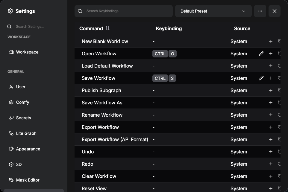