mirror of
https://github.com/Comfy-Org/ComfyUI_frontend.git
synced 2026-05-24 14:45:36 +00:00
a7d0ebc19a4d67f5ba5f2abcd4420b335abf733a
18 Commits
| Author | SHA1 | Message | Date | |
|---|---|---|---|---|
 Yourz
Yourz
|
fef2cab31e |
fix(website): prevent video glitch when c-projection.webp loads on /customers (#12060)
*PR Created by the Glary-Bot Agent* --- ## Summary Fix the video position glitch on `/customers` caused by `c-projection.webp` loading. ## Root cause In `HeroSection.vue` the hero `<img>` for `c-projection.webp` had no `width`/`height` attributes, so the browser reserved no space for it. When the image finished loading, the layout shifted ~192px, pushing the `VideoPlayer` below it. `useHeroAnimation` registers a GSAP `ScrollTrigger` parallax against the video in `onMounted` (before the image is loaded), so the cached scroll geometry then went stale and the video visibly glitched. ## Fix - Add explicit `width="1568"` / `height="1763"` to the `<img>` (the image's native size) so the browser reserves the correct aspect-ratio'd space upfront. - Add `h-auto` so the height attribute doesn't override the responsive layout. - Refresh `ScrollTrigger` on the image's `@load` (with `refresh(true)` so measurements happen after layout has settled) as a defensive measure for any sub-pixel adjustments. ## Test coverage Added `apps/website/e2e/customers.spec.ts` with a regression guard that: 1. Asserts the hero `<img>` declares numeric `width`/`height` attributes. 2. Asserts the unloaded image still reserves vertical space (>100px), which is the exact property that prevents the video from jumping when the image finishes loading. Verified the test fails when the `width`/`height` attributes are removed and passes with the fix applied. ## Verification - `pnpm typecheck` clean. - `pnpm test:unit` (website app) — 30/30 pass. - `pnpm test:e2e customers.spec.ts --project=desktop` — passes. - ESLint + oxfmt clean on changed files. - Manual Playwright verification confirmed the video bounding rect stays at `top=785, height=628` through the full image load lifecycle. Reverting the fix in DevTools and re-loading the image reproduces the original ~192px shift. ## Out of scope `apps/website/src/components/contact/FormSection.vue` uses the same `c-projection.webp` pattern (also without `width`/`height`). It runs `useHeroAnimation` with `parallax: false`, so the symptom is much smaller — leaving as a follow-up to keep this PR minimal. - Fixes [FE-607](https://linear.app/comfyorg/issue/FE-607/bug-video-on-customers-shifts-position-when-c-projectionwebp-finishes) ## Screenshots 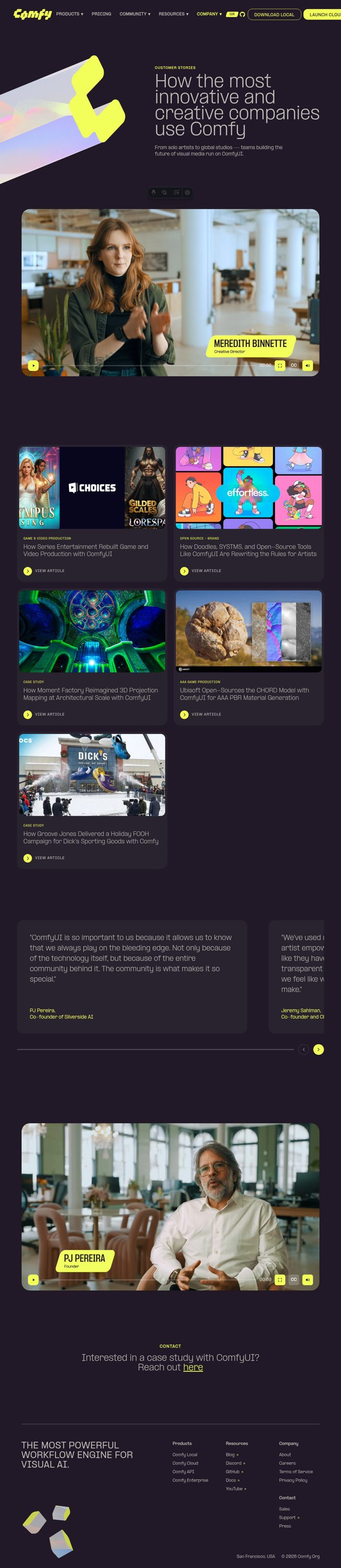 ┆Issue is synchronized with this [Notion page](https://www.notion.so/PR-12060-fix-website-prevent-video-glitch-when-c-projection-webp-loads-on-customers-3596d73d365081ebbcb8db25aaa5c451) by [Unito](https://www.unito.io) --------- Co-authored-by: Glary-Bot <glary-bot@users.noreply.github.com> |
||
|
Yourz
|
2322a5a497 |
fix: use webm video for VFX use case right asset (#12040)
*PR Created by the Glary-Bot Agent* --- ## Summary Replaces `right1.webp` with `right1.webm` in the VFX panel of `UseCaseSection`. `BlobMedia` already auto-detects `.webm` URLs and mounts a `<video>` element (with the `.webp` as poster), so this single URL swap is the only change required — matching the pattern used by the other 4 use-case panels. ## Files changed - `apps/website/src/components/home/UseCaseSection.vue` — swap `right1.webp` → `right1.webm`. ## Verification - `pnpm exec nx run website:typecheck` — clean - `pnpm exec eslint` on changed file — clean - `pnpm exec oxfmt --check` — clean - pre-commit lint-staged hooks — passed ## Reviewer note (Oracle finding) VFX is the default active panel, so the homepage's initial right-rail asset moves from ~131 KB `.webp` to ~4.1 MB `.webm`. Behaviorally consistent with the other 4 panels (which already use `.webm`), but worth confirming whether `right1.webm` should be re-encoded smaller on the CDN before promoting this PR out of draft. ┆Issue is synchronized with this [Notion page](https://www.notion.so/PR-12040-fix-use-webm-video-for-VFX-use-case-right-asset-3596d73d365081829976f37b733840f1) by [Unito](https://www.unito.io) --------- Co-authored-by: Glary-Bot <glary-bot@users.noreply.github.com> Co-authored-by: Amp <amp@ampcode.com> |
||
|
Yourz
|
81d9df61f2 |
fix(website): tighten GitHub ticker spacing on wide screens (#12021)
*PR Created by the Glary-Bot Agent* --- ## Summary The GitHub star ticker reads as detached from the GitHub octocat icon on wider viewports. The CSS gap is constant (`gap-2` = 8px), but the 28px icon next to a 20px badge plus the fixed gap make the pair look like two separate items at `lg+` widths instead of a single coupled unit. ## Change `apps/website/src/components/common/GitHubStarBadge.vue`: - Inner gap `gap-2` → `gap-1` (8px → 4px) so the badge and icon sit closer together. - Icon `size-7` → `size-6 shrink-0` (28px → 24px) so the icon height is closer to the badge height (20px) and the pair reads as one unit. The outer `gap-2` between CTA items in `SiteNav.vue` is intentionally unchanged — it is the correct spacing between unrelated CTA elements. ## Verification - `pnpm typecheck` — 0 errors (1 pre-existing hint in unrelated file). - `pnpm format:check` — clean. - `pnpm exec eslint apps/website/src/components/common/GitHubStarBadge.vue` — clean. - `pnpm test:unit` (apps/website) — 30/30 pass. - Pre-commit hook (oxfmt + oxlint + eslint + typecheck + typecheck:website) — passed. - `/review` (Oracle) — 0 critical, 0 warnings, 0 suggestions. - Manual visual verification at 1280px, 1920px, and 2560px viewports. - Tested longer star strings (`999.9K`, `1.2M`) — no wrapping. ## Before / After (2560px viewport) Before: badge and octocat appear visually detached. After: badge and octocat read as a single tightly-coupled unit. ## Screenshots      ┆Issue is synchronized with this [Notion page](https://www.notion.so/PR-12021-fix-website-tighten-GitHub-ticker-spacing-on-wide-screens-3586d73d365081be8d66dfbb22b8dc2c) by [Unito](https://www.unito.io) --------- Co-authored-by: Glary-Bot <glary-bot@users.noreply.github.com> Co-authored-by: github-actions <github-actions@github.com> Co-authored-by: Alexander Brown <drjkl@comfy.org> |
||
|
Yourz
|
d3f802de10 |
feat(pricing): add concurrent API jobs feature to Creator and Pro tiers (#12000)
*PR Created by the Glary-Bot Agent* --- ## Summary Adds a new feature bullet to the Creator and Pro plans on the [cloud pricing page](https://comfy.org/cloud/pricing) to call out included API concurrency: - **Creator**: `3 concurrent API jobs` - **Pro**: `5 concurrent API jobs` Free and Standard tiers do not include API access, so they are not changed. This matches the language landing in the docs PR: [Comfy-Org/docs#965](https://github.com/Comfy-Org/docs/pull/965). ## Changes - `apps/website/src/components/pricing/PriceSection.vue`: added `feature2` to the Creator and Pro plan feature lists. - `apps/website/src/i18n/translations.ts`: added `pricing.plan.creator.feature2` and `pricing.plan.pro.feature2` for `en` and `zh-CN`. - Updated `pricing-tiers-{1-sm,2-md,3-lg,4-xl}` visual regression snapshots in `apps/website/e2e/visual-responsive.spec.ts-snapshots/` to match the new copy. ## Verification - `pnpm nx run @comfyorg/website:typecheck` — clean - ESLint and `oxfmt` clean on changed files (pre-commit lint-staged also passed) - `pnpm exec playwright test --project visual -g "pricing-tiers"` — 4/4 passing against the regenerated snapshots - Manually rendered `localhost:4321/cloud/pricing`; confirmed copy appears in both desktop and mobile layouts and that Free / Standard are unchanged. Screenshots below. ## Screenshots ### Desktop  ### Mobile — Creator  ### Mobile — Pro  ## Screenshots 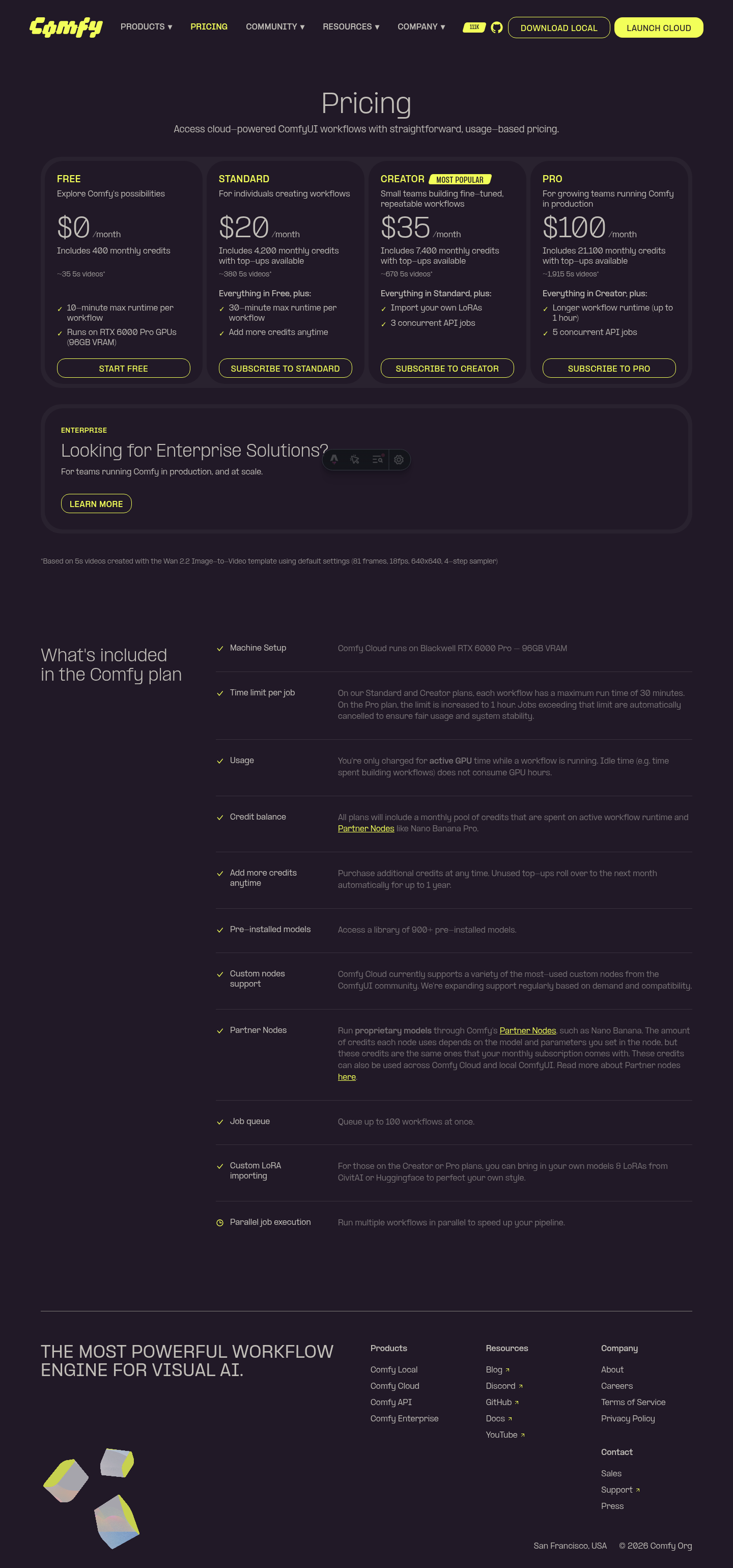  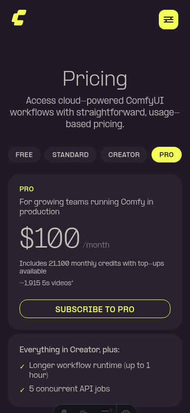 ┆Issue is synchronized with this [Notion page](https://www.notion.so/PR-12000-feat-pricing-add-concurrent-API-jobs-feature-to-Creator-and-Pro-tiers-3586d73d365081559acfc44eb5024c52) by [Unito](https://www.unito.io) --------- Co-authored-by: Glary-Bot <glary-bot@users.noreply.github.com> Co-authored-by: github-actions <github-actions@github.com> |
||
|
Yourz
|
6474faaa17 |
fix(website): prevent illustration cutoff in enterprise hero section (#11973)
*PR Created by the Glary-Bot Agent* --- ## Summary The illustration in the `HeroSection` of `/cloud/enterprise` was getting cut off at the top — the topmost ripple ring was clipped by the section's `overflow-y-clip`/`overflow-hidden`. **Root cause:** the SVG wrapper has `scale-150`, which makes the rendered illustration 50% larger than its layout box and overflows symmetrically (~25% above, ~25% below). The section only had `lg:pb-[min(8vw,10rem)]` — bottom padding — and on lg the wrapper had `lg:translate-y-[40px]` to nudge it down, but that wasn't enough room for the top to escape clipping. On mobile there was no padding at all, so the same issue occurred. **Fix:** add symmetric vertical padding (`pt-16` on mobile, `lg:pt-[min(8vw,10rem)]` mirroring the existing bottom value on lg) so the scaled illustration has room above and below. Removed the now-unnecessary `lg:translate-y-[40px]` since symmetric padding keeps the illustration vertically centered within the flex row. Verified at 375px (mobile), 1024px (lg), and 1440px (xl) viewports — all four ripple rings render fully without clipping at the top. ## Verification - `pnpm typecheck:website` ✅ - `pnpm exec oxfmt --check` on edited file ✅ - `pnpm exec oxlint` on edited file ✅ - `pnpm --filter @comfyorg/website build` ✅ - Pre-commit hooks (stylelint, oxfmt, oxlint, eslint, typecheck, typecheck:website) ✅ - Visual verification with Playwright at mobile / lg / xl ## Before vs After **Desktop (1440px) — before:** the topmost ripple ring is clipped at the top of the section. **Desktop (1440px) — after:** all four ripple rings are fully visible. **Mobile (375px) — before:** the top of the outermost ring is cut off by the section's top edge. **Mobile (375px) — after:** the full illustration (rings + blocks) is visible. ## Screenshots 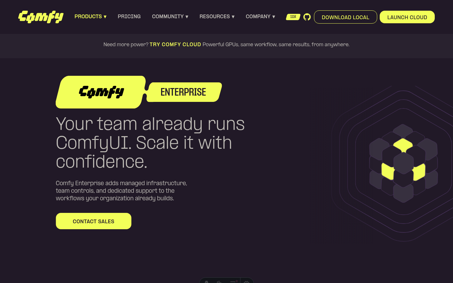 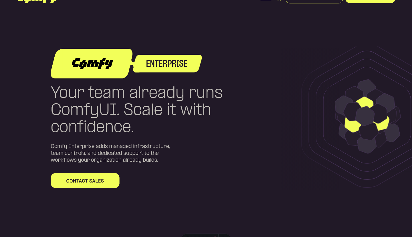 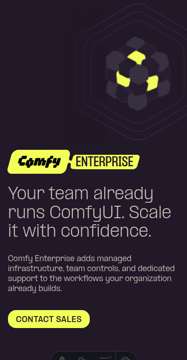  ┆Issue is synchronized with this [Notion page](https://www.notion.so/PR-11973-fix-website-prevent-illustration-cutoff-in-enterprise-hero-section-3576d73d3650813f9f04c3f93b9b42d6) by [Unito](https://www.unito.io) --------- Co-authored-by: Glary-Bot <glary-bot@users.noreply.github.com> Co-authored-by: Alexander Brown <drjkl@comfy.org> |
||
|
Christian Byrne
|
d1df5fadf8 |
fix(website): update payment-failed heading to "Unable to complete payment" (#11943)
*PR Created by the Glary-Bot Agent* --- ## Summary Reword the `payment.failed.title` copy on `comfy.org/payment/failed` from "Payment was not completed" to "Unable to complete payment" — a more active, distinguishing phrasing per design feedback. ## Changes - `apps/website/src/i18n/translations.ts` — update English (`Unable to complete payment`) and Chinese (`无法完成支付`) translations - `apps/website/e2e/payment.spec.ts` — update both English and zh-CN heading assertions to match ## Verification - `pnpm --filter website typecheck` — passes - `pnpm --filter website test:unit` — 30 tests passing - Pre-commit hooks (oxfmt, oxlint, eslint, typecheck, typecheck:website) — all pass - Manual visual verification with Playwright on `/payment/failed` and `/zh-CN/payment/failed` — both render the new heading correctly (screenshots attached) ## Screenshots 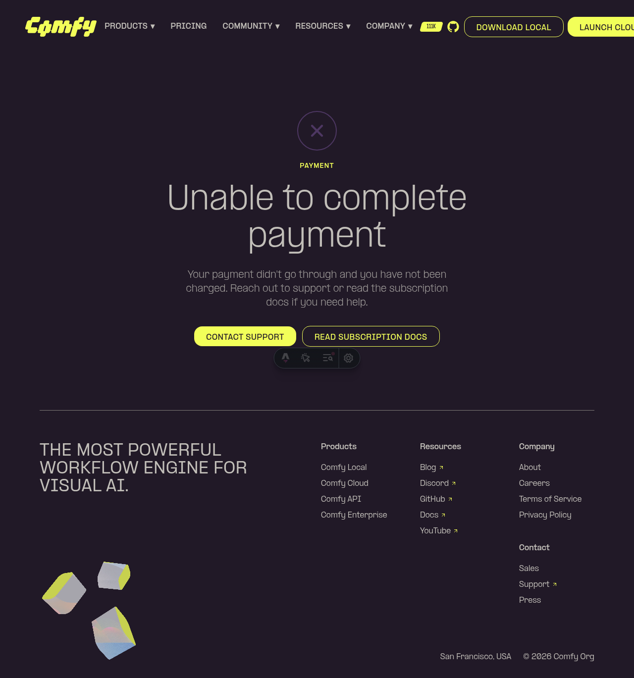 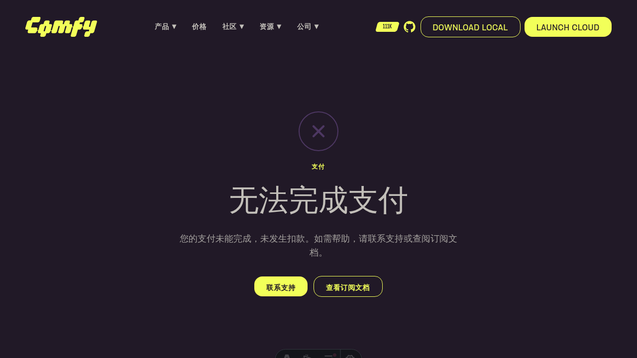 ┆Issue is synchronized with this [Notion page](https://www.notion.so/PR-11943-fix-website-update-payment-failed-heading-to-Unable-to-complete-payment-3576d73d3650817e85e2e7a3891cc307) by [Unito](https://www.unito.io) --------- Co-authored-by: Glary-Bot <glary-bot@users.noreply.github.com> |
||
|
Christian Byrne
|
aef71852f0 |
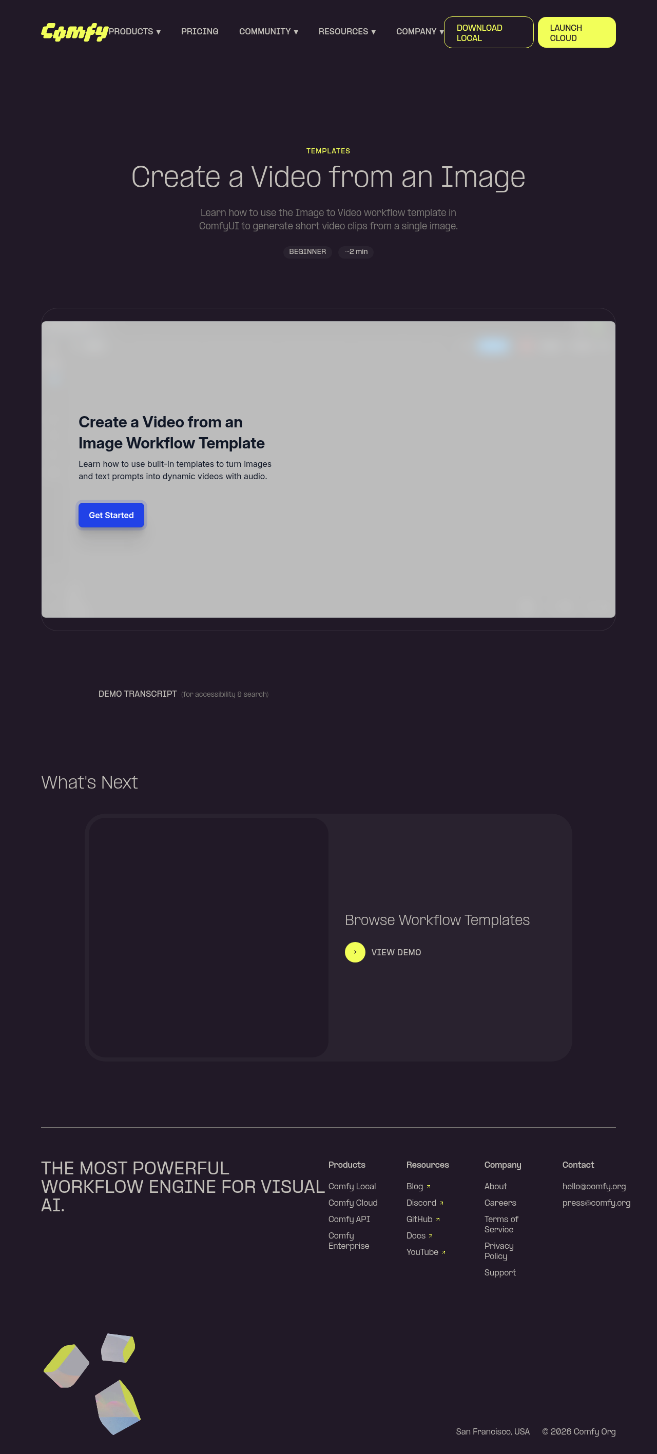
feat: add demo pages with Arcade embeds at /demos/{slug} (#11436)
*PR Created by the Glary-Bot Agent*
---
## Summary
Adds a demo pages system to the website that embeds Arcade interactive
walkthroughs at `comfy.org/demos/{slug}`. These pages will be linked
from welcome/lifecycle emails via Customer.io.
- Adds `/demos/image-to-video` and `/demos/workflow-templates` as the
first two demos
- Follows the existing `customers/[slug].astro` pattern exactly
(config-driven `getStaticPaths()`)
- Full SEO: OG/Twitter cards, HowTo + LearningResource + BreadcrumbList
JSON-LD schemas
- GEO: AI crawler directives in robots.txt, crawlable transcript
alongside iframe
- A11y: iframe title, sr-only transcript, aria-expanded toggle, noscript
fallback
- Email optimization: 1200x630 OG images, SSG pre-rendered, preconnect
to Arcade CDN
- Full zh-CN localization
- Library index stub at /demos for future expansion
- Automatic sitemap inclusion
## Architecture
Adding a new demo = adding one object to `src/config/demos.ts`.
## Note
OG images are tiny placeholders — replace with real 1200x630 screenshots
before go-live.
## Screenshots
┆Issue is synchronized with this [Notion
page](https://www.notion.so/PR-11436-feat-add-demo-pages-with-Arcade-embeds-at-demos-slug-3486d73d365081abbd72e02bf497a43a)
by [Unito](https://www.unito.io)
---------
Co-authored-by: Glary-Bot <glary-bot@users.noreply.github.com>
|
||
|
guill
|
f70285dcb2 |
fix(website): point Install via GitHub buttons to install docs anchor (#11852)
*PR Created by the Glary-Bot Agent* --- ## Summary Updates the "Install via GitHub" CTA buttons on the `/download` page to deep-link to the install instructions section of the ComfyUI README (`#installing`) instead of the repo root, so users land directly on setup steps. ## Changes - `apps/website/src/config/routes.ts`: add `externalLinks.githubInstall = 'https://github.com/Comfy-Org/ComfyUI#installing'` (separate from `externalLinks.github`, which is still used by the navbar/footer/star badge for the generic repo link). - `apps/website/src/components/product/local/HeroSection.vue`: switch the secondary CTA next to "Download Local" from `externalLinks.github` to `externalLinks.githubInstall`. - `apps/website/src/components/product/local/EcoSystemSection.vue`: same swap on the ecosystem-section CTA. The platform-aware `Download Local` button (Windows/macOS installers via `useDownloadUrl`) and the generic GitHub social/repo links elsewhere on the site are unchanged. ## Verification - `pnpm --filter @comfyorg/website typecheck` — 0 errors - `pnpm --filter @comfyorg/website test:unit` — 23/23 passing - `pnpm exec eslint` on changed files — clean - `pnpm exec oxfmt --check` — clean - Manual via `pnpm dev` + Playwright DOM assertion on `/download`: - Hero "INSTALL FROM GITHUB" → `https://github.com/Comfy-Org/ComfyUI#installing` ✓ - EcoSystem "INSTALL FROM GITHUB" → `https://github.com/Comfy-Org/ComfyUI#installing` ✓ - Other "GitHub" links (nav, footer, star badge) → unchanged at `https://github.com/Comfy-Org/ComfyUI` ✓ Per request from #website-and-docs: the local download surfaces should at least link to the ComfyUI install instructions on GitHub. Companion change to comfy-org/website#227. ## Screenshots  ┆Issue is synchronized with this [Notion page](https://www.notion.so/PR-11852-fix-website-point-Install-via-GitHub-buttons-to-install-docs-anchor-3546d73d365081fe8370cd675ae8f896) by [Unito](https://www.unito.io) --------- Co-authored-by: Glary-Bot <glary-bot@users.noreply.github.com> |
||
|
Christian Byrne
|
6762c08134 |
feat(website): add payment success and failed pages (#11855)
*PR Created by the Glary-Bot Agent* --- ## Summary Recreate the two payment status pages that were never migrated from Framer (they weren't in the sitemap, so were missed). The Stripe checkout flow in `comfy-api` redirects to `https://www.comfy.org/payment/{success,failed}` after a checkout session, so users currently hit a 404 on completion or cancel. ## Changes - **What**: New static Astro pages at `/payment/success`, `/payment/failed` and their `/zh-CN/` variants, sharing a `PaymentStatusSection.vue` component built from the existing `BrandButton` / `SectionLabel` primitives. Translation keys live in `src/i18n/translations.ts` for both locales. Pages are `noindex` and explicitly excluded from the generated sitemap. Adds a Playwright e2e spec covering both pages in both locales. - **Dependencies**: none ## Review Focus - **URL slug**: matches production Stripe config (`STRIPE_CANCEL_URL=…/payment/failed` in `comfy-api/run-service-{prod,staging}.yaml`), not `/payment/failure`. - **Primary CTA target**: links to `externalLinks.apiKeys` (`platform.comfy.org/profile/api-keys`) — the platform root is just a redirect, so this avoids a hop. - **Locale-aware secondary CTA**: derived from `getRoutes(locale)` so future i18n/route changes flow through the existing helper. - **Stale fallback** (out of scope): `comfy-api/gateways/stripe/stripe.go:159` has an unrelated stale fallback pointing at `/payments/` (plural) that's overridden by the env config in production. Worth fixing in a follow-up. ## Screenshots EN success / failed and zh-CN success / failed at desktop widths. Mobile viewport stacks the CTA buttons vertically (verified locally). ## Screenshots 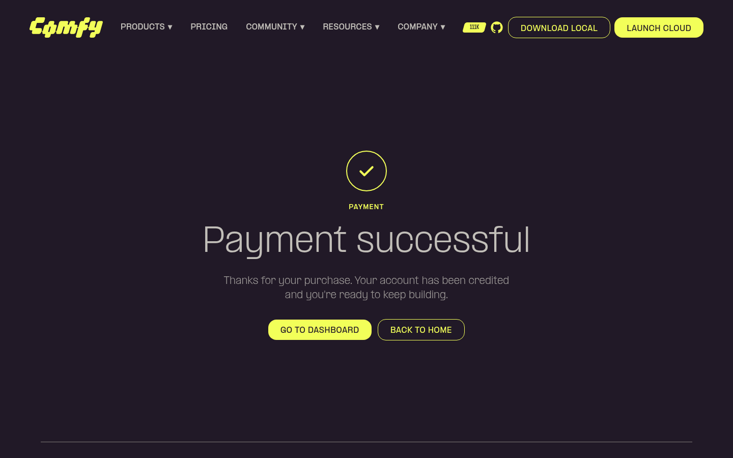 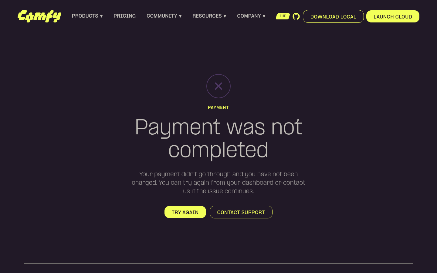 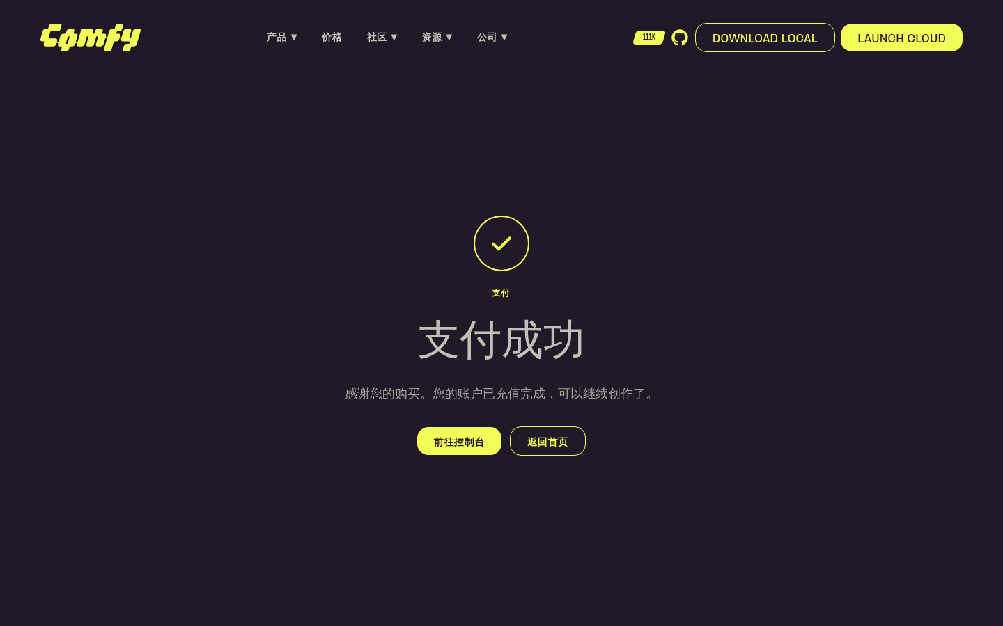 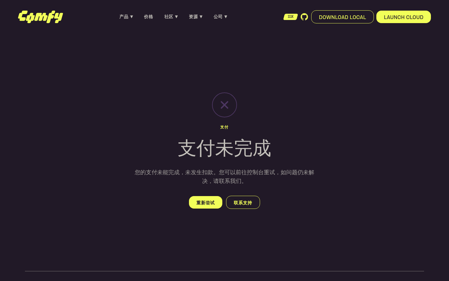 ┆Issue is synchronized with this [Notion page](https://www.notion.so/PR-11855-feat-website-add-payment-success-and-failed-pages-3556d73d3650819f8f45d8ecf27cb264) by [Unito](https://www.unito.io) --------- Co-authored-by: Glary-Bot <glary-bot@users.noreply.github.com> |
||
|
Christian Byrne
|
5523df1aea |
fix(website): unstretch See all case studies button (#11854)
*PR Created by the Glary-Bot Agent* --- ## Summary The "See all case studies" button on the homepage `CaseStudySpotlightSection` was rendering oddly stretched because it had `class="flex-1 text-center"` while being the sole child of a `flex-row` container — it expanded to fill the entire content column (~592px) instead of sizing to its label. This drops `flex-1`/`text-center` and adds `items-start` to the wrapper so the button sizes to its content and is left-aligned, matching the proportions of every other outline `BrandButton` on the site (Hero, UseCase, customer detail, etc.). ## Changes - `apps/website/src/components/home/CaseStudySpotlightSection.vue`: remove `flex-1 text-center` from the `BrandButton` and align the row's items to the start. `BrandButton` already centers its label internally via `inline-flex … justify-center`, so dropping `text-center` is a no-op visually. ## Before / After - Desktop before: button width = 592px (stretched across the column) - Desktop after: button width = 223px (natural) - Mobile: 1-column layout, now consistently left-aligned ## Review Focus Whether the fix should also live on the `BrandButton` component itself (e.g. a global `max-width`) instead of at the call site. I went with the instance-level fix because every other CTA in the website intentionally uses bare `BrandButton` and lets the content size it; only this one had `flex-1`. A blanket `max-width` would risk changing Hero/MobileMenu buttons that explicitly opt into `w-full lg:w-auto lg:min-w-60`. ## Screenshots 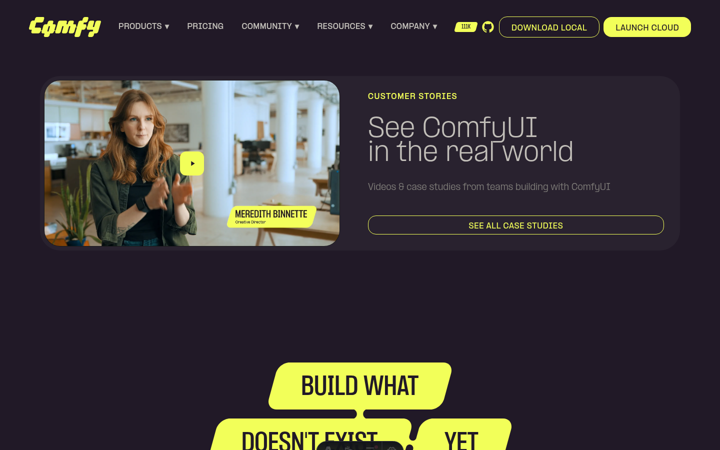 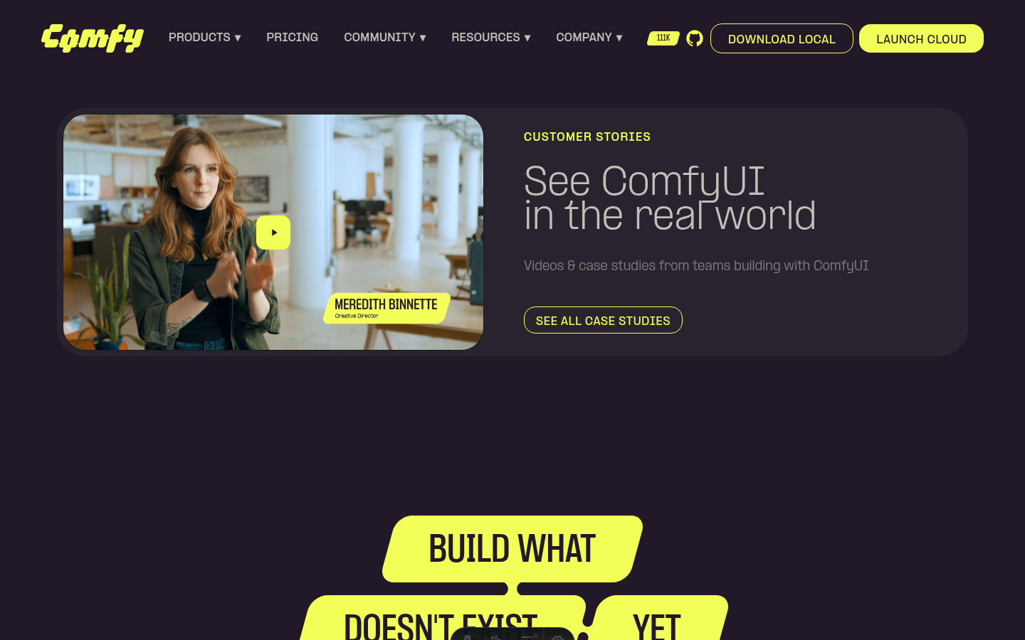 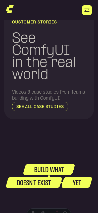 ┆Issue is synchronized with this [Notion page](https://www.notion.so/PR-11854-fix-website-unstretch-See-all-case-studies-button-3556d73d365081abb3bbe9dbc51cbc07) by [Unito](https://www.unito.io) --------- Co-authored-by: Glary-Bot <glary-bot@users.noreply.github.com> |
||
|
Alexander Brown
|
ef98ba0e8f |
feat: add plum/ink color primitives and standardize design tokens (#11139)
*PR Created by the Glary-Bot Agent* --- ## Summary Adds new `plum` and `ink` color scales for Comfy Hub branding and standardizes existing tokens to align with current Figma design system. ### Changes **Phase 1 — New primitives** (`_palette.css`) - Added `plum-300/400/500/600` and `ink-100` through `ink-900` **Phase 2 — Token cleanup** (`style.css`) - Removed deprecated `slate-100/200/300` primitives (cool blue-grey, removed from Figma) - Removed duplicate `graphite-400` (identical hex to slate-100) - Dark mode: migrated 6 slate/graphite references to muted-foreground, smoke-700, smoke-800, charcoal-200 - Light mode: replaced 3 `ash-500` references with `smoke-800` per designer alignment ### Token migration detail | Dark mode token | Old value | New value | Rationale | |---|---|---|---| | `--node-component-header-icon` | slate-300 (#5b5e7d) | muted-foreground (smoke-800) | Figma `node/foreground-secondary` | | `--node-component-slot-text` | slate-200 (#9fa2bd) | smoke-700 (#a0a0a0) | Lighter neutral for text contrast | | `--node-component-surface-highlight` | slate-100 (#9c9eab) | smoke-800 (#8a8a8a) | Neutral grey highlight | | `--node-component-tooltip-border` | slate-300 (#5b5e7d) | charcoal-200 (#494a50) | Consistent with dark border tokens | | `--text-secondary` | slate-100 (#9c9eab) | smoke-700 (#a0a0a0) | Adequate contrast on dark surfaces | | `--widget-background-highlighted` | graphite-400 (#9c9eab) | smoke-800 (#8a8a8a) | Removed duplicate, neutral replacement | ### Visual note These changes shift some dark mode colors from cool blue-grey to neutral grey. This is intentional per the design team. The `--node-component-surface-highlight` and `--node-component-tooltip-border` tokens should be QA'd as the designer noted. ### Not included (Phase 3) Hub Dark overlay theme will ship separately once the Hub UI work is ready to validate against. ## Screenshots   ┆Issue is synchronized with this [Notion page](https://www.notion.so/PR-11139-feat-add-plum-ink-color-primitives-and-standardize-design-tokens-33e6d73d365081418e13e0efe6161fb5) by [Unito](https://www.unito.io) --------- Co-authored-by: Glary-Bot <glary-bot@users.noreply.github.com> Co-authored-by: github-actions <github-actions@github.com> Co-authored-by: Amp <amp@ampcode.com> |
||
|
Benjamin Lu
|
17c18b0707 |
fix: embed HubSpot contact form (#11723)
## Summary Embed the HubSpot-hosted contact sales form on `/contact` and `/zh-CN/contact` so HubSpot owns submission handling, validation, anti-spam/security updates, tracking context, and form configuration. ## Changes - **What**: Replaces the custom local contact form stub with a HubSpot embed component using the HubSpot-hosted developer/raw HTML script and `hs-form-html` container. - **Localization**: Uses the existing English form ID by default and switches to the zh-CN form ID for `/zh-CN/contact`. - **Styling**: Applies HubSpot form CSS custom properties to match the Comfy contact page colors and `PP Formula` font more closely. - **Docs**: Updates the website README with the developer embed snippet and the zh-CN form ID. - **Dependencies**: None. ## Why Embedded Form - HubSpot docs say forms should be loaded with the HubSpot-hosted JavaScript file, and that security, anti-spam, accessibility, and performance improvements will not propagate if the embed runtime is copied or self-hosted: https://developers.hubspot.com/docs/cms/start-building/building-blocks/modules/forms - The direct form submission endpoint is documented under `v3 legacy`: https://developers.hubspot.com/docs/api-reference/legacy/marketing/forms/v3-legacy/submit-data-unauthenticated - HubSpot’s legacy API overview says numeric-versioned APIs are legacy and will be deprecated in a future release: https://developers.hubspot.com/docs/api-reference/legacy/overview ## Review Focus - Confirm the portal ID and form IDs are correct: - `en`: `94e05eab-1373-47f7-ab5e-d84f9e6aa262` - `zh-CN`: `6885750c-02ef-4aa2-ba0d-213be9cccf93` - Check visual fit on `/contact` and `/zh-CN/contact`, especially font, background, inputs, radio controls, and submit button. - Confirm the developer/raw HTML embed remains the preferred integration over a custom Forms API POST. ## Local Checks - `pnpm exec oxfmt --check apps/website/src/components/contact/HubspotFormEmbed.vue apps/website/README.md` - `pnpm exec eslint apps/website/src/components/contact/HubspotFormEmbed.vue` - `pnpm --filter @comfyorg/website typecheck` - `pnpm --filter @comfyorg/website test:unit` - `pnpm --filter @comfyorg/website build` - Commit hooks: stylelint, oxfmt, oxlint, eslint, `pnpm typecheck`, `pnpm typecheck:website` - Push hook: `pnpm knip --cache` Build completed with existing non-fatal environment warnings: Node `v25.8.1` vs requested `24.x`, unresolved website font paths deferred to runtime, `transformWithEsbuild` deprecation, and missing Ashby env falling back to the committed snapshot. Incredibly, during the taking of these screenshots, I discovered a bug in macos, where despite the snapshot/record bar not existing, from me esc'ing out, some of the tooltips persist. Closing and reopening the lid did not fix this. I didn't see the process in activity monitor. <img width="1512" height="862" alt="Screenshot 2026-04-29 at 7 09 55 PM" src="https://github.com/user-attachments/assets/92518795-6845-4b34-8da3-54048b440eb1" /> <img width="1512" height="862" alt="Screenshot 2026-04-29 at 7 13 18 PM" src="https://github.com/user-attachments/assets/f7609e58-898d-413c-975c-b02b70b84e73" /> ┆Issue is synchronized with this [Notion page](https://www.notion.so/PR-11723-fix-embed-HubSpot-contact-form-3506d73d365081528bfbe4b024c2a21f) by [Unito](https://www.unito.io) --------- Co-authored-by: github-actions <github-actions@github.com> |
||
|
Christian Byrne
|
5a8ded7959 |
Website: pull careers page listing from ashby API (#11590)
Careers --------- Co-authored-by: Glary-Bot <glary-bot@users.noreply.github.com> Co-authored-by: Alexander Brown <drjkl@comfy.org> |
||
|
Alexander Brown
|
0b2e605dee |
content: website copy and pricing updates (#11567)
## Summary

Update website copy: fix branding ("Comfy" → "ComfyUI"), correct pricing
runtime, remove "coming soon" seat features, and shorten use-case label.

## Changes

- **What**: Copy corrections in `translations.ts` (branding, runtime "60
min" → "30 min" for Standard plan, remove placeholder seat features for
Creator/Pro plans); trim feature arrays in `PriceSection.vue`

## Review Focus

Verify zh-CN translations still make sense after the English copy
changes (runtime string not updated in zh-CN).

┆Issue is synchronized with this [Notion
page](https://www.notion.so/PR-11567-content-website-copy-and-pricing-updates-34b6d73d365081c29af8ee1469b08358)
by [Unito](https://www.unito.io)

---------

Co-authored-by: Amp <amp@ampcode.com>
Co-authored-by: github-actions <github-actions@github.com>
|
||
|
Alexander Brown
|
68798d8e37 |
feat(website): website mise en place (#11552)
## Summary Assorted website copy and content refinements — tidying up loose ends across the site. ## Changes - **What**: Remove placeholder doc links from custom nodes feature description on pricing page ## Review Focus Low-risk copy changes only; no logic or layout modifications. ┆Issue is synchronized with this [Notion page](https://www.notion.so/PR-11552-feat-website-website-mise-en-place-34b6d73d3650813b954afbc965e4dc74) by [Unito](https://www.unito.io) > **Note:** The `PR: Vercel Website Preview` workflow is `workflow_run`-triggered, so it always runs the **main branch version** of the workflow file. Until this PR is merged, the preview workflow will continue posting standalone comments using the old `<!-- VERCEL_WEBSITE_PREVIEW -->` marker instead of writing to the consolidated `<!-- WEBSITE_CI_REPORT -->` comment. This is expected and resolves itself on merge. --------- Co-authored-by: Amp <amp@ampcode.com> Co-authored-by: github-actions <github-actions@github.com> Co-authored-by: Yourz <crazilou@vip.qq.com> |
||
|
Yourz
|
bbb043c9cc |
feat(website): Polish and fix UI (#11363)
## Summary <!-- One sentence describing what changed and why. --> Polish and fix UI for new website ## Changes - **What**: <!-- Core functionality added/modified --> - [x] update about video - [x] update Moment factory story content - [x] update homepage visual - [x] update customer story visual - [x] put images and videos to bucket ## Review Focus <!-- Critical design decisions or edge cases that need attention --> <!-- If this PR fixes an issue, uncomment and update the line below --> <!-- Fixes #ISSUE_NUMBER --> ## Screenshots (if applicable) <!-- Add screenshots or video recording to help explain your changes --> ┆Issue is synchronized with this [Notion page](https://www.notion.so/PR-11363-feat-website-Polish-and-fix-UI-3466d73d365081f895aff84b594450c9) by [Unito](https://www.unito.io) --------- Co-authored-by: DrJKL <DrJKL0424@gmail.com> Co-authored-by: Amp <amp@ampcode.com> Co-authored-by: GitHub Action <action@github.com> Co-authored-by: Alexander Brown <drjkl@comfy.org> Co-authored-by: github-actions <github-actions@github.com> |
||
|
Yourz
|
39dc8d896b |
feat(website): unified preview — cloud page, API & enterprise pages, use case images (#11273)
## Summary Unified preview branch combining three feature PRs for the website product pages. > **Constituent PRs:** #11247, #11270, #11266 ## Changes - **Cloud page** (#11247): Add Cloud product page sections (Hero, Reason, FAQ, AI Models, Audience, Pricing, ProductCards). Extract `FAQSection` to `common/` and `ReasonSection` to `product/shared/` for reuse across product pages. Add cloud-related i18n translations. - **API & Enterprise pages** (#11270): Add API page (Hero, Steps, Automation, Reason) and Enterprise page (Hero, Team, DataOwnership, BYOKey, Orchestration, Reason). Add shared `CardGridSection`, `FeatureShowcaseSection`, `CloudBannerSection`. Add all API/enterprise i18n translations. - **Use case images** (#11266): Replace placeholder divs with real images in `UseCaseSection`. Add SVG blob clip-paths (`objectBoundingBox`) and crossfade transitions on category switch. Use `useId()` for unique clip-path IDs. ## Review Focus - Shared component API design (`ReasonSection` slot/prop surface) - Component placement: `common/` vs `product/shared/` - Clip-path coordinate accuracy and crossfade transition smoothness --------- Co-authored-by: Amp <amp@ampcode.com> Co-authored-by: GitHub Action <action@github.com> Co-authored-by: DrJKL <DrJKL0424@gmail.com> Co-authored-by: Alexander Brown <drjkl@comfy.org> Co-authored-by: pythongosssss <125205205+pythongosssss@users.noreply.github.com> Co-authored-by: AustinMroz <austin@comfy.org> |
||
|
Yourz
|
121ceda66d |
feat: implement website layout and homepage (#11168)
## Summary Implement the website layout system and homepage with all sections, reusable components, scroll-driven animations, and routing. ## Changes - **What**: - Reorganize components into `common/`, `home/`, `company/`, `product/` directories - Add `BaseLayout` with shared `SiteNav` and `SiteFooter` - Implement homepage sections: Hero, SocialProofBar, ProductShowcase, UseCase, GetStarted, ProductCards, CaseStudySpotlight, BuildWhat - Add reusable components: BrandButton, NodeBadge, ProductCard, FooterLinkColumn, NavDesktopLink, MobileMenu - Add PPFormula font family, client logos, and icon assets - Add hero/footer logo frame sequences for scroll-driven animations - Add `useFrameScrub` composable and `smoothScroll` (Lenis + GSAP ScrollTrigger) - Add route config, nav config, and placeholder pages for all routes - Add Playwright e2e tests for homepage and navigation - **Dependencies**: gsap, lenis, @astrojs/check desktop  mobile  ## Review Focus - Component structure and naming conventions under `apps/website/` - Scroll-driven animation approach (GSAP ScrollTrigger + Lenis smooth scroll) - Mobile responsive behavior (MobileMenu, ScrollTrigger matchMedia) --------- Co-authored-by: GitHub Action <action@github.com> Co-authored-by: DrJKL <DrJKL0424@gmail.com> Co-authored-by: Amp <amp@ampcode.com> Co-authored-by: Alexander Brown <drjkl@comfy.org> |