mirror of
https://github.com/Comfy-Org/ComfyUI_frontend.git
synced 2026-07-15 19:54:32 +00:00
b1d5ff8094de46f0a44c3696f30ab204ba80986e
787 Commits
| Author | SHA1 | Message | Date | |
|---|---|---|---|---|
 AustinMroz
|
46526cfabd |
On mode toggle apply to group children (#12809)
When performing mode toggle operations (like bypass or mute) with a group (the colored rectangles) selected, nodes contained within the group will be considered selected and will have their state toggled. <img width="1024" height="1024" alt="AnimateDiff_00002" src="https://github.com/user-attachments/assets/c4e9db17-3fe8-4fd8-9012-0e9a0bc59707" /> |
||
|
jaeone94
|
c7797b201e |
Simplify swap node error presentation (#12768)
## Summary Simplifies the Swap Nodes error card as the fourth slice of the catalog/error-tab presentation refactor, aligning it with the newer compact error-row patterns while preserving the existing replace and locate behavior. This follows the staged rollout plan from the earlier error-tab PRs: 1. #12683 refined execution-style errors: validation, runtime, and prompt errors. 2. #12705 simplified missing media errors into flat, locatable rows. 3. #12735 simplified missing node pack errors and aligned grouped-row behavior. 4. This PR applies the same simplification pass to Swap Nodes errors. 5. A later PR is expected to handle Missing Models, which is larger and intentionally kept separate. After the Missing Models slice lands, a follow-up consistency PR will normalize the shared row/disclosure pattern across Missing Node Packs, Swap Nodes, and Missing Models together. That follow-up will cover parameterized i18n labels for disclosure controls, shared text-button styling, and consistent disclosure semantics/accessibility across those grouped rows. ## Changes - **What**: Reworks the Swap Nodes card rows so each replacement group is presented as a compact row with the source node type, replacement target, replace action, and locate action. - **What**: For a single affected node, the visible row label can be clicked to locate the node, matching the interaction model used by the newer missing-media and missing-node rows. - **What**: For multiple affected nodes with the same replacement target, the group renders a count badge and a disclosure row. Expanding the group shows the affected node rows, each with its own locate action. - **What**: Removes the old node-id badge path from Swap Nodes rows. Node-id badges remain available to the other error cards that still own that behavior. - **What**: Keeps replacement behavior unchanged: per-group replacement and replace-all still call through the existing node replacement store flow. - **What**: Adds regression coverage for the new grouped-row UI, including same-type grouping in both Vue Nodes and LiteGraph render modes. - **Breaking**: None. - **Dependencies**: None. ## Review Focus Please focus on the Swap Nodes presentation and interaction symmetry with the previous error-tab PRs: - Single-node groups should remain directly locatable via the row label and the locate icon. - Multi-node groups should expose the count and expand/collapse behavior without adding duplicate focusable disclosure controls. - The visible row labels intentionally keep their own accessible names, while the separate locate icon uses the generic `Locate node on canvas` accessible name. This mirrors the established pattern from the previous slices. - The newly added Playwright fixture covers two same-type replaceable nodes so duplicate group keys and grouped disclosure behavior are exercised end-to-end. ## Validation - `pnpm format` - `pnpm test:unit src/platform/nodeReplacement/components/SwapNodeGroupRow.test.ts` - `pnpm test:browser:local browser_tests/tests/nodeReplacement.spec.ts --project=chromium` - Pre-commit hook: lint-staged, stylelint, oxfmt, oxlint, eslint, `pnpm typecheck`, `pnpm typecheck:browser` - Pre-push hook: `pnpm knip --cache` - Additional parallel code review pass completed locally; no blocker or major issues remained. ## Screenshots (if applicable) This PR <img width="561" height="362" alt="스크린샷 2026-06-11 오전 3 46 06" src="https://github.com/user-attachments/assets/65395467-6c2f-4aa1-84c5-3d9614c00c80" /> old (Main) <img width="611" height="798" alt="스크린샷 2026-06-11 오전 3 46 32" src="https://github.com/user-attachments/assets/3862d5df-f839-40c0-9488-ce64b051378e" /> |
||
|
Dante
|
598cf33ab7 |
[bugfix] Truncate long workspace names in workspace switcher (#12762)
## Summary Long team workspace names wrapped onto multiple lines in the user-menu workspace switcher, overflowing the fixed 54px rows and breaking the dropdown layout. Applies the same single-line ellipsis pattern already used by the current-workspace header (`CurrentUserPopoverWorkspace.vue`). ## Changes - **What**: `truncate` on the switcher name span, `max-w-full` on the name row, `shrink-0` on avatar/tier badge/check icon so only the name shrinks (`WorkspaceSwitcherPopover.vue`, 5 lines) - Regression tests: Vitest component test + `@cloud` Playwright e2e measuring single-line render height Fixes [FE-778](https://linear.app/comfyorg/issue/FE-778/bug-team-workspace-names-wrapping-to-multiple-lines-display-poorly-in) ## Red-Green Verification | Commit | CI | Result | |---|---|---| | `30e04e2` test only | [Tests Unit](https://github.com/Comfy-Org/ComfyUI_frontend/actions/runs/27278378157) / [Tests E2E](https://github.com/Comfy-Org/ComfyUI_frontend/actions/runs/27278378213) | 🔴 new unit test + cloud e2e fail (proves tests catch the bug) | | `d8f9a5c` fix | [Tests Unit](https://github.com/Comfy-Org/ComfyUI_frontend/actions/runs/27279508881) / [Tests E2E](https://github.com/Comfy-Org/ComfyUI_frontend/actions/runs/27279508715) | 🟢 same tests pass | ## Screenshots | Before | After | |---|---| | <img width="320" alt="before — name wraps to 4 lines, rows collide" src="https://github.com/user-attachments/assets/90f3286a-5b50-4477-9b5c-9d32d0b026e4" /> | <img width="320" alt="after — single line with ellipsis, row height intact" src="https://github.com/user-attachments/assets/8e47bbb2-b5b1-4945-a008-68491f39dc46" /> | ## Review Focus - Truncation chain: the name span is a flex item, so `truncate` (overflow-hidden) zeroes its automatic min size; `max-w-full` caps the `items-start` row at the container width. Mirrors the header pattern — no new component. - Figma `Team Plan - Workspaces` (Workspaces Menu component, node 2045-14413) specifies compact single-line rows; long-name overflow was undesigned, truncation preserves the spec'd layout. |
||
|
jaeone94
|
1b14f4df8a |
Simplify missing node pack error presentation (#12735)
## Summary Simplify the Missing Node Packs error card so it follows the new error-tab item-row direction, with clearer pack rows, predictable locate behavior, and focused E2E coverage. This is the third PR in the staged error-tab simplification plan: 1. Merged: execution/prompt/validation error presentation and catalog grouping in #12683. 2. Merged: missing media presentation simplification in #12705. 3. This PR: missing node pack presentation simplification. 4. Planned next: swap-node presentation simplification. 5. Planned later: missing model presentation and action-flow simplification. ## Changes - **What**: Refactors Missing Node Packs rows so pack-level and node-level actions are easier to scan and more consistent with the rest of the refreshed Errors tab. - **What**: Removes the node-id badge from missing node pack rows, matching the simplified item-row direction. - **What**: Makes a single-node known pack row directly locatable from the pack label, rather than rendering an extra child row. - **What**: Keeps multi-node packs collapsed by default, with both the chevron and pack title toggling the child node list. - **What**: Keeps unknown packs expanded by default, including the single-node unknown-pack case, so users can still see the unresolved node type immediately. - **What**: Keeps per-node child rows clickable for locate-on-canvas behavior when a pack contains multiple affected nodes. - **What**: Replaces missing-node-pack action labels with shared `g.install` and `g.search` copy and removes now-unused English locale keys. - **What**: Adds targeted Playwright coverage for the simplified missing-node-pack card, including unknown-pack default rows, row-label locate behavior, and chevron/title expansion behavior. - **Breaking**: None. - **Dependencies**: None. ## Review Focus Please focus on the missing-node-pack row behavior: - Single known pack with one affected node should stay compact and locate the node from the pack label or locate icon. - Known packs with multiple affected nodes should show a count, start collapsed, and expand/collapse from either the chevron or title. - Unknown packs should expose the affected node rows immediately, including when there is only one affected node. - Locate actions should remain attached to the affected node rows, not to the parent pack when there are multiple nodes. - The E2E fixture intentionally uses two missing nodes with the same `cnr_id` and node sizes of `[400, 200]` to follow browser-test asset guidance. ## Validation - `pnpm format:check` - `pnpm lint` - `pnpm typecheck` - `pnpm knip --cache` via pre-push hook - `pnpm test:unit src/components/rightSidePanel/errors/MissingPackGroupRow.test.ts src/components/rightSidePanel/errors/MissingNodeCard.test.ts --run` - `pnpm test:browser:local browser_tests/tests/propertiesPanel/errorsTabMissingNodes.spec.ts --project=chromium` - Pre-commit hook: staged formatting, linting, `pnpm typecheck`, and `pnpm typecheck:browser` ## Screenshots This PR <img width="531" height="598" alt="스크린샷 2026-06-10 오전 1 54 31" src="https://github.com/user-attachments/assets/9c0addeb-92d2-4cef-a4f3-35a87bbad308" /> old (Main) <img width="509" height="807" alt="스크린샷 2026-06-10 오전 1 53 51" src="https://github.com/user-attachments/assets/b8488f73-d8ed-4356-bd4c-fc678ea205f7" /> |
||
|
jaeone94
|
14f8fdebdd |
fix: refresh promoted combo host options after missing model reload (#12692)
## Summary Fixes a Vue node subgraph case where the missing-model refresh flow clears the missing-model error, but the promoted combo widget remains in an invalid visual state because its hosted options snapshot is stale. ## Changes - **What**: After `reloadNodeDefs()` refreshes combo option lists and extension `refreshComboInNodes` hooks run, resync hosted options snapshots for promoted combo widgets so Vue-rendered subgraph nodes see the newly available model option. - **What**: Adds a focused E2E regression for the missing-model refresh path on a subgraph with a promoted `ckpt_name` widget. - **What**: Hardens the E2E by cleaning up its `/object_info` route override and asserting the widget's `aria-invalid` state rather than a Tailwind implementation class. - **Breaking**: None. - **Dependencies**: None. ## Review Focus This PR is intentionally a minimal patch for the missing-model refresh path, not a broader subgraph architecture change. Root cause: `reloadNodeDefs()` updates the live LiteGraph combo widget options, including widgets inside subgraphs. However, Vue nodes render promoted widgets from a hosted `WidgetState.options` snapshot. When a missing model is downloaded and the missing-model refresh button reloads node definitions, the source combo receives the updated model list, but the promoted host snapshot can still contain the old option list. The missing-model error and node-level state are cleared, while the Vue combo still computes itself as invalid from stale options. The fix keeps the existing host snapshot model intact. It simply resyncs promoted combo host options after the normal combo refresh pipeline finishes. This avoids changing promoted-widget ownership, `useProcessedWidgets` merge precedence, or broader subgraph internals while addressing the reported stale invalid state. Why the helper is in `app.ts`: this sync is currently a single-call-site post-step of `reloadNodeDefs()`, and the ordering is load-bearing. It must run after the core combo refresh loop and after extension `refreshComboInNodes` hooks so it captures both built-in and extension-provided option changes. Keeping the small private helper next to the refresh orchestration makes that sequence explicit and avoids adding a new public subgraph helper or introducing a more visible dependency cycle through `promotionUtils` for a narrow patch. This is stacked on `jaeone/fe-942-bug-error-indicators-persist-after-resolving-missing-model`, so it is opened as a draft until the base PR lands. ## Test Plan - `pnpm knip` - `pnpm exec oxfmt --check src/scripts/app.ts browser_tests/tests/propertiesPanel/errorsTabModeAware.spec.ts` - `pnpm exec eslint --cache --no-warn-ignored src/scripts/app.ts browser_tests/tests/propertiesPanel/errorsTabModeAware.spec.ts` - `pnpm typecheck` - `pnpm test:browser:local --grep "Refreshing a resolved promoted missing model clears the combo invalid state"` - First local run hit a `beforeEach` timeout while the dev server was still warming custom-node/conflict-detection output. - Re-running against the warmed dev server passed. ## Screenshots (if applicable) N/A. The behavioral E2E covers the visible invalid-state regression. |
||
|
jaeone94
|
1b90696459 |
Simplify missing media error presentation (#12705)
## Summary This is the second PR in the planned Workflow Overview error-tab modernization stack. It follows the merged execution-error slice in #12683 and focuses only on Missing Media / Missing Inputs. The intent is to simplify missing-media errors from media-type/file-resolution cards into compact node-level guidance. Missing media is now presented as a flat list of affected node inputs, matching the new catalog-driven item-row direction introduced by the first PR while intentionally avoiding the larger missing-node, swap-node, and missing-model redesigns. This PR also removes the upload/library selection workflow from the error tab. Missing media rows now help the user locate the affected node/input directly, rather than attempting to resolve the missing file inside the error card. ## Changes - **What**: Simplifies the Missing Inputs card into a flat list of affected node/widget rows. - **What**: Displays each missing media row with a catalog-resolved item label in the form `{nodeName} - {inputName}`. - **What**: Makes both the row label and right-aligned locate icon navigate to the affected node on canvas. - **What**: Adds item-specific accessible labels for locate icon buttons and an explicit focus-visible state for clickable row labels. - **What**: Uses the existing `list-scale` transition pattern so missing media rows animate consistently when they enter or leave. - **What**: Removes the old image/video/audio sub-sections from the missing-media card. - **What**: Removes missing-media upload/dropzone/library-selection/status/confirm/cancel UI, because resolution is no longer handled inside this card. - **What**: Removes stale E2E selectors and tests tied to the deleted upload/library controls. - **What**: Removes stale English missing-media locale keys for the deleted controls; translated locale files are intentionally left to the localization sync process. - **What**: Removes stale missing-media store interaction state (`expandState`, `uploadState`, `pendingSelection`) and the now-unused name-based removal API that only supported the deleted upload/library flow. - **What**: Keeps the remaining widget/node/prefix candidate-removal APIs used by the missing-media lifecycle. - **What**: Carries `nodeType` through missing-media referencing nodes so fallback labels remain correct when the same missing filename is referenced by multiple node types. - **Breaking**: None expected. This changes the missing-media error-tab UX, but does not change the workflow schema or backend APIs. - **Dependencies**: None. ## Planned stack This PR is part of the same staged redesign plan described in #12683. The goal is to keep each error category reviewable and stable before moving to the next slice. 1. Execution errors, merged in #12683: validation, runtime, and prompt error grouping/presentation. 2. Missing media, this PR: simplify image/video/audio missing-media cards into node-level catalog item rows with locate actions. 3. Missing node and swap node: align missing-pack rows, nested node references, install/replace actions, and locate behavior. 4. Missing model: unify OSS and Cloud presentation, simplify download/import actions, and improve import/download progress behavior. This PR intentionally does not change missing node packs, swap nodes, missing models, runtime errors, validation errors, or prompt errors. ## Review Focus - Missing media rows should now be node-level rows, not file-level rows and not image/video/audio sections. - If the same missing media filename is referenced by multiple nodes, each affected node/input should render as its own row. - Clicking either the row label or locate icon should focus the corresponding affected node. - Removed upload/library controls are intentional and should not be restored in this PR. - The missing-media store cleanup should not remove any state or API still used by the remaining missing-media lifecycle. - Only `rightSidePanel.missingMedia.missingMediaTitle` should remain in the English locale for the old missing-media UI namespace; new row copy lives in the error catalog. - This PR should stay scoped to Missing Media / Missing Inputs and should not include the larger missing model/node/swap redesign work. ## Screenshots (if applicable) This PR <img width="483" height="339" alt="스크린샷 2026-06-08 오후 8 26 43" src="https://github.com/user-attachments/assets/e029411e-b1db-41cd-aa6e-2bd5d86762f6" /> Before (Main) <img width="484" height="802" alt="스크린샷 2026-06-08 오후 8 32 19" src="https://github.com/user-attachments/assets/c183c18d-babe-4f4e-b4e0-706ce41298de" /> ## Validation - `pnpm format` - `pnpm test:unit src/platform/missingMedia/missingMediaStore.test.ts src/components/rightSidePanel/errors/TabErrors.test.ts src/platform/errorCatalog/errorMessageResolver.test.ts src/platform/missingMedia/missingMediaScan.test.ts src/platform/missingMedia/missingMediaAssetResolver.test.ts` - `pnpm typecheck` - `pnpm knip --cache` - `pnpm test:browser:local browser_tests/tests/propertiesPanel/errorsTabMissingMedia.spec.ts --project=chromium` - Pre-push hook: `pnpm knip --cache` ## Review notes Claude review was run after the main implementation and again after cleanup. No blocker or major issues remained. The only final minor finding was stale inline i18n fixture data in `TabErrors.test.ts`, which was removed in the final commit. |
||
|
Dante
|
b93338cac7 |
fix(keybindings): progressively truncate keybinding column at narrow widths (#12181)
## Summary - Progressive container-query truncation for the **Keybinding** column in the Settings → Keybinding panel so the **actions column stops getting clipped** at narrow widths. - Tiers (all driven by `@container/keybindings` on the cell content — no JS resize listeners): - `>= 16rem`: `Ctrl S , Ctrl Shift S + 1 more` (2 combos + `N-2 more`) - `>= 12rem`: `Ctrl S + 2 more` (1 combo + `N-1 more`) - `>= 8rem`: `Ctrl S + 2` (1 combo + compact `+N`) - smallest: first combo only - Actions column pinned with `whitespace-nowrap` so it always stays fully visible — the keybindings column compresses first, not the icons. - New `KeybindingList.vue` extracted from `KeybindingPanel.vue`; the prior inline rendering was inlined twice (column body + we'd need it elsewhere if expansion logic changes). - Adds `g.nMoreKeybindingsCompact` and `g.keybindingListAriaLabel` i18n keys (en only; other locales fall back to en). ## Before / after ### before https://github.com/user-attachments/assets/227cdd6a-fd5d-41ba-8af2-2a49e2d9cf15 ### after <img width="936" height="812" alt="Screenshot 2026-05-13 at 11 05 12 AM" src="https://github.com/user-attachments/assets/f750efd8-7d14-4a46-a92d-fa67e57c7909" /> <!-- Drag the PNGs from ~/Desktop/fe-523-screenshots/ into this section. Recommended order: wide → 16rem → 12rem → 8rem, before then after at each tier. Captured by temp/scripts/capture-fe523-screenshots.ts at 4 dialog widths. --> _screenshots pending — drag/drop from `~/Desktop/fe-523-screenshots/`_ The narrow tier shows the original FE-523 bug clearly: on `main` the Source and Actions columns are clipped without a scrollbar; with this PR the keybinding column compresses first, keeping at least the edit icon visible. Some action icons still get clipped at the absolute narrowest tier — full sticky-actions behavior is a follow-up. ## Why draft Manual visual verification of the four container-query tiers on a real backend still needs to happen — the snapshot script runs against a stubbed-out backend, so the dataset is sparse (the multi-combo rows aren't injected). Moving out of draft after that pass. ## References - Fixes [FE-523](https://linear.app/comfyorg/issue/FE-523/update-keybinding-panel-responsiveness) - Figma proposal: https://www.figma.com/design/ZNLRans6JLM3hvCz5LlCQA/Keyboard-Shortcut?node-id=625-17286 - Slack thread: https://comfy-organization.slack.com/archives/C075ANWQ8KS/p1776818615078629?thread_ts=1776808927.654249&cid=C075ANWQ8KS ## Test plan - [x] `pnpm test:unit` — new `KeybindingList.test.ts` covers all 4 tiers (0/1/2/3+ keybindings, count math `N-2` vs `N-1`, container class present, aria-label assembled). - [x] `pnpm typecheck` - [x] `pnpm lint` - [x] Snapshot diff at 4 widths (see Before / after section above once images are attached). - [ ] Manual on a real backend: command with 1 / 2 / 3 / 5 keybindings each renders the correct `+N more` / `+N` value at each tier. - [ ] Manual: confirm whether residual actions-column clipping at the absolute narrowest tier warrants a follow-up. |
||
|
AustinMroz
|
d7f0d75efd |
Support fast disco on subgraph IO (#12619)
Because subgraph links don't follow the normal link logic, the fast disconnection circle would not function when dragging input links that originate from a subgraph IO node. There's some sad duplication of state, but I think the flow is marginally cleaner now by not requiring `instanceof` checks. The test added by this PR also verifies behavior for the node-to-node case. |
||
|
jaeone94
|
74b9f16b62 |
Refine execution error presentation (#12683)
## Summary This is the first PR in a planned stack to modernize the Workflow Overview error tab. It focuses only on execution-style errors: validation errors, runtime errors, and known prompt errors. The intent is to establish the catalog-driven presentation model before touching the larger missing-resource cards. Validation and prompt errors are known product states, so this PR makes them read more like structured guidance instead of generic reportable failures. Runtime errors remain reportable, but their details are reorganized so the error log is easier to scan and copy. ## What changed - Groups validation errors by error catalog id instead of node class/type. - Adds an `unknown_validation_error` fallback catalog id so validation grouping can follow one rule without special-case missing catalog ids. - Shows validation group title and message once, then lists each affected input as a compact item row. - Adds per-item validation detail disclosure so detailed validation text is still available without repeating the group title/message for every item. - Keeps locate-node behavior available from validation rows, including keyboard/ARIA disclosure wiring. - Removes GitHub, copy, and help actions from validation/prompt errors because these are known, cataloged errors where the UI copy should guide the user directly. - Refines runtime error cards so the error log is visible by default, has its own header, and keeps copy/report actions inside the log area. - Removes the special full-panel singleton runtime layout so runtime errors keep the same fixed card rhythm as the other error groups. - Keeps runtime errors reportable via Get Help and Find on GitHub, because these can still represent unexpected execution failures. - Updates prompt error detail styling to match the darker runtime error-log treatment. - Restores display-message semantics for grouped execution messages: `displayMessage ?? message` is used for user-facing dedupe instead of raw backend-only messages. - Adds focused unit coverage for catalog grouping, fallback validation catalog ids, display-message grouping, runtime detail behavior, and the updated prompt/validation action model. ## Planned stack This PR intentionally keeps the first slice narrow. The broader redesign is planned as a sequence of follow-up PRs rather than one large change: 1. Execution errors, this PR: validation, runtime, and prompt error grouping/presentation. 2. Missing media: simplify image/video/audio missing-media cards around catalog item labels and locate actions. 3. Missing node and swap node: align missing-pack rows, nested node references, install/replace actions, and locate behavior. 4. Missing model: unify OSS and Cloud presentation, simplify download/import actions, and improve import/download progress behavior. The goal is to review and stabilize each slice before stacking the next one. This is especially important because later missing-model changes are much larger and should not obscure the catalog/error-card behavior introduced here. ## Review focus - Validation errors should now group by catalog id, not by node class. - Validation groups intentionally show one message per group, with individual affected inputs rendered as rows. - Prompt and validation errors intentionally no longer show report/copy/help actions. - Runtime errors intentionally still show report actions, but only inside the error-log panel. - Node id badges are intentionally not shown in these execution error rows; the follow-up missing-resource PRs will handle their own row treatments separately. - This PR does not change missing media, missing model, missing node pack, or swap node cards. ## Screenshots ### This PR Validation error <img width="457" height="362" alt="스크린샷 2026-06-07 오전 4 26 19" src="https://github.com/user-attachments/assets/4c35b9f3-57dd-4dae-b44a-6d2fd8547b7c" /> Runtime error <img width="454" height="545" alt="스크린샷 2026-06-07 오전 4 24 24" src="https://github.com/user-attachments/assets/b7d4482f-b35b-4ed2-90f2-0a62dafa3519" /> Prompt / Service error <img width="456" height="192" alt="스크린샷 2026-06-07 오전 4 27 58" src="https://github.com/user-attachments/assets/aeec0978-b47f-40c7-ab71-0a0d18ceb054" /> ### Old (main) Validation error <img width="457" height="853" alt="스크린샷 2026-06-07 오전 4 25 09" src="https://github.com/user-attachments/assets/185dd573-430d-4041-8b31-a8eb6346f1ff" /> Runtime error <img width="455" height="554" alt="스크린샷 2026-06-07 오전 4 24 58" src="https://github.com/user-attachments/assets/deb1c09d-ea58-4d6a-9ac6-d2a3a9832fbe" /> Prompt / Service error <img width="455" height="297" alt="스크린샷 2026-06-07 오전 4 28 14" src="https://github.com/user-attachments/assets/c68eef7c-6525-4a5b-858c-6482fe76ad27" /> ## Validation - `pnpm format:check` - `pnpm test:unit src/components/rightSidePanel/errors/TabErrors.test.ts src/components/rightSidePanel/errors/ErrorNodeCard.test.ts src/components/rightSidePanel/errors/useErrorGroups.test.ts src/platform/errorCatalog/errorMessageResolver.test.ts` - `pnpm typecheck` - `pnpm lint` - `pnpm knip` - `pnpm build` |
||
|
jaeone94
|
dbeb9cc10d |
fix: clear missing model on promoted widget change (#12677)
## Summary Fixes FE-942 by clearing missing model indicators when promoted subgraph widgets are changed through the legacy canvas path. ## Changes - **What**: Resolves promoted widget error-clearing targets in `useErrorClearingHooks`, including legacy canvas path events from interior widgets. - **Dependencies**: None. ## Review Focus - Promoted widget validation errors clear by resolved interior widget name, while missing model/media state clears by source widget name. - Same-named promoted widgets are value-gated so changing one promoted model widget does not clear unchanged sibling indicators. - Core promoted widget event emission remains unchanged; the fix is scoped to the error-clearing hook. ## Validation - `pnpm test:unit src/composables/graph/useErrorClearingHooks.test.ts` - `pnpm test:unit src/core/graph/subgraph/promotedWidgetView.test.ts src/lib/litegraph/src/subgraph/SubgraphWidgetPromotion.test.ts` - `pnpm exec oxfmt --check src/composables/graph/useErrorClearingHooks.ts src/composables/graph/useErrorClearingHooks.test.ts src/stores/executionErrorStore.ts` - `pnpm exec oxlint src/composables/graph/useErrorClearingHooks.ts src/composables/graph/useErrorClearingHooks.test.ts src/stores/executionErrorStore.ts --type-aware` - `pnpm exec eslint src/composables/graph/useErrorClearingHooks.ts src/composables/graph/useErrorClearingHooks.test.ts src/stores/executionErrorStore.ts` - `pnpm typecheck` - `pnpm test:browser:local browser_tests/tests/propertiesPanel/errorsTabModeAware.spec.ts --project=chromium --grep Subgraph` - pre-push `knip --cache` ## Screenshots (if applicable) N/A |
||
|
Dante
|
f8187cec4c |
test: e2e for on-node grid thumbnail previews (FE-741) (#12667)
## Summary Adds an end-to-end (Playwright) test for the on-node image-grid thumbnail behavior introduced in #12561 (FE-741), kept in its own PR so #12561 stays scoped to the fix + unit tests. #12561 makes small on-node grid cells request a lightweight thumbnail URL (`preview=webp;75`, server-resized via `res` on cloud) instead of downloading the full-resolution `/api/view` image. That PR covers the helper and component with unit tests. This PR adds the missing **integration** coverage: it drives a real `Preview Image` node in the browser, injects a multi-image grid over the websocket, and asserts the rendered grid `<img>` elements request thumbnails. It exercises the full path the unit tests can't: `executed` WS output → `nodeOutputStore.buildImageUrls` → `getGridThumbnailUrl` → rendered grid `<img>` `src` ## What it checks - A 4-image `Preview Image` grid renders 4 cells (`viewMode === 'grid'`). - Every grid cell `<img>` `src` carries the compact thumbnail format (`preview=webp;75`; the `;` may be percent-encoded as `%3B`). - Each `src` still points at the real `/api/view` URL for that output (`filename=grid-<n>.png`), confirming it's the thumbnailed view URL, not a placeholder/blob. Lives next to the existing batch-preview test in `browser_tests/tests/vueNodes/interactions/node/imagePreview.spec.ts`, reusing the `ExecutionHelper` + `webSocketFixture` injection pattern. ## Notes - **Stacked on #12561** (`jaewon/fe-741-onnode-grid-thumbnail-preview`). Without that fix the grid cells use the full-res URL and this test is red — i.e. it's a true regression guard. Retarget to `main` once #12561 merges. - Gallery/full-view URLs staying at full resolution is already covered by the unit tests in #12561 (`currentImageUrl` is left untransformed); this test deliberately scopes to the grid path to avoid depending on injected previews actually resolving on the backend. ## Test Plan - [x] `pnpm typecheck:browser` clean - [x] ESLint + oxlint clean - [ ] e2e CI (`ci-tests-e2e`) green on this PR |
||
|
Terry Jia
|
7e61358724 |
FE-905 fix(load3d): cache scene capture so unchanged runs hit backend cache (#12627)
## Summary The scene widget's serializeValue uploaded a fresh temp image on every queue, so the `image / mask / normal` filenames in the prompt JSON were new each run. The backend cache key (which hashes those input strings) never matched, forcing Load3D and every downstream node to re-execute even when the user changed nothing. Track a session-scoped dirty flag and last-output cache in module-level WeakMaps keyed by LGraphNode. serializeValue returns the cached output when nothing has changed; user actions that mutate the visible scene (scene/model/camera/light config, animation, recording, gizmo, camera orbit) mark dirty through useLoad3d watchers and event handlers. The model_file / width / height widget callbacks invalidate via a new optional onSceneInvalidated hook plumbed through Load3DConfiguration, so the captured screenshot stays consistent with the inputs the backend sees. ## Screenshots (if applicable) Before https://github.com/user-attachments/assets/5ee5f79f-dd38-401e-babe-4d6ea156e56d After https://github.com/user-attachments/assets/5e00beb4-937c-4c66-abb2-e455f5301de6 |
||
|
Alexander Brown
|
ff9e6415b5 |
fix(nodes-2): apply Textarea widget font-size setting in Vue Nodes 2.0 (#12386)
*PR Created by the Glary-Bot Agent* --- ## Summary `Settings → Appearance → Node Widget → Textarea widget font size` (`Comfy.TextareaWidget.FontSize`) was wired through the legacy LiteGraph textarea only. The Vue Nodes 2.0 `WidgetTextarea.vue` hardcoded Tailwind `text-xs`, so once Vue nodes were enabled the slider had no effect. `GraphView.vue` already writes the setting value to `--comfy-textarea-font-size` on `:root` for the legacy `.comfy-multiline-input` rule. This PR makes `WidgetTextarea` consume the same variable via Tailwind v4's parenthesized CSS-variable shorthand, keeping `GraphView` as the single source of truth. - `text-xs` → `text-(length:--comfy-textarea-font-size) leading-normal`. The `length:` type hint is required because `text-` is ambiguous between `font-size` and `color`. `leading-normal` keeps line-height proportional to font-size across the 8–24 px range so multi-line text doesn't clip at the high end. - Initialize `--comfy-textarea-font-size: 10px` on `:root` in the design-system stylesheet so isolated renders (Storybook, tests) that do not mount `GraphView` still pick up the documented default. - Fixes [FE-799](https://linear.app/comfyorg/issue/FE-799/bug-textarea-widget-font-size-setting-not-working-in-nodes-20) ## Verification - `pnpm typecheck`, `pnpm lint`, `pnpm exec stylelint`, `pnpm exec oxfmt --check`, `pnpm knip`, and `WidgetTextarea.test.ts` (20 tests) all pass. - Manual browser verification with Vue Nodes 2.0 enabled and a `CLIPTextEncode` node: - setting `8` → computed `font-size: 8px` - setting `22` → computed `font-size: 22px` - setting `24` → computed `font-size: 24px`, computed `line-height: 36px` (ratio 1.5, no clipping) - Confirmed the legacy LiteGraph path still resolves to `comfy-multiline-input` with `font-size: 22px` when Vue Nodes is disabled (no regression). - Confirmed the `:root` default resolves to `10px` when `GraphView`'s inline override is absent (Storybook-like environments). ## Out of scope (follow-up) `WidgetMarkdown.vue` (the Vue Nodes 2.0 markdown/tiptap widget) also hardcodes `text-sm`. The legacy `.comfy-markdown .tiptap` rule reads the same `--comfy-textarea-font-size` variable, so the setting historically governed markdown widgets in Nodes 1.0. Bringing that into line with this PR's approach is a follow-up the design team should weigh in on before changing. ## Screenshots 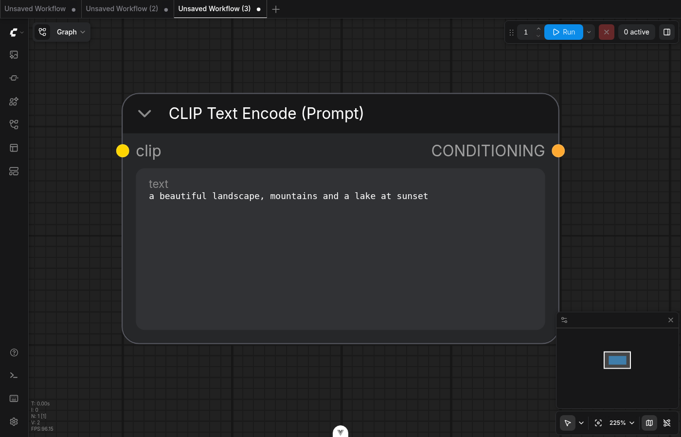 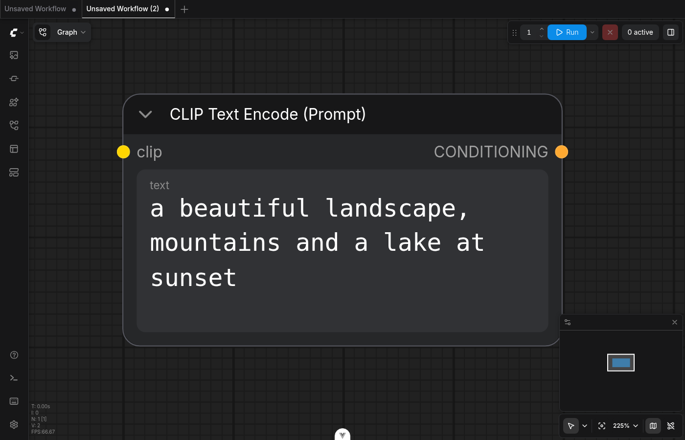 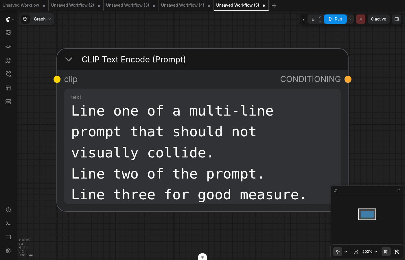 ┆Issue is synchronized with this [Notion page](https://www.notion.so/PR-12386-fix-nodes-2-apply-Textarea-widget-font-size-setting-in-Vue-Nodes-2-0-3666d73d365081fd8084e84a41ee357b) by [Unito](https://www.unito.io) --------- Co-authored-by: Glary-Bot <glary-bot@users.noreply.github.com> Co-authored-by: github-actions <github-actions@github.com> |
||
|
Willie
|
b907423526 |
feat: add Arrange action to multi-select toolbox (#12068)
## Summary Adds an Arrange popover to the multi-select toolbox that repositions selected nodes into vertical, horizontal, or grid layouts, with a follow-up slider to tune the spacing. https://github.com/user-attachments/assets/f9a55ef9-2619-462b-a83f-2b86eb076fe3 ## Changes - **What**: New `ArrangeButton` placed between the color picker and frame icons. Three layouts (vertical, horizontal, grid) sort selected nodes by current position and lay them out from the smallest-`x+y` anchor with a 12-unit gap. Visual bounds account for `LiteGraph.NODE_TITLE_HEIGHT` so titles don't overlap stacked bodies. After picking a layout, the popover swaps to a 0–48 spacing slider — drag previews live (rAF-throttled, no undo capture), release commits one undo entry. Closing the popover ends the session. - **Breaking**: none - **Dependencies**: none ## Review Focus - `useArrangeNodes.computeArrangement` — pure layout math separated from side effects; covered by 8 unit tests including the title-height handling and `TitleMode.NO_TITLE` case. - `useArrangeSession` — owns the slider's state machine. rAF-throttled `previewGap` collapses rapid drag events into one frame; `commitGap` cancels any pending preview before capturing undo. Covered by 5 unit tests. - Position mutations go through `useLayoutMutations().batchMoveNodes` (single batched layout-store transaction) followed by `changeTracker.captureCanvasState()` for undo — same pattern as drag and other selection-toolbox actions. - Anchor selection uses smallest `pos.x + pos.y` rather than min-x or min-y alone, to keep the layout origin stable across re-runs (slider drags). ┆Issue is synchronized with this [Notion page](https://www.notion.so/PR-12068-feat-add-Arrange-action-to-multi-select-toolbox-3596d73d365081e58c25ffac41dc0b2a) by [Unito](https://www.unito.io) --------- Co-authored-by: AustinMroz <austin@comfy.org> |
||
|
AustinMroz
|
7d99189211 |
Ensure dropdowns display over selection toolbox (#12513)
| Before | After | | ------ | ----- | | <img width="360" alt="before" src="https://github.com/user-attachments/assets/a7fc3432-3db3-40a5-b28e-11a309db76ce" /> | <img width="360" alt="after" src="https://github.com/user-attachments/assets/a6a702cd-2ba3-4900-8afa-227cd9d61492" />| Dropdowns were appended to self, but the selectionToolbox isappended to body. As a result, changes to z-index on the dropdown would not allow it to display above the selectionToolbox. Since dropdowns have been migrated to reka-ui, dropdowns can now be safely appended to body as well. Doing so cleans up a lot of no-longer-needed code. Of note WidgetSelectDropdown seemed to never actually bind the `appendTo` and is unaffected by the removal As a secondary consequence of this change, dropdowns will no longer scale with the current zoom level of the graph. Since litegraph would not scale the size of popovers, this had been reported as a regression by some users. | Before | After | | ------ | ----- | | <img width="360" alt="before" src="https://github.com/user-attachments/assets/0cb200c2-0811-4023-9ff1-aaa61113cbd5"/> | <img width="360" alt="after" src="https://github.com/user-attachments/assets/c82c087f-1f25-49c5-a85d-d9502b438526" />| |
||
|
jaeone94
|
82bea29dda |
fix: defer node auto-pan until drag starts (#12654)
## Summary Fix a Vue node drag edge case where holding the partially off-screen Advanced inputs button could continuously auto-pan the canvas even though the pointer had not moved into an actual drag. Linear: [FE-938](https://linear.app/comfyorg/issue/FE-938/holding-partially-off-screen-advanced-inputs-causes-continuous) ## Changes - **What**: Move Vue node auto-pan initialization from `startDrag()` to `handleDrag()`, so auto-pan starts only after the pointer interaction has become a real drag. - **What**: Keep the existing auto-pan behavior during active drags by creating the controller on the first `handleDrag()` call, updating its pointer position on later drag frames, and preserving the existing `onPan` position adjustments. - **What**: Add unit coverage for the important drag lifecycle invariants: no auto-pan on pointerdown/startDrag, auto-pan starts on handleDrag, the same controller is reused across handleDrag calls, and cleanup still stops auto-pan on endDrag. - **What**: Add a Playwright regression that places the Advanced inputs button partially beyond the visible canvas edge, holds the pointer down without moving, and verifies the canvas offset stays stable. - **What**: Add `data-testid="advanced-inputs-button"` to the Advanced inputs footer button variants so the regression test does not depend on translated button text. - **Breaking**: None. - **Dependencies**: None. ## Root Cause `useNodeDrag.startDrag()` created and started `AutoPanController` immediately on pointerdown. When the Advanced inputs button was partly outside the canvas bounds, a stationary pointer near the visible canvas edge was enough for auto-pan to begin, even before any drag movement occurred. The pointer interaction layer already distinguishes press/hold from real dragging before calling `handleDrag()`. Deferring auto-pan to `handleDrag()` aligns auto-pan startup with that drag threshold and prevents a plain hold from panning the canvas. ## Review Focus - Auto-pan should not start from `startDrag()`/pointerdown alone. - Auto-pan should still start promptly once `handleDrag()` runs for an actual drag. - Repeated `handleDrag()` calls should reuse the existing controller rather than recreate it. - Existing `onPan` behavior should continue to update drag start positions, selected node start positions, selected groups, and node positions during active drags. - The E2E intentionally asserts the canvas offset, not node bounds, because the reported bug is unintended canvas auto-pan while the pointer is stationary. ## Red-Green Verification - `a00b5d2fb test: add failing advanced button hold pan regression`: adds the Playwright regression and test id plumbing. This was verified red against the pre-fix production code. - `5c207ae28 fix: defer node auto-pan until drag starts`: adds the production fix and unit coverage. The same regression is verified green with the fix. ## Validation - `pnpm format` - `pnpm lint` - `pnpm typecheck` - `pnpm typecheck:browser` - `pnpm test:unit` - `pnpm test:unit src/renderer/extensions/vueNodes/layout/useNodeDrag.test.ts` - `PLAYWRIGHT_SETUP_API_URL=http://127.0.0.1:8188 pnpm test:browser:local browser_tests/tests/vueNodes/interactions/node/move.spec.ts --grep "should not pan while holding the Advanced button without dragging"` - Pre-push hook: `pnpm knip --cache` ## Screenshots (Before / After) Before https://github.com/user-attachments/assets/6080de2d-e2da-4b38-a1ed-1f1f88548c2d After https://github.com/user-attachments/assets/f331271a-9ea1-41ec-92cb-974bc57be56b |
||
|
jaeone94
|
d129f757c0 |
fix: keep connected advanced inputs visible (#12652)
## Summary Keep connected advanced widget inputs visible on Vue-rendered nodes when advanced inputs are collapsed. This fixes Linear [FE-924](https://linear.app/comfyorg/issue/FE-924/bug-connected-advanced-input-parameters-become-hidden-when-advanced), where a user could connect a noodle to an advanced input, collapse advanced inputs, and then lose visual access to the connected parameter even though it was actively used by the workflow. ## Changes - **What**: Treat a widget-backed input as visible when its slot is linked, even if the widget is advanced and the node-level advanced section is collapsed. - **What**: Move Vue node widget rendering to use the processed `widget.visible` value instead of reimplementing visibility in `NodeWidgets.vue`. - **What**: Keep the visibility decision as a single source of truth during widget processing, including the existing deduplication path. - **What**: Add unit coverage for the new linked-widget visibility behavior and the precedence rule that explicit hidden state still wins. - **What**: Add an E2E regression that connects a `PrimitiveFloat` to the advanced `max_shift` input on `ModelSamplingFlux`, collapses advanced inputs, and verifies the connected input remains visible while an unconnected advanced input remains hidden. - **Breaking**: None. - **Dependencies**: None. ## Review Focus The key behavior is that linked advanced widgets should be promoted into the visible widget set only while they are connected. Explicitly hidden widgets must remain hidden even when linked. The fix uses existing slot metadata from `useGraphNodeManager`; no new graph state is introduced. This keeps the change scoped to Vue node widget processing and rendering. ## Red-Green Verification | Commit | Purpose | Local result | | --- | --- | --- | | `4fa5932c6` | Adds the E2E regression only | Red: `max_shift` was not found after collapsing advanced inputs | | `e5d1ee06a` | Adds the production fix and focused unit coverage | Green: targeted E2E passed | ## Test Plan - `pnpm test:unit src/renderer/extensions/vueNodes/composables/useProcessedWidgets.test.ts` - `PLAYWRIGHT_LOCAL=1 PLAYWRIGHT_TEST_URL=http://127.0.0.1:5175 PLAYWRIGHT_SETUP_API_URL=http://127.0.0.1:8188 pnpm test:browser -g "should keep connected advanced widgets visible when advanced inputs are hidden" browser_tests/tests/vueNodes/widgets/advancedWidgets.spec.ts` - `pnpm typecheck && pnpm typecheck:browser` ## Screenshots (Before / After) Before https://github.com/user-attachments/assets/bf1e88f3-2983-4bef-9cef-48ffe6dbfd6d After https://github.com/user-attachments/assets/4dee7766-0252-478f-9b1c-4b801fc20eb2 |
||
|
jaeone94
|
874b486640 |
fix: resolve missing resource error messages (#12646)
## Summary Resolve missing resource error groups through the error catalog so missing nodes, replaceable nodes, missing models, and missing media use consistent panel and single-error overlay copy. ## Changes - **What**: Adds missing-resource resolvers for `missing_node`, `swap_nodes`, `missing_model`, and `missing_media` that provide `displayMessage`, `toastTitle`, and `toastMessage` alongside the existing group titles. The Errors tab now renders a group-level `displayMessage` under non-execution group headers, which gives grouped missing-resource cards the same explanatory message path used by validation/runtime errors without adding per-row detail fields that these grouped cards do not need. - **What**: Moves missing node and swap node explanatory copy out of card-local hardcoded text and into `errorCatalog.missingErrors.*` keys. `MissingNodeCard` and `SwapNodesCard` now focus on rendering their grouped rows and actions, while the shared error group header owns the explanatory copy. - **What**: Adds environment-aware copy for missing node packs and missing models. Cloud messages explain unsupported resources and replacement/import paths without suggesting local execution, while OSS messages point users toward installing or downloading the missing resources. - **What**: Adds single-error overlay/toast copy for missing resources. Missing media uses a concise input-focused title/message, missing models distinguish Cloud unsupported models from OSS missing files, and missing nodes/swap nodes use node-type-aware copy. - **What**: Deduplicates missing node and swap node toast decisions by distinct node type so repeated instances of the same missing/replaceable node do not accidentally switch the single-error copy to plural copy. - **What**: Preserves representative missing media candidate metadata so missing media toast copy can use a human-readable node name such as `Load Image is missing a required media file.` - **What**: Removes unused missing-resource resolver fields such as grouped `displayDetails`, grouped `displayItemLabel`, and the unused `mediaTypes` source parameter after deciding those fields do not fit grouped missing-resource cards. - **Breaking**: None. - **Dependencies**: None. ## Review Focus - Missing resource groups are still grouped cards. This PR intentionally gives them group-level display and toast copy, but does not split missing resources into one error item per underlying candidate. - Missing resource count semantics are intentionally not normalized here. Error overlay totals, store counts, and grouped card counts still follow the existing behavior; a follow-up PR can define those count units separately. - The Cloud/OSS message variants remain explicit in the resolver instead of being abstracted into a generic variant helper. That keeps this PR focused on the messaging behavior and avoids a broader resolver refactor. - Only `src/locales/en/main.json` is updated directly. Other locales should be synced by the existing localization flow. ## Screenshots (if applicable) <img width="668" height="245" alt="스크린샷 2026-06-05 오전 3 16 49" src="https://github.com/user-attachments/assets/98b50ac3-67e1-438d-8c37-e06c7bf465ee" /> <img width="666" height="195" alt="스크린샷 2026-06-05 오전 3 16 58" src="https://github.com/user-attachments/assets/92da95b1-03d6-4739-97e6-c573982bfec9" /> <img width="505" height="358" alt="스크린샷 2026-06-05 오전 3 17 27" src="https://github.com/user-attachments/assets/4d0e1a6e-13b9-4097-9fb5-19fe0c5331dc" /> <img width="507" height="324" alt="스크린샷 2026-06-05 오전 3 17 44" src="https://github.com/user-attachments/assets/054e42f8-0d0c-44b5-8a67-e467fc04f1fc" /> ## Validation - `pnpm format` - `pnpm lint` - `pnpm test:unit src/platform/errorCatalog/errorMessageResolver.test.ts src/components/rightSidePanel/errors/useErrorGroups.test.ts src/components/rightSidePanel/errors/TabErrors.test.ts` - `pnpm typecheck` - push hook: `knip --cache` |
||
|
Matt Miller
|
8a819fa2be |
refactor(assets): read content hash from the canonical hash field (#12638)
## Summary The assets API exposes an asset's content hash as `hash`. An older `asset_hash` field was a deprecated alias carrying the same value. This PR moves the frontend fully onto `hash` and removes `asset_hash` from the frontend entirely. ## Changes - Read `asset.hash` (no `?? asset_hash` fallback) across the asset consumers: - `useMediaAssetActions` — widget-value variants + cloud-mode stored-filename resolution - `assetsStore` — input-asset-by-filename map - `assetMetadataUtils.getAssetUrlFilename` - `missingMedia` resolver/scan and `missingModel` scan hash matching - `useComboWidget` / `useWidgetSelectItems` - `assetPreviewUtil.findOutputAsset` now queries `/assets?hash=` instead of the deprecated `?asset_hash=` param and matches on `a.hash`. - Removed `asset_hash` from the zod asset schema and the local `AssetRecord` type. Responses that still include the alias parse cleanly — zod strips unknown keys — so the declared field protected nothing once the reads were gone. - Purged `asset_hash` from all test fixtures/mocks; tests key on the canonical `hash`. ## Safety / rollout The API currently emits **both** `hash` and `asset_hash` with identical values, so reading `hash` is safe today. This is the frontend half of retiring the alias; the backend stops emitting `asset_hash` only after this ships and old bundles age out, so there is no window where the field the UI reads is absent. ## Verification - `pnpm typecheck`: clean. - Affected unit tests pass (asset utils, store, media/model scans, widget composables). - `grep -rn asset_hash src/`: zero matches. |
||
|
jaeone94
|
f9cbaf750f |
fix: simplify error overlay messaging (#12598)
## Summary Simplifies the error overlay so it presents one clear title, one clear message, and one stable details action instead of rendering a list of per-error messages. ## Changes - **What**: Extracts the error overlay view model into `useErrorOverlayState`, adds focused unit coverage for the overlay copy resolution rules, and updates the overlay E2E coverage to match the new behavior. - **Breaking**: None. - **Dependencies**: None. ### Behavior changes - The overlay body no longer renders a `<ul>` of individual error messages. It now always renders a single paragraph message. - Single-error overlays now prefer toast-specific copy when it exists. For execution errors, the overlay resolves the message in this order: `toastMessage`, `displayMessage`, raw `message`, group `displayMessage`, then group `displayTitle`. The title resolves from `toastTitle`, then `displayTitle`, then the group title. - Single non-execution groups use group-level toast/display copy. This lets grouped error types supply overlay-friendly copy without the overlay needing to understand each card implementation. - Multiple-error overlays now ignore individual error item copy in the overlay itself. The header becomes the pluralized count title, for example `7 errors found`, and the body becomes the fixed guidance message: `Resolve them before running the workflow.` - The overlay is hidden if the store reports an error count but no resolved overlay message exists. This avoids rendering a visible shell with an empty body. - The action button no longer varies by error type in normal app mode. Missing nodes, missing models, missing media, swap nodes, validation errors, and runtime errors all use `View details` instead of labels like `Show missing nodes`, `Show missing models`, `Show missing inputs`, or `See Errors`. - App mode keeps its existing `Show errors in graph` action label. - The overlay width now keeps the previous width as its minimum and allows a wider maximum, reducing avoidable wrapping in longer error headers. - The live region was softened from an assertive alert-style announcement to `role="status"` with `aria-live="polite"` so updates such as count changes are less disruptive. ### Tests - Adds component coverage for the rendered overlay shape and app-mode action label. - Adds composable coverage for single execution errors, runtime errors, grouped missing media errors, multiple-error aggregate copy, hidden empty-message state, and display-copy fallback behavior. - Updates `errorOverlay.spec.ts` so the E2E suite checks the new single-message overlay, the stable `View details` action, and the fixed multiple-error body guidance. - Removes the old type-specific button-label E2E expectations because that branch no longer exists in product behavior. ### Follow-up PR A follow-up PR is stacked on top of this one: `jaeone/fe-816-missing-resource-error-messaging`. That follow-up will wire missing resource error resolvers into the copy model consumed here. It covers missing node packs, missing models, missing media, and swap-node groups, including the group-level `toastTitle`, `toastMessage`, `displayMessage`, `displayDetails`, and item label copy those cards need. This PR intentionally keeps the overlay behavior separate so it can merge first without depending on the missing-resource resolver copy. ## Review Focus - Please check the single-error versus multiple-error overlay behavior, especially the fallback order for execution error copy. - Please check that the `View details` action is now intentionally error-type agnostic in normal app mode while app mode keeps `Show errors in graph`. - Please check the empty-message guard and the requirement that a single-error overlay only resolves a single group when the total error count and group list agree. - Please check the E2E reduction: the old type-specific action-label assertions were removed because the UI branch they tested was removed. ## Screenshots (if applicable) N/A |
||
|
jaeone94
|
4bfb0c36be |
Fix Cloud media input defaults (#12562)
## Summary Fix Cloud media loader widgets so `LoadImage`, `LoadVideo`, and `LoadAudio` resolve their default values from Cloud input assets instead of blindly accepting backend `object_info` combo options. When no matching Cloud input asset exists, the widgets now start empty instead of selecting a server-only value that immediately trips missing-input detection. ## Changes - **What**: Cloud media input widgets now derive their available values from `assetsStore.inputAssets`, filtered to the node's media type and to assets with a valid `asset_hash`. - **What**: Cloud media defaults now prefer an explicit default only when it matches an available Cloud input asset hash or name, then fall back to the first matching Cloud input asset, and otherwise use an empty value. - **What**: The media path keeps the existing model-widget implementation style by resolving Cloud asset state through the store internally, while preserving media-specific hash/name matching because media widgets submit Cloud `asset_hash` values. - **What**: Added regression coverage for adding empty Cloud `LoadImage`, `LoadVideo`, and `LoadAudio` nodes when backend `object_info` advertises server-only media options. - **What**: Expanded media widget unit coverage for image/video/audio inputs, empty defaults, first-asset fallback, default-by-hash matching, default-by-name matching, hashless asset filtering, unrelated media filtering, dynamic values, option labels, lazy input loading, and `control_after_generate` wiring. - **What**: Kept existing OSS and Cloud runtime missing-media E2E coverage, with Cloud fixtures consistently using the local setup backend for `object_info` so tests do not depend on live Cloud backend startup details. - **Breaking**: None. - **Dependencies**: None. ## Review Focus - Cloud media loader defaults should no longer be sourced from backend file lists unless the value also corresponds to a Cloud input asset. - Empty Cloud input-asset libraries should produce empty media widget values, not missing-input errors at node creation time. - Model asset-browser behavior is intentionally unchanged. The media path mirrors the store-access style, but media defaults still resolve to asset hashes because those are the values submitted by Cloud media widgets. - The Cloud E2E fixture stubs bootstrap endpoints and routes `object_info` through the local setup backend. This keeps the test focused on frontend behavior while still using realistic node definitions. ## Testing - `pnpm exec oxfmt browser_tests/tests/propertiesPanel/errorsTabMissingMediaRuntime.spec.ts src/renderer/extensions/vueNodes/widgets/composables/useComboWidget.test.ts src/renderer/extensions/vueNodes/widgets/composables/useComboWidget.ts` - `pnpm lint` - `pnpm typecheck` - `pnpm typecheck:browser` - `pnpm exec vitest run src/renderer/extensions/vueNodes/widgets/composables/useComboWidget.test.ts` - `PLAYWRIGHT_TEST_URL=http://127.0.0.1:5174 PLAYWRIGHT_SETUP_API_URL=http://127.0.0.1:8188 pnpm exec playwright test browser_tests/tests/propertiesPanel/errorsTabMissingMediaRuntime.spec.ts --project=chromium --workers=1` - `PLAYWRIGHT_TEST_URL=http://127.0.0.1:5175 PLAYWRIGHT_SETUP_API_URL=http://127.0.0.1:8188 pnpm exec playwright test browser_tests/tests/propertiesPanel/errorsTabMissingMediaRuntime.spec.ts --project=cloud --workers=1` - `git diff --check` - `pnpm knip` - `.claude/skills/reviewing-unit-tests/SKILL.md` red-flag review ## Screenshots Before https://github.com/user-attachments/assets/5df04036-d15c-4f94-bdcd-df8b26a29329 After https://github.com/user-attachments/assets/abe7caf5-a83b-4960-aa6f-65a377424a85 |
||
|
Dante
|
f86ffbb05f |
fix(assets): dedupe outputs by composite key to prevent media asset panel scroll-duplication (#11716)
## Summary

When the cloud `getJobDetail` returns two output records that resolve to
the same composite key `${nodeId}-${subfolder}-${filename}`,
`mapOutputsToAssetItems` in
`src/platform/assets/utils/outputAssetUtil.ts` produces two `AssetItem`s
with the same synthetic id. The Vue `v-for :key="item.key"` in
`src/components/common/VirtualGrid.vue:10` collides, Vue reuses one DOM
node for the colliding rows, and the user sees one asset visibly
duplicate and progressively replace its neighbours while scrolling
through an expanded large job in the media asset panel — symptom matches
FE-297 in both list and grid views (both views derive from the same
`displayAssets` populated by `resolveOutputAssetItems`).

Fix tracks composite keys per resolved job and skips subsequent records
that collide on the same key. Treats the composite key as the canonical
identity of an output, so each rendered row is unique in both views
without changing public id semantics for non-colliding inputs.

- Fixes FE-297
- Source: [Slack
#bug-dump](https://comfy-organization.slack.com/archives/C0A4XMHANP3/p1777047001770899)

## Red-Green Verification (unit)

| Commit | Purpose | CI |
| --- | --- | --- |
|
[`b263af29b`](https://github.com/Comfy-Org/ComfyUI_frontend/pull/11716/commits/b263af29b)
test: FE-297 add failing test for asset id collision on duplicate output
key | Proves the test catches the regression | 🔴 [Red run
25038514049](https://github.com/Comfy-Org/ComfyUI_frontend/actions/runs/25038514049)
— `FE-297: deduplicates outputs that share the same composite output
key` failed with `expected length 2 but got 3` |
|
[`af38cad1d`](https://github.com/Comfy-Org/ComfyUI_frontend/pull/11716/commits/af38cad1d)
fix(assets): dedupe outputs by composite key to prevent visual collapse
on scroll | Proves the fix resolves it | 🟢 [Green run
25038832343](https://github.com/Comfy-Org/ComfyUI_frontend/actions/runs/25038832343)
— all unit tests pass |

Local verification (`pnpm vitest run
src/platform/assets/utils/outputAssetUtil.test.ts`):
- On red commit: `FE-297: deduplicates outputs that share the same
composite output key` fails with `expected length 2 but got 3`.
- On green commit: all 8 tests pass; broader `pnpm vitest run
src/platform/assets/` reports 390/390 pass.

## Browser-level Verification (e2e)


[`c5f80e225`](https://github.com/Comfy-Org/ComfyUI_frontend/pull/11716/commits/c5f80e225)
adds `browser_tests/tests/sidebar/assets-fe297-dedupe.spec.ts`. The spec
mocks `/api/jobs` + `/api/jobs/{jobId}` so the assets sidebar receives a
5-output stack job whose detail payload contains two records sharing
`9--duplicate_00002_.png`. It expands the stack into folder view and
reads the underlying `VirtualGrid` row total from the top/bottom spacer
heights so the assertion does not depend on viewport size, scroll
virtualization, or Vue's same-key DOM reuse.

Locally validated red→green (`pnpm dev` + local ComfyUI on :8188, `pnpm
exec playwright test … --project=cloud`):

| Source | `totalRows` | rendered tile labels | result |
| --- | --- | --- | --- |
| Red (dedup removed from `mapOutputsToAssetItems`) | **5** |
`[duplicate_00002_.png, duplicate_00002_.png, distinct_00004_.png]` (two
adjacent collisions) | 🔴 `Expected: 4 / Received: 5` |
| Green (HEAD) | **4** | `[duplicate_00002_.png, distinct_00004_.png,
distinct_00003_.png]` (no collisions) | 🟢 `1 passed` |

Manual repro of the same flow against the running dev server (Chrome
DevTools, runtime `fetch` interceptor for `/api/jobs/<id>`) reproduces
the FE-297 symptom directly: with the fix removed, the folder view
renders **two consecutive cards both labelled `duplicate_00002_.png`**;
with the fix applied that second slot is replaced by the next distinct
file.

## Cloud Prod Verification (unmocked)

Verified against a real cloud prod job
(`22dda683-1634-4120-8a7d-233cff28e07e`) whose `/api/jobs/{id}` payload
organically contains the FE-297 trigger condition.

Raw cloud response analysis: **35 output records across 27 nodes, 34
unique composite keys, 1 colliding key**
(`103--cbbce08934d17e85987b09824ae519822e4462b4294fc52fc40dca8d5b096323.png`
appears twice — same nodeId/subfolder/filename emitted from two distinct
output records).

Expanded folder view on local FE running this branch against cloud prod
backend:

| Measurement | Value | Expectation |
| --- | --- | --- |
| `outputCount` (backend) | 35 | — |
| Unique composite keys (backend) | 34 | (35 - 1 collision) |
| VirtualGrid rendered cells (`totalRows * colCount` via spacer height)
| **34** | matches dedupe target |
| Simultaneously-visible duplicate labels | 0 | no Vue `:key` collision
|

This is the first visual confirmation of FE-297 against actual prod data
rather than synthetic/mocked payloads. The block had been pending on
FE-844 — cloud `/api/jobs/{id}` returns `text: [null]` for empty
subgraph promoted text outputs, which the FE Zod schema rejects, causing
`fetchJobDetail` to return `undefined` and the folder view to collapse
to the cover preview only. With [PR
#12449](https://github.com/Comfy-Org/ComfyUI_frontend/pull/12449)
(FE-844) applied locally, the job-detail response reaches
`resolveOutputAssetItems`, FE-297's dedupe runs, and the 35→34 collapse
is observable end-to-end.

## Test Plan

- [x] New unit regression covering composite-key collision in
`mapOutputsToAssetItems`
- [x] Existing `outputAssetUtil` tests still pass (`job-1-1-sub-a.png`
etc. id format unchanged for non-colliding inputs)
- [x] Broader asset platform suite (`src/platform/assets/`) passes
- [x] CI red-green sequence captured (links above)
- [x] Browser-level e2e (`assets-fe297-dedupe.spec.ts`) red→green
validated locally; will run in CI on this commit
- [x] Manual repro on dev server confirms the duplicate-card symptom
disappears with the fix
- [x] Unmocked cloud-prod repro: real 35-output job with 1 organic
composite-key collision renders 34 cells, 0 duplicate labels
simultaneously visible (requires
[#12449](https://github.com/Comfy-Org/ComfyUI_frontend/pull/12449) for
job-detail fetch to succeed)
|
||
|
Alexander Brown
|
488bc33288 |
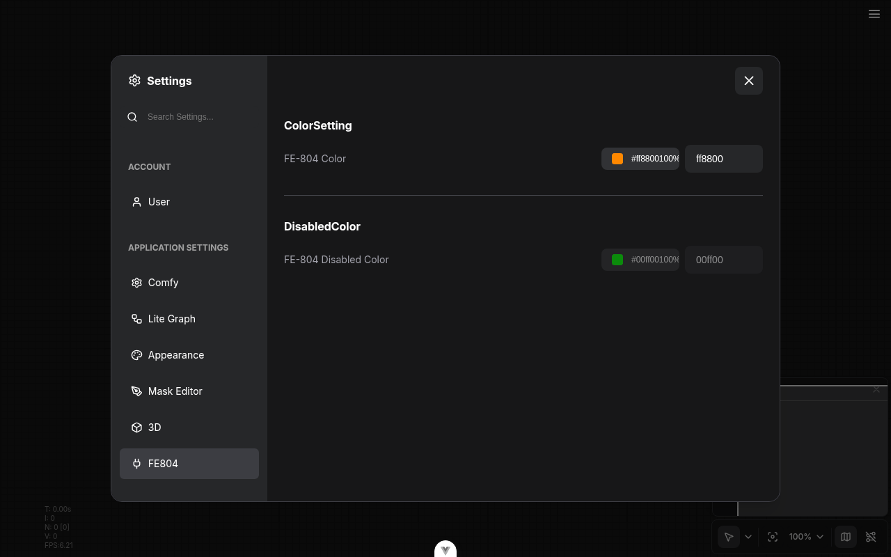
refactor: drop primevue/colorpicker from settings form and customization selector (FE-804) (#12391)
*PR Created by the Glary-Bot Agent*
---
## Summary
The node-canvas COLOR widget (`WidgetColorPicker.vue`) already migrated
off PrimeVue; this PR finishes FE-804 by porting the two remaining
`primevue/colorpicker` consumers — `FormColorPicker.vue` (settings form
`type: 'color'`) and `ColorCustomizationSelector.vue`
(folder-customization dialog) — to the in-house Reka-UI based
`ColorPicker`. The now-dead PrimeVue overlay workaround in
`CustomizationDialog.vue` is removed.
After this lands there are **zero `primevue/colorpicker` imports left**
in `src/`.
## Changes
- **What**: `FormColorPicker.vue` swaps `primevue/colorpicker` +
`primevue/inputtext` for the in-house `ColorPicker` + `Input`. The
legacy "hex without `#`" storage contract (e.g. `load3d`'s
`BackgroundColor` default `'282828'`) is preserved on read and on write.
- **What**: The text input now uses a separate draft value and only
commits on blur / Enter when the input is a complete 6- or 8-digit hex.
This fixes the "type `#f` and watch it snap to black" regression that a
naive shared-`v-model` implementation re-introduces.
- **What**: `disabled`, `id`, and `aria-labelledby` are now explicit
props on `FormColorPicker` and are forwarded to both children. The
custom `ColorPicker` learned a `disabled` prop that propagates to its
`<PopoverTrigger>` button.
- **What**: `ColorCustomizationSelector.vue` swaps
`primevue/colorpicker` for the in-house `ColorPicker` (still uses
`primevue/selectbutton` — intentionally out of scope per FE-804's title;
`SelectButton` migration is a separate effort).
- **What**: `CustomizationDialog.vue` drops the `.p-colorpicker-panel,
.p-overlay, .p-overlay-mask` `pointer-down-outside` guard. With PrimeVue
ColorPicker gone, no descendant of this dialog teleports an overlay to
`<body>` anymore.
- **What**: Updates two affected browser tests — `extensionAPI.spec.ts`
(the `disabled` attr smoke check) and `sidebar/nodeLibrary.spec.ts` (the
bookmark color customization flow) — to target the new picker via stable
accessible names (`role="slider"` + i18n aria-label `Color saturation
and brightness`) and the `.color-picker-wrapper > button` trigger. The
disabled-attr eval helper now handles `HTMLButtonElement` in addition to
`HTMLInputElement`.
- **What**: Adds `FormColorPicker.test.ts` with focused regression
coverage for the manual-entry contract: legacy no-`#` storage
round-trip, no commit on partial hex, revert on partial-then-Enter,
8-digit alpha hex, and `disabled` propagation.
- **Dependencies**: none added; removes two PrimeVue imports.
- **Breaking**: no breaking change to the documented FormItem `'color'`
setting contract. Manual-entry semantics change: typing partial hex no
longer immediately writes mangled state — it commits on blur or Enter
when the value fully parses. Existing settings values are unaffected.
## Verification
- `pnpm typecheck` clean
- `pnpm typecheck:browser` clean
- `pnpm exec eslint` on every touched file clean
- `pnpm test:unit` over the affected directories — **216 passed**
- Manual QA via Playwright against the running dev server:
- Registered a test extension with `type: 'color'` + a `disabled: true`
variant
- Confirmed the new picker renders, opens its Reka popover, and the
disabled row has `button.disabled === true` and `input.disabled ===
true`
- Confirmed partial hex (`#ab`) does **not** clobber the swatch
- Confirmed `#1133aa` + blur commits and round-trips through the picker
## Review focus
1. The manual-entry commit gate in `FormColorPicker.vue`
(`commitDraft()` + `FULL_HEX`) — is the regex strict enough? Should
3/4-digit shorthand hex be accepted on commit too? PrimeVue accepted
3-digit shorthand; the existing `toHexFromFormat()` already does, so
adding `|[0-9a-f]{3}|[0-9a-f]{4}` is a one-line change if reviewers want
parity.
2. Disabled-attr E2E selector swap (`.p-colorpicker-preview` →
`.color-picker-wrapper > button`) + the eval-helper update that now
handles `HTMLButtonElement` in addition to `HTMLInputElement`. The
structural selector matches what PrimeVue had; happy to add a
`data-testid` if reviewers prefer.
3. `ColorPicker.vue` gained a `disabled` prop — kept explicit (peer of
`class`) to match the existing prop shape rather than forwarding through
`$attrs`.
## Follow-up (NOT in this PR)
Discussed in-thread — the **Reka-UI `ColorField` migration** (full
picker rebuild) and the **Kijai regression suite** for alpha-disabled +
manual-entry on the node-canvas COLOR widget belong in a separate,
scoped PR alongside the `ColorInputSpec` schema additions (`hasAlpha`,
`format`). The custom picker also has a known lossy HSV-percent
quantization (e.g. `#1133aa` round-trips to `#1033a9`) that pre-dates
this PR and would be addressed by the Reka primitives.
- Fixes FE-804
## Screenshots
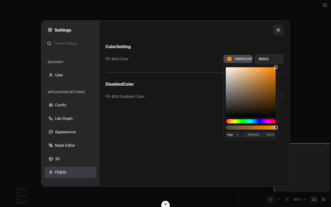
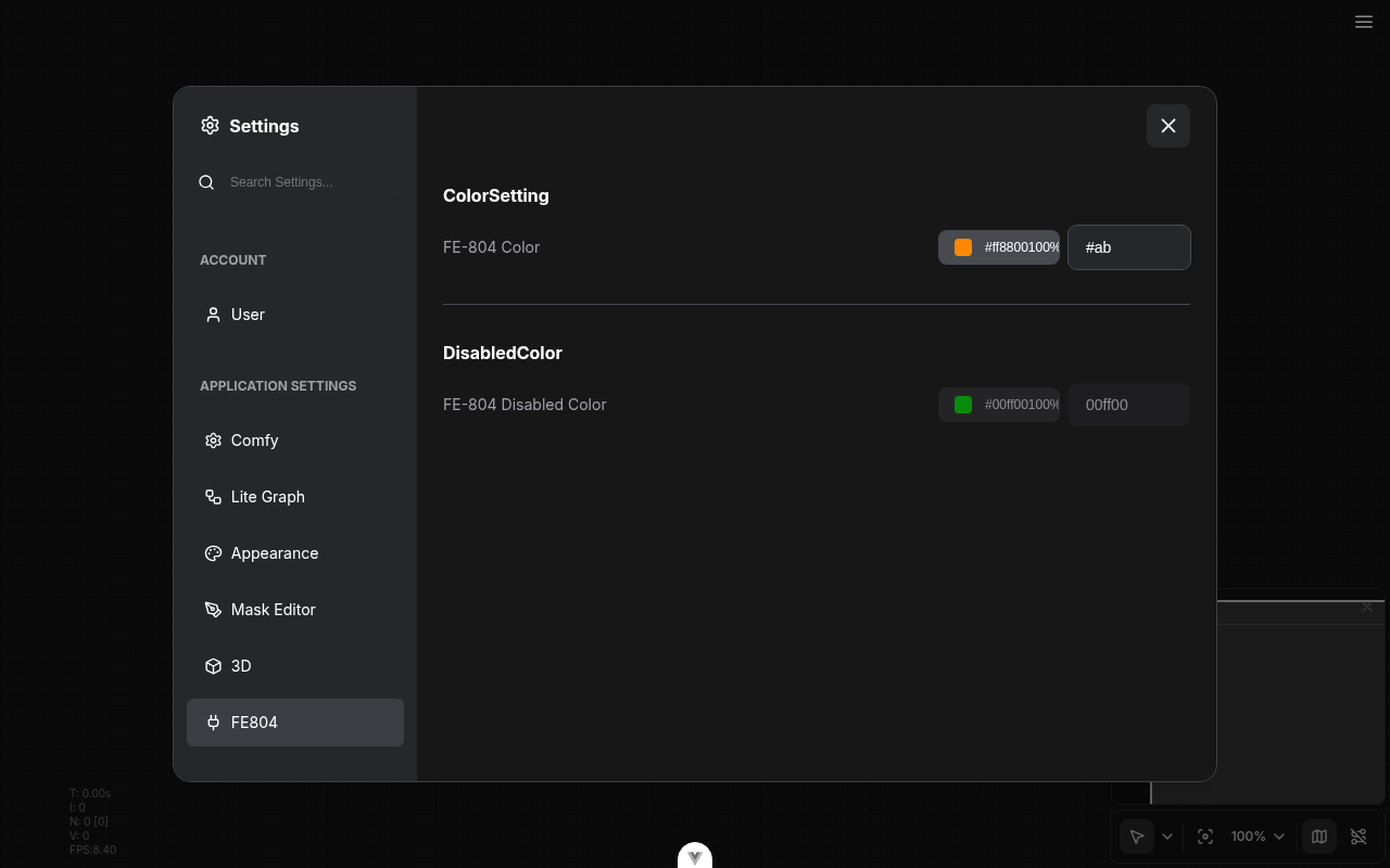
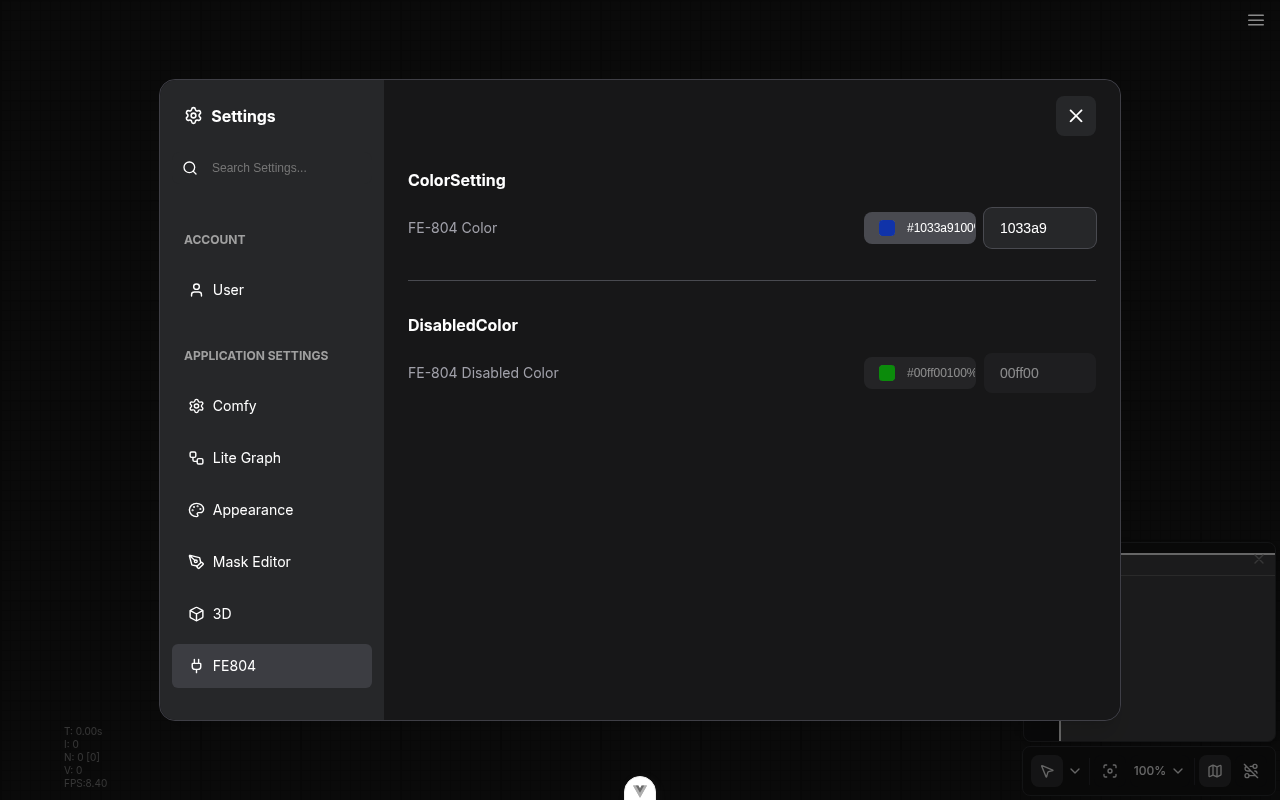
---------
Co-authored-by: Glary-Bot <glary-bot@users.noreply.github.com>
|
||
|
Dante
|
60a4dc3001 |
fix: dedupe Bypass context-menu items via state-aware legacy label (FE-720) (#12500)
## Summary Right-clicking a bypassed node showed two bypass-related items in the Vue "More Options" context menu (FE-720): - Plain `Bypass` from the legacy LiteGraph `getExtraMenuOptions` hook in `litegraphService.ts` - `Remove Bypass` (with `Ctrl+B` and an icon) from the Vue `getBypassOption` composable The Vue menu's exact-label deduplicator in `contextMenuConverter.ts` collapsed the unbypassed case (both emit `Bypass` → Vue source wins) but not the bypassed case (`Bypass` vs `Remove Bypass`), so the duplicate leaked through whenever the node was bypassed. ### before <img width="1920" height="958" alt="fe-720-before" src="https://github.com/user-attachments/assets/ef001aca-d70e-4798-ac61-01cc34c31e44" /> ### after <img width="1920" height="958" alt="fe-720-after" src="https://github.com/user-attachments/assets/d6d2bf4b-cb98-4b30-9dac-9bd4b68a7e36" /> #### single active node (KSampler) <img width="1920" height="958" alt="fe-720-1-unbypassed-node-menu" src="https://github.com/user-attachments/assets/bec9cd47-2f2d-4adb-b95b-266e7969a36c" /> #### single bypassed node (Load Checkpoint) <img width="1920" height="958" alt="fe-720-2-bypassed-node-menu" src="https://github.com/user-attachments/assets/91f80157-836d-4fce-adad-474f31baff04" /> #### KSampler + bypassed Load Checkpoint <img width="1920" height="958" alt="fe-720-3-mixed-selection-menu" src="https://github.com/user-attachments/assets/e4780b16-08e5-4f87-80e9-3ff65a5acdae" /> ## Root cause `src/services/litegraphService.ts` pushes a `Bypass` entry from its legacy `getExtraMenuOptions` hook in addition to the Vue `getBypassOption`. In Vue-menu mode both reach the menu; the exact-label dedup in `contextMenuConverter.ts` only collapses them when the labels match, which fails once the node is bypassed and the Vue side switches to `Remove Bypass`. ## Fix Add `Bypass` and `Remove Bypass` to the `HARD_BLACKLIST` in `contextMenuConverter.ts`. The blacklist filters the legacy emission out of the Vue conversion pipeline (`convertContextMenuToOptions`) before it is ever merged, so Vue's `getBypassOption` is the single source of the bypass item in every node state — no duplicate is created in the first place. This is the established convention for legacy items that the Vue menu replaces (`Properties`, `Colors`, `Shapes`, `Title`, `Mode`, `Properties Panel`, `Copy (Clipspace)`); Bypass is the same category. `litegraphService.ts` reverts to a plain `content: 'Bypass'` and no longer imports `areAllSelectedNodesInMode` or i18n keys for this entry. The Vue `getBypassOption` label is still derived from the same selection-aware predicate (`areAllSelectedNodesInMode`) that `toggleSelectedNodesMode` uses, so on mixed selections the label stays in sync with the action — it shows `Bypass` when clicking would bypass the rest, rather than `Remove Bypass`. **Trade-off:** the classic LiteGraph canvas menu (`Comfy.VueNodes.Enabled: false`) renders `litegraphService`'s options directly without going through `convertContextMenuToOptions`, so it shows a plain `Bypass` regardless of node state. This matches the pre-PR behavior (the legacy push was already a hardcoded `Bypass`), so it is not a regression. ## Considered and rejected - **`equivalents` map** (`bypass: ['bypass', 'remove bypass']`) — would collapse `Bypass` and `Remove Bypass` as synonyms, which is semantically wrong: they are distinct actions that must stay distinguishable, and the rule would also misfire on the unbypassed case. A converter test locks in that they are not treated as equivalents. - **State-aware label on the legacy push** (matching the Vue label so the exact-label dedup collapses them) — works, and additionally gives the classic canvas menu a state-aware label, but it couples `litegraphService` to the selection predicate and i18n keys solely to keep a downstream dedup load-bearing. `HARD_BLACKLIST` removes the duplicate at the source instead of creating, converting, then collapsing it. The only thing lost is the classic-menu state-aware label, which was never present pre-PR. - **Gating the legacy push on `Comfy.UseNewMenu === 'Disabled'`** — the setting that selects the legacy vs Vue context menu is `Comfy.VueNodes.Enabled`, not `Comfy.UseNewMenu` (an unrelated top-menu-bar toggle). Gating on `UseNewMenu` would drop the Bypass entry from the legacy canvas menu for the OSS default (`VueNodes.Enabled: false` + `UseNewMenu: 'Top'`). - **Suppressing the legacy callback via `SUPPRESSED_LITEGRAPH_CALLBACKS`** — matches by callback identity and adds cross-file coupling for what is a simple label-based filter that `HARD_BLACKLIST` already expresses. ## Cleanups (review feedback) - Removed the now-dead `NodeSelectionState.bypassed` field and its producer (no consumers after the label switch). - Replaced the `vue-i18n` mock in `useNodeMenuOptions.test.ts` with a real `createI18n` instance per `docs/testing/vitest-patterns.md`; removed a `ts-expect-error` via a typed hoisted `app` mock. - Simplified `getSelectedNodeArray` to `Object.values(app.canvas.selected_nodes ?? {})`. ## Tests - `useSelectedLiteGraphItems.test.ts` — `areAllSelectedNodesInMode`: all-bypassed → true, mixed → false, empty → false. - `useNodeMenuOptions.test.ts` — Vue label is `Bypass` (active / mixed) and `Remove Bypass` (all bypassed). - `contextMenuConverter.test.ts` — the legacy `Bypass` push is filtered by `HARD_BLACKLIST` so the Vue item is the only bypass entry (keeps shortcut/source); `Bypass` and `Remove Bypass` are not treated as label equivalents. - `browser_tests/tests/vueNodes/interactions/node/contextMenu.spec.ts` — e2e regression: exactly one bypass-family item per node state. Verified live on a bypassed Load Checkpoint: single `Remove Bypass` → toggle un-bypasses → single `Bypass`; no duplicate, rest of the menu intact. - Fixes FE-720 --------- Co-authored-by: Alexander Brown <drjkl@comfy.org> |
||
|
Alexander Brown
|
c4c1dfa58a |
Remove drag node test from interaction.spec.ts (#12579)
It's flaky. |
||
|
AustinMroz
|
1938ba809b |
Track undo state on subgraph conversion (#12575)
When converting to subgraph, `beforeChange` and `afterChange` were being called, but these functions exclusively called vestigial change handlers that don't actually affect change tracking. Consequentially, if you made a change to the graph (updating a widget), converted a node to a subgraph using the selectionToolbox, and then pushed Ctrl+Z before performing any other canvas interaction, it would incorrectly undo the prior widget edit as well. This is resolved by calling the important handlers directly. Adding them to `beforeChange`/`afterChange` was considered, but caused breakage in other functions (`connect`) which failed to even attempt symmetric calls of the function. |
||
|
Dante
|
3a8ddfb6f1 |
fix: wrap long workflow name in Open shared workflow dialog (FE-828) (#12540)
## Summary The "Open shared workflow" dialog rendered the workflow name in an `<h2>` with no wrapping control. A long, space-free name (e.g. a content-hash filename) is a single unbreakable "word", so with the default `overflow-wrap: normal` it could not wrap. It overflowed its box and, because PrimeVue's `.p-dialog-content` is `overflow-x: auto`, the dialog scrolled horizontally instead of wrapping. CDP measurement on the unfixed build (96-char name): dialog content `scrollWidth 1336` vs `clientWidth 702` -> horizontal scroll. After adding `wrap-anywhere` to the heading: `scrollWidth 702 == clientWidth 702`, name wraps to multiple lines, full name still in the DOM. ### before <img width="704" height="295" alt="before-dialog" src="https://github.com/user-attachments/assets/ea05ab32-a80d-4210-951c-f43d595bd6eb" /> ### after <img width="704" height="359" alt="after-dialog" src="https://github.com/user-attachments/assets/cbf3019e-5e71-4dba-a1fd-ea3586dd995a" /> ## Changes - `OpenSharedWorkflowDialogContent.vue`: add `wrap-anywhere` to the workflow-name `<h2>` so a long unbreakable name wraps within the dialog bounds instead of forcing horizontal scroll. The parent already has `min-w-0`. - Breaking: none ## Red-Green Verification | Commit | CI | Purpose | |--------|-----|---------| | [`test:` |
||
|
AustinMroz
|
e97c4b6ab9 | Remove flake screenshot (#12529) | ||
|
jaeone94
|
fb58a76a53 |
fix: preserve validation errors on execution start (#12493)
## Summary Preserve validation node errors and their overlay when a valid active root starts execution, so partial workflow runs no longer hide validation failures. ## Changes - **What**: Split execution-start clearing from full error clearing; `execution_start` now clears transient execution/prompt state without clearing validation `lastNodeErrors`. - **What**: Keep the ErrorOverlay open when validation errors are still present, and show it for successful prompt responses that include `node_errors`. - **Dependencies**: None. ## Review Focus Please check the error-clearing boundary between prompt submission/workflow changes and WebSocket `execution_start`. Full clearing still happens through `clearAllErrors`; execution start now uses the narrower clearing path and only dismisses the overlay when there are no validation node errors to show. Linear: FE-851 ## Red-Green Verification - Red: `76bcf34c4 test: add failing validation error preservation e2e` - Green: `9766172ea fix: preserve validation errors on execution start` - Follow-up: `321c95aba fix: keep validation error overlay during execution start` - Coverage: `7b5fab577 test: cover prompt node error overlay` ## Test Plan - `pnpm exec vitest run src/scripts/app.test.ts` - `pnpm exec vitest run src/stores/executionStore.test.ts` - `pnpm exec vitest run src/scripts/app.test.ts src/stores/executionStore.test.ts --coverage` - `pnpm format:check -- src/stores/executionErrorStore.ts src/stores/executionStore.ts src/stores/executionStore.test.ts src/scripts/app.ts src/scripts/app.test.ts browser_tests/fixtures/helpers/ExecutionHelper.ts browser_tests/tests/execution.spec.ts` - `pnpm exec oxlint src/stores/executionErrorStore.ts src/stores/executionStore.ts src/stores/executionStore.test.ts src/scripts/app.ts src/scripts/app.test.ts browser_tests/tests/execution.spec.ts --type-aware` - `pnpm typecheck` - `PLAYWRIGHT_LOCAL=1 PLAYWRIGHT_TEST_URL=http://127.0.0.1:5175 pnpm exec playwright test browser_tests/tests/execution.spec.ts:132` ## Screenshots (Before/After) Before https://github.com/user-attachments/assets/04a212b6-66f9-4c77-9056-58bdc642d96e After https://github.com/user-attachments/assets/db7813c7-bf8a-4e19-9b66-7f49fd01c305 |
||
|
AustinMroz
|
b7990f7645 |
Fix ghost links on IO remove slot (#12473)
Context menu operations on subgraph IO slots only set the foreground canvas as dirty, so links would visually persist until a different operation caused a background draw. |
||
|
Dante
|
c57944f315 |
fix: hide duplicate LiteGraph Resize/Collapse/Expand entries from Vue node menu (FE-867) (#12487)
## Summary https://linear.app/comfyorg/issue/FE-867/bug-node-expand-menu-doesnt-work-nodes-immediately-collapse-after Recreates #12175 on a fresh `main` base (original branch's CI failed only because its `frontend-dist` artifact had expired — not a code issue). Original work by @christian-byrne / Glary-Bot, cherry-picked here so it can land while he's offline. The Vue right-click "More Options" node menu shows duplicates for collapse/expand functionality: - **Vue source**: `Minimize Node` / `Expand Node` (works) - **LiteGraph source**: `Resize`, `Collapse`, `Expand` (silently no-op in this menu — the converter wrapper invokes `LGraphCanvas.onMenuNodeCollapse` without the `node` arg it expects) Suppress the LiteGraph duplicates in `convertContextMenuToOptions` by matching the built-in **callback identity** (`LGraphCanvas.onMenuResizeNode`, `LGraphCanvas.onMenuNodeCollapse`), not the raw label. Matching by identity avoids accidentally hiding extension-provided items that share those labels. Also align `CORE_MENU_ITEMS` / `MENU_ORDER` on the Vue label `Expand Node` so the toggled Minimize/Expand pair sorts correctly. ## Scope of suppression Only the Vue node menu (via `convertContextMenuToOptions`) is affected. The raw `LGraphCanvas.getNodeMenuOptions` output is untouched, so: - The legacy right-click menu (`Comfy.UseNewMenu` disabled) still has `Collapse` / `Resize`. - `useLoad3d.ts`, which calls `new LiteGraph.ContextMenu(app.canvas.getNodeMenuOptions(node), ...)`, is unaffected. - Extensions that monkey-patch `getNodeMenuOptions` continue to receive the full option list. ## Tests - `contextMenuConverter.test.ts`: covers both that built-in entries are dropped by identity AND that extension-provided items with the same labels survive. - E2E `selectionToolboxMoreActions.spec.ts`: asserts the Vue "More Options" menu shows `Minimize Node` but no `Resize`/`Collapse`/`Expand`. - `pnpm typecheck` clean. Supersedes #12175. --------- Co-authored-by: Glary-Bot <glary-bot@users.noreply.github.com> |
||
|
jaeone94
|
d86483a6af |
refactor: consolidate middle-button pan handling (#12491)
## Summary Refactors middle mouse button pan handling around the intent of #11409, dropping the outdated implementation details from that PR and aligning the core behavior with the current main branch. ## Changes - **What**: Centralized phase-specific middle mouse button handling in `src/base/pointerUtils.ts`, added a shared Vue widget forwarding helper, and updated canvas, LiteGraph, Vue node, and mask editor call sites to use the same semantics. - **Breaking**: None expected. This keeps existing middle-click pan behavior while making pointerdown, pointermove, pointerup, and auxclick checks explicit for their event phases. - **Dependencies**: None. ## Review Focus This PR is intentionally narrower than #11409. That PR had the right goal, but its implementation became outdated against main: mask editor tests now have helper coverage on main, Vue node/widget code has shifted, and a blanket replacement with `isMiddlePointerInput` would lose the bitmask behavior needed during pointermove drags. The core difference is that this PR preserves the useful part of #11409, namely removing scattered ad-hoc MMB checks, while avoiding stale changes that no longer fit the current codebase. Key behavior changes: - `isMiddlePointerInput` is the conservative pointerdown-style check: changed middle button or strict middle-only `buttons === 4`. - `isMiddleButtonHeld` handles pointermove-style held-button bitmasks so chorded drags with the middle button still pan. - `isMiddleButtonEvent` handles pointerup/auxclick-style changed-button events. - Call sites now choose the phase-specific helper directly instead of routing through an event-type dispatcher. - String and markdown widgets now share `forwardMiddleButtonToCanvas(...)` instead of duplicating three pointer listeners each. - The widget helper intentionally keeps the existing `app.canvas.processMouseDown/Move/Up` forwarding route and only centralizes the duplicated listener logic. - Mask editor pan handling, Vue node pointer forwarding, graph canvas pan forwarding, LiteGraph middle-click checks, input indicators, and transform settling now use the centralized helpers. Coverage added or updated: - Unit coverage for middle-button helper semantics, including chorded pointermove drags and pointercancel held-bit behavior. - Unit coverage for widget forwarding helper down/move/up routing. - Regression coverage for canvas, mask editor, Vue node media preview, and transform-settling pointer handling. - Browser coverage for middle-click drag panning on a Vue node, a multiline string widget, and the mask editor canvas. Validation run: - `pnpm format` - `pnpm lint` - `pnpm typecheck` - `pnpm test:unit src/base/pointerUtils.test.ts src/renderer/extensions/vueNodes/widgets/utils/forwardMiddleButtonToCanvas.test.ts src/renderer/extensions/vueNodes/widgets/composables/useStringWidget.test.ts src/renderer/extensions/vueNodes/widgets/composables/useMarkdownWidget.test.ts src/renderer/core/canvas/useCanvasInteractions.test.ts src/composables/maskeditor/useToolManager.test.ts src/renderer/core/layout/transform/useTransformSettling.test.ts src/composables/node/useNodeImage.test.ts src/composables/node/useNodeAnimatedImage.test.ts src/components/graph/SelectionToolbox.test.ts src/lib/litegraph/src/LGraphCanvas.slotHitDetection.test.ts` - `pnpm typecheck:browser` - `pnpm test:browser:local browser_tests/tests/vueNodes/interactions/canvas/pan.spec.ts browser_tests/tests/vueNodes/widgets/text/multilineStringWidget.spec.ts browser_tests/tests/maskEditor.spec.ts --project chromium --grep "Middle-click drag"` - Commit hook: staged file format/lint, `pnpm typecheck` ## Screenshots (if applicable) Not applicable; this is interaction behavior covered by unit and browser tests. |
||
|
Alexis Rolland
|
dc1bc4c9f8 |
Update utils category to utilities (#12498)
## Summary Update frontend only nodes categories to consolidate utility nodes into a `utilities` category (instead of utils). Paired with changes done in the core repo here: https://github.com/Comfy-Org/ComfyUI/pull/14145 ## Changes - **What**: - Rename frontend only nodes category from `utils` to `utilities` - Move frontend only Primitive node from `utils` to `utilities/primitive` ## Screenshots <img width="563" height="352" alt="image" src="https://github.com/user-attachments/assets/a768ec48-fb87-4fa3-934a-bd593bb35f3d" /> <img width="1181" height="773" alt="image" src="https://github.com/user-attachments/assets/a3e09e25-3412-4d23-abe8-220948b87258" /> |
||
|
AustinMroz
|
767bd17077 |
Fix "open tutorial button" not working in templates (#12511)
The "open tutorial" button only existed in the DOM when the template card as actively hovered. For reasons I can not comprehend (probably overzealous pointer handlers somewhere), the act of clicking on the button would fire a mouseleave event. This caused the button to disappear for the exact moment it was clicked alike to a mischievous dondurma vendor. This is resolved by keeping the button always in DOM, but making it invisible when the card isn't hovered. The PR also removes a deeply nested `v-bind='$attrs'`. I'm assuming it must be a mistake that attributes applied to the entire template selector dialogue would be bound to every deeply nested tutorial button on individual workflow cards. |
||
|
jaeone94
|
dc8471c6d3 |
fix: show workflow refresh loading state (#12509)
## Summary Adds visible loading feedback to the Workflows sidebar refresh button so users can tell when a workflow sync request is in flight. ## Changes - **What**: Exposes `isSyncLoading` from the workflow store and binds the Workflows sidebar refresh button to disabled, `aria-busy`, and spinning icon states while sync is pending. - **What**: Adds stable E2E selectors for the workflows refresh button and covers the loading state with unit and browser tests. - **Dependencies**: None. ## Review Focus Please verify the refresh control behavior while `/api/userdata?dir=workflows` is pending, especially that the button is disabled, exposes busy state, and returns to idle after sync completes. ## Validation - `pnpm format` - `pnpm test:unit src/components/sidebar/tabs/BaseWorkflowsSidebarTab.test.ts` - `pnpm test:browser:local browser_tests/tests/sidebar/workflows.spec.ts -g "Shows loading state while refreshing workflows"` - `pnpm lint` - Commit hooks: `oxfmt`, `oxlint`, `eslint`, `typecheck`, `typecheck:browser` ## Screenshots (if applicable) https://github.com/user-attachments/assets/e8b893ae-a91d-45c9-81ea-adaf164de227 |
||
|
Christian Byrne
|
8206022982 |
fix(subgraph): validate URL hash and redirect to root when subgraph missing (#12169)
*PR Created by the Glary-Bot Agent*
---
## Summary
Fix FE-559: browser forward/back to a deleted subgraph used to leave the
canvas on stale state (and sometimes triggered unrelated tab navigation)
because the subgraph id in the URL hash was looked up with no validation
or fallback.
## Changes
- **What**:
- Added `src/schemas/subgraphIdSchema.ts` — `zSubgraphId =
z.string().uuid()` + `isValidSubgraphId(value)` type guard, matching how
subgraph ids are persisted in `workflowSchema.ts` and generated by
`createUuidv4()`.
- `subgraphNavigationStore.navigateToHash()` now (a) validates the hash
with `isValidSubgraphId` before any lookup, (b) redirects to the root
graph (`router.replace('#' + root.id)` + `canvas.setGraph(root)`) when
the locator is malformed, missing from `root.subgraphs`, or still
unresolved after a workflow-load attempt.
- Replaced the `console.error('subgraph poofed after load?')` dead-end
with the same redirect helper.
- Re-ordered the "already on this graph" short-circuit so a stale canvas
reference to a now-deleted subgraph doesn't suppress the redirect.
## Review Focus
- TDD: 6 new tests in `subgraphNavigationStore.navigateToHash.test.ts`
cover valid navigation, deleted-subgraph hash, malformed (non-UUID)
hash, no-op when target equals current, empty-hash root case, and
stale-canvas recovery. 15 new tests in `subgraphIdSchema.test.ts` lock
down the validator.
- `redirectToRoot()` toggles `blockHashUpdate` while calling
`router.replace`, so the new redirect doesn't re-trigger `updateHash()`
and clobber the canvas state.
- Generalized validation: the new schema lives in `src/schemas/` and can
be reused anywhere a subgraph id crosses an untrusted boundary (URL,
IPC, etc.).
## Manual Verification
Ran ComfyUI backend (`--cpu --port 8188`) + frontend dev server, then
drove Playwright through three scenarios:
| Input hash | Result | Console |
|---|---|---|
| `#11111111-2222-4333-8444-555555555555` (UUID-shaped, non-existent) |
URL replaced with `#<root-id>` | `[subgraphNavigation] subgraph not
found: 11111111-…; redirecting to root graph` |
| `#not-a-valid-uuid` (malformed) | URL replaced with `#<root-id>` |
`[subgraphNavigation] invalid subgraph id in hash: not-a-valid-uuid;
redirecting to root graph` |
| `#aaaaaaaa-bbbb-4ccc-8ddd-eeeeeeeeeeee` (UUID-shaped, non-existent) |
URL replaced with `#<root-id>` | (same redirect message) |
Screenshot below shows the redirected viewport.
Fixes FE-559
## Screenshots
┆Issue is synchronized with this [Notion
page](https://www.notion.so/PR-12169-fix-subgraph-validate-URL-hash-and-redirect-to-root-when-subgraph-missing-35e6d73d3650819f840af1475b9f44d4)
by [Unito](https://www.unito.io)
---------
Co-authored-by: Glary-Bot <glary-bot@users.noreply.github.com>
Co-authored-by: jaeone94 <89377375+jaeone94@users.noreply.github.com>
|
||
|
Dante
|
a931acadd3 |
feat(dialog): migrate Settings dialog to Reka-UI (Phase 3) (#12182)
## Summary Phase 3 of the dialog migration. Closes the parity gaps in the Reka renderer (maximize affordance, headless layout mode, overlay-class plumbing), then flips `useSettingsDialog` onto the Reka path. Public API of `useDialogService` / `dialogStore` is unchanged. Parent: [FE-571](https://linear.app/comfyorg/issue/FE-571/dialog-system-migration-primevue-reka-ui-parent) This phase: [FE-575](https://linear.app/comfyorg/issue/FE-575/phase-3-migrate-settings-dialog-workspace-non-workspace-designer) Predecessors: #11719 (Phase 0, merged), #12041 (Phase 1, merged), #12109 (Phase 2, **stacked PR base**) > **Stacked on Phase 2**: this PR targets `jaewon/dialog-reka-migration-phase-2`. Rebase onto `main` after #12109 lands. ## Changes ### Reka primitives — parity gaps closed | File | Change | | --- | --- | | `src/components/ui/dialog/dialog.variants.ts` | New `maximized` variant. `false` keeps the centered/sized layout; `true` switches to `inset-2 top-2 left-2 size-auto max-h-none max-w-none sm:max-w-none` for full-screen mode | | `src/components/ui/dialog/DialogContent.vue` | Accepts `maximized` prop, forwards to variants | | `src/components/ui/dialog/DialogMaximize.vue` **(new)** | Icon-only button toggling `lucide--maximize-2` / `lucide--minimize-2`; emits `toggle`; uses `g.maximizeDialog` / `g.restoreDialog` i18n | | `src/stores/dialogStore.ts` | Adds `overlayClass?: HTMLAttributes['class']` to `CustomDialogComponentProps` (Reka-only; PrimeVue path uses `pt.mask`) | | `src/components/dialog/GlobalDialog.vue` | (a) Forwards `overlayClass` to `DialogOverlay`; (b) passes `:maximized` to `DialogContent`; (c) renders `DialogMaximize` in the header when `maximizable`, wired to a local `toggleMaximize`; (d) when `headless: true`, skips the inner `flex-1 overflow-auto px-4 py-2` wrapper so layout dialogs control their own chrome | ### Settings flip | File | Change | | --- | --- | | `src/platform/settings/composables/useSettingsDialog.ts` | Adds `dialogComponentProps: { renderer: 'reka', size: 'full', contentClass: '\<...\>', overlayClass }`. `contentClass` is `w-[90vw] max-w-[960px] sm:max-w-[960px] h-[80vh] max-h-none rounded-2xl overflow-hidden` — matches the previous `BaseModalLayout size="sm"` (960px × 80vh). `overlayClass: 'p-8'` only when `isCloud && teamWorkspacesEnabled` (preserves the workspace breathing-room contract) | | `src/components/dialog/GlobalDialog.vue` | Drops the now-dead `getDialogPt` workspace special case and the orphan `.settings-dialog-workspace` CSS. Removes unused imports (`merge`, `computed`, `useFeatureFlags`, `isCloud`, `DialogPassThroughOptions`) | ### Tests - `src/platform/settings/composables/useSettingsDialog.test.ts` **(new)** — 5 tests: renderer flip + sizing, workspace `overlayClass` toggle, panel forwarding, `showAbout()` ## Quality gates - [x] `pnpm typecheck` — clean - [x] `pnpm lint` — 0 errors (3 pre-existing warnings unrelated to this PR) - [x] `pnpm format` — applied - [x] `pnpm test:unit` (touched + adjacent areas): - `useSettingsDialog.test.ts` — 5/5 - `dialogService.renderer.test.ts` — 5/5 - `GlobalDialog.test.ts` — 9/9 - All `src/components/dialog/` — 73/73 - All `src/platform/settings/` — 75/75 - `CustomizationDialog.test.ts` — 4/4 - [ ] CI Playwright matrix - [ ] Manual verification on a backend ## Screenshots End-to-end verification of the Reka flip on a local dev server: | | | | --- | --- | | Settings dialog rendered via Reka (non-modal, focus stays in dialog body) | 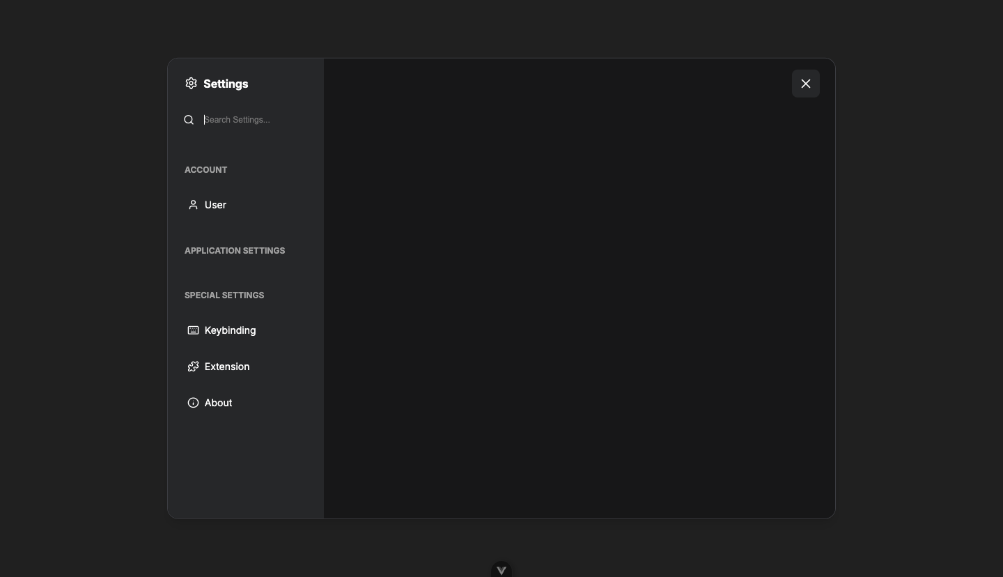 | | Keybinding panel inside the Reka Settings dialog | 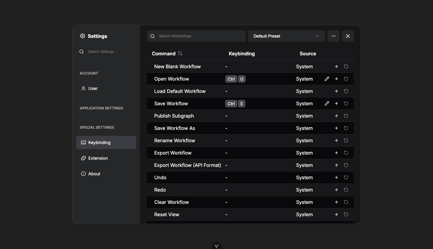 | | Nested PrimeVue **Modify keybinding** dialog stacked on top — `document.activeElement` is the `<input autofocus>`, proving the focus-trap fix |  | ## Public API impact None. `useSettingsDialog().show()` keeps the same signature. Reka primitives gain optional `maximized` prop and `overlayClass` field — additive, non-breaking. ## Out of scope (later phases) - Manager dialog — Phase 4 (FE-576) — will consume the new `maximizable` affordance - `ConfirmDialog` callers — Phase 5 (FE-577) - Removing PrimeVue `Dialog`/`<style>` overrides in `GlobalDialog.vue` — Phase 6 (FE-578) ## Review focus 1. **Sizing strategy** — `contentClass` overrides Reka's default content sizing (matching the existing `BaseModalLayout size="sm"` of 960 × 80vh). Worth a designer pass per FE-575's acceptance criteria. 2. **`overlayClass: 'p-8'` workspace mode** — Reka's `DialogContent` is positioned with viewport coordinates, so overlay padding does not constrain it the way the old PrimeVue `mask.p-8` did. Cosmetic gutter only. If designer flags missing breathing room, follow-up by shrinking `contentClass` in workspace mode. 3. **`headless: true` semantics for Reka** — now skips the inner padding wrapper. Existing migrated dialogs (Phases 1–2) all set a header, so no visible impact. The Reka-headless path is new with this PR. 4. **Maximize wiring** — `toggleMaximize` mutates `item.dialogComponentProps.maximized` directly (Pinia deep-reactive proxy). The store's `onMaximize` / `onUnmaximize` callbacks are still wired for the PrimeVue path; not double-fired. ## Test plan - [x] Unit: 102/102 across touched + adjacent areas - [ ] CI: full Vitest + Playwright matrix - [ ] Manual on a backend: - Open Settings via gear icon / keyboard shortcut → renders through Reka, search works, panel navigation works, ESC closes - Open Settings → trigger a reset confirmation (stacked confirm) → confirm renders above Settings, ESC closes only the confirm - Cloud workspace mode: Settings opens with workspace panel; `overlayClass` applied - Cloud non-workspace mode: Settings opens without workspace panel; no `overlayClass` ┆Issue is synchronized with this [Notion page](https://www.notion.so/PR-12182-feat-dialog-migrate-Settings-dialog-to-Reka-UI-Phase-3-35e6d73d36508144bb4af88f83c5ab20) by [Unito](https://www.unito.io) --------- Co-authored-by: github-actions <github-actions@github.com> Co-authored-by: GitHub Action <action@github.com> |
||
|
AustinMroz
|
b89940134f |
Better preview grid tiling (#12463)
The previous image preview tiling code was less than ideal. It had fixed breakpoints based on the number of images. Outputs with many images would become comically long. This PR instead tiles images to fill the available space. | Before | After | | ------ | ----- | | <img width="360" alt="before" src="https://github.com/user-attachments/assets/e793ce65-8efc-44ca-b049-98f066a65b7d" /> | <img width="360" alt="after" src="https://github.com/user-attachments/assets/ca891ce2-335f-42ce-aeec-a99579f669c8" />| |
||
|
Christian Byrne
|
7ac1cbbd53 |
test: add E2E coverage for NE, SW, NW corner node resizing (#11408)
*PR Created by the Glary-Bot Agent*

---

## Summary

- Adds parameterized Playwright E2E tests covering all non-SE resize
corners (NE, SW, NW), closing the coverage gap in the `useNodeResize.ts`
switch statement
- Adds `resizeFromCorner()` and `getResizeHandle()` to `VueNodeFixture`
for reuse across tests
- Test cases are derived from the production `RESIZE_HANDLES` config so
they stay in sync with the actual handle definitions

## Test Groups (8 new tests)

| Group | Tests | Coverage |
|-------|-------|----------|
| Corner resize directions | NE, SW, NW — size increases and correct
edges shift | Lines 110-124, 184 |
| Opposite edge anchoring | NE, SW, NW — opposite corner stays fixed |
Position compensation end-to-end |
| Minimum size enforcement | SW width clamp (≥ MIN_NODE_WIDTH), NE
height clamp | Lines 162-176 |

## Design Decisions

**Locator-based handle discovery**: `resizeFromCorner()` finds handles
via `getByRole('button', { name: ariaLabel })` instead of coordinate
offsets. The resize handles have `opacity-0 pointer-events-auto`,
meaning they're always interactive even when visually transparent —
Playwright considers elements with `opacity: 0` as visible (it only
gates on `visibility: hidden` / `display: none` / zero-size bounding
box). If this approach turns out to be flaky in CI due to handle
discoverability, we can fall back to coordinate-based targeting
(computing offsets from the node's bounding box corners), which is what
the original SE-corner test uses.

**Parameterization from production config**: Tests import
`RESIZE_HANDLES` from `resizeHandleConfig.ts` and derive test case data
(drag direction, which axes move) from the corner name. An upfront guard
throws if any expected corner is missing from the config, preventing
silent coverage loss.

**Aria-label coupling**: `RESIZE_HANDLE_LABELS` in `VueNodeFixture`
hardcodes the English aria-label strings. This is intentional — tests
run in English locale, and aria-labels are the accessibility interface
contract. If a more stable hook is needed (e.g., `data-testid` per
handle), that can be added to `LGraphNode.vue` in a follow-up.

**Frame settlement**: `resizeFromCorner()` calls `nextFrame()` after the
mouse-up to ensure layout settles before assertions run, per
`FLAKE_PREVENTION_RULES.md`.

┆Issue is synchronized with this [Notion
page](https://www.notion.so/PR-11408-test-add-E2E-coverage-for-NE-SW-NW-corner-node-resizing-3476d73d3650818d8a5ce5d6d535b38c)
by [Unito](https://www.unito.io)

---------

Co-authored-by: Glary-Bot <glary-bot@users.noreply.github.com>
Co-authored-by: jaeone94 <89377375+jaeone94@users.noreply.github.com>
Co-authored-by: Connor Byrne <c.byrne@comfy.org>
|
||
|
Alexander Brown
|
0157b47024 |
feat(subgraph): Subgraph Link Only Promotion (ADR 0009) + migration/store hygiene (#12197)
## Summary Introduces **Subgraph Link Only Promotion** (ADR 0009) — a new model for surfacing inner subgraph widgets on the parent SubgraphNode by *promoting through links* rather than by duplicating widget state on the host. Ships with the hygiene/refactor pass on the migration, store, and event layers that the new model depends on. ## What changes ### Subgraph Link Only Promotion (ADR 0009) Promoted widgets are defined by the link from a SubgraphNode input to the interior node, not by a duplicated widget instance on the host. Consequences: - A SubgraphNode renders inner widgets purely as a **projection** of the interior widgets and links — no host-side state to drift. - **Per-host independence**: multiple instances of the same SubgraphNode render and edit their own values without cross-talk. - **Reversible promote/demote**: structural link operation, so demote preserves host slots and external connections (#12278). ### Supporting refactors - **Migration** — Planner/classifier/repair/quarantine helpers collapsed into a single `proxyWidgetMigration` entry point with black-box round-trip coverage. Honors the source-node-id disambiguator on `proxyWidgets`, so deduplicated names (e.g. `text`, `text_1`) resolve to the right interior widget. - **Widget identity** — `appMode` unified on `WidgetEntityId`; promoted widget state is keyed by entityId across the store, DOM, and migration paths. - **SubgraphNode** — 3-key promoted-view cache replaced with a single version counter + explicit `invalidatePromotedViews()` at mutation sites; `id === -1` sentinel removed. - **Events** — `LGraph.trigger()` now dispatches node trigger payloads through `this.events`, replacing a leaky `onTrigger` monkey-patch. `SubgraphEditor` reactivity is driven from subgraph events instead of imperative refresh. - **Stores** — `appModeStore` migration helpers collapsed into `upgradeAndValidateInput`; `nodeOutputStore.*ByExecutionId` derived from the locator index; `previewExposureStore` cleanup and cycle-detection double-warn fix. - **Misc** — `Outcome` types consolidated; mutable accumulators replaced with `flatMap`; new ESLint rule forbids litegraph imports under `src/world/`. ### Tests - Browser tests for promoted widgets retagged `@vue-nodes` and rewritten to assert against the rendered Vue node DOM (via `getNodeLocator` / `getByRole('textbox')` / `enterSubgraph`) instead of `page.evaluate` graph introspection. - Per-host widget independence asserted via DOM. - Migration coverage moved to black-box round-trip tests. - Added coverage for duplicate-named promoted widget identity (ADR 0009) and the per-parent demote branch in `WidgetActions`. ## Review focus - ADR 0009 conformance of the link-only promotion model. - Disambiguator resolution path in `proxyWidgetMigration`. - Single-version-counter promoted-view cache and its `invalidatePromotedViews()` call sites. - `LGraph.trigger()` event dispatch and the `AppModeWidgetList.vue` migration off `onTrigger` (FE-667 tracks the remaining `useGraphNodeManager` conversion). ## Breaking changes None for users. Internal subgraph promotion APIs changed — see ADR 0009. ┆Issue is synchronized with this [Notion page](https://www.notion.so/PR-12197-feat-subgraph-link-only-widget-promotion-migration-store-hygiene-35e6d73d365081fd882cf3a69bc09956) by [Unito](https://www.unito.io) --------- Co-authored-by: Amp <amp@ampcode.com> Co-authored-by: GitHub Action <action@github.com> Co-authored-by: github-actions <github-actions@github.com> Co-authored-by: Glary-Bot <glary-bot@users.noreply.github.com> Co-authored-by: AustinMroz <austin@comfy.org> |
||
|
AustinMroz
|
876ed502c9 |
Mock sign-in request in test (#12482)
Mock the sign in request in e2e tests to ensure tests success isn't tied to external variables. |
||
|
AustinMroz
|
c638ad194b |
Fix restoring values to dynamic combos (#12211)
`DynamicCombo`s redefined `widget.value` without going through the store. This would result in desync of state. Most noticeably, swapping to and from a workflow would break vue reactivity and cause the default option to display visually ┆Issue is synchronized with this [Notion page](https://www.notion.so/PR-12211-Fix-restoring-values-to-dynamic-combos-35f6d73d3650814ba12ccda42615239a) by [Unito](https://www.unito.io) |
||
|
AustinMroz
|
bbaaa82125 |
Fix missing value control on 'Primitive Int' (#12431)
#8505 added support for specifying default values for `control_after_generate`. Unbeknown to me, this exact same format of assigning `control_after_generate` to a string in the schema already served a function of renaming the control widget. As a result, control widgets with a default value set would use a different internal name, but due to other overlapping systems, would either have a label of `control_after_generate` or `control_before_generate`. The fix here, is incredibly simple and low scope. Instead of trying to filter control widgets by name, the dedicated `IS_CONTROL_WIDGET` symbol is used. | Before | After | | ------ | ----- | | <img width="360" alt="before" src="https://github.com/user-attachments/assets/5917e093-124a-4923-80ff-321fc0a94ef3" /> | <img width="360" alt="after" src="https://github.com/user-attachments/assets/c6d95b5a-2764-4e71-a09f-dcae5ddcfdbb" />| |
||
|
Alexander Brown
|
8d1a170136 |
feat: remove ability to create Group Nodes (#12347)
*PR Created by the Glary-Bot Agent* --- Group Nodes are a legacy feature superseded by Subgraphs. This PR removes every UI entry point for *creating* a new Group Node while keeping the loading, ungrouping, and management code intact so existing workflows that contain Group Nodes continue to load and can still be unpacked or managed. ## Removed creation entry points - `Comfy.GroupNode.ConvertSelectedNodesToGroupNode` command - `Alt+G` keybinding - "Convert to Group Node (Deprecated)" canvas and node right-click menu items (`groupNode.ts` `getCanvasMenuItems` / `getNodeMenuItems`) - "Convert to Group Node" entry in the Vue selection menu (`useSelectionMenuOptions.ts`) - Associated `MENU_ORDER` entry in `contextMenuConverter.ts` - `convertSelectedNodesToGroupNode` / `convertDisabled` helpers in `groupNode.ts` - `BadgeVariant.DEPRECATED` enum member (no remaining consumers; knip-clean) - Matching `en` locale strings in `main.json` (`contextMenu.Convert to Group Node`, `commands.Convert selected nodes to group node`) and `commands.json` (`Comfy_GroupNode_ConvertSelectedNodesToGroupNode`) - Browser-test helpers `convertToGroupNode` / `convertAllNodesToGroupNode` and the three tests that exercised the creation flow ## Preserved (intentionally) - `GroupNodeHandler`, `GroupNodeConfig`, `GroupNodeBuilder`, `ManageGroupDialog` - `beforeConfigureGraph` / `nodeCreated` hooks that load and initialize Group Nodes from saved workflows - "Manage Group Nodes" canvas menu item, the `Comfy.GroupNode.ManageGroupNodes` command, and the per-node "Manage Group Node" / "Convert to nodes" options on existing group node instances - "Ungroup selected group nodes" command + `Alt+Shift+G` keybinding so users can disassemble existing group nodes in legacy workflows - Reduced `browser_tests/tests/groupNode.spec.ts` covering surviving behaviors: workflow loading (legacy `/` separator, hidden-input config, v1.3.3 fixture), copy/paste of already-loaded group nodes across workflows, and opening the Manage Group Node dialog ## Verification - `pnpm typecheck` clean - `pnpm typecheck:browser` clean - `pnpm format` clean - `pnpm knip` clean (no new findings; pre-existing flac.ts tag warning unchanged) - `pnpm test:unit` — 796 files, 10,789 tests pass (8 pre-existing skipped); includes a regression test in `useSelectionMenuOptions.test.ts` asserting the Vue selection menu no longer offers a Convert to Group Node option - Pre-commit hooks (oxfmt, oxlint, eslint, typecheck, typecheck:browser) passed - Manual verification against a live dev server: programmatically inspecting the GroupNode extension showed `getCanvasMenuItems` returns only `[Manage Group Nodes]`, `getNodeMenuItems` returns `[]`, and the `ConvertSelectedNodesToGroupNode` command + Alt+G keybinding are absent from the registries. Visually captured the node right-click menu (attached screenshot) — "Convert to Subgraph" remains, no "Convert to Group Node" entry - Browser E2E suite not executed locally (sandbox has no GPU and Playwright requires a full backend; the reduced spec will run in CI) - Non-English locales not modified — per `src/locales/CONTRIBUTING.md` they are regenerated by CI ## Notes for reviewers - This is a surgical removal of creation only; loading any older workflow that already contains group nodes will continue to work. - If you'd like to also remove the management UI (`Manage Group Nodes` command/menu/dialog) or the ungroup command in a follow-up, happy to open a separate PR. ## Screenshots 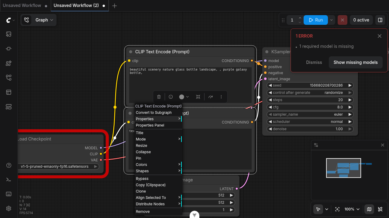 ┆Issue is synchronized with this [Notion page](https://www.notion.so/PR-12347-feat-remove-ability-to-create-Group-Nodes-3656d73d365081d488bfd98ffd7545c0) by [Unito](https://www.unito.io) --------- Co-authored-by: Glary-Bot <glary-bot@users.noreply.github.com> Co-authored-by: github-actions <github-actions@github.com> Co-authored-by: Amp <amp@ampcode.com> |
||
|
AustinMroz
|
fb5b4a62ba |
Fix mask editor sometimes showing wrong image (#12413)
Mask editor checks `node.images` to determine the image which is edited. If the user generates an output image in litegraph mode, swaps to vue mode, then generates a new image, the mask editor will incorrectly display the image last shown in litegraph mode. This is resolved by having `syncLegacyNodeImgs` also synchronize node outputs to `node.images`. |
||
|
Dante
|
d405002127 |
fix(widgets): collapse duplicate COLOR widget rendering on Color to RGB Int (FE-842) (#12447)
## Summary Fix the duplicate \`<WidgetColorPicker>\` rendering on the \`Color to RGB Int\` node (and any other COLOR-using V3 node that the runtime double-registers a widget for). <img width="480" alt="after-fix-dedupe-proof" src="https://github.com/user-attachments/assets/5c801806-ed5d-493f-92b6-e0b99dd8e408" /> ## Changes - **What**: - \`useProcessedWidgets.getWidgetIdentity\`: fall back to the host \`nodeId\` parameter for the dedupe identity root when neither \`storeNodeId/widget.nodeId\` nor \`sourceExecutionId\` is set. Normal root-graph widgets now dedupe identically to promoted/execution-scoped widgets, so any duplicate same-name+same-type widget collapses to one render. \`sourceExecutionId\` precedence is preserved. - \`useColorWidget\`: read top-level \`default\` from the V2 spec (falls back to nested \`options.default\` for hand-authored V2 specs), and short-circuit if a same-name color widget already exists on \`node.widgets\` so a second \`addWidget('color', …)\` call from upstream hooks (or a \`configure\` round-trip) no longer duplicates the row. - **Tests**: - New \`useColorWidget.test.ts\` covers top-level default, nested-options fallback, no-default fallback, and the idempotency guard. - \`useProcessedWidgets.test.ts\` gets a regression case for two identical color widgets on the same node collapsing to one render, plus an updated \`getWidgetIdentity\` case for the host-nodeId fallback. ## Review Focus - \`getWidgetIdentity\` precedence change. The fallback only fires when none of \`storeNodeId\`, \`widget.nodeId\`, or \`sourceExecutionId\` are present, so promoted/exec-scoped widgets (incl. the \"unresolved same-name promoted entries distinct by source execution identity\" \`NodeWidgets\` test) are unaffected. - \`useColorWidget\` idempotency guard is defensive — the root cause of the second \`addWidget\` call (cloud-only hook or persisted \`info.widgets\` configure round-trip) is not in this diff; that's tracked separately. Fixes [FE-842](https://linear.app/comfyorg/issue/FE-842/color-to-rgb-int-node-shows-duplicate-color-widgets) |
||
|
pythongosssss
|
abd233d10d |
feat: default search to essentials when graph is empty (#12377)
## Summary Currently, when opening node search on an empty graph, the default view shows "Most Relevant" nodes, which includes nodes like CLIP and VAE. For users building from scratch, these nodes are not necessarily the most helpful starting point. ## Changes - **What**: - Update default mode to Essentials when graph is empty ┆Issue is synchronized with this [Notion page](https://www.notion.so/PR-12377-feat-default-search-to-essentials-when-graph-is-empty-3666d73d3650816d9d5ae3ed602a30ec) by [Unito](https://www.unito.io) |
||
|
jaeone94
|
91d2df45a1 |
Fix V2 draft lifecycle persistence (#12269)
## Summary This PR fixes the remaining FE-367 workflow persistence gap by moving the workflow draft lifecycle callers from the legacy V1 draft store to `workflowDraftStoreV2`, following the core design from #10367 while omitting unrelated changes. It keeps the change focused on saved workflow tab restore and V2 draft lifecycle behavior: - save active workflow drafts through V2 before loading a new graph - load, save, save-as, close, rename, and delete workflows against V2 draft storage - prefer a fresh V2 draft when loading a saved workflow, and discard stale drafts when the remote workflow is newer - restore saved open tabs from persisted tab state instead of letting stale active-path state win - preserve V2 draft payload timestamps when moving or refreshing draft recency - remove the now-unused V1 draft store/cache implementation instead of suppressing knip; the raw V1 on-disk migration path remains for existing users Co-authored-by: xmarre <xmarre@users.noreply.github.com> ## Test coverage Added unit coverage for V2 draft load, stale draft discard, rename/close lifecycle cleanup, tab restore ordering, metadata-load waiting/fallback, draft recency updates, quota eviction retry, and persistence-disabled reset behavior. Updated the workflow persistence composable tests to use a real `vue-i18n` plugin host instead of mocking `vue-i18n`. Added an E2E regression test that saves two workflows, edits an inactive saved tab draft, makes the active-path pointer stale, reloads, and verifies the saved tab order, active tab, and inactive draft restoration. ## Validation - `pnpm format` - `pnpm lint` - `pnpm typecheck` - `pnpm test:unit` - pre-push `pnpm knip` (passes with the existing flac tag hint) ┆Issue is synchronized with this [Notion page](https://www.notion.so/PR-12269-Fix-V2-draft-lifecycle-persistence-3606d73d365081b4a84feb1696ed88bb) by [Unito](https://www.unito.io) --------- Co-authored-by: xmarre <xmarre@users.noreply.github.com> |
||
|
AustinMroz
|
ee286291d4 |
Fix reactivity on matchType output slots (#12397)
Relevant: #9935. A PR claimed to solve the same issue (and was approved by me), but the issue persists. Even when checking out that exact commit, the issue does not appear affected. This PR is somewhat heavier. It converts the outputs into shallowReactive. Since there is no individual moment of registration for outputs, this conversion happens on type change and leverages that calling `shallowReactive` on a shallow reactive is low cost and reflexive. It also adds a test to ensure that regression can not happen in the future. | Before | After | | ------ | ----- | | <img width="360" alt="before" src="https://github.com/user-attachments/assets/3e4f4a0a-906f-4539-95b6-b2e80de7ceff" /> | <img width="360" alt="after" src="https://github.com/user-attachments/assets/1a29ac66-ed5e-4874-82dc-ce9f6135dea5" />| |
||
|
pythongosssss
|
b3ba6c9344 |
fix: select node after adding from library (#12404)
## Summary When adding a node from the library sidebar, the node was not correctly selected upon placing it. This was due to the canvas capturing the node under the cursor on mouse down, however the node had not yet been comitted to the graph at that point, and so selection was then cleared on mouse up. ## Changes - **What**: - add `blockCommitPointerDown` so if the cursor is over the canvas stop propagation to prevent LiteGraph adding the mouse handler to clear the selection ## Review Focus Alternative approaches considered were blocking the event in endDrag however this then required manual cleanup of LiteGraph handlers or overriding the `pointer.onClick` function to force selection of our node, both felt worse than this approach. ## Screenshots (if applicable) https://github.com/user-attachments/assets/a2eb154e-5178-4a1e-b5c7-884efd7a10c6 |











