## Summary

Redesigns the cloud login and signup screens with a new split-screen
template featuring hero carousel on the right.

## Changes

- **What**:
- New `CloudHeroCarousel` component (product logo chips for Gemini,
Grok, Seedance)
- `CloudTemplate` restructured: removed video background and
`BaseViewTemplate` wrapper; new shell uses `bg-charcoal-750` /
`text-sand-500` and renders the carousel in the right column at `lg+`
- `CloudLoginView` and `CloudSignupView` restyled to match the new dark
shell (sand/azure/smoke tokens, `shadow-inset-highlight` OAuth buttons,
brand-yellow free-tier badge)
- `CloudSignInForm` submit button restyled to match the OAuth secondary
style
- `CloudLogo` switched from `<img>` to inline SVG with `currentColor` +
`aria-label`
- Three new logo components (`GeminiLogo`, `GrokLogo`, `SeedanceLogo`) —
inline SVG, `aria-hidden`, `currentColor`
- Theme tokens added in `style.css`: `--color-charcoal-750`,
`--color-sand-500`, `--shadow-inset-highlight`
- i18n keys added under `cloudHero.*` for carousel titles, descriptions,
and pager labels
- Hero image assets added under
`src/platform/cloud/onboarding/assets/hero/`


## Screenshots

<img width="1470" height="838" alt="image"
src="https://github.com/user-attachments/assets/747bfc98-f605-4904-9a3f-3ba0de88573b"
/>

---------

Co-authored-by: Deep Mehta <42841935+deepme987@users.noreply.github.com>
Co-authored-by: Austin <austin@comfy.org>
## Summary

Silence false Iconify warning spam during Tailwind lint analysis while
preserving icon utility generation and real failure signals.

## Changes

- **What**: Local wrapper around `@iconify/tailwind4` that swallows the
noise from `better-tailwindcss/enforce-canonical-classes` probes.
Wrapper delegates icon resolution to upstream's `getDynamicCSSRules`;
only custom-comfy folder loading is reimplemented. `lucideStrokePlugin`
uses a `InvalidIconProbeError` sentinel so missing icons / missing deps
still surface.
- **Dependencies**: None.

## Background

Both upstreams have refused to address this:

- `better-tailwindcss`
([schoero/eslint-plugin-better-tailwindcss#377](https://github.com/schoero/eslint-plugin-better-tailwindcss/issues/377),
open) — owner declines to filter third-party warnings; says it should be
fixed in iconify.
- `@iconify/tailwind4`
([iconify/iconify#357](https://github.com/iconify/iconify/issues/357),
closed) — maintainer defends the `console.warn` as intentional; *"not
something plugin has control over"*.

Trigger path: `enforce-canonical-classes` → Tailwind
`canonicalizeCandidates()` → iconify `matchComponents` handler throws on
non-icon strings → upstream catches + `console.warn`.

## Review Focus

- Inline `loadComfyIconSet` in `iconifyDynamicPlugin.js` skips
`@iconify/tools`' `parseColors → currentColor` normalization. Verified
the comfy SVGs already use `currentColor` directly; multi-color icons
(bria, bytedance) keep their explicit fills as expected.
- `lucideStrokePlugin.js` catch is now type-discriminated — only
`InvalidIconProbeError` returns `{}`; `Cannot load icon set` and `Cannot
find icon` re-throw.

---------

Co-authored-by: Amp <amp@ampcode.com>
## Summary

Migrate pnpm configuration to the v11 layout and clean up stale v10-era
references.

## Changes

- **What**: Moves pnpm settings into `pnpm-workspace.yaml`, converts
build dependency policy to `allowBuilds`, removes stale workspace
`packageManager` pins, and updates global install commands in CI.
- **Dependencies**: No new dependencies.

## Review Focus

- Confirm pnpm v11 workspace settings match the former `.npmrc`
behavior.
- Confirm CI global install syntax is compatible with pnpm v11.

## Test Plan

- `pnpm install --frozen-lockfile`
- `pnpm exec oxfmt --check pnpm-workspace.yaml
packages/shared-frontend-utils/package.json
packages/registry-types/package.json packages/ingest-types/package.json
packages/design-system/package.json
.github/workflows/weekly-docs-check.yaml
.github/workflows/pr-claude-review.yaml`
- commit hook: `pnpm typecheck`

┆Issue is synchronized with this [Notion
page](https://www.notion.so/PR-12195-build-migrate-pnpm-config-to-v11-35e6d73d36508116a821dbc71db94cd1)
by [Unito](https://www.unito.io)

---------

Co-authored-by: Amp <amp@ampcode.com>
*PR Created by the Glary-Bot Agent*
---
## Summary
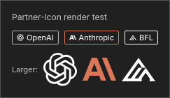
Adds the Anthropic logo to the partner-node icon set so nodes whose
category ends in `Anthropic` (e.g. the Claude node added in
Comfy-Org/ComfyUI#13867 with `category="api node/text/Anthropic"`)
render the correct provider badge in the node library.
## Changes
- `packages/design-system/src/icons/anthropic.svg` — new auto-discovered
partner icon (Anthropic A glyph, sourced from
[lobehub/lobe-icons](https://github.com/lobehub/lobe-icons), uses
`fill="currentColor"` for theme adaptation)
- `src/utils/categoryUtil.ts` — register Anthropic's brand coral
`#D97757` as the badge border color
- `packages/design-system/src/css/style.css` — add `anthropic` to the
dynamic comfy-icon safelist so Tailwind/Iconify emits CSS for
`icon-[comfy--anthropic]` in production builds
- `src/utils/categoryUtil.test.ts` — regression tests for
`getProviderIcon('Anthropic')` and `getProviderBorderStyle('Anthropic')`
## Verification
- `pnpm typecheck` ✓
- `pnpm lint` ✓ (0 errors; 3 pre-existing warnings in unrelated files)
- `pnpm format:check` ✓
- `pnpm test:unit -- src/utils/categoryUtil.test.ts` ✓ (13/13)
- `pnpm build` ✓ — confirmed `comfy--anthropic` class is emitted into
`dist/assets/index-*.css`
- Manual visual check via Playwright against `pnpm dev`: injected `<i
class="icon-[comfy--anthropic]">` elements at badge size (10px) and 48px
alongside the existing OpenAI and BFL icons and confirmed the Anthropic
"A" glyph renders correctly in coral. See screenshot.
End-to-end visual verification of the live badge in the node library
requires Comfy-Org/ComfyUI#13867 to land first (the Claude node is what
produces the `Anthropic` category that triggers the icon lookup).
Related: Comfy-Org/ComfyUI#13867
## Screenshots
┆Issue is synchronized with this [Notion
page](https://www.notion.so/PR-12216-feat-add-Anthropic-partner-icon-35f6d73d36508133a134fcafaf72f4f8)
by [Unito](https://www.unito.io)
---------
Co-authored-by: Glary-Bot <glary-bot@users.noreply.github.com>
*PR Created by the Glary-Bot Agent*
---
## Summary
Adds new `plum` and `ink` color scales for Comfy Hub branding and
standardizes existing tokens to align with current Figma design system.
### Changes
**Phase 1 — New primitives** (`_palette.css`)
- Added `plum-300/400/500/600` and `ink-100` through `ink-900`
**Phase 2 — Token cleanup** (`style.css`)
- Removed deprecated `slate-100/200/300` primitives (cool blue-grey,
removed from Figma)
- Removed duplicate `graphite-400` (identical hex to slate-100)
- Dark mode: migrated 6 slate/graphite references to muted-foreground,
smoke-700, smoke-800, charcoal-200
- Light mode: replaced 3 `ash-500` references with `smoke-800` per
designer alignment
### Token migration detail
| Dark mode token | Old value | New value | Rationale |
|---|---|---|---|
| `--node-component-header-icon` | slate-300 (#5b5e7d) |
muted-foreground (smoke-800) | Figma `node/foreground-secondary` |
| `--node-component-slot-text` | slate-200 (#9fa2bd) | smoke-700
(#a0a0a0) | Lighter neutral for text contrast |
| `--node-component-surface-highlight` | slate-100 (#9c9eab) | smoke-800
(#8a8a8a) | Neutral grey highlight |
| `--node-component-tooltip-border` | slate-300 (#5b5e7d) | charcoal-200
(#494a50) | Consistent with dark border tokens |
| `--text-secondary` | slate-100 (#9c9eab) | smoke-700 (#a0a0a0) |
Adequate contrast on dark surfaces |
| `--widget-background-highlighted` | graphite-400 (#9c9eab) | smoke-800
(#8a8a8a) | Removed duplicate, neutral replacement |
### Visual note
These changes shift some dark mode colors from cool blue-grey to neutral
grey. This is intentional per the design team. The
`--node-component-surface-highlight` and
`--node-component-tooltip-border` tokens should be QA'd as the designer
noted.
### Not included (Phase 3)
Hub Dark overlay theme will ship separately once the Hub UI work is
ready to validate against.
## Screenshots
┆Issue is synchronized with this [Notion
page](https://www.notion.so/PR-11139-feat-add-plum-ink-color-primitives-and-standardize-design-tokens-33e6d73d365081418e13e0efe6161fb5)
by [Unito](https://www.unito.io)
---------
Co-authored-by: Glary-Bot <glary-bot@users.noreply.github.com>
Co-authored-by: github-actions <github-actions@github.com>
Co-authored-by: Amp <amp@ampcode.com>
## Summary

Addresses feedback from the initial v2 node search implementation for
improved UI and UX

## Changes

- **What**:
- add root filter buttons
- remove all extra tree categories leaving only "Most relevant"
- replace input/output selection with popover
- replace price badge with one from node header
- add chevrons and additional styling to category tree
- hide empty categories
- fix bug with hovering selecting item under mouse automatically
- fix tailwind merge with custom sizes removing them
- keyboard navigation
- general tidy/refactor/test

## Screenshots (if applicable)

https://github.com/user-attachments/assets/db798dfa-e248-4b48-bb56-2fa7b6c5f65f


┆Issue is synchronized with this [Notion
page](https://www.notion.so/PR-9714-feat-Node-search-UX-updates-31f6d73d365081cebd96c4253ad1ca53)
by [Unito](https://www.unito.io)

---------

Co-authored-by: GitHub Action <action@github.com>
## Summary
Add missing delete and bookmark actions for user blueprints in the V2
node library sidebar, fixing parity with the V1 sidebar.
## Changes
- **What**:
- Add delete button (inline + context menu) for user blueprints in
`TreeExplorerV2Node` and `TreeExplorerV2`
- Extract `isUserBlueprint()` helper in `subgraphStore` for DRY usage
across V1/V2 sidebars

## Review Focus
- `isUserBlueprint` consolidates logic previously duplicated between
`NodeTreeLeaf` and the new V2 components
- Context menu guard `contextMenuNode?.data` prevents showing empty
menus
- Folder `@contextmenu` handler clears stale `contextMenuNode` to
prevent wrong actions
┆Issue is synchronized with this [Notion
page](https://www.notion.so/PR-10827-fix-add-delete-bookmark-actions-for-blueprints-in-V2-node-library-sidebar-3366d73d36508111afd2c2c7d8ff0220)
by [Unito](https://www.unito.io)
## Summary
Adds the layout shell for the marketing site: SEO head, analytics, nav,
and footer.

## Changes (incremental from #10140)
- BaseLayout.astro: SEO meta (OG/Twitter), GTM (GTM-NP9JM6K7), Vercel
Analytics, ClientRouter, i18n
- SiteNav.vue: Fixed nav with logo, Enterprise/Gallery/About/Careers
links, COMFY CLOUD + COMFY HUB CTAs, mobile hamburger with ARIA
- SiteFooter.vue: Product/Resources/Company/Legal columns, social icons

## Stack (via Graphite)
- #10140 [1/3] Scaffold ← merge first
- **[2/3] Layout Shell** ← this PR
- #10142 [3/3] Homepage Sections

┆Issue is synchronized with this [Notion
page](https://www.notion.so/PR-10141-feat-add-layout-shell-BaseLayout-SiteNav-SiteFooter-2-3-3266d73d365081aeb2d7e598943a8e17)
by [Unito](https://www.unito.io)
## Summary
- Rename `text-xxxs`/`text-xxs` to `text-3xs`/`text-2xs` in design
system CSS — fixes `tailwind-merge` incorrectly classifying custom
font-size utilities as color classes, which clobbered text color
- Add `Badge` component with updated severity colors matching Figma
design (white text on colored backgrounds)
- Add Badge stories under `Components/Badges/Badge`
- Add unit tests including twMerge regression coverage
Split from #10438 per review feedback — this PR contains the
foundational Badge component; migration of consumers follows in a
separate PR.
## Test plan
- [x] Unit tests pass (`Badge.test.ts` — 12 tests)
- [x] Typecheck passes
- [x] Lint passes
- [ ] Verify Badge stories render correctly in Storybook
- [ ] Verify existing components using `text-2xs`/`text-3xs` render
unchanged
Fixes#10438 (partial)
┆Issue is synchronized with this [Notion
page](https://www.notion.so/PR-10580-refactor-add-Badge-component-and-fix-twMerge-font-size-detection-32f6d73d3650810dae7cd0d4af67fd1c)
by [Unito](https://www.unito.io)
## Summary
Scaffolds the new apps/website/ Astro 5 + Vue 3 marketing site inside
the monorepo.

## Changes
- apps/website/ with package.json, astro.config.mjs, tsconfig, Nx
targets
- @comfyorg/design-system/css/base.css — brand tokens + fonts (no
PrimeVue)
- pnpm-workspace.yaml catalog entries for Astro deps
- .gitignore and env.d.ts for Astro

## Stack (via Graphite)
- **[1/3] Scaffold** ← this PR
- #10141 [2/3] Layout Shell
- #10142 [3/3] Homepage Sections

Part of the comfy.org website refresh (replacing Framer).

┆Issue is synchronized with this [Notion
page](https://www.notion.so/PR-10140-feat-scaffold-Astro-5-website-app-design-system-base-css-1-3-3266d73d365081688dcee0220a03eca4)
by [Unito](https://www.unito.io)
## Summary

<!-- One sentence describing what changed and why. -->

Enable Quiver AI icon for partner nodes

## Changes

- **What**: <!-- Core functionality added/modified -->
  - Enable  Quiver AI icon for partner nodes

No Quiver AI nodes now, just mock the data to see how it will look
<img width="1062" height="926" alt="image"
src="https://github.com/user-attachments/assets/1b81a1cc-d72c-413d-bd75-a63925c27a4b"
/>


## Review Focus
When Quiver AI nodes provided, the icon should show at both node library
tree, but also the PreviewCard label.


<!-- Critical design decisions or edge cases that need attention -->

<!-- If this PR fixes an issue, uncomment and update the line below -->
<!-- Fixes #ISSUE_NUMBER -->

## Screenshots (if applicable)

<!-- Add screenshots or video recording to help explain your changes -->

┆Issue is synchronized with this [Notion
page](https://www.notion.so/PR-10366-feat-enable-Quiver-AI-icon-for-partner-nodes-32a6d73d365081d4801ec2619bd2c77c)
by [Unito](https://www.unito.io)
- When in app mode, workflows can be loaded by dragging and dropping as
elsewhere.
- Dragging a file which is supported by a selected app input to the
center panel will apply drop effects on the specific input
- This overrides the loading of workflows
- There's not currently an indicator for where the image will go. This
is being considered for a followup PR
- Outputs can be dragged from the assets panel onto nodes
- This fixes behaviour outside of app mode as well
- Has some thorny implementation specifics
- Non-core nodes may not be able to accept these inputs without an
update
- Node DragOver filtering has reduced functionality when dragging from
the assets pane. Nodes may have the blue border without being able to
accept a drag operation.
- When dropped onto the canvas, the workflow will load (a fix), but the
workflow name will be the url of the image preview
- The entire card is used for the drag preview
<img width="329" height="380" alt="image"
src="https://github.com/user-attachments/assets/2945f9a3-3e77-4e14-a812-4a361976390d"
/>
- Adds a new scroll-shadows tailwind util as an indicator that more
content is available by scrolling.
- Since a primary goal was preventing API costs overflowing, I've made
the indicator fairly strong. This can be tuned later if needed

- Initial support for text outputs in App Mode
- Also causes jobs with text outputs to incorrectly display in the
assets panel with a generic 'check' icon instead of a text specific
icon. This will need a dedicated pass, but shouldn't be overly onerous
in the interim.
<img width="1209" height="735" alt="text output"
src="https://github.com/user-attachments/assets/fcd1cf9f-5d5c-434c-acd0-58d248237b99"
/>
NOTE: Displaying text outputs conflicted with the changes in #9622. I'll
leave text output still disabled in this PR and open a new PR for
reconciling text as an output so it can go through dedicated review.
┆Issue is synchronized with this [Notion
page](https://www.notion.so/PR-10122-App-Mode-dragAndDrop-text-output-and-scroll-shadows-3256d73d3650810caaf8d75de94388c9)
by [Unito](https://www.unito.io)
---------
Co-authored-by: GitHub Action <action@github.com>
## Summary

When many nodes are rendered in the transform container, both zoom and
pan can cause FPS drops because the browser re-rasterizes all visible
content at the new transform. `will-change: transform` tells the browser
to keep the layer as a GPU texture and skip re-rasterization during
active interaction, restoring visual quality only after settling.

- Add pointer drag detection so `will-change: transform` covers pan in
addition to zoom. Without this, dragging with 256+ nodes causes jank as
the browser re-rasterizes the entire layer on every frame of the pan.
- Fix settleDelay from 16ms to 256ms. At 16ms the debounce fires between
consecutive wheel events (~50ms apart on a physical mouse), causing
`will-change` to toggle on/off rapidly. Each toggle forces the browser
to promote/demote the compositor layer, which is more expensive than not
having the optimization at all.
- Replace scoped CSS with Tailwind `will-change-transform`.
- Remove per-node `will-change: transform` on `.lg-node`. Promoting each
node to its own compositor layer (256 nodes = 256 GPU textures)
increases memory pressure and compositing overhead, making performance
worse than a single promoted container.
- Previously, the virtual DOM of Nodes was updated during zooming and
dragging, but now this update is avoided through some techniques.
- Using the 3D versions of scale and translate can provide a smoother
experience when dealing with a large number of nodes.

## Test plan
- [x] Unit tests updated and passing
- [x] Manual: verify during both zoom and pan
- [x] Manual: compare pan FPS with 256 nodes before/after

┆Issue is synchronized with this [Notion
page](https://www.notion.so/PR-9649-perf-detect-pointer-drag-in-useTransformSettling-for-pan-optimization-31e6d73d3650818bb2c3ccd01a465140)
by [Unito](https://www.unito.io)

---------

Co-authored-by: github-actions <github-actions@github.com>
A working branch of smaller app mode fixes. Can be merged at any time
and I'll make a new branch.
- Selected inputs and outputs can now be re-ordered when clicking on
label text
- 3d outputs once again display correctly
- Some padding has been added to the side so that control buttons don't
overlap with the floating app sidebar controls
- A "Share" button placeholder has been added to the menu, but is
disabled
- Adds a workaround for canvas read_only state being disabled when
'space' is pressed.
  - This one is particularly hacky, and can be pulled out if problematic
- Fix download all only downloading the first output

┆Issue is synchronized with this [Notion
page](https://www.notion.so/PR-9368-Misc-app-mode-fixes-3196d73d365081eab02ad1e693784707)
by [Unito](https://www.unito.io)
## Summary

Add persistent upgrade CTAs for free-tier users: a topbar button and
"Upgrade to add credits" replacing "Add Credits" in popovers and
settings panels.

## Changes

- **What**:
- New `TopbarSubscribeButton` component in both GraphCanvas and
LinearView topbars, visible only to free-tier users
- Profile popover (legacy + workspace): free-tier users see "Upgrade to
add credits" instead of "Add Credits", linking directly to the pricing
table
- Manage Plan settings (legacy + workspace): same replacement —
free-tier users see "Upgrade to add credits" instead of "Add Credits"
- Paid-tier users retain the original "Add Credits" behavior in all
locations
  - All upgrade buttons go directly to the pricing table (one-step flow)

## Review Focus

- The `isFreeTier` conditional gating on the buttons — ensure free-tier
users see upgrade CTAs and paid users see normal Add Credits
- Layout in Manage Plan panels uses `flex flex-col gap-3` to stack the
upgrade button below the usage history link instead of side-by-side

┆Issue is synchronized with this [Notion
page](https://www.notion.so/PR-9315-feat-add-ever-present-upgrade-button-for-free-tier-users-3166d73d365081228cdfe6a67fec6aec)
by [Unito](https://www.unito.io)
## Summary

Implement 11 Figma design discrepancies for the Node Library sidebar and
V2 Node Search dialog, aligning the UI with the [Toolbox Figma
design](https://www.figma.com/design/xMFxCziXJe6Denz4dpDGTq/Toolbox?node-id=2074-21394&m=dev).

## Changes

- **What**: Sidebar: reorder tabs (All/Essentials/Blueprints), rename
Custom→Blueprints, uppercase section headers, chevron-left of folder
icon, bookmark-on-hover for node rows, filter dropdown with checkbox
items, sort labels (Categorized/A-Z) with label-left/check-right layout,
hide section headers in A-Z mode. Search dialog: expand filter chips
from 3→6, add Recents and source categories to sidebar, remove "Filter
by" label. Pull foundation V2 components from merged PR #8548.
- **Dependencies**: Depends on #8987 (V2 Node Search) and #8548
(NodeLibrarySidebarTabV2)

## Review Focus

- Filter dropdown (`filterOptions`) is UI-scaffolded but not yet wired
to filtering logic (pending V2 integration)
- "Recents" category currently returns frequency-based results as
placeholder until a usage-tracking store is implemented
- Pre-existing type errors from V2 PR dependencies not in the base
commit (SearchBoxV2, usePerTabState, TextTicker, getProviderIcon,
getLinkTypeColor, SidebarContainerKey) are expected and will resolve
when rebased onto main after parent PRs land

┆Issue is synchronized with this [Notion
page](https://www.notion.so/PR-9085-feat-Node-Library-sidebar-and-V2-Search-dialog-Figma-design-improvements-30f6d73d36508175bf72d716f5904476)
by [Unito](https://www.unito.io)

---------

Co-authored-by: Yourz <crazilou@vip.qq.com>
Co-authored-by: github-actions <github-actions@github.com>
## Summary

Remove Tailwind `@apply` from Vue styles across `src/` and
`apps/desktop-ui/src/` to align with Tailwind v4 guidance, replacing
usages with template utilities or native CSS while preserving behavior.

## Changes

- **What**:
- Batch 1: migrated low-risk template/style utility bundles out of
`@apply`.
- Batch 2: converted PrimeVue/`:deep()` override `@apply` blocks to
native CSS declarations.
- Batch 3: converted `src/components/node/NodeHelpContent.vue` markdown
styling from `@apply` to native CSS/token-based declarations.
- Batch 4: converted final desktop pseudo-element `@apply` styles and
removed stale `@reference` directives no longer required.
- Verified `rg -n "^\s*@apply\b" src apps -g "*.vue"` has no real CSS
`@apply` directives remaining (only known template false-positive event
binding in `NodeSearchContent.vue`).

## Review Focus

- Visual parity in components that previously depended on `@apply` in
`:deep()` selectors and markdown content:
  - topbar tabs/popovers, dialogs, breadcrumb, terminal overrides
  - desktop install/dialog/update/maintenance surfaces
  - node help markdown rendering
- Confirm no regressions from removal of now-unneeded `@reference`
directives.

## Screenshots (if applicable)

- No new screenshots included in this PR.
- Screenshot Playwright suite was run with `--grep="@screenshot"` and
reports baseline diffs in this environment (164 passed, 39 failed, 3
skipped) plus a teardown `EPERM` restore error on local path
`C:\Users\DrJKL\ComfyUI\LTXV\user`.

┆Issue is synchronized with this [Notion
page](https://www.notion.so/PR-9146-fix-eradicate-tailwind-apply-usage-in-vue-styles-3116d73d3650813d8642e0bada13df32)
by [Unito](https://www.unito.io)

---------

Co-authored-by: Amp <amp@ampcode.com>
Co-authored-by: coderabbitai[bot] <136622811+coderabbitai[bot]@users.noreply.github.com>
## Summary

Adds new store for tracking outputs lin linear mode and reworks outputs
to display the following: skeleton -> latent preview -> node output ->
job result.

## Changes

- **What**:
- New store for wrangling various events into a usable list of live
outputs
- Replace manual list with reka-ui list box
- Extract various composables

## Review Focus
Getting all the events and stores aligned to happen consistently and in
the correct order was a challenge, unifying the various sources. so
suggestions there would be good

## Screenshots (if applicable)


https://github.com/user-attachments/assets/13449780-ee48-4d9a-b3aa-51dca0a124c7

┆Issue is synchronized with this [Notion
page](https://www.notion.so/PR-9028-App-Mode-Progress-outputs-5-30d6d73d3650817aaa9dee622fffe426)
by [Unito](https://www.unito.io)

---------

Co-authored-by: GitHub Action <action@github.com>
## Summary
- Raise `.graphdialog` z-index from 41 to 1500 so the widget prompt
dialog is no longer hidden behind menu bars when a node is near the top
of the screen.
### Why 1500 instead of 10000?
The issue suggested 10000, but that would place the dialog **above**
context menus (9999) and at the same level as toasts (10000). A value of
1500 is sufficient to sit above the top menu bar (1001) and actionbar
(1300), while staying **below** popovers (1700), context menus (9999),
and toasts (10000).
| Element | z-index |
|---------|---------|
| `.comfyui-body-top` (top menu) | 1001 |
| Actionbar | 1300 |
| **`.graphdialog` (this PR)** | **1500** |
| Popover | 1700 |
| Context menus / search box | 9999 |
| Toast | 10000 |
- Fixes#4573
### test
#### AS IS
<img width="534" height="120" alt="스크린샷 2026-02-21 오후 1 27 56"
src="https://github.com/user-attachments/assets/e58922b4-ae3f-4083-a0e1-06c27efb64af"
/>
#### TO BE
<img width="659" height="140" alt="스크린샷 2026-02-21 오후 1 47 09"
src="https://github.com/user-attachments/assets/980334f4-b5d2-43f5-a237-d7c2a7dfb6c9"
/>
┆Issue is synchronized with this [Notion
page](https://www.notion.so/PR-9049-fix-raise-graphdialog-z-index-above-menu-bars-30e6d73d36508172b9b3c728c3628477)
by [Unito](https://www.unito.io)
Co-authored-by: Claude Opus 4.6 <noreply@anthropic.com>
- "Enter Subgraph" "Show advanced inputs" and a new "show node Errors"
button now use a combined button design at the bottom of the node.
- A new "Errors" tab is added to the right side panel
- After a failed queue, the label of an invalid widget is now red.
- Badges other than price are now displayed on the bottom of the node.
- Price badge will now truncate from the first space, prioritizing the
sizing of the node title
- An indicator for the node resize handle is now displayed while mousing
over the node.
<img width="669" height="233" alt="image"
src="https://github.com/user-attachments/assets/53b3b59c-830b-474d-8f20-07f557124af7"
/>

---------
Co-authored-by: github-actions <github-actions@github.com>
## Summary

Replace the manager button puzzle icon with a custom extensions-blocks
SVG icon and add a "Manage Extensions" text label to the top bar button.

## Changes

- **What**: Swap `icon-[lucide--puzzle]` →
`icon-[comfy--extensions-blocks]` in TopMenuSection, ComfyMenuButton,
and ManagerDialog. Add visible "Manage Extensions" label (hidden below
md). Align tooltip with new label text.

## Review Focus

- Visual appearance of the new icon at different sizes
- Button layout with text label at md+ breakpoints
- Red dot notification positioning with wider button

Fixes COM-12161

┆Issue is synchronized with this [Notion
page](https://www.notion.so/PR-8644-feat-replace-puzzle-icon-with-extensions-blocks-icon-for-manager-button-2fe6d73d3650815c8867efc5a0842ef7)
by [Unito](https://www.unito.io)

Co-authored-by: Alexander Brown <drjkl@comfy.org>
- Fix deserialization of matchtype inputs spawned by autogrow.
- Rotate multitype slot indicators to align with design changes.
- Fix several instance of incorrect group matching
- MatchType reactively updates input type in vue
- Support the "hollow circle" optional input indicator in vue
- Custom combo sends index of selection to backend

┆Issue is synchronized with this [Notion
page](https://www.notion.so/PR-8026-Further-dynamic-input-fixes-2e76d73d3650819680fef327a94f4294)
by [Unito](https://www.unito.io)
## Summary

Add TagsInput component based on shadcn-vue/Reka UI primitives with a
click-to-edit UX pattern.

## Features

- **Click-to-edit behavior**: Starts in read-only state; clicking
enables editing and focuses input; clicking outside exits edit mode
- **Disabled state**: When `disabled=true`, component is completely
inert
- **Empty state placeholder**: Shows input placeholder when tag list is
empty
- **Animated transitions**: Delete button animates when toggling edit
mode

---------

Co-authored-by: Amp <amp@ampcode.com>
A major, full rewrite of linear mode, now under the name "Simple Mode".
- Fixes widget styling
- Adds a new simplified history
- Adds support for non-image outputs
- Supports right sidebar
- Allows and panning on the output image preview
- Provides support for drag and drop zones
- Moves workflow notes into a popover.
- Allows scrolling through outputs with Ctrl+scroll or arrow keys

The primary means of accessing Simple Mode is a toggle button on the
bottom right. This button is only shown if a feature flag is enabled, or
the user has already seen linear mode during the current session. Simple
Mode can also be accessed by
- Using the toggle linear mode keybind
- Loading a workflow that that was saved in Simple Mode workflow
- Loading a template url with appropriate parameter

<img width="1790" height="1387" alt="image"
src="https://github.com/user-attachments/assets/d86a4a41-dfbf-41e7-a6d9-146473005606"
/>

Known issues:
- Outputs on cloud are not filtered to those produced by the current
workflow.
  - Output filtering has been globally disabled for consistency
- Outputs will load more items on scroll, but does not unload
- Performance may be reduced on weak devices with very large histories.

┆Issue is synchronized with this [Notion
page](https://www.notion.so/PR-7734-linear-v2-2d16d73d3650819b8a10f150ff12ea22)
by [Unito](https://www.unito.io)
## Summary
- Define `touch:` Tailwind variant using `@media (hover: none)` to
target touch devices
- Add `touch:opacity-100` to `TreeExplorerTreeNode` for node action
buttons
- Add `useMediaQuery('(hover: none)')` to `MediaAssetCard` for action
overlay visibility
## Problem
On touch devices, sidebar buttons that appear on hover are inaccessible
because:
1. The `touch:` Tailwind variant was used but never defined (classes
silently ignored)
2. `TreeExplorerTreeNode` had no touch support for action buttons
3. `MediaAssetCard` used JS-based `useElementHover` which doesn't work
on touch
## Screenshots (Touch Device Emulation)
### Before (main branch)
- No "Generated"/"Imported" tabs visible in header
- Only duration chips shown on cards, no action buttons (zoom, menu)

### After (with fix)
- "Generated"/"Imported" tabs visible in header
- Action buttons (zoom, menu) visible on left of cards
- Duration chips moved to right side

## Test plan
- [ ] On touch device: verify Media Assets sidebar
"Imported"/"Generated" tabs are visible
- [ ] On touch device: verify Node Library filter buttons are visible
- [ ] On touch device: verify tree node action buttons (bookmark, help)
are visible
- [ ] On touch device: verify media asset card zoom/menu buttons are
visible
- [ ] On desktop with mouse: verify hover behavior still works as
expected
## Summary
Ensures the nodes get their own compositing layers during scale
transform (tracked via mouse wheel events), which prevents rasterization
during transform. Adds forced reflow at end of transform to ensure
layers are always at correct resolution (fixes blurriness and some
readability issues).
Videos show testing this branch first then testing main - doing layer
visualization, paint (include paint operations calculations and actual
raster) visualizations, and cpu usage monitoring.
https://github.com/user-attachments/assets/c5fab219-0b32-4822-9238-c4572f0d6a44https://github.com/user-attachments/assets/7e172e8d-cc5b-4dcd-aa07-1dfc3eb65bac
## Summary

Reduce lower level font definitions in most places. Default to Inter.

See #6912

## Review Focus

Comic Sans is still an option...

## Screenshots (if applicable)

<!-- Add screenshots or video recording to help explain your changes -->

┆Issue is synchronized with this [Notion
page](https://www.notion.so/PR-7220-Style-Font-Consistency-2c26d73d365081348f2dd8909dd9bb8f)
by [Unito](https://www.unito.io)

---------

Co-authored-by: coderabbitai[bot] <136622811+coderabbitai[bot]@users.noreply.github.com>
Co-authored-by: github-actions <github-actions@github.com>