mirror of
https://github.com/Comfy-Org/ComfyUI_frontend.git
synced 2026-05-24 06:35:10 +00:00
dcdc9e7bfadde8cee18c376cfcb6ce87fb4c2fcd
22 Commits
| Author | SHA1 | Message | Date | |
|---|---|---|---|---|
 Christian Byrne
|
759ed3d4e2 |
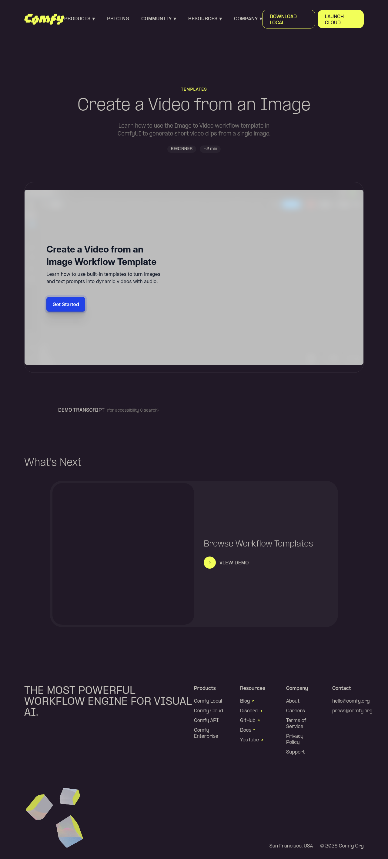
feat(website): add community-workflows demo page (#11942)
*PR Created by the Glary-Bot Agent* --- Adds a new interactive demo page at `comfy.org/demos/community-workflows` for the [Explore and Use a Community Workflow from the Hub](https://app.arcade.software/flows/mqZh17oWDuWIyhK0xwEV/view) Arcade walkthrough. Built on top of the demo infrastructure merged in #11436. ## Changes - `apps/website/src/config/demos.ts` — register the new demo - `apps/website/src/i18n/translations.ts` — add en + zh-CN strings (title, description, transcript) - `apps/website/public/images/demos/community-workflows-og.png` — 1200×630 OG image so email/social previews render correctly - `apps/website/public/images/demos/community-workflows-thumb.webp` — 1280×720 WebP thumbnail - `apps/website/e2e/demos.spec.ts` — refactored to iterate `demos` from config so every demo (current + future) is exercised in both en and zh-CN, and the iframe `src` is asserted to contain the correct Arcade ID Adding a new demo only requires editing `demos.ts` + `translations.ts` going forward; the e2e refactor is a one-time generalization that gives future demos coverage automatically. ## Verification - `pnpm typecheck:website`: 0 errors, 0 warnings, 0 hints - Pre-commit hook ran `pnpm typecheck`, `oxfmt`, `oxlint`, `eslint` — all clean on staged files - `npx astro build`: 53 pages built; `/demos/community-workflows/` and `/zh-CN/demos/community-workflows/` generated and present in `sitemap-0.xml` - Page rendered in Playwright preview: hero (title, GETTING STARTED, BEGINNER, ~2 min), Arcade embed loads, transcript section present, "What's Next" links to `image-to-video` - zh-CN page shows localized title (探索并使用社区工作流), description, badges, and "What's Next" heading - OG meta tag references the new 1200×630 PNG ## Screenshots 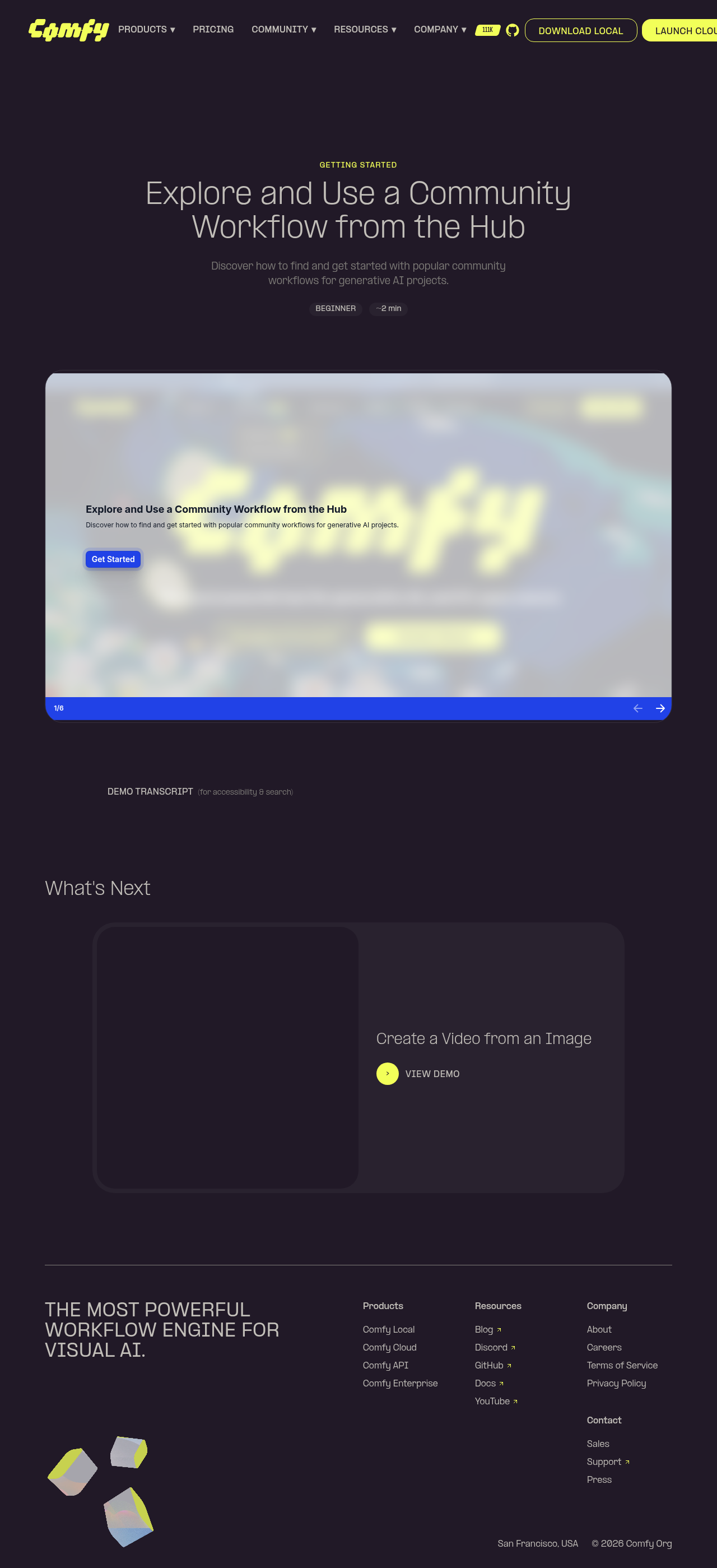 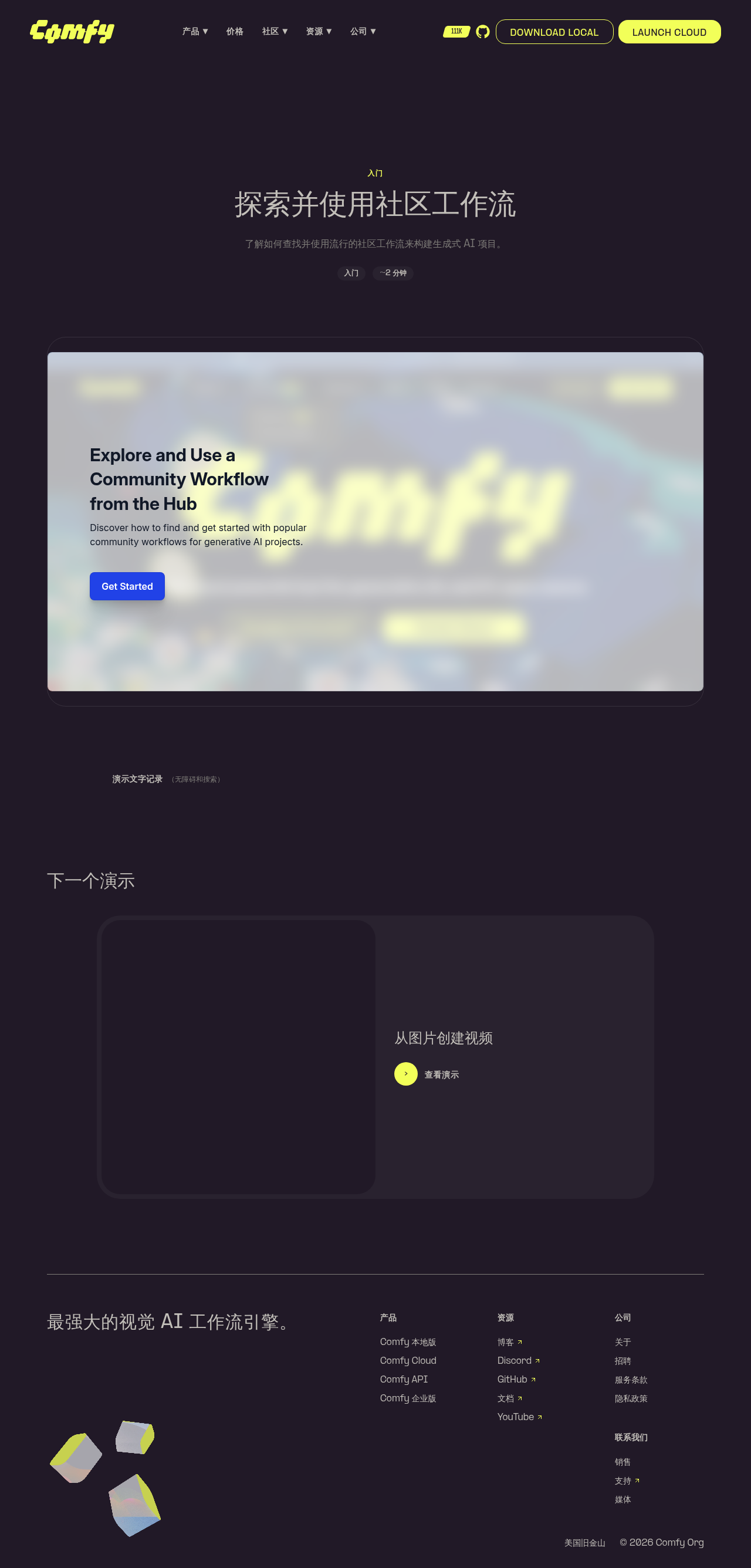 ┆Issue is synchronized with this [Notion page](https://www.notion.so/PR-11942-feat-website-add-community-workflows-demo-page-3576d73d36508139b647c774b1d39323) by [Unito](https://www.unito.io) --------- Co-authored-by: Glary-Bot <glary-bot@users.noreply.github.com> |
||
|
Yourz
|
d901c63a0b |
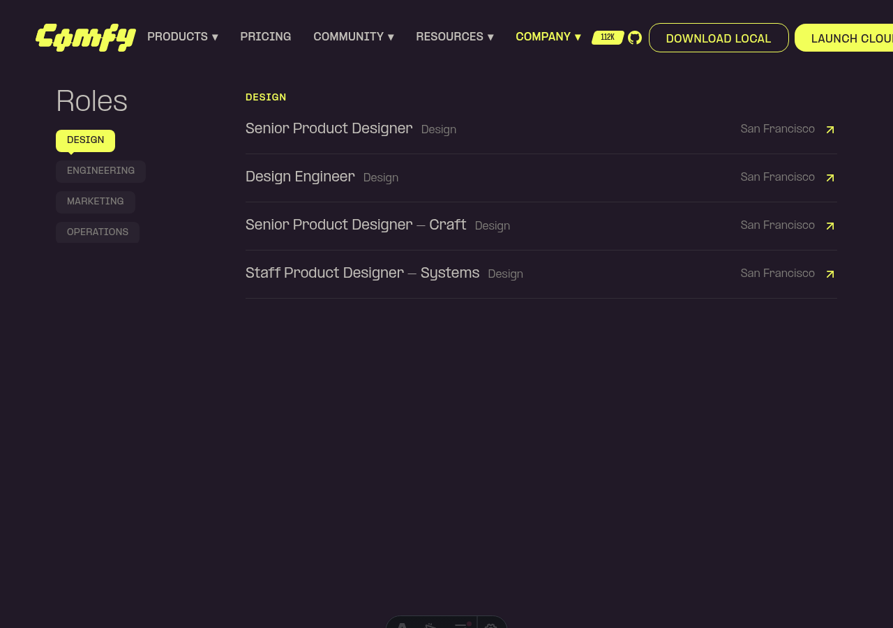
feat: convert careers CategoryNav to scroll-spy locator (#12110)
*PR Created by the Glary-Bot Agent*
---
Converts the `CategoryNav` in the careers `RolesSection` from a
click-to-filter button into a scroll-spy section locator, matching the
pattern already used by `ContentSection.vue` (customer story details,
TOS, privacy policy).
## Changes
- **`apps/website/src/components/careers/RolesSection.vue`**
- Replaced category-based filtering with anchor navigation: clicking a
department in the sidebar smooth-scrolls (via existing Lenis/GSAP
`scrollTo` helper) to that department's section with a `-144px` header
offset.
- Removed the `ALL` button — every department is always rendered as its
own scroll target with `id="careers-dept-{key}"`.
- Added `useIntersectionObserver` (rootMargin `-20% 0px -60% 0px`) that
updates the active nav item as the user scrolls. An `isScrolling` guard
prevents the observer from fighting click-jumps mid-animation.
- Added a viewport-entry fade/slide-up animation on each department
section, gated by `motion-safe:` so users with `prefers-reduced-motion`
see content immediately. The reveal state is sticky (one-way) so
sections don't disappear once revealed.
- Active state is driven by raw department keys; both the nav model and
the observer's id-to-key mapping use a single consistent identifier.
- **`apps/website/e2e/careers.spec.ts`**
- Replaced the obsolete "ENGINEERING filter narrows the list" test with
one that validates locator behavior: clicking the department button
scrolls the section into the viewport, sets `aria-pressed="true"`, and
keeps the full role list rendered.
## Verification
- `pnpm --filter @comfyorg/website typecheck` — clean.
- `pnpm exec oxfmt` / `pnpm exec eslint` / `pnpm exec oxlint` — clean.
- Pre-commit lint-staged hooks (stylelint, oxfmt, oxlint, eslint,
typecheck) — passing.
- Manual smoke test via Playwright on `astro dev`: careers page renders
all departments stacked vertically, active department in the sidebar
highlights based on viewport position (DESIGN active on initial scroll),
nav items reflect each department instead of including an `ALL` button.
## Screenshots
┆Issue is synchronized with this [Notion
page](https://www.notion.so/PR-12110-feat-convert-careers-CategoryNav-to-scroll-spy-locator-35b6d73d3650818a9226e5dcb1244756)
by [Unito](https://www.unito.io)
---------
Co-authored-by: Glary <glary@bot.local>
|
||
|
Yourz
|
6d5fa743b3 |
fix: seamless SocialProofBar marquee loop (#12139)
*PR Created by the Glary-Bot Agent* --- ## Summary The partner-logo marquee on the homepage `SocialProofBar` glitched on every loop restart — a visible jump where the strip snapped back to the start. ## Root cause The previous implementation rendered all logos as siblings of a single flex container and animated the track from `translateX(0)` to `translateX(-50%)`. Because the `gap` utility inserts spacing between every adjacent pair of items (including the seam between the two duplicated halves), `-50%` of the total width does not equal the distance from one half-start to the next half-start. The mismatch (`gap / 2`) is exactly what the eye sees as a jump. ## Fix - Wrap each duplicated half in its own flex group. - Place the two groups as siblings of an outer `flex w-max gap-X` track with a gap that matches the inner gap. - Animate each group by `translateX(calc(-100% - var(--marquee-gap)))`, where `--marquee-gap` is set inline to the same value as the Tailwind gap class. - Scope the `animation` declaration to `@media (prefers-reduced-motion: no-preference)` so reduced-motion users get a stable, non-animated client list instead of the global "snap to 0.01ms" jump. At `t = end`, the second group sits at `x = 0` — exactly where the first group started — so the next animation cycle is visually indistinguishable from the previous frame. The duplicate carries `aria-hidden="true"` so screen readers don't read the client list twice. ## Verification - `pnpm typecheck`, `pnpm format`, `npx eslint` on changed files: clean. - Geometry verified at runtime on desktop (1440×900) and mobile (390×844): copy widths match, second copy lands at `x = 0` at animation end. - New Playwright regression tests (`apps/website/e2e/responsive.spec.ts`) pause the CSS animation, sample bounding rects at `t=0` and `t≈duration`, and assert the seam invariant — covering desktop forward, mobile forward, and mobile reverse marquees. All 5 SocialProofBar tests pass on both `desktop` and `mobile` projects. - Reduced-motion behavior verified in the browser: `animationName: none`, `transform: none`, tracks at their natural positions. Fixes FE-649 ## Screenshots     ┆Issue is synchronized with this [Notion page](https://www.notion.so/PR-12139-fix-seamless-SocialProofBar-marquee-loop-35d6d73d36508141b6ccf0167016b8c8) by [Unito](https://www.unito.io) Co-authored-by: Glary-Bot <glary-bot@users.noreply.github.com> |
||
|
Yourz
|
d767a325a2 |
FE-604: fix(website): activate last section badge when scrolled to bottom (#12057)
*PR Created by the Glary-Bot Agent* --- ## Summary Fixes the bug where the last badge in `ContentSection`'s sticky sidebar nav stays unhighlighted when the user scrolls to the very bottom of the page on tall viewports (reported on a 14" MacBook M4 Pro at 3024×1964 / 2016×1310 logical, both Chrome and Safari). ## Root cause The scroll-spy uses an IntersectionObserver with `rootMargin: '-20% 0px -60% 0px'`, which makes only a 20%–40% horizontal band from the viewport top "active". When multiple intersecting entries are reported, the callback picks the one whose `boundingClientRect.top` is smallest (highest up on screen). On tall viewports, when the page is scrolled to the absolute bottom, the last *and* the second-to-last sections frequently both sit inside that 20%–40% band at the same time. The "smallest top" tiebreak then selects the second-to-last section, leaving the last badge inactive even though the user has reached the end of the page. ## Fix `apps/website/src/components/common/ContentSection.vue`: 1. Add `isAtBottom()` — true when the viewport bottom has reached the document bottom (within 4px to absorb sub-pixel rounding). 2. The IntersectionObserver callback bails out when `isAtBottom()` so it cannot overwrite the choice below. 3. A passive `scroll` listener (and a one-shot `onMounted` call) sets `activeSection` to the last section whenever the page is at the bottom — including when the component mounts already at the bottom (e.g. hash navigation to a trailing anchor, restored scroll position, or a page shorter than the viewport). 4. Both the scroll handler and the IO callback honor the existing `isScrolling` flag, so click-driven smooth scroll-to-section behavior is unchanged. ## Verification Reproduced the bug at viewport 2016×1310 (14" M4 Pro "More Space" mode) on `/privacy-policy`: - Before fix: at absolute bottom, IntersectionObserver picks `australian-privacy` (second-to-last) — bug confirmed via DOM inspection that showed multiple sections intersecting the active band, with the second-to-last winning the "smallest top" tiebreak. - After fix: - Scrolled to bottom → last badge `CONTACT` is active. - Scrolled to top → first badge `INTRO` is active. - Scrolled mid-page → correct mid-section is active. - Click on a badge → smooth scrolls and that badge becomes active. - Initial render at bottom (loaded `/privacy-policy#contact`, browser scrolls to the bottom on mount) → `CONTACT` active immediately. `pnpm typecheck` and `pnpm typecheck:website` pass; `pnpm lint` reports 0 errors; existing website unit tests pass. Note: The website app currently has no Vue component test setup (`vitest.config.ts` is configured for `node` env, no DOM). Adding component tests for this scroll-spy interaction would require setting up `happy-dom` and `@testing-library/vue` for the website app, which is out of scope for this bug fix. Fixes FE-604 ┆Issue is synchronized with this [Notion page](https://www.notion.so/PR-12057-FE-604-fix-website-activate-last-section-badge-when-scrolled-to-bottom-3596d73d365081faa243f4dd8e6ee54a) by [Unito](https://www.unito.io) --------- Co-authored-by: Glary-Bot <glary-bot@users.noreply.github.com> |
||
|
Yourz
|
fef2cab31e |
fix(website): prevent video glitch when c-projection.webp loads on /customers (#12060)
*PR Created by the Glary-Bot Agent* --- ## Summary Fix the video position glitch on `/customers` caused by `c-projection.webp` loading. ## Root cause In `HeroSection.vue` the hero `<img>` for `c-projection.webp` had no `width`/`height` attributes, so the browser reserved no space for it. When the image finished loading, the layout shifted ~192px, pushing the `VideoPlayer` below it. `useHeroAnimation` registers a GSAP `ScrollTrigger` parallax against the video in `onMounted` (before the image is loaded), so the cached scroll geometry then went stale and the video visibly glitched. ## Fix - Add explicit `width="1568"` / `height="1763"` to the `<img>` (the image's native size) so the browser reserves the correct aspect-ratio'd space upfront. - Add `h-auto` so the height attribute doesn't override the responsive layout. - Refresh `ScrollTrigger` on the image's `@load` (with `refresh(true)` so measurements happen after layout has settled) as a defensive measure for any sub-pixel adjustments. ## Test coverage Added `apps/website/e2e/customers.spec.ts` with a regression guard that: 1. Asserts the hero `<img>` declares numeric `width`/`height` attributes. 2. Asserts the unloaded image still reserves vertical space (>100px), which is the exact property that prevents the video from jumping when the image finishes loading. Verified the test fails when the `width`/`height` attributes are removed and passes with the fix applied. ## Verification - `pnpm typecheck` clean. - `pnpm test:unit` (website app) — 30/30 pass. - `pnpm test:e2e customers.spec.ts --project=desktop` — passes. - ESLint + oxfmt clean on changed files. - Manual Playwright verification confirmed the video bounding rect stays at `top=785, height=628` through the full image load lifecycle. Reverting the fix in DevTools and re-loading the image reproduces the original ~192px shift. ## Out of scope `apps/website/src/components/contact/FormSection.vue` uses the same `c-projection.webp` pattern (also without `width`/`height`). It runs `useHeroAnimation` with `parallax: false`, so the symptom is much smaller — leaving as a follow-up to keep this PR minimal. - Fixes [FE-607](https://linear.app/comfyorg/issue/FE-607/bug-video-on-customers-shifts-position-when-c-projectionwebp-finishes) ## Screenshots  ┆Issue is synchronized with this [Notion page](https://www.notion.so/PR-12060-fix-website-prevent-video-glitch-when-c-projection-webp-loads-on-customers-3596d73d365081ebbcb8db25aaa5c451) by [Unito](https://www.unito.io) --------- Co-authored-by: Glary-Bot <glary-bot@users.noreply.github.com> |
||
|
Yourz
|
2322a5a497 |
fix: use webm video for VFX use case right asset (#12040)
*PR Created by the Glary-Bot Agent* --- ## Summary Replaces `right1.webp` with `right1.webm` in the VFX panel of `UseCaseSection`. `BlobMedia` already auto-detects `.webm` URLs and mounts a `<video>` element (with the `.webp` as poster), so this single URL swap is the only change required — matching the pattern used by the other 4 use-case panels. ## Files changed - `apps/website/src/components/home/UseCaseSection.vue` — swap `right1.webp` → `right1.webm`. ## Verification - `pnpm exec nx run website:typecheck` — clean - `pnpm exec eslint` on changed file — clean - `pnpm exec oxfmt --check` — clean - pre-commit lint-staged hooks — passed ## Reviewer note (Oracle finding) VFX is the default active panel, so the homepage's initial right-rail asset moves from ~131 KB `.webp` to ~4.1 MB `.webm`. Behaviorally consistent with the other 4 panels (which already use `.webm`), but worth confirming whether `right1.webm` should be re-encoded smaller on the CDN before promoting this PR out of draft. ┆Issue is synchronized with this [Notion page](https://www.notion.so/PR-12040-fix-use-webm-video-for-VFX-use-case-right-asset-3596d73d365081829976f37b733840f1) by [Unito](https://www.unito.io) --------- Co-authored-by: Glary-Bot <glary-bot@users.noreply.github.com> Co-authored-by: Amp <amp@ampcode.com> |
||
|
Yourz
|
81d9df61f2 |
fix(website): tighten GitHub ticker spacing on wide screens (#12021)
*PR Created by the Glary-Bot Agent* --- ## Summary The GitHub star ticker reads as detached from the GitHub octocat icon on wider viewports. The CSS gap is constant (`gap-2` = 8px), but the 28px icon next to a 20px badge plus the fixed gap make the pair look like two separate items at `lg+` widths instead of a single coupled unit. ## Change `apps/website/src/components/common/GitHubStarBadge.vue`: - Inner gap `gap-2` → `gap-1` (8px → 4px) so the badge and icon sit closer together. - Icon `size-7` → `size-6 shrink-0` (28px → 24px) so the icon height is closer to the badge height (20px) and the pair reads as one unit. The outer `gap-2` between CTA items in `SiteNav.vue` is intentionally unchanged — it is the correct spacing between unrelated CTA elements. ## Verification - `pnpm typecheck` — 0 errors (1 pre-existing hint in unrelated file). - `pnpm format:check` — clean. - `pnpm exec eslint apps/website/src/components/common/GitHubStarBadge.vue` — clean. - `pnpm test:unit` (apps/website) — 30/30 pass. - Pre-commit hook (oxfmt + oxlint + eslint + typecheck + typecheck:website) — passed. - `/review` (Oracle) — 0 critical, 0 warnings, 0 suggestions. - Manual visual verification at 1280px, 1920px, and 2560px viewports. - Tested longer star strings (`999.9K`, `1.2M`) — no wrapping. ## Before / After (2560px viewport) Before: badge and octocat appear visually detached. After: badge and octocat read as a single tightly-coupled unit. ## Screenshots      ┆Issue is synchronized with this [Notion page](https://www.notion.so/PR-12021-fix-website-tighten-GitHub-ticker-spacing-on-wide-screens-3586d73d365081be8d66dfbb22b8dc2c) by [Unito](https://www.unito.io) --------- Co-authored-by: Glary-Bot <glary-bot@users.noreply.github.com> Co-authored-by: github-actions <github-actions@github.com> Co-authored-by: Alexander Brown <drjkl@comfy.org> |
||
|
Yourz
|
d3f802de10 |
feat(pricing): add concurrent API jobs feature to Creator and Pro tiers (#12000)
*PR Created by the Glary-Bot Agent* --- ## Summary Adds a new feature bullet to the Creator and Pro plans on the [cloud pricing page](https://comfy.org/cloud/pricing) to call out included API concurrency: - **Creator**: `3 concurrent API jobs` - **Pro**: `5 concurrent API jobs` Free and Standard tiers do not include API access, so they are not changed. This matches the language landing in the docs PR: [Comfy-Org/docs#965](https://github.com/Comfy-Org/docs/pull/965). ## Changes - `apps/website/src/components/pricing/PriceSection.vue`: added `feature2` to the Creator and Pro plan feature lists. - `apps/website/src/i18n/translations.ts`: added `pricing.plan.creator.feature2` and `pricing.plan.pro.feature2` for `en` and `zh-CN`. - Updated `pricing-tiers-{1-sm,2-md,3-lg,4-xl}` visual regression snapshots in `apps/website/e2e/visual-responsive.spec.ts-snapshots/` to match the new copy. ## Verification - `pnpm nx run @comfyorg/website:typecheck` — clean - ESLint and `oxfmt` clean on changed files (pre-commit lint-staged also passed) - `pnpm exec playwright test --project visual -g "pricing-tiers"` — 4/4 passing against the regenerated snapshots - Manually rendered `localhost:4321/cloud/pricing`; confirmed copy appears in both desktop and mobile layouts and that Free / Standard are unchanged. Screenshots below. ## Screenshots ### Desktop  ### Mobile — Creator  ### Mobile — Pro  ## Screenshots 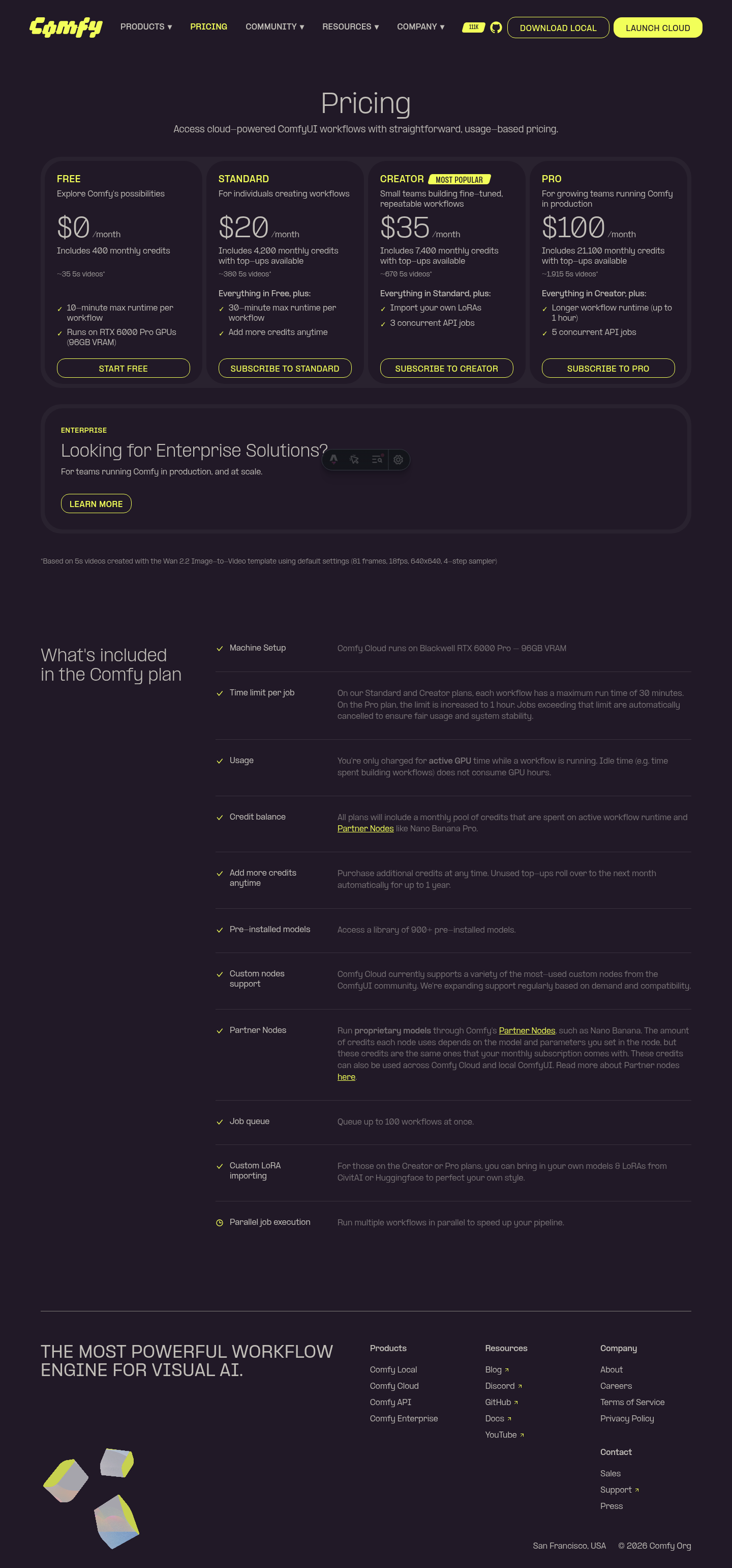  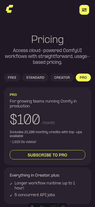 ┆Issue is synchronized with this [Notion page](https://www.notion.so/PR-12000-feat-pricing-add-concurrent-API-jobs-feature-to-Creator-and-Pro-tiers-3586d73d365081559acfc44eb5024c52) by [Unito](https://www.unito.io) --------- Co-authored-by: Glary-Bot <glary-bot@users.noreply.github.com> Co-authored-by: github-actions <github-actions@github.com> |
||
|
Yourz
|
6474faaa17 |
fix(website): prevent illustration cutoff in enterprise hero section (#11973)
*PR Created by the Glary-Bot Agent* --- ## Summary The illustration in the `HeroSection` of `/cloud/enterprise` was getting cut off at the top — the topmost ripple ring was clipped by the section's `overflow-y-clip`/`overflow-hidden`. **Root cause:** the SVG wrapper has `scale-150`, which makes the rendered illustration 50% larger than its layout box and overflows symmetrically (~25% above, ~25% below). The section only had `lg:pb-[min(8vw,10rem)]` — bottom padding — and on lg the wrapper had `lg:translate-y-[40px]` to nudge it down, but that wasn't enough room for the top to escape clipping. On mobile there was no padding at all, so the same issue occurred. **Fix:** add symmetric vertical padding (`pt-16` on mobile, `lg:pt-[min(8vw,10rem)]` mirroring the existing bottom value on lg) so the scaled illustration has room above and below. Removed the now-unnecessary `lg:translate-y-[40px]` since symmetric padding keeps the illustration vertically centered within the flex row. Verified at 375px (mobile), 1024px (lg), and 1440px (xl) viewports — all four ripple rings render fully without clipping at the top. ## Verification - `pnpm typecheck:website` ✅ - `pnpm exec oxfmt --check` on edited file ✅ - `pnpm exec oxlint` on edited file ✅ - `pnpm --filter @comfyorg/website build` ✅ - Pre-commit hooks (stylelint, oxfmt, oxlint, eslint, typecheck, typecheck:website) ✅ - Visual verification with Playwright at mobile / lg / xl ## Before vs After **Desktop (1440px) — before:** the topmost ripple ring is clipped at the top of the section. **Desktop (1440px) — after:** all four ripple rings are fully visible. **Mobile (375px) — before:** the top of the outermost ring is cut off by the section's top edge. **Mobile (375px) — after:** the full illustration (rings + blocks) is visible. ## Screenshots   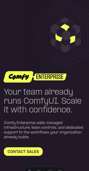  ┆Issue is synchronized with this [Notion page](https://www.notion.so/PR-11973-fix-website-prevent-illustration-cutoff-in-enterprise-hero-section-3576d73d3650813f9f04c3f93b9b42d6) by [Unito](https://www.unito.io) --------- Co-authored-by: Glary-Bot <glary-bot@users.noreply.github.com> Co-authored-by: Alexander Brown <drjkl@comfy.org> |
||
|
Christian Byrne
|
d1df5fadf8 |
fix(website): update payment-failed heading to "Unable to complete payment" (#11943)
*PR Created by the Glary-Bot Agent* --- ## Summary Reword the `payment.failed.title` copy on `comfy.org/payment/failed` from "Payment was not completed" to "Unable to complete payment" — a more active, distinguishing phrasing per design feedback. ## Changes - `apps/website/src/i18n/translations.ts` — update English (`Unable to complete payment`) and Chinese (`无法完成支付`) translations - `apps/website/e2e/payment.spec.ts` — update both English and zh-CN heading assertions to match ## Verification - `pnpm --filter website typecheck` — passes - `pnpm --filter website test:unit` — 30 tests passing - Pre-commit hooks (oxfmt, oxlint, eslint, typecheck, typecheck:website) — all pass - Manual visual verification with Playwright on `/payment/failed` and `/zh-CN/payment/failed` — both render the new heading correctly (screenshots attached) ## Screenshots 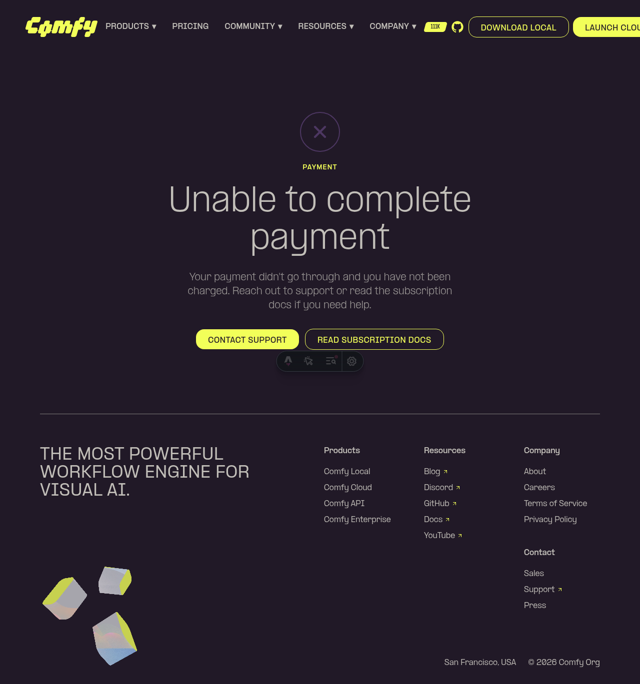 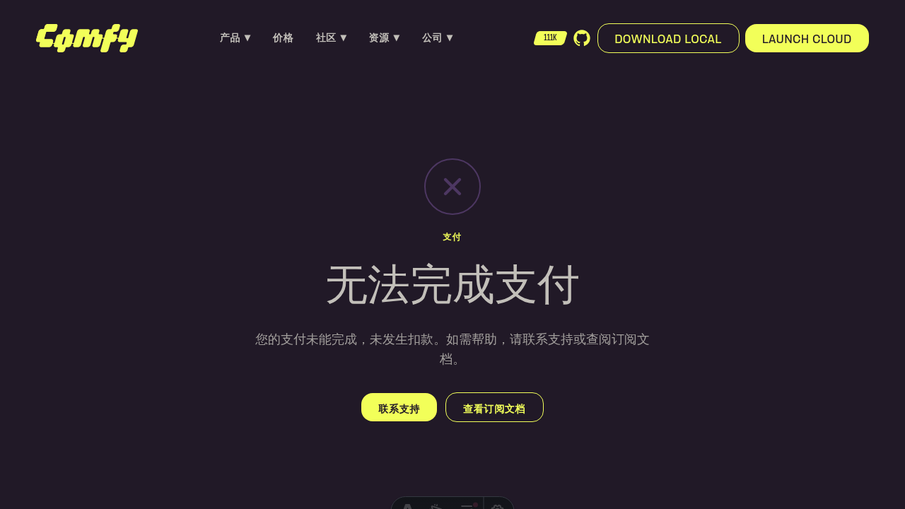 ┆Issue is synchronized with this [Notion page](https://www.notion.so/PR-11943-fix-website-update-payment-failed-heading-to-Unable-to-complete-payment-3576d73d3650817e85e2e7a3891cc307) by [Unito](https://www.unito.io) --------- Co-authored-by: Glary-Bot <glary-bot@users.noreply.github.com> |
||
|
Christian Byrne
|
aef71852f0 |
feat: add demo pages with Arcade embeds at /demos/{slug} (#11436)
*PR Created by the Glary-Bot Agent*
---
## Summary
Adds a demo pages system to the website that embeds Arcade interactive
walkthroughs at `comfy.org/demos/{slug}`. These pages will be linked
from welcome/lifecycle emails via Customer.io.
- Adds `/demos/image-to-video` and `/demos/workflow-templates` as the
first two demos
- Follows the existing `customers/[slug].astro` pattern exactly
(config-driven `getStaticPaths()`)
- Full SEO: OG/Twitter cards, HowTo + LearningResource + BreadcrumbList
JSON-LD schemas
- GEO: AI crawler directives in robots.txt, crawlable transcript
alongside iframe
- A11y: iframe title, sr-only transcript, aria-expanded toggle, noscript
fallback
- Email optimization: 1200x630 OG images, SSG pre-rendered, preconnect
to Arcade CDN
- Full zh-CN localization
- Library index stub at /demos for future expansion
- Automatic sitemap inclusion
## Architecture
Adding a new demo = adding one object to `src/config/demos.ts`.
## Note
OG images are tiny placeholders — replace with real 1200x630 screenshots
before go-live.
## Screenshots
┆Issue is synchronized with this [Notion
page](https://www.notion.so/PR-11436-feat-add-demo-pages-with-Arcade-embeds-at-demos-slug-3486d73d365081abbd72e02bf497a43a)
by [Unito](https://www.unito.io)
---------
Co-authored-by: Glary-Bot <glary-bot@users.noreply.github.com>
|
||
|
guill
|
f70285dcb2 |
fix(website): point Install via GitHub buttons to install docs anchor (#11852)
*PR Created by the Glary-Bot Agent* --- ## Summary Updates the "Install via GitHub" CTA buttons on the `/download` page to deep-link to the install instructions section of the ComfyUI README (`#installing`) instead of the repo root, so users land directly on setup steps. ## Changes - `apps/website/src/config/routes.ts`: add `externalLinks.githubInstall = 'https://github.com/Comfy-Org/ComfyUI#installing'` (separate from `externalLinks.github`, which is still used by the navbar/footer/star badge for the generic repo link). - `apps/website/src/components/product/local/HeroSection.vue`: switch the secondary CTA next to "Download Local" from `externalLinks.github` to `externalLinks.githubInstall`. - `apps/website/src/components/product/local/EcoSystemSection.vue`: same swap on the ecosystem-section CTA. The platform-aware `Download Local` button (Windows/macOS installers via `useDownloadUrl`) and the generic GitHub social/repo links elsewhere on the site are unchanged. ## Verification - `pnpm --filter @comfyorg/website typecheck` — 0 errors - `pnpm --filter @comfyorg/website test:unit` — 23/23 passing - `pnpm exec eslint` on changed files — clean - `pnpm exec oxfmt --check` — clean - Manual via `pnpm dev` + Playwright DOM assertion on `/download`: - Hero "INSTALL FROM GITHUB" → `https://github.com/Comfy-Org/ComfyUI#installing` ✓ - EcoSystem "INSTALL FROM GITHUB" → `https://github.com/Comfy-Org/ComfyUI#installing` ✓ - Other "GitHub" links (nav, footer, star badge) → unchanged at `https://github.com/Comfy-Org/ComfyUI` ✓ Per request from #website-and-docs: the local download surfaces should at least link to the ComfyUI install instructions on GitHub. Companion change to comfy-org/website#227. ## Screenshots  ┆Issue is synchronized with this [Notion page](https://www.notion.so/PR-11852-fix-website-point-Install-via-GitHub-buttons-to-install-docs-anchor-3546d73d365081fe8370cd675ae8f896) by [Unito](https://www.unito.io) --------- Co-authored-by: Glary-Bot <glary-bot@users.noreply.github.com> |
||
|
Christian Byrne
|
6762c08134 |
feat(website): add payment success and failed pages (#11855)
*PR Created by the Glary-Bot Agent* --- ## Summary Recreate the two payment status pages that were never migrated from Framer (they weren't in the sitemap, so were missed). The Stripe checkout flow in `comfy-api` redirects to `https://www.comfy.org/payment/{success,failed}` after a checkout session, so users currently hit a 404 on completion or cancel. ## Changes - **What**: New static Astro pages at `/payment/success`, `/payment/failed` and their `/zh-CN/` variants, sharing a `PaymentStatusSection.vue` component built from the existing `BrandButton` / `SectionLabel` primitives. Translation keys live in `src/i18n/translations.ts` for both locales. Pages are `noindex` and explicitly excluded from the generated sitemap. Adds a Playwright e2e spec covering both pages in both locales. - **Dependencies**: none ## Review Focus - **URL slug**: matches production Stripe config (`STRIPE_CANCEL_URL=…/payment/failed` in `comfy-api/run-service-{prod,staging}.yaml`), not `/payment/failure`. - **Primary CTA target**: links to `externalLinks.apiKeys` (`platform.comfy.org/profile/api-keys`) — the platform root is just a redirect, so this avoids a hop. - **Locale-aware secondary CTA**: derived from `getRoutes(locale)` so future i18n/route changes flow through the existing helper. - **Stale fallback** (out of scope): `comfy-api/gateways/stripe/stripe.go:159` has an unrelated stale fallback pointing at `/payments/` (plural) that's overridden by the env config in production. Worth fixing in a follow-up. ## Screenshots EN success / failed and zh-CN success / failed at desktop widths. Mobile viewport stacks the CTA buttons vertically (verified locally). ## Screenshots 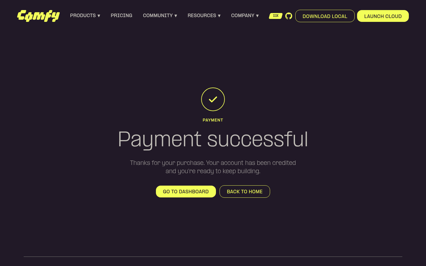 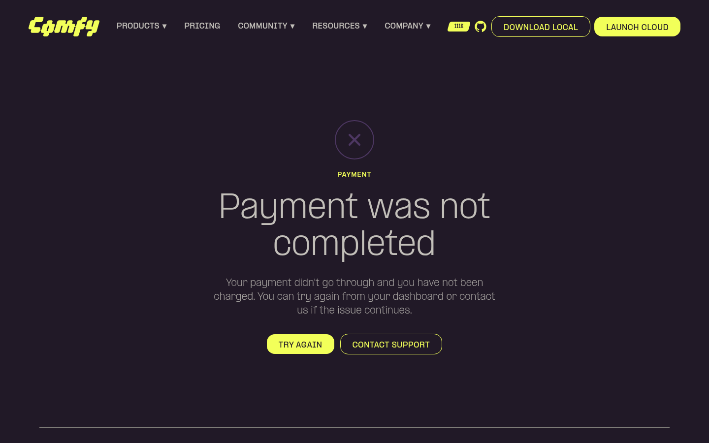 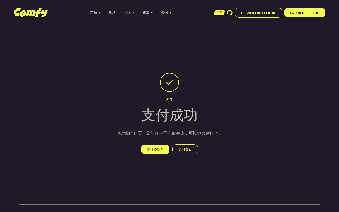 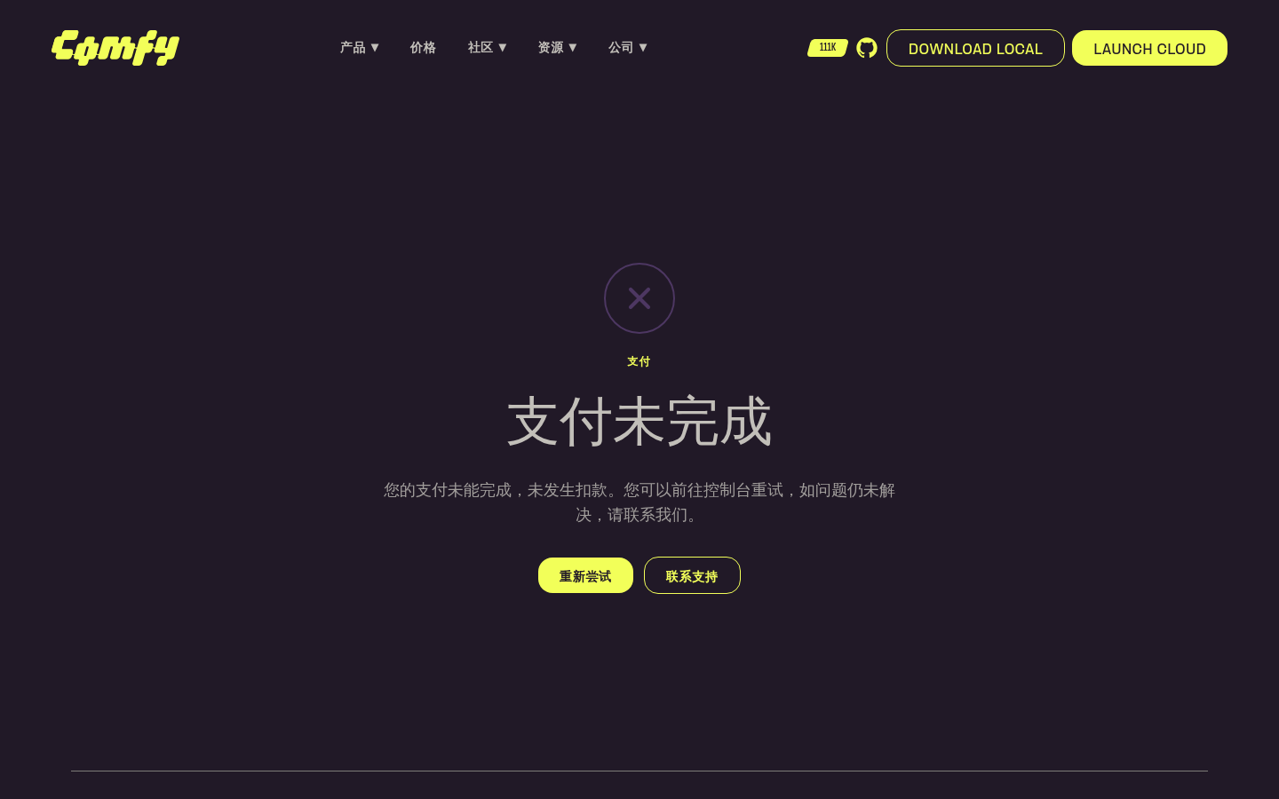 ┆Issue is synchronized with this [Notion page](https://www.notion.so/PR-11855-feat-website-add-payment-success-and-failed-pages-3556d73d3650819f8f45d8ecf27cb264) by [Unito](https://www.unito.io) --------- Co-authored-by: Glary-Bot <glary-bot@users.noreply.github.com> |
||
|
Christian Byrne
|
5523df1aea |
fix(website): unstretch See all case studies button (#11854)
*PR Created by the Glary-Bot Agent* --- ## Summary The "See all case studies" button on the homepage `CaseStudySpotlightSection` was rendering oddly stretched because it had `class="flex-1 text-center"` while being the sole child of a `flex-row` container — it expanded to fill the entire content column (~592px) instead of sizing to its label. This drops `flex-1`/`text-center` and adds `items-start` to the wrapper so the button sizes to its content and is left-aligned, matching the proportions of every other outline `BrandButton` on the site (Hero, UseCase, customer detail, etc.). ## Changes - `apps/website/src/components/home/CaseStudySpotlightSection.vue`: remove `flex-1 text-center` from the `BrandButton` and align the row's items to the start. `BrandButton` already centers its label internally via `inline-flex … justify-center`, so dropping `text-center` is a no-op visually. ## Before / After - Desktop before: button width = 592px (stretched across the column) - Desktop after: button width = 223px (natural) - Mobile: 1-column layout, now consistently left-aligned ## Review Focus Whether the fix should also live on the `BrandButton` component itself (e.g. a global `max-width`) instead of at the call site. I went with the instance-level fix because every other CTA in the website intentionally uses bare `BrandButton` and lets the content size it; only this one had `flex-1`. A blanket `max-width` would risk changing Hero/MobileMenu buttons that explicitly opt into `w-full lg:w-auto lg:min-w-60`. ## Screenshots 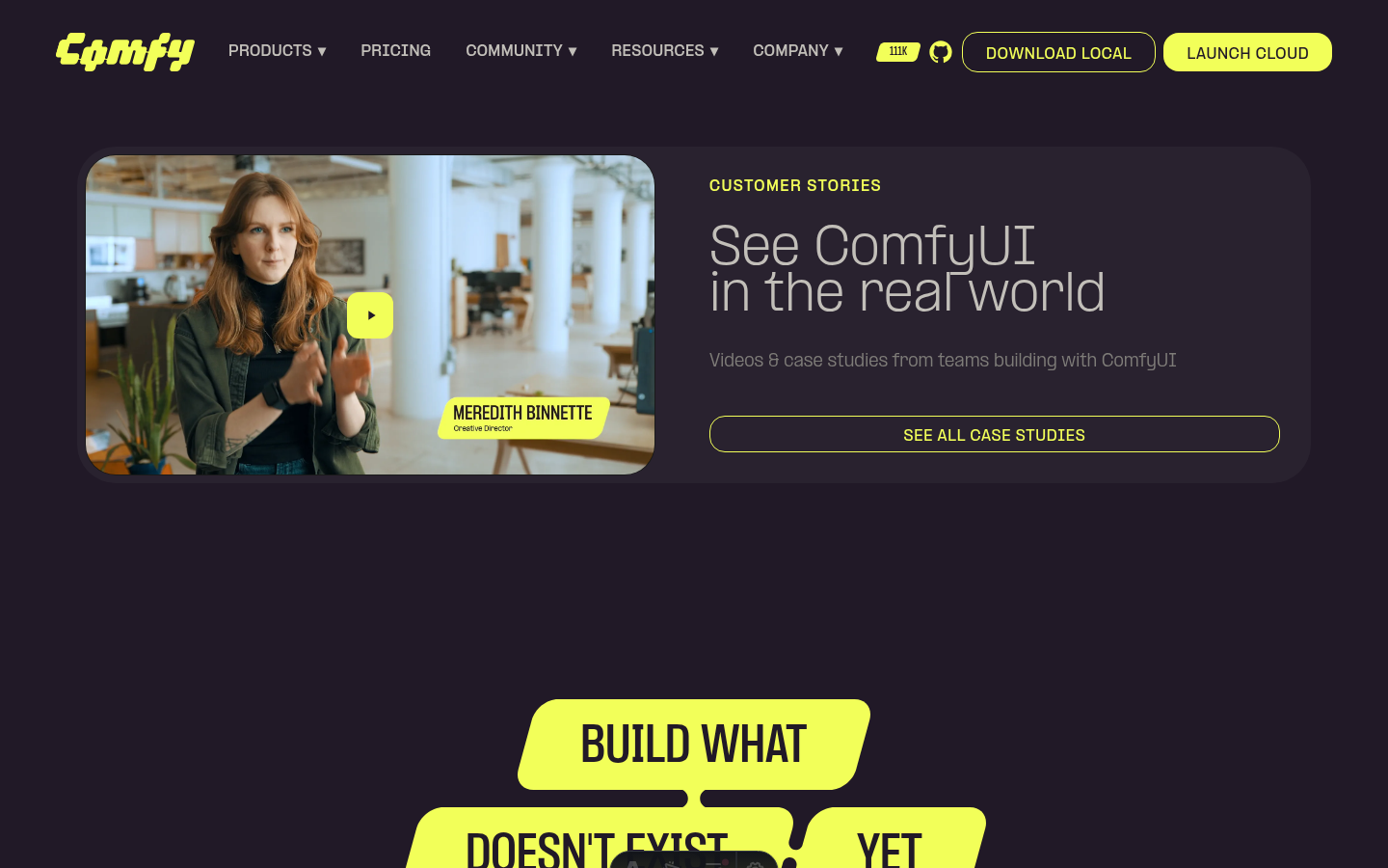 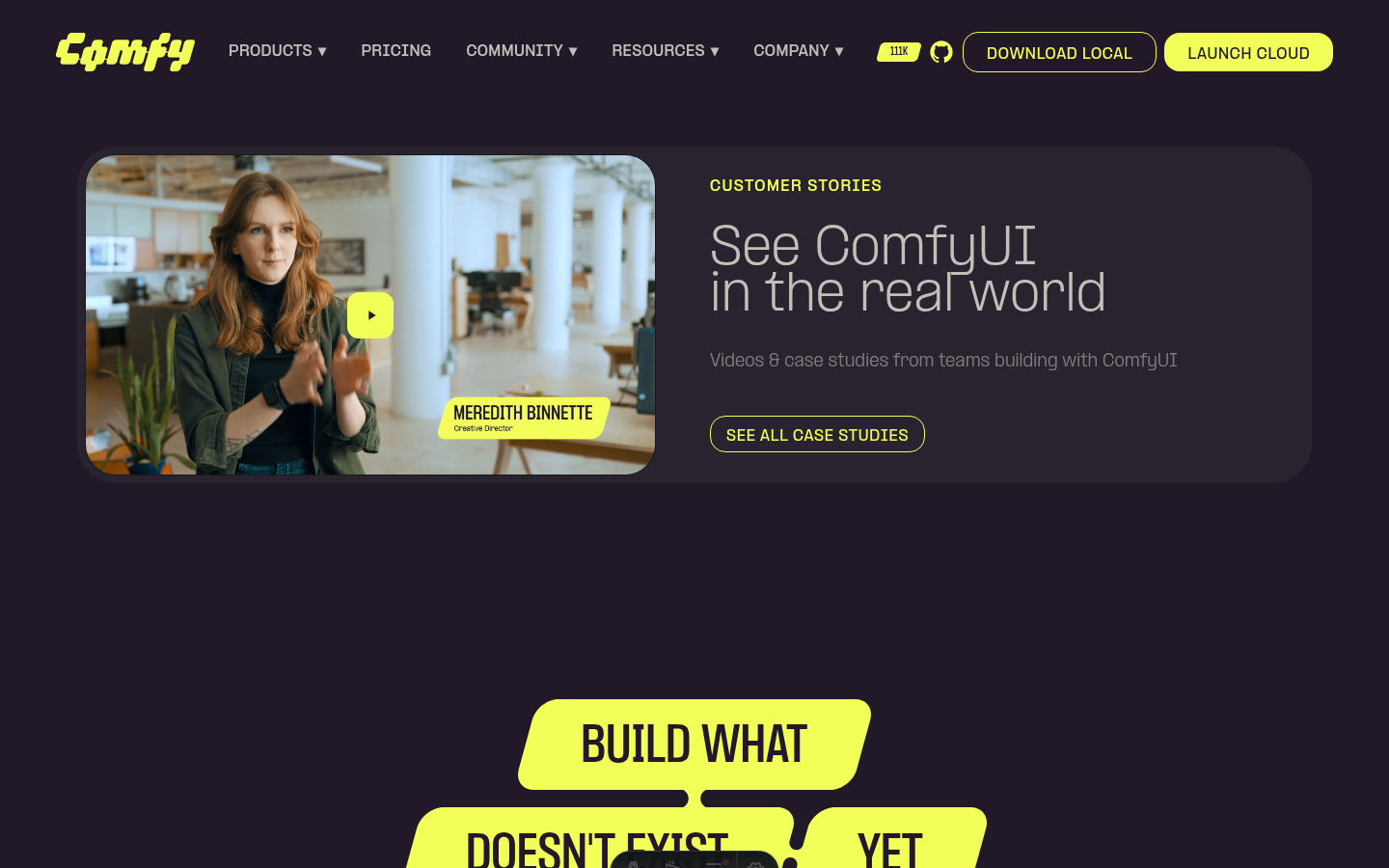 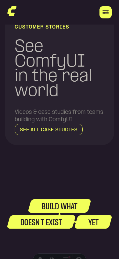 ┆Issue is synchronized with this [Notion page](https://www.notion.so/PR-11854-fix-website-unstretch-See-all-case-studies-button-3556d73d365081abb3bbe9dbc51cbc07) by [Unito](https://www.unito.io) --------- Co-authored-by: Glary-Bot <glary-bot@users.noreply.github.com> |
||
|
Alexander Brown
|
ef98ba0e8f |
feat: add plum/ink color primitives and standardize design tokens (#11139)
*PR Created by the Glary-Bot Agent* --- ## Summary Adds new `plum` and `ink` color scales for Comfy Hub branding and standardizes existing tokens to align with current Figma design system. ### Changes **Phase 1 — New primitives** (`_palette.css`) - Added `plum-300/400/500/600` and `ink-100` through `ink-900` **Phase 2 — Token cleanup** (`style.css`) - Removed deprecated `slate-100/200/300` primitives (cool blue-grey, removed from Figma) - Removed duplicate `graphite-400` (identical hex to slate-100) - Dark mode: migrated 6 slate/graphite references to muted-foreground, smoke-700, smoke-800, charcoal-200 - Light mode: replaced 3 `ash-500` references with `smoke-800` per designer alignment ### Token migration detail | Dark mode token | Old value | New value | Rationale | |---|---|---|---| | `--node-component-header-icon` | slate-300 (#5b5e7d) | muted-foreground (smoke-800) | Figma `node/foreground-secondary` | | `--node-component-slot-text` | slate-200 (#9fa2bd) | smoke-700 (#a0a0a0) | Lighter neutral for text contrast | | `--node-component-surface-highlight` | slate-100 (#9c9eab) | smoke-800 (#8a8a8a) | Neutral grey highlight | | `--node-component-tooltip-border` | slate-300 (#5b5e7d) | charcoal-200 (#494a50) | Consistent with dark border tokens | | `--text-secondary` | slate-100 (#9c9eab) | smoke-700 (#a0a0a0) | Adequate contrast on dark surfaces | | `--widget-background-highlighted` | graphite-400 (#9c9eab) | smoke-800 (#8a8a8a) | Removed duplicate, neutral replacement | ### Visual note These changes shift some dark mode colors from cool blue-grey to neutral grey. This is intentional per the design team. The `--node-component-surface-highlight` and `--node-component-tooltip-border` tokens should be QA'd as the designer noted. ### Not included (Phase 3) Hub Dark overlay theme will ship separately once the Hub UI work is ready to validate against. ## Screenshots   ┆Issue is synchronized with this [Notion page](https://www.notion.so/PR-11139-feat-add-plum-ink-color-primitives-and-standardize-design-tokens-33e6d73d365081418e13e0efe6161fb5) by [Unito](https://www.unito.io) --------- Co-authored-by: Glary-Bot <glary-bot@users.noreply.github.com> Co-authored-by: github-actions <github-actions@github.com> Co-authored-by: Amp <amp@ampcode.com> |
||
|
Benjamin Lu
|
17c18b0707 |
fix: embed HubSpot contact form (#11723)
## Summary Embed the HubSpot-hosted contact sales form on `/contact` and `/zh-CN/contact` so HubSpot owns submission handling, validation, anti-spam/security updates, tracking context, and form configuration. ## Changes - **What**: Replaces the custom local contact form stub with a HubSpot embed component using the HubSpot-hosted developer/raw HTML script and `hs-form-html` container. - **Localization**: Uses the existing English form ID by default and switches to the zh-CN form ID for `/zh-CN/contact`. - **Styling**: Applies HubSpot form CSS custom properties to match the Comfy contact page colors and `PP Formula` font more closely. - **Docs**: Updates the website README with the developer embed snippet and the zh-CN form ID. - **Dependencies**: None. ## Why Embedded Form - HubSpot docs say forms should be loaded with the HubSpot-hosted JavaScript file, and that security, anti-spam, accessibility, and performance improvements will not propagate if the embed runtime is copied or self-hosted: https://developers.hubspot.com/docs/cms/start-building/building-blocks/modules/forms - The direct form submission endpoint is documented under `v3 legacy`: https://developers.hubspot.com/docs/api-reference/legacy/marketing/forms/v3-legacy/submit-data-unauthenticated - HubSpot’s legacy API overview says numeric-versioned APIs are legacy and will be deprecated in a future release: https://developers.hubspot.com/docs/api-reference/legacy/overview ## Review Focus - Confirm the portal ID and form IDs are correct: - `en`: `94e05eab-1373-47f7-ab5e-d84f9e6aa262` - `zh-CN`: `6885750c-02ef-4aa2-ba0d-213be9cccf93` - Check visual fit on `/contact` and `/zh-CN/contact`, especially font, background, inputs, radio controls, and submit button. - Confirm the developer/raw HTML embed remains the preferred integration over a custom Forms API POST. ## Local Checks - `pnpm exec oxfmt --check apps/website/src/components/contact/HubspotFormEmbed.vue apps/website/README.md` - `pnpm exec eslint apps/website/src/components/contact/HubspotFormEmbed.vue` - `pnpm --filter @comfyorg/website typecheck` - `pnpm --filter @comfyorg/website test:unit` - `pnpm --filter @comfyorg/website build` - Commit hooks: stylelint, oxfmt, oxlint, eslint, `pnpm typecheck`, `pnpm typecheck:website` - Push hook: `pnpm knip --cache` Build completed with existing non-fatal environment warnings: Node `v25.8.1` vs requested `24.x`, unresolved website font paths deferred to runtime, `transformWithEsbuild` deprecation, and missing Ashby env falling back to the committed snapshot. Incredibly, during the taking of these screenshots, I discovered a bug in macos, where despite the snapshot/record bar not existing, from me esc'ing out, some of the tooltips persist. Closing and reopening the lid did not fix this. I didn't see the process in activity monitor. <img width="1512" height="862" alt="Screenshot 2026-04-29 at 7 09 55 PM" src="https://github.com/user-attachments/assets/92518795-6845-4b34-8da3-54048b440eb1" /> <img width="1512" height="862" alt="Screenshot 2026-04-29 at 7 13 18 PM" src="https://github.com/user-attachments/assets/f7609e58-898d-413c-975c-b02b70b84e73" /> ┆Issue is synchronized with this [Notion page](https://www.notion.so/PR-11723-fix-embed-HubSpot-contact-form-3506d73d365081528bfbe4b024c2a21f) by [Unito](https://www.unito.io) --------- Co-authored-by: github-actions <github-actions@github.com> |
||
|
Christian Byrne
|
5a8ded7959 |
Website: pull careers page listing from ashby API (#11590)
Careers --------- Co-authored-by: Glary-Bot <glary-bot@users.noreply.github.com> Co-authored-by: Alexander Brown <drjkl@comfy.org> |
||
|
Alexander Brown
|
0b2e605dee |
content: website copy and pricing updates (#11567)
## Summary

Update website copy: fix branding ("Comfy" → "ComfyUI"), correct pricing
runtime, remove "coming soon" seat features, and shorten use-case label.

## Changes

- **What**: Copy corrections in `translations.ts` (branding, runtime "60
min" → "30 min" for Standard plan, remove placeholder seat features for
Creator/Pro plans); trim feature arrays in `PriceSection.vue`

## Review Focus

Verify zh-CN translations still make sense after the English copy
changes (runtime string not updated in zh-CN).

┆Issue is synchronized with this [Notion
page](https://www.notion.so/PR-11567-content-website-copy-and-pricing-updates-34b6d73d365081c29af8ee1469b08358)
by [Unito](https://www.unito.io)

---------

Co-authored-by: Amp <amp@ampcode.com>
Co-authored-by: github-actions <github-actions@github.com>
|
||
|
Alexander Brown
|
68798d8e37 |
feat(website): website mise en place (#11552)
## Summary Assorted website copy and content refinements — tidying up loose ends across the site. ## Changes - **What**: Remove placeholder doc links from custom nodes feature description on pricing page ## Review Focus Low-risk copy changes only; no logic or layout modifications. ┆Issue is synchronized with this [Notion page](https://www.notion.so/PR-11552-feat-website-website-mise-en-place-34b6d73d3650813b954afbc965e4dc74) by [Unito](https://www.unito.io) > **Note:** The `PR: Vercel Website Preview` workflow is `workflow_run`-triggered, so it always runs the **main branch version** of the workflow file. Until this PR is merged, the preview workflow will continue posting standalone comments using the old `<!-- VERCEL_WEBSITE_PREVIEW -->` marker instead of writing to the consolidated `<!-- WEBSITE_CI_REPORT -->` comment. This is expected and resolves itself on merge. --------- Co-authored-by: Amp <amp@ampcode.com> Co-authored-by: github-actions <github-actions@github.com> Co-authored-by: Yourz <crazilou@vip.qq.com> |
||
|
Yourz
|
bbb043c9cc |
feat(website): Polish and fix UI (#11363)
## Summary <!-- One sentence describing what changed and why. --> Polish and fix UI for new website ## Changes - **What**: <!-- Core functionality added/modified --> - [x] update about video - [x] update Moment factory story content - [x] update homepage visual - [x] update customer story visual - [x] put images and videos to bucket ## Review Focus <!-- Critical design decisions or edge cases that need attention --> <!-- If this PR fixes an issue, uncomment and update the line below --> <!-- Fixes #ISSUE_NUMBER --> ## Screenshots (if applicable) <!-- Add screenshots or video recording to help explain your changes --> ┆Issue is synchronized with this [Notion page](https://www.notion.so/PR-11363-feat-website-Polish-and-fix-UI-3466d73d365081f895aff84b594450c9) by [Unito](https://www.unito.io) --------- Co-authored-by: DrJKL <DrJKL0424@gmail.com> Co-authored-by: Amp <amp@ampcode.com> Co-authored-by: GitHub Action <action@github.com> Co-authored-by: Alexander Brown <drjkl@comfy.org> Co-authored-by: github-actions <github-actions@github.com> |
||
|
Yourz
|
39dc8d896b |
feat(website): unified preview — cloud page, API & enterprise pages, use case images (#11273)
## Summary Unified preview branch combining three feature PRs for the website product pages. > **Constituent PRs:** #11247, #11270, #11266 ## Changes - **Cloud page** (#11247): Add Cloud product page sections (Hero, Reason, FAQ, AI Models, Audience, Pricing, ProductCards). Extract `FAQSection` to `common/` and `ReasonSection` to `product/shared/` for reuse across product pages. Add cloud-related i18n translations. - **API & Enterprise pages** (#11270): Add API page (Hero, Steps, Automation, Reason) and Enterprise page (Hero, Team, DataOwnership, BYOKey, Orchestration, Reason). Add shared `CardGridSection`, `FeatureShowcaseSection`, `CloudBannerSection`. Add all API/enterprise i18n translations. - **Use case images** (#11266): Replace placeholder divs with real images in `UseCaseSection`. Add SVG blob clip-paths (`objectBoundingBox`) and crossfade transitions on category switch. Use `useId()` for unique clip-path IDs. ## Review Focus - Shared component API design (`ReasonSection` slot/prop surface) - Component placement: `common/` vs `product/shared/` - Clip-path coordinate accuracy and crossfade transition smoothness --------- Co-authored-by: Amp <amp@ampcode.com> Co-authored-by: GitHub Action <action@github.com> Co-authored-by: DrJKL <DrJKL0424@gmail.com> Co-authored-by: Alexander Brown <drjkl@comfy.org> Co-authored-by: pythongosssss <125205205+pythongosssss@users.noreply.github.com> Co-authored-by: AustinMroz <austin@comfy.org> |
||
|
Yourz
|
121ceda66d |
feat: implement website layout and homepage (#11168)
## Summary Implement the website layout system and homepage with all sections, reusable components, scroll-driven animations, and routing. ## Changes - **What**: - Reorganize components into `common/`, `home/`, `company/`, `product/` directories - Add `BaseLayout` with shared `SiteNav` and `SiteFooter` - Implement homepage sections: Hero, SocialProofBar, ProductShowcase, UseCase, GetStarted, ProductCards, CaseStudySpotlight, BuildWhat - Add reusable components: BrandButton, NodeBadge, ProductCard, FooterLinkColumn, NavDesktopLink, MobileMenu - Add PPFormula font family, client logos, and icon assets - Add hero/footer logo frame sequences for scroll-driven animations - Add `useFrameScrub` composable and `smoothScroll` (Lenis + GSAP ScrollTrigger) - Add route config, nav config, and placeholder pages for all routes - Add Playwright e2e tests for homepage and navigation - **Dependencies**: gsap, lenis, @astrojs/check desktop  mobile  ## Review Focus - Component structure and naming conventions under `apps/website/` - Scroll-driven animation approach (GSAP ScrollTrigger + Lenis smooth scroll) - Mobile responsive behavior (MobileMenu, ScrollTrigger matchMedia) --------- Co-authored-by: GitHub Action <action@github.com> Co-authored-by: DrJKL <DrJKL0424@gmail.com> Co-authored-by: Amp <amp@ampcode.com> Co-authored-by: Alexander Brown <drjkl@comfy.org> |