mirror of
https://github.com/Comfy-Org/ComfyUI_frontend.git
synced 2026-04-27 01:39:47 +00:00
 4ba85dd3ef
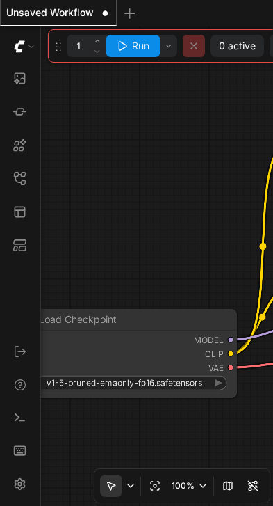
## Summary

Fix the bottom-right graph canvas toolbar (zoom controls, fit-to-view,
minimap toggle) not being visible on mobile devices in normal graph
mode.

## Problem

PrimeVue applies `overflow: hidden` to all `.p-splitterpanel` elements
by default. The `GraphCanvasMenu` component is absolutely positioned
(`right-0 bottom-0`) inside the `graph-canvas-panel` SplitterPanel. On
mobile viewports, the panel's bounding box can be smaller than the full
canvas area, causing the toolbar to be clipped by the `overflow:
hidden`.

## Solution

Add `overflow-visible` to the `graph-canvas-panel` SplitterPanel class
to override PrimeVue's default `overflow: hidden`. This allows the
absolutely-positioned toolbar (and minimap) to remain visible regardless
of viewport size.

<img width="873" height="1056" alt="image"
src="https://github.com/user-attachments/assets/7239a5ce-8ce8-4e1d-a8ff-6d6d3c61f5da"
/>


┆Issue is synchronized with this [Notion
page](https://www.notion.so/PR-10168-fix-make-graph-canvas-toolbar-visible-on-mobile-3266d73d36508130b675e839cb748fd5)
by [Unito](https://www.unito.io)
32 KiB
393x727px
32 KiB
393x727px