mirror of
https://github.com/Comfy-Org/ComfyUI_frontend.git
synced 2026-05-23 06:10:32 +00:00
 9fe19a2afb
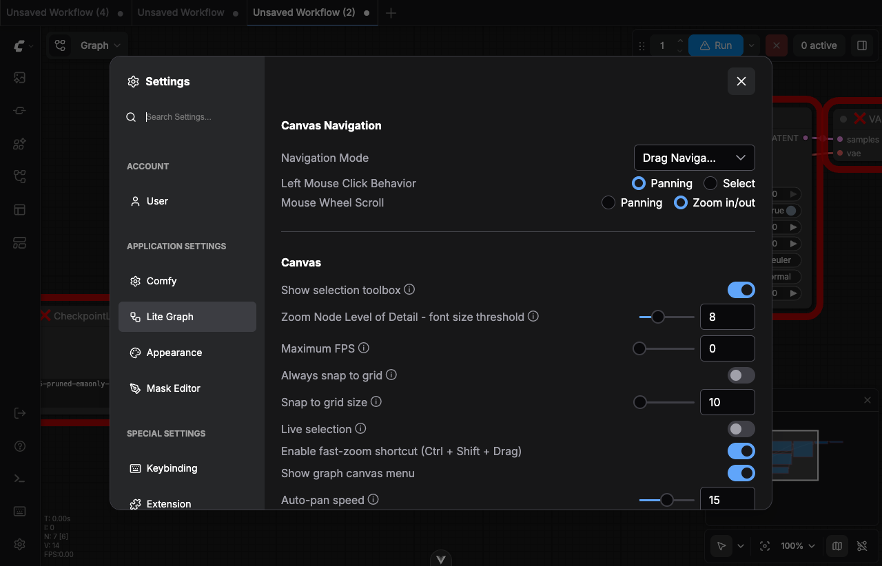
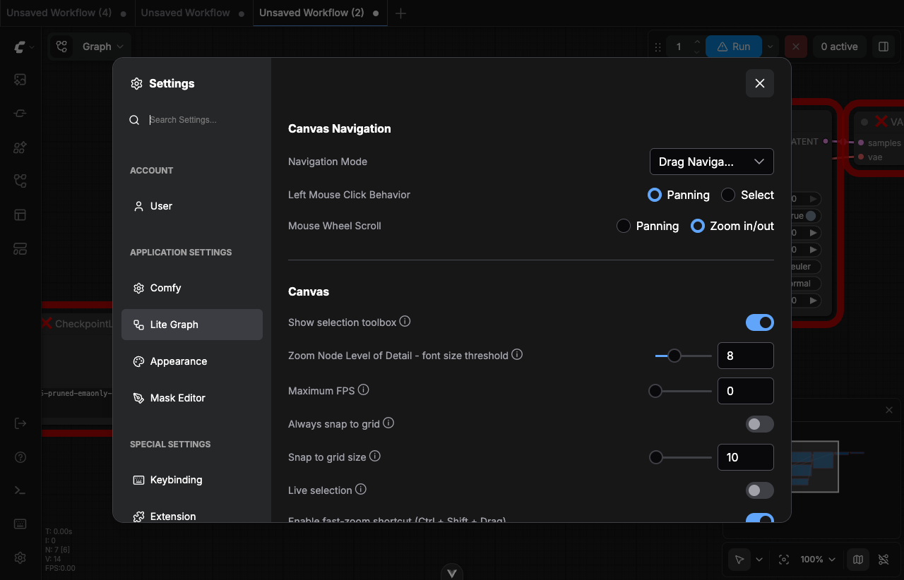
## Summary

Body text in the settings dialog was still rendering at the inherited
16px (browser default) instead of the 14px design spec, and rows with
different control types (toggle, slider, dropdown, radio) collapsed to
different heights — making the list look uneven and cramped.

## Changes

- **What**: `FormItem` label now uses `text-sm` (14px) and the row
enforces `min-h-8` (32px) so toggle/slider/dropdown/radio rows align.
`SettingGroup` bumps inter-item margin from `mb-2` to `mb-3` for
breathing room between settings.

## Review Focus

`FormItem` is also used by `ServerConfigPanel`, so the 14px/32px row
also applies there — consistent with the same settings-dialog visual
language, but worth a glance.

Fixes #FE-525

## Screenshots

Lite Graph panel (1280×900 viewport) showing
toggle/slider/dropdown/radio rows side-by-side:

| Before (`origin/main`) | After (this PR) |
| --- | --- |
| <img
src="https://raw.githubusercontent.com/Comfy-Org/ComfyUI_frontend/pr-12180-screenshots/before-litegraph.png"
width="480"> | <img
src="https://raw.githubusercontent.com/Comfy-Org/ComfyUI_frontend/pr-12180-screenshots/after-litegraph.png"
width="480"> |

Before: label text inherits 16px from `<body>`; toggle-only rows (e.g.
"Always snap to grid", "Live selection") shrink to ~24px while
dropdown/slider rows stay ~32px, so the list looks uneven and cramped.
After: labels are 14px; every row is at least 32px tall so
toggles/sliders/dropdowns/radios line up; `mb-3` adds 4px of breathing
room between rows.

## References

- Linear:
https://linear.app/comfyorg/issue/FE-525/verify-settings-text-size-and-item-heights
- Figma:
https://www.figma.com/design/vALUV83vIdBzEsTJAhQgXq/Comfy-Design-System?node-id=6290-75412
- Origin thread:
https://comfy-organization.slack.com/archives/C075ANWQ8KS/p1777657610484679?thread_ts=1776808927.654249

---------

Co-authored-by: github-actions <github-actions@github.com>
Co-authored-by: Benjamin Lu <benjaminlu1107@gmail.com>
135 lines
3.7 KiB
Vue
135 lines
3.7 KiB
Vue
<!-- A generalized form item for rendering in a form. -->
|
|
<template>
|
|
<div class="flex min-h-8 flex-row items-center gap-2">
|
|
<div class="form-label flex grow items-center">
|
|
<span
|
|
:id="`${props.id}-label`"
|
|
class="text-sm text-muted"
|
|
:class="props.labelClass"
|
|
>
|
|
<slot name="name-prefix" />
|
|
{{ props.item.name }}
|
|
<i
|
|
v-if="props.item.tooltip"
|
|
v-tooltip="props.item.tooltip"
|
|
class="pi pi-info-circle bg-transparent"
|
|
/>
|
|
<slot name="name-suffix" />
|
|
</span>
|
|
</div>
|
|
<div class="form-input flex justify-end">
|
|
<component
|
|
:is="markRaw(getFormComponent(props.item))"
|
|
:id="props.id"
|
|
v-model:model-value="formValue"
|
|
:aria-labelledby="`${props.id}-label`"
|
|
v-bind="getFormAttrs(props.item)"
|
|
/>
|
|
</div>
|
|
</div>
|
|
</template>
|
|
|
|
<script setup lang="ts">
|
|
import InputNumber from 'primevue/inputnumber'
|
|
import InputText from 'primevue/inputtext'
|
|
import Select from 'primevue/select'
|
|
import ToggleSwitch from 'primevue/toggleswitch'
|
|
import { markRaw } from 'vue'
|
|
import type { Component } from 'vue'
|
|
|
|
import BackgroundImageUpload from '@/components/common/BackgroundImageUpload.vue'
|
|
import CustomFormValue from '@/components/common/CustomFormValue.vue'
|
|
import FormColorPicker from '@/components/common/FormColorPicker.vue'
|
|
import FormImageUpload from '@/components/common/FormImageUpload.vue'
|
|
import FormRadioGroup from '@/components/common/FormRadioGroup.vue'
|
|
import InputKnob from '@/components/common/InputKnob.vue'
|
|
import InputSlider from '@/components/common/InputSlider.vue'
|
|
import UrlInput from '@/components/common/UrlInput.vue'
|
|
import type { FormItem } from '@/platform/settings/types'
|
|
|
|
const formValue = defineModel<unknown>('formValue')
|
|
const props = defineProps<{
|
|
item: FormItem
|
|
id?: string
|
|
labelClass?: string | Record<string, boolean>
|
|
}>()
|
|
|
|
function getFormAttrs(item: FormItem) {
|
|
const attrs = { ...(item.attrs || {}) }
|
|
const inputType = item.type
|
|
if (typeof inputType === 'function') {
|
|
attrs['renderFunction'] = () =>
|
|
inputType(
|
|
props.item.name,
|
|
(v: unknown) => (formValue.value = v),
|
|
formValue.value,
|
|
item.attrs
|
|
)
|
|
}
|
|
switch (item.type) {
|
|
case 'combo':
|
|
case 'radio':
|
|
attrs['options'] =
|
|
typeof item.options === 'function'
|
|
? // @ts-expect-error: Audit and deprecate usage of legacy options type:
|
|
// (value) => [string | {text: string, value: string}]
|
|
item.options(formValue.value)
|
|
: item.options
|
|
|
|
if (typeof item.options?.[0] !== 'string') {
|
|
attrs['optionLabel'] = 'text'
|
|
attrs['optionValue'] = 'value'
|
|
}
|
|
break
|
|
}
|
|
return attrs
|
|
}
|
|
|
|
function getFormComponent(item: FormItem): Component {
|
|
if (typeof item.type === 'function') {
|
|
return CustomFormValue
|
|
}
|
|
switch (item.type) {
|
|
case 'boolean':
|
|
return ToggleSwitch
|
|
case 'number':
|
|
return InputNumber
|
|
case 'slider':
|
|
return InputSlider
|
|
case 'knob':
|
|
return InputKnob
|
|
case 'combo':
|
|
return Select
|
|
case 'radio':
|
|
return FormRadioGroup
|
|
case 'image':
|
|
return FormImageUpload
|
|
case 'color':
|
|
return FormColorPicker
|
|
case 'url':
|
|
return UrlInput
|
|
case 'backgroundImage':
|
|
return BackgroundImageUpload
|
|
default:
|
|
return InputText
|
|
}
|
|
}
|
|
</script>
|
|
|
|
<style scoped>
|
|
.form-input :deep(.input-slider) .p-inputnumber input,
|
|
.form-input :deep(.input-slider) .slider-part {
|
|
width: 5rem;
|
|
}
|
|
|
|
.form-input :deep(.input-knob) .p-inputnumber input,
|
|
.form-input :deep(.input-knob) .knob-part {
|
|
width: 8rem;
|
|
}
|
|
|
|
.form-input :deep(.p-inputtext),
|
|
.form-input :deep(.p-select) {
|
|
width: 11rem;
|
|
}
|
|
</style>
|