mirror of
https://github.com/Comfy-Org/ComfyUI_frontend.git
synced 2026-07-12 02:08:25 +00:00
 d855466fdf
*PR Created by the Glary-Bot Agent*
---
## Summary
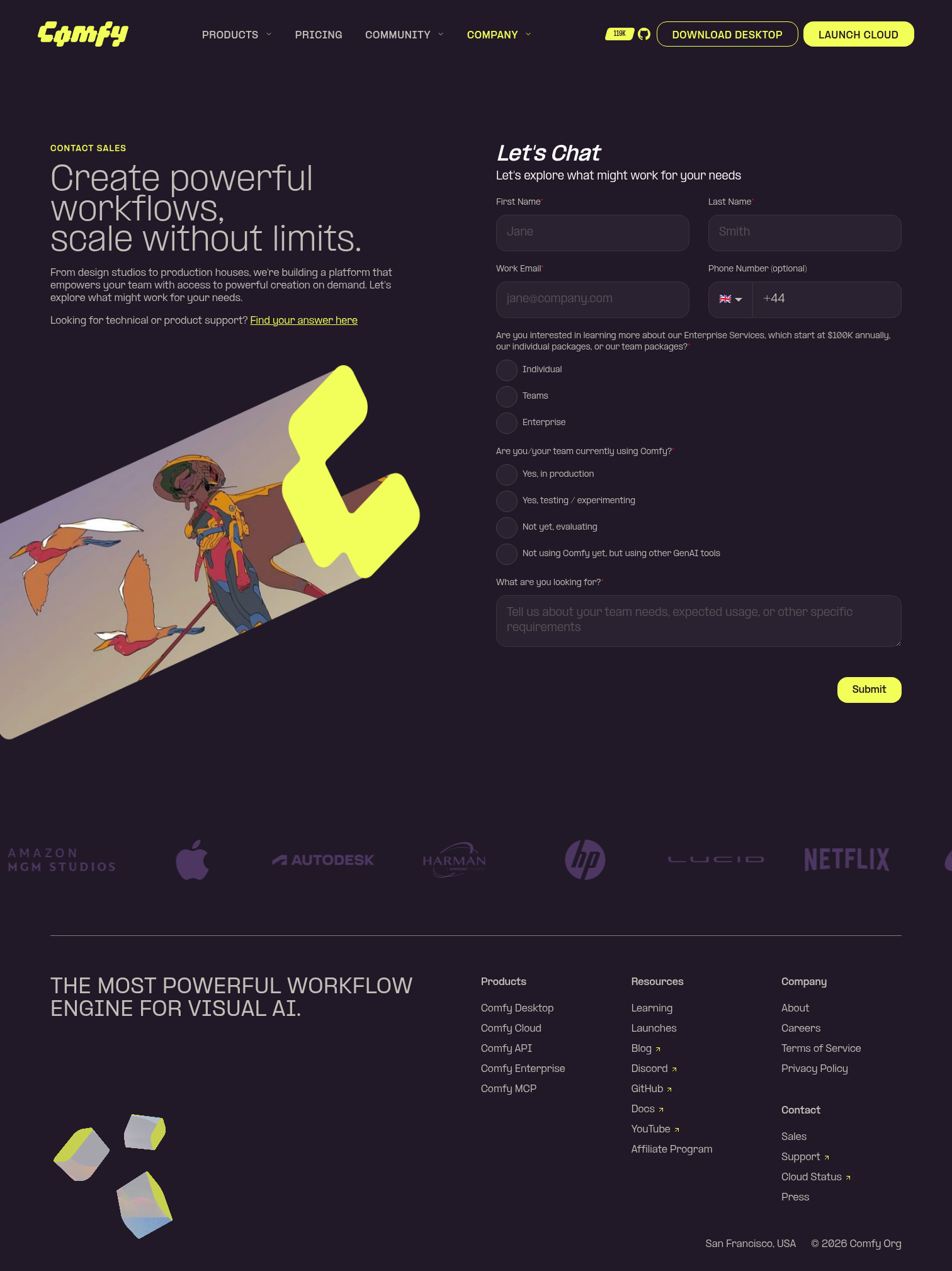
On `comfy.org/contact` the intro copy ("Create powerful workflows, scale
without limits." + description) ran right up against the HubSpot form
fields on desktop. The two `lg:w-1/2` columns had no gap between them
and the left column had no max-width, so long description text extended
almost to the form's edge.
- Add `lg:gap-16` between the two columns in `FormSection.vue`, matching
the pattern already used by `common/ContentSection.vue` and
`legal/LegalContentSection.vue`.
- Wrap the intro text block (badge + heading + description) in an
`lg:max-w-xl` container so the copy no longer stretches into the gap.
The illustration below keeps its full-column bleed via the existing
`lg:-ml-20`.
- Mobile (`<lg`) layout is unchanged — all new classes are
`lg:`-prefixed.
## Verification
Screenshots taken via Playwright against the local `apps/website` dev
server:
- Desktop (1512×900) — intro text now caps at a comfortable line length
with a clear gap to the form.
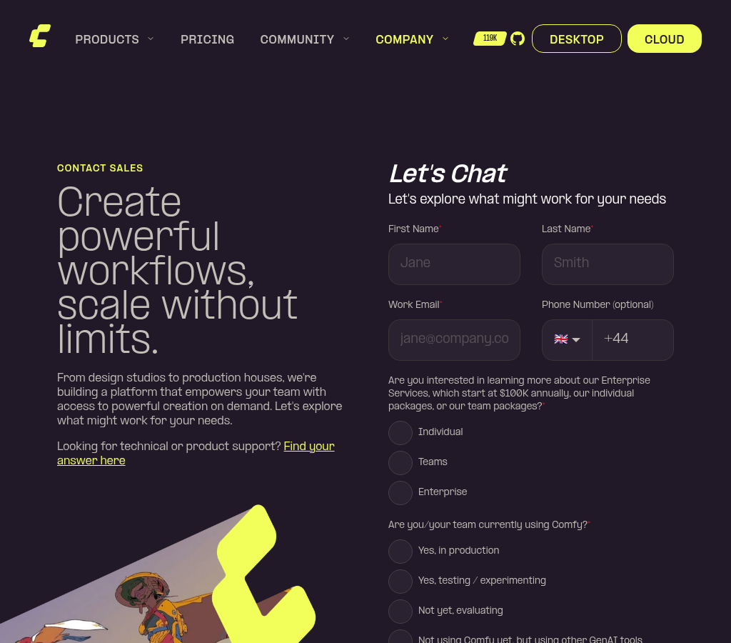
- 1024px — still works at the `lg:` breakpoint.
- 375px mobile — visually identical to before.
Also ran `pnpm format` and `pnpm --filter @comfyorg/website typecheck`
(0 errors). Three pre-existing
`better-tailwindcss/enforce-consistent-class-order` lint warnings on
this file exist on `main` and were left untouched.
- Fixes contact-page layout complaint from #website-and-docs (July 2)
## Screenshots

Co-authored-by: Glary-Bot <glary-bot@users.noreply.github.com>


