mirror of
https://github.com/Comfy-Org/ComfyUI_frontend.git
synced 2026-05-24 06:35:10 +00:00
 5523df1aea
*PR Created by the Glary-Bot Agent* --- ## Summary The "See all case studies" button on the homepage `CaseStudySpotlightSection` was rendering oddly stretched because it had `class="flex-1 text-center"` while being the sole child of a `flex-row` container — it expanded to fill the entire content column (~592px) instead of sizing to its label. This drops `flex-1`/`text-center` and adds `items-start` to the wrapper so the button sizes to its content and is left-aligned, matching the proportions of every other outline `BrandButton` on the site (Hero, UseCase, customer detail, etc.). ## Changes - `apps/website/src/components/home/CaseStudySpotlightSection.vue`: remove `flex-1 text-center` from the `BrandButton` and align the row's items to the start. `BrandButton` already centers its label internally via `inline-flex … justify-center`, so dropping `text-center` is a no-op visually. ## Before / After - Desktop before: button width = 592px (stretched across the column) - Desktop after: button width = 223px (natural) - Mobile: 1-column layout, now consistently left-aligned ## Review Focus Whether the fix should also live on the `BrandButton` component itself (e.g. a global `max-width`) instead of at the call site. I went with the instance-level fix because every other CTA in the website intentionally uses bare `BrandButton` and lets the content size it; only this one had `flex-1`. A blanket `max-width` would risk changing Hero/MobileMenu buttons that explicitly opt into `w-full lg:w-auto lg:min-w-60`. ## Screenshots 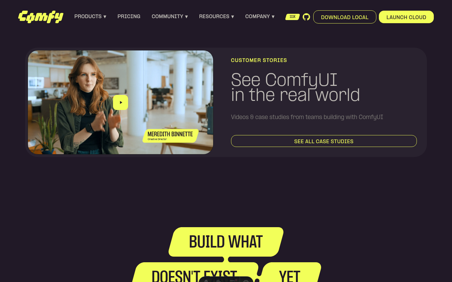 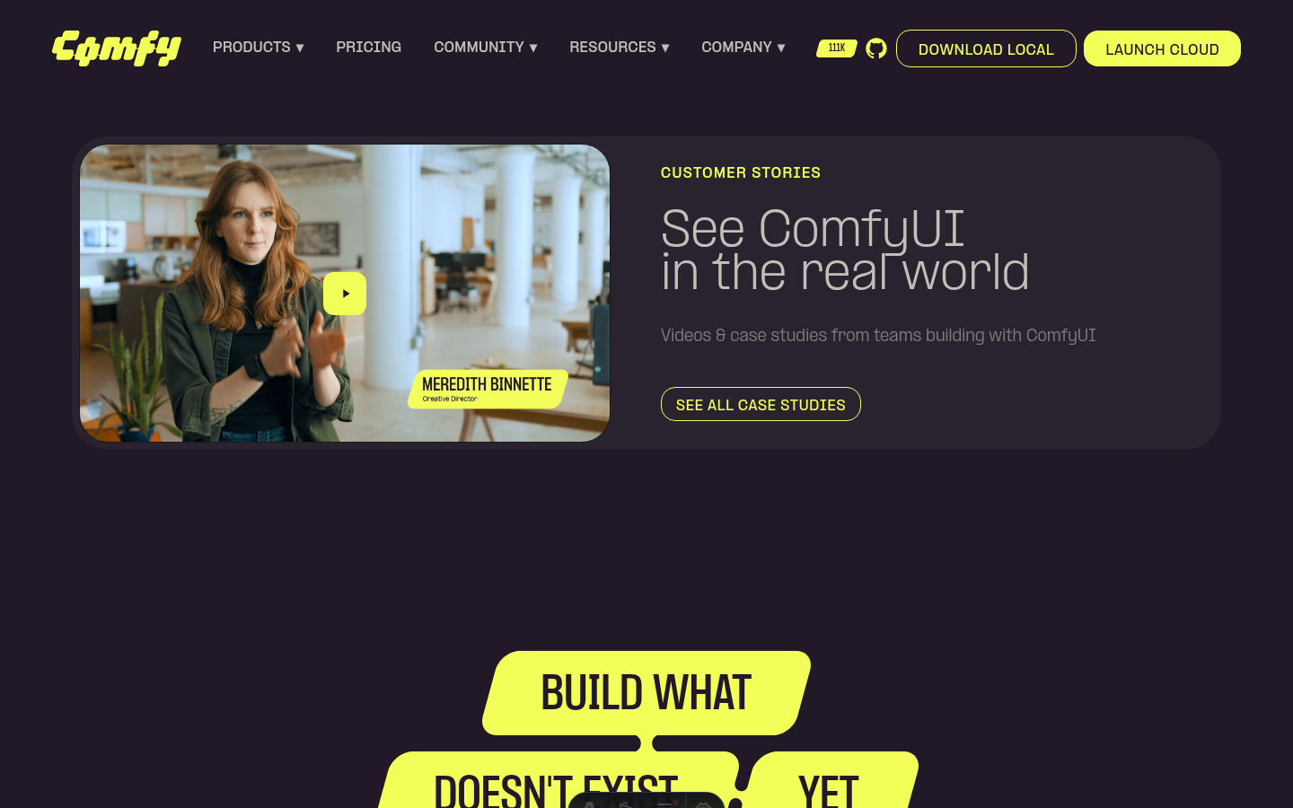 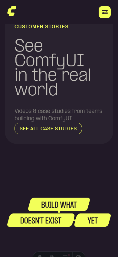 ┆Issue is synchronized with this [Notion page](https://www.notion.so/PR-11854-fix-website-unstretch-See-all-case-studies-button-3556d73d365081abb3bbe9dbc51cbc07) by [Unito](https://www.unito.io) --------- Co-authored-by: Glary-Bot <glary-bot@users.noreply.github.com>
67 lines
2.1 KiB
Vue
67 lines
2.1 KiB
Vue
<script setup lang="ts">
|
|
import type { Locale } from '../../i18n/translations'
|
|
|
|
import { getRoutes } from '../../config/routes'
|
|
import { t } from '../../i18n/translations'
|
|
import BrandButton from '../common/BrandButton.vue'
|
|
import GlassCard from '../common/GlassCard.vue'
|
|
import VideoPlayer from '../common/VideoPlayer.vue'
|
|
|
|
const { locale = 'en' } = defineProps<{ locale?: Locale }>()
|
|
const routes = getRoutes(locale)
|
|
</script>
|
|
|
|
<template>
|
|
<section class="bg-primary-comfy-ink px-4 py-20 lg:px-20 lg:py-24">
|
|
<GlassCard
|
|
class="flex flex-col gap-12 lg:flex-row lg:items-stretch lg:gap-8"
|
|
>
|
|
<!-- Left: video -->
|
|
<div class="flex-1 overflow-hidden rounded-4xl">
|
|
<VideoPlayer
|
|
src="https://media.comfy.org/website/customers/blackmath/video.webm"
|
|
poster="https://media.comfy.org/website/customers/blackmath/poster.webp"
|
|
minimal
|
|
:tracks="[
|
|
{
|
|
src: 'https://media.comfy.org/website/customers/blackmath/video.vtt',
|
|
kind: 'subtitles',
|
|
srclang: 'en',
|
|
label: 'English'
|
|
}
|
|
]"
|
|
:locale
|
|
/>
|
|
</div>
|
|
|
|
<!-- Right: content -->
|
|
<div
|
|
data-testid="case-study-content"
|
|
class="flex flex-col justify-between p-6 lg:flex-1"
|
|
>
|
|
<div class="flex flex-col gap-8">
|
|
<p
|
|
class="text-primary-comfy-yellow text-sm font-bold tracking-widest uppercase"
|
|
>
|
|
{{ t('caseStudy.label', locale) }}
|
|
</p>
|
|
<h2
|
|
class="text-primary-comfy-canvas text-5xl font-light whitespace-pre-line"
|
|
>
|
|
{{ t('caseStudy.heading', locale) }}
|
|
</h2>
|
|
<p class="text-primary-warm-gray text-base">
|
|
{{ t('caseStudy.subheading', locale) }}
|
|
</p>
|
|
</div>
|
|
|
|
<div class="mt-8 flex flex-col items-start gap-3 sm:flex-row lg:mt-0">
|
|
<BrandButton :href="routes.customers" variant="outline">
|
|
{{ t('caseStudy.seeAll', locale) }}
|
|
</BrandButton>
|
|
</div>
|
|
</div>
|
|
</GlassCard>
|
|
</section>
|
|
</template>
|