mirror of
https://github.com/Comfy-Org/ComfyUI_frontend.git
synced 2026-07-11 01:28:03 +00:00
2c14ee428aed77b471b4c9865a052d02b8250467
8492 Commits
| Author | SHA1 | Message | Date | |
|---|---|---|---|---|
 Michael B
|
2c14ee428a |
feat(website): rebuild vfx page hero, logos, and tutorial cards
- Rebuild vfx HeroSection on HeroBackdrop01 with video backdrop, new copy, and Contact Sales / Try Now CTAs; add tone prop (light/dark) to HeroBackdrop01 for dark backdrops with white text - Extract logo marquee into LogosAll01 block with clientLogos data; SocialProofBarSection is now a thin wrapper; add logos under vfx hero - Extract shared TutorialCard and TutorialDetailDialog into common/, dedupe Tutorial type and poster helper from both tutorial data files - Remove FeaturedWorkflowSection from vfx pages; update tutorials heading/description and CTA copy (with zh-CN); balance CTA heading line wrapping; point vfx tutorial assets at website/vfx Co-Authored-By: Claude Fable 5 <noreply@anthropic.com> |
||
|
Michael B
|
1d07692f5e | Merge remote-tracking branch 'origin/main' into feat/vfx-page | ||
|
Maanil Verma
|
ceb5ae1eba |
fix(cloud): keep survey footer visible on small screens (#13568)
## Summary Keep the onboarding survey's Back/Submit footer visible on small screens by scrolling only the question area instead of the whole survey. ## Changes - **What**: The survey scrolled as a single block , so on short viewports the button row slid under the template footer (Terms/Privacy). Now the outer is bounded to its slot and the question wrapper in `DynamicSurveyForm` scrolls internally with a responsive cap , so option lists scroll while the footer buttons stay pinned. The step height animation is unchanged. ## Screen Recording https://github.com/user-attachments/assets/6d7f6d50-59b8-4dc0-b20e-8f4ca08167c6 |
||
|
Comfy Org PR Bot
|
9f880c78cb |
1.48.1 (#13559)
Patch version increment to 1.48.1

**Base branch:** `main`

---------

Co-authored-by: christian-byrne <72887196+christian-byrne@users.noreply.github.com>
Co-authored-by: github-actions <github-actions@github.com>
v1.48.1 |
||
|
Benjamin Lu
|
3b2eb50f3b |
feat(cloud): redeem desktop login codes for web-to-desktop identity stitching (GTM-93) (#13418)
## What Browser half of GTM-93 macOS web→desktop identity stitching: when the desktop app opens the system browser at cloud login with `?desktop_login_code=dlc_…`, the frontend redeems that code against the cloud backend once a Firebase session exists — after **explicit user approval**. Reworked on top of the preserved-query `stripAfterCapture` capability (#13465): - The `DESKTOP_LOGIN` namespace opts into strip-on-capture: the code is stashed and removed from the URL **before any navigation completes**, so it never reaches history, `previousFullPath`, later guards, or telemetry — the hand-rolled URL scrubbing this PR previously carried (raw-string parser + three strip sites) is gone. - `desktopLoginRedemption.ts` is a plain module with a single export, `installDesktopLoginRedemption(router)`, installed once in `router.ts`'s cloud block (replaces six per-view/composable trigger sites). Redemption reads the code only from the stash: per-code state (approval + 2-attempt transient budget, so a second code gets its own approval and budget), approval dialog, `POST /api/auth/desktop-login-codes/redeem` with the raw Firebase ID token (backend route is Firebase-JWT-only), 10s fetch timeout. - Triggers: `router.afterEach` (the cloud auth guard settles Firebase init before navigations complete) plus a lazy watcher on `authStore.currentUser` for sessions that appear without a navigation (OAuth-resume error branch, dialog sign-in). One bounded in-page retry (5s) guarantees an approved sign-in always ends in a success or failure toast. - Terminal rejections (400/403/404/409/410) drop the code with an error toast; transient failures (401/5xx/timeout/network) retry once; budget exhaustion now surfaces a failure toast instead of dying silently. ## Why Windows stitches web→desktop at download time via installer stamping; macOS DMGs can't be stamped, so we stitch at login. The browser is where both halves meet: the existing `posthog.identify(uid)` merges the web anon person into the Firebase uid, and the backend emits `comfy.cloud.identity.login_attributed` (uid ↔ installation_id) at redeem. The desktop app polls the backend and receives a one-time custom token — no auth material posted to a desktop loopback server (the concern that stalled #12983, which this supersedes). ## Security - **Approval dialog before redeem** — redemption mints the desktop a sign-in token for *your* account, so a lured click must not be enough (device-code phishing mitigation). Cancel clears the stash and does nothing. - Only the opaque single-use code ever appears in a URL; the tracker strips it on first sight, pre-navigation, and it is never logged. ## Testing Vitest, driven through a real router (createRouter/createMemoryHistory, no vue-router mocks) and the real preserved-query manager: capture/stash lifecycle, approval gate (no fetch before approve; decline/dismiss clears; per-code approval), Bearer/body shape, terminal-vs-transient statuses, timeout abort, bounded in-page retry + failure toast on budget exhaustion, per-code regressions (second code after success/decline/exhaustion redeems independently), auth-watcher trigger (session appearing without navigation), unauthenticated no-op, trigger coalescing. Typecheck/lint/format clean. Types are hand-written with a `TODO(@comfyorg/ingest-types)` — the generated types land automatically once the cloud PR merges and the type-gen workflow runs. ## Landing order 1. Cloud backend: https://github.com/Comfy-Org/cloud/pull/4736 (until it ships, redemption never triggers — this PR is inert) 2. #13465 preserved-query strip-on-capture (base of this PR) 3. #13466 global-prompt FIFO queue (runtime dependency: the approval confirm must settle even if another prompt is open) 4. **This PR** 5. Desktop (activates the flow): https://github.com/Comfy-Org/Comfy-Desktop/pull/1222 GTM-93 · Supersedes #12983 --------- Co-authored-by: AustinMroz <austin@comfy.org> |
||
|
Matt Miller
|
2ef341dcd8 |
test: E2E for BYOK secret add / list / delete flow (#13510)
## ELI-5 The settings screen now has a "Secrets" panel where you can save API keys for model/AI providers. This adds an end-to-end test that plays out the whole story like a real user: open the panel, add a key, watch it show up in the list, then delete it. It also checks the security promise — the key you type is sent to the server but is **never** shown back to you afterward — and that an account without access to the gated providers never even sees them in the dropdown. ## What Adds `browser_tests/tests/cloudSecrets.spec.ts`, a Playwright spec covering the secrets (API keys) surface in the cloud app: - **Entitled account, full CRUD round-trip:** empty state -> add a provider key (pick provider, name, secret value, save) -> the key appears in the list -> delete it via the confirm dialog -> back to empty state. - **Secret value is write-only:** asserts the create request carried the plaintext value, but the value is never echoed back into the DOM (the list-response schema is metadata-only). - **Entitlement gate:** an account whose provider allowlist is empty never sees the gated providers anywhere in the add dialog. Follows the existing cloud E2E conventions: drives a raw `page` and reuses the `mockCloudBoot` / `bootCloud` helpers so the app boots signed-in against fully mocked endpoints. A small stateful in-memory handler backs the secrets endpoints (list / create / delete + the provider allowlist) so the flow is deterministic and never touches a real backend. ## Why Verification capstone for the secrets settings surface — proves the add / list / delete flow works against the documented API behavior (`GET`/`POST`/`DELETE` on the secrets collection, `GET` on the provider allowlist) and locks in the two contracts that matter: the secret value is never returned after creation, and the provider allowlist is the only thing that surfaces gated providers to the user. ## Tests - `browser_tests/tests/cloudSecrets.spec.ts` — new, two cases (tagged `@cloud`). - Static checks pass locally: oxlint (0 warnings/errors) and oxfmt formatting. - The browser run itself needs a served app + the E2E harness (CI), so it was not executed in this environment; the spec is self-contained and mocks all network. --------- Co-authored-by: GitHub Action <action@github.com> Co-authored-by: Claude Opus 4.8 <noreply@anthropic.com> |
||
|
Mobeen Abdullah
|
1815c7f7a4 |
feat(website): add JSON-LD structured data across the site (#13480)
## Summary This PR adds schema.org **JSON-LD structured data across the whole marketing site**, built from one shared, CMS-ready module and gated by a small CI validator. It replaces the old global block (which had a stale logo, wrong social links, disconnected nodes, and a head slot that rendered three times) with a single connected `@graph` on every page. Structured data only — there is no visual or runtime change for users. Tracks Linear **FE-1170**. The design goal was that structured data should be impossible to get subtly wrong: one place builds it, honesty rules are enforced in code, and a build-time validator fails the build if any page ships a broken `@id` graph or a fabricated price/rating. ## Changes - **One builder, one sink.** `utils/jsonLd.ts` holds pure, node-testable builders; `components/common/JsonLdGraph.astro` is the single escaped `<script type="application/ld+json">` sink (prevents `</script>` breakout XSS). - **The layout owns the page entity.** `BaseLayout` emits a baseline `Organization` + `WebSite` + `WebPage` graph on every page from its own `title`/`description`/canonical props. Enriched pages pass only what is specific to them: `pageType`, `breadcrumbs`, `mainEntityId`, and `extraJsonLd` nodes. This makes it impossible for a page's meta tags and its structured data to drift apart. - **Corrected site-wide entity.** Raster PNG logo (Google does not index SVG logos), real `sameAs` handles sourced from the footer links, `@id`-linked `Organization`/`WebSite`, and the triple-rendered head slot fixed. - **Honesty is enforced, not just intended.** No fabricated `Review`/`AggregateRating`/`Offer`. Pricing offers are parsed only from plain `$N` copy (a future "Contact us" drops the offer instead of shipping a garbage price). Third-party node packs and listed models do **not** claim Comfy Org as author/publisher. `noindex` pages (404, payment) emit no structured data. - **CI validator.** `pnpm --filter @comfyorg/website validate:jsonld` runs over `dist/` in the website build workflow and fails on invalid JSON, an unresolved `@id`, a fake rating, or an empty/non-numeric offer price. - **Breaking:** none. ## Coverage (also a manual QA checklist for the preview) Every public page carries at least `Organization` + `WebSite` + `WebPage`. The pages below add a page-specific primary entity, in **English and zh-CN**: | Page | Path (example) | Adds to the graph | |---|---|---| | Home | `/`, `/zh-CN` | `SoftwareApplication` (ComfyUI, free) + `SoftwareSourceCode` | | Download | `/download` | `SoftwareApplication` (ComfyUI desktop) | | Pricing | `/cloud/pricing` | `Product` + 3 monthly `Offer`s ($20/$35/$100) + Breadcrumb | | Models catalog | `/p/supported-models` | `CollectionPage` + `ItemList` (313, lean) + Breadcrumb | | Model detail | `/p/supported-models/4x-ultrasharp` | `SoftwareApplication` + `FAQPage` + Breadcrumb | | Nodes catalog | `/cloud/supported-nodes` | `CollectionPage` + `ItemList` (58 packs) + Breadcrumb | | Node-pack detail | `/cloud/supported-nodes/ComfyQR` | `SoftwareApplication` (+ free `Offer`) + Breadcrumb | | Demos | `/demos/community-workflows` | `LearningResource` + Breadcrumb | | About / Contact | `/about`, `/contact` | `AboutPage` / `ContactPage` (Org as `mainEntity`) + Breadcrumb | | Careers | `/careers` | `CollectionPage` + `ItemList` of open roles + Breadcrumb | | Affiliates | `/affiliates` | `FAQPage` + Breadcrumb | Pages deliberately left at the baseline `WebPage` (generic landings, legal, coming-soon) and pages with **no** structured data (`noindex`: `/404`, `/payment/*`; redirect URLs) are intentional. ## Review Focus - **Layout-owns-WebPage design.** `BaseLayout` builds the `WebPage`; pages contribute only extra nodes. This is the main structural decision and is what removes meta-vs-schema drift by construction. - **Honesty guardrails.** Worth confirming: pricing offers, third-party author omission on packs/models, and that `noindex` pages emit nothing. - **`@id` and URL consistency.** All cross-page links and `@id`s resolve to the canonical trailing-slash form; zh-CN breadcrumbs are rooted under `/zh-CN`; the singleton `WebSite`/`#software` entities carry one consistent definition across pages and locales. - **The validator.** It is a bespoke ~100-line script scoped to the website build job (not the prod deploy). Happy to make it non-blocking or drop it if the team prefers. - **Coordination with #13468.** Both branches add `components/common/JsonLdGraph.astro`. Customer pages are intentionally excluded here; #13468 can converge onto this shared builder. ## Verification `astro check` 0 errors · 166 unit tests · `knip` 0 · `eslint` 0 · build 497 pages · validator passes across 500 pages · JSON-LD e2e specs 24/24. (The 3 pre-existing demo e2e timeouts are an external Arcade-embed flake on one slug, reproduced identically on `main`.) ## Screenshots Not applicable — head-only structured data, no visual change. Validate on the Vercel preview with the Rich Results Test and the schema.org validator. Note: `@id`/URL values render as `comfy.org` (from `astro.config` `site`) even on the preview host, which is correct. |
||
|
imick-io
|
287b9eb980 |
feat(website): add HeroBackdrop01 block component (#13549)
## Summary Adds the `HeroBackdrop01` hero block component to the website app. This lands the component on its own so it can be merged to `main` ahead of the EDU page work (on another branch) that consumes it. The component renders a responsive hero with an optional image/video backdrop (in-flow rounded card on mobile, full-bleed background on desktop), an optional product badge, title, subtitle, and footnote. It respects `prefers-reduced-motion` by not autoplaying the looping backdrop video (WCAG 2.2.2). ## Notes - No consumer imports the component yet — it is intentionally added ahead of the page that will use it. The `knip` unused-file check flags this, which is expected for this staging PR. - Depends on existing `useReducedMotion` composable and `ProductHeroBadge` component, both already present on `main`. ## Test plan - [ ] `pnpm typecheck:website` passes (verified locally via pre-commit hook) - [ ] Component renders correctly once wired into a page 🤖 Generated with [Claude Code](https://claude.com/claude-code) --------- Co-authored-by: Claude Opus 4.8 (1M context) <noreply@anthropic.com> |
||
|
Matt Miller
|
06b0471257 |
test: pin unknown-provider flow-through in server-driven provider options (#13546)
## ELI-5 The provider picker for BYOK secrets is now driven by the server's `availableProviders` list, not a hardcoded frontend list. The point is that a provider the server offers but the frontend has never heard of should still show up — using its raw id as the label and no logo. This adds the one test that actually pins that behavior, so nobody can later re-add a "only show providers the frontend knows about" filter without a test going red. ## Summary Regression test for the server-driven provider options introduced in #13509: asserts that an unknown provider id passes through `providerOptions` rather than being filtered against the local presentational registry. ## Changes - **What**: Adds one `useSecretForm.test.ts` case asserting that a create-mode `availableProviders` list containing an id absent from the local `SECRET_PROVIDERS` registry (`'brand-new-provider'`) yields a single `providerOptions` entry rendered with the raw id as its label and `logo: undefined`. ## Review Focus The existing suite already covers the registry fallback (`providers.test.ts`) and server-listed *known* ids (`runway`/`gemini`), but every one of those cases uses an id that exists in the local registry — so a future change that re-filtered `availableProviders` against `SECRET_PROVIDERS` could pass all current tests while silently dropping unknown providers. This test closes that gap by using an id that is deliberately absent from the registry, so it fails if pass-through is ever broken. Follow-up to the optional review ask on #13509. Test-only; no production code changes. |
||
|
Maanil Verma
|
8120142f49 |
feat(cloud): redesign the cloud onboarding survey (#13518)
## Summary New users get a cleaner, faster onboarding survey: one question per screen on tappable cards that advance the moment you pick an answer, with follow-up questions that appear only when they're relevant. The questions themselves were reworked to learn what people actually want to do with ComfyUI. ## Changes **What** - Replaced the radio/checkbox list with a card-based, one-question-at-a-time wizard. Choosing a single-select answer advances automatically — no separate Next click — while multi-select and free-text steps still wait for you to confirm. - Reworked the question set: what you want to make, how well you know ComfyUI, and how you found us. Two questions are now conditional — a "what are you building?" follow-up appears only for workflow/API builders, and a "which platform?" follow-up appears only when you say you found us on social media. - Added an "other" free-text escape hatch to the intent and source questions, required before you can move on so we don't capture an empty "other". - Polished the whole surface to the comfy-canvas theme with animated step-height and cross-fade transitions between questions, and hid the marketing hero on the survey and user-check routes so the form has room. - Errors now surface only after you've interacted with a field, not on first paint. - Extended the telemetry survey-response and remote-config option shapes to carry the new fields (including per-option icons), leaving the older fields in place so historical responses still typecheck. **Breaking** — None. The remote-config survey schema stays backend-overridable, hidden branch answers are zeroed in the submitted payload, and the telemetry field names line up 1:1 with the schema. The backend dynamic config already ships the matching version-3 schema. ## Testing Behavioral coverage over the wizard's real interactions rather than DOM structure, since the risk is in navigation/branching/validation, not markup. `vue-i18n` is mounted for real with the actual locale file so tests assert on rendered copy. - [DynamicSurveyForm.test.ts](src/platform/cloud/onboarding/survey/DynamicSurveyForm.test.ts) — auto-advance on single-select, no-advance on multi/other, Back navigation, branch reveal/hide and its submitted payload, required-"other" gating, post-interaction error surfacing, and survey-prop reset. - [DynamicSurveyField.test.ts](src/platform/cloud/onboarding/survey/DynamicSurveyField.test.ts) — card rendering/selection state, stable option ids, multi-select emit, the conditional "other" input, and label resolution via key / locale map / id fallback. - [surveySchema.test.ts](src/platform/cloud/onboarding/survey/surveySchema.test.ts) — default-schema branching (which steps show), hidden-field zeroing and free-text-over-sentinel in the payload, and the shared `hasNonEmptyValue` truth table. Gates: `vue-tsc` typecheck clean; eslint/oxfmt clean on touched files; survey suite green (68 tests across the three files). Manual: run the cloud onboarding flow, pick a workflow/apps intent to confirm the "building" follow-up, pick social to confirm the platform follow-up, and verify an empty "other" blocks advancing. ## Screen Recording https://github.com/user-attachments/assets/1908ca18-93d1-41a2-a55b-1f04a6df2268 |
||
|
Michael B
|
a539e02613 | Merge remote-tracking branch 'origin/main' into feat/vfx-page | ||
|
AustinMroz
|
3164e6ab61 |
On workflow swap, restore 'Preview as Text' text (#13536)
Also adds proper typing for `onNodeOutputsUpdated` See also: #12877 and #13427, which include near equivalent changes for the bug itself, but different tests. If I had more time and had not already made my own fix, I would have liked to spend more time getting either of them cleaned up. |
||
|
pythongosssss
|
731512c655 |
test: remove timeout causing flake (#13543)
## Summary The timeout resolved 1 second after the test completed sometimes throwing: ``` ⎯⎯⎯⎯ Unhandled Rejection ⎯⎯⎯⎯⎯ ReferenceError: window is not defined ❯ resolveMessageFormat node_modules/.pnpm/@intlify+core-base@9.14.5/node_modules/@intlify/core-base/dist/core-base.mjs:1357:13 ❯ translate node_modules/.pnpm/@intlify+core-base@9.14.5/node_modules/@intlify/core-base/dist/core-base.mjs:1216:11 ❯ node_modules/.pnpm/vue-i18n@9.14.5_vue@3.5.34_typescript@5.9.3_/node_modules/vue-i18n/dist/vue-i18n.mjs:581:48 ❯ wrapWithDeps node_modules/.pnpm/vue-i18n@9.14.5_vue@3.5.34_typescript@5.9.3_/node_modules/vue-i18n/dist/vue-i18n.mjs:526:19 ❯ t node_modules/.pnpm/vue-i18n@9.14.5_vue@3.5.34_typescript@5.9.3_/node_modules/vue-i18n/dist/vue-i18n.mjs:581:16 ❯ onNodePackChange src/workbench/extensions/manager/components/manager/PackVersionSelectorPopover.vue:201:10 199| // Add Latest option with actual version number 200| const latestLabel = latestVersionNumber 201| ? `${t('manager.latestVersion')} (${latestVersionNumber})` | ^ 202| : t('manager.latestVersion') 203| This error originated in "src/workbench/extensions/manager/components/manager/PackVersionSelectorPopover.test.ts" test file. It doesn't mean the error was thrown inside the file itself, but while it was running. ``` The timeout was not required for the test to validate the loading text. ## Changes - **What**: Remove timeout |
||
|
imick-io
|
c0ad1e98c2 |
test(website): add e2e specs for the learning page (#13529)
## Summary Add end-to-end test coverage for the `/learning` page, which previously had none. ## Changes - **What**: New `e2e/learning.spec.ts` covering the EN page smoke behaviour (hero, featured workflow, tutorial grid rendered from the `learningTutorials` data source, per-tutorial Try Workflow links, and the contact-sales CTA), the tutorial video dialog open/close/Escape interactions, and the zh-CN localized page. ## Review Focus Assertions are driven off the `learningTutorials` data source and `t()` i18n keys rather than hardcoded strings to avoid change-detector tests. Media is stubbed by the auto-applied `blockExternalMedia` fixture, so the specs have no network dependency. The tutorial-dialog interaction uses a `toPass` retry to accommodate `client:visible` hydration. |
||
|
Comfy Org PR Bot
|
bd9fab2d2f |
1.48.0 (#13541)
Minor version increment to 1.48.0

**Base branch:** `main`

Co-authored-by: christian-byrne <72887196+christian-byrne@users.noreply.github.com>
v1.48.0 |
||
|
Comfy Org PR Bot
|
c7fe6a23ec |
1.47.7 (#13246)
Patch version increment to 1.47.7

**Base branch:** `main`

---------

Co-authored-by: christian-byrne <72887196+christian-byrne@users.noreply.github.com>
Co-authored-by: github-actions <github-actions@github.com>
Co-authored-by: Christian Byrne <cbyrne@comfy.org>
v1.47.7 |
||
|
nav-tej
|
df9b5bfa0a |
feat(website): rework MCP page setup + hero, hide promo banner on /mcp (#13514)
## Summary Two changes to the comfy.org `/mcp` experience: reframe the Setup section around the agent-driven install and tidy the hero CTAs, and stop the sitewide MCP promo banner from showing on the page it links to. ## Changes - **Setup Step 1** is now **"Ask your agent to install Comfy MCP"** with a multi-line, copyable prompt (`Help me install Comfy MCP. / Follow the setup guide at https://docs.comfy.org/agent-tools/cloud`). `CopyableField` gains a `multiline` variant (wraps the text, top-aligns the copy button); `FeatureGrid01`'s `code` action threads the flag through. - **Step 2** becomes the optional manual-connector path (**"Or add it by hand"**) so the three-step flow stays coherent — no dangling "paste the URL" that Step 1 no longer copies. - **Hero** swaps the **"Run a workflow"** primary CTA for **"Install MCP"**, which anchors to the on-page `#setup` steps; **"View Docs"** stays as the secondary CTA. - **Announcement banner** no longer advertises the page you're already on. `evaluateBannerVisibility` gains a build-time gate: when the current path matches the banner's CTA destination it's suppressed. Locale prefix is stripped (so `/zh-CN/mcp` matches an unprefixed `/mcp` href), trailing slashes are tolerated, and external CTA links never suppress. Result: the MCP banner shows everywhere except `/mcp` and `/zh-CN/mcp`. - New i18n keys (`mcp.setup.step1.command`, `mcp.hero.installMcp`) with en + zh-CN parity; 5 new unit tests cover the banner suppression logic. - **Breaking**: none. ## Review Focus - @deepme987 @bertfy — copy + flow check. The Step 1 prompt is a paraphrase of the `agent-tools/cloud` install guide. The raw `cloud.comfy.org/mcp` URL is no longer surfaced on the page (the manual path now points to the MCP docs instead) — flag if you'd rather keep the raw URL visible in Step 2. - Banner suppression keys off the CTA's `link.href` — general, so any future banner pointing at an internal page auto-hides on that page. It's a **build-time** gate (this is a static site), consistent with the existing `startsAt`/`endsAt` behavior. - Only the **hero** CTA changed. The "How it works" section deliberately keeps its "Run a workflow" CTA. - zh-CN strings are machine-drafted; a native check would be welcome. ## Screenshots Verified locally against a production build (`astro build` + preview): - **Hero** — `INSTALL MCP` + `VIEW DOCS` (the "Run a workflow" button is gone). "Install MCP" scrolls to `#setup`. - **Setup** — Step 1 shows the agent-install prompt in a multi-line copyable field; Step 2 "Or add it by hand"; Step 3 unchanged. - **Banner** — present on `/`, `/download`, `/cloud`; absent on `/mcp` and `/zh-CN/mcp`. A Vercel preview deploy attaches automatically for a live view. --------- Co-authored-by: imick-io <153135517+imick-io@users.noreply.github.com> |
||
|
Yousef R. Gamaleldin
|
a6b7ce11aa |
feat: add preview support for save text node (CORE:-176) (#12521)
## Summary Add a frontend preview extension for the SaveText node that displays saved text content after execution. ## Changes The extension add a multiline text widget into the SaveText node and populates it upon onExecuted PR on core: https://github.com/Comfy-Org/ComfyUI/pull/14102 ## Review Focus <!-- Critical design decisions or edge cases that need attention --> Extension follows the same pattern as previewAny.ts <!-- If this PR fixes an issue, uncomment and update the line below --> <!-- Fixes #ISSUE_NUMBER --> ## Screenshots <img width="1127" height="421" alt="Screenshot 2026-05-29 194925" src="https://github.com/user-attachments/assets/e7a72807-858b-47c7-be07-595f9e539a49" /> <!-- Add screenshots or video recording to help explain your changes --> --------- Co-authored-by: Terry Jia <terryjia88@gmail.com> |
||
|
Matt Miller
|
d3b100be8d |
feat: render BYOK provider surface (labels / logos / help) from server data (#13509)
## ELI-5 The "API Keys & Secrets" settings screen lets you save a key for a provider (HuggingFace, Civitai, and now video/image API providers). The list of which providers you can pick is decided by the server. This PR makes the picker and the saved-keys list show a nice name, logo, and short help text for each provider the server offers — and, crucially, actually render providers the server newly lists instead of silently dropping them. ## What - The provider dropdown in the add-secret dialog is now driven by the providers the server returns from `GET /secrets/providers`. Each id is mapped to its display label, logo, and optional help text through a small presentational registry. - Previously the dropdown took a hardcoded known-provider array and *intersected* it with the server list, so any provider the server listed that wasn't already hardcoded could never appear. That intersection is gone: once the server list loads, it renders verbatim. - Unknown provider ids fall back gracefully to the raw id with no logo, so adding a provider server-side requires no frontend change; giving it a first-class label/logo is an optional enhancement. - The saved-keys list already resolved label/logo through the same registry, so it picks up the new providers automatically. - Added provider-specific help text under the picker (falls back to the generic hint), plus placeholder logo assets under `public/assets/images/` for the two new API providers. ## Why Keeps the provider surface data-driven end to end: the server owns *which* providers are configurable, and the frontend owns *how* each one renders. This removes the last hardcoded gate that stopped server-listed providers from showing up. ## Tests - New `providers.test.ts`: label/logo/help lookups for all known providers, graceful fallback for unknown ids and `undefined`, and that the not-loaded fallback list stays the pre-existing baseline (does not silently include the new providers). - Extended `useSecretForm.test.ts`: server-listed providers render with correct labels + logos; providers the server omits do not appear; provider-specific vs generic help text selection. - Full secrets suite green (66 tests). Changed files typecheck clean. Note: the two new provider logos are simple placeholder SVGs and can be swapped for final brand assets. --------- Co-authored-by: GitHub Action <action@github.com> |
||
|
Hunter
|
54b0c10148 |
fix(auth): stop workspace auth from oscillating to personal identity (#13511)
## Summary Fixes a "weird stale auth" bug where cloud requests oscillated between workspace-scoped and personal (Firebase) identity. **Root cause:** workspace membership lives in two decoupled places — `teamWorkspaceStore.activeWorkspaceId` (durable intent) and `workspaceAuthStore` (the mintable token). When the token was transiently missing while `activeWorkspaceId` was still set (bootstrap mint in flight, expired token, or a context cleared by a recoverable refresh failure), `getAuthHeader`/`getAuthToken` silently downgraded to the personal Firebase token. Depending on timing, consecutive requests carried different identities, so the backend saw the user flip between workspace and personal scope. ## Changes - **On-demand recovery, fail closed:** when a workspace is active, `getAuthHeader`/`getAuthToken` route through `ensureWorkspaceToken(activeWorkspaceId)`, which re-mints the token on demand and returns `null` rather than downgrading. Recovery also revalidates expiry, so an expired token is reminted instead of sent stale. - **`getAuthToken` parity:** WebSocket/queue auth now recovers the same way (previously only `getAuthHeader` did). - **Coalescing:** a burst of callers collapses onto a single in-flight mint (loop re-checks the in-flight promise), and only a token minted for the requested workspace is accepted. - **Backoff:** a 5s cooldown after any failed/empty recovery prevents hammering `POST /auth/token`; reset on a successful mint and on context teardown. - **Lifecycle hygiene:** `clearWorkspaceContext()` now resets `recoveryCooldownUntil` and `inFlightSwitchPromise` so logout/re-login without a reload isn't wedged. - **Transient vs permanent:** a missing Firebase ID token while the user is still signed in (e.g. `NETWORK_REQUEST_FAILED`, which `getIdToken()` swallows) is treated as transient, not a revoked session. - **Revoked-workspace reconciliation:** on `ACCESS_DENIED`/`WORKSPACE_NOT_FOUND`, `teamWorkspaceStore.forgetRevokedActiveWorkspace()` drops the persisted selection and reloads to fall back to the personal workspace (skipping the personal workspace itself to avoid reload loops). `INVALID_FIREBASE_TOKEN`/`NOT_AUTHENTICATED` do not trigger this. ## Testing - `pnpm test:unit` for the three affected stores: **210 tests pass**. - `pnpm lint` and `pnpm typecheck` pass locally (run with a raised Node heap; the pre-commit/`pnpm typecheck` step OOMs in this environment, so commits used `--no-verify` — CI should re-run the gates). Draft pending green CI. --------- Co-authored-by: GitHub Action <action@github.com> |
||
|
jaeone94
|
2b540a5281 |
fix: resolve cloud output video missing-media false positives (#13507)
## Summary Fix Cloud missing-media false positives for output videos inserted as loader nodes when the widget value includes a subfoldered output path such as `video/<hash>.mp4 [output]`, while Cloud output assets expose the generated media by a flat hash. ## Changes - **What**: resolve Cloud output candidates with subfolders against output asset hashes by falling back from the normalized candidate basename only for Cloud output media. - **What**: keep that fallback hash-only so unrelated flat output asset names do not satisfy subfoldered candidates. - **What**: make Cloud output pagination completion hash-aware so a colliding `asset.name` does not stop loading before the hash match appears. - **What**: add unit regressions plus a small Cloud E2E fixture covering `LoadVideo` with `video/cloud-video-hash.mp4 [output]`. - No breaking changes or dependency changes. ## Review Focus Root cause: Cloud output videos can be inserted as loader nodes with widget values from workflow metadata that include a media subfolder, e.g. `video/<hash>.mp4 [output]`. The Cloud output asset list resolves generated media by a flat hash. The existing missing-media scan compared the subfoldered candidate against flat asset identifiers, so valid generated output media could be flagged as missing. Images often did not reproduce because their metadata commonly lacked the subfolder, so the existing exact/compact matching happened to work. Why the fix is scoped to missing-media scan: the inserted widget value is valid node/workflow state and may carry folder information for other Cloud/runtime paths. Stripping the subfolder at insertion would broaden the behavioral change to asset insertion and loader widgets. Missing-media scan owns the decision of whether a candidate resolves to an existing Cloud asset, so the smallest production change is to recognize the Cloud output hash shape there. Why this is safe for Cloud: the basename fallback is applied only for candidates annotated as output and only in Cloud. It matches against output asset hashes, not flat asset names, which prevents unrelated assets named `<hash>.mp4` from masking a real miss. Input media and non-Cloud exact path behavior continue to use the existing identifier matching. Cloud output pagination early-exit is also hash-aware now, so a flat name collision cannot stop paging before the real hash match is fetched. Red-green and validation: added the unit regression first to reproduce `video/<hash>.mp4 [output]` as missing before the production fix, then verified it green after the scanner/resolver change. Added a compact Cloud E2E for the same `LoadVideo` subfoldered output case. Local validation run: - `pnpm test:unit src/platform/missingMedia/missingMediaScan.test.ts src/platform/missingMedia/missingMediaAssetResolver.test.ts` - 59 passed - `PLAYWRIGHT_LOCAL=1 PLAYWRIGHT_TEST_URL=http://localhost:5175 PLAYWRIGHT_SETUP_API_URL=http://localhost:8188 pnpm exec playwright test browser_tests/tests/propertiesPanel/errorsTabMissingMediaRuntime.spec.ts --project=cloud --grep "subfoldered output video" --repeat-each=5 --reporter=line` - 5 passed - `PLAYWRIGHT_LOCAL=1 PLAYWRIGHT_TEST_URL=http://localhost:5175 PLAYWRIGHT_SETUP_API_URL=http://localhost:8188 pnpm exec playwright test browser_tests/tests/propertiesPanel/errorsTabMissingMediaRuntime.spec.ts --project=cloud --grep "resolves compact annotated output media|resolves subfoldered output video" --reporter=line` - 2 passed - `pnpm typecheck` - `pnpm typecheck:browser` - `pnpm knip` - `pnpm lint` - staged pre-commit hooks: oxfmt, oxlint, eslint, typecheck, typecheck:browser ## Screenshots (if applicable) Before https://github.com/user-attachments/assets/4d980546-a981-4764-9c81-4eaed69e4679 After https://github.com/user-attachments/assets/6a4ddb26-6c16-4cbf-b7bc-b9cd55eece58 |
||
|
ShihChi Huang
|
51156c5503 |
chore: route CodeRabbit test reviews through guidance docs (#13486)
## Summary
Adds CodeRabbit `path_instructions` so changed test files are reviewed
with the repo's existing test guidance docs.
## Changes
- **What**: Routes Vitest `**/*.test.ts` files to
`.agents/checks/test-quality.md`, `docs/testing/README.md`, and
`docs/guidance/vitest.md`.
- **What**: Routes Playwright
`{browser_tests,apps/website/e2e}/**/*.spec.ts` files to
`.agents/checks/test-quality.md`, `docs/testing/README.md`, and
`docs/guidance/playwright.md`.
- **What**: Routes LiteGraph Vitest files to the same Vitest docs plus
`docs/testing/litegraph-testing.md`, which now only documents shared
factory usage and preferring real LiteGraph instances where practical.
## Review Focus
Confirm the path globs cover the intended test files and that
LiteGraph-specific review guidance stays scoped to LiteGraph tests.
## Testing
- Parsed `.coderabbit.yaml` with Ruby YAML
- Ran `git diff --check`
- Commit hooks ran `oxfmt`, `oxlint`, `eslint`, and `pnpm typecheck`
- Push hook ran `knip --cache`
Created by Codex
<!-- CURSOR_SUMMARY -->
---
> [!NOTE]
> **Low Risk**
> Documentation and CodeRabbit review configuration only; no runtime or
test execution behavior changes.
>
> **Overview**
> Configures **CodeRabbit `path_instructions`** so automated reviews of
changed tests pull in the repo’s written testing standards instead of
generic heuristics.
>
> **Vitest** (`**/*.test.ts`) reviews must treat
`.agents/checks/test-quality.md`, `docs/testing/README.md`, and
`docs/guidance/vitest.md` as required context. **LiteGraph Vitest**
under `src/lib/litegraph/**/*.test.ts` adds
`docs/testing/litegraph-testing.md`. **Playwright** specs under
`browser_tests/` and `apps/website/e2e/` use the test-quality and
testing README docs plus `docs/guidance/playwright.md`.
>
> The testing index now lists a fourth guide, **LiteGraph Testing**, and
the new `litegraph-testing.md` doc steers authors toward
`litegraphTestUtils` factories and real LiteGraph instances over broad
mocks.
>
> <sup>Reviewed by [Cursor Bugbot](https://cursor.com/bugbot) for commit
|
||
|
Michael B
|
aacde8db0c |
feat(website): add /vfx page mirroring /learning
Duplicate the learning page as a new VFX page: route, EN + zh-CN astro pages, vfx component directory, tutorial data, and locale-complete vfx.* i18n keys. Co-Authored-By: Claude Opus 4.8 (1M context) <noreply@anthropic.com> |
||
|
Matt Miller
|
e11f98b91f |
feat: render secrets provider dropdown from server data (#13494)
## ELI-5 The "Secrets" settings panel lets you add an API key for a provider (HuggingFace, Civitai). Until now the list of providers in that dropdown was hardcoded in the frontend. This PR makes the dropdown ask the server which providers you're allowed to configure (`GET /api/secrets/providers`) and shows that set instead. For everyone today it looks exactly the same — the endpoint returns the same two base providers — but it means the backend can now control the list (needed for the upcoming bring-your-own-key providers) without a frontend change. ## Summary Render the Secrets provider dropdown from server data (`GET /api/secrets/providers`) instead of the hardcoded provider list, with no visual change for existing users. ## Changes - **What**: - `secretsApi.ts`: add `listSecretProviders()` → `GET /api/secrets/providers`, returning the provider ids. - `useSecrets`: fetch the available providers on panel mount into `availableProviders`; failures are logged and swallowed so no new error surfaces to users. - `useSecretForm`: `providerOptions` is now gated by the server response — when providers are returned, the dropdown shows exactly that set; when the list is empty (endpoint absent/unreachable) it falls back to the base providers, preserving today's UX. - Thread `availableProviders` from the panel through both `SecretFormDialog` instances. - **Breaking**: none — panel visibility is still gated on the `userSecretsEnabled` feature flag; only the *contents* of the provider dropdown are now server-driven. ## Review Focus - **Ships dark / byte-for-byte UX.** The server's base response is exactly the two hardcoded providers, and any failure/empty response falls back to the hardcoded list, so existing users see zero change. The membership of the dropdown is what becomes server-driven. - **Response types come from the generated `@comfyorg/ingest-types`.** `SecretMetadata` aliases the generated `SecretResponse`, and `secretsApi` consumes `SecretListResponse` / `SecretProvidersResponse` for the list + providers envelopes — no hand-typed duplicates. `provider` follows the schema as a free-form string; the known-provider union stays only for the label/logo UI in `providers.ts`. - **Provider metadata (labels/logos) still comes from `providers.ts`.** The endpoint returns identifiers only; label/logo per provider is a follow-up (provider surface labels/logos). So this first cut intentionally shows base providers only — an id the server returns that has no local label/logo config is not rendered yet. ## Test plan - `useSecrets`: `fetchProviders` populates `availableProviders`; API failure leaves it empty and raises no toast. - `useSecretForm`: options restrict to the server-returned providers, fall back to base providers when empty, and react to the list changing. --------- Co-authored-by: Claude Opus 4.8 <noreply@anthropic.com> |
||
|
Dante
|
bab2a22428 |
fix(dialog): restore backdrop scrim on non-modal Reka dialogs (#13502)
## Summary Restore the backdrop scrim on Reka dialogs opened with `modal: false` (Settings, Manager, legacy-team subscription) — reka-ui only renders `DialogOverlay` for modal roots, so these dialogs silently lost their backdrop when they moved to the Reka renderer. ## Changes - **What**: `src/components/ui/dialog/DialogOverlay.vue` injects `injectDialogRootContext()` (public reka-ui export) and branches: modal dialogs keep Reka's `DialogOverlay`; non-modal dialogs render a plain backdrop `div` wrapped in Reka's `Presence` (`:present="forceMount || open"`), so it honors `forceMount` and plays the `data-[state=closed]` exit fade in sync with the content. Both branches carry `data-testid="dialog-overlay"`. - **Popover stacking**: the scrim/content carry inline z-indexes from @primeuix's `'modal'` counter, which body-portaled popovers with a static `z-1700` class lost to. Extracted `DropdownMenu.vue`'s existing lift into `useModalLiftedZIndex` and applied it to `ColorPicker.vue` and the shared `ui/Popover.vue`, so they stack above the top-most dialog (verified live: scrim 1701 < content 1702 < picker 1703, panel clickable, Settings stays open). ## Review Focus - **Why not `modal: true`**: Settings/Manager intentionally opt out of Reka's modal mode because its focus trap + body `pointer-events: none` break nested PrimeVue overlays teleported to body (see comments in `useSettingsDialog.ts` / `useManagerDialog.ts`). The fallback restores only the visual scrim; body pointer-events stay `auto`. - **Dismissal semantics unchanged**: the scrim sits outside Reka's `DismissableLayer`, so a pointerdown on it goes through the existing `onRekaPointerDownOutside` bridge — scrim click dismisses the top-most dialog, exactly like the modal overlay path (unit-covered). - **CustomizationDialog also gains its scrim back**: the bookmark-folder Customize dialog renders `:modal="false"` with an explicit `<DialogOverlay />`, so it picks up the backdrop too (its template always intended one); its ColorPicker popover is covered by the z-index lift above. A test pins that a mounted-but-closed non-modal root renders no scrim (CustomizationDialog mounts with `open: false`). Verified live (dev): scrim renders behind Settings; nested Modify-Keybinding dialog opens/focuses over it without dismissing Settings; scrim click closes Settings; `Comfy.Load3D.BackgroundColor` color picker opens above the scrim and is fully interactive; no new console warnings. Unit tests are red without the fix, green with it. Reported in Slack (FE Main), design confirmed scrims are intended. ## Screenshots Images hosted on a fork-only branch (`pr-assets/13502-scrim`), not part of this PR's history. | Before (`modal: false` — no scrim) | After | | --- | --- | | <img width="480" alt="before" src="https://raw.githubusercontent.com/dante01yoon/ComfyUI_frontend/pr-assets/13502-scrim/.github/pr-assets/settings-scrim-before.png" /> | <img width="480" alt="after" src="https://raw.githubusercontent.com/dante01yoon/ComfyUI_frontend/pr-assets/13502-scrim/.github/pr-assets/settings-scrim-after.png" /> | Color picker stacking above the scrim (z-index lift): <img width="640" alt="color picker above scrim" src="https://raw.githubusercontent.com/dante01yoon/ComfyUI_frontend/pr-assets/13502-scrim/.github/pr-assets/settings-colorpicker-above-scrim.png" /> |
||
|
jaeone94
|
1efe8d9da5 |
feat: make errors tab selection an emphasis instead of a filter (#13459)
## Summary

Selecting a node no longer filters the errors tab down to that node —
the tab now always shows every error in the workflow, and selection
instead *emphasizes* the matching entries (auto-expand, row highlight,
and a context label), so the error count never lies about whether the
workflow can run.

## Why

The errors tab has quietly been playing two roles at once. It is a
**status surface** ("is this workflow runnable? what's broken and how
much?") — that's what the hero count, the panel-button badge, and the
Run warning all lean on. But it also behaves like an **inspector**:
select a node and the whole list silently narrows to that node's errors.

Mixing the two is confusing in a very concrete way: with 3 errors in the
workflow, clicking one error node makes the tab read "1 Error detected".
Fix that one error while it's selected and the tab reads as clean —
while Run would still fail on the other two. The count changes meaning
depending on an invisible condition (selection), and it disagrees with
the global badges right next to it. This is the same reason VS Code's
Problems panel always lists everything and makes "current file only" an
explicit toggle rather than an implicit one.

## Changes

- **What**: Selection now works as emphasis on top of an always-complete
list:
- The hero count and the group list always describe the whole workflow,
regardless of selection.
- Selecting a node with errors auto-expands the groups containing them
and collapses the rest; clearing the selection (or moving it to an
error-free node) restores the expansion. Manual collapse choices are
left alone when a selection never matched anything.
- Matching entries get a background highlight using the design-system
selection blue (`--color-blue-selection`), so the panel emphasis
visually matches the canvas selection color. The highlight fades in/out
and bleeds slightly past the text without shifting any layout. This
works across all error kinds: execution errors, missing models, missing
media, missing node packs, and swap suggestions (each row/pack that
references the selected node is highlighted).
- A **resident context strip** sits between the hero and the list. With
no selection it reads `{n} nodes — {count} errors` as a workflow
summary; while a selection has errors it switches to `{node title} —
{count} errors` (or `{n} nodes selected — …` for multi-select). Because
the strip always occupies its slot, selecting/deselecting never reflows
the list.
- The strip is deliberately **always visible** rather than mounted on
demand: we plan to rename the tab to "Issues" and downgrade the
missing-* categories from errors to warnings, at which point this same
line becomes the mixed status readout (`X nodes — X errors / X
warnings`). Landing it as a resident status line now means that change
is a label swap, not a layout change.
- **Refactor**: the tab body (search, hero, grouped cards,
locate/install/replace handlers) is extracted from `TabErrors.vue` into
a reusable `ErrorGroupList.vue` — a follow-up PR mounts it outside the
sidebar. The old selection-filter machinery is kept internally as
`selectionScopedGroups` and now only derives the emphasis state (matched
group keys / card ids / asset node ids, selection error count). The
orphaned `compact` prop on `ErrorNodeCard` is removed along with it.
- **Fixes along the way**: node titles containing `=`/`&` no longer
render as HTML entities in the strip (title goes through `i18n-t` slots
instead of an escaped `t()` param), untitled nodes fall back to
"Untitled" instead of producing "1 nodes selected", and emphasized rows
expose their state to assistive tech via `aria-current` while the strip
announces via `role="status"`.

## Review Focus

- `useErrorGroups.ts`: the selection-emphasis derivation
(`selectionScopedGroups` and the `selectionMatched*` computeds).
Selection matching resolves execution ids through the graph (and by
container prefix for subgraph selections) rather than comparing raw ids
— the new unit tests pin both paths.
- `ErrorGroupList.vue`: the emphasis watcher (immediate,
membership-signature based) that syncs collapse state, and the strip
mode switch. The component tests cover the expand/collapse/restore
cycle, emphasis for selections that predate mount, and the strip label
states.
- The two e2e tests that previously asserted the filtering behavior now
assert the new one (counts stay global, strip shows the selection-scoped
count, deselect returns to the summary).

Known follow-ups (intentionally out of scope): distinct-node counting
can over/under-count in subgraph + mixed-error edge cases (execution ids
vs serialized ids), snapshot/restore of user collapse state across
emphasis, and narrowing the list-container `aria-live` region.

## Screenshots (if applicable)

Before


https://github.com/user-attachments/assets/ccf98954-83ed-4333-ba4e-31cedb9fc38b

### After


https://github.com/user-attachments/assets/f7317e4b-71c2-4009-94cc-25287979c0e4


https://github.com/user-attachments/assets/9008c100-0ec0-4612-8fe4-942fec1be2fe


https://github.com/user-attachments/assets/45734552-9986-41f8-93ad-5d072e355d3d
|
||
|
nav-tej
|
7b1cc3498d |
feat(website): add /enterprise-msa page for the Enterprise Customer Agreement (#13483)
*PR Created by the Glary-Bot Agent* --- Publishes the Comfy Enterprise Customer Agreement (MSA) as a browsable web page at [`/enterprise-msa`](https://comfy.org/enterprise-msa) so prospects can review the template before signing an Order Form. Requested in the `#website-and-docs` thread to make it easier for companies to view ahead of time and easier to share. Uses the same `LegalContentSection` template that already serves [`/affiliates/terms`](https://comfy.org/affiliates/terms), so the visual language matches the existing legal pages and layout choices (sticky TOC, active-section tracking, mobile collapsible TOC) are picked up for free. ## Changes - **New page** `apps/website/src/pages/enterprise-msa.astro` — mirrors the `/affiliates/terms` pattern, English-only, with a preamble paragraph identifying the parties above the TOC. - **`enterprise-msa` i18n block** in `translations.ts` — drives 12 numbered sections (Definitions → Miscellaneous) plus `Exhibit A. Order Form`, verbatim from the executed template dated May 22, 2026. - **Route + locale invariance** — `enterpriseMsa: '/enterprise-msa'` added to `baseRoutes` and to `LOCALE_INVARIANT_ROUTE_KEYS`, so localized variants are not served without a legal review of the translation. Consistent with the existing `termsOfService` / `affiliateTerms` convention documented in `config/routes.ts`. - **Footer discovery** — `Enterprise MSA` link added to the `Company` column of `SiteFooter.vue`, between `Terms of Service` and `Privacy Policy`. This makes the MSA reachable from the `/cloud/enterprise` page (and site-wide) with no changes to the enterprise page itself. - **Test coverage** — new `enterpriseMsaSections.test.ts` guards section IDs, numeric title pattern, page-chrome keys, and the locale-invariant route so a future refactor of `LOCALE_INVARIANT_ROUTE_KEYS` cannot silently start serving an unreviewed translation. ## Verification - `pnpm test:unit` — 162/162 pass (17 files, 7 new tests) - `pnpm typecheck` — 0 errors, 0 warnings on changed files (pre-existing hints untouched) - `pnpm build` — 498 pages built, `/enterprise-msa/index.html` (80 KB) contains all 12 sections + Exhibit A - `oxlint` + `oxfmt` clean on all changed files - Manual QA via `pnpm preview` at 1440×900 desktop and 390×844 mobile (responsive layout inherits from `LegalContentSection`, verified visually) — desktop screenshots attached ## Notes for review - The MSA copy is a verbatim reproduction of the executed `.docx` template shared in Slack. If Legal wants edits, they can happen inline in the `enterprise-msa.*` i18n block — no template restructuring needed. - The effective date is hard-coded to `May 22, 2026` (matches the template file name `GP 5.22.26`); update `enterprise-msa.effective-date` when Legal ships a new template. - The page intentionally does NOT set `noindex` — the MSA is a customer-facing document that should be discoverable via search, matching the user's stated goal of "easier for companies to view ahead of time." cc @michael-poganski — requested by James in the Slack thread for approval to ship. ## Screenshots 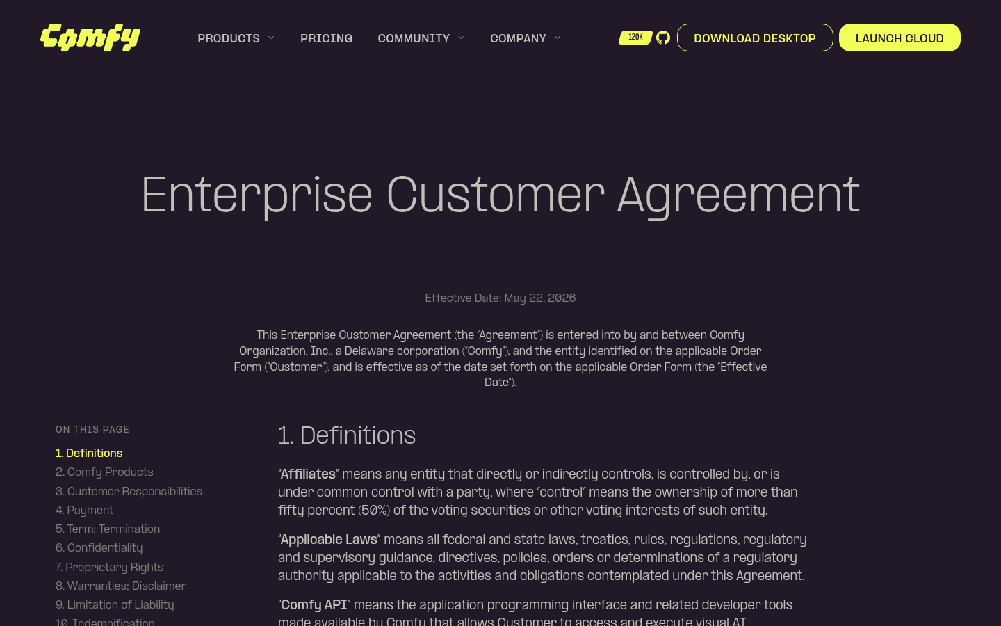 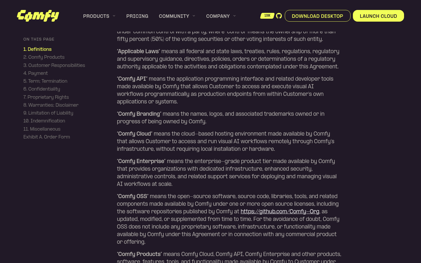   --------- Co-authored-by: Glary-Bot <glary-bot@users.noreply.github.com> Co-authored-by: Michael B <michael@imick.io> |
||
|
Robin Huang
|
b30cedffec |
fix: point Comfy API "View Docs" link to cloud overview (#13439)
*PR Created by the Glary-Bot Agent* --- Update the `docsApi` external link so the "View Docs" CTAs on the Comfy API product page point to the cloud overview's Quick Start section instead of the old API reference URL. - `apps/website/src/config/routes.ts`: `docsApi` → `https://docs.comfy.org/development/cloud/overview#quick-start` Both "View Docs" buttons on `/api` (in `HeroSection.vue` and `StepsSection.vue`) consume this single source of truth, so no component changes were needed. ## Verification - Confirmed destination page and `#quick-start` anchor exist (`docs/development/cloud/overview.mdx` has `## Quick Start`). - Ran the Astro dev server and loaded `/api` locally — both `VIEW DOCS` anchors resolve to the new URL. - `pnpm typecheck` / lint-staged (oxfmt, oxlint, eslint, typecheck) all pass via pre-commit. - `/review` sub-agent reviewed the diff: 0 findings, ready to merge. ## Screenshots Both hero and steps sections now link to the new URL. ## Screenshots 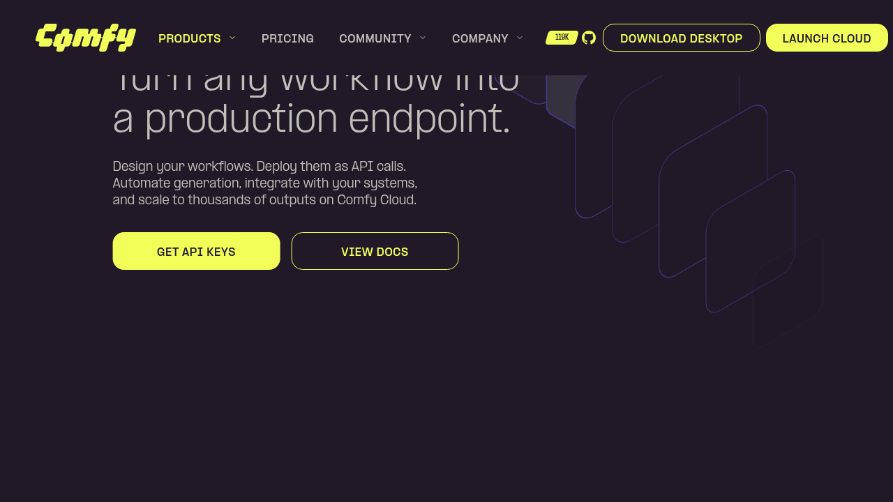 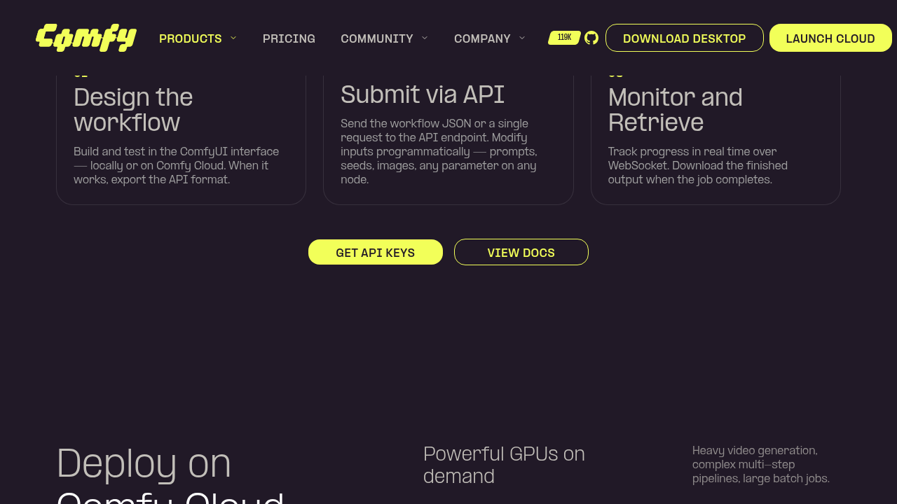 Co-authored-by: Glary-Bot <glary-bot@users.noreply.github.com> Co-authored-by: imick-io <153135517+imick-io@users.noreply.github.com> Co-authored-by: Michael B <michael@imick.io> |
||
|
imick-io
|
010389903d |
feat(website): sitewide announcement banner (#13481)
## Summary Adds a **sitewide announcement banner** to the website, rendered above the navbar on every page. It has a two-layer visibility model: - **Build-time gate** — a pure, unit-tested `evaluateBannerVisibility()` decides whether the banner mounts at all (active flag + optional date window + locale/section targeting), driven by a typed config (`src/config/banner.ts`). No CMS; copy resolves through i18n. - **Client-side dismissal** — persisted in `localStorage`, keyed by a **content hash** so editing the copy re-shows the banner (per-locale, so an en edit doesn't re-show it for zh-CN). Current content points the CTA at **Comfy MCP** (`/mcp`). ## Highlights - **Full-width branded bar** above a now-`sticky` navbar; reuses the design system (`Button`, gradient tokens, new reusable `IconButton`). - **Flash-free** on load: an inline pre-hydration script hides an already-dismissed banner before paint (no pop-in, no layout shift); `close()` sets the same signal after the leave animation to stay flash-free across ClientRouter navigations. - **Open/close transition**: grid-rows height collapse + fade, respecting `prefers-reduced-motion`. - **i18n**: copy in `en` + `zh-CN`. ## Where to edit later - **Copy**: `apps/website/src/i18n/translations.ts` → `launches.banner.text` / `launches.banner.cta` - **Link / on-off / dates / targeting**: `apps/website/src/config/banner.ts` (`bannerConfig`) ## Notes - On a static site the `startsAt`/`endsAt` window is evaluated at **build time** (documented in `banner.ts`). - Changing the copy or link changes the content hash, so previously-dismissed visitors will see the banner again — by design. ## Test plan - `pnpm test:unit` — evaluator + version-hash unit tests pass. - `pnpm typecheck` + lint clean. - On the preview: banner shows on `/`, `/launches`, and a `zh-CN` page; CTA -> `/mcp`; dismiss animates and stays dismissed on reload (no flash); reduced-motion disables the animation. 🤖 Generated with [Claude Code](https://claude.com/claude-code) --------- Co-authored-by: Claude Opus 4.8 (1M context) <noreply@anthropic.com> |
||
|
Benjamin Lu
|
684b0b08b0 |
feat(telemetry): register client + deployment platform axes on PostHog (#13469)
## Problem Filtering PostHog for the three product surfaces — **desktop local**, **desktop cloud**, **web cloud** — currently requires a different hack per pipe. For this repo's cloud build, the desktop-embedded frontend and a plain browser are indistinguishable except by sniffing `Electron` in `$raw_user_agent` (~124K desktop-cloud vs ~844K web-cloud execution events/week get separated that way today). ## Change Register the two standardized platform axes as PostHog super properties at SDK init in `PostHogTelemetryProvider`: - **`client`** — which surface emitted the event: `'desktop'` when the desktop preload bridge (`window.__comfyDesktop2`) is present, else `'web'`. The bridge is injected by Electron before any page script runs, so detection is deterministic — unlike the existing utm-based `source_app` attribution, which only covers sessions that *entered* via a desktop link. - **`deployment`** — which backend runs the work: pinned to `'cloud'`. The register happens before the pre-init event queue flushes, so events captured during the posthog-js dynamic-import window carry the axes too. ## Why pinning `deployment: 'cloud'` is safe (including embedded-in-desktop) The cloud bundle also runs **embedded in Comfy Desktop** — a cloud install loads this same bundle in Electron, where `isCloud` and the host bridge are both true. Two things happen there: 1. `main.ts` runs `initHostTelemetry()` *after* `initTelemetry()`, and (when remote config `enable_telemetry` is on) it **replaces** the registry with `HostTelemetrySink` — so tracked events (`execution_start`, …) route through the desktop main process, bypassing this provider. Those are tagged the same `client`/`deployment` values main-side from the install's source category ([Comfy-Desktop#1229](https://github.com/Comfy-Org/Comfy-Desktop/pull/1229)). 2. posthog-js keeps capturing independently of the registry (pageviews, web vitals, identify) — those are what these super properties cover in the embedded case, and `deployment: 'cloud'` is correct for them because the cloud bundle always talks to the cloud backend regardless of embedding; the embedding itself is what `client: 'desktop'` captures. The only way a cloud build runs against a non-cloud backend is a dev setup, where `window.__CONFIG__.posthog_project_token` is absent (injected by the cloud server) and the provider disables itself before registering anything. The locally-served frontend (desktop/localhost builds) never runs this provider: `__DISTRIBUTION__` is a compile-time define, so the `initTelemetry()` call folds away, with a runtime `IS_CLOUD_BUILD` guard as backstop. With both PRs, the three platforms become clean property filters: | Surface | Filter | |---|---| | Desktop local | `client=desktop, deployment=local` | | Desktop cloud | `client=desktop, deployment=cloud` | | Web cloud | `client=web, deployment=cloud` | ## Testing - `vitest run` on `PostHogTelemetryProvider.test.ts` — 45 passing, including new coverage: web default, bridge-present → `client=desktop`, and register-before-queue-flush ordering. The two desktop-entry tests that asserted `register` is never called were narrowed to assert no `source_app` register call. - `pnpm typecheck` + eslint/oxlint on touched files — clean. Ref [MAR-51](https://linear.app/comfyorg/issue/MAR-51/foundation-desktop-sdk-dual-send-to-posthog-alongside-mixpanel) --------- Co-authored-by: AustinMroz <austin@comfy.org> |
||
|
Benjamin Lu
|
95b121bed9 |
fix(website): unbreak website-e2e on main (card count, CTA overflow, stale goldens) (#13496)
## Summary Fix the website-e2e job, red on main since 2026-07-07 15:19 UTC, by updating the cloud model-card count test and regenerating stale visual screenshot goldens. ## Context website-e2e runs Playwright tests against the marketing site (`apps/website`). It broke on main in two independent ways, so every PR since — however unrelated — has shown a red website-e2e check: 1. **Model-card count.** #13431 added a sixth model card (GPT Image 2) to the /cloud "AI models" section but didn't update the test that pins the card count at 5. CI: `locator resolved to 6 elements`. 2. **Stale screenshot goldens.** #13431 also swapped the ProductCard CTA to the shared `Button` (`whitespace-nowrap`, so e.g. "SEE ENTERPRISE FEATURES" renders on one line instead of wrapping) and committed matching `home-product-cards-*` goldens. Minutes later #13445 — a branch cut from main *before* #13431 — ran the screenshot-regen workflow, which checks out the raw PR branch, not the branch merged with main. Its regenerated lg/xl goldens therefore depict the **old** pre-#13431 card (wrapped label; pixel-identical layout to the pre-#13431 golden), and overwrote #13431's correct ones at merge. #13445's own website-e2e was red at merge time for exactly this reason. The sm/md goldens (last captured by #13431, without #13445's `ppformula-text-center` 0.19em→0.1em nudge) went stale by ~900 px the moment #13445 landed. ## Changes - **What**: `cloud.spec.ts` — model-card count assertion and test title 5 → 6 (verified against the 6 entries in `AIModelsSection.vue`; passes locally). - **What**: `ProductCard.vue` — `h-auto whitespace-normal` on the CTA `Button`. The shared Button's `whitespace-nowrap` made long labels ("SEE ENTERPRISE FEATURES") overflow past the card edge at lg/xl (live on prod since #13431); labels now wrap inside the card as they did before #13431. - **What**: regenerated `home-product-cards-*` goldens via the `Update Website Screenshots` workflow, run on this branch, so they capture the fixed rendering rather than enshrining the overflow. ## Review Focus - At lg, "SEE DESKTOP/CLOUD FEATURES" now also wrap to two lines: #13431 raised the CTA font from `text-xs` to `md:text-sm`, so those labels no longer fit one line in the 200px content box either (pre-fix they silently consumed the card padding). If design prefers one-liners, shrinking the CTA font is a follow-up. - Process gaps this incident exposed (follow-ups, not in this PR): the regen workflow captures against the raw branch instead of the main-merged result, and website-e2e was red on #13445 at merge without blocking it. --- *Six cards where five once stood,* *a button's text sat where it should —* *but pixels pinned in amber lied,* *so Linux looked, and rectified.* --------- Co-authored-by: github-actions <github-actions@github.com> |
||
|
Wei Hai
|
baeb6df662 |
Gate signup submit on Turnstile being enabled, not enforced (#13463)
## Summary - Shadow-mode Turnstile never blocked the signup Submit button on the async Cloudflare challenge resolving, so most real submits raced ahead of the widget and reached the backend with an empty token. This defeated the point of shadow mode, which needs real tokens to measure the false-positive rate before flipping to enforce. - Submit is now blocked while the widget is enabled (shadow or enforce) and has no token yet, in both modes. - To keep a broken or slow Cloudflare load (network issue, ad-blocker, CDN outage) from permanently blocking a legitimate signup, `TurnstileWidget` now reports itself "unavailable" on a script-load failure, a challenge error, or a 9s load timeout, and the form treats that the same as shadow previously did: proceed without a token. ## Test plan - [x] `vitest run` on `TurnstileWidget.test.ts` + `SignUpForm.test.ts` (unit tests updated/added, all passing) - [x] `pnpm typecheck` / eslint / oxlint / stylelint / oxfmt via pre-commit hooks - [ ] Manual click-through on staging to confirm no perceptible UX regression during normal-latency challenge solves - [ ] Confirm the 9s fallback timeout against real p95 Turnstile challenge-solve latency 🤖 Generated with [Claude Code](https://claude.com/claude-code) |
||
|
CodeJuggernaut
|
e58b231664 |
fix: suppress the stray focus ring on the sidebar splitter panel (#13482)
Clicking empty space in a workspace panel focuses the whole PrimeVue SplitterPanel (tabindex=-1 makes it click-focusable), and any following non-chord keypress (e.g. Shift) trips the browser focus-visible heuristic, painting the default blue ring around the entire panel. The wrappers are not Tab-reachable (Tab lands on the controls inside, never the panel box) and nothing focuses them programmatically, so the ring conveys nothing. `focus-visible:outline-hidden` suppresses it while keeping a forced-colors (High Contrast) indicator. Confirmed as noise with design (Alex Tov). Covers every click-focusable panel in `LiteGraphCanvasSplitterOverlay.vue`: the sidebar panel (both locations), the properties-side panel (both branches), and the bottom panel. The center and graph-canvas panels are left untouched - they inherit `pointer-events-none`, so a click can never focus them. ## Repro / QA Ring trigger: click an empty, non-interactive spot inside the panel, then press solo Shift. On main the browser paints a blue ring around the whole panel; on this PR nothing appears. (Ctrl+Shift only triggers when Shift lands first, hence the original "sometimes".) | Panel | How to open | Fixed | | --- | --- | --- | | Sidebar (left, default) | Any rail icon, e.g. Assets | yes | | Sidebar (right) | Settings > Sidebar Location > right | yes | | Properties-side panel | Toggle properties panel / builder mode | yes | | Bottom panel | Toggle Logs/Terminal | yes | | Canvas / center | n/a | untouched - pointer-events-none, cannot be click-focused | - [ ] Each fixed panel: click empty spot, press Shift, no ring - [ ] Same steps on main/prod show the ring (before-state) - [ ] Tab still reaches controls inside each panel and their own focus rings still show - [ ] Media Assets shortcuts unchanged (Ctrl/Cmd+A, marquee modifiers) - PR is CSS-only - Surfaced during design review of #13323 |
||
|
Comfy Org PR Bot
|
545b48ee5b |
[chore] Update Ingest API types from cloud@421de6d (#12777)
## Automated Ingest API Type Update This PR updates the Ingest API TypeScript types and Zod schemas from the latest cloud OpenAPI specification. - Cloud commit: 421de6d - Generated using @hey-api/openapi-ts with Zod plugin These types cover cloud-only endpoints (workspaces, billing, secrets, assets, tasks, etc.). Overlapping endpoints shared with the local ComfyUI Python backend are excluded. --------- Co-authored-by: mattmillerai <7741082+mattmillerai@users.noreply.github.com> Co-authored-by: Benjamin Lu <benjaminlu1107@gmail.com> Co-authored-by: GitHub Action <action@github.com> |
||
|
Benjamin Lu
|
22ea53fb56 |
fix(ci): remove out-of-rootDir config files from package tsconfig includes (#13485)
## Summary Type-aware oxlint rejects `packages/ingest-types/tsconfig.json` and `packages/object-info-parser/tsconfig.json` as invalid (TS6059): their `include` lists a root-level config file (`openapi-ts.config.ts` / `vitest.config.ts`) that sits outside `rootDir: "src"`. This fails the lint-and-format job with "Invalid tsconfig" on any PR that touches those packages' src files — currently blocking every auto-generated ingest-types sync (e.g. #12777). ## Changes - **What**: Drop the out-of-`rootDir` config-file entries from the two package tsconfig `include` arrays, matching the other workspace packages. Repro: `pnpm exec oxlint --type-aware packages/ingest-types/src/index.ts` fails before, passes after; the config files themselves still lint clean. ## Review Focus Neither package emits a build, so `rootDir`/`outDir` are editor/lint-only; excluding the config files from the project has no runtime effect (vitest/openapi-ts load their configs directly). |
||
|
cloud-code-bot[bot]
|
9fe5dd51b8 |
ci: bump cursor-review to github-workflows@df507e6 (#13493)
Automatic SHA bump — `cursor-review.yml` was updated in
`Comfy-Org/github-workflows` at
[`df507e6`](
|
||
|
Wei Hai
|
747f76db76 |
ci: auto-merge approved, green backport PRs (#13390)
## Problem `pr-backport.yaml` opens each backport PR (labelled `backport`) and calls `gh pr merge --auto --squash`. GitHub's `--auto` only takes effect when the repository's **"Allow auto-merge"** setting is enabled — it's currently off, so that call is a silent no-op (swallowed by its `|| echo "::warning::…"`). The result: every backport PR sits unmerged until someone manually clicks merge, even when it's already approved with green checks. ## What this does Adds `.github/workflows/backport-auto-merge.yaml`, which completes the merge directly — a plain `gh pr merge --squash` (which does **not** depend on the "Allow auto-merge" setting) — once GitHub reports the PR ready to merge. Ready = `reviewDecision == APPROVED` **and** `mergeStateStatus` is `CLEAN` or `UNSTABLE`. `UNSTABLE` means the required checks passed but a *non-required* check is still pending/failing — GitHub still permits that merge, and gating on `CLEAN` alone would leave backports stuck behind slow/flaky non-required checks (Socket, codecov, perf, storybook, etc.). **Branch protection stays the real gate.** The `core/**` / `cloud/**` ruleset unconditionally requires an approval + the required checks and can't be bypassed, and GitHub's merge API re-enforces it at merge time — so this workflow can only ever finish a merge that already satisfies those rules. The eligibility check just avoids pointless attempts. ## Design notes - **Merges with `PR_GH_TOKEN`, not the default token**, on purpose: a merge by the default `GITHUB_TOKEN` does not emit the `pull_request: closed` event, which would silently starve `cloud-backport-tag.yaml` (it creates the `cloud/vX.Y.Z` tag on that event). - **Triggers:** review submission + check-suite completion (low latency), plus a 30-min sweep as a backstop for cases the events miss. - **Never checks out PR code** (no untrusted-code path); only reads PR metadata via the API. `permissions` on the default token are read-only. - **Idempotent, bounded merge loop:** treats an already-merged PR (e.g. a concurrent run or a human) as success, so it won't post a false failure comment. - Leaves the existing conflict path in `pr-backport.yaml` untouched (conflicts never create a PR, so there's nothing here to act on). ## Validation YAML parses; `actionlint` (with shellcheck) and `zizmor` both clean (0 findings). ## Before relying on it - Confirm the org allows this workflow to run/merge (Actions policy) — the merge uses a PAT so it shouldn't depend on the "Actions can approve PRs" toggle, but worth verifying. - First real backport: confirm it merges on ready and that `cloud-backport-tag.yaml` then fires and creates the tag. |
||
|
Mobeen Abdullah
|
386460afef |
fix(website): center button labels by tuning ppformula-text-center (#13445)
## Summary Vertically center button/badge/nav labels by tuning the shared `ppformula-text-center` utility from `top: 0.19em` to `top: 0.1em`. ## The alignment issue PP Formula (our brand font) has asymmetric vertical metrics: its caps sit high in the line box, so a naively centered label looks too high. `ppformula-text-center` compensates by nudging the label down with `position: relative; top: <em>` (a purely visual shift, it does not change the element's box, so button/badge sizes are unaffected). The value was `0.19em`, which **over-corrected**: the glyph ink ended up ~1.4px **below** center on every button, so labels read slightly low. Measuring the actual glyph ink (canvas `measureText` `actualBoundingBox*`) showed ~**0.09-0.10em** centers uppercase labels; `0.1em` lands the ink within ~0.1px of center. ## Why it's safe (verified) This utility is used site-wide (Button, Badge, ButtonPill, ButtonMask, BrandButton, nav triggers, section labels). Because it's a `position:relative` nudge, there is **no layout/box-size change** anywhere. I measured glyph-ink centering across **12 pages** (home, cloud, cloud/pricing, download, careers, customers, demos, enterprise, api, mcp, gallery, learning): - Buttons/badges/pills went from ~1.37px low to **~0.11px** (centered). - **Nothing regressed** (no element pushed too high). - The handful of numeric "outliers" were `text-transform: uppercase` measurement artifacts (source text with descenders that don't render); confirmed visually as centered. ## Changes - **What**: `apps/website/src/styles/global.css` — `ppformula-text-center` `top: 0.19em` → `0.1em` (one line). --------- Co-authored-by: github-actions <github-actions@github.com> |
||
|
Mobeen Abdullah
|
5cf647d183 |
feat(website): add GPT Image 2 to cloud page model list (#13431)
## Summary Add GPT Image 2 to the `/cloud` "AI models" section, and apply the design review polish from Bert and June on the same section and the neighbouring cloud-page cards. ## Changes - **GPT Image 2 card**: 6th card in `AIModelsSection` (workflow video on `media.comfy.org`, OpenAI badge reused from `packages/design-system`), new `cloud.aiModels.card.gptImage2` i18n key (en + zh-CN), and GPT Image 2 added to the `cloud.reason.2.description` partner-model list. - **AI models layout**: the six cards are now equal 1:1 squares in one shared grey container (was a per-card treatment, then simplified to a single container per design), with a corner arrow affordance on each. - **Audience cards** (`AudienceSection`): the creators / teams cards now link to `cloud.comfy.org` with the same corner arrow (highlights on card hover). - **Reusable `CardArrow`**: extracted the corner arrow into a shared, decorative (`aria-hidden`) component used by both sections; `hover="group"` (card hover) for audience, self-hover for the model cards so it doesn't double up with the provider badge. - **`ProductCard` CTA**: swapped the hand-rolled pill `<span>` for the shared `Button` (`as="span"`) so the label is vertically centered (fixes Bert's off-centre text) without nesting an anchor inside the card link. ## Split out of this PR - **Button label centering** (the global `ppformula-text-center` tweak) → separate PR #13445, so the site-wide change is reviewed in isolation. - **Pricing banner frame fix** reverted here; it belongs in Michael's upcoming pricing PR (team tier, edu billing, FAQ). `PricingSection.vue` shows only an automatic Tailwind class-order reformat from the pre-commit hook, no behaviour change. ## Review focus - The single-container AI models layout and the `CardArrow` hover behaviour (group vs self). - `Button as="span"` inside the `ProductCard` link (avoids nested `<a>`). Linear: FE-423 --------- Co-authored-by: github-actions <github-actions@github.com> |
||
|
Mobeen Abdullah
|
fe1fc8baa6 |
fix(website): standardize favicon to square brand icon (#13467)
## Summary Standardize the marketing-site favicons to the square, full-bleed brand mark (ink background, yellow C) so each platform applies its own corner mask instead of double-rounding a pre-rounded asset. ## Changes - **What**: Replace three files in `apps/website/public/`: - `favicon.svg` — was a 57 KB RealFaviconGenerator wrapper around an embedded PNG; now a 1.2 KB vector of the square mark. - `favicon-96x96.png` and `apple-touch-icon.png` — regenerated square. The apple-touch icon previously had transparent rounded corners, which iOS composites onto a white tile; it is now full-bleed. - `favicon.ico` and the `web-app-manifest-*.png` files were already the square mark, so they are left unchanged. ## Review Focus - Favicons cache aggressively (browser + CDN, and these paths are marked `immutable` in `vercel.json`), so verify the preview with a hard refresh or a fresh profile. - Part of the org-wide favicon standardization (FE-705). Companion PRs update the workflows hub, docs, and registry favicons to the same mark. Design direction (square, not rounded) confirmed by Bert. ## Screenshots The before/after for each binary is visible inline in the Files changed tab. Square ink + yellow C, no transparency, sharp corners. |
||
|
Benjamin Lu
|
3e4dd59e5f |
feat(navigation): add opt-in strip-on-capture to preserved-query tracker (#13465)
## What - `installPreservedQueryTracker` definitions accept an opt-in `stripAfterCapture` flag: the marked keys are captured into the sessionStorage stash and removed from the URL before the navigation completes (single guard redirect at the decoded query-object level; push/replace semantics are inherited from the original navigation, and vue-router force-replaces the initial one). - `preservedQueryManager` now captures the first non-empty string element of repeated (array-valued) params instead of silently dropping them. - New real-router test suite for the tracker (createRouter + createMemoryHistory, no router mocks), including a history-depth test pinning the push/replace inheritance; manager tests extended for the array/junk-value cases. ## Why One-time secrets in query params (first consumer: desktop login codes, GTM-93) must not linger in the visible URL, browser history, `previousFullPath` redirects, or telemetry. Stripping after navigation — what each loader does ad hoc today — leaves a window and forces per-feature URL scrubbing; #13418 originally needed a hand-rolled encoding-aware string parser in three places. Stripping at capture time, at the decoded query-object level, makes the stash the only carrier and lets vue-router round-trip the surviving params' encoding itself. Capability only — no existing namespace opts in; behavior is unchanged for all current definitions. `stripAfterCapture`'s contract is documented on the option: strip-marked keys must never be read from `route.query` by later guards or views; the stash is the only post-capture source. ## Landing order Independent of everything else; #13418 stacks on this branch. |
||
|
Benjamin Lu
|
e25e0f2e16 |
refactor: simplify slot link drop finalization (#13471)
## Summary

Small cleanup in `useSlotLinkInteraction.ts`, no behavior change:

- Removed a duplicated `raf.flush()` in `finishInteraction` (it was
called twice back-to-back).
- Collapsed four single-line `attempt*` alias closures in
`connectByPriority` into a direct short-circuit chain, preserving the
same evaluation order:

  ```ts
  return (
    tryConnectToCandidate(snappedCandidate) ||
    tryConnectToCandidate(domSlotCandidate) ||
    tryConnectToCandidate(nodeSurfaceSlotCandidate) ||
    tryConnectViaRerouteAtPointer()
  )
  ```

The closures added no behavior beyond renaming the calls (AGENTS.md rule
26), and `||` gives the same first-truthy-wins semantics as the previous
`if (attempt()) return true` ladder.

Verification not rerun after rebasing onto `Comfy-Org/main`; original
branch reported `pnpm typecheck`, `pnpm lint`, `pnpm format:check`,
`pnpm knip`, and the existing `useSlotLinkInteraction` unit tests
passing.

Link to Devin session:
https://app.devin.ai/sessions/1351ff5174494106a7a688777554f387
Requested by: @benceruleanlu

Co-authored-by: Devin AI <158243242+devin-ai-integration[bot]@users.noreply.github.com>
|
||
|
Benjamin Lu
|
2ee91c30ee |
fix: report CLA check in merge queue (#13477)
Report the CLA Assistant required check for merge queue commits so queued PRs do not wait indefinitely on a check that ran on the PR head. |
||
|
Alexis Rolland
|
854770d305 |
ci: Update CLA workflow to build author-only allowlist (#13378)
## Summary

Update CLA workflow to build a dynamic `allowlist` that includes
everyone except the author of the PR. This relaxes the CLA signature
requirement so that it is limited to the PR author only. By signing, the
author confirms he gots approval from other contributors.

## Changes

- **What**: `cla.yml`

## Screenshots (if applicable)

<img width="1831" height="756"
alt="{B6F6C23D-EC2E-4BB3-A288-99B6087F4CAC}"
src="https://github.com/user-attachments/assets/62c04465-d1a3-4ddb-bfe7-950a29a802c4"
/>
|
||
|
jaeone94
|
2e4c9c6fdc |
style: use neutral credits info button (#13461)
## Summary Replaces the Additional credits tooltip trigger with the shared Button component so the icon renders with the neutral muted treatment used by the rest of the UI. ## Changes - **What**: Uses the shared Button component for the Additional credits info action while preserving the existing tooltip and aria label. - **Dependencies**: None. ## Review Focus Confirm this remains a visual-only change scoped to the Plan & Credits credits tile. ## Screenshots (if applicable) Before <img width="397" height="368" alt="스크린샷 2026-07-06 오후 11 30 38" src="https://github.com/user-attachments/assets/9cda1aee-4dc2-4ce1-b001-29d0e09fc07d" /> After <img width="374" height="355" alt="스크린샷 2026-07-06 오후 11 31 00" src="https://github.com/user-attachments/assets/64d0b726-6031-42d4-84d7-35405150698c" /> ## Testing - `pnpm format` - `pnpm lint` - pre-commit hook: stylelint, oxfmt, oxlint, eslint, typecheck - `pnpm test:unit src/platform/cloud/subscription/components/CreditsTile.test.ts` |
||
|
Mobeen Abdullah
|
7d2858e74b |
feat(website): add Supported Models link to nav and footer (#13432)
## Summary Surface the supported-models catalog (`/p/supported-models`) from the home page by adding a "Supported Models" link to the Products dropdown and the footer. ## Changes - **What**: Add a `nav.supportedModels` i18n entry (en `Supported Models`, zh-CN `支持的模型`) and link it to the existing `routes.models` constant in two places: the Products mega-menu Features column (between Launches and Docs) and the footer Products column (after Comfy MCP). Locale handling comes from `getRoutes`, so zh-CN resolves to `/zh-CN/p/supported-models` automatically. ## Review Focus - Placement is intentionally in **both** the nav and the footer (per FE-1190). Fine to drop either, happy to adjust after review. - Reuses the existing nav/footer link pattern, no new components or styles, and no `new` badge (the page is not newly launched). - Consumes `routes.models`, which was already defined but previously unused. FE-1190 ## Screenshots **Nav — Products dropdown, Features column** _Desktop:_ _Mobile:_ **Footer — Products column** _Desktop:_ _Mobile:_ Preview: https://comfy-website-preview-pr-13432.vercel.app |
||
|
Robin Huang
|
b9a0ac0fed |
fix(manager): drop embed=true so the Cloud survey renders its dark theme (#13438)
Remove `embed=true`, so PostHog applies the survey's own dark appearance and it renders correctly. Verified live on testcloud that removing the flag fixes the styling; `distinct_id` user linkage is unaffected. |
||
|
AustinMroz
|
b61e54db3b |
Allow forcing icon display as mask or image (#13414)
- Adds support for forcing an icon to display as a mask or image with `icon-mask` and `icon-image`. - Updated the logic so that svg of a solid color (like the claude logo) display as an image by default - Update many svg to consistently use `currentColor` so that they still function as masks by default |
||
|
jaeone94
|
b51ea29074 |
test: clean up TemplateHelper route mocks (#13019)
## Summary Follow-up draft PR for the CodeRabbit issues created from the #12999 review. This keeps the original stabilization PR merged as-is and moves the non-functional TemplateHelper cleanup into its own small branch. ## Changes - Extracted TemplateHelper route patterns into named module-scope constants. - Normalized the TemplateHelper route patterns to anchored regexes with optional query-string handling. - Extracted `mockCustomTemplates()` from `mockIndex()` and made `mock()` register custom templates, core index, and thumbnails together. - Added a private `registerRoute()` helper so every mocked route is registered for teardown consistently. - Simplified the fixed empty custom-template response to `body: '{}'`. - Updated the cloud template filtering spec to use `templateApi.mock()` instead of manually combining thumbnail and index mocks. ## Issues - Closes #13014 - Closes #13016 - Closes #13017 - Closes #13018 - Related #13015: this PR normalizes the TemplateHelper route patterns only. The broader fixture-wide route pattern convention cleanup remains intentionally separate. ## Validation - `pnpm exec oxfmt --check browser_tests/fixtures/helpers/TemplateHelper.ts browser_tests/tests/templateFilteringCount.spec.ts` - `pnpm exec eslint browser_tests/fixtures/helpers/TemplateHelper.ts browser_tests/tests/templateFilteringCount.spec.ts` - `pnpm typecheck:browser` - Pre-commit hook also ran `oxfmt`, `oxlint`, `eslint`, `pnpm typecheck`, and `pnpm typecheck:browser` successfully. Note: I attempted the targeted cloud Playwright spec locally with `PLAYWRIGHT_LOCAL=1 PLAYWRIGHT_TEST_URL=http://localhost:5173 pnpm exec playwright test browser_tests/tests/templateFilteringCount.spec.ts --project=cloud`, but the local 5173 app was not running with the cloud distribution configuration, so the distribution-filter assertions failed in the expected local/cloud mismatch way. This should be verified by CI's cloud project. |
||
|
Robin Huang
|
d85ce2bf9e |
feat: add custom nodes waitlist survey to Manager button on Cloud (#13135)
## Summary On Comfy Cloud, show the Manager button and open a hosted survey in the manager modal (in place of the local node manager) so we can gauge demand for custom nodes on Cloud. ## Changes - **What**: `TopMenuSection` shows the Manager button when `isCloud`; clicking it opens `ManagerSurveyDialog`, which embeds a PostHog hosted survey via iframe. The survey URL comes per-environment from cloud config (`manager_survey_url`), with the logged-in user's `distinct_id` appended so responses link to the user. Includes loading/error states and PostHog's `posthog:survey:height` iframe auto-resize. - **Dependencies**: none ## Review Focus - Survey URL is sourced from `remoteConfig.manager_survey_url` (must be set per environment in cloud config); falls back to an error state when unset or malformed. - iframe embedding requires the PostHog survey to be `external_survey` type with embedding enabled. |







