mirror of
https://github.com/Comfy-Org/ComfyUI_frontend.git
synced 2026-06-06 05:46:39 +00:00
36c7fbfee0ce4caff6affbd7413fccbcdc1940cc
8207 Commits
| Author | SHA1 | Message | Date | |
|---|---|---|---|---|
 Michael B
|
36c7fbfee0 |
refactor: extract ShowcaseCard component from models showcase
Move per-card markup out of ModelsShowcaseSection into a dedicated ShowcaseCard component (mirroring GalleryCard). Switch the card to a uniform h-80 height, animate the badge color on hover, and drop the now-conflicting aspect-ratio classes that caused cards to overflow their grid columns. |
||
|
Michael B
|
3417fbb7e5 | feat: add featured AI models showcase to models page | ||
|
Michael B
|
6ed81e05db | feat: add creations and product showcase sections to models page | ||
|
Michael B
|
08354d74a3 |
feat: add models page hero section
Adds ModelsHeroSection component, models list pages (en and zh-CN), and accompanying i18n translations. |
||
|
imick-io
|
5ddf5faef3 |
feat: scaffold Learning page with Featured Workflow, Tutorials, and CTA sections (#12602)
## Summary Adds a new Learning page to the website with a hero, featured workflow showcase, tutorials section, and CTA, wired into site nav and footer Resources. ## Changes - **What**: - New `/learning` page (Astro) with `HeroSection`, `FeaturedWorkflowSection`, `TutorialsSection`, and `CallToActionSection` - Localized for `zh-CN` at `/zh-CN/learning` - Featured workflow CTA links out to `comfy.org/workflows/<slug>` - Added `nav.learning` translation; added Learning entry to `SiteNav` and `SiteFooter` Resources - New shared `PillButton`, `MaskRevealButton`, `Badge`, and `VideoPlayer` work used by the page; `TutorialDetailDialog` for tutorial deep-dives - Featured demo video updated; poster image added - `routes.ts`: added `learning` route entry - `EventsSection` temporarily hidden pending content ## Review Focus - Copy on `learning.featured.description` (newly written, both `en` and `zh-CN`) - Tutorial data shape in `data/learningTutorials*.ts` - Internal-vs-external link styling: Learning shows the active-page yellow when viewing `/learning` (expected — internal route, no external arrow) ## Screenshots (if applicable) _Add deployment preview screenshots here._ --------- Co-authored-by: Claude Opus 4.7 (1M context) <noreply@anthropic.com> Co-authored-by: Alexander Brown <drjkl@comfy.org> |
||
|
Terry Jia
|
4fe78997b0 |
fix(load3d): load Preview3DAdvanced output from temp/, allow temp loadFolder (#12661)
follow up https://github.com/Comfy-Org/ComfyUI_frontend/pull/12527 use temp folder for new Preview3DAdvanced node BE https://github.com/Comfy-Org/ComfyUI/pull/14294 |
||
|
Dante
|
cda2929572 |
fix: use thumbnail previews for on-node image grid cells (FE-741) (#12561)
## Summary On-node image grids rendered **full-resolution** `/api/view` images into small grid cells. `nodeOutputStore.buildImageUrls` only appends a thumbnail flag via `app.getPreviewFormatParam()`, which returns `''` whenever `Comfy.PreviewFormat` is empty (the default on a fresh install). So each grid `<img>` received the original URL with no `&preview=`, and the browser downloaded + decoded the full asset into a ~98px cell. Fix: grid cells request a lightweight thumbnail URL via a new `getGridThumbnailUrl` helper — server-resized on cloud (`res`, mirroring `ResultItemImpl.previewUrl`) and re-encoded to a compact format on every backend (`preview=webp;75`). Gallery / full-view URLs stay at full resolution; a URL that already carries a `preview` (user-set `Comfy.PreviewFormat`) and SVGs (the server cannot rasterize them into a preview) are left untouched. Scoped to the Vue `ImagePreview.vue` path; the legacy canvas preview is deprecated. - Linear: [FE-741](https://linear.app/comfyorg/issue/FE-741) ## Before / After (CDP, localhost:5173 → OSS backend, default settings) Reproduced by rendering an on-node grid of 3 input images on a `SaveImage` node. Measured the `/api/view` request for `02_tangled_code.png` (2560×1440) in one ~98px grid cell: | | Grid cell `<img>` src | Transfer | Type | |---|---|---|---| | **Before** | `…&filename=02_tangled_code.png&subfolder=&rand=…` | **3,222,654 B (3.07 MB)** | `image/png` | | **After** | `…&filename=02_tangled_code.png&subfolder=&rand=…&preview=webp;75` | **119,098 B (116 KB)** | `image/webp` | **~27× less bandwidth** per cell (-96.3%). On cloud the URL additionally gets `res=512` for a true server-side downscale. | Before | After | |---|---| | <img width="430" alt="fe-741-before" src="https://github.com/user-attachments/assets/677b19aa-1b89-4a22-a98f-79c122f5b9d6" /> | <img width="430" alt="fe-741-after" src="https://github.com/user-attachments/assets/6b4b30b0-14bb-4f19-8407-01f8e5de9143" /> | On-node rendering is pixel-identical (OSS re-encodes rather than downscales) — no visual regression; the win is the transferred bytes/format shown above. ## Red-Green Verification | Commit | CI | Result | |--------|----|--------| | [`test:` `b1b410b5`](https://github.com/Comfy-Org/ComfyUI_frontend/actions/runs/26740459200) | 🔴 Red | grid `<img>` still used the full-res URL → test fails | | [`fix:` `2025cbe7`](https://github.com/Comfy-Org/ComfyUI_frontend/actions/runs/26740850069) | 🟢 Green | grid `<img>` requests a thumbnail → test passes | Follow-up `4fff42ed` hardens SVG handling and adds `getGridThumbnailUrl` unit tests (CI green). ## Test Plan - [x] CI red on test-only commit ([run](https://github.com/Comfy-Org/ComfyUI_frontend/actions/runs/26740459200)) - [x] CI green on fix commit ([run](https://github.com/Comfy-Org/ComfyUI_frontend/actions/runs/26740850069)) - [x] CDP before/after on a live on-node grid (network transfer 3.07 MB → 116 KB per cell) - [x] Unit suites green: `ImagePreview` 31/31, `imageUtil` 10/10; gallery/full-view URLs unchanged |
||
|
jaeone94
|
82bea29dda |
fix: defer node auto-pan until drag starts (#12654)
## Summary Fix a Vue node drag edge case where holding the partially off-screen Advanced inputs button could continuously auto-pan the canvas even though the pointer had not moved into an actual drag. Linear: [FE-938](https://linear.app/comfyorg/issue/FE-938/holding-partially-off-screen-advanced-inputs-causes-continuous) ## Changes - **What**: Move Vue node auto-pan initialization from `startDrag()` to `handleDrag()`, so auto-pan starts only after the pointer interaction has become a real drag. - **What**: Keep the existing auto-pan behavior during active drags by creating the controller on the first `handleDrag()` call, updating its pointer position on later drag frames, and preserving the existing `onPan` position adjustments. - **What**: Add unit coverage for the important drag lifecycle invariants: no auto-pan on pointerdown/startDrag, auto-pan starts on handleDrag, the same controller is reused across handleDrag calls, and cleanup still stops auto-pan on endDrag. - **What**: Add a Playwright regression that places the Advanced inputs button partially beyond the visible canvas edge, holds the pointer down without moving, and verifies the canvas offset stays stable. - **What**: Add `data-testid="advanced-inputs-button"` to the Advanced inputs footer button variants so the regression test does not depend on translated button text. - **Breaking**: None. - **Dependencies**: None. ## Root Cause `useNodeDrag.startDrag()` created and started `AutoPanController` immediately on pointerdown. When the Advanced inputs button was partly outside the canvas bounds, a stationary pointer near the visible canvas edge was enough for auto-pan to begin, even before any drag movement occurred. The pointer interaction layer already distinguishes press/hold from real dragging before calling `handleDrag()`. Deferring auto-pan to `handleDrag()` aligns auto-pan startup with that drag threshold and prevents a plain hold from panning the canvas. ## Review Focus - Auto-pan should not start from `startDrag()`/pointerdown alone. - Auto-pan should still start promptly once `handleDrag()` runs for an actual drag. - Repeated `handleDrag()` calls should reuse the existing controller rather than recreate it. - Existing `onPan` behavior should continue to update drag start positions, selected node start positions, selected groups, and node positions during active drags. - The E2E intentionally asserts the canvas offset, not node bounds, because the reported bug is unintended canvas auto-pan while the pointer is stationary. ## Red-Green Verification - `a00b5d2fb test: add failing advanced button hold pan regression`: adds the Playwright regression and test id plumbing. This was verified red against the pre-fix production code. - `5c207ae28 fix: defer node auto-pan until drag starts`: adds the production fix and unit coverage. The same regression is verified green with the fix. ## Validation - `pnpm format` - `pnpm lint` - `pnpm typecheck` - `pnpm typecheck:browser` - `pnpm test:unit` - `pnpm test:unit src/renderer/extensions/vueNodes/layout/useNodeDrag.test.ts` - `PLAYWRIGHT_SETUP_API_URL=http://127.0.0.1:8188 pnpm test:browser:local browser_tests/tests/vueNodes/interactions/node/move.spec.ts --grep "should not pan while holding the Advanced button without dragging"` - Pre-push hook: `pnpm knip --cache` ## Screenshots (Before / After) Before https://github.com/user-attachments/assets/6080de2d-e2da-4b38-a1ed-1f1f88548c2d After https://github.com/user-attachments/assets/f331271a-9ea1-41ec-92cb-974bc57be56b |
||
|
jaeone94
|
d129f757c0 |
fix: keep connected advanced inputs visible (#12652)
## Summary Keep connected advanced widget inputs visible on Vue-rendered nodes when advanced inputs are collapsed. This fixes Linear [FE-924](https://linear.app/comfyorg/issue/FE-924/bug-connected-advanced-input-parameters-become-hidden-when-advanced), where a user could connect a noodle to an advanced input, collapse advanced inputs, and then lose visual access to the connected parameter even though it was actively used by the workflow. ## Changes - **What**: Treat a widget-backed input as visible when its slot is linked, even if the widget is advanced and the node-level advanced section is collapsed. - **What**: Move Vue node widget rendering to use the processed `widget.visible` value instead of reimplementing visibility in `NodeWidgets.vue`. - **What**: Keep the visibility decision as a single source of truth during widget processing, including the existing deduplication path. - **What**: Add unit coverage for the new linked-widget visibility behavior and the precedence rule that explicit hidden state still wins. - **What**: Add an E2E regression that connects a `PrimitiveFloat` to the advanced `max_shift` input on `ModelSamplingFlux`, collapses advanced inputs, and verifies the connected input remains visible while an unconnected advanced input remains hidden. - **Breaking**: None. - **Dependencies**: None. ## Review Focus The key behavior is that linked advanced widgets should be promoted into the visible widget set only while they are connected. Explicitly hidden widgets must remain hidden even when linked. The fix uses existing slot metadata from `useGraphNodeManager`; no new graph state is introduced. This keeps the change scoped to Vue node widget processing and rendering. ## Red-Green Verification | Commit | Purpose | Local result | | --- | --- | --- | | `4fa5932c6` | Adds the E2E regression only | Red: `max_shift` was not found after collapsing advanced inputs | | `e5d1ee06a` | Adds the production fix and focused unit coverage | Green: targeted E2E passed | ## Test Plan - `pnpm test:unit src/renderer/extensions/vueNodes/composables/useProcessedWidgets.test.ts` - `PLAYWRIGHT_LOCAL=1 PLAYWRIGHT_TEST_URL=http://127.0.0.1:5175 PLAYWRIGHT_SETUP_API_URL=http://127.0.0.1:8188 pnpm test:browser -g "should keep connected advanced widgets visible when advanced inputs are hidden" browser_tests/tests/vueNodes/widgets/advancedWidgets.spec.ts` - `pnpm typecheck && pnpm typecheck:browser` ## Screenshots (Before / After) Before https://github.com/user-attachments/assets/bf1e88f3-2983-4bef-9cef-48ffe6dbfd6d After https://github.com/user-attachments/assets/4dee7766-0252-478f-9b1c-4b801fc20eb2 |
||
|
jaeone94
|
874b486640 |
fix: resolve missing resource error messages (#12646)
## Summary Resolve missing resource error groups through the error catalog so missing nodes, replaceable nodes, missing models, and missing media use consistent panel and single-error overlay copy. ## Changes - **What**: Adds missing-resource resolvers for `missing_node`, `swap_nodes`, `missing_model`, and `missing_media` that provide `displayMessage`, `toastTitle`, and `toastMessage` alongside the existing group titles. The Errors tab now renders a group-level `displayMessage` under non-execution group headers, which gives grouped missing-resource cards the same explanatory message path used by validation/runtime errors without adding per-row detail fields that these grouped cards do not need. - **What**: Moves missing node and swap node explanatory copy out of card-local hardcoded text and into `errorCatalog.missingErrors.*` keys. `MissingNodeCard` and `SwapNodesCard` now focus on rendering their grouped rows and actions, while the shared error group header owns the explanatory copy. - **What**: Adds environment-aware copy for missing node packs and missing models. Cloud messages explain unsupported resources and replacement/import paths without suggesting local execution, while OSS messages point users toward installing or downloading the missing resources. - **What**: Adds single-error overlay/toast copy for missing resources. Missing media uses a concise input-focused title/message, missing models distinguish Cloud unsupported models from OSS missing files, and missing nodes/swap nodes use node-type-aware copy. - **What**: Deduplicates missing node and swap node toast decisions by distinct node type so repeated instances of the same missing/replaceable node do not accidentally switch the single-error copy to plural copy. - **What**: Preserves representative missing media candidate metadata so missing media toast copy can use a human-readable node name such as `Load Image is missing a required media file.` - **What**: Removes unused missing-resource resolver fields such as grouped `displayDetails`, grouped `displayItemLabel`, and the unused `mediaTypes` source parameter after deciding those fields do not fit grouped missing-resource cards. - **Breaking**: None. - **Dependencies**: None. ## Review Focus - Missing resource groups are still grouped cards. This PR intentionally gives them group-level display and toast copy, but does not split missing resources into one error item per underlying candidate. - Missing resource count semantics are intentionally not normalized here. Error overlay totals, store counts, and grouped card counts still follow the existing behavior; a follow-up PR can define those count units separately. - The Cloud/OSS message variants remain explicit in the resolver instead of being abstracted into a generic variant helper. That keeps this PR focused on the messaging behavior and avoids a broader resolver refactor. - Only `src/locales/en/main.json` is updated directly. Other locales should be synced by the existing localization flow. ## Screenshots (if applicable) <img width="668" height="245" alt="스크린샷 2026-06-05 오전 3 16 49" src="https://github.com/user-attachments/assets/98b50ac3-67e1-438d-8c37-e06c7bf465ee" /> <img width="666" height="195" alt="스크린샷 2026-06-05 오전 3 16 58" src="https://github.com/user-attachments/assets/92da95b1-03d6-4739-97e6-c573982bfec9" /> <img width="505" height="358" alt="스크린샷 2026-06-05 오전 3 17 27" src="https://github.com/user-attachments/assets/4d0e1a6e-13b9-4097-9fb5-19fe0c5331dc" /> <img width="507" height="324" alt="스크린샷 2026-06-05 오전 3 17 44" src="https://github.com/user-attachments/assets/054e42f8-0d0c-44b5-8a67-e467fc04f1fc" /> ## Validation - `pnpm format` - `pnpm lint` - `pnpm test:unit src/platform/errorCatalog/errorMessageResolver.test.ts src/components/rightSidePanel/errors/useErrorGroups.test.ts src/components/rightSidePanel/errors/TabErrors.test.ts` - `pnpm typecheck` - push hook: `knip --cache` |
||
|
Matt Miller
|
1eede54582 |
fix(cloud): render the OAuth consent view in the dark theme (#12655)
## Problem On the Comfy Cloud login flow, the OAuth / MCP consent modal (`/cloud/oauth/consent`) renders with broken colors: a light-gray card on the dark onboarding background, with a washed-out, barely-legible title, section headers, and permission labels. Reported via internal QA. ## Root cause The cloud onboarding shell (`CloudTemplate`) paints a dark surface using hardcoded brand tokens (`primary-comfy-ink` / `primary-comfy-canvas`) but never applies `.dark-theme` to the DOM. That class — which flips the design-system **semantic** tokens to their dark values — is only set by `GraphView` / `BaseViewTemplate`, neither of which mounts on the cloud onboarding routes. `OAuthConsentView` is the first onboarding view whose primary surface (the card) is built on semantic tokens, so without a dark-theme context they fall back to their light values: | token | fell back to (light) | should be (dark) | | --- | --- | --- | | `secondary-background` (card) | `#e9e9e9` | `#262729` | | inherited foreground (title / headers / labels) | `primary-comfy-canvas` `#c2bfb9` on `#e9e9e9` → illegible | `#c2bfb9` on `#262729` → legible | | `muted` (subtitle / help / card border) | `#71717a` | `#a1a1aa` | | `primary-background` (scope checks + CTA) | azure-400 `#31b9f4` | azure-600 `#0b8ce9` | The card sets no foreground of its own, so its title/headers/labels inherit `primary-comfy-canvas` from the shell — fine on a dark card, illegible on the light fallback one. The component markup is already correct; it just never receives a dark-theme context. (The sibling login/signup pages avoid this because they use hardcoded `primary-comfy` / `brand-yellow` tokens, not semantic ones.) ## Fix Scope `.dark-theme` to the consent view's own root `<main>` — the same class mechanism `BaseViewTemplate` uses for its `dark` prop. The card's semantic tokens now resolve dark and the text is legible, while the sibling login / signup / survey screens are untouched. This is intentionally scoped to the reported view. Theming the whole cloud onboarding shell (so any future semantic-token component there is covered automatically) is a reasonable follow-up, but it shifts several other views and has a wider blast radius, so it's left out of this fix. ## Preview (real component) CI auto-deploys a Storybook preview of this branch to Cloudflare Pages (see the **🎨 Storybook** comment below). The `Cloud/OAuth/Consent` story renders the populated card with no backend — and with this change it themes dark correctly: **▶ [Cloud/OAuth/Consent — live story](https://fbae9a69.comfy-storybook.pages.dev/?path=/story/cloud-oauth-consent--single-workspace)** And the fix on the **live app**, captured in a preview environment via a real OAuth flow: 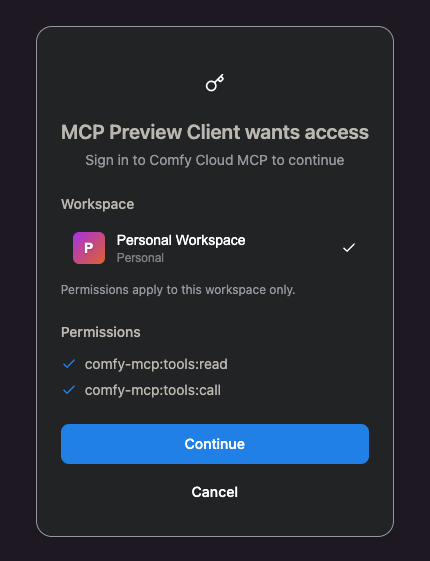 ## Verification The `Cloud/OAuth/Consent` Storybook story renders the real component; switching the Storybook theme global from **light → dark** reproduces this exact before/after. This change makes the live route match the dark rendering. Existing `OAuthConsentView.test.ts` assertions are on text/roles and are unaffected by the added class. ## ELI-5 The "allow access?" popup was wearing light-colored clothes inside a dark room, so the words blended into the card and you couldn't read them. This tells the popup it's in a dark room, so it dresses for the dark and the text shows up again. Nothing else in the room changes. |
||
|
Terry Jia
|
be131f7e9a |
feat(load3d): register Preview3DAdvanced extension (#12527)
## Summary Preview3DAdvanced is a Preview3D variant that emits live viewport state as outputs (model_file, camera_info, model_3d_info, width, height) plus a width/height pair. Reuses the LOAD_3D capture widget for the viewport but skips upload/clear buttons (it has no model_file widget). Adds a camera-only + gizmo serializeValue path (no scene/mask/normal image uploads since no image outputs are emitted) and an onExecuted that loads the saved preview model via Load3DConfiguration.configureForSaveMesh and applies the input camera_info forwarded via PreviewUI3D when one was connected, so a chain of Preview3DAdvanced nodes propagates camera state in a single run instead of lagging one hop per execution. Drops the per-node camera lock toggle (retainViewOnReload) across all 3D nodes (Load3D, Preview3D, Preview3DAdvanced). The viewport now always preserves the user's adjusted framing after the first model load; the toggle was rarely needed and made chained propagation ambiguous. Saved workflows with retainViewOnReload in their cameraConfig continue to load, the field is simply ignored at runtime. camera_info / model_3d_info resolved by execute: the input when connected, otherwise the viewport's own live state. Applying them overrides the preserved viewport in the input case and is a no-op echo when the viewport already matches. Only the first model_3d_info entry is applied, single-object viewer currently. BE: https://github.com/Comfy-Org/ComfyUI/pull/14175 ## Screenshots (if applicable) https://github.com/user-attachments/assets/42536469-e188-492a-9864-cdb6bfa76e97 |
||
|
pythongosssss
|
daf07a7442 |
fix: node library drag drop to add node appears in wrong place in firefox (#12419)
## Summary Firefox can give invalid drag coordinates causing incorrect drop position (https://bugzilla.mozilla.org/show_bug.cgi?id=1773886) I was unable to consistently recreate this issue and it only happened in Firefox, so not a candidate for e2e tests. ## Changes - **What**: - store position on `dragover` which looks to reliably report the correct position and use that value on drop ## Screenshots (if applicable) https://github.com/user-attachments/assets/6ff604b7-92fb-4a70-bd9f-c37cdba292ba |
||
|
Dante
|
454e124099 |
feat(graph): add mask icon to "Open in Mask Editor" context menu option (FE-929) (#12642)
## Summary <img width="1600" height="882" alt="fe-mask-icon-after" src="https://github.com/user-attachments/assets/7ddd6ae3-4c6a-4c4d-9a61-2059851bd4f9" /> Stacked on #12563 (FE-839). Follow-up requested in the FE-839 thread by @AlexisRolland and @alextov: the media-node context menu gives every image action an icon **except** `Open in Mask Editor`, leaving its label misaligned with the rest of the group. This reuses the existing custom `comfy--mask` icon — the same one shown on the node image overlay / selection-toolbox `MaskEditorButton` — for the `Open in Mask Editor` entry. With it, all five image actions (`Open Image`, `Open in Mask Editor`, `Copy Image`, `Paste Image`, `Save Image`) now carry an icon and their labels line up. - Follow-up to FE-839 - Context (FE-839 Slack thread): Alexis — *"it would be nice to have an icon for open in mask editor. There is one on the image overlay in the node which could be reused"*; Alex Tov — icon name is `mask`, a custom icon. > The broader idea of reserving a placeholder/buffer for options that have no icon so **all** menu labels align (Alex Tov) is intentionally out of scope here — this PR only completes the image-action group. ## Implementation - `useImageMenuOptions.ts`: add `icon: 'icon-[comfy--mask]'` to the `Open in Mask Editor` option. No rendering changes are needed — `NodeContextMenu.vue` already renders the icon via `<i v-if="item.icon" :class="[item.icon, 'size-4']" />`, and `comfy--mask` is already registered (custom collection loaded from `packages/design-system/src/icons`, used today by `MaskEditorButton.vue` and `linearMode/DropZone.vue`). ## Red-Green Verification (local) | Step | Result | |------|--------| | Test-only commit (`d8b7e2c`) | 🔴 Red — `expected undefined to be 'icon-[comfy--mask]'`; image group not fully iconed | | Fix commit (`feeb505`) | 🟢 Green — 10/10 passing | ## Before / After Right-click a media node (Load / Preview / Save Image) → image-action group at the top of the menu: | Before (base `FE-839`) | After (this PR) | | --- | --- | | `Open in Mask Editor` has no icon — its label sits flush-left while the other four image actions are indented past their icons. | `Open in Mask Editor` shows the mask icon; all five image actions line up. | <!-- drag fe-mask-icon-before.png and fe-mask-icon-after.png into the two cells above --> Captured locally against a Load Image node with `example.png` (Vue nodes enabled), dev server proxied to a live backend. https://comfy-organization.slack.com/archives/C0A7ADM4797/p1780467176353799?thread_ts=1779462362.995709&cid=C0A7ADM4797 ## Test Plan - [x] Local red on the test-only commit - [x] Local green on the fix commit - [x] `useImageMenuOptions.test.ts` — 2 new tests (mask icon present on `Open in Mask Editor`; every image action carries an icon) - [x] eslint clean on changed files - [ ] Manual: right-click a media node and confirm the mask icon renders next to `Open in Mask Editor` |
||
|
Matt Miller
|
8a819fa2be |
refactor(assets): read content hash from the canonical hash field (#12638)
## Summary The assets API exposes an asset's content hash as `hash`. An older `asset_hash` field was a deprecated alias carrying the same value. This PR moves the frontend fully onto `hash` and removes `asset_hash` from the frontend entirely. ## Changes - Read `asset.hash` (no `?? asset_hash` fallback) across the asset consumers: - `useMediaAssetActions` — widget-value variants + cloud-mode stored-filename resolution - `assetsStore` — input-asset-by-filename map - `assetMetadataUtils.getAssetUrlFilename` - `missingMedia` resolver/scan and `missingModel` scan hash matching - `useComboWidget` / `useWidgetSelectItems` - `assetPreviewUtil.findOutputAsset` now queries `/assets?hash=` instead of the deprecated `?asset_hash=` param and matches on `a.hash`. - Removed `asset_hash` from the zod asset schema and the local `AssetRecord` type. Responses that still include the alias parse cleanly — zod strips unknown keys — so the declared field protected nothing once the reads were gone. - Purged `asset_hash` from all test fixtures/mocks; tests key on the canonical `hash`. ## Safety / rollout The API currently emits **both** `hash` and `asset_hash` with identical values, so reading `hash` is safe today. This is the frontend half of retiring the alias; the backend stops emitting `asset_hash` only after this ships and old bundles age out, so there is no window where the field the UI reads is absent. ## Verification - `pnpm typecheck`: clean. - Affected unit tests pass (asset utils, store, media/model scans, widget composables). - `grep -rn asset_hash src/`: zero matches. |
||
|
Deep Mehta
|
35157f1af0 |
feat(telemetry): capture desktop entry props in cloud build (#12647)
## Summary When a visitor arrives at the cloud product with `utm_source=comfy.desktop`, register `source_app` and `desktop_device_id` as PostHog super-properties and persist them onto the person on identify. Backend-fired billing events (Stripe webhook → `billing:subscription_created`) then inherit the desktop attribution via person-on-events, closing the cross-session gap where browser-side utm capture and backend webhook events live on different `distinct_id`s. ## Why The desktop app appends `?desktop_device_id=<id>&utm_source=comfy.desktop` to its cloud links. `utm_source` is auto-captured by posthog-js as a session super-property, but arbitrary query params like `desktop_device_id` are ignored. Without this, cross-session Desktop→Cloud sub attribution silently shows zero. Confirmed empirically: across 24h of recent billing events, `person.$initial_utm_source = 'comfy.desktop'` matched 0 rows, because users had visited the cloud surface before they ever launched desktop. Person-property based join via this PR is the durable fix. ## Test plan - [x] Unit tests for: no utm, wrong utm, utm with device id, utm without device id, person.set after identify, no-op for non-desktop visitors - [x] `pnpm vitest run PostHogTelemetryProvider.test.ts` — 28/28 pass - [x] `pnpm typecheck` — clean - [x] `pnpm lint` — clean - [ ] Manual verification post-merge: visit cloud.comfy.org with `?utm_source=comfy.desktop&desktop_device_id=test-abc`, log in, check PostHog person profile gains `desktop_device_id`, `last_seen_via_desktop`, `first_seen_via_desktop`, `source_app` |
||
|
jaeone94
|
f9cbaf750f |
fix: simplify error overlay messaging (#12598)
## Summary Simplifies the error overlay so it presents one clear title, one clear message, and one stable details action instead of rendering a list of per-error messages. ## Changes - **What**: Extracts the error overlay view model into `useErrorOverlayState`, adds focused unit coverage for the overlay copy resolution rules, and updates the overlay E2E coverage to match the new behavior. - **Breaking**: None. - **Dependencies**: None. ### Behavior changes - The overlay body no longer renders a `<ul>` of individual error messages. It now always renders a single paragraph message. - Single-error overlays now prefer toast-specific copy when it exists. For execution errors, the overlay resolves the message in this order: `toastMessage`, `displayMessage`, raw `message`, group `displayMessage`, then group `displayTitle`. The title resolves from `toastTitle`, then `displayTitle`, then the group title. - Single non-execution groups use group-level toast/display copy. This lets grouped error types supply overlay-friendly copy without the overlay needing to understand each card implementation. - Multiple-error overlays now ignore individual error item copy in the overlay itself. The header becomes the pluralized count title, for example `7 errors found`, and the body becomes the fixed guidance message: `Resolve them before running the workflow.` - The overlay is hidden if the store reports an error count but no resolved overlay message exists. This avoids rendering a visible shell with an empty body. - The action button no longer varies by error type in normal app mode. Missing nodes, missing models, missing media, swap nodes, validation errors, and runtime errors all use `View details` instead of labels like `Show missing nodes`, `Show missing models`, `Show missing inputs`, or `See Errors`. - App mode keeps its existing `Show errors in graph` action label. - The overlay width now keeps the previous width as its minimum and allows a wider maximum, reducing avoidable wrapping in longer error headers. - The live region was softened from an assertive alert-style announcement to `role="status"` with `aria-live="polite"` so updates such as count changes are less disruptive. ### Tests - Adds component coverage for the rendered overlay shape and app-mode action label. - Adds composable coverage for single execution errors, runtime errors, grouped missing media errors, multiple-error aggregate copy, hidden empty-message state, and display-copy fallback behavior. - Updates `errorOverlay.spec.ts` so the E2E suite checks the new single-message overlay, the stable `View details` action, and the fixed multiple-error body guidance. - Removes the old type-specific button-label E2E expectations because that branch no longer exists in product behavior. ### Follow-up PR A follow-up PR is stacked on top of this one: `jaeone/fe-816-missing-resource-error-messaging`. That follow-up will wire missing resource error resolvers into the copy model consumed here. It covers missing node packs, missing models, missing media, and swap-node groups, including the group-level `toastTitle`, `toastMessage`, `displayMessage`, `displayDetails`, and item label copy those cards need. This PR intentionally keeps the overlay behavior separate so it can merge first without depending on the missing-resource resolver copy. ## Review Focus - Please check the single-error versus multiple-error overlay behavior, especially the fallback order for execution error copy. - Please check that the `View details` action is now intentionally error-type agnostic in normal app mode while app mode keeps `Show errors in graph`. - Please check the empty-message guard and the requirement that a single-error overlay only resolves a single group when the total error count and group list agree. - Please check the E2E reduction: the old type-specific action-label assertions were removed because the UI branch they tested was removed. ## Screenshots (if applicable) N/A |
||
|
jaeone94
|
4bfb0c36be |
Fix Cloud media input defaults (#12562)
## Summary Fix Cloud media loader widgets so `LoadImage`, `LoadVideo`, and `LoadAudio` resolve their default values from Cloud input assets instead of blindly accepting backend `object_info` combo options. When no matching Cloud input asset exists, the widgets now start empty instead of selecting a server-only value that immediately trips missing-input detection. ## Changes - **What**: Cloud media input widgets now derive their available values from `assetsStore.inputAssets`, filtered to the node's media type and to assets with a valid `asset_hash`. - **What**: Cloud media defaults now prefer an explicit default only when it matches an available Cloud input asset hash or name, then fall back to the first matching Cloud input asset, and otherwise use an empty value. - **What**: The media path keeps the existing model-widget implementation style by resolving Cloud asset state through the store internally, while preserving media-specific hash/name matching because media widgets submit Cloud `asset_hash` values. - **What**: Added regression coverage for adding empty Cloud `LoadImage`, `LoadVideo`, and `LoadAudio` nodes when backend `object_info` advertises server-only media options. - **What**: Expanded media widget unit coverage for image/video/audio inputs, empty defaults, first-asset fallback, default-by-hash matching, default-by-name matching, hashless asset filtering, unrelated media filtering, dynamic values, option labels, lazy input loading, and `control_after_generate` wiring. - **What**: Kept existing OSS and Cloud runtime missing-media E2E coverage, with Cloud fixtures consistently using the local setup backend for `object_info` so tests do not depend on live Cloud backend startup details. - **Breaking**: None. - **Dependencies**: None. ## Review Focus - Cloud media loader defaults should no longer be sourced from backend file lists unless the value also corresponds to a Cloud input asset. - Empty Cloud input-asset libraries should produce empty media widget values, not missing-input errors at node creation time. - Model asset-browser behavior is intentionally unchanged. The media path mirrors the store-access style, but media defaults still resolve to asset hashes because those are the values submitted by Cloud media widgets. - The Cloud E2E fixture stubs bootstrap endpoints and routes `object_info` through the local setup backend. This keeps the test focused on frontend behavior while still using realistic node definitions. ## Testing - `pnpm exec oxfmt browser_tests/tests/propertiesPanel/errorsTabMissingMediaRuntime.spec.ts src/renderer/extensions/vueNodes/widgets/composables/useComboWidget.test.ts src/renderer/extensions/vueNodes/widgets/composables/useComboWidget.ts` - `pnpm lint` - `pnpm typecheck` - `pnpm typecheck:browser` - `pnpm exec vitest run src/renderer/extensions/vueNodes/widgets/composables/useComboWidget.test.ts` - `PLAYWRIGHT_TEST_URL=http://127.0.0.1:5174 PLAYWRIGHT_SETUP_API_URL=http://127.0.0.1:8188 pnpm exec playwright test browser_tests/tests/propertiesPanel/errorsTabMissingMediaRuntime.spec.ts --project=chromium --workers=1` - `PLAYWRIGHT_TEST_URL=http://127.0.0.1:5175 PLAYWRIGHT_SETUP_API_URL=http://127.0.0.1:8188 pnpm exec playwright test browser_tests/tests/propertiesPanel/errorsTabMissingMediaRuntime.spec.ts --project=cloud --workers=1` - `git diff --check` - `pnpm knip` - `.claude/skills/reviewing-unit-tests/SKILL.md` red-flag review ## Screenshots Before https://github.com/user-attachments/assets/5df04036-d15c-4f94-bdcd-df8b26a29329 After https://github.com/user-attachments/assets/abe7caf5-a83b-4960-aa6f-65a377424a85 |
||
|
Dante
|
b996ed3ab5 |
fix: surface image actions at top of node context menu (FE-839) (#12563)
## Summary On media nodes (Load/Preview/Save Image), the right-click context menu buried the image actions at the very bottom — and `Open Image` sat *second* within that group, behind `Open in Mask Editor`. In legacy LiteGraph (Node 1.x) `Open Image` was the first menu item (`options.unshift`), so the Vue menu was a regression in muscle memory. This hoists the image-action group (`Open Image`, `Open in Mask Editor`, `Copy Image`, `Paste Image`, `Save Image`) to a new top section of the menu, with `Open Image` first. Because these labels only ever appear for media nodes, non-media node menus are unchanged (keeps the core menu order stable — per Alex Tov's request in the FE-839 thread). - FE-839 - Related: DES-368 (lightbox idea this replaces) ## Implementation - `contextMenuConverter.ts`: move the image group to the front of `MENU_ORDER` (new "Section 0"), shift `getSectionNumber` boundaries, and change the section-divider sentinel `lastSection` from `0` to `-1` (Section 0 is now a real section, so the old `> 0` guard would have dropped the divider before `Rename`). - `useImageMenuOptions.ts`: push `Open Image` before `Open in Mask Editor` for source/display consistency. ## Red-Green Verification | Commit | Unit CI | Result | |--------|---------|--------| | `test: add failing tests …` | [run 26749384308](https://github.com/Comfy-Org/ComfyUI_frontend/actions/runs/26749384308) | Red — fails on `expected 'Rename' to be 'Open Image'` | | `fix: surface image actions …` | [run 26749817184](https://github.com/Comfy-Org/ComfyUI_frontend/actions/runs/26749817184) | Green — passing | ## Before / After Right-click on a media node (Load Image with `example.png`): - **Before:** `Open Image` buried near the bottom, second within its group. - **After:** image actions group surfaced at the top, `Open Image` first; core order (Rename/Copy/…) unchanged below the divider. | Before (`main`) | After (this PR) | | --- | --- | | <img width="460" alt="Before: image actions buried at the bottom of the menu, Open in Mask Editor above Open Image" src="https://github.com/user-attachments/assets/2d0a6345-6cbb-4391-8cee-60632a6af72f" /> | <img width="460" alt="After: image actions hoisted to the top of the menu, Open Image first" src="https://github.com/user-attachments/assets/6af0840f-0623-41f2-9fa1-b4a16798f9a5" /> | ## Test Plan - [x] CI red on test-only commit - [x] CI green on fix commit - [x] Unit regression in `contextMenuConverter.test.ts` (6 tests: Open Image first / image group above Rename / divider between / Copy<Paste<Save / core order preserved / non-media unchanged) - [x] Manual verification in live app (before/after) |
||
|
Robin Huang
|
dc46519fa7 |
feat: add app:node_added telemetry event (#12615)
## Summary

Adds a new `app:node_added` PostHog event that fires whenever a user
adds a node to the canvas, tagged with a `source` discriminator
(sidebar_drag, search_modal, paste, programmatic, unknown). Lets us
measure how users compose graphs — which we can't infer from any
existing event.

## Changes

- **What**: Subscribes to `LGraph.onNodeAdded` via
`installNodeAddedTelemetry()`. Source is threaded through call sites via
a synchronous module-level flag (`withNodeAddSource`) — `addNodeOnGraph`
signature is unchanged.
- Wired sources: sidebar drag (3 sidebars + canvas drop), search-modal
popover, vintage clipboard paste, programmatic adds (job menu, media
asset actions). Unrecognized paths fall through as `unknown`.
- **Skip on workflow load**: `ChangeTracker.isLoadingGraph` gates out
the bulk-add path. `workflow_imported` already covers that population,
and 4M imports/month × ~50 nodes would dwarf user-initiated signal.

## Review Focus

- Module-level flag is synchronous-only — the source is read inside the
synchronous `onNodeAdded` callback that fires during `graph.add()`.
Async code (e.g. `createNode`'s `await setTimeout(0)`) doesn't
interleave because the wrap is around `graph.add`, not the await.
- Unit test covers: fires with current source, defaults to 'unknown',
skips during workflow load, preserves existing onNodeAdded subscriber.

---------

Co-authored-by: Claude Opus 4.7 (1M context) <noreply@anthropic.com>
v1.46.9 |
||
|
Comfy Org PR Bot
|
28837b8913 |
1.46.9 (#12637)
Patch version increment to 1.46.9 **Base branch:** `main` --------- Co-authored-by: christian-byrne <72887196+christian-byrne@users.noreply.github.com> Co-authored-by: github-actions <github-actions@github.com> |
||
|
Terry Jia
|
6d495f5642 |
FE-906 fix(vueNodes): require dragGuard.wasDragged for multi-select drag-start (#12623)
## Summary The multi-select branch of onPointermove started a node drag whenever LMB + shift/ctrl/meta was held during pointermove, even when pointerdown had never reached the node (because a child widget swallowed it with @pointerdown.stop). In Preview3D/Load3D, shift+drag inside the threejs scene therefore dragged the underlying Vue node. Gate the multi-select branch on dragGuard.wasDragged(event) — same gate the regular branch already uses. dragGuard.start is only recorded by onPointerdown, so a widget that swallows pointerdown now naturally opts itself out of node drag-start without having to also swallow pointermove (which would break libraries like three.js OrbitControls that listen for pointermove on document). ## Screenshots (if applicable) before https://github.com/user-attachments/assets/b5faa803-5993-4341-a1d0-7ec980362344 after https://github.com/user-attachments/assets/f7367e61-6194-4e16-9713-c398f989d26b |
||
|
Dante
|
f86ffbb05f |
fix(assets): dedupe outputs by composite key to prevent media asset panel scroll-duplication (#11716)
## Summary

When the cloud `getJobDetail` returns two output records that resolve to
the same composite key `${nodeId}-${subfolder}-${filename}`,
`mapOutputsToAssetItems` in
`src/platform/assets/utils/outputAssetUtil.ts` produces two `AssetItem`s
with the same synthetic id. The Vue `v-for :key="item.key"` in
`src/components/common/VirtualGrid.vue:10` collides, Vue reuses one DOM
node for the colliding rows, and the user sees one asset visibly
duplicate and progressively replace its neighbours while scrolling
through an expanded large job in the media asset panel — symptom matches
FE-297 in both list and grid views (both views derive from the same
`displayAssets` populated by `resolveOutputAssetItems`).

Fix tracks composite keys per resolved job and skips subsequent records
that collide on the same key. Treats the composite key as the canonical
identity of an output, so each rendered row is unique in both views
without changing public id semantics for non-colliding inputs.

- Fixes FE-297
- Source: [Slack
#bug-dump](https://comfy-organization.slack.com/archives/C0A4XMHANP3/p1777047001770899)

## Red-Green Verification (unit)

| Commit | Purpose | CI |
| --- | --- | --- |
|
[`b263af29b`](https://github.com/Comfy-Org/ComfyUI_frontend/pull/11716/commits/b263af29b)
test: FE-297 add failing test for asset id collision on duplicate output
key | Proves the test catches the regression | 🔴 [Red run
25038514049](https://github.com/Comfy-Org/ComfyUI_frontend/actions/runs/25038514049)
— `FE-297: deduplicates outputs that share the same composite output
key` failed with `expected length 2 but got 3` |
|
[`af38cad1d`](https://github.com/Comfy-Org/ComfyUI_frontend/pull/11716/commits/af38cad1d)
fix(assets): dedupe outputs by composite key to prevent visual collapse
on scroll | Proves the fix resolves it | 🟢 [Green run
25038832343](https://github.com/Comfy-Org/ComfyUI_frontend/actions/runs/25038832343)
— all unit tests pass |

Local verification (`pnpm vitest run
src/platform/assets/utils/outputAssetUtil.test.ts`):
- On red commit: `FE-297: deduplicates outputs that share the same
composite output key` fails with `expected length 2 but got 3`.
- On green commit: all 8 tests pass; broader `pnpm vitest run
src/platform/assets/` reports 390/390 pass.

## Browser-level Verification (e2e)


[`c5f80e225`](https://github.com/Comfy-Org/ComfyUI_frontend/pull/11716/commits/c5f80e225)
adds `browser_tests/tests/sidebar/assets-fe297-dedupe.spec.ts`. The spec
mocks `/api/jobs` + `/api/jobs/{jobId}` so the assets sidebar receives a
5-output stack job whose detail payload contains two records sharing
`9--duplicate_00002_.png`. It expands the stack into folder view and
reads the underlying `VirtualGrid` row total from the top/bottom spacer
heights so the assertion does not depend on viewport size, scroll
virtualization, or Vue's same-key DOM reuse.

Locally validated red→green (`pnpm dev` + local ComfyUI on :8188, `pnpm
exec playwright test … --project=cloud`):

| Source | `totalRows` | rendered tile labels | result |
| --- | --- | --- | --- |
| Red (dedup removed from `mapOutputsToAssetItems`) | **5** |
`[duplicate_00002_.png, duplicate_00002_.png, distinct_00004_.png]` (two
adjacent collisions) | 🔴 `Expected: 4 / Received: 5` |
| Green (HEAD) | **4** | `[duplicate_00002_.png, distinct_00004_.png,
distinct_00003_.png]` (no collisions) | 🟢 `1 passed` |

Manual repro of the same flow against the running dev server (Chrome
DevTools, runtime `fetch` interceptor for `/api/jobs/<id>`) reproduces
the FE-297 symptom directly: with the fix removed, the folder view
renders **two consecutive cards both labelled `duplicate_00002_.png`**;
with the fix applied that second slot is replaced by the next distinct
file.

## Cloud Prod Verification (unmocked)

Verified against a real cloud prod job
(`22dda683-1634-4120-8a7d-233cff28e07e`) whose `/api/jobs/{id}` payload
organically contains the FE-297 trigger condition.

Raw cloud response analysis: **35 output records across 27 nodes, 34
unique composite keys, 1 colliding key**
(`103--cbbce08934d17e85987b09824ae519822e4462b4294fc52fc40dca8d5b096323.png`
appears twice — same nodeId/subfolder/filename emitted from two distinct
output records).

Expanded folder view on local FE running this branch against cloud prod
backend:

| Measurement | Value | Expectation |
| --- | --- | --- |
| `outputCount` (backend) | 35 | — |
| Unique composite keys (backend) | 34 | (35 - 1 collision) |
| VirtualGrid rendered cells (`totalRows * colCount` via spacer height)
| **34** | matches dedupe target |
| Simultaneously-visible duplicate labels | 0 | no Vue `:key` collision
|

This is the first visual confirmation of FE-297 against actual prod data
rather than synthetic/mocked payloads. The block had been pending on
FE-844 — cloud `/api/jobs/{id}` returns `text: [null]` for empty
subgraph promoted text outputs, which the FE Zod schema rejects, causing
`fetchJobDetail` to return `undefined` and the folder view to collapse
to the cover preview only. With [PR
#12449](https://github.com/Comfy-Org/ComfyUI_frontend/pull/12449)
(FE-844) applied locally, the job-detail response reaches
`resolveOutputAssetItems`, FE-297's dedupe runs, and the 35→34 collapse
is observable end-to-end.

## Test Plan

- [x] New unit regression covering composite-key collision in
`mapOutputsToAssetItems`
- [x] Existing `outputAssetUtil` tests still pass (`job-1-1-sub-a.png`
etc. id format unchanged for non-colliding inputs)
- [x] Broader asset platform suite (`src/platform/assets/`) passes
- [x] CI red-green sequence captured (links above)
- [x] Browser-level e2e (`assets-fe297-dedupe.spec.ts`) red→green
validated locally; will run in CI on this commit
- [x] Manual repro on dev server confirms the duplicate-card symptom
disappears with the fix
- [x] Unmocked cloud-prod repro: real 35-output job with 1 organic
composite-key collision renders 34 cells, 0 duplicate labels
simultaneously visible (requires
[#12449](https://github.com/Comfy-Org/ComfyUI_frontend/pull/12449) for
job-detail fetch to succeed)
|
||
|
Deep Mehta
|
6e7c4f85fe |
fix: update PWA/app icon to new brand colors (#12632)
## Summary cloud.comfy.org shows the old yellow-on-blue ComfyUI mark as its favicon. Root cause: `manifest.json` points at `comfy-logo-single.svg` (old `#172DD7` blue logo), and older deployed builds set no static `<link rel="icon">`, so the browser uses the manifest icon for the tab. Point the manifest at new-brand dark+yellow icons. ## Changes - **What**: `manifest.json` icons now reference new `comfy-icon-192.png` / `comfy-icon-512.png` (dark `#211927` + yellow `#F2FF59`, full-bleed for `maskable` safe zone) instead of the old blue `comfy-logo-single.svg`. - **Breaking**: none. ## Review Focus - Pairs with #12537 (static `favicon.ico` link, merged) — together the tab favicon and the PWA/install icon are both the new brand. - This does NOT change `comfy-logo-single.svg` itself, which is still used as the in-app header logo (`ComfyOrgHeader.vue`) and the cloud subscription redirect view — those remain the old blue mark and can be updated separately if desired. - Note: cloud.comfy.org runs a pinned/older frontend build; this (and #12537) only take effect once cloud bumps its frontend version. ## Screenshots (if applicable) |
||
|
Alexander Brown
|
11a621152c |
ci: skip PR Unified Report on main branch (#12631)
*PR Created by the Glary-Bot Agent* --- ## Summary The [`pr-report.yaml`](https://github.com/Comfy-Org/ComfyUI_frontend/blob/main/.github/workflows/pr-report.yaml) workflow is dispatched via `workflow_run` after `CI: Size Data`, `CI: Performance Report`, or `CI: E2E Coverage` complete. Those upstream workflows also run on push to `main`, which dispatches `PR: Unified Report` on the `main` branch head, producing failed runs like [run 26913874399](https://github.com/Comfy-Org/ComfyUI_frontend/actions/runs/26913874399/job/79398707144). The existing job-level guard (`github.event.workflow_run.event == 'pull_request'`) doesn't always prevent the runner from spinning up, so noisy failed runs still appear under the workflow's history on `main`. ## Change Add `branches-ignore: [main]` to the `workflow_run` trigger so the workflow no longer dispatches when the upstream run's head branch is `main`. ```yaml on: workflow_run: workflows: ['CI: Size Data', 'CI: Performance Report', 'CI: E2E Coverage'] types: - completed branches-ignore: - main ``` ## Tradeoff to flag `workflow_run.branches-ignore` filters on the triggering workflow run's head branch. For PRs, that's the PR's source branch. A fork PR whose source branch is literally named `main` (e.g., a fork opened from its default branch) will no longer get a unified report comment. This is uncommon for contributors who follow the usual feature-branch workflow, but if preserving comments for fork-from-`main` PRs matters, the alternative is to leave the dispatch in place and rely solely on the existing job-level `if` guard. Co-authored-by: Glary-Bot <glary-bot@users.noreply.github.com> |
||
|
Alexander Brown
|
6fe50a3685 |
chore: centralize pnpm Node options (#12626)
## Summary Centralize pnpm-run Node options so Node 25 does not shadow happy-dom storage and build scripts keep the existing heap limit. ## Changes - **What**: Adds workspace-level `nodeOptions` that preserve caller-provided `NODE_OPTIONS`, disable Node's native Web Storage, and set `--max-old-space-size=8192`. - **What**: Removes duplicate script-local heap `NODE_OPTIONS` from build scripts now covered by pnpm. - **Dependencies**: None. ## Review Focus Check whether applying these Node options to all pnpm-run Node subprocesses is acceptable versus keeping flags script-local. ## Screenshots (if applicable) Not applicable. |
||
|
Alexander Brown
|
488bc33288 |
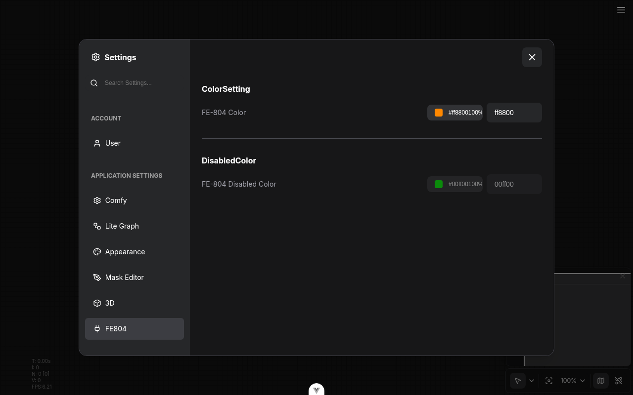
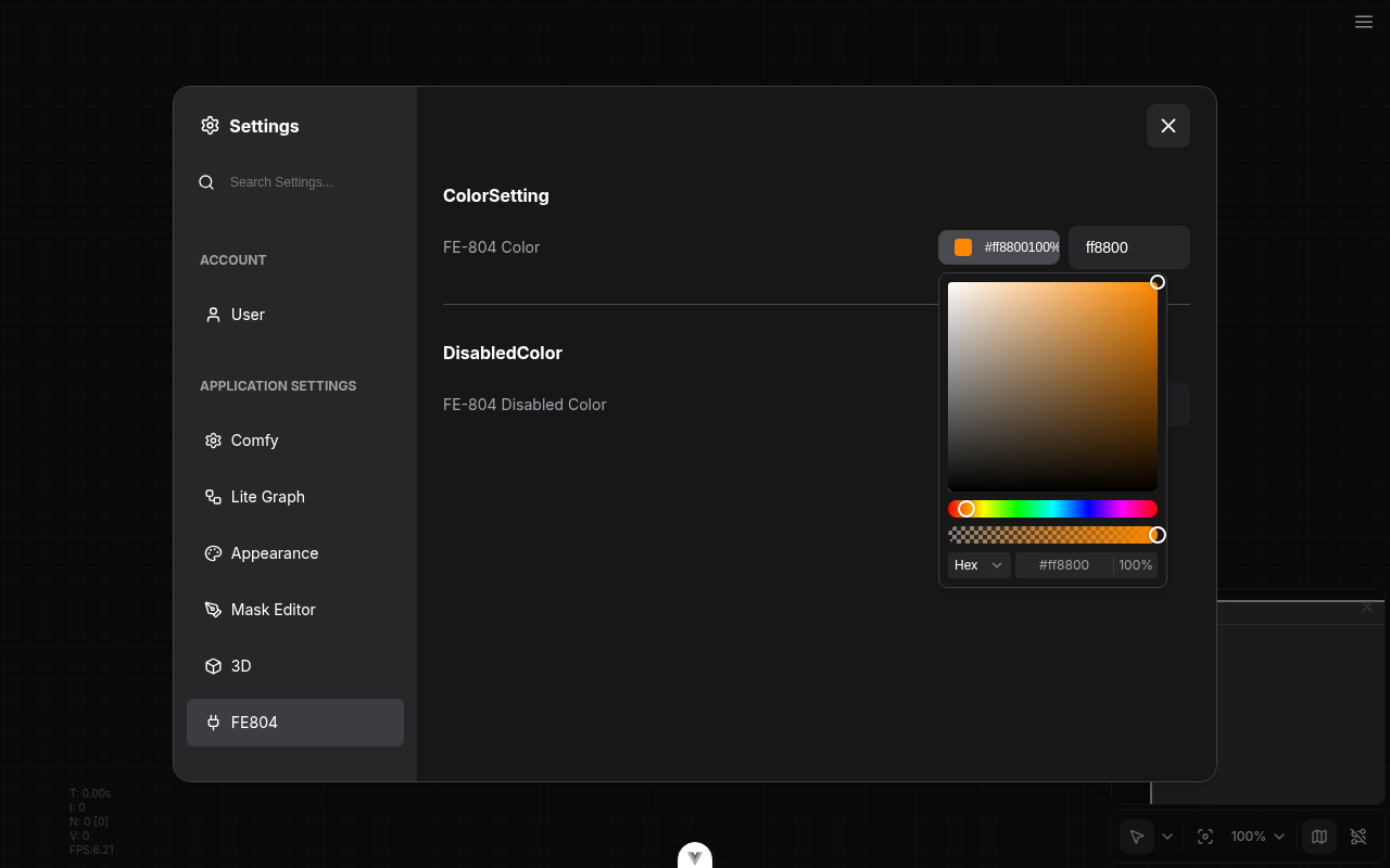
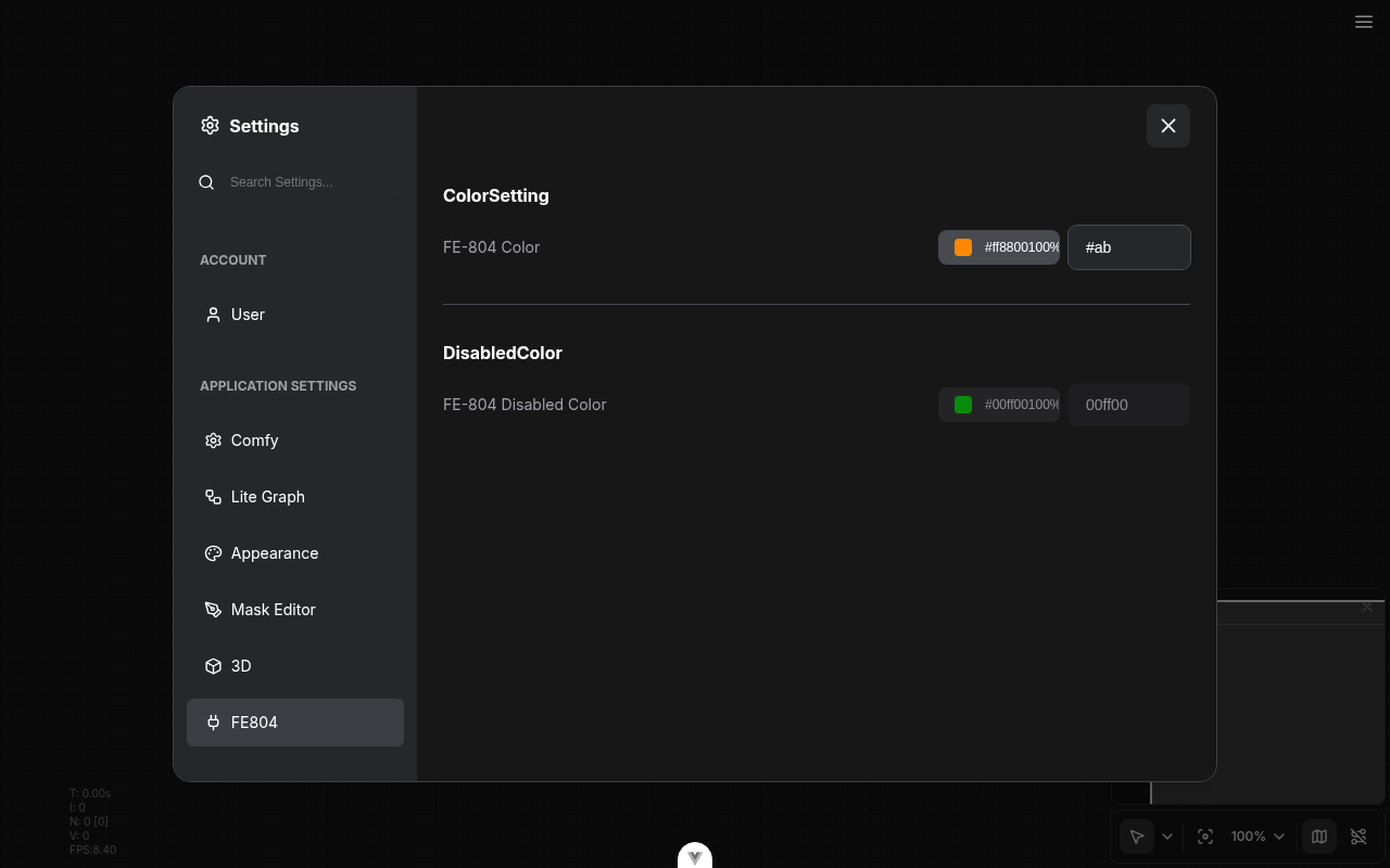
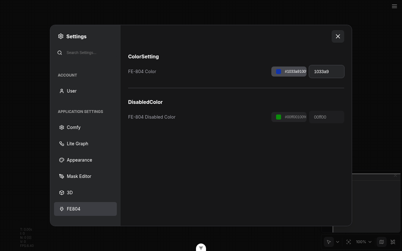
refactor: drop primevue/colorpicker from settings form and customization selector (FE-804) (#12391)
*PR Created by the Glary-Bot Agent*
---
## Summary
The node-canvas COLOR widget (`WidgetColorPicker.vue`) already migrated
off PrimeVue; this PR finishes FE-804 by porting the two remaining
`primevue/colorpicker` consumers — `FormColorPicker.vue` (settings form
`type: 'color'`) and `ColorCustomizationSelector.vue`
(folder-customization dialog) — to the in-house Reka-UI based
`ColorPicker`. The now-dead PrimeVue overlay workaround in
`CustomizationDialog.vue` is removed.
After this lands there are **zero `primevue/colorpicker` imports left**
in `src/`.
## Changes
- **What**: `FormColorPicker.vue` swaps `primevue/colorpicker` +
`primevue/inputtext` for the in-house `ColorPicker` + `Input`. The
legacy "hex without `#`" storage contract (e.g. `load3d`'s
`BackgroundColor` default `'282828'`) is preserved on read and on write.
- **What**: The text input now uses a separate draft value and only
commits on blur / Enter when the input is a complete 6- or 8-digit hex.
This fixes the "type `#f` and watch it snap to black" regression that a
naive shared-`v-model` implementation re-introduces.
- **What**: `disabled`, `id`, and `aria-labelledby` are now explicit
props on `FormColorPicker` and are forwarded to both children. The
custom `ColorPicker` learned a `disabled` prop that propagates to its
`<PopoverTrigger>` button.
- **What**: `ColorCustomizationSelector.vue` swaps
`primevue/colorpicker` for the in-house `ColorPicker` (still uses
`primevue/selectbutton` — intentionally out of scope per FE-804's title;
`SelectButton` migration is a separate effort).
- **What**: `CustomizationDialog.vue` drops the `.p-colorpicker-panel,
.p-overlay, .p-overlay-mask` `pointer-down-outside` guard. With PrimeVue
ColorPicker gone, no descendant of this dialog teleports an overlay to
`<body>` anymore.
- **What**: Updates two affected browser tests — `extensionAPI.spec.ts`
(the `disabled` attr smoke check) and `sidebar/nodeLibrary.spec.ts` (the
bookmark color customization flow) — to target the new picker via stable
accessible names (`role="slider"` + i18n aria-label `Color saturation
and brightness`) and the `.color-picker-wrapper > button` trigger. The
disabled-attr eval helper now handles `HTMLButtonElement` in addition to
`HTMLInputElement`.
- **What**: Adds `FormColorPicker.test.ts` with focused regression
coverage for the manual-entry contract: legacy no-`#` storage
round-trip, no commit on partial hex, revert on partial-then-Enter,
8-digit alpha hex, and `disabled` propagation.
- **Dependencies**: none added; removes two PrimeVue imports.
- **Breaking**: no breaking change to the documented FormItem `'color'`
setting contract. Manual-entry semantics change: typing partial hex no
longer immediately writes mangled state — it commits on blur or Enter
when the value fully parses. Existing settings values are unaffected.
## Verification
- `pnpm typecheck` clean
- `pnpm typecheck:browser` clean
- `pnpm exec eslint` on every touched file clean
- `pnpm test:unit` over the affected directories — **216 passed**
- Manual QA via Playwright against the running dev server:
- Registered a test extension with `type: 'color'` + a `disabled: true`
variant
- Confirmed the new picker renders, opens its Reka popover, and the
disabled row has `button.disabled === true` and `input.disabled ===
true`
- Confirmed partial hex (`#ab`) does **not** clobber the swatch
- Confirmed `#1133aa` + blur commits and round-trips through the picker
## Review focus
1. The manual-entry commit gate in `FormColorPicker.vue`
(`commitDraft()` + `FULL_HEX`) — is the regex strict enough? Should
3/4-digit shorthand hex be accepted on commit too? PrimeVue accepted
3-digit shorthand; the existing `toHexFromFormat()` already does, so
adding `|[0-9a-f]{3}|[0-9a-f]{4}` is a one-line change if reviewers want
parity.
2. Disabled-attr E2E selector swap (`.p-colorpicker-preview` →
`.color-picker-wrapper > button`) + the eval-helper update that now
handles `HTMLButtonElement` in addition to `HTMLInputElement`. The
structural selector matches what PrimeVue had; happy to add a
`data-testid` if reviewers prefer.
3. `ColorPicker.vue` gained a `disabled` prop — kept explicit (peer of
`class`) to match the existing prop shape rather than forwarding through
`$attrs`.
## Follow-up (NOT in this PR)
Discussed in-thread — the **Reka-UI `ColorField` migration** (full
picker rebuild) and the **Kijai regression suite** for alpha-disabled +
manual-entry on the node-canvas COLOR widget belong in a separate,
scoped PR alongside the `ColorInputSpec` schema additions (`hasAlpha`,
`format`). The custom picker also has a known lossy HSV-percent
quantization (e.g. `#1133aa` round-trips to `#1033a9`) that pre-dates
this PR and would be addressed by the Reka primitives.
- Fixes FE-804
## Screenshots
---------
Co-authored-by: Glary-Bot <glary-bot@users.noreply.github.com>
|
||
|
AustinMroz
|
f0034b9b1b |
Fix audits again, update vitest (#12620)
#12532 caused some regressions in security audits. I've updated `vitest` resolve a [newly reported vulnerability](https://github.com/Comfy-Org/ComfyUI_frontend/security/dependabot/166) and performed and re-resovled the lockfile to clear out the audit warnings. Sanity check: `pnpm audit` passes with the lock-file introduced by this PR, but multiple packages are showing a downgrade in version. Second opinions would be appreciated. |
||
|
nav-tej
|
e4d5824813 |
feat(telemetry): capture Rewardful referral on checkout attribution (#12311)
*PR Created by the Glary-Bot Agent* --- ## Summary Mirrors the existing Impact affiliate wiring for the new Rewardful affiliate network. The client reads `window.Rewardful.referral` when `getCheckoutAttribution()` runs at checkout time and emits it as a new optional `rewardful_referral` field on `CheckoutAttributionMetadata`. The Go backend consumes this field separately and passes it to Stripe as `ClientReferenceID` on the Checkout Session create call — that wiring lives in a sibling PR on `Comfy-Org/cloud` (services/comfy-api) and is the path that actually credits affiliate commissions for Stripe subscriptions. Per Rewardful's docs for server-side Stripe Checkout Sessions, the GTM-loaded Rewardful JS handles cookie persistence on the client but **cannot** attribute Checkout Sessions on its own — the merchant must explicitly pass the referral UUID server-side as `client_reference_id`. ## Why this is the simplest possible client-side change - Rewardful's JS (loaded via GTM) owns its own cookie persistence, so unlike Impact (where we capture `im_ref` from URL params and persist to localStorage ourselves), we just read `window.Rewardful.referral` at checkout time. No URL fallback, no localStorage handling. - If Rewardful's script hasn't loaded or the user didn't come from an affiliate link, the field is simply omitted from the payload. - Adds a narrow `RewardfulGlobal` interface to `global.d.ts` (`referral` plus optional `affiliate`/`campaign` metadata Rewardful exposes) so `window.Rewardful` is typed everywhere it's accessed. - 4 new unit tests covering: present, absent, empty-string, and alongside Impact attribution. The existing 10 Impact/UTM tests are untouched. ## Files touched | File | Change | |---|---| | `global.d.ts` | Add `RewardfulGlobal` interface + `Rewardful?:` on `Window` | | `src/platform/telemetry/types.ts` | Add `rewardful_referral?: string` to `CheckoutAttributionMetadata` | | `src/platform/telemetry/utils/checkoutAttribution.ts` | Read `window.Rewardful?.referral` in `getCheckoutAttribution()` | | `src/platform/telemetry/utils/__tests__/checkoutAttribution.test.ts` | 4 new tests + `window.Rewardful = undefined` reset in `beforeEach` | ## Cross-PR dependency Needs the sibling [`Comfy-Org/cloud` PR](https://github.com/Comfy-Org/cloud/pulls?q=is%3Apr+rewardful) (branch `glary/rewardful-affiliate-tracking`) to actually credit referrals. **This PR is safe to ship independently** — the field is just ignored by the existing comfy-api endpoint until that PR lands. ## Verification - `pnpm typecheck` — clean - `pnpm test:unit src/platform/telemetry/utils` — 14/14 passing (10 prior + 4 new) - `pnpm test:unit` (full repo) — passing - `pnpm lint` — 3 warnings, 0 errors (warnings pre-existing on `main`) - `pnpm format:check` — clean - `pnpm knip` — clean (1 pre-existing unrelated warning) - `pnpm exec vite build` — successful (7.85s) Related: FE-704 (Finish affiliate pages PRs) for context on the broader affiliate launch. ┆Issue is synchronized with this [Notion page](https://www.notion.so/PR-12311-feat-telemetry-capture-Rewardful-referral-on-checkout-attribution-3626d73d365081beb03afb2e000c83a6) by [Unito](https://www.unito.io) --------- Co-authored-by: glary-bot <glary-bot@comfy.org> Co-authored-by: Benjamin Lu <benjaminlu1107@gmail.com> |
||
|
Comfy Org PR Bot
|
8854fbde19 |
1.46.8 (#12614)
Patch version increment to 1.46.8

**Base branch:** `main`

---------

Co-authored-by: christian-byrne <72887196+christian-byrne@users.noreply.github.com>
Co-authored-by: github-actions <github-actions@github.com>
v1.46.8 |
||
|
Robin Huang
|
b1ecf3b48e |
feat: add missing_node_packs to app:workflow_imported telemetry (#12613)
## Summary

Adds a `missing_node_packs` property to the existing
`app:workflow_imported` PostHog event so we can see *which custom node
packs* a workflow depends on, not just the raw node names.

## Changes

- **What**: Group missing-node entries by their `cnrId` (already present
on each node's properties) and attach as `missing_node_packs: [{
pack_id, node_types }]`. Pure helper, fully sync, no network calls.
Nodes without a `cnrId` bucket under `pack_id: 'unknown'` so we can size
that population separately.
- Fires on every import path (drag-drop, file picker, shared URL) —
`open_source` already disambiguates.

## Review Focus

- The `'unknown'` bucket is intentional. It tells us how often workflows
arrive without pack metadata, which is itself useful.
- No async lookups — if `cnrId` isn't in the JSON, we don't go ask the
registry. Keeps import fast and offline-safe.

Co-authored-by: Claude Opus 4.7 (1M context) <noreply@anthropic.com>
|
||
|
Matt Miller
|
8657bff7d9 |
refactor(assets): read content hash via hash field, fall back to asset_hash (#12609)
## Summary

Reads the asset content hash from a new `hash` field, preferring it and
falling back to the existing `asset_hash` alias everywhere asset hashes
are consumed. This is the frontend half of converging the asset
content-hash field name onto `hash` (which the asset content-addressing
endpoints — `from-hash`, `hash/{hash}` — already use).

## Why this is safe to land now (order-independent)

- Against the current backend (emits only `asset_hash`), `hash` is
absent, so every read falls back to `asset_hash` → **byte-identical
behavior**.
- Once the backend emits `hash`, the FE uses it — which then lets the
backend drop `asset_hash` without breaking any read.

So this can merge independently of the backend; nothing is gated on it.

## What changed

- Add `hash` to the asset zod schema (`AssetItem`) and the local
`AssetRecord` type.
- Migrate all response reads of `asset_hash` → `hash ?? asset_hash`
(combo widget, widget select items, missing-media/missing-model scans,
media asset actions, preview util, metadata util, assets store).
- The `isCloud` storage-model branches (cloud = hash-as-filename, local
= name) keep their gate — only the field source changes. Removing those
conditionals is a separate behavioral change, not part of this rename.
- The `fetchAssets({ asset_hash })` request param is intentionally left
as-is; it flips to `hash` only after the backend accepts the new param
name.

## Test plan

- `vue-tsc --noEmit` — 0 errors
- `eslint` — clean
- `vitest run` on assets / missingMedia / missingModel — 775 tests pass

---------

Co-authored-by: GitHub Action <action@github.com>
|
||
|
nav-tej
|
ddf9308cd8 |
feat(website): add Affiliate Program link to footer Resources (#12600)
*PR Created by the Glary-Bot Agent* --- Adds an **Affiliate Program** entry under the Resources column of the site footer, positioned immediately after the YouTube link. Links to `/affiliates` via the existing locale-invariant `routes.affiliates` helper. ### Stacked on #12002 This PR is branched off `glary/affiliates-landing-page` (PR #12002), not `main`, because: - `routes.affiliates` and the `/affiliates` page itself are added by #12002 and aren't on `main` yet. - Linking to `/affiliates` from the footer before #12002 merges would 404 in production. GitHub will auto-rebase this PR onto `main` once #12002 merges. **Re-target this PR's base from `glary/affiliates-landing-page` to `main` before reviewing for merge** (or simply merge #12002 first and GitHub will switch the base for you). ### Diff ``` apps/website/src/components/common/SiteFooter.vue +4 apps/website/src/i18n/translations.ts +4 ``` - New `footer.affiliateProgram` i18n key. English-only per the go-live direction for affiliate-related copy (zh-CN mirrors EN to satisfy the dictionary's `Record<Locale, string>` shape; matches how `nav.youtube` and other proper-noun footer entries handle this). - New `FooterLink` entry in `topColumns[1].links` (the Resources column), after the YouTube entry. Internal route, so no `external: true`. ### Local verification - `pnpm typecheck`: 0 errors - `pnpm build`: 380 pages, footer renders `Affiliate Program` → `/affiliates` in both desktop and mobile layouts, on `/`, `/about`, `/zh-CN/`, etc. Link ordering in Resources: `Blog → Discord → GitHub → Docs → YouTube → Affiliate Program` (verified by parsing the built HTML) - `pnpm test:unit`: passing (no SiteFooter unit test exists; it's exercised through e2e/visual coverage) - `pnpm lint`: no new warnings (3 pre-existing on unrelated files) - `pnpm format:check`: clean - `pnpm knip`: clean - `pnpm exec tsx scripts/check-unused-i18n-keys.ts`: clean (new key is used) ### Out of scope - No new Linear ticket (this is a follow-up to the affiliate-program go-live work tracked under FE-704). - Header nav / mobile menu changes — only the footer was requested. Co-authored-by: Glary-Bot <glary-bot@users.noreply.github.com> |
||
|
Maanil Verma
|
775201f06d |
Feat/cloud onboarding redesign (#12442)
## Summary Redesigns the cloud login and signup screens with a new split-screen template featuring hero carousel on the right. ## Changes - **What**: - New `CloudHeroCarousel` component (product logo chips for Gemini, Grok, Seedance) - `CloudTemplate` restructured: removed video background and `BaseViewTemplate` wrapper; new shell uses `bg-charcoal-750` / `text-sand-500` and renders the carousel in the right column at `lg+` - `CloudLoginView` and `CloudSignupView` restyled to match the new dark shell (sand/azure/smoke tokens, `shadow-inset-highlight` OAuth buttons, brand-yellow free-tier badge) - `CloudSignInForm` submit button restyled to match the OAuth secondary style - `CloudLogo` switched from `<img>` to inline SVG with `currentColor` + `aria-label` - Three new logo components (`GeminiLogo`, `GrokLogo`, `SeedanceLogo`) — inline SVG, `aria-hidden`, `currentColor` - Theme tokens added in `style.css`: `--color-charcoal-750`, `--color-sand-500`, `--shadow-inset-highlight` - i18n keys added under `cloudHero.*` for carousel titles, descriptions, and pager labels - Hero image assets added under `src/platform/cloud/onboarding/assets/hero/` ## Screenshots <img width="1470" height="838" alt="image" src="https://github.com/user-attachments/assets/747bfc98-f605-4904-9a3f-3ba0de88573b" /> --------- Co-authored-by: Deep Mehta <42841935+deepme987@users.noreply.github.com> Co-authored-by: Austin <austin@comfy.org> |
||
|
nav-tej
|
f4088bcc63 |
feat(website): draft Affiliate Program landing page at /affiliates (#12002)
*PR Created by the Glary-Bot Agent* --- Conversion-oriented English landing page that drives applications to the Comfy Affiliate Program Google Form. Shipped behind `noindex` while copy and assets are finalized — a follow-up PR will flip it indexable and add the zh-CN locale. Mirrors the type scale, brand tokens, and noindex/sitemap/robots conventions from the [/affiliates/terms PR (#11954)](https://github.com/Comfy-Org/ComfyUI_frontend/pull/11954) so the two pages feel like a set. The footer's "Read the affiliate program terms" link points at `/affiliates/terms`, which lands with #11954. ## What's in the box Sections (in render order): hero → trust band → how-it-works → who-we're-looking-for → program details → brand assets → FAQ → footer CTA. - **i18n** — Copy lives under `affiliate-landing.*` in `src/i18n/translations.ts` (en only; zh-CN values mirror en until a localized version lands, so non-engineers can edit copy without touching components). - **Component reuse audit** — Reuses `common/FAQSection`, `common/BrandButton`, `common/SectionHeader`, `common/SectionLabel` verbatim. Sections without a clean primitive fit (split hero, trust band, 3-step flow, audience list, details table, brand-asset grid, footer CTA) render inline with brand tokens rather than forking new shared components. - **Brand assets** — Wired via a config object in `components/affiliates/brandAssets.ts` so 728×90 / 300×250 / 160×600 / 1200×628 banners can be dropped in later without code changes. Live tiles for `/icons/logo.svg` and `/icons/logomark.svg`; placeholder "Coming soon" tiles for the four banner sizes. - **CTA** — `Apply Now` → `https://forms.gle/RS8L2ttcuGap4Q1v6`, opens in new tab with `target="_blank"` and `rel="noopener noreferrer"`. Hero and footer-CTA both use it. - **Hero media slot** — Wired as a named slot (`<slot name="media">`) with a static node-graph SVG fallback, so a video can be dropped in later via the page without component changes. - **FAQ structured data** — Page emits `schema.org/FAQPage` JSON-LD so it's ready for SEO when `noindex` flips off. - **noindex** — `<meta name="robots" content="noindex, nofollow">` via `BaseLayout.noindex`. `/affiliates` added to `NOINDEX_PATHNAMES` in `astro.config.ts` (excluded from sitemap for both en and zh-CN locale prefixes via the existing `LOCALE_PREFIXES.flatMap` pattern) and to `robots.txt Disallow` under every UA block including the explicit AI-bot overrides (GPTBot, ClaudeBot, OAI-SearchBot, ChatGPT-User, Claude-User, Claude-SearchBot, PerplexityBot, Google-Extended). - **BrandButton** — Added `rel?: string` prop so external CTAs across the site can pair `target="_blank"` with `rel="noopener noreferrer"`. - **Routes** — Added `affiliates`, `affiliateTerms`, `affiliateApplicationForm` to `src/config/routes.ts`. ## Component-mapping (per AGENTS.md "no speculative variants" rule) | Section | Where it lives | Reuse decision | |---|---|---| | Hero (split text+media) | `components/affiliates/HeroSection.vue` | Inline. Existing `HeroSection`s are tightly coupled to specific i18n namespaces (`cloud.hero.*` etc.) and `legal/HeroSection` is title-only. | | Trust band | `components/affiliates/TrustBandSection.vue` | Inline. `common/SocialProofBarSection` hardcodes a 12-logo client strip; not a fit for a single text claim. | | How-it-works | `components/affiliates/HowItWorksSection.vue` + `common/SectionHeader` | Inline cards. Existing `StepsSection`s are tightly bound to product-specific namespaces. | | Who we're looking for | `components/affiliates/AudienceSection.vue` + `common/SectionHeader` | Inline icon-bullet list. `pricing/PricingPlanFeatureList` is shaped for plan features with descriptions. | | Program details | `components/affiliates/ProgramDetailsSection.vue` + `common/SectionHeader` | Inline `<table>` (desktop) + `<dl>` (mobile). `product/shared/ReasonSection` is a long-form "left heading + right list" layout, not a key/value table. | | Brand assets | `components/affiliates/BrandAssetsSection.vue` + `common/SectionHeader` | Inline grid (no existing download-grid primitive). | | FAQ | `common/FAQSection.vue` (verbatim reuse) | Reuse — the component is already generic over `headingKey`/`faqPrefix`/`faqCount`. | | Footer CTA | `components/affiliates/FooterCtaSection.vue` + `common/BrandButton` | Inline. `customers/WhatsNextSection` is an arrow-CTA card, not a centered band. | ## Responsive behaviour - Hero stacks (text above media) under `lg` (1024px). - Program Details collapses from `<table>` (md+) to a `<dl>` definition list (sm). - 3-step flow collapses from 3-up grid to vertical stack at `md`. - Brand-asset grid steps from `lg:grid-cols-4` → `sm:grid-cols-2` → `grid-cols-1`. ## Tests - **Vitest unit** (`src/components/affiliates/affiliateLanding.test.ts`) — asserts i18n key structure: every section prefix exists, sections render in order, no internal/draft keys leak, every indexed item (hero highlights, steps, audience items, details rows, FAQs) has an English translation. - **Playwright e2e** (`e2e/affiliates.spec.ts`) — desktop+mobile render/visibility under `@smoke`, plus a non-smoke `desktop interactions` describe that exercises the Apply Now click (popup + form URL) and FAQ accordion toggle. Mobile asserts table → definition-list collapse and no horizontal overflow on every section. FAQPage JSON-LD presence verified end-to-end. Local verification: `pnpm typecheck`, `pnpm test:unit`, `pnpm exec playwright test e2e/affiliates.spec.ts`, `pnpm knip` — all green (40 unit, 11/11 e2e). ## Out of scope (intentional follow-ups) - zh-CN locale + `/zh-CN/affiliates` route (omitted from `robots.txt` until the route exists; sitemap exclusion already handles it generically via `LOCALE_PREFIXES.flatMap`). - Flipping `noindex` off once copy and assets are finalized. - Dropping in the four banner SVGs (728×90, 300×250, 160×600, 1200×628) — config object is wired, just edit `components/affiliates/brandAssets.ts`. - Hero video (slot is wired). - Hooking the Apply Now CTA up to a tracked URL once the affiliate platform is live. ## Cross-PR dependency The footer "Read the affiliate program terms" link targets `/affiliates/terms`, which is added by #11954. Until that PR lands, the link 404s on this branch's preview deployment; once both merge to main, the pair is complete. ## Screenshots Desktop (1280w) render attached. ## Screenshots 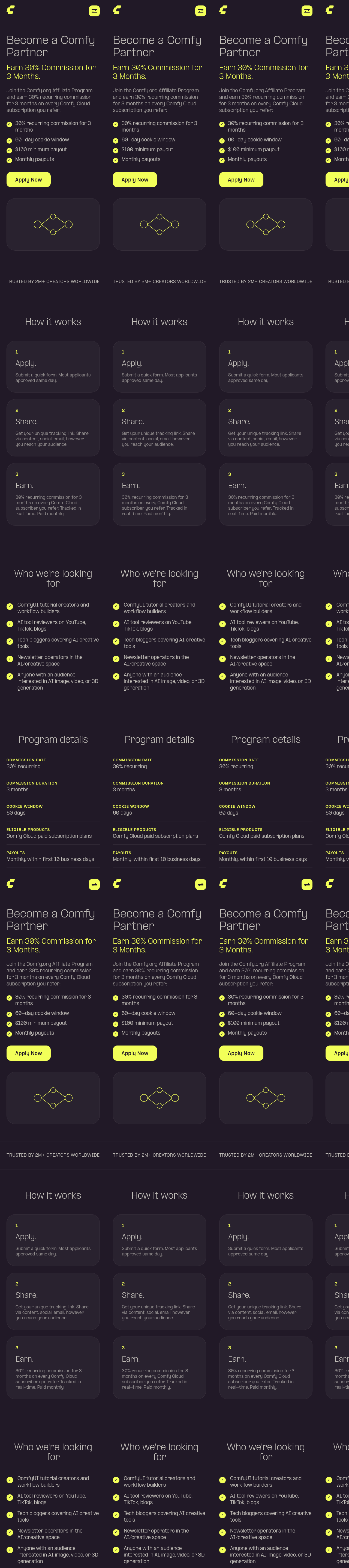 ┆Issue is synchronized with this [Notion page](https://www.notion.so/PR-12002-feat-website-draft-Affiliate-Program-landing-page-at-affiliates-3586d73d365081cc9d78cf7ebe04747d) by [Unito](https://www.unito.io) --------- Co-authored-by: Glary-Bot <glary-bot@users.noreply.github.com> Co-authored-by: Miles Ryan <thedatalife@users.noreply.github.com> |
||
|
Dante
|
75e2c3ef9b |
fix: unify node selection source onto canonical selectedItems (FE-891) (#12592)
## Summary Migrate the node-menu action path off the legacy `app.canvas.selected_nodes` dict onto the canonical `canvas.selectedItems` set so the Pin and Bypass context-menu options read their selection state from one source. ## Changes - **What**: `getSelectedNodes` and `getSelectedNodesShallow` in `useSelectedLiteGraphItems` now derive from `canvasStore.canvas?.selectedItems` filtered by `isLGraphNode` — the same source the Pin label already uses via `useSelectionState`. The Bypass label (`areAllSelectedNodesInMode`) and all node actions (pin/collapse/bypass/mute/size/runBranch) now share that canonical source. Subgraph expansion (`getSelectedNodes` → `collectFromNodes`) and the no-expansion all-match mode toggle are preserved unchanged. The accessor returns `[]` when the canvas is unavailable, preserving the prior null-tolerance. - **Breaking**: None. `app.canvas.selected_nodes` is untouched (still maintained by LiteGraph, still read by extensions). For every selection reachable through normal canvas interaction the two collections hold the identical top-level node set and order, so behavior is preserved. ## Review Focus - Resolves the dual-source-of-truth flagged by @DrJKL in #12500 (`useNodeMenuOptions.ts:99`): the Pin label read `selectedItems` while the Bypass label read `selected_nodes`. Both now read `selectedItems`. - Follow-up to #12500 (FE-720), which merged into `main`. - **Scope is source-unification only.** Pre-existing semantic gaps are left as follow-ups: Pin per-node-flip vs Bypass all-match toggle; Pin expands subgraph children while Bypass does not; reroute-only selection still renders no-op Pin/Bypass items. - The legacy `selected_nodes` dict still has direct readers in the extension layer — tracked in **FE-896** so the dict can eventually be retired. ## Testing Unit-only by design — this is a pure composable-layer source swap with **no user-visible behavior change** (the node set and ordering are identical to `selected_nodes` for every canvas-originated selection). An E2E test would only re-exercise existing Pin/Bypass menu flows that already pass unchanged. Coverage: - `useSelectedLiteGraphItems.test.ts`: node accessors source from the canonical `selectedItems`; a decoy node in the legacy `selected_nodes` dict is asserted *not* to be read; canvas-unavailable returns `[]` without throwing; subgraph expansion + all-match toggle preserved. - `useNodeMenuOptions.test.ts`: the Bypass label derives from `selectedItems`. - Red→green: `c0bfc94c0a` adds the canonical-source tests (fail against the legacy-source base); `f7f7176683` migrates the source (all green). Linear: FE-891 |
||
|
Alexander Brown
|
60db6e85bf |
chore: Remove unused tags, add a config option to prevent future unused tags (#12569)
Also updates the minor knip version. |
||
|
Steven Tran
|
f61a3212a9 |
Updated Pr 12480 - fix(telemetry): call posthog.reset(true) on logout to prevent session bleeding (#12599)
Summary Moves posthog.reset(true) off the explicit logout action and onto the user session-state transition (currentUser truthy → null), so PostHog identity reset fires on every way a session ends — not just button-initiated logout. Covers server-side token revocation, account deletion, and cross-tab sign-out, which previously left the user anonymous without ever resetting PostHog (the identity bleed this guards against). Changes What: Replaces the trackLogout() hook with onUserLogout(() => posthog.reset(true)) in PostHogTelemetryProvider's post-init block, next to the existing onUserResolved identify call. Removes trackLogout() from the TelemetryProvider interface, TelemetryRegistry, and PostHogTelemetryProvider (plus the shouldResetOnInit field), and removes the call site in useAuthActions.logout() Why state-driven: onUserLogout is watch(resolvedUserInfo, (user, prev) => prev && !user && cb()) — it fires on the truthy → null transition regardless of how the session ended. Since persistence is browserLocalPersistence, this catches token revocation, account deletion, and cross-tab sign-out, none of which route through useAuthActions reset(true) still generates a fresh anonymous distinct_id — same identity-bleed guarantee as the old hook, just triggered by the actual invariant (session ended) rather than one path to it Net simplification: the entire trackLogout plumbing goes away, and the previous intentional-skip special case for reauth is no longer needed Review Focus Reauth recovery: createReauthenticationRecovery (useAuthActions.ts ~219) signs out then immediately re-signs-in the same user. The watcher now fires reset on the transient null and re-identifies the same user right after — harmless, nothing happens in between, and the old intentional-skip is no longer required Pre-init window: the watcher attaches in the post-init .then(), so a logout during the posthog-js dynamic-import window isn't caught. Accepted intentionally — nothing is identified pre-init (identify runs in the same post-init block), so there's no Person to bleed. The one behavior dropped vs. the old code is the pre-init eventQueue = [] clear; this only matters in a logout-then-different-login race inside the import window, documented inline, and no pre-init hook is re-added Tests: the 3 trackLogout tests are replaced with watcher-fires tests — truthy → null triggers reset(true), and the reauth roundtrip re-identifies the same user --------- Co-authored-by: Nav Singh <nav@comfy.org> Co-authored-by: Claude Sonnet 4.6 <noreply@anthropic.com> Co-authored-by: nav-tej <36310614+nav-tej@users.noreply.github.com> Co-authored-by: nav <nav@mac.lan> Co-authored-by: Steven Tran <steventran@Stevens-MacBook-Air.local> |
||
|
Steven Tran
|
705f36c81a |
Pr/12481 - fixed error (#12574)
Replaces sending Mixpanel-style "$set_once" in the USER_AUTH_COMPLETED event with a PostHog people.set_once (fallback to people.set) call after PostHog initialization. Prevents telemetry from initializing / sending network calls in test and E2E environments (detects import.meta.env.MODE === 'test' or VITE_E2E / VITE_DISABLE_TELEMETRY), to avoid flaky CI sharded E2E failures. Keeps event capture behavior and queuing logic intact; user-level property is now set via PostHog people API instead of event payload. --------- Co-authored-by: Nav Singh <nav@comfy.org> Co-authored-by: Claude Sonnet 4.6 <noreply@anthropic.com> Co-authored-by: Steven Tran <steventran@Stevens-MacBook-Air.local> Co-authored-by: Benjamin Lu <benjaminlu1107@gmail.com> |
||
|
Alexander Brown
|
18810cfd6f |
fix: resolve pnpm lint warnings in test files (#12534)
## Summary

Resolve the 3 outstanding `pnpm lint` warnings in two test files so the
lint run is clean.

## Changes

- **What**:
-
[src/composables/useLoad3d.test.ts](src/composables/useLoad3d.test.ts):
Extract `vi.mocked(...).mock.calls` chains into a single-line
intermediate. The previous multi-line chain tripped an oxlint
`vitest/hoisted-apis-on-top` false-positive; the rule actually targets
`vi.mock`/`vi.hoisted`/`vi.doMock` but mis-flags split
`vi.mocked(...).mock.calls` expressions. All other call sites in the
same file already use the single-line form.
-
[src/platform/workspace/composables/useWorkspaceBilling.test.ts](src/platform/workspace/composables/useWorkspaceBilling.test.ts):
Drop the `{ ...originalLocation, href: ... }` spread when stubbing
`window.location`. `useWorkspaceBilling` only reads
`window.location.href`, so the spread of a `Location` class instance was
both unnecessary and triggered `typescript-eslint/no-misused-spread`.

## Review Focus

- The oxlint warning on `vi.mocked(...).mock.calls` looks like a rule
bug — confirm the workaround is acceptable rather than suppressing the
rule.
- Confirm there is no test that depends on `window.location` carrying
anything beyond `href` in `useWorkspaceBilling.test.ts` (verified: only
`href` is read in production code and assertions).

Verified locally: `pnpm lint` reports 0 warnings / 0 errors, and both
affected test files pass (121 tests).

---------

Co-authored-by: Amp <amp@ampcode.com>
|
||
|
Dante
|
87aca15dc4 |
feat(dialog): migrate ConfirmDialog callers to Reka-UI (Phase 5) (#12502)
## Summary Phase 5 of the dialog migration. Replaces the remaining PrimeVue `useConfirm` / `<ConfirmDialog>` usage in the main frontend (`src/`) with the `showConfirmDialog` helper added in Phase 1. Public API of `useDialogService` / `dialogStore` is unchanged. Parent: [FE-571](https://linear.app/comfyorg/issue/FE-571/dialog-system-migration-primevue-reka-ui-parent) This phase: [FE-577](https://linear.app/comfyorg/issue/FE-577/phase-5-migrate-confirmdialog-callers-secretspanel) Predecessors: #11719 (Phase 0, merged), #12041 (Phase 1, merged), #12109 (Phase 2, merged), #12182 (Phase 3, merged), #12403 (Phase 4, **stacked PR base**) > **Stacked on Phase 4**: this PR targets `jaewon/fe-576-dialog-reka-migration-phase-4`. Rebase onto `main` after #12403 lands. ## Changes ### before <img width="1586" height="840" alt="phase4-before-primevue-confirm" src="https://github.com/user-attachments/assets/2cb78cc2-7324-4349-b44b-98b5e696a83f" /> ### after <img width="1586" height="840" alt="phase5-after-reka-confirm" src="https://github.com/user-attachments/assets/c092b026-828b-46aa-a4ff-f8611906f692" /> ### `src/platform/secrets/components/SecretsPanel.vue` Delete-secret confirmation routes through the Reka helper: | Before | After | | --- | --- | | `useConfirm()` + `<ConfirmDialog group="secrets" />` + `confirm.require({ acceptClass: 'p-button-danger', accept: () => deleteSecret(secret) })` | `showConfirmDialog({ headerProps, props.promptText, footerProps: { confirmText: t('g.delete'), confirmVariant: 'destructive', onCancel, onConfirm } })` with explicit `dialogStore.closeDialog(dialog)` on both branches | Header / message i18n keys (`secrets.deleteConfirmTitle`, `secrets.deleteConfirmMessage`) unchanged. Confirm button now uses `t('g.delete')` instead of the implicit PrimeVue "Yes" default, matching the Reka helper convention used in `KeybindingPanel` / `AssetCard`. ### `src/components/sidebar/tabs/BaseWorkflowsSidebarTab.vue` Drops the vestigial `<ConfirmDialog />` mount and its import. The script section never called `useConfirm()` — close/delete workflow flows were already migrated to `dialogService.confirm()` (the Reka path) in Phase 1, so the dangling overlay served no consumer. ### Tests - `src/platform/secrets/components/SecretsPanel.test.ts` **(new)** — 3 tests: helper invoked with destructive variant + correct i18n props, `onConfirm` closes the dialog **with the exact helper handle** and calls `deleteSecret`, `onCancel` closes with the handle without deleting. The mock returns a stable `DIALOG_HANDLE` so a regression that passes the wrong arg to `closeDialog` fails the suite. - `src/components/sidebar/tabs/BaseWorkflowsSidebarTab.test.ts` — removed the now-orphan `vi.mock('primevue/confirmdialog', ...)`. ## Verification After this PR, the only remaining references to PrimeVue's confirm system in `src/` are the global `ConfirmationService` registration in `main.ts`, which is owned by Phase 6 (FE-578) alongside the broader Dialog / CSS cleanup: ``` $ grep -rn 'primevue/useconfirm\|primevue/confirmdialog\|useConfirm\b' src --include='*.ts' --include='*.vue' (no matches) ``` ## Out of scope **Phase 6 (FE-578) — main frontend cleanup** - Remove `ConfirmationService` registration from `src/main.ts`. - Remove PrimeVue `Dialog` imports from `GlobalDialog.vue` and its remaining `<style>` overrides (including `.manager-dialog`). **`apps/desktop-ui/` — not part of FE-577** - `apps/desktop-ui/src/components/maintenance/TaskListPanel.vue` still uses `useConfirm()` + `<ConfirmPopup />`, and `apps/desktop-ui/src/main.ts` + `.storybook/preview.ts` still register `ConfirmationService`. The desktop app is a separate workspace package consuming the main frontend; its PrimeVue confirm usage is intentionally **not** migrated here. Tracking separately (follow-up ticket). **Renderer scope caveat** - `showConfirmDialog()` does not currently pass `renderer: 'reka'` to `dialogStore.showDialog`. The helper continues to render through the PrimeVue branch in `GlobalDialog.vue` until the helper itself is flipped (Phase 1/6 territory). This PR only routes callers **to** the helper — flipping the helper's render path is intentionally out of scope. ## Quality gates - [x] `pnpm typecheck` — clean - [x] `pnpm lint` — 0 errors (3 pre-existing warnings in unrelated files: `useLoad3d.test.ts`, `useWorkspaceBilling.test.ts`) - [x] `pnpm format` — applied - [x] `pnpm test:unit` (touched + adjacent): - `SecretsPanel.test.ts` — 3/3 (hardened to assert handle pass-through) - `BaseWorkflowsSidebarTab.test.ts` — 3/3 - `src/platform/secrets` + `src/components/sidebar/tabs` + `src/components/dialog` — 178/178 - [x] Manual verification on `cloud.comfy.org` via local HTTPS dev server (Settings → Secrets → delete flow, before & after side-by-side) - [ ] CI Playwright matrix ## Public API impact None. `useDialogService` / `dialogStore` surface is unchanged. ## Review focus 1. **Destructive variant choice** — `acceptClass: 'p-button-danger'` (PrimeVue) → `confirmVariant: 'destructive'` (Reka helper). Same red-affirmative semantic; visual match confirmed in screenshots above. 2. **Confirm label** — switched from PrimeVue's implicit "Yes" to `t('g.delete')` for the delete flow, matching how `KeybindingPanel` / `AssetCard` configure the helper. 3. **`BaseWorkflowsSidebarTab.vue` deletion** — verifying the `<ConfirmDialog />` was genuinely vestigial: `grep useConfirm src/components/sidebar/tabs/BaseWorkflowsSidebarTab.vue` returns nothing, and `workflowService.deleteWorkflow` / `closeWorkflow` route through `dialogService.confirm()` (Reka path). 4. **desktop-ui scope** — see "Out of scope" above. If the team wants desktop-ui folded into this phase, happy to extend the PR. --------- Co-authored-by: github-actions <github-actions@github.com> Co-authored-by: GitHub Action <action@github.com> |
||
|
Alexander Brown
|
162908a421 |
docs: ECS pattern survey appendix + PromotionStore cleanup (#12580)
## Summary Add the ECS pattern survey appendix to ADR 0008's companion-documents table, and drop stale `PromotionStore` references across architecture docs to reflect the ADR 0009 removal. ## Changes - **What**: - New `docs/architecture/appendix-ecs-pattern-survey.md` — surveys bitECS, miniplex, koota, ECSY, Bevy, and Thyseus: patterns adopted, departed from, and when to revisit. - ADR 0008 companion table gains a row pointing at the new appendix. - `docs/adr/0009-…/before-after-flows.md`, `docs/architecture/ecs-target-architecture.md`, `docs/architecture/entity-problems.md` — drop references to `PromotionStore` / `usePromotionStore` (the legacy three-layer mechanism is gone; promoted value widgets are now linked `SubgraphInput`s). - `docs/architecture/subgraph-boundaries-and-promotion.md` — reframes its "current mechanism" section as historical context with an explicit "removed by ADR 0009" callout. - **Breaking**: None — docs-only. ## Review Focus Wording in the historical-context callout on `subgraph-boundaries-and-promotion.md`. Everything else is a small cleanup or a new standalone document. --------- Co-authored-by: Amp <amp@ampcode.com> Co-authored-by: coderabbitai[bot] <136622811+coderabbitai[bot]@users.noreply.github.com> Co-authored-by: GitHub Action <action@github.com> |
||
|
Christian Byrne
|
c5cc09dbc1 |
feat: draft Affiliate Program Terms page at /affiliates/terms (#11954)
*PR Created by the Glary-Bot Agent* --- Draft, `noindex`-gated legal page rendering the **Comfy.org Affiliate Program Terms and Conditions** verbatim from the source document. Treats the copy as legal-final-pending-signoff: lives in i18n translations so legal/non-engineers can edit text without a code change, the page is excluded from search engines (`<meta robots noindex>` + `robots.txt` + sitemap filter), and a follow-up PR will flip it to indexable once legal signs off. ## What this adds - **Route:** `/affiliates/terms` (en) + `/zh-CN/affiliates/terms` (zh-CN), matching the existing privacy-policy / terms-of-service localization pattern. - **Anchor IDs match the spec exactly:** `#1-program-overview`, `#2-eligible-products`, …, `#11-miscellaneous` — stable deep-linking. - **Sticky desktop TOC** with active-section highlighting (IntersectionObserver, smooth scroll, header offset, `prefers-reduced-motion` aware). - **Collapsed `<details>` accordion TOC on mobile** that auto-closes after a click. - **Effective Date** is a single i18n key (`affiliate-terms.effective-date`) — currently `[TBD]`. One config var, consumed by the page footer. - **Plain accessible legal-doc styling:** site design tokens, no marketing flourish or gradients, narrow column for readable line length, high-contrast text. - **noindex everywhere:** robots `noindex,nofollow` meta via `BaseLayout.noindex`, `Disallow: /affiliates/terms` added to every UA block in `robots.txt` (including the AI-bot overrides), and the route excluded from `@astrojs/sitemap` for both locales. ## Implementation notes The website does not currently use MDX — it uses i18n translation keys + Vue `ContentSection` components for legal pages. I followed that established pattern (per AGENTS.md "Align with rest of subrepo on impl and design") rather than introducing MDX integration just for this page. Editing affiliates terms copy is a one-file change in `src/i18n/translations.ts`, no code touch required, which satisfies the "Nav or legal can edit without a code change" intent. A new component `LegalContentSection.vue` is added (rather than reusing `ContentSection.vue` directly) because legal docs need: (a) a `<details>` mobile accordion TOC instead of the existing horizontal-scroll `CategoryNav`, (b) a footer Effective Date, and (c) a tighter block-type set (paragraph + bullet list only). Privacy / Terms-of-Service pages are untouched. ## Skipped per spec Per the original brief, "Competitive analysis" bullets and the "Open questions for legal review" callout are internal-only and were not copied into the i18n keys. There is a unit test asserting no key matching `competitive-analysis|open-questions|legal-review` exists under the `affiliate-terms.*` namespace. ## ⚠️ Flag for legal review The source legal copy contains an internal contradiction that I copied verbatim rather than silently editing: - **Section 3 (Commission Structure)** says: *"Commission duration: 3 months from the referred customer's first paid subscription"* - **Section 7 (Termination)** says: *"Commissions on referred customers will cease at the time of termination, even if within the **12-month** commission window"* These two clauses imply different commission windows (3 months vs 12 months). I left the copy as-is for legal to resolve before the indexable follow-up PR — flagging here so it doesn't get missed. ## Verification - `pnpm typecheck` (root) — clean - `pnpm typecheck:website` — clean (91 Astro files, 0 errors) - `pnpm test:unit` (website) — 35/35 passing including 5 new unit tests for the affiliate-terms section structure - `pnpm exec playwright test affiliates-terms` — 8/8 passing (5 desktop `@smoke`, 3 mobile `@mobile`) - `pnpm format:check` — clean - `pnpm build` — clean, both routes generated, sitemap correctly excludes both locale variants - All pre-commit hooks pass (stylelint + oxfmt + oxlint + eslint + typecheck + typecheck:website + check-unused-i18n-keys) ## Manual verification Screenshots embedded below from the local Astro preview build at desktop (1280×900) and mobile (Pixel 5 / 393×852) viewports. The mobile accordion's collapsed and expanded states are both captured. ## Sub-agent review Ran the Oracle review against `main`. Initial pass flagged the Last-updated/Effective-Date footer duplication and a missing zh-CN route — both addressed in commit `8a1ce890d`. The 3-month vs 12-month contradiction is left for legal (see above). ## Preview URL The Vercel preview URL with the route appended will be posted as a PR comment after CI completes: `<vercel-preview-host>/affiliates/terms` ## Screenshots 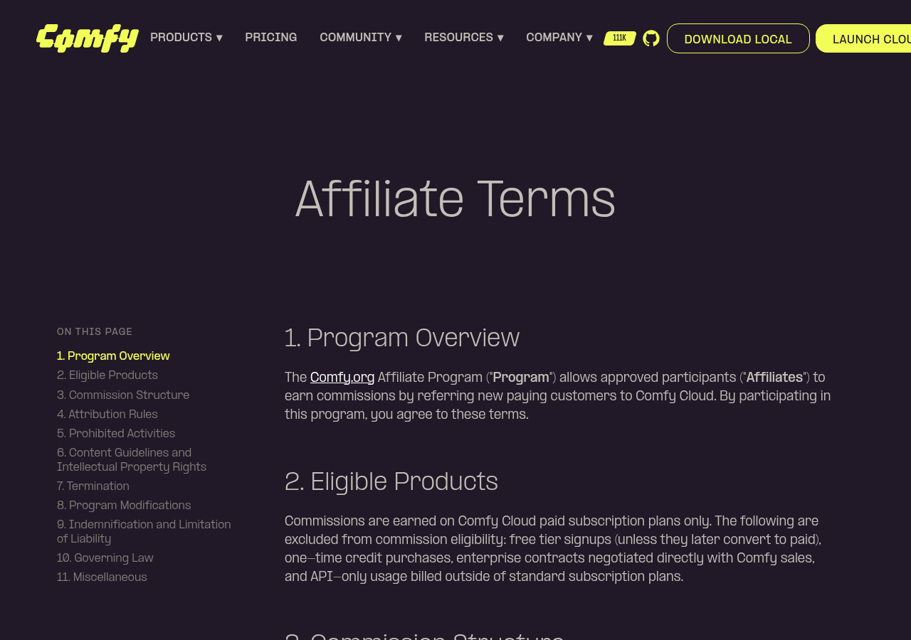 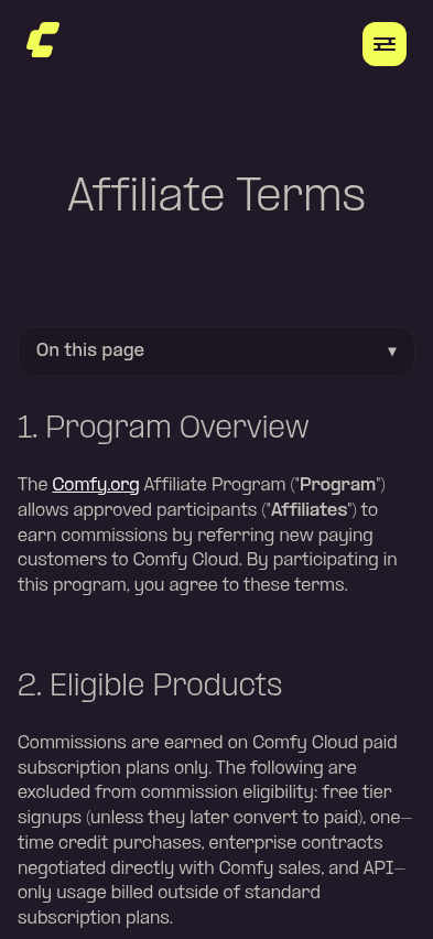  ┆Issue is synchronized with this [Notion page](https://www.notion.so/PR-11954-feat-draft-Affiliate-Program-Terms-page-at-affiliates-terms-3576d73d36508121851ef666a8c4c537) by [Unito](https://www.unito.io) --------- Co-authored-by: Glary-Bot <glary-bot@users.noreply.github.com> Co-authored-by: glary-bot <glary-bot@comfy.org> |
||
|
Alexander Brown
|
e566ec4ca3 |
refactor: relocate UUID and NodeId out of litegraph (#12581)
## Summary

Move the canonical `UUID` utilities and the `NodeId` alias up out of
`src/lib/litegraph/` so non-litegraph code can reference them without
crossing the litegraph layer boundary.

## Changes

- **What**:
- `src/lib/litegraph/src/utils/uuid.ts` → `src/utils/uuid.ts` (full
file: `UUID`, `zeroUuid`, `createUuidv4`).
- `NodeId` moves from `src/lib/litegraph/src/LGraphNode.ts` to
`src/world/entityIds.ts`. `LGraphNode.ts` re-exports it; the litegraph
barrel still re-exports `createUuidv4` / `UUID` so the package's public
surface is unchanged.
- All 22 importers updated to `@/utils/uuid` (both
`@/lib/litegraph/src/utils/uuid` and the litegraph-internal
`./utils/uuid` relative paths).
- Drops the two `import-x/no-restricted-paths` ESLint disables in
`src/world/entityIds.ts` that were waiting on these moves.
- **Breaking**: None — litegraph re-exports preserve backward
compatibility for downstream consumers.

## Review Focus

- Each importer's change is identical (`@/lib/litegraph/src/utils/uuid`
→ `@/utils/uuid`), generated by `sed`.
- `src/lib/litegraph/src/LGraphNode.ts` now does `import type { NodeId }
from '@/world/entityIds'` + `export type { NodeId }` — confirm this
satisfies the litegraph layer boundary rules.
- `src/world/entityIds.ts` defines `NodeId` locally as `number |
string`; no semantic change.

Co-authored-by: Amp <amp@ampcode.com>
|
||
|
Alexander Brown
|
1e01c7128b |
chore: Add org prefix for team in CODEOWNERS (#12590)
https://github.com/orgs/community/discussions/22751 |
||
|
Comfy Org PR Bot
|
ee65074edc |
1.46.7 (#12546)
Patch version increment to 1.46.7

**Base branch:** `main`

---------

Co-authored-by: christian-byrne <72887196+christian-byrne@users.noreply.github.com>
Co-authored-by: github-actions <github-actions@github.com>
v1.46.7 |
||
|
Alexander Brown
|
3d8bb91069 |
Revert "feat: enrich App Mode telemetry with view_mode, workflow_id, and is_app" (#12583)
Reverts Comfy-Org/ComfyUI_frontend#12543 |
||
|
Dante
|
60a4dc3001 |
fix: dedupe Bypass context-menu items via state-aware legacy label (FE-720) (#12500)
## Summary Right-clicking a bypassed node showed two bypass-related items in the Vue "More Options" context menu (FE-720): - Plain `Bypass` from the legacy LiteGraph `getExtraMenuOptions` hook in `litegraphService.ts` - `Remove Bypass` (with `Ctrl+B` and an icon) from the Vue `getBypassOption` composable The Vue menu's exact-label deduplicator in `contextMenuConverter.ts` collapsed the unbypassed case (both emit `Bypass` → Vue source wins) but not the bypassed case (`Bypass` vs `Remove Bypass`), so the duplicate leaked through whenever the node was bypassed. ### before <img width="1920" height="958" alt="fe-720-before" src="https://github.com/user-attachments/assets/ef001aca-d70e-4798-ac61-01cc34c31e44" /> ### after <img width="1920" height="958" alt="fe-720-after" src="https://github.com/user-attachments/assets/d6d2bf4b-cb98-4b30-9dac-9bd4b68a7e36" /> #### single active node (KSampler) <img width="1920" height="958" alt="fe-720-1-unbypassed-node-menu" src="https://github.com/user-attachments/assets/bec9cd47-2f2d-4adb-b95b-266e7969a36c" /> #### single bypassed node (Load Checkpoint) <img width="1920" height="958" alt="fe-720-2-bypassed-node-menu" src="https://github.com/user-attachments/assets/91f80157-836d-4fce-adad-474f31baff04" /> #### KSampler + bypassed Load Checkpoint <img width="1920" height="958" alt="fe-720-3-mixed-selection-menu" src="https://github.com/user-attachments/assets/e4780b16-08e5-4f87-80e9-3ff65a5acdae" /> ## Root cause `src/services/litegraphService.ts` pushes a `Bypass` entry from its legacy `getExtraMenuOptions` hook in addition to the Vue `getBypassOption`. In Vue-menu mode both reach the menu; the exact-label dedup in `contextMenuConverter.ts` only collapses them when the labels match, which fails once the node is bypassed and the Vue side switches to `Remove Bypass`. ## Fix Add `Bypass` and `Remove Bypass` to the `HARD_BLACKLIST` in `contextMenuConverter.ts`. The blacklist filters the legacy emission out of the Vue conversion pipeline (`convertContextMenuToOptions`) before it is ever merged, so Vue's `getBypassOption` is the single source of the bypass item in every node state — no duplicate is created in the first place. This is the established convention for legacy items that the Vue menu replaces (`Properties`, `Colors`, `Shapes`, `Title`, `Mode`, `Properties Panel`, `Copy (Clipspace)`); Bypass is the same category. `litegraphService.ts` reverts to a plain `content: 'Bypass'` and no longer imports `areAllSelectedNodesInMode` or i18n keys for this entry. The Vue `getBypassOption` label is still derived from the same selection-aware predicate (`areAllSelectedNodesInMode`) that `toggleSelectedNodesMode` uses, so on mixed selections the label stays in sync with the action — it shows `Bypass` when clicking would bypass the rest, rather than `Remove Bypass`. **Trade-off:** the classic LiteGraph canvas menu (`Comfy.VueNodes.Enabled: false`) renders `litegraphService`'s options directly without going through `convertContextMenuToOptions`, so it shows a plain `Bypass` regardless of node state. This matches the pre-PR behavior (the legacy push was already a hardcoded `Bypass`), so it is not a regression. ## Considered and rejected - **`equivalents` map** (`bypass: ['bypass', 'remove bypass']`) — would collapse `Bypass` and `Remove Bypass` as synonyms, which is semantically wrong: they are distinct actions that must stay distinguishable, and the rule would also misfire on the unbypassed case. A converter test locks in that they are not treated as equivalents. - **State-aware label on the legacy push** (matching the Vue label so the exact-label dedup collapses them) — works, and additionally gives the classic canvas menu a state-aware label, but it couples `litegraphService` to the selection predicate and i18n keys solely to keep a downstream dedup load-bearing. `HARD_BLACKLIST` removes the duplicate at the source instead of creating, converting, then collapsing it. The only thing lost is the classic-menu state-aware label, which was never present pre-PR. - **Gating the legacy push on `Comfy.UseNewMenu === 'Disabled'`** — the setting that selects the legacy vs Vue context menu is `Comfy.VueNodes.Enabled`, not `Comfy.UseNewMenu` (an unrelated top-menu-bar toggle). Gating on `UseNewMenu` would drop the Bypass entry from the legacy canvas menu for the OSS default (`VueNodes.Enabled: false` + `UseNewMenu: 'Top'`). - **Suppressing the legacy callback via `SUPPRESSED_LITEGRAPH_CALLBACKS`** — matches by callback identity and adds cross-file coupling for what is a simple label-based filter that `HARD_BLACKLIST` already expresses. ## Cleanups (review feedback) - Removed the now-dead `NodeSelectionState.bypassed` field and its producer (no consumers after the label switch). - Replaced the `vue-i18n` mock in `useNodeMenuOptions.test.ts` with a real `createI18n` instance per `docs/testing/vitest-patterns.md`; removed a `ts-expect-error` via a typed hoisted `app` mock. - Simplified `getSelectedNodeArray` to `Object.values(app.canvas.selected_nodes ?? {})`. ## Tests - `useSelectedLiteGraphItems.test.ts` — `areAllSelectedNodesInMode`: all-bypassed → true, mixed → false, empty → false. - `useNodeMenuOptions.test.ts` — Vue label is `Bypass` (active / mixed) and `Remove Bypass` (all bypassed). - `contextMenuConverter.test.ts` — the legacy `Bypass` push is filtered by `HARD_BLACKLIST` so the Vue item is the only bypass entry (keeps shortcut/source); `Bypass` and `Remove Bypass` are not treated as label equivalents. - `browser_tests/tests/vueNodes/interactions/node/contextMenu.spec.ts` — e2e regression: exactly one bypass-family item per node state. Verified live on a bypassed Load Checkpoint: single `Remove Bypass` → toggle un-bypasses → single `Bypass`; no duplicate, rest of the menu intact. - Fixes FE-720 --------- Co-authored-by: Alexander Brown <drjkl@comfy.org> |
||
|
Alexander Brown
|
c4c1dfa58a |
Remove drag node test from interaction.spec.ts (#12579)
It's flaky. |
||
|
AustinMroz
|
1938ba809b |
Track undo state on subgraph conversion (#12575)
When converting to subgraph, `beforeChange` and `afterChange` were being called, but these functions exclusively called vestigial change handlers that don't actually affect change tracking. Consequentially, if you made a change to the graph (updating a widget), converted a node to a subgraph using the selectionToolbox, and then pushed Ctrl+Z before performing any other canvas interaction, it would incorrectly undo the prior widget edit as well. This is resolved by calling the important handlers directly. Adding them to `beforeChange`/`afterChange` was considered, but caused breakage in other functions (`connect`) which failed to even attempt symmetric calls of the function. |