mirror of
https://github.com/Comfy-Org/ComfyUI_frontend.git
synced 2026-07-18 17:58:23 +00:00
bfaf39d66c914cfdb2fc0caaaba64b8e3eaeeb21
190 Commits
| Author | SHA1 | Message | Date | |
|---|---|---|---|---|
 claude[bot]
|
a154e6a311 |
Redirect comfy.org/login to cloud.comfy.org/login (#13727)
<!-- ccr-slack-attribution --> _Requested by **nav** · [Slack thread](https://comfy-organization.slack.com/archives/C0B61J7QCJW/p1784217313626029?thread_ts=1784217313.626029&cid=C0B61J7QCJW)_ ## Summary Redirect comfy.org/login to cloud.comfy.org/login. ## Changes - **What**: Adds a `/login` entry to the `redirects` array in `apps/website/vercel.json`, matching the existing `/blog` -> `https://blog.comfy.org` cross-origin redirect pattern. ## Review Focus - Before: `comfy.org/login` had no redirect (404/no route). - After: `comfy.org/login` returns a 302 (`permanent: false`) to `https://cloud.comfy.org/login`. - How: Astro's native redirects don't support cross-origin destinations, so this uses Vercel's `redirects` config in `apps/website/vercel.json`, consistent with the existing `/blog` entry. ## Screenshots (if applicable) N/A --- _Generated by [Claude Code](https://claude.ai/code/session_01UZGZ27NenZf5dzdvNcTFev)_ Co-authored-by: Claude <noreply@anthropic.com> |
||
|
steven-comfy
|
46fec1d47d |
feat: add hidden /booking-confirmation page for meeting-booking confirmations (#13730)
*PR Created by the Glary-Bot Agent* --- ## Summary Adds `/booking-confirmation`, a hidden `noindex` page intended as the post-submit redirect target after a visitor books a meeting with the GTM team. The page confirms the booking, tells the visitor to check their email for the calendar invite, and offers a small list of "while you wait" resources. ## Design Mirrors the `/individual-submission` template landed in #13697 — `BaseLayout` + `HeroSection` — so typography and spacing feel native to the marketing site. The "Resources while you wait" heading uses the yellow-italic accent used elsewhere on the site; each resource is a centered `label — url` row. Resource links source their URLs from `config/routes.ts` where possible (`routes.learning`, `routes.customers`, `externalLinks.workflows`, `externalLinks.docs`) so the page stays in sync if those paths ever move. ## Hidden-page mechanics Follows the pattern already used for `/individual-submission`, `/terms-of-service`, and `/payment/*`: - `noindex` meta tag on the page (both `en` and `zh-CN`) - Both `/booking-confirmation` and `/zh-CN/booking-confirmation` added to `SITEMAP_EXCLUDED_PATHNAMES` in `astro.config.ts` via `LOCALE_PREFIXES`, so neither URL is emitted in the sitemap - Not linked from `routes.ts`, `HeaderMain`, or `SiteFooter` - English + Simplified Chinese variants both exist as full pages (matching the existing `/individual-submission` treatment) ## Next step (not in this PR) Someone with HubSpot / Chili Piper access needs to configure the meeting-booking flow to redirect visitors to `https://comfy.org/booking-confirmation` after they schedule. ## Verification - `pnpm typecheck` → 0 errors, 0 warnings (10 pre-existing hints unrelated to this change) - `pnpm build` (in `apps/website`) → 504 pages built; `/booking-confirmation/` and `/zh-CN/booking-confirmation/` emitted; neither appears in `dist/sitemap-0.xml` - `oxlint` and `oxfmt` clean on changed files (also enforced by lint-staged pre-commit) - Playwright preview at 1280×900 (English + zh-CN) and 390×844 (English mobile) — hero, body copy, section header, and all 4 resource rows render as expected; no horizontal overflow on mobile; only console noise was transient Vite dep-optimizer 504s unrelated to this change - `/review` (oracle) flagged one issue on the initial revision: the zh-CN page was `noindex` but its URL still appeared in the sitemap. Fixed by extending the exclusion set across both `LOCALE_PREFIXES`; the follow-up `/review` returned 0 findings. ## Screenshots ## Screenshots 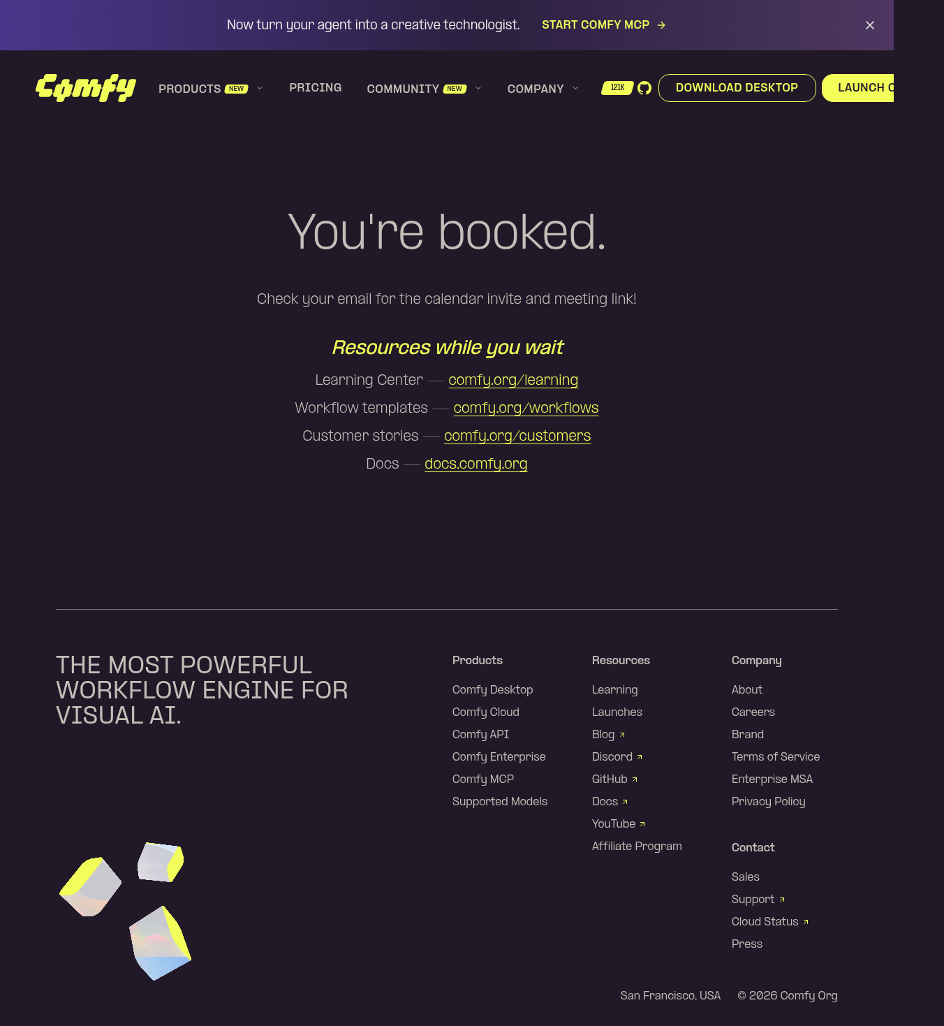 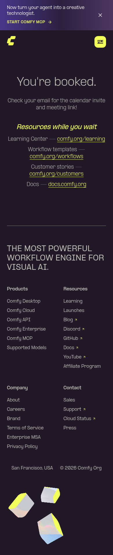 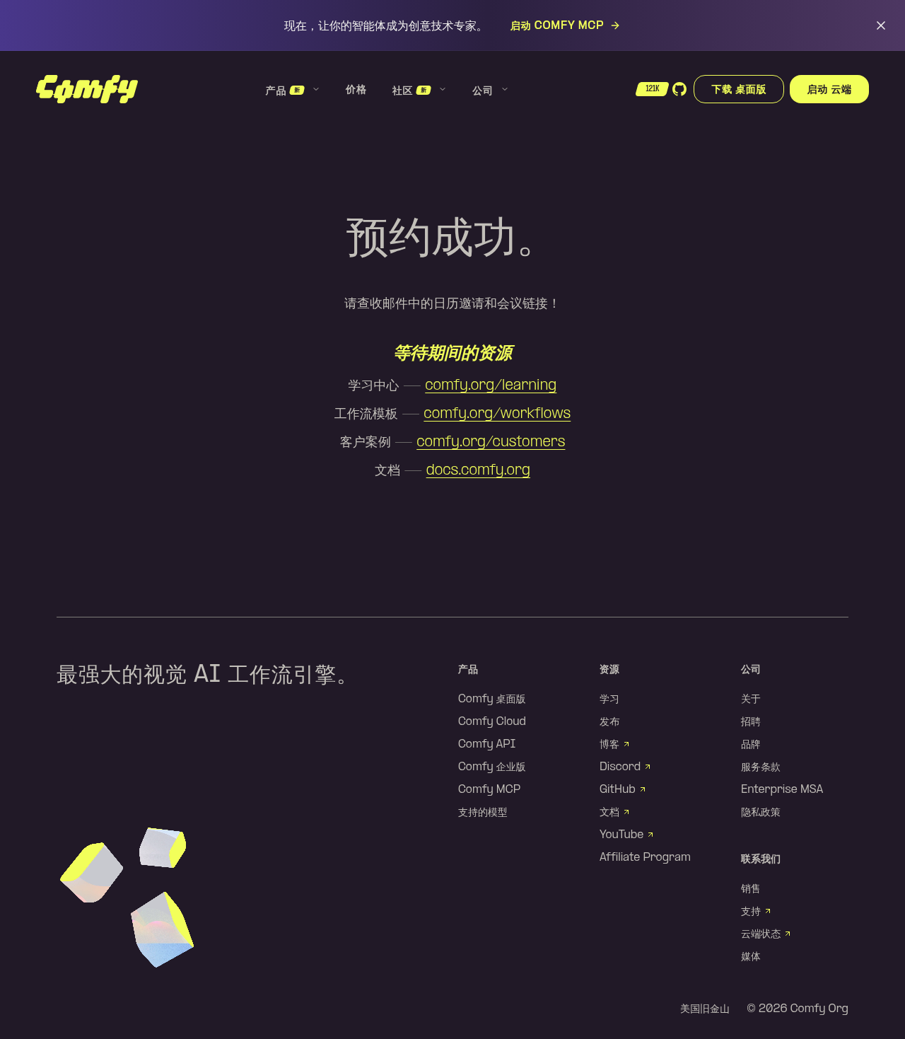 --------- Co-authored-by: Glary-Bot <glary-bot@users.noreply.github.com> Co-authored-by: Michael B <michael@imick.io> |
||
|
steven-comfy
|
f524683f3c |
feat: add hidden /individual-submission page for sales-form redirects (#13697)
*PR Created by the Glary-Bot Agent* --- ## Summary Adds `/individual-submission`, a hidden `noindex` page intended as the post-submit redirect target for the HubSpot sales form when the visitor selects the "individual" option. The page thanks the visitor, points them at the self-serve plans on `/cloud/pricing`, and offers a `mailto:gtm-team@comfy.org` fallback for enterprise inquiries. ## Design Mirrors the `terms-of-service.astro` template — `BaseLayout` + `HeroSection` — so typography and spacing feel native to the marketing site. Plan names (**Standard**, **Creator**, **Pro**, **Teams**) are highlighted with the yellow-italic accent used elsewhere on the site. ## Hidden-page mechanics Follows the pattern already used for `/terms-of-service` and `/payment/*`: - `noindex` meta tag on the page - Path added to `SITEMAP_EXCLUDED_PATHNAMES` in `astro.config.ts` - English-only, with a `/zh-CN/individual-submission` → `/individual-submission` redirect (matches `termsOfService` handling) - Not linked from `routes.ts`, `HeaderMain`, or `SiteFooter` ## Next step (not in this PR) Someone with HubSpot access needs to configure the form (portal `244637579`, form `94e05eab-1373-47f7-ab5e-d84f9e6aa262`) to redirect to `https://comfy.org/individual-submission` when the "individual" option is selected. Happy to add a JS-side fallback in a follow-up PR if HubSpot's conditional redirects aren't a fit. ## Verification - `pnpm typecheck` → 0 errors (10 pre-existing hints unrelated to this change) - `pnpm build` → 499 pages built; `/individual-submission/` and `/zh-CN/individual-submission/` (redirect stub) emitted; sitemap excludes both - Playwright preview at 1280×900 and 390×844 — hero title, prose, plan-name highlighting, CTA button, and mailto link all render as expected; no console errors; `whitespace-nowrap` keeps the email address on one line on mobile - `/review` (oracle) on the previous revision: 0 findings; only change since is the URL rename - `/zh-CN/individual-submission` redirect verified in preview ## Screenshots 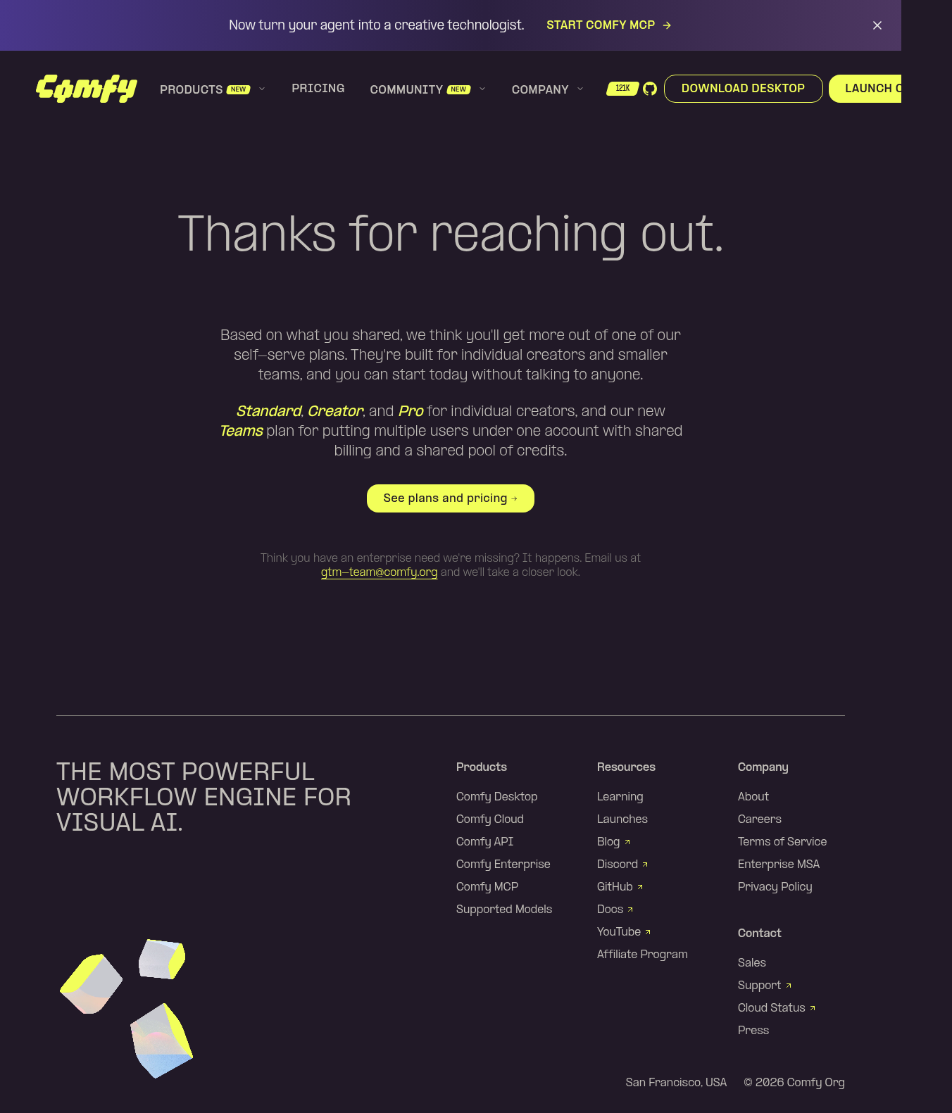  --------- Co-authored-by: Glary-Bot <glary-bot@users.noreply.github.com> Co-authored-by: imick-io <michael@concreo.io> Co-authored-by: Michael B <michael@imick.io> Co-authored-by: Claude Opus 4.8 (1M context) <noreply@anthropic.com> |
||
|
Deep Mehta
|
6ac9b653bb |
feat(website): six-card MCP capabilities and nine-item FAQ (stacked) (#13694)
## Summary Stacked on #13693. Ports the capabilities six-card expansion and the nine-item FAQ rewrite from #13649 (imick-io) onto the reworked page, keeping the two-option setup module from the base branch as the single setup implementation. ## Changes - **What**: - Capabilities section grows from three to six cards (Direct any model, Generate in batches, Ship it as an app) with real media wired; `FeatureRows01` and `VideoPlayer` gain a `fit: cover | contain` option and a fixed-ratio media column. - FAQ rewritten to nine items, reordered so setup facts come first; `FAQSplit01` autolinks URLs in answers (regex includes coderabbit's character-class fix from the source PR). - Quality pass on top of the port: FAQ links get the same branded `focus-visible` rings as the setup section, "download the assets to local" copy polished, and two new e2e tests cover the six cards and the nine-item FAQ with its autolinked server URL. - Deliberately NOT ported from #13649: its `SetupSection`/`FeatureGrid01` Step 2 changes and the `cloudMcpServer` route entry. Those solve the buried-URL problem on the old three-step layout; the base branch's two-option redesign already covers it via `externalLinks.mcpEndpoint`. ## Review Focus - Translation splice: `mcp.tools.*` and `mcp.faq.*` blocks taken verbatim from #13649's branch (en + zh-CN); base branch's hero/setup keys untouched. - All 7 e2e tests pass against the production build; tools and FAQ sections verified rendering with live media. Linear: [PM-132](https://linear.app/comfyorg/issue/PM-132/comfyorgmcp-faq-is-stale-and-contradicts-the-page-rewrite-faq-fix) Source: #13649 ## Screenshots (if applicable) --------- Co-authored-by: Michael B <michael@imick.io> |
||
|
Mobeen Abdullah
|
86bccf8d4c |
feat(website): add brand portal page at /brand (#13484)
## Summary Add the Brand Portal page at `/brand` (and `/zh-CN/brand`), implementing the Figma design in English and Simplified Chinese. ## Changes - **What**: New marketing page with hero, logo system, color palette, voice guidelines, trademark, and questions sections. Reuses `BaseLayout`, `Button`, and `SectionHeader`; adds `data/brandColors.ts` (palette with hex/rgb/hsl/cmyk) and `templates/brand/` sections. The hero "View brand guidelines" downloads the guidelines PDF; both "Download logos" actions download the brand-assets zip. Route registered in `config/routes.ts`; copy in `i18n/translations.ts` (en + zh-CN). - **Dependencies**: none ## Review Focus - Typography, spacing, and palette values were matched to the Figma per section; the Chinese is a first-pass translation. - The guidelines PDF and logo zip are served from `media.comfy.org` with `Content-Disposition: attachment` so the buttons download rather than open inline. - Contact links point to `/contact` in the same tab (the Figma prototype annotation used a new tab). Implements FE-1217. ## Screenshots **Desktop** <img width="1440" height="3648" alt="brand-portal-desktop" src="https://github.com/user-attachments/assets/050855b2-dd2a-4616-b5c8-c2c79b049df8" /> **Mobile** <img width="390" height="6342" alt="brand-portal-mobile" src="https://github.com/user-attachments/assets/85f3ca97-655e-4fcc-987d-976faeae2efa" /> ## Test plan - [x] `pnpm --filter @comfyorg/website typecheck` - [x] `pnpm lint` - [x] `pnpm format` - [x] `e2e/brand.spec.ts` (sections render; logo bundle and guidelines-PDF download links) - [x] Verified responsive at 1440 / 834 / 390 |
||
|
Mobeen Abdullah
|
b52f6ce764 |
feat(website): strengthen the ComfyUI entity links in JSON-LD (#13689)
## Summary Implements the genuine parts of the schema enrichment follow-up to #13480 (FE-1232): the ComfyUI `SoftwareApplication` now names its canonical page and links back to its `SoftwareSourceCode`. Several other items from the recommendations doc are deliberately **not** implemented, with reasoning below. ## Changes - **`mainEntityOfPage` on the ComfyUI application.** The WebPage already pointed at the app via `mainEntity`; the app now points back at the home page, completing the relationship. - **`isBasedOn` linking the app to its source code.** `SoftwareSourceCode` already declared `targetProduct` -> the app, but only on the home page, and the app had no reverse link. The app now references the source node, so the application and its GitHub repository resolve as one connected entity. - **Download pages now emit the source code node** (en + zh-CN). They render the application node, so without this the new `isBasedOn` reference would not resolve inside their graph. `/download` previously described the app with no link to the repo at all. - Extracted a shared `comfyUiSourceCodeId()` so the `#sourcecode` anchor has one definition, matching the `comfyUiSoftwareId()` pattern from #13480 review. - 3 unit tests: canonical page is set, `isBasedOn` round-trips to the source node's real `@id`, and third-party software gets neither. ## Review Focus **Why `mainEntityOfPage` is a plain URL, not an `@id` reference.** The app node is shared by `/` and `/download` under one site-wide `@id` (`/#software`). A per-page reference would make the same entity claim two different canonical pages, and pointing at the home page's `#webpage` id would leave an unresolved reference on `/download`, which `validate:jsonld` fails the build on. A plain URL keeps the node byte-identical everywhere it is emitted. **Coupling worth knowing about:** any page emitting `comfyUiApplicationNode` must also emit `comfyUiSourceCodeNode`, or the `isBasedOn` reference dangles. This is enforced at build time by `validate:jsonld`, so it fails loudly rather than shipping a broken graph. **Third-party software is untouched.** Packs and models get neither property, the same isolation already applied to `author`, `publisher`, `seller` and `sameAs`. They are not our application and do not share our repository. ## Not implemented, and why The recommendations doc proposed six schema changes. Four are not actionable: 1. **`Review` + `AggregateRating` (4.8 / 126, "Verified User")** - invented numbers with no real review system behind them. Google disallows self-serving ratings that are not backed by genuine on-page reviews, and this repo's own build validator fails on fabricated ratings. 2. **`brand` on the `SoftwareApplication`** - not valid. Per schema.org, `brand` applies to Organization, Person, Product and Service. `SoftwareApplication` is a `CreativeWork`, not a `Product`, so `brand` is outside its domain. The doc's own proposed code puts `brand` on a `Product` node, not on a `SoftwareApplication`, so the recommendation does not match the example it ships with. The relationship it is reaching for already exists here: the app declares `author` and `publisher` -> Comfy Org, the free Offer declares `seller` -> Comfy Org, and our actual `Product` (Comfy Cloud, on `/cloud/pricing`) already carries `brand` -> Comfy Org. 3. **`seller` on the Offer** - already shipped in #13480. Live on the free Offer and on all three pricing tiers. 4. **Strengthening the Organization (logo, `sameAs`)** - already shipped, and the proposed version is a downgrade: it uses `favicon.ico` in place of our 512x512 PNG, and its `sameAs` points at the Wikipedia article for "Comfort" (the feeling). The accompanying `about`/`mentions` entities map our title words to unrelated pages (Canvas -> Canvas Networks, Scratch -> Abrasion). We already link the correct Wikidata entities, the ComfyUI Wikipedia article and G2. The document's larger "Watch Page" checklist targets a video watch/listing page that does not exist on this site, and is mostly content work rather than schema. ## Scope note This is entity-graph hygiene, not a ranking change. `mainEntityOfPage` and `SoftwareSourceCode` do not produce rich results. The value is that machines can resolve that Comfy Org publishes ComfyUI, an open-source application whose code lives on GitHub. ## Verification `test:unit` 199 passed, `astro check` 0 errors, `knip` clean, `build` 498 pages, **`validate:jsonld` passed across 501 pages** (confirms no unresolved `@id` on any page), and e2e for the download, cloud-nodes and affiliates specs (the JSON-LD asserting ones) 38 passed. No visual change: this is `<head>` structured data only, so there is nothing to screenshot. Ref: FE-1232 |
||
|
imick-io
|
4341972be3 |
fix(website): remove opacity-80 washing out footer logo colors (#13648)
## Problem The animated logo in the site footer (a webp frame sequence drawn to a `<canvas>`) renders with dull, darkened colors. The brand neon yellow `rgb(242, 255, 90)` shows up as a muddy olive `≈ rgb(198, 209, 80)`, and the gray/pastel faces are darkened and purple-tinted. ## Cause The footer `<canvas>` carried an `opacity-80` Tailwind class. At 80% opacity the browser composites the animation 20% over the dark purple footer background (`rgb(33, 25, 39)`), shifting every color. The source webp frames themselves are correct — the shift only happens at display time. ## Fix Remove `opacity-80` from the canvas in `SiteFooter.vue` so it renders the authored frame colors at full opacity. ## Verify - Pre-check (no deploy): in DevTools, select the footer `<canvas>` and untick `opacity: 0.8` — colors pop back immediately. - After change: sample a yellow cube face in the footer animation with a color picker — it should read `#F2FF5A` / `rgb(242, 255, 90)`, not `rgb(198, 209, 80)`. 🤖 Generated with [Claude Code](https://claude.com/claude-code) Co-authored-by: Claude Opus 4.8 (1M context) <noreply@anthropic.com> |
||
|
Mobeen Abdullah
|
96c6dbcb69 |
fix(website): replace em dash meta title separators with hyphens (#13628)
## Summary Switch the meta title separator sitewide from an em dash (—) to a spaced hyphen ( - ), the follow-up to #13480 tracked as FE-1233, based on the Screaming Frog crawl that flagged the em dash titles. ## Changes - **What**: Replaced the em dash separator with a hyphen in every page meta title, in both `en` and `zh-CN`. Covers ~44 inline page titles, the shared title keys in `i18n/translations.ts` (`cloudNodes.meta.title`, `mcp.meta.title`, `affiliate-terms.page.title`, `enterprise-msa.page.title`, `affiliate.page.title`, `launches.page.title`), and the dynamic `customers`, `demos`, and `supported-models` `... - Comfy` suffixes. `BaseLayout` reuses each page title for `og:title`, `twitter:title`, and the JSON-LD `name`, so those inherit the change from a single source per page. - Updated the e2e title assertions to match. `launches` asserts via `t()` so it follows the translation change automatically. ## Review Focus - **Scope is titles only.** The crawl and this ticket are about meta titles. Description / body copy em dashes are left untouched, they are marketing copy, which we keep em-dashed per the comms-only styling decision. A full JSON-LD audit across all 57 routes confirms every `name`/title field is now em-dash-free. - **zh-CN cloud-nodes title keeps its Chinese double dash `——`** (`自定义节点包合集——开箱即用`). That is correct CJK punctuation, a dash break, not a brand/Latin separator, so the Latin-script separator concern does not apply. Its e2e assertion is left as `——` to match. - No visual change: titles are `<head>` metadata, not rendered UI, so there is nothing to screenshot on the page. Rendered `<title>` output was verified on the dev server across inline, `t()`-based, zh-CN, dynamic, and 404 routes, and `og:`/`twitter:` inheritance was confirmed. Ref: FE-1233 |
||
|
imick-io
|
97fffb5394 |
[feat] Add NEW badge to top-level header nav items (#13527)
## Summary Adds an accent NEW badge next to top-level header nav items (Products, Community) on both desktop and mobile. ## Changes - **What**: New `badge?: 'new'` field on `NavItem`, rendered as an accent `Badge` in `HeaderMainDesktop.vue` and `HeaderMainMobile.vue`; adds a `xxs` badge size and drops hardcoded padding/size from the `accent` variant so it composes with size. - **Tests**: e2e coverage asserting the badge shows only on Products/Community, not Company/Pricing. ## Review Focus - The `accent` badge variant now inherits padding/font-size from `size` instead of hardcoding them — verify existing `accent` usages still render correctly. --------- Co-authored-by: Claude Opus 4.8 (1M context) <noreply@anthropic.com> Co-authored-by: github-actions <github-actions@github.com> |
||
|
Mobeen Abdullah
|
1815c7f7a4 |
feat(website): add JSON-LD structured data across the site (#13480)
## Summary This PR adds schema.org **JSON-LD structured data across the whole marketing site**, built from one shared, CMS-ready module and gated by a small CI validator. It replaces the old global block (which had a stale logo, wrong social links, disconnected nodes, and a head slot that rendered three times) with a single connected `@graph` on every page. Structured data only — there is no visual or runtime change for users. Tracks Linear **FE-1170**. The design goal was that structured data should be impossible to get subtly wrong: one place builds it, honesty rules are enforced in code, and a build-time validator fails the build if any page ships a broken `@id` graph or a fabricated price/rating. ## Changes - **One builder, one sink.** `utils/jsonLd.ts` holds pure, node-testable builders; `components/common/JsonLdGraph.astro` is the single escaped `<script type="application/ld+json">` sink (prevents `</script>` breakout XSS). - **The layout owns the page entity.** `BaseLayout` emits a baseline `Organization` + `WebSite` + `WebPage` graph on every page from its own `title`/`description`/canonical props. Enriched pages pass only what is specific to them: `pageType`, `breadcrumbs`, `mainEntityId`, and `extraJsonLd` nodes. This makes it impossible for a page's meta tags and its structured data to drift apart. - **Corrected site-wide entity.** Raster PNG logo (Google does not index SVG logos), real `sameAs` handles sourced from the footer links, `@id`-linked `Organization`/`WebSite`, and the triple-rendered head slot fixed. - **Honesty is enforced, not just intended.** No fabricated `Review`/`AggregateRating`/`Offer`. Pricing offers are parsed only from plain `$N` copy (a future "Contact us" drops the offer instead of shipping a garbage price). Third-party node packs and listed models do **not** claim Comfy Org as author/publisher. `noindex` pages (404, payment) emit no structured data. - **CI validator.** `pnpm --filter @comfyorg/website validate:jsonld` runs over `dist/` in the website build workflow and fails on invalid JSON, an unresolved `@id`, a fake rating, or an empty/non-numeric offer price. - **Breaking:** none. ## Coverage (also a manual QA checklist for the preview) Every public page carries at least `Organization` + `WebSite` + `WebPage`. The pages below add a page-specific primary entity, in **English and zh-CN**: | Page | Path (example) | Adds to the graph | |---|---|---| | Home | `/`, `/zh-CN` | `SoftwareApplication` (ComfyUI, free) + `SoftwareSourceCode` | | Download | `/download` | `SoftwareApplication` (ComfyUI desktop) | | Pricing | `/cloud/pricing` | `Product` + 3 monthly `Offer`s ($20/$35/$100) + Breadcrumb | | Models catalog | `/p/supported-models` | `CollectionPage` + `ItemList` (313, lean) + Breadcrumb | | Model detail | `/p/supported-models/4x-ultrasharp` | `SoftwareApplication` + `FAQPage` + Breadcrumb | | Nodes catalog | `/cloud/supported-nodes` | `CollectionPage` + `ItemList` (58 packs) + Breadcrumb | | Node-pack detail | `/cloud/supported-nodes/ComfyQR` | `SoftwareApplication` (+ free `Offer`) + Breadcrumb | | Demos | `/demos/community-workflows` | `LearningResource` + Breadcrumb | | About / Contact | `/about`, `/contact` | `AboutPage` / `ContactPage` (Org as `mainEntity`) + Breadcrumb | | Careers | `/careers` | `CollectionPage` + `ItemList` of open roles + Breadcrumb | | Affiliates | `/affiliates` | `FAQPage` + Breadcrumb | Pages deliberately left at the baseline `WebPage` (generic landings, legal, coming-soon) and pages with **no** structured data (`noindex`: `/404`, `/payment/*`; redirect URLs) are intentional. ## Review Focus - **Layout-owns-WebPage design.** `BaseLayout` builds the `WebPage`; pages contribute only extra nodes. This is the main structural decision and is what removes meta-vs-schema drift by construction. - **Honesty guardrails.** Worth confirming: pricing offers, third-party author omission on packs/models, and that `noindex` pages emit nothing. - **`@id` and URL consistency.** All cross-page links and `@id`s resolve to the canonical trailing-slash form; zh-CN breadcrumbs are rooted under `/zh-CN`; the singleton `WebSite`/`#software` entities carry one consistent definition across pages and locales. - **The validator.** It is a bespoke ~100-line script scoped to the website build job (not the prod deploy). Happy to make it non-blocking or drop it if the team prefers. - **Coordination with #13468.** Both branches add `components/common/JsonLdGraph.astro`. Customer pages are intentionally excluded here; #13468 can converge onto this shared builder. ## Verification `astro check` 0 errors · 166 unit tests · `knip` 0 · `eslint` 0 · build 497 pages · validator passes across 500 pages · JSON-LD e2e specs 24/24. (The 3 pre-existing demo e2e timeouts are an external Arcade-embed flake on one slug, reproduced identically on `main`.) ## Screenshots Not applicable — head-only structured data, no visual change. Validate on the Vercel preview with the Rich Results Test and the schema.org validator. Note: `@id`/URL values render as `comfy.org` (from `astro.config` `site`) even on the preview host, which is correct. |
||
|
imick-io
|
287b9eb980 |
feat(website): add HeroBackdrop01 block component (#13549)
## Summary Adds the `HeroBackdrop01` hero block component to the website app. This lands the component on its own so it can be merged to `main` ahead of the EDU page work (on another branch) that consumes it. The component renders a responsive hero with an optional image/video backdrop (in-flow rounded card on mobile, full-bleed background on desktop), an optional product badge, title, subtitle, and footnote. It respects `prefers-reduced-motion` by not autoplaying the looping backdrop video (WCAG 2.2.2). ## Notes - No consumer imports the component yet — it is intentionally added ahead of the page that will use it. The `knip` unused-file check flags this, which is expected for this staging PR. - Depends on existing `useReducedMotion` composable and `ProductHeroBadge` component, both already present on `main`. ## Test plan - [ ] `pnpm typecheck:website` passes (verified locally via pre-commit hook) - [ ] Component renders correctly once wired into a page 🤖 Generated with [Claude Code](https://claude.com/claude-code) --------- Co-authored-by: Claude Opus 4.8 (1M context) <noreply@anthropic.com> |
||
|
imick-io
|
c0ad1e98c2 |
test(website): add e2e specs for the learning page (#13529)
## Summary Add end-to-end test coverage for the `/learning` page, which previously had none. ## Changes - **What**: New `e2e/learning.spec.ts` covering the EN page smoke behaviour (hero, featured workflow, tutorial grid rendered from the `learningTutorials` data source, per-tutorial Try Workflow links, and the contact-sales CTA), the tutorial video dialog open/close/Escape interactions, and the zh-CN localized page. ## Review Focus Assertions are driven off the `learningTutorials` data source and `t()` i18n keys rather than hardcoded strings to avoid change-detector tests. Media is stubbed by the auto-applied `blockExternalMedia` fixture, so the specs have no network dependency. The tutorial-dialog interaction uses a `toPass` retry to accommodate `client:visible` hydration. |
||
|
nav-tej
|
df9b5bfa0a |
feat(website): rework MCP page setup + hero, hide promo banner on /mcp (#13514)
## Summary Two changes to the comfy.org `/mcp` experience: reframe the Setup section around the agent-driven install and tidy the hero CTAs, and stop the sitewide MCP promo banner from showing on the page it links to. ## Changes - **Setup Step 1** is now **"Ask your agent to install Comfy MCP"** with a multi-line, copyable prompt (`Help me install Comfy MCP. / Follow the setup guide at https://docs.comfy.org/agent-tools/cloud`). `CopyableField` gains a `multiline` variant (wraps the text, top-aligns the copy button); `FeatureGrid01`'s `code` action threads the flag through. - **Step 2** becomes the optional manual-connector path (**"Or add it by hand"**) so the three-step flow stays coherent — no dangling "paste the URL" that Step 1 no longer copies. - **Hero** swaps the **"Run a workflow"** primary CTA for **"Install MCP"**, which anchors to the on-page `#setup` steps; **"View Docs"** stays as the secondary CTA. - **Announcement banner** no longer advertises the page you're already on. `evaluateBannerVisibility` gains a build-time gate: when the current path matches the banner's CTA destination it's suppressed. Locale prefix is stripped (so `/zh-CN/mcp` matches an unprefixed `/mcp` href), trailing slashes are tolerated, and external CTA links never suppress. Result: the MCP banner shows everywhere except `/mcp` and `/zh-CN/mcp`. - New i18n keys (`mcp.setup.step1.command`, `mcp.hero.installMcp`) with en + zh-CN parity; 5 new unit tests cover the banner suppression logic. - **Breaking**: none. ## Review Focus - @deepme987 @bertfy — copy + flow check. The Step 1 prompt is a paraphrase of the `agent-tools/cloud` install guide. The raw `cloud.comfy.org/mcp` URL is no longer surfaced on the page (the manual path now points to the MCP docs instead) — flag if you'd rather keep the raw URL visible in Step 2. - Banner suppression keys off the CTA's `link.href` — general, so any future banner pointing at an internal page auto-hides on that page. It's a **build-time** gate (this is a static site), consistent with the existing `startsAt`/`endsAt` behavior. - Only the **hero** CTA changed. The "How it works" section deliberately keeps its "Run a workflow" CTA. - zh-CN strings are machine-drafted; a native check would be welcome. ## Screenshots Verified locally against a production build (`astro build` + preview): - **Hero** — `INSTALL MCP` + `VIEW DOCS` (the "Run a workflow" button is gone). "Install MCP" scrolls to `#setup`. - **Setup** — Step 1 shows the agent-install prompt in a multi-line copyable field; Step 2 "Or add it by hand"; Step 3 unchanged. - **Banner** — present on `/`, `/download`, `/cloud`; absent on `/mcp` and `/zh-CN/mcp`. A Vercel preview deploy attaches automatically for a live view. --------- Co-authored-by: imick-io <153135517+imick-io@users.noreply.github.com> |
||
|
nav-tej
|
7b1cc3498d |
feat(website): add /enterprise-msa page for the Enterprise Customer Agreement (#13483)
*PR Created by the Glary-Bot Agent* --- Publishes the Comfy Enterprise Customer Agreement (MSA) as a browsable web page at [`/enterprise-msa`](https://comfy.org/enterprise-msa) so prospects can review the template before signing an Order Form. Requested in the `#website-and-docs` thread to make it easier for companies to view ahead of time and easier to share. Uses the same `LegalContentSection` template that already serves [`/affiliates/terms`](https://comfy.org/affiliates/terms), so the visual language matches the existing legal pages and layout choices (sticky TOC, active-section tracking, mobile collapsible TOC) are picked up for free. ## Changes - **New page** `apps/website/src/pages/enterprise-msa.astro` — mirrors the `/affiliates/terms` pattern, English-only, with a preamble paragraph identifying the parties above the TOC. - **`enterprise-msa` i18n block** in `translations.ts` — drives 12 numbered sections (Definitions → Miscellaneous) plus `Exhibit A. Order Form`, verbatim from the executed template dated May 22, 2026. - **Route + locale invariance** — `enterpriseMsa: '/enterprise-msa'` added to `baseRoutes` and to `LOCALE_INVARIANT_ROUTE_KEYS`, so localized variants are not served without a legal review of the translation. Consistent with the existing `termsOfService` / `affiliateTerms` convention documented in `config/routes.ts`. - **Footer discovery** — `Enterprise MSA` link added to the `Company` column of `SiteFooter.vue`, between `Terms of Service` and `Privacy Policy`. This makes the MSA reachable from the `/cloud/enterprise` page (and site-wide) with no changes to the enterprise page itself. - **Test coverage** — new `enterpriseMsaSections.test.ts` guards section IDs, numeric title pattern, page-chrome keys, and the locale-invariant route so a future refactor of `LOCALE_INVARIANT_ROUTE_KEYS` cannot silently start serving an unreviewed translation. ## Verification - `pnpm test:unit` — 162/162 pass (17 files, 7 new tests) - `pnpm typecheck` — 0 errors, 0 warnings on changed files (pre-existing hints untouched) - `pnpm build` — 498 pages built, `/enterprise-msa/index.html` (80 KB) contains all 12 sections + Exhibit A - `oxlint` + `oxfmt` clean on all changed files - Manual QA via `pnpm preview` at 1440×900 desktop and 390×844 mobile (responsive layout inherits from `LegalContentSection`, verified visually) — desktop screenshots attached ## Notes for review - The MSA copy is a verbatim reproduction of the executed `.docx` template shared in Slack. If Legal wants edits, they can happen inline in the `enterprise-msa.*` i18n block — no template restructuring needed. - The effective date is hard-coded to `May 22, 2026` (matches the template file name `GP 5.22.26`); update `enterprise-msa.effective-date` when Legal ships a new template. - The page intentionally does NOT set `noindex` — the MSA is a customer-facing document that should be discoverable via search, matching the user's stated goal of "easier for companies to view ahead of time." cc @michael-poganski — requested by James in the Slack thread for approval to ship. ## Screenshots 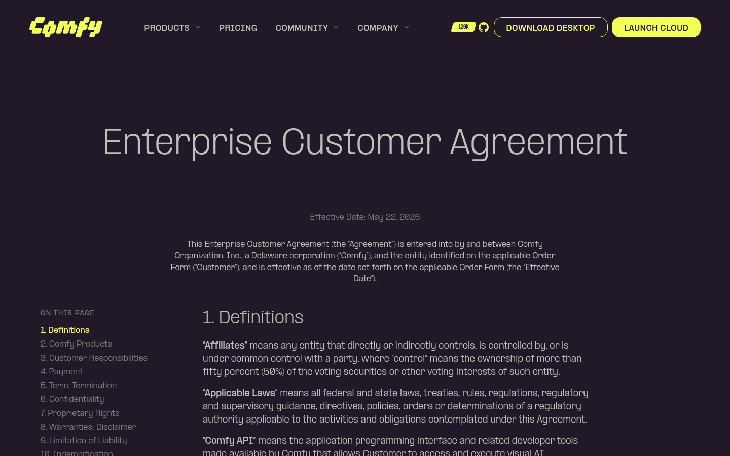 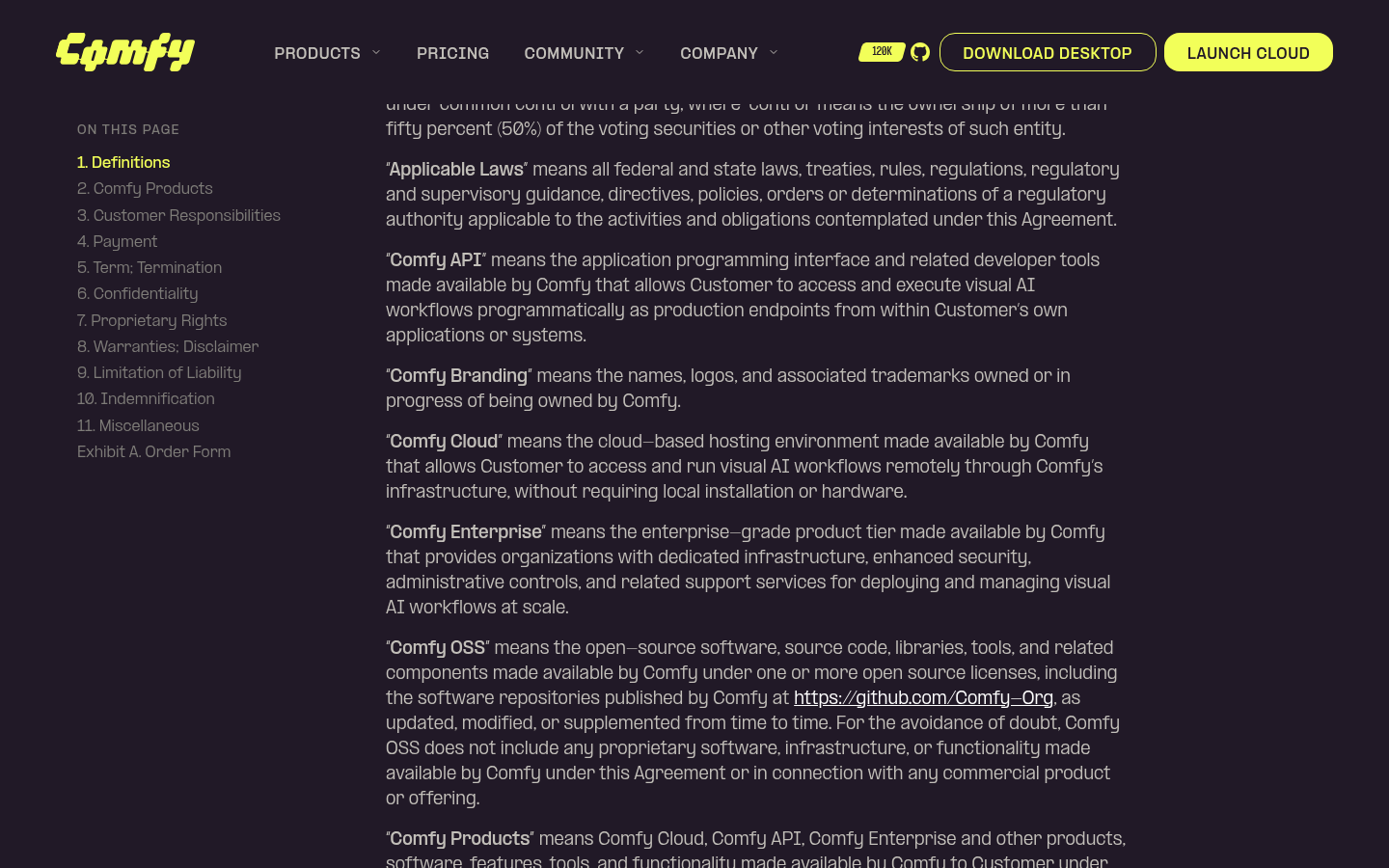 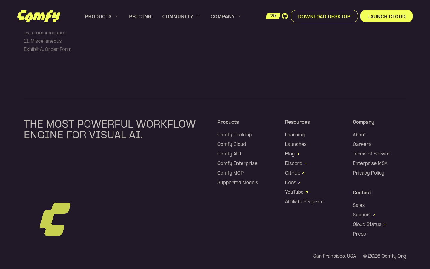  --------- Co-authored-by: Glary-Bot <glary-bot@users.noreply.github.com> Co-authored-by: Michael B <michael@imick.io> |
||
|
Robin Huang
|
b30cedffec |
fix: point Comfy API "View Docs" link to cloud overview (#13439)
*PR Created by the Glary-Bot Agent* --- Update the `docsApi` external link so the "View Docs" CTAs on the Comfy API product page point to the cloud overview's Quick Start section instead of the old API reference URL. - `apps/website/src/config/routes.ts`: `docsApi` → `https://docs.comfy.org/development/cloud/overview#quick-start` Both "View Docs" buttons on `/api` (in `HeroSection.vue` and `StepsSection.vue`) consume this single source of truth, so no component changes were needed. ## Verification - Confirmed destination page and `#quick-start` anchor exist (`docs/development/cloud/overview.mdx` has `## Quick Start`). - Ran the Astro dev server and loaded `/api` locally — both `VIEW DOCS` anchors resolve to the new URL. - `pnpm typecheck` / lint-staged (oxfmt, oxlint, eslint, typecheck) all pass via pre-commit. - `/review` sub-agent reviewed the diff: 0 findings, ready to merge. ## Screenshots Both hero and steps sections now link to the new URL. ## Screenshots 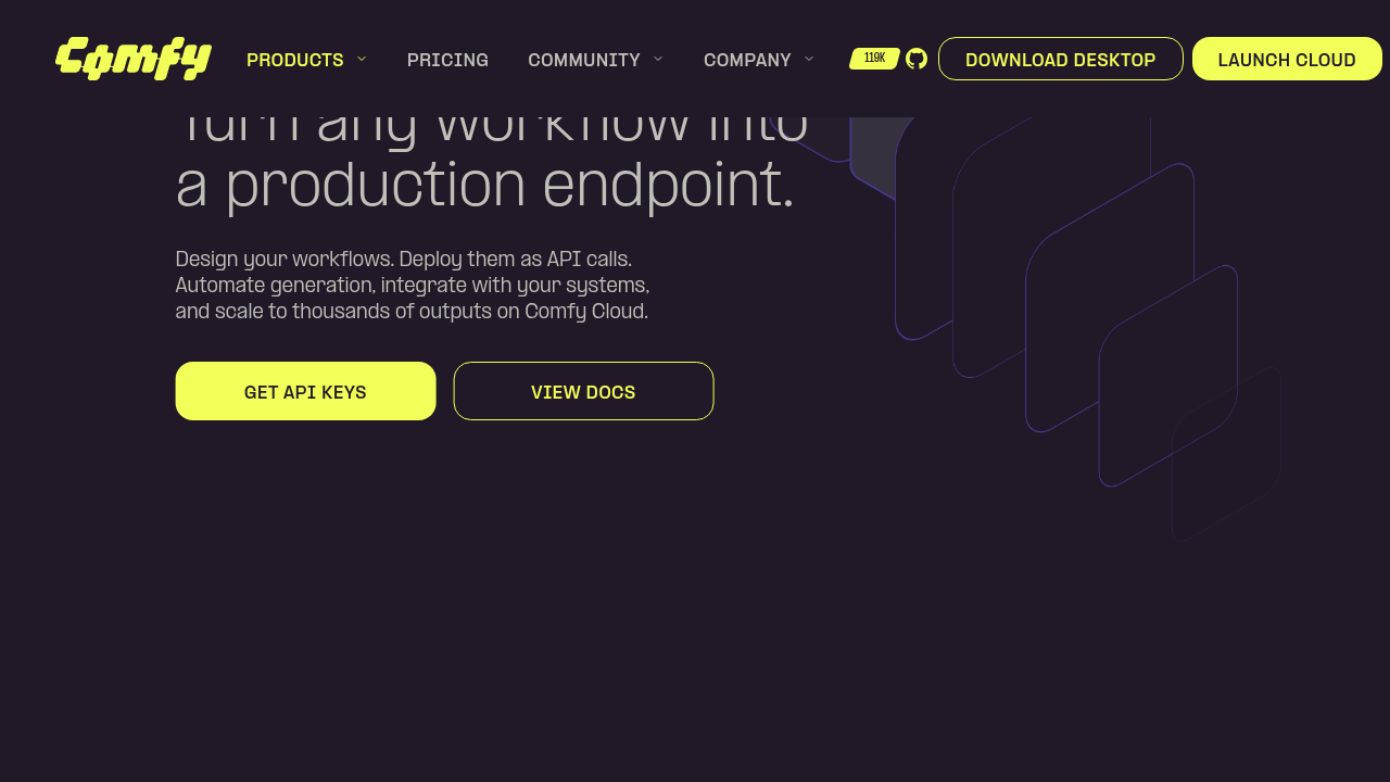 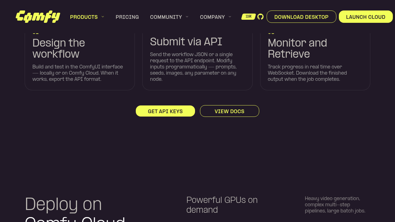 Co-authored-by: Glary-Bot <glary-bot@users.noreply.github.com> Co-authored-by: imick-io <153135517+imick-io@users.noreply.github.com> Co-authored-by: Michael B <michael@imick.io> |
||
|
imick-io
|
010389903d |
feat(website): sitewide announcement banner (#13481)
## Summary Adds a **sitewide announcement banner** to the website, rendered above the navbar on every page. It has a two-layer visibility model: - **Build-time gate** — a pure, unit-tested `evaluateBannerVisibility()` decides whether the banner mounts at all (active flag + optional date window + locale/section targeting), driven by a typed config (`src/config/banner.ts`). No CMS; copy resolves through i18n. - **Client-side dismissal** — persisted in `localStorage`, keyed by a **content hash** so editing the copy re-shows the banner (per-locale, so an en edit doesn't re-show it for zh-CN). Current content points the CTA at **Comfy MCP** (`/mcp`). ## Highlights - **Full-width branded bar** above a now-`sticky` navbar; reuses the design system (`Button`, gradient tokens, new reusable `IconButton`). - **Flash-free** on load: an inline pre-hydration script hides an already-dismissed banner before paint (no pop-in, no layout shift); `close()` sets the same signal after the leave animation to stay flash-free across ClientRouter navigations. - **Open/close transition**: grid-rows height collapse + fade, respecting `prefers-reduced-motion`. - **i18n**: copy in `en` + `zh-CN`. ## Where to edit later - **Copy**: `apps/website/src/i18n/translations.ts` → `launches.banner.text` / `launches.banner.cta` - **Link / on-off / dates / targeting**: `apps/website/src/config/banner.ts` (`bannerConfig`) ## Notes - On a static site the `startsAt`/`endsAt` window is evaluated at **build time** (documented in `banner.ts`). - Changing the copy or link changes the content hash, so previously-dismissed visitors will see the banner again — by design. ## Test plan - `pnpm test:unit` — evaluator + version-hash unit tests pass. - `pnpm typecheck` + lint clean. - On the preview: banner shows on `/`, `/launches`, and a `zh-CN` page; CTA -> `/mcp`; dismiss animates and stays dismissed on reload (no flash); reduced-motion disables the animation. 🤖 Generated with [Claude Code](https://claude.com/claude-code) --------- Co-authored-by: Claude Opus 4.8 (1M context) <noreply@anthropic.com> |
||
|
Benjamin Lu
|
95b121bed9 |
fix(website): unbreak website-e2e on main (card count, CTA overflow, stale goldens) (#13496)
## Summary Fix the website-e2e job, red on main since 2026-07-07 15:19 UTC, by updating the cloud model-card count test and regenerating stale visual screenshot goldens. ## Context website-e2e runs Playwright tests against the marketing site (`apps/website`). It broke on main in two independent ways, so every PR since — however unrelated — has shown a red website-e2e check: 1. **Model-card count.** #13431 added a sixth model card (GPT Image 2) to the /cloud "AI models" section but didn't update the test that pins the card count at 5. CI: `locator resolved to 6 elements`. 2. **Stale screenshot goldens.** #13431 also swapped the ProductCard CTA to the shared `Button` (`whitespace-nowrap`, so e.g. "SEE ENTERPRISE FEATURES" renders on one line instead of wrapping) and committed matching `home-product-cards-*` goldens. Minutes later #13445 — a branch cut from main *before* #13431 — ran the screenshot-regen workflow, which checks out the raw PR branch, not the branch merged with main. Its regenerated lg/xl goldens therefore depict the **old** pre-#13431 card (wrapped label; pixel-identical layout to the pre-#13431 golden), and overwrote #13431's correct ones at merge. #13445's own website-e2e was red at merge time for exactly this reason. The sm/md goldens (last captured by #13431, without #13445's `ppformula-text-center` 0.19em→0.1em nudge) went stale by ~900 px the moment #13445 landed. ## Changes - **What**: `cloud.spec.ts` — model-card count assertion and test title 5 → 6 (verified against the 6 entries in `AIModelsSection.vue`; passes locally). - **What**: `ProductCard.vue` — `h-auto whitespace-normal` on the CTA `Button`. The shared Button's `whitespace-nowrap` made long labels ("SEE ENTERPRISE FEATURES") overflow past the card edge at lg/xl (live on prod since #13431); labels now wrap inside the card as they did before #13431. - **What**: regenerated `home-product-cards-*` goldens via the `Update Website Screenshots` workflow, run on this branch, so they capture the fixed rendering rather than enshrining the overflow. ## Review Focus - At lg, "SEE DESKTOP/CLOUD FEATURES" now also wrap to two lines: #13431 raised the CTA font from `text-xs` to `md:text-sm`, so those labels no longer fit one line in the 200px content box either (pre-fix they silently consumed the card padding). If design prefers one-liners, shrinking the CTA font is a follow-up. - Process gaps this incident exposed (follow-ups, not in this PR): the regen workflow captures against the raw branch instead of the main-merged result, and website-e2e was red on #13445 at merge without blocking it. --- *Six cards where five once stood,* *a button's text sat where it should —* *but pixels pinned in amber lied,* *so Linux looked, and rectified.* --------- Co-authored-by: github-actions <github-actions@github.com> |
||
|
Mobeen Abdullah
|
386460afef |
fix(website): center button labels by tuning ppformula-text-center (#13445)
## Summary Vertically center button/badge/nav labels by tuning the shared `ppformula-text-center` utility from `top: 0.19em` to `top: 0.1em`. ## The alignment issue PP Formula (our brand font) has asymmetric vertical metrics: its caps sit high in the line box, so a naively centered label looks too high. `ppformula-text-center` compensates by nudging the label down with `position: relative; top: <em>` (a purely visual shift, it does not change the element's box, so button/badge sizes are unaffected). The value was `0.19em`, which **over-corrected**: the glyph ink ended up ~1.4px **below** center on every button, so labels read slightly low. Measuring the actual glyph ink (canvas `measureText` `actualBoundingBox*`) showed ~**0.09-0.10em** centers uppercase labels; `0.1em` lands the ink within ~0.1px of center. ## Why it's safe (verified) This utility is used site-wide (Button, Badge, ButtonPill, ButtonMask, BrandButton, nav triggers, section labels). Because it's a `position:relative` nudge, there is **no layout/box-size change** anywhere. I measured glyph-ink centering across **12 pages** (home, cloud, cloud/pricing, download, careers, customers, demos, enterprise, api, mcp, gallery, learning): - Buttons/badges/pills went from ~1.37px low to **~0.11px** (centered). - **Nothing regressed** (no element pushed too high). - The handful of numeric "outliers" were `text-transform: uppercase` measurement artifacts (source text with descenders that don't render); confirmed visually as centered. ## Changes - **What**: `apps/website/src/styles/global.css` — `ppformula-text-center` `top: 0.19em` → `0.1em` (one line). --------- Co-authored-by: github-actions <github-actions@github.com> |
||
|
Mobeen Abdullah
|
5cf647d183 |
feat(website): add GPT Image 2 to cloud page model list (#13431)
## Summary Add GPT Image 2 to the `/cloud` "AI models" section, and apply the design review polish from Bert and June on the same section and the neighbouring cloud-page cards. ## Changes - **GPT Image 2 card**: 6th card in `AIModelsSection` (workflow video on `media.comfy.org`, OpenAI badge reused from `packages/design-system`), new `cloud.aiModels.card.gptImage2` i18n key (en + zh-CN), and GPT Image 2 added to the `cloud.reason.2.description` partner-model list. - **AI models layout**: the six cards are now equal 1:1 squares in one shared grey container (was a per-card treatment, then simplified to a single container per design), with a corner arrow affordance on each. - **Audience cards** (`AudienceSection`): the creators / teams cards now link to `cloud.comfy.org` with the same corner arrow (highlights on card hover). - **Reusable `CardArrow`**: extracted the corner arrow into a shared, decorative (`aria-hidden`) component used by both sections; `hover="group"` (card hover) for audience, self-hover for the model cards so it doesn't double up with the provider badge. - **`ProductCard` CTA**: swapped the hand-rolled pill `<span>` for the shared `Button` (`as="span"`) so the label is vertically centered (fixes Bert's off-centre text) without nesting an anchor inside the card link. ## Split out of this PR - **Button label centering** (the global `ppformula-text-center` tweak) → separate PR #13445, so the site-wide change is reviewed in isolation. - **Pricing banner frame fix** reverted here; it belongs in Michael's upcoming pricing PR (team tier, edu billing, FAQ). `PricingSection.vue` shows only an automatic Tailwind class-order reformat from the pre-commit hook, no behaviour change. ## Review focus - The single-container AI models layout and the `CardArrow` hover behaviour (group vs self). - `Button as="span"` inside the `ProductCard` link (avoids nested `<a>`). Linear: FE-423 --------- Co-authored-by: github-actions <github-actions@github.com> |
||
|
Mobeen Abdullah
|
fe1fc8baa6 |
fix(website): standardize favicon to square brand icon (#13467)
## Summary Standardize the marketing-site favicons to the square, full-bleed brand mark (ink background, yellow C) so each platform applies its own corner mask instead of double-rounding a pre-rounded asset. ## Changes - **What**: Replace three files in `apps/website/public/`: - `favicon.svg` — was a 57 KB RealFaviconGenerator wrapper around an embedded PNG; now a 1.2 KB vector of the square mark. - `favicon-96x96.png` and `apple-touch-icon.png` — regenerated square. The apple-touch icon previously had transparent rounded corners, which iOS composites onto a white tile; it is now full-bleed. - `favicon.ico` and the `web-app-manifest-*.png` files were already the square mark, so they are left unchanged. ## Review Focus - Favicons cache aggressively (browser + CDN, and these paths are marked `immutable` in `vercel.json`), so verify the preview with a hard refresh or a fresh profile. - Part of the org-wide favicon standardization (FE-705). Companion PRs update the workflows hub, docs, and registry favicons to the same mark. Design direction (square, not rounded) confirmed by Bert. ## Screenshots The before/after for each binary is visible inline in the Files changed tab. Square ink + yellow C, no transparency, sharp corners. |
||
|
Mobeen Abdullah
|
7d2858e74b |
feat(website): add Supported Models link to nav and footer (#13432)
## Summary Surface the supported-models catalog (`/p/supported-models`) from the home page by adding a "Supported Models" link to the Products dropdown and the footer. ## Changes - **What**: Add a `nav.supportedModels` i18n entry (en `Supported Models`, zh-CN `支持的模型`) and link it to the existing `routes.models` constant in two places: the Products mega-menu Features column (between Launches and Docs) and the footer Products column (after Comfy MCP). Locale handling comes from `getRoutes`, so zh-CN resolves to `/zh-CN/p/supported-models` automatically. ## Review Focus - Placement is intentionally in **both** the nav and the footer (per FE-1190). Fine to drop either, happy to adjust after review. - Reuses the existing nav/footer link pattern, no new components or styles, and no `new` badge (the page is not newly launched). - Consumes `routes.models`, which was already defined but previously unused. FE-1190 ## Screenshots **Nav — Products dropdown, Features column** _Desktop:_ _Mobile:_ **Footer — Products column** _Desktop:_ _Mobile:_ Preview: https://comfy-website-preview-pr-13432.vercel.app |
||
|
imick-io
|
156f2f59b7 |
feat(website): swap nav featured card to Comfy MCP (#13388)
## Summary

Repurpose the Products dropdown featured card to promote Comfy MCP.

## Changes

- **What**: Update the nav featured card title ("NEW: COMFY MCP"), alt
text, image asset (`mcp-card.webp`), and CTA ("GET STARTED") in
`mainNavigation.ts`; route the CTA to the localized `/mcp` page via
`routes.mcp`. All copy is i18n'd (en + zh-CN) in `translations.ts`,
adding a reusable `cta.getStarted` key.

## Review Focus

- CTA uses a new reusable `cta.getStarted` key rather than the
section-scoped `mcp.setup.label`, and routes to the internal
`routes.mcp` so non-en locales resolve to `/{locale}/mcp`.

🤖 Generated with [Claude Code](https://claude.com/claude-code)

---------

Co-authored-by: Claude Opus 4.8 (1M context) <noreply@anthropic.com>
|
||
|
nav-tej
|
d855466fdf |
fix(website): cap contact intro text width and space it from the form (#13420)
*PR Created by the Glary-Bot Agent*
---
## Summary
On `comfy.org/contact` the intro copy ("Create powerful workflows, scale
without limits." + description) ran right up against the HubSpot form
fields on desktop. The two `lg:w-1/2` columns had no gap between them
and the left column had no max-width, so long description text extended
almost to the form's edge.
- Add `lg:gap-16` between the two columns in `FormSection.vue`, matching
the pattern already used by `common/ContentSection.vue` and
`legal/LegalContentSection.vue`.
- Wrap the intro text block (badge + heading + description) in an
`lg:max-w-xl` container so the copy no longer stretches into the gap.
The illustration below keeps its full-column bleed via the existing
`lg:-ml-20`.
- Mobile (`<lg`) layout is unchanged — all new classes are
`lg:`-prefixed.
## Verification
Screenshots taken via Playwright against the local `apps/website` dev
server:
- Desktop (1512×900) — intro text now caps at a comfortable line length
with a clear gap to the form.
- 1024px — still works at the `lg:` breakpoint.
- 375px mobile — visually identical to before.
Also ran `pnpm format` and `pnpm --filter @comfyorg/website typecheck`
(0 errors). Three pre-existing
`better-tailwindcss/enforce-consistent-class-order` lint warnings on
this file exist on `main` and were left untouched.
- Fixes contact-page layout complaint from #website-and-docs (July 2)
## Screenshots
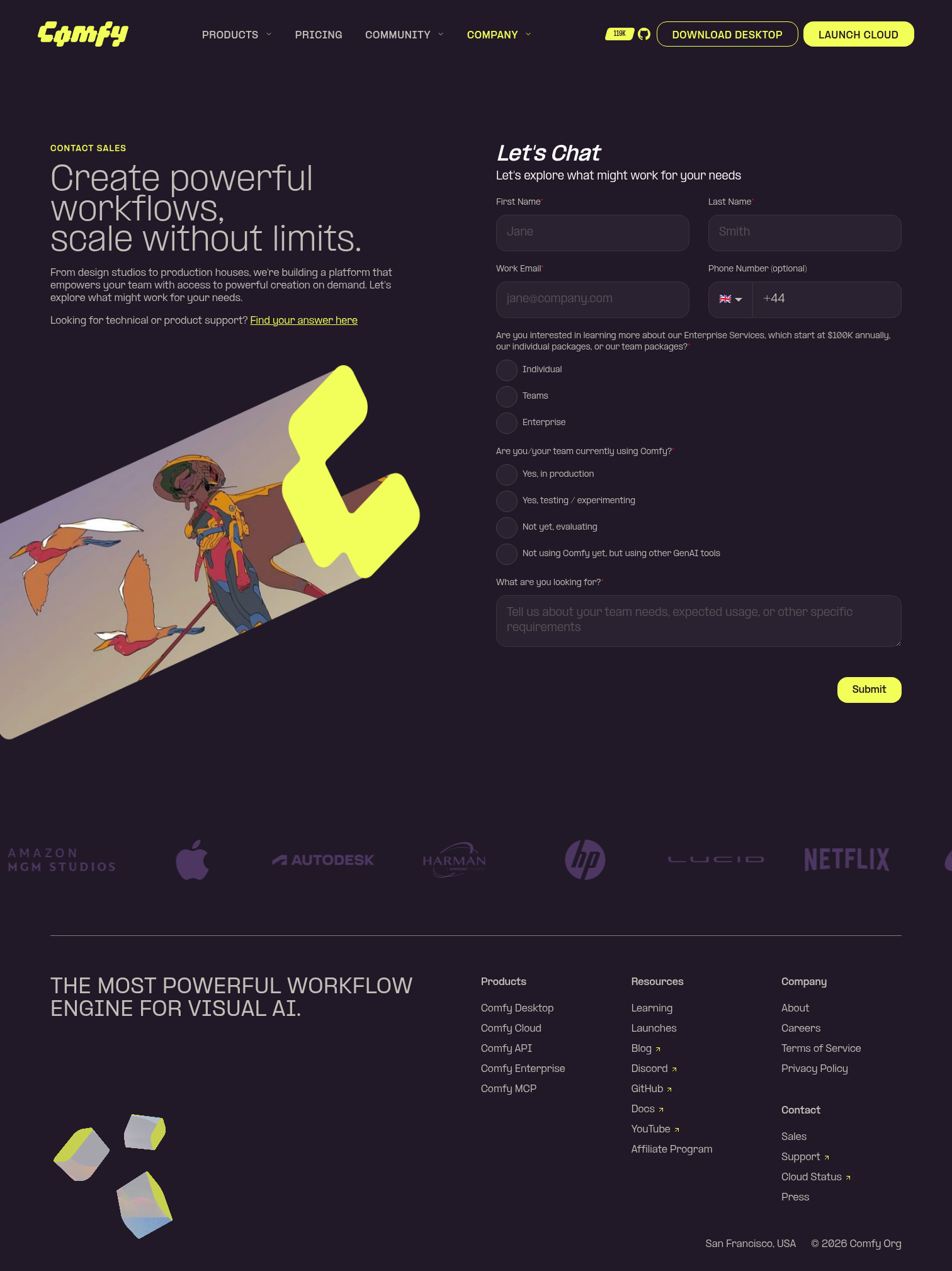
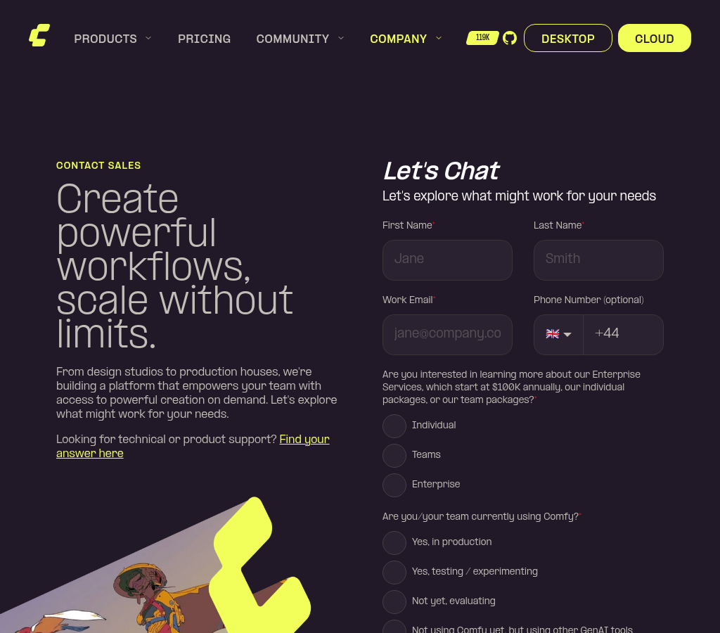

Co-authored-by: Glary-Bot <glary-bot@users.noreply.github.com>
|
||
|
Mobeen Abdullah
|
4cc0402325 |
revert(website): remove Creative Campus customer stories (#13370) (#13407)
## Summary Reverts #13370 (the five Creative Campus customer stories) from `main`. These are education-tied stories, and the "Education Program is live" CTA links to the education page, which is not live yet, so they should not be public before the education launch. This is a clean `git revert` of the squash commit `49a90d4e2` (no history rewrite, no force-push). No work is lost: the story branch (`feat/website-customer-stories-education`) is intact, and the stories will relaunch together with pricing and the education page via #13406. ## Changes - **What**: Reverts the 5 new story MDX files, the new article block components, and the related changes to `CustomerArticle.astro`, `global.css`, `Figure`/`Quote`/`Contributors`, the content test, and the e2e spec. The existing five stories and the customers pages are unaffected. - **Breaking**: none. ## Review Focus - Pure inverse of #13370; the diff is `-858/+11` mirroring the original merge. - Files touched by #13370 are disjoint from the education-page work in #13406, so this does not conflict with that branch. ## Verification - Build: 497 pages (down 5 en story pages). Unit: 156/156. Typecheck: 0 errors. format:check and knip clean. ## Next steps - Stories move into the education bundle (#13406) via a separate PR. - When the education page and its auth (FE-1174) are ready, pricing + customer stories + education launch together. |
||
|
Mobeen Abdullah
|
49a90d4e2e |
feat(website): add five Creative Campus customer stories (#13370)
## Summary Add the five new Comfy Education Initiative (Creative Campus) customer stories to `/customers`, each with its own detail page, reusing the existing Astro content-collection pattern. Brings the listing to ten stories. Linear: FE-1161. ## Changes - **What**: Five new English MDX stories (Xindi Zhang, Ina Conradi, Golan Levin, Kathy Smith, and the UAL CCI partnership) added to the customers collection, ordered after the existing five. Adds a small set of reusable article blocks these stories need: `Embed` (Vimeo), `Video` (wraps the existing `VideoPlayer`), `Download` (workflow JSON), `AuthorBio`, `EducationCta`, `AtAGlance`, a styled inline `Link`, and `Heading4`. `Quote`'s `name` is now optional for unattributed pull-quotes; `Figure` gained an optional rich-caption slot (for captions that contain links); `AuthorBio` supports a single-author bio via slot. - **Breaking**: none. All additions are backward compatible; the existing five stories and their pages are untouched. - **Dependencies**: none. ## Review Focus - The logic to review is small and isolated: the new block components in `components/customers/content/` and their registration in `CustomerArticle.astro`. The rest of the diff is MDX content. - **Story copy is transcribed verbatim from the source docs**; punctuation (em/en dashes, curly quotes) is preserved as written and is intentional, not a formatting slip. - **Downloads (cross-origin):** the workflow JSON files are on media.comfy.org, so the HTML `download` attribute is ignored by browsers. The real download is forced server-side with `Content-Disposition: attachment` on the storage objects. Xindi's two workflow files are served from a cache-fresh `.../workflows/` path (with an explicit `filename=`) so the CDN serves the attachment header immediately. - **Embed hardening:** the Vimeo `Embed` iframe carries `referrerpolicy="strict-origin-when-cross-origin"` and a scoped `sandbox` (`allow-scripts allow-same-origin allow-presentation allow-popups`); the player was verified to still load and play. - All media (card covers, inline images, one video with a poster frame, workflow JSON/PNG downloads) is hosted on media.comfy.org. No local assets are committed. Golan's workflow files are re-hosted there; his lesson-plan and demo-project links intentionally stay on GitHub/p5.js as view-only. - English-first: Chinese versions will be added later through a separate translation service. The listing and detail pages already handle a locale that only has English entries, so no page-code changes were needed. - Tags: "Creative Campus Showcase" for the four teaching stories, and "Creative Campus Partnership" for the UAL announcement. ## Verification - Unit `176/176`, typecheck (astro check) `0 errors`, build `502 pages`, `format:check`, `knip`, and `eslint` all pass. - e2e customer specs `6/6` pass (includes a new test asserting the Creative Campus education blocks render). - Visual pass on all ten stories at desktop (1440) and mobile (390): no horizontal overflow, the Vimeo player plays, and all downloads resolve to media.comfy.org. ## Screenshots (if applicable) Easiest way to review is the Vercel preview: https://comfy-website-preview-pr-13370.vercel.app/customers then open the five new stories. Verified on desktop (1440) and mobile (390). |
||
|
imick-io
|
a6db1ab3d6 |
fix(website): restore node-link.svg intrinsic sizing (#13384)
## Summary Restore the original `node-link.svg` asset, which PR #13095 accidentally overwrote with a stretch-to-fill Figma export, breaking the node connector across the marketing site. ## Changes - **What**: Revert `apps/website/public/icons/node-link.svg` to its intrinsic **20×32** form (`fill="#F2FF59"`). PR #13283 had replaced it with a raw Figma export (`preserveAspectRatio="none"`, `width="100%" height="100%"`, `fill="var(--fill-0, …)"`). Every consumer loads it as a bare `<img src>` and relies on the intrinsic size plus `scale-*`/`rotate` classes — with no intrinsic dimensions the connector expanded to fill its container and distorted. ## Review Focus - The overwrite originated in the first commit of #13283's stack and rode through the squash merge; nothing in that PR actually referenced this file (the MCP page uses the separate `NodeUnionIcon.vue`), so restoring the shared asset fixes all consumers (`BuildWhatSection`, `ProductShowcaseSection`, `OurValuesSection`, `GalleryDetailModal`) without touching the MCP page. - `apps/website/dist/icons/node-link.svg` is stale build output and regenerates on the next `pnpm build`. --------- Co-authored-by: Claude Opus 4.8 (1M context) <noreply@anthropic.com> Co-authored-by: github-actions <github-actions@github.com> |
||
|
Mobeen Abdullah
|
9cf5c9a93f |
refactor(website): tidy customer story review nits (#13324)
## Summary Small follow-up to #13289 applying two non-blocking review nits from Alex's review. ## Changes - **What**: drop the redundant `before:content-['']` on the customer-story list bullet (Tailwind emits the empty `content` automatically once another `before:` utility is present), and rename `HEADER_OFFSET` to `HEADER_OFFSET_PX` in `ArticleNav` so the scroll constants use consistent unit suffixes. ## Review Focus Both changes are cosmetic with no behavior change. Confirmed in the browser that the list bullet still renders identically (6px yellow dot) without the explicit `content` utility. ## Notes from the #13289 review (left as-is here, open to discussion) Three other comments from the review are intentionally not changed in this PR; reasoning below so the decisions are on record: - **`Category` type in `ArticleNav`**: kept the `ComponentProps<typeof CategoryNav>` derivation. AGENTS.md says to derive component types via `vue-component-type-helpers` rather than redefining them, so the current form follows the styleguide. Happy to switch to a plain named type if preferred. - **Section ids in frontmatter vs the body `<Section>`**: kept the `customers.content.test.ts` parity test. The short TOC labels live only in frontmatter and Astro can't introspect the rendered MDX body to build the nav, so the frontmatter `sections` list and the body anchor ids can't be trivially deduplicated. A real fix would need a remark plugin (larger, separate change). The test guards against silent drift in the meantime. - **`nextStory` throw**: left as a fail-loud, build-time invariant. The slug always comes from the same `getStaticPaths` collection, so the throw is effectively unreachable; it surfaces a future-refactor bug loudly instead of linking to the wrong story. |
||
|
Mobeen Abdullah
|
01738b7b19 |
feat(website): move customer stories to Astro content collections (#13289)
## Summary

Move the five customer stories on `/customers` out of the old
`customerStories.ts` array and the shared i18n file into an Astro
content collection (MDX, English and Chinese). The pages look and read
exactly the same; this just changes where the content lives so it is
easier to edit, and it sets the pattern we will reuse to migrate the
rest of the marketing content.

Linear: FE-1158

## Changes

- **What**:
- Added a `customers` content collection (`src/content.config.ts` +
`src/content/customers.schema.ts`), with one MDX file per story per
locale under `src/content/customers/{en,zh-CN}/`.
- Rebuilt the article rendering as small static components (`Section`,
`Figure`, `Quote`, `Contributors`, `Steps`, plus styled
paragraph/heading/list). The article body is now static HTML; only the
scroll-spy sidebar (`ArticleNav.vue`) ships JavaScript.
- Repointed the `/customers` listing and detail pages (both locales) to
read from the collection.
- Removed the old `customerStories.ts` array and the customer-story keys
from `translations.ts` (about 1,300 lines).
- Dropped the two "Read more" links that just redirected back to the
same page; kept the two that point to the real Substack articles.
- Switched the "Read more" button to the design-system `Button`, which
also fixes its vertical alignment.
- Added a short pattern doc at `apps/website/src/content/README.md` for
reuse.
- **Dependencies**: `@astrojs/mdx` (renders the MDX content).

## Review Focus

This is meant to be a no-visual-change migration. I checked content and
layout against the live site for all five stories in both languages, on
desktop and mobile. The only intended differences are the two removed
self-referential "Read more" links and the read-more button now using
the shared `Button`.

A few small setup changes explain part of the diff:

- `src/env.d.ts` now references `.astro/types.d.ts` so the collection
types resolve (this is the repo's first content collection).
- `astro.config.ts` sets `markdown.smartypants: false` so quotes stay
straight (MDX would otherwise curl them). This option is deprecated in
Astro 7 and moves onto the markdown processor; that belongs with the
eventual Astro 7 upgrade, not here.
- ESLint ignores the `astro:` virtual modules for `apps/website` files
(they are real at build time, but the resolver cannot see them).
- Content MDX is excluded from `oxfmt` in `.oxfmtrc.json`: the formatter
rewraps component slots and changes the rendered output (it broke the
blockquotes), so content files are kept out of it like generated files
and fixtures.
- `components/common/ContentSection.vue` and `config/contentSections.ts`
are untouched; they still power the legal and privacy pages.

The diff is large, but most of it is MDX content, the lockfile, and the
removed i18n keys. The logic to review is small: the collection config
and schema, the components, and the page wiring.

## Screenshots

No visual change is intended, so before and after of the article pages
are identical (verified across both locales and on desktop and mobile).
The one deliberate tweak is the "Read more" button, which now uses the
design-system `Button` for better vertical alignment. Before/after
captures are available if needed.
|
||
|
Christian Byrne
|
da34fa3944 |
docs(website): update ToS payment terms for Free Tier overages (#13315)
*PR Created by the Glary-Bot Agent* --- Updates two sections on https://comfy.org/terms-of-service per legal copy provided in [the website-and-docs Slack thread](https://comfy-org.slack.com/archives/C098QHJ8YDR/p1782775899132369). ## Changes Edits `apps/website/src/i18n/translations.ts` (the source of truth for the ToS page rendered by `apps/website/src/pages/terms-of-service.astro`): - **`tos.payment.block.1` — Plans; Fees; Free Tier.** Adds language clarifying that a Free Tier user who provides a payment method expressly authorizes Comfy to charge it for overages (intentional use, third-party use, or technical factors), and that approach-to-cap notifications are best-effort, not a precondition to charging. - **`tos.payment.block.3` — Self-Serve Credit Card Billing.** Clarifies that the billing authorization applies to paid Plan and Free Tier overages alike, and that retry rights for failed charges extend to Free Tier overage charges. `en` and `zh-CN` values are kept in sync per the existing convention for these keys (the `/zh-CN/terms-of-service` page is a redirect to the English page). ## Open question for legal / requester `tos.effectiveDate` is currently `May 13, 2026` and was **not** bumped in this PR — the original request did not mention it. If legal wants this revision to carry a new effective date, that should be a follow-up commit on this branch before merge. ## Verification - `pnpm typecheck` (apps/website): 0 errors, 0 warnings. - `pnpm build` (apps/website): 497 pages built; the rendered `/terms-of-service` HTML contains both new sentences. - `pnpm exec eslint` / `oxfmt --check` on the changed file: clean. - Husky pre-commit (`lint-staged` + `check-unused-i18n-keys`): clean. - Manual: served the built `dist/` via local HTTP and verified the rendered Payment section in a real browser (screenshot below). ## Screenshots 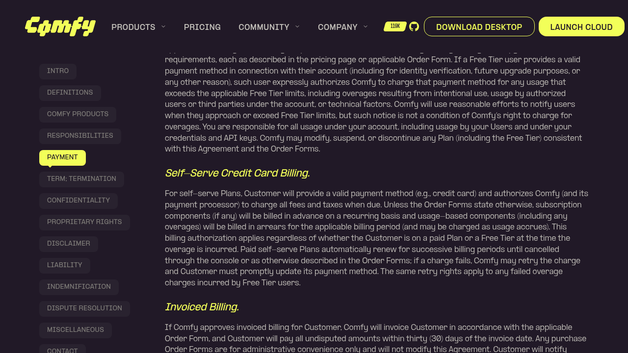 Co-authored-by: Glary-Bot <glary-bot@users.noreply.github.com> |
||
|
nav-tej
|
61cb1bcde0 |
fix(website): point launches Comfy MCP CTA to /mcp (#13287)
*PR Created by the Glary-Bot Agent* --- ## Summary Update the `EXPLORE` CTA on the Comfy MCP card on [/launches](https://comfy.org/launches) to link to [/mcp](https://comfy.org/mcp) instead of the docs (`docs.comfy.org/agent-tools/cloud`). ## Change Single line in `apps/website/src/data/drops.ts`: ```diff cta: { label: EXPLORE, - href: { en: externalLinks.docsMcp, 'zh-CN': externalLinks.docsMcp } + href: { en: '/mcp', 'zh-CN': '/zh-CN/mcp' } } ``` Matches the locale-aware pattern used by sibling cards (`/download` / `/zh-CN/download`, `/api` / `/zh-CN/api`). Both `src/pages/mcp.astro` and `src/pages/zh-CN/mcp.astro` already exist, so neither link is dead. The `externalLinks.docsMcp` constant is retained because the MCP page itself still uses it. ## Verification - `pnpm typecheck` / `pnpm typecheck:website` clean. - `oxfmt`, `oxlint`, `eslint` clean (all ran via lint-staged on commit). - Manually loaded `/launches` and `/zh-CN/launches` in the dev server and confirmed the Comfy MCP card now points to `/mcp` and `/zh-CN/mcp` respectively. - Loaded `/mcp` and confirmed the destination page renders ("Comfy MCP — Drive ComfyUI from any AI agent"). - Code review by Oracle: no issues. Screenshot shows the updated MCP card on /launches. ## Screenshots 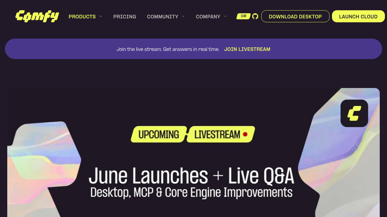 Co-authored-by: Glary-Bot <glary-bot@users.noreply.github.com> |
||
|
imick-io
|
fb3350ee0e |
feat(website): redesign Comfy MCP setup steps and add button variant (#13285)
## Summary Reworks the Comfy MCP page's **"Set up Comfy MCP in three steps"** section to match the new design, and adds a per-action button `variant` option to `FeatureGrid01`. The three steps are now: | Step | Title | Action | | --- | --- | --- | | 1 | Copy the MCP URL | Copy field showing `https://cloud.comfy.org/mcp` | | 2 | Add the connector | Filled button **"COMFY CLOUD MCP DOCS" ↗** → MCP docs | | 3 | Connect and sign in | Filled button **"COMFY CLOUD SKILLS" ↗** → comfy-skills repo | ## Changes - **`FeatureGrid01.vue`** — add `variant?: 'default' | 'outline'` to the link card action; button now uses `card.action.variant ?? 'outline'` instead of a hardcoded outline, so callers can opt into the filled style. - **`config/routes.ts`** — add `mcpSkills` external link (`https://github.com/Comfy-Org/comfy-skills`). - **`i18n/translations.ts`** — refresh the `mcp.setup.*` copy (en + zh-CN): new subtitle, reworded steps, new `step2.cta` / `step3.cta`, drop the now-unused `step1.cta`. - **`SetupSection.vue`** — re-map cards: step 1 → copy field, steps 2 & 3 → filled link buttons. ## Test plan - [x] `pnpm typecheck` — 0 errors - [x] Pre-commit hooks (stylelint, oxfmt, oxlint, eslint, typecheck) pass - [ ] Visual check on `/mcp` and `/zh-CN/mcp` (copy field on step 1; two filled yellow CTAs with up-right arrows on steps 2 & 3) 🤖 Generated with [Claude Code](https://claude.com/claude-code) --------- Co-authored-by: Claude Opus 4.8 (1M context) <noreply@anthropic.com> |
||
|
imick-io
|
be8e0010ee |
feat(website): rebuild Comfy MCP page on the design system (+ zh-CN) (#13283)
Rebuilds the **Comfy MCP** marketing page on the website design-system stack and adds the missing zh-CN page. ## What's here - Replaces the bespoke `components/product/mcp/` section silo with thin `templates/mcp/*` wrappers over reusable `blocks/` + `common/` components. - Adds `src/pages/zh-CN/mcp.astro` and threads `locale` through every section (was English-only). - New/extended design-system blocks: - `FeatureGrid01` — setup steps, with a reusable `ui/CopyableField` (uses `@vueuse/core` `useClipboard`). - `FeatureGrid02` — how-it-works steps with `NodeUnionIcon` connectors + a CTA pair via `ui/button`. - `FeatureRows01` — alternating media rows; `ReasonsSplit01` — "why" list. - `HeroSplit01` gained `subtitle`, a `media` slot, and a `class` passthrough; `SectionHeader` gained `align`. - Standardized block section spacing on `px-6 py-16 lg:py-24`. - Refreshed all 8 MCP FAQ answers (en + zh-CN) and hydrated the FAQ section so the accordion is interactive. ## Notes - Stacked on the original MCP landing-page commits (previously PR #13095); those ride along here. - `typecheck` and `build` are green; `/mcp` and `/zh-CN/mcp` both render in both locales. 🤖 Generated with [Claude Code](https://claude.com/claude-code) --------- Co-authored-by: Balpreet Brar <balpreet.brar@growthnatives.com> Co-authored-by: Claude Opus 4.8 (1M context) <noreply@anthropic.com> Co-authored-by: github-actions <github-actions@github.com> Co-authored-by: Alexander Brown <drjkl@comfy.org> |
||
|
imick-io
|
d0e97d6933 |
fix(website): move launches nav item and add cleanplate workflow link (#13282)
## Summary - Move the `/launches` nav item from **Company → More** to **Products → Features** in the main navbar - Add the workflow link to the **Cleanplate Walkthrough** learning tutorial (`https://comfy.org/workflows/8f2cf0df5da6-8f2cf0df5da6/`) ## Changes - `apps/website/src/data/mainNavigation.ts` - `apps/website/src/data/learningTutorials.ts` 🤖 Generated with [Claude Code](https://claude.com/claude-code) Co-authored-by: Claude Opus 4.8 (1M context) <noreply@anthropic.com> |
||
|
Christian Byrne
|
4a2393be48 |
chore: drop unnecessary exports on file-local types to satisfy knip (#13204)
Current `main` **fails a fresh `knip` run** with 13 unused exported types (exit 1). They're invisible on main because lint/knip only runs on `pull_request`/`merge_group`, never on push to main — so merge skew (one PR adds an export used by file X; a later PR removes X's usage) accumulates latent failures that ambush backport branches (e.g. #13163, #13162). Each of the 13 is `export`ed but referenced only within its own file (verified 0 importers; ≥2 in-file uses, so not dead code). Fix: drop the redundant `export`. Types cleaned: `VideoSource`, `ObjectInfoResponse`, `PromotedMissingModelWorkflow`, `PixelReadout`, `ResizeDirection`, `ResizeHandle`, `RunButtonTelemetryOptions`, `ResolvedModelNode`, `AccountPreconditionContext`, `SubscriptionDialogOptions`, `MonthlyCreditsUsage`, `MissingMediaReference`, `ResolvedHostWidget`. Reviewer note: `ResolvedHostWidget` and `ResolvedModelNode` sit under `renderer/extensions`/`platform/assets`; no in-repo importers, but if either is intended as published/extension-facing API, prefer a knip `entry`/`ignore` over un-exporting — flag in review and I'll adjust. After fresh `knip`: **0 unused exported types**. Supersedes #13179 (fixed only `AccountPreconditionContext`). Pairs with the push-gate workflow #13203 — merge this first so that gate is green on main. 🤖 Generated with [Claude Code](https://claude.com/claude-code) Co-authored-by: Claude Opus 4.8 (1M context) <noreply@anthropic.com> |
||
|
balpreetgrowthnatives
|
e2c670bbc3 |
fix: prevent payment routes from being indexed (#12706)
## Summary Allow crawler access to `/payment/` routes in robots.txt so search engines can read the `noindex` tag, and forcefully inject the `x-robots-tag: noindex` header via `vercel.json`. ## Changes - **What**: Removed `Disallow: /payment/` from `robots.txt` and added rules to `vercel.json` applying `x-robots-tag: noindex` to `/payment/(.*)` and `/zh-CN/payment/(.*)` routes. ## Review Focus - The configurations in `vercel.json` apply to both English and localized payment routes (`/zh-CN/payment/(.*)`). --------- Co-authored-by: nav-tej <36310614+nav-tej@users.noreply.github.com> Co-authored-by: Christian Byrne <cbyrne@comfy.org> |
||
|
imick-io
|
7d3d8ce63f |
feat(website): add /drops landing page (livestream hero + drops grid) (#13053)
## Summary Adds the `/drops` landing page in English and Simplified Chinese, ahead of the 2026-06-24 livestream. The page is composed of a livestream-gated hero, a 10-card drops grid, a subscribe banner, and a closing CTA. Production media for the hero and several cards is wired in; the rest fall back to placeholders. ## Changes - **New `/drops` page** (`pages/drops.astro`, `pages/zh-CN/drops.astro`) plus en/zh-CN translations. - **`HeroLivestream01` block** — renders the rotating-logo video before the stream window, swaps to a YouTube nocookie iframe between `startDateTime` and `endDateTime`. SSR stays deterministic on the logo and only flips to the embed after client hydration. Takes `youtubeVideoId` directly (no URL parsing). - **Drops grid** — `data/drops.ts` defines the 10 cards with `imageFor` / `videoFor` media helpers, badges, and per-locale title/description/href. `DropCard.vue` renders an image or autoplaying muted video inside the new `Card` primitive set (`Card`, `CardHeader`, `CardTitle`, `CardDescription`, `CardContent`, `CardFooter`). - **Supporting blocks** — `SubscribeBanner` uses the Button `link` variant with an animated hover underline; closing `CtaCenter01` is extended with a terms link. `resolveRel` is shared from `utils/cta.ts` instead of duplicated per block. - **Visual extension to `HeroLivestream01.visual`** — discriminated `image | video` union so the hero can render a looping video. - **E2E** — `e2e/drops.spec.ts` covers both locales (hero + grid render, locale-correct links). ## Review Focus - `youtubeVideoId` is currently a `nlLZfNIqF8M` placeholder; `startDateTime`/`endDateTime` are placeholders too — see TODO in `HeroSection.vue`. These need to be swapped to the production stream + window before launch. - Several drop cards still point at placeholder destinations (e.g. Comfy MCP at `/mcp`) — TODO noted in `drops.ts`. - Drop card media is a mix of images and short MP4s served from `media.comfy.org`. The videos autoplay muted/looped with `preload="metadata"`. ## Test plan - [ ] `pnpm --filter website dev` → visit `/drops` and `/zh-CN/drops`; confirm hero video plays, grid renders all 10 cards, video cards loop, subscribe banner link styled correctly - [ ] Temporarily set `startDateTime` to the past and `endDateTime` to the future; confirm hero swaps to the YouTube iframe after hydration - [ ] `pnpm --filter website test:e2e drops.spec.ts` - [ ] `pnpm typecheck:website` 🤖 Generated with [Claude Code](https://claude.com/claude-code) --------- Co-authored-by: Claude Opus 4.7 (1M context) <noreply@anthropic.com> |
||
|
Benjamin Lu
|
da55529d23 |
GTM-93 point Windows download at comfy.org proxy (#12974)
## Summary - Point the website Windows desktop download URL at `https://comfy.org/download/windows/nsis/x64`. - Keep macOS on the existing ToDesktop URL. - Update the download page smoke test to expect the new Windows href. ## Context This is the frontend leg of the GTM-93 Windows MVP. ToDesktop still controls `download.comfy.org`; instead of changing DNS, the website sends Windows users to a controlled `comfy.org` proxy path that the router PR handles. The proxy forwards to ToDesktop and adds a tokenized `Content-Disposition` filename for Desktop to consume on Windows. Linear: https://linear.app/comfyorg/issue/GTM-93/fix-posthog-identify-call-unblock-funnel-attribution-desktop-funnel Router PR: https://github.com/Comfy-Org/comfy-router/pull/33 Desktop PR: https://github.com/Comfy-Org/Comfy-Desktop/pull/1149 ## Validation - `pnpm --filter @comfyorg/website run typecheck` - `pnpm --filter @comfyorg/website run build` - `pnpm --filter @comfyorg/website exec playwright test e2e/download.spec.ts` - pre-commit: `pnpm typecheck`, `pnpm typecheck:website` |
||
|
Dante
|
49a7b7b558 |
feat(billing): UnifiedPricingTable — one table, personal/team plan toggle (B4 / FE-934) (#12666)
## What **B4 (FE-934): `UnifiedPricingTable`** — one pricing table for the **Jun-5 model** (typeless workspace; personal/team is a **plan**, shown as a Gamma-style **plan toggle** on one workspace), per **DES-197**. A new, flag-gated component that will replace the two legacy tables at cutover (strangler). ### video https://github.com/user-attachments/assets/82b704a4-101e-4609-8ff5-06b7cf7f9cd7 > **Stacked on #12644 (FE-935 `CreditSlider`).** Base is the slider branch — retarget to `main` once #12644 merges. The slider commits show in the diff until then. ## Changes - **`UnifiedPricingTable.vue`** — plan toggle (personal/team, flag-gated on `teamWorkspacesEnabled`); personal tier cards (facade `plans` + `TIER_PRICING` fallback, billing-cycle toggle); team column hosting `<CreditSlider>`; Enterprise card. Reuses `useBillingContext`; emits `subscribe`/`resubscribe` (personal) + `subscribeTeam` (team). - **`SubscriptionRequiredDialogContentUnified.vue`** — host; wires personal checkout through `useSubscriptionCheckout` (full flow incl. preview/transition + **new `'success'` step**); team checkout stubbed. - **Confirm/success screens (DES 3084-15873)** — aligned the reused `SubscriptionAddPaymentPreviewWorkspace` / `SubscriptionTransitionPreviewWorkspace` to DES-197 (drop `/member`, `comfy--credits` icon, plan-specific CTAs **"Subscribe to {plan}" / "Switch to {plan}"**); added **`SubscriptionSuccessWorkspace.vue`** ("You're all set") as the `'success'` checkout step. - **`showPricingTable`** — renders the unified host when `teamWorkspacesEnabled`, legacy `PricingTable.vue` for flag-off. (The old workspace-variant fork is removed; `PricingTableWorkspace.vue` becomes unused on flag-on → deleted at cutover.) - **i18n** — `subscription.planScope` / `teamPlan` / `enterprise` + `subscription.preview.{subscribeToPlan,switchToPlan}` + `subscription.success.*` keys. ## Strategy (new component + cutover — per FE-934) Build new, retire old at cutover (a later single PR deletes `PricingTable.vue` + `PricingTableWorkspace.vue` + the legacy dialog host + the dispatch fork; `TIER_PRICING` kept only as the flag-off/OSS fallback). Avoids half-migrated conditional cruft in the live tables. ## Screenshots Pricing captured live on the authenticated cloud-prod session (`local.comfy.org`, flag on). Confirm/success captured in Storybook (prop-driven) — a **personal** workspace can't reach these live until **B1/FE-966** flips its billing path off the legacy `/customers/*` adapter (whose `plans` is always empty); the screens themselves are unchanged regardless of source. **Pricing table** | Personal | Team | |---|---| | <img width="420" alt="pricing-personal" src="https://github.com/user-attachments/assets/2be3b8bc-ac54-41db-8c21-5c950d3e7338" /> | <img width="420" alt="pricing-team" src="https://github.com/user-attachments/assets/c4078eb4-ee7d-42f6-bcc3-375686ab7f1e" /> | **Confirm your payment / plan change** | New subscription | Plan change (Pro → Creator) | |---|---| | <img width="380" alt="confirm-new-subscription" src="https://github.com/user-attachments/assets/e371c744-dc64-43e8-b977-73f9f99f85bc" /> | <img width="380" alt="confirm-plan-change" src="https://github.com/user-attachments/assets/b1ee5ab3-c572-4c40-9b70-f078d66b78f4" /> | **You're all set (success)** <img width="380" alt="success-all-set" src="https://github.com/user-attachments/assets/8ec9e90f-8ba4-4cb0-81a7-6b4316e0c19e" /> ## ⚠️ BE-blocked (deferred) - **Team checkout**: the slider stop → plan-slug / subscribe-request shape is undefined (doc **Open Q#2** / "Team-slider contract", **BE-1254**). `subscribeTeam` is stubbed (toast "coming soon") until BE provides it. - **Live discount data**: stops come from the hardcoded **DES-197 fallback** (`teamPlanCreditStops.ts`) until `GET /api/billing/plans` carries them. - **Confirm "credits you'll get right away" line** + **async-success routing** (Stripe-tab/`pending_payment` → in-dialog success) deferred — see ticket notes; credits-cents unit is the open BE-1254 question. ## Verification - `vue-tsc --noEmit`: clean (pre-commit). - `oxlint`/`eslint`/`stylelint`/`oxfmt`: pass (pre-commit). - `vitest` `useSubscriptionDialog.test.ts` (11) + `useSubscriptionCheckout.test.ts` (17) + new `SubscriptionSuccessWorkspace.test.ts` (2): pass. - Personal checkout reuses the existing `useSubscriptionCheckout` flow; subscribed → new `'success'` step. ## Not in scope - Pixel-finalizing vs DES-197 (visual reference = Alex's **reference-only** #12042); personal-card detail refinement. - Settings / Misc-UX (FE-768/770); team-checkout wiring (BE contract). Design: **DES-197** / **3084-15873**. Survey: *FE Billing API Divergence* (B4 / P1 / P2 / P4). --------- Co-authored-by: Claude Opus 4.8 (1M context) <noreply@anthropic.com> Co-authored-by: GitHub Action <action@github.com> |
||
|
imick-io
|
fc4d44c3db |
[feat] migrate website navbar to shadcn-vue + mobile sheet drill-down (#12861)
## Summary - Migrate the website's top nav from bespoke components (`SiteNav`, `MobileMenu`, `NavDesktopLink`, `PillButton`, `MaskRevealButton`) to shadcn-vue primitives (`NavigationMenu`, `Sheet`, `Button`), split into `HeaderMain` → `HeaderMainDesktop` + `HeaderMainMobile`. - Mobile nav becomes a `Sheet` with drill-down sub-navigation, scroll lock, sticky CTAs, sr-only i18n title/description, and a back-to-home logo. - Desktop nav uses `NavigationMenu` with shared viewport, featured cards, `NavColumn` extraction, and centralized nav data in `data/mainNavigation.ts`. - Adds i18n strings for nav labels, dropdown column headers, close/back affordances, and the mobile menu description. ## Test plan - [ ] Desktop: hover PRODUCTS / COMMUNITY / COMPANY — dropdowns open with featured card + columns, NEW badges render, external links show the arrow-up-right icon, viewport is shared between triggers. - [ ] Mobile (<lg): open hamburger sheet — verify logo + close, body scroll is locked while open, top-level nav scrolls if it overflows, CTAs stay pinned at bottom. - [ ] Tap COMMUNITY / PRODUCTS / COMPANY — sub-panel slides over root nav, in-sheet BACK returns to root, links navigate correctly. - [ ] Reload `?locale=zh-CN`: dropdown labels, sheet title/description, BACK / close affordances all localized. - [ ] No regressions on `/cloud`, `/cloud/pricing`, `/customers`, etc. — pages that swap CTAs (`BrandButton` → shadcn `Button`) still render at every breakpoint. 🤖 Generated with [Claude Code](https://claude.com/claude-code) --------- Co-authored-by: Claude Opus 4.7 (1M context) <noreply@anthropic.com> Co-authored-by: GitHub Action <action@github.com> Co-authored-by: github-actions <github-actions@github.com> Co-authored-by: Alexander Brown <drjkl@comfy.org> |
||
|
imick-io
|
003303d8ac |
feat(website): pricing API copy + tutorial video captions (#12929)
## Summary - **Pricing copy** — replace "concurrent API jobs" wording with "workflows via API" on Creator/Pro plans, add a third feature line to Standard, and add a new "Run Workflows via API" entry to the "What's Included" section (existing feature11 → feature12). - **Tutorial captions** — wire per-locale VTT caption tracks into `TutorialDetailDialog`, so the CC button in `VideoPlayer` is now functional for the learning tutorials. `LearningTutorial.caption` is typed as `readonly VideoTrack[]`; `VideoTrack` is now exported from `VideoPlayer.vue`. - Tailwind class ordering in `PriceSection.vue` shifted due to the formatter on touched lines. ## Test plan - [ ] `/pricing` page (EN + zh-CN): Standard plan shows the new "1 workflow via API" line; Creator/Pro show "3/5 workflows via API"; "What's Included" lists "Run Workflows via API" above "Parallel job execution". - [ ] Open a learning tutorial → CC button is visible in the player → toggling CC shows English captions in sync with playback. - [ ] Tutorials without a `caption` entry hide the CC button. 🤖 Generated with [Claude Code](https://claude.com/claude-code) --------- Co-authored-by: Claude Opus 4.7 (1M context) <noreply@anthropic.com> Co-authored-by: github-actions <github-actions@github.com> |
||
|
Deep Mehta
|
ccf2f12b25 |
fix(website): correct top-up credit rollover copy on cloud pricing (#12923)
## Summary The `/cloud/pricing` page's "Add more credits anytime" feature claims unused top-up credits **roll over** to the next month. Per product (Pablo, #cloud), top-up credits **do not** roll over. Fix the copy to match policy and the docs. ## Changes - **What**: `pricing.included.feature5.description` (en + zh-CN) in `apps/website/src/i18n/translations.ts`. - Before: "Purchase additional credits at any time. Unused top-ups roll over to the next month automatically for up to 1 year." - After: "Purchase additional credits at any time. Top-up credits are valid for 1 year from the date of purchase and do not roll over with your monthly plan." - Keeps the accurate 1-year validity window (matches `docs/interface/credits.mdx`). - Scope: this is the **only** rollover claim on the page. The tier cards (lines 1224/1255/1286) only say "top-ups available" — no change needed. - **Breaking**: none (copy only). ## Deliberately out of scope The Slack thread surfaced an **unresolved** question: Pablo said top-ups don't roll over *"as opposed to subscription credits which do,"* but `docs/interface/credits.mdx` says monthly credits don't roll over either. This PR makes **no claim about subscription/monthly credit rollover** (the new copy is neutral: "do not roll over *with your monthly plan*"). Resolving that — and the optional FAQ entry / docs alignment Glary-Bot proposed — needs a product decision first. Flagging for follow-up. |
||
|
AustinMroz
|
eaa6776559 | Fix broken e2e test (#12818) | ||
|
Benjamin Lu
|
fefbe7843c |
refactor(website): dedupe download label and add shared Platform type (#12776)
## Summary

Cleanup of the website download button: deduplicate the label lookup in
`DownloadLocalButton.vue`, and export a `Platform` domain type from
`useDownloadUrl` so the button spec, icon map, and analytics all consume
it instead of loose `string`s.

## Changes

- **What**:
- Hoist `t('download.hero.downloadLocal', locale)` into a single `label`
computed, reused by the fallback aria-labels and the button text
(previously evaluated in two places)
- Export `Platform` (`'windows' | 'mac'`) from `useDownloadUrl`;
`ButtonSpec.key`, the `ICONS` map (`Record<Platform, string>`), and
`captureDownloadClick` now consume it — adding a platform without an
icon becomes a compile error, and typo'd platform names can't reach
PostHog
- Drop the redundant `aria-hidden="true"` on the icon (`alt=""` already
marks it decorative)

## Review Focus

`ppformula-text-center` on the icon is intentionally kept — it is
positional (`position: relative; top: 0.19em`), not typographic, and
keeps the icon aligned with the optically-shifted PP Formula text.

No behavior change.

🤖 Generated with [Claude Code](https://claude.com/claude-code)
|
||
|
imick-io
|
6445690ed3 |
fix(website): rebrand "Comfy Local" to "Comfy Desktop" (#12794)
## Summary - Rebrand "Comfy Local" → "Comfy Desktop" across all user-facing copy on `apps/website`. The nav already showed "Comfy Desktop"; this pulls the rest of the site in line. - Updates the homepage product card, the `/cloud` page FAQ + pricing copy, the `/download` page SEO title/keywords, and matching Storybook stories. Both `en` and `zh-CN`. - Internal identifiers left untouched (i18n key names, the `src/components/product/local/` folder, the `Product = 'local' | …` type discriminator, and the `media.comfy.org/website/local/*` CDN paths). ## Test plan - [ ] `pnpm --filter @comfyorg/website dev` and visually verify: - [ ] `/` — product card section reads "Comfy Desktop" / "SEE DESKTOP FEATURES" - [ ] `/cloud` (en + zh-CN) — every FAQ "Local" reference now reads "Comfy Desktop" - [ ] `/download` — page `<title>` and meta keywords show new values - [ ] Nav + footer still read "Comfy Desktop" / "DOWNLOAD DESKTOP" (unchanged) - [ ] `pnpm --filter @comfyorg/website test:e2e -- navigation.spec.ts` passes - [ ] Storybook: `Website/Common/ProductCard` and `Website/Common/FooterLinkColumn` render with new labels - [ ] Regenerate any screenshot baselines that snapshot the homepage product cards or the `/cloud` FAQ section 🤖 Generated with [Claude Code](https://claude.com/claude-code) --------- Co-authored-by: Claude Opus 4.7 (1M context) <noreply@anthropic.com> Co-authored-by: github-actions <github-actions@github.com> |
||
|
Deep Mehta
|
79acf7be5e |
fix: re-encode favicon.ico with PNG frames to fix white corner artifacts (#12753)
## Summary The rebranded `favicon.ico` renders with **opaque white corners** in browsers — the rounded mark shows white slivers around its corners on any background. This is a decode bug, not a design issue: the ICO contains **BMP-format frames** whose alpha channel Chrome (and other consumers) mishandle. Verified by loading the raw `.ico` in headless Chrome on a dark page: corners render white instead of transparent. Every surface that consumes the `.ico` directly shows the artifact — Google search results, connector icon scraping, raw image views — while browser tabs look fine because they prefer the SVG favicon. ## Changes - **What**: Re-encode `apps/website/public/favicon.ico` and `public/assets/favicon.ico` with **PNG-format ICO frames** (16/32/48). PNG frames carry unambiguous alpha and decode correctly in all modern browsers. - **No design change**: identical rounded artwork, same transparency, same sizes and filenames. SVG, PNGs, apple-touch-icon, and manifest icons are untouched. - **Breaking**: none. ## Review Focus - Headless-Chrome verified: the old ico renders white corners on a dark page; the re-encoded one renders transparent corners. (Comparison in PR comments.) - PNG-in-ICO is supported by all modern browsers and Google's favicon pipeline. - After merge, please add `needs-backport` + `cloud/1.45` so cloud.comfy.org's copy gets the same fix. ## Screenshots (if applicable) --------- Co-authored-by: GitHub Action <action@github.com> |
||
|
Robin Huang
|
9617e498c9 |
feat: track desktop download button clicks on website (#12770)
Adds a `website:download_button_clicked` PostHog event (with `platform` property) fired when a user clicks the desktop installer download button on comfy.org. Previously we only had `/download` pageviews as a proxy — autocapture is not active on the website project, so these clicks were untracked. Includes unit tests for the new capture helper. Co-authored-by: Claude Fable 5 <noreply@anthropic.com> |
||
|
imick-io
|
ed4f7db7f4 |
feat(website): add affiliate program page at /affiliates (#12670)
## Summary - Adds the Comfy affiliate program landing page at `/affiliates`, composed from 8 reusable presentational blocks (`HeroSplit01`, `ChecklistSplit01`, `StepsGrid01`, `BenefitsGrid01`, `DetailsTable01`, `BrandAssetsGrid01`, `FAQSplit01`, `CtaCenter01`) and thin section wrappers under `templates/affiliate/*`. The page funnels through: Hero → Audience → How It Works → Why ComfyUI → Program Details → Brand Assets → FAQ → closing "Ready to start earning?" CTA. - Removes the older parallel implementation under `components/affiliates/*` (7 Vue sections, 3 data files, the i18n contract test) and the `affiliate-landing.*` translation keys — the page now has a single canonical i18n surface under `affiliate.*`. - Rewrites `e2e/affiliates.spec.ts` to target the new sections via semantic queries (no testids were added to production), covering hero indexability, the closing CTA's apply + terms links, FAQPage JSON-LD entry count, and FAQ toggle behavior. - Apply CTA links to the application form (`forms.gle/RS8L2ttcuGap4Q1v6`, `target=_blank`); terms link goes to `/affiliates/terms` (English-only by design, per the legal-reviewed terms document). ## Test plan - [ ] `pnpm --filter @comfyorg/website typecheck` passes (0 errors) - [ ] `pnpm --filter @comfyorg/website test:unit` passes (96 tests across 13 files) - [ ] `pnpm --filter @comfyorg/website knip --cache` reports no new orphans introduced by this branch - [ ] Visit `/affiliates` — all 8 sections render in order on desktop and mobile - [ ] APPLY NOW (in closing CTA section) opens `forms.gle/RS8L2ttcuGap4Q1v6` in a new tab - [ ] "Read the affiliate program terms" link navigates to `/affiliates/terms` in the same tab - [ ] FAQ items expand/collapse on click; `<script type="application/ld+json">` FAQPage entry contains all 8 Q/A pairs from `src/data/affiliateFaq.ts` - [ ] Run e2e: `pnpm --filter @comfyorg/website playwright test e2e/affiliates.spec.ts` 🤖 Generated with [Claude Code](https://claude.com/claude-code) --------- Co-authored-by: Claude Opus 4.7 (1M context) <noreply@anthropic.com> Co-authored-by: GitHub Action <action@github.com> |
||
|
imick-io
|
39157f2375 |
Feat/models page (#12429)
## Summary Add a new `/models` landing page (EN + zh-CN) for the marketing site, plus supporting tweaks: a generator-side mechanism for old→new model-slug 301 redirects, spacing/CTA polish on shared sections, and a per-item layout option on GalleryCard. ## Changes - **What**: - New `/models` and `/zh-CN/models` pages composed of a hero (autoplay video, modelName + i18n CTA), a creations gallery, and the shared `AIModelsSection`. - New `ModelsHeroSection.vue` and `ModelCreationsSection.vue` components; localised strings under `models.list.*` / `models.hero.*` in `translations.ts`. - Reused `AIModelsSection` on the models page (replaces the duplicated showcase markup that previously lived under `models/`) so the same component now powers both the cloud product page and the models page. - `generate-models.ts`: renamed the `grok` provider to **Grok Imagine** (`grok-imagine` slug) and added a `LEGACY_SLUG_REDIRECTS` constant that emits stub entries so the existing `canonicalSlug` mechanism in `[slug].astro` issues a 301 from old slugs (`grok-image` → `grok-imagine`). - `model-metadata.ts`: renamed the metadata key from `grok-image` to `grok-imagine` (hub slug unchanged). - `GalleryCard.vue`: added per-item `objectFit` / `objectPosition` overrides so individual gallery entries can opt out of the default `cover` crop. - `ModelsHeroSection.vue`: dropped the empty-string default on `videoAriaLabel` and omit `aria-label` (with `aria-hidden="true"`) when no label is provided — addresses the CodeRabbit accessibility note. - Minor vertical-spacing tightening on `ModelCreationsSection` and the shared `AIModelsSection`. - **Breaking**: None. Old `/p/supported-models/grok-image` URLs 301 to the new slug. - **Dependencies**: None. ## Review Focus - The `LEGACY_SLUG_REDIRECTS` constant in `apps/website/scripts/generate-models.ts` is the new source of truth for renamed slugs — future slug renames should follow the same pattern so the redirect survives regeneration of `generated-models.json`. - The shared `AIModelsSection` is now used in two places; confirm the spacing tweak (`py-24 → py-16`, `mt-24 → mt-16 lg:mt-24`) still looks correct on the cloud product page. - `generated-models.json` is fully regenerated by `pnpm generate:models` — diff size is large but mechanical. ## Screenshots (if applicable) <!-- Add screenshots or video recording to help explain your changes --> --------- Co-authored-by: Claude Opus 4.7 (1M context) <noreply@anthropic.com> Co-authored-by: Alexander Brown <drjkl@comfy.org> |
||
|
Deep Mehta
|
68238a5742 |
fix(website): show Windows + Mac fallback on /download when UA detection fails (#12727)
## What The /download hero now surfaces both Windows AND macOS download buttons when the post-mount UA sniff comes back empty (Linux desktop, mobile, privacy-stripped UAs). Today those users see only the GitHub-install button — no actual download link. ## Why Field complaint: \"I can't find a download link at all on this page.\" Reproduced on Chrome with a Linux UA — \`useDownloadUrl\` returns \`platform: null\`, and \`<DownloadLocalButton v-show=\"platform\">\` collapses to \`display: none\`. The user only sees \"INSTALL FROM GITHUB\" next to it, with no obvious way to grab the Windows or Mac dmg. Showing both is the better fallback — they're the two artifacts we actually ship today (\`downloadUrls.windows\`, \`downloadUrls.macArm\`), the UA path already encodes them, and the buttons exist as fragment siblings so they slot into the parent's flex container next to the existing GitHub button without extra layout wrapping. ## How - \`useDownloadUrl\` now exposes a \`detected\` ref that flips to \`true\` post-mount regardless of whether UA matched. Lets the component distinguish three states: - **\`!detected\`** → pre-hydration, render nothing (avoids SSR flicker) - **\`detected && platform\`** → single matched CTA, current behaviour - **\`detected && !platform\`** → NEW: render both Windows AND Mac - \`DownloadLocalButton\` adds the fallback branch as a \`<template v-else-if>\` fragment so the two buttons slot directly into the parent's existing \`flex-col lg:flex-row\` layout next to the GitHub button. Each carries its OS icon and an \`aria-label\` combining the existing \"DOWNLOAD DESKTOP\" copy with the OS name so screen readers get equal context to the detected-OS path. - \`downloadUrls\` is now re-exported from the composable so the fallback path uses the same source of truth instead of duplicating the URLs. ## Tests - [x] New \`@smoke\` e2e test (\`HeroSection falls back to both Windows + Mac when UA is unrecognized\`) — uses Linux UA, asserts both fallback buttons appear with the right hrefs / target=\"_blank\", and confirms the auto-detected single CTA is NOT also present - [x] Existing Windows-UA test (\`HeroSection has download and GitHub buttons\`) still passes — single CTA branch unchanged - [ ] Manual: load /download on Linux Chrome → both buttons visible - [ ] Manual: load /download on Windows → still single \"DOWNLOAD DESKTOP\" button (no regression) - [ ] Manual: load /download on macOS → still single \"DOWNLOAD DESKTOP\" button with Apple icon - [ ] Manual: load /download on mobile (which detection treats as null) → both fallback buttons visible |
||
|
Deep Mehta
|
fa2d187c83 |
feat(website): add Desktop privacy policy at /privacy/desktop (#12714)
## Summary Publishes the Comfy Desktop privacy policy (currently bundled in-app only) as a public page at \`/privacy/desktop\`, so users can read what they consented to without re-opening the app and so the document is verifiable / link-shareable. Also adds a single-sentence link from the existing \`/privacy-policy\` page so people who land on the org-wide policy can find the surface-specific one. ## Changes - **What**: New marketing-site page at \`/privacy/desktop\` (en) and \`/zh-CN/privacy/desktop\` (zh), backed by ~50 new \`desktop_privacy.*\` i18n keys mirroring the in-app document. One-sentence addition to \`privacy.intro.block.3\` linking to the new page. - **Breaking**: None. - **Dependencies**: None. ## Why now Recent Discord audit by a user (cited Civitai as precedent) identified six legitimate gaps between our website privacy policy and what GDPR / UK GDPR Art 13 requires (named processors, lawful basis mapping, retention specifics, international transfer mechanism, etc.). The **in-app Desktop policy already addresses all of them**, but it isn't publicly visible. This PR makes it visible at a URL. A separate, counsel-reviewed PR will be needed to bring the org-wide \`/privacy-policy\` page up to the same standard — that's deliberately not in scope here. ## Content the new page covers Mirrors the Desktop in-app document (effective 2026-05-19): - Named processors: PostHog, Datadog, ToDesktop, Comfy Org analytics warehouse - Article 6 mapping: 6(1)(a) consent for analytics + crash reports; 6(1)(f) legitimate interests for update server - Retention: 24 months analytics / 15 days crash / 36 months aggregate / 90 days update logs / removed on uninstall - International transfers: Standard Contractual Clauses where required - Data subject rights + \`privacy@comfy.org\` as contact - Right to lodge complaint with ICO / EU supervisory authority / CPPA ## Review Focus 1. **i18n zh-CN placeholders.** Following the existing convention in this file (see e.g. \`affiliate-landing.footerCta\`), zh-CN values use the English text as placeholders. A follow-up PR will land Chinese translations. Flag if there's a different preferred convention. 2. **Source-of-truth coupling.** This page is a publish of the bundled in-app policy at \`src/renderer/src/lib/legalDocs.ts\` (\`PRIVACY_POLICY\` constant) in the \`Comfy-Desktop\` repo. There's no automated sync — the two need to stay aligned manually when the in-app policy is revised. Worth a quarterly review reminder. 3. **\`privacy@comfy.org\` mailbox.** The policy directs all data subject rights requests there. Confirm this inbox exists and is monitored before merge. 4. **No \`noindex\` on the new page.** Unlike the existing \`/privacy-policy\` page, this one is intentionally indexable — the point is that it should be discoverable. ## Test plan - [x] \`pnpm typecheck\` clean (0 errors, 0 warnings) - [x] \`pnpm build\` succeeds; both \`/privacy/desktop/index.html\` and \`/zh-CN/privacy/desktop/index.html\` are emitted - [x] All 385 site pages still build - [ ] After preview deploy: verify the link from \`/privacy-policy\` to \`/privacy/desktop\` renders correctly, and the page table-of-contents nav works (\`ContentSection\` infers sections from i18n keys) ## Companion items (not in this PR) - Update \`comfy.org/privacy-policy\` (the org-wide policy) with named processors, Art 6 mapping, retention specifics, and SCC language — requires privacy counsel review - Confirm Comfy Org Inc ICO registration status - One-page determination from privacy counsel on whether Art 37 requires a formal DPO (pseudonymous product telemetry is likely below threshold, but the question deserves a documented answer) |















