mirror of
https://github.com/Comfy-Org/ComfyUI_frontend.git
synced 2026-05-07 06:28:48 +00:00
Compare commits
13 Commits
chore/1184
...
cloud/1.44
| Author | SHA1 | Date | |
|---|---|---|---|
|
1ab9752af8 | ||
|
|
e469611f6d | ||
|
|
ad6cbf7cbe | ||
|
|
5ebf5e03ae | ||
|
|
d3ab2be695 | ||
|
|
37f0fbcbef | ||
|
|
6ef051f200 | ||
|
|
0788e71394 | ||
|
|
d3f802de10 | ||
|
|
d78c630d36 | ||
|
|
aa4343a98b | ||
|
|
270c7e34f4 | ||
|
|
666684e6e6 |
6
.github/workflows/ci-perf-report.yaml
vendored
6
.github/workflows/ci-perf-report.yaml
vendored
@@ -54,10 +54,14 @@ jobs:
|
||||
- name: Start ComfyUI server
|
||||
uses: ./.github/actions/start-comfyui-server
|
||||
|
||||
# PRs run each test once to keep wall time bounded; main runs 3× so the
|
||||
# baseline saved to perf-data has enough samples to median over noise.
|
||||
- name: Run performance tests
|
||||
id: perf
|
||||
continue-on-error: true
|
||||
run: pnpm exec playwright test --project=performance --workers=1 --repeat-each=3
|
||||
env:
|
||||
PERF_REPEAT: ${{ github.event_name == 'push' && github.ref == 'refs/heads/main' && '3' || '2' }}
|
||||
run: pnpm exec playwright test --project=performance --workers=1 --repeat-each=$PERF_REPEAT
|
||||
|
||||
- name: Upload perf metrics
|
||||
if: always()
|
||||
|
||||
Binary file not shown.
|
Before Width: | Height: | Size: 92 KiB After Width: | Height: | Size: 95 KiB |
Binary file not shown.
|
Before Width: | Height: | Size: 96 KiB After Width: | Height: | Size: 100 KiB |
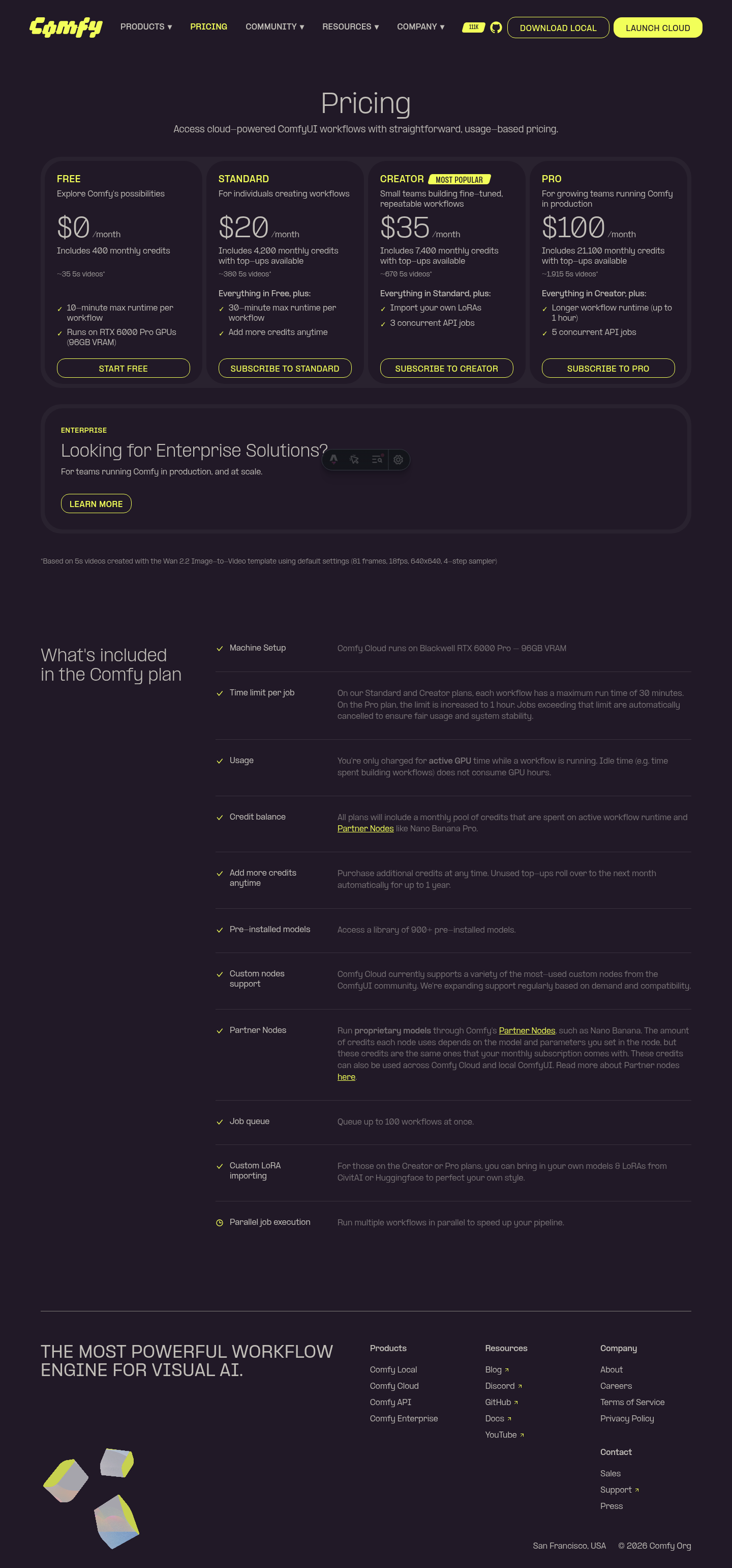
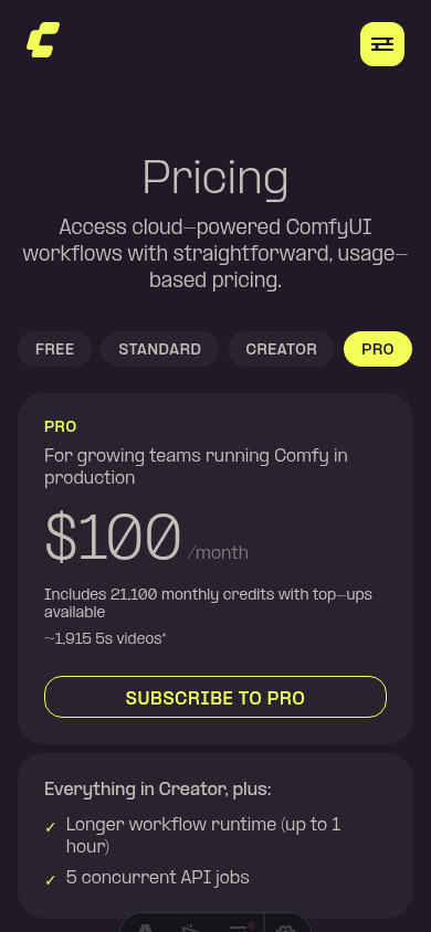
@@ -77,7 +77,10 @@ const plans: PricingPlan[] = [
|
||||
ctaKey: 'pricing.plan.creator.cta',
|
||||
ctaHref: subscribeUrl('creator'),
|
||||
featureIntroKey: 'pricing.plan.creator.featureIntro',
|
||||
features: [{ text: 'pricing.plan.creator.feature1' }],
|
||||
features: [
|
||||
{ text: 'pricing.plan.creator.feature1' },
|
||||
{ text: 'pricing.plan.creator.feature2' }
|
||||
],
|
||||
isPopular: true
|
||||
},
|
||||
{
|
||||
@@ -90,7 +93,10 @@ const plans: PricingPlan[] = [
|
||||
ctaKey: 'pricing.plan.pro.cta',
|
||||
ctaHref: subscribeUrl('pro'),
|
||||
featureIntroKey: 'pricing.plan.pro.featureIntro',
|
||||
features: [{ text: 'pricing.plan.pro.feature1' }]
|
||||
features: [
|
||||
{ text: 'pricing.plan.pro.feature1' },
|
||||
{ text: 'pricing.plan.pro.feature2' }
|
||||
]
|
||||
},
|
||||
{
|
||||
id: 'enterprise',
|
||||
|
||||
@@ -1119,6 +1119,10 @@ const translations = {
|
||||
en: 'Import your own LoRAs',
|
||||
'zh-CN': '导入你自己的 LoRA'
|
||||
},
|
||||
'pricing.plan.creator.feature2': {
|
||||
en: '3 concurrent API jobs',
|
||||
'zh-CN': '3 个并发 API 任务'
|
||||
},
|
||||
|
||||
'pricing.plan.pro.label': { en: 'PRO', 'zh-CN': '专业版' },
|
||||
'pricing.plan.pro.summary': {
|
||||
@@ -1143,6 +1147,10 @@ const translations = {
|
||||
en: 'Longer workflow runtime (up to 1 hour)',
|
||||
'zh-CN': '更长工作流运行时长(最长 1 小时)'
|
||||
},
|
||||
'pricing.plan.pro.feature2': {
|
||||
en: '5 concurrent API jobs',
|
||||
'zh-CN': '5 个并发 API 任务'
|
||||
},
|
||||
|
||||
'pricing.enterprise.label': { en: 'ENTERPRISE', 'zh-CN': '企业版' },
|
||||
'pricing.enterprise.heading': {
|
||||
|
||||
1449
browser_tests/assets/subgraphs/large-subgraph-80-nodes.json
Normal file
1449
browser_tests/assets/subgraphs/large-subgraph-80-nodes.json
Normal file
File diff suppressed because it is too large
Load Diff
@@ -352,6 +352,12 @@ export class ComfyPage {
|
||||
await nextFrame(this.page)
|
||||
}
|
||||
|
||||
async idleFrames(count: number) {
|
||||
for (let i = 0; i < count; i++) {
|
||||
await this.nextFrame()
|
||||
}
|
||||
}
|
||||
|
||||
async delay(ms: number) {
|
||||
return sleep(ms)
|
||||
}
|
||||
|
||||
@@ -39,10 +39,32 @@ class ComfyQueueButton {
|
||||
await this.dropdownButton.click()
|
||||
return new ComfyQueueButtonOptions(this.actionbar.page)
|
||||
}
|
||||
|
||||
public async openOptions() {
|
||||
const options = new ComfyQueueButtonOptions(this.actionbar.page)
|
||||
if (!(await options.menu.isVisible())) {
|
||||
await this.dropdownButton.click()
|
||||
}
|
||||
return options
|
||||
}
|
||||
}
|
||||
|
||||
class ComfyQueueButtonOptions {
|
||||
constructor(public readonly page: Page) {}
|
||||
public readonly menu: Locator
|
||||
public readonly modeItems: Locator
|
||||
|
||||
constructor(public readonly page: Page) {
|
||||
this.menu = page.getByRole('menu')
|
||||
this.modeItems = this.menu.getByRole('menuitem')
|
||||
}
|
||||
|
||||
public modeItem(name: string) {
|
||||
return this.menu.getByRole('menuitem', { name, exact: true })
|
||||
}
|
||||
|
||||
public async selectMode(name: string) {
|
||||
await this.modeItem(name).click()
|
||||
}
|
||||
|
||||
public async setMode(mode: AutoQueueMode) {
|
||||
await this.page.evaluate((mode) => {
|
||||
|
||||
@@ -351,6 +351,45 @@ test.describe('Performance', { tag: ['@perf'] }, () => {
|
||||
})
|
||||
})
|
||||
|
||||
test(
|
||||
'subgraph transition (enter and exit)',
|
||||
{ tag: ['@vue-nodes'] },
|
||||
async ({ comfyPage }, testInfo) => {
|
||||
// Heaviest perf test: loads an 80-node subgraph and pays ~30s/repeat.
|
||||
// The signal is dominated by N=80 mount cost, so a single sample per
|
||||
// CI invocation is sufficient — early-return on subsequent repeats.
|
||||
if (testInfo.repeatEachIndex > 0) return
|
||||
|
||||
// Load workflow with a subgraph containing 80 interior nodes.
|
||||
// Entering the subgraph unmounts root nodes and mounts all 80 interior
|
||||
// nodes synchronously — this is the bottleneck we're measuring.
|
||||
await comfyPage.workflow.loadWorkflow('subgraphs/large-subgraph-80-nodes')
|
||||
|
||||
await comfyPage.idleFrames(30)
|
||||
|
||||
await comfyPage.vueNodes.enterSubgraph()
|
||||
await comfyPage.vueNodes.waitForNodes(80)
|
||||
await comfyPage.idleFrames(30)
|
||||
|
||||
// Exit back to root graph before measuring a fresh enter/exit cycle
|
||||
await comfyPage.subgraph.exitViaBreadcrumb()
|
||||
await comfyPage.idleFrames(10)
|
||||
|
||||
// Start measuring the enter transition
|
||||
await comfyPage.perf.startMeasuring()
|
||||
|
||||
await comfyPage.vueNodes.enterSubgraph()
|
||||
await comfyPage.vueNodes.waitForNodes(80)
|
||||
await comfyPage.idleFrames(30)
|
||||
|
||||
const m = await comfyPage.perf.stopMeasuring('subgraph-transition-enter')
|
||||
recordMeasurement(m)
|
||||
console.log(
|
||||
`Subgraph enter (80 nodes): ${m.taskDurationMs.toFixed(0)}ms task, ${m.layouts} layouts, TBT=${m.totalBlockingTimeMs.toFixed(0)}ms`
|
||||
)
|
||||
}
|
||||
)
|
||||
|
||||
test('workflow execution', async ({ comfyPage }) => {
|
||||
// Uses lightweight PrimitiveString → PreviewAny workflow (no GPU needed)
|
||||
await comfyPage.workflow.loadWorkflow('execution/partial_execution')
|
||||
|
||||
42
browser_tests/tests/previewAsText.spec.ts
Normal file
42
browser_tests/tests/previewAsText.spec.ts
Normal file
@@ -0,0 +1,42 @@
|
||||
import {
|
||||
comfyPageFixture as test,
|
||||
comfyExpect as expect
|
||||
} from '../fixtures/ComfyPage'
|
||||
|
||||
test.describe('Preview as Text node', () => {
|
||||
test('does not include preview widget values in the API prompt', async ({
|
||||
comfyPage
|
||||
}) => {
|
||||
await comfyPage.page.evaluate(() => {
|
||||
const node = window.LiteGraph!.createNode('PreviewAny')!
|
||||
node.pos = [500, 200]
|
||||
window.app!.graph.add(node)
|
||||
})
|
||||
|
||||
// Simulate a previous execution: backend returned text and the frontend
|
||||
// populated the preview widget values. The next prompt submission must
|
||||
// NOT echo those values back as inputs (which would change the cache
|
||||
// signature and trigger a redundant re-execution).
|
||||
await comfyPage.page.evaluate(() => {
|
||||
const node = window.app!.graph.nodes.find((n) => n.type === 'PreviewAny')!
|
||||
for (const widget of node.widgets ?? []) {
|
||||
if (widget.name?.startsWith('preview_')) {
|
||||
widget.value = 'rendered preview content from previous execution'
|
||||
}
|
||||
}
|
||||
})
|
||||
|
||||
const apiWorkflow = await comfyPage.workflow.getExportedWorkflow({
|
||||
api: true
|
||||
})
|
||||
|
||||
const previewEntry = Object.values(apiWorkflow).find(
|
||||
(n) => n.class_type === 'PreviewAny'
|
||||
)
|
||||
expect(previewEntry).toBeDefined()
|
||||
|
||||
expect(previewEntry!.inputs).not.toHaveProperty('preview_markdown')
|
||||
expect(previewEntry!.inputs).not.toHaveProperty('preview_text')
|
||||
expect(previewEntry!.inputs).not.toHaveProperty('previewMode')
|
||||
})
|
||||
})
|
||||
@@ -3,62 +3,42 @@ import { expect } from '@playwright/test'
|
||||
import type { PromptResponse } from '@/schemas/apiSchema'
|
||||
|
||||
import { comfyPageFixture as test } from '@e2e/fixtures/ComfyPage'
|
||||
import { TestIds } from '@e2e/fixtures/selectors'
|
||||
|
||||
const queueModeLabels = ['Run', 'Run (On Change)', 'Run (Instant)']
|
||||
const runOnChangeLabel = queueModeLabels[1]
|
||||
|
||||
test.describe('Queue button modes', { tag: '@ui' }, () => {
|
||||
test('Run button is visible in topbar', async ({ comfyPage }) => {
|
||||
await expect(comfyPage.runButton).toBeVisible()
|
||||
await expect(comfyPage.actionbar.queueButton.primaryButton).toBeVisible()
|
||||
})
|
||||
|
||||
test('Queue mode trigger menu is visible', async ({ comfyPage }) => {
|
||||
const trigger = comfyPage.page.getByTestId(
|
||||
TestIds.topbar.queueModeMenuTrigger
|
||||
)
|
||||
await expect(trigger).toBeVisible()
|
||||
await expect(comfyPage.actionbar.queueButton.dropdownButton).toBeVisible()
|
||||
})
|
||||
|
||||
test('Clicking queue mode trigger opens mode menu', async ({ comfyPage }) => {
|
||||
const trigger = comfyPage.page.getByTestId(
|
||||
TestIds.topbar.queueModeMenuTrigger
|
||||
)
|
||||
await trigger.click()
|
||||
const options = await comfyPage.actionbar.queueButton.openOptions()
|
||||
|
||||
const menu = comfyPage.page.getByRole('menu')
|
||||
await expect(menu).toBeVisible()
|
||||
await expect(options.menu).toBeVisible()
|
||||
})
|
||||
|
||||
test('Queue mode menu shows available modes', async ({ comfyPage }) => {
|
||||
const trigger = comfyPage.page.getByTestId(
|
||||
TestIds.topbar.queueModeMenuTrigger
|
||||
)
|
||||
await trigger.click()
|
||||
const options = await comfyPage.actionbar.queueButton.openOptions()
|
||||
|
||||
const menu = comfyPage.page.getByRole('menu')
|
||||
await expect(menu).toBeVisible()
|
||||
|
||||
const items = menu.getByRole('menuitem')
|
||||
await expect(items).toHaveCount(3)
|
||||
await expect(items.nth(0)).toHaveText('Run')
|
||||
await expect(items.nth(1)).toHaveText('Run (On Change)')
|
||||
await expect(items.nth(2)).toHaveText('Run (Instant)')
|
||||
await expect(options.menu).toBeVisible()
|
||||
await expect(options.modeItems).toHaveText(queueModeLabels)
|
||||
})
|
||||
|
||||
test('Selecting a non-default mode updates the Run button label', async ({
|
||||
comfyPage
|
||||
}) => {
|
||||
const trigger = comfyPage.page.getByTestId(
|
||||
TestIds.topbar.queueModeMenuTrigger
|
||||
)
|
||||
await trigger.click()
|
||||
const queueButton = comfyPage.actionbar.queueButton
|
||||
const options = await queueButton.openOptions()
|
||||
|
||||
const menu = comfyPage.page.getByRole('menu')
|
||||
await expect(menu).toBeVisible()
|
||||
await expect(options.menu).toBeVisible()
|
||||
await options.selectMode(runOnChangeLabel)
|
||||
|
||||
// Select "Run (On Change)" — a non-default mode so we observe a real change
|
||||
const onChangeItem = menu.getByRole('menuitem').nth(1)
|
||||
await onChangeItem.click()
|
||||
|
||||
await expect(comfyPage.runButton).toContainText('Run (On Change)')
|
||||
await expect(queueButton.primaryButton).toContainText(runOnChangeLabel)
|
||||
})
|
||||
|
||||
test('Run button sends prompt when clicked', async ({ comfyPage }) => {
|
||||
@@ -76,7 +56,7 @@ test.describe('Queue button modes', { tag: '@ui' }, () => {
|
||||
})
|
||||
})
|
||||
|
||||
await comfyPage.runButton.click()
|
||||
await comfyPage.actionbar.queueButton.primaryButton.click()
|
||||
|
||||
await expect.poll(() => promptQueued).toBe(true)
|
||||
})
|
||||
|
||||
@@ -40,7 +40,10 @@
|
||||
|
||||
<template #contentFilter>
|
||||
<div class="relative flex flex-wrap justify-between gap-2 px-6 pb-4">
|
||||
<div class="flex flex-wrap gap-2">
|
||||
<div
|
||||
:ref="primeVueOverlay.overlayScopeRef"
|
||||
class="flex flex-wrap gap-2"
|
||||
>
|
||||
<!-- Model Filter -->
|
||||
<MultiSelect
|
||||
v-model="selectedModelObjects"
|
||||
@@ -48,6 +51,7 @@
|
||||
class="w-[250px]"
|
||||
:label="modelFilterLabel"
|
||||
:options="modelOptions"
|
||||
:content-style="selectContentStyle"
|
||||
:show-search-box="true"
|
||||
:show-selected-count="true"
|
||||
:show-clear-button="true"
|
||||
@@ -62,6 +66,7 @@
|
||||
v-model="selectedUseCaseObjects"
|
||||
:label="useCaseFilterLabel"
|
||||
:options="useCaseOptions"
|
||||
:content-style="selectContentStyle"
|
||||
:show-search-box="true"
|
||||
:show-selected-count="true"
|
||||
:show-clear-button="true"
|
||||
@@ -76,6 +81,7 @@
|
||||
v-model="selectedRunsOnObjects"
|
||||
:label="runsOnFilterLabel"
|
||||
:options="runsOnOptions"
|
||||
:content-style="selectContentStyle"
|
||||
:show-search-box="true"
|
||||
:show-selected-count="true"
|
||||
:show-clear-button="true"
|
||||
@@ -92,6 +98,7 @@
|
||||
v-model="sortBy"
|
||||
:label="$t('templateWorkflows.sorting', 'Sort by')"
|
||||
:options="sortOptions"
|
||||
:content-style="selectContentStyle"
|
||||
class="w-62.5"
|
||||
>
|
||||
<template #icon>
|
||||
@@ -416,6 +423,7 @@ import BaseModalLayout from '@/components/widget/layout/BaseModalLayout.vue'
|
||||
import LeftSidePanel from '@/components/widget/panel/LeftSidePanel.vue'
|
||||
import { useIntersectionObserver } from '@/composables/useIntersectionObserver'
|
||||
import { useLazyPagination } from '@/composables/useLazyPagination'
|
||||
import { usePrimeVueOverlayChildStyle } from '@/composables/usePopoverSizing'
|
||||
import { useTemplateFiltering } from '@/composables/useTemplateFiltering'
|
||||
import { isCloud } from '@/platform/distribution/types'
|
||||
import { useTelemetry } from '@/platform/telemetry'
|
||||
@@ -632,6 +640,8 @@ const selectedRunsOnObjects = computed({
|
||||
const loadingTemplate = ref<string | null>(null)
|
||||
const hoveredTemplate = ref<string | null>(null)
|
||||
const cardRefs = ref<HTMLElement[]>([])
|
||||
const primeVueOverlay = usePrimeVueOverlayChildStyle()
|
||||
const selectContentStyle = primeVueOverlay.contentStyle
|
||||
|
||||
// Force re-render key for templates when sorting changes
|
||||
const templateListKey = ref(0)
|
||||
|
||||
192
src/components/dialog/GlobalDialog.test.ts
Normal file
192
src/components/dialog/GlobalDialog.test.ts
Normal file
@@ -0,0 +1,192 @@
|
||||
import { createTestingPinia } from '@pinia/testing'
|
||||
import { cleanup, render, screen } from '@testing-library/vue'
|
||||
import userEvent from '@testing-library/user-event'
|
||||
import { setActivePinia } from 'pinia'
|
||||
import PrimeVue from 'primevue/config'
|
||||
import { afterEach, beforeEach, describe, expect, it } from 'vitest'
|
||||
import { defineComponent, h } from 'vue'
|
||||
import { createI18n } from 'vue-i18n'
|
||||
|
||||
import GlobalDialog from '@/components/dialog/GlobalDialog.vue'
|
||||
import { useDialogStore } from '@/stores/dialogStore'
|
||||
|
||||
const i18n = createI18n({
|
||||
legacy: false,
|
||||
locale: 'en',
|
||||
messages: { en: { g: { close: 'Close' } } },
|
||||
missingWarn: false,
|
||||
fallbackWarn: false
|
||||
})
|
||||
|
||||
const Body = defineComponent({
|
||||
name: 'Body',
|
||||
setup: () => () => h('p', { 'data-testid': 'body' }, 'body content')
|
||||
})
|
||||
|
||||
function mountDialog() {
|
||||
return render(GlobalDialog, {
|
||||
global: { plugins: [PrimeVue, i18n] }
|
||||
})
|
||||
}
|
||||
|
||||
describe('GlobalDialog renderer branching', () => {
|
||||
beforeEach(() => {
|
||||
setActivePinia(createTestingPinia({ stubActions: false }))
|
||||
})
|
||||
|
||||
afterEach(() => {
|
||||
cleanup()
|
||||
})
|
||||
|
||||
it('renders the PrimeVue branch when renderer is omitted', async () => {
|
||||
mountDialog()
|
||||
const store = useDialogStore()
|
||||
|
||||
store.showDialog({
|
||||
key: 'primevue-default',
|
||||
title: 'PrimeVue dialog',
|
||||
component: Body
|
||||
})
|
||||
|
||||
const dialogs = await screen.findAllByRole('dialog')
|
||||
expect(dialogs.some((el) => el.classList.contains('p-dialog'))).toBe(true)
|
||||
})
|
||||
|
||||
it('renders the Reka branch when renderer is reka', async () => {
|
||||
mountDialog()
|
||||
const store = useDialogStore()
|
||||
|
||||
store.showDialog({
|
||||
key: 'reka-opt-in',
|
||||
title: 'Reka dialog',
|
||||
component: Body,
|
||||
dialogComponentProps: { renderer: 'reka' }
|
||||
})
|
||||
|
||||
const dialogs = await screen.findAllByRole('dialog')
|
||||
expect(dialogs.length).toBeGreaterThan(0)
|
||||
expect(dialogs.some((el) => el.classList.contains('p-dialog'))).toBe(false)
|
||||
})
|
||||
|
||||
it('preserves the renderer flag on the dialog stack item', async () => {
|
||||
mountDialog()
|
||||
const store = useDialogStore()
|
||||
|
||||
store.showDialog({
|
||||
key: 'reka-flag-check',
|
||||
title: 'Reka',
|
||||
component: Body,
|
||||
dialogComponentProps: { renderer: 'reka' }
|
||||
})
|
||||
|
||||
await screen.findByRole('dialog')
|
||||
const item = store.dialogStack.find((d) => d.key === 'reka-flag-check')
|
||||
expect(item?.dialogComponentProps.renderer).toBe('reka')
|
||||
})
|
||||
})
|
||||
|
||||
describe('GlobalDialog Reka parity with PrimeVue', () => {
|
||||
beforeEach(() => {
|
||||
setActivePinia(createTestingPinia({ stubActions: false }))
|
||||
})
|
||||
|
||||
afterEach(() => {
|
||||
cleanup()
|
||||
})
|
||||
|
||||
it('omits the close button when closable is false', async () => {
|
||||
mountDialog()
|
||||
const store = useDialogStore()
|
||||
|
||||
store.showDialog({
|
||||
key: 'reka-not-closable',
|
||||
title: 'No close',
|
||||
component: Body,
|
||||
dialogComponentProps: { renderer: 'reka', closable: false }
|
||||
})
|
||||
|
||||
await screen.findByRole('dialog')
|
||||
expect(screen.queryByRole('button', { name: 'Close' })).toBeNull()
|
||||
})
|
||||
|
||||
it('renders the close button by default', async () => {
|
||||
mountDialog()
|
||||
const store = useDialogStore()
|
||||
|
||||
store.showDialog({
|
||||
key: 'reka-closable',
|
||||
title: 'Closable',
|
||||
component: Body,
|
||||
dialogComponentProps: { renderer: 'reka' }
|
||||
})
|
||||
|
||||
await screen.findByRole('dialog')
|
||||
expect(screen.getByRole('button', { name: 'Close' })).toBeInTheDocument()
|
||||
})
|
||||
|
||||
it('omits the title when headless is true', async () => {
|
||||
mountDialog()
|
||||
const store = useDialogStore()
|
||||
|
||||
store.showDialog({
|
||||
key: 'reka-headless',
|
||||
title: 'Hidden title',
|
||||
component: Body,
|
||||
dialogComponentProps: { renderer: 'reka', headless: true }
|
||||
})
|
||||
|
||||
await screen.findByRole('dialog')
|
||||
expect(screen.queryByText('Hidden title')).toBeNull()
|
||||
})
|
||||
|
||||
it('renders the title when headless is omitted', async () => {
|
||||
mountDialog()
|
||||
const store = useDialogStore()
|
||||
|
||||
store.showDialog({
|
||||
key: 'reka-titled',
|
||||
title: 'Visible title',
|
||||
component: Body,
|
||||
dialogComponentProps: { renderer: 'reka' }
|
||||
})
|
||||
|
||||
await screen.findByRole('dialog')
|
||||
expect(screen.getByText('Visible title')).toBeInTheDocument()
|
||||
})
|
||||
|
||||
it('closes the dialog on Escape by default', async () => {
|
||||
mountDialog()
|
||||
const store = useDialogStore()
|
||||
const user = userEvent.setup()
|
||||
|
||||
store.showDialog({
|
||||
key: 'reka-esc-default',
|
||||
title: 'Esc closes',
|
||||
component: Body,
|
||||
dialogComponentProps: { renderer: 'reka' }
|
||||
})
|
||||
|
||||
await screen.findByRole('dialog')
|
||||
await user.keyboard('{Escape}')
|
||||
|
||||
expect(store.isDialogOpen('reka-esc-default')).toBe(false)
|
||||
})
|
||||
|
||||
it('does not close on Escape when closable is false', async () => {
|
||||
mountDialog()
|
||||
const store = useDialogStore()
|
||||
const user = userEvent.setup()
|
||||
|
||||
store.showDialog({
|
||||
key: 'reka-esc-blocked',
|
||||
title: 'Esc blocked',
|
||||
component: Body,
|
||||
dialogComponentProps: { renderer: 'reka', closable: false }
|
||||
})
|
||||
|
||||
await screen.findByRole('dialog')
|
||||
await user.keyboard('{Escape}')
|
||||
|
||||
expect(store.isDialogOpen('reka-esc-blocked')).toBe(true)
|
||||
})
|
||||
})
|
||||
@@ -1,49 +1,106 @@
|
||||
<!-- The main global dialog to show various things -->
|
||||
<template>
|
||||
<Dialog
|
||||
v-for="item in dialogStore.dialogStack"
|
||||
:key="item.key"
|
||||
v-model:visible="item.visible"
|
||||
class="global-dialog"
|
||||
v-bind="item.dialogComponentProps"
|
||||
:pt="getDialogPt(item)"
|
||||
:aria-labelledby="item.key"
|
||||
>
|
||||
<template #header>
|
||||
<div v-if="!item.dialogComponentProps?.headless">
|
||||
<component
|
||||
:is="item.headerComponent"
|
||||
v-if="item.headerComponent"
|
||||
v-bind="item.headerProps"
|
||||
:id="item.key"
|
||||
/>
|
||||
<h3 v-else :id="item.key">
|
||||
{{ item.title || ' ' }}
|
||||
</h3>
|
||||
</div>
|
||||
</template>
|
||||
<template v-for="item in dialogStore.dialogStack" :key="item.key">
|
||||
<Dialog
|
||||
v-if="isRekaItem(item)"
|
||||
:open="item.visible"
|
||||
:modal="item.dialogComponentProps.modal ?? true"
|
||||
@update:open="(open) => onRekaOpenChange(item.key, open)"
|
||||
>
|
||||
<DialogPortal>
|
||||
<DialogOverlay />
|
||||
<DialogContent
|
||||
:size="item.dialogComponentProps.size ?? 'md'"
|
||||
:aria-labelledby="item.key"
|
||||
@escape-key-down="
|
||||
(e) =>
|
||||
item.dialogComponentProps.closeOnEscape === false &&
|
||||
e.preventDefault()
|
||||
"
|
||||
@pointer-down-outside="
|
||||
(e) =>
|
||||
item.dialogComponentProps.dismissableMask === false &&
|
||||
e.preventDefault()
|
||||
"
|
||||
@mousedown="() => dialogStore.riseDialog({ key: item.key })"
|
||||
>
|
||||
<DialogHeader v-if="!item.dialogComponentProps.headless">
|
||||
<component
|
||||
:is="item.headerComponent"
|
||||
v-if="item.headerComponent"
|
||||
v-bind="item.headerProps"
|
||||
:id="item.key"
|
||||
/>
|
||||
<DialogTitle v-else :id="item.key">
|
||||
{{ item.title || ' ' }}
|
||||
</DialogTitle>
|
||||
<DialogClose v-if="item.dialogComponentProps.closable !== false" />
|
||||
</DialogHeader>
|
||||
<div class="flex-1 overflow-auto px-4 py-2">
|
||||
<component
|
||||
:is="item.component"
|
||||
v-bind="item.contentProps"
|
||||
:maximized="item.dialogComponentProps.maximized"
|
||||
/>
|
||||
</div>
|
||||
<DialogFooter v-if="item.footerComponent">
|
||||
<component :is="item.footerComponent" v-bind="item.footerProps" />
|
||||
</DialogFooter>
|
||||
</DialogContent>
|
||||
</DialogPortal>
|
||||
</Dialog>
|
||||
<PrimeDialog
|
||||
v-else
|
||||
v-model:visible="item.visible"
|
||||
class="global-dialog"
|
||||
v-bind="item.dialogComponentProps"
|
||||
:pt="getDialogPt(item)"
|
||||
:aria-labelledby="item.key"
|
||||
>
|
||||
<template #header>
|
||||
<div v-if="!item.dialogComponentProps?.headless">
|
||||
<component
|
||||
:is="item.headerComponent"
|
||||
v-if="item.headerComponent"
|
||||
v-bind="item.headerProps"
|
||||
:id="item.key"
|
||||
/>
|
||||
<h3 v-else :id="item.key">
|
||||
{{ item.title || ' ' }}
|
||||
</h3>
|
||||
</div>
|
||||
</template>
|
||||
|
||||
<component
|
||||
:is="item.component"
|
||||
v-bind="item.contentProps"
|
||||
:maximized="item.dialogComponentProps.maximized"
|
||||
/>
|
||||
<component
|
||||
:is="item.component"
|
||||
v-bind="item.contentProps"
|
||||
:maximized="item.dialogComponentProps.maximized"
|
||||
/>
|
||||
|
||||
<template v-if="item.footerComponent" #footer>
|
||||
<component :is="item.footerComponent" v-bind="item.footerProps" />
|
||||
</template>
|
||||
</Dialog>
|
||||
<template v-if="item.footerComponent" #footer>
|
||||
<component :is="item.footerComponent" v-bind="item.footerProps" />
|
||||
</template>
|
||||
</PrimeDialog>
|
||||
</template>
|
||||
</template>
|
||||
|
||||
<script setup lang="ts">
|
||||
import { merge } from 'es-toolkit/compat'
|
||||
import Dialog from 'primevue/dialog'
|
||||
import PrimeDialog from 'primevue/dialog'
|
||||
import type { DialogPassThroughOptions } from 'primevue/dialog'
|
||||
import { computed } from 'vue'
|
||||
|
||||
import Dialog from '@/components/ui/dialog/Dialog.vue'
|
||||
import DialogClose from '@/components/ui/dialog/DialogClose.vue'
|
||||
import DialogContent from '@/components/ui/dialog/DialogContent.vue'
|
||||
import DialogFooter from '@/components/ui/dialog/DialogFooter.vue'
|
||||
import DialogHeader from '@/components/ui/dialog/DialogHeader.vue'
|
||||
import DialogOverlay from '@/components/ui/dialog/DialogOverlay.vue'
|
||||
import DialogPortal from '@/components/ui/dialog/DialogPortal.vue'
|
||||
import DialogTitle from '@/components/ui/dialog/DialogTitle.vue'
|
||||
import { useFeatureFlags } from '@/composables/useFeatureFlags'
|
||||
import { isCloud } from '@/platform/distribution/types'
|
||||
import type { DialogComponentProps } from '@/stores/dialogStore'
|
||||
import type { DialogComponentProps, DialogInstance } from '@/stores/dialogStore'
|
||||
import { useDialogStore } from '@/stores/dialogStore'
|
||||
|
||||
const { flags } = useFeatureFlags()
|
||||
@@ -53,6 +110,14 @@ const teamWorkspacesEnabled = computed(
|
||||
|
||||
const dialogStore = useDialogStore()
|
||||
|
||||
function isRekaItem(item: DialogInstance) {
|
||||
return item.dialogComponentProps.renderer === 'reka'
|
||||
}
|
||||
|
||||
function onRekaOpenChange(key: string, open: boolean) {
|
||||
if (!open) dialogStore.closeDialog({ key })
|
||||
}
|
||||
|
||||
function getDialogPt(item: {
|
||||
key: string
|
||||
dialogComponentProps: DialogComponentProps
|
||||
|
||||
@@ -1,5 +1,8 @@
|
||||
<template>
|
||||
<div class="keybinding-panel flex flex-col gap-2">
|
||||
<div
|
||||
:ref="primeVueOverlay.overlayScopeRef"
|
||||
class="keybinding-panel flex flex-col gap-2"
|
||||
>
|
||||
<Teleport defer to="#keybinding-panel-header">
|
||||
<SearchInput
|
||||
v-model="filters['global'].value"
|
||||
@@ -15,10 +18,12 @@
|
||||
<div class="flex items-center gap-2">
|
||||
<KeybindingPresetToolbar
|
||||
:preset-names="presetNames"
|
||||
:content-style="keybindingOverlayContentStyle"
|
||||
@presets-changed="refreshPresetList"
|
||||
/>
|
||||
<DropdownMenu
|
||||
:entries="menuEntries"
|
||||
:style="keybindingOverlayContentStyle"
|
||||
icon="icon-[lucide--ellipsis]"
|
||||
item-class="text-sm gap-2"
|
||||
button-size="unset"
|
||||
@@ -238,6 +243,7 @@
|
||||
</ContextMenuTrigger>
|
||||
<ContextMenuPortal>
|
||||
<ContextMenuContent
|
||||
:style="keybindingOverlayContentStyle"
|
||||
class="z-1200 min-w-56 rounded-lg border border-border-subtle bg-base-background px-2 py-3 shadow-interface"
|
||||
>
|
||||
<ContextMenuItem
|
||||
@@ -314,6 +320,7 @@ import { showConfirmDialog } from '@/components/dialog/confirm/confirmDialog'
|
||||
import Button from '@/components/ui/button/Button.vue'
|
||||
import SearchInput from '@/components/ui/search-input/SearchInput.vue'
|
||||
import { useEditKeybindingDialog } from '@/composables/useEditKeybindingDialog'
|
||||
import { usePrimeVueOverlayChildStyle } from '@/composables/usePopoverSizing'
|
||||
import type { KeybindingImpl } from '@/platform/keybindings/keybinding'
|
||||
import { useKeybindingService } from '@/platform/keybindings/keybindingService'
|
||||
import { useKeybindingStore } from '@/platform/keybindings/keybindingStore'
|
||||
@@ -337,6 +344,8 @@ const settingStore = useSettingStore()
|
||||
const commandStore = useCommandStore()
|
||||
const dialogStore = useDialogStore()
|
||||
const { t } = useI18n()
|
||||
const primeVueOverlay = usePrimeVueOverlayChildStyle()
|
||||
const keybindingOverlayContentStyle = primeVueOverlay.contentStyle
|
||||
|
||||
const presetNames = ref<string[]>([])
|
||||
|
||||
|
||||
@@ -9,7 +9,10 @@
|
||||
{{ displayLabel }}
|
||||
</SelectValue>
|
||||
</SelectTrigger>
|
||||
<SelectContent class="max-w-64 min-w-0 **:[[role=listbox]]:gap-1">
|
||||
<SelectContent
|
||||
:style="contentStyle"
|
||||
class="max-w-64 min-w-0 **:[[role=listbox]]:gap-1"
|
||||
>
|
||||
<div class="max-w-60">
|
||||
<SelectItem
|
||||
value="default"
|
||||
@@ -46,6 +49,7 @@
|
||||
|
||||
<script setup lang="ts">
|
||||
import { computed, ref, watch } from 'vue'
|
||||
import type { StyleValue } from 'vue'
|
||||
import { useI18n } from 'vue-i18n'
|
||||
|
||||
import Button from '@/components/ui/button/Button.vue'
|
||||
@@ -57,8 +61,9 @@ import SelectValue from '@/components/ui/select/SelectValue.vue'
|
||||
import { useKeybindingPresetService } from '@/platform/keybindings/presetService'
|
||||
import { useKeybindingStore } from '@/platform/keybindings/keybindingStore'
|
||||
|
||||
const { presetNames } = defineProps<{
|
||||
const { presetNames, contentStyle } = defineProps<{
|
||||
presetNames: string[]
|
||||
contentStyle?: StyleValue
|
||||
}>()
|
||||
|
||||
const emit = defineEmits<{
|
||||
|
||||
@@ -21,20 +21,42 @@
|
||||
</Button>
|
||||
|
||||
<Select
|
||||
v-model="selectedSpeed"
|
||||
:options="speedOptions"
|
||||
option-label="name"
|
||||
option-value="value"
|
||||
class="w-24"
|
||||
/>
|
||||
:model-value="selectedSpeed != null ? String(selectedSpeed) : undefined"
|
||||
@update:model-value="(val) => (selectedSpeed = Number(val))"
|
||||
>
|
||||
<SelectTrigger size="md" class="w-24">
|
||||
<SelectValue />
|
||||
</SelectTrigger>
|
||||
<SelectContent>
|
||||
<SelectItem
|
||||
v-for="opt in speedOptions"
|
||||
:key="opt.value"
|
||||
:value="String(opt.value)"
|
||||
>
|
||||
{{ opt.name }}
|
||||
</SelectItem>
|
||||
</SelectContent>
|
||||
</Select>
|
||||
|
||||
<Select
|
||||
v-model="selectedAnimation"
|
||||
:options="animations"
|
||||
option-label="name"
|
||||
option-value="index"
|
||||
class="w-32"
|
||||
/>
|
||||
:model-value="
|
||||
selectedAnimation != null ? String(selectedAnimation) : undefined
|
||||
"
|
||||
@update:model-value="(val) => (selectedAnimation = Number(val))"
|
||||
>
|
||||
<SelectTrigger size="md" class="w-32">
|
||||
<SelectValue />
|
||||
</SelectTrigger>
|
||||
<SelectContent>
|
||||
<SelectItem
|
||||
v-for="anim in animations"
|
||||
:key="anim.index"
|
||||
:value="String(anim.index)"
|
||||
>
|
||||
{{ anim.name }}
|
||||
</SelectItem>
|
||||
</SelectContent>
|
||||
</Select>
|
||||
</div>
|
||||
|
||||
<div class="flex w-full max-w-xs items-center gap-2 px-4">
|
||||
@@ -54,10 +76,14 @@
|
||||
</template>
|
||||
|
||||
<script setup lang="ts">
|
||||
import Select from 'primevue/select'
|
||||
import { computed } from 'vue'
|
||||
|
||||
import Button from '@/components/ui/button/Button.vue'
|
||||
import Select from '@/components/ui/select/Select.vue'
|
||||
import SelectContent from '@/components/ui/select/SelectContent.vue'
|
||||
import SelectItem from '@/components/ui/select/SelectItem.vue'
|
||||
import SelectTrigger from '@/components/ui/select/SelectTrigger.vue'
|
||||
import SelectValue from '@/components/ui/select/SelectValue.vue'
|
||||
import Slider from '@/components/ui/slider/Slider.vue'
|
||||
|
||||
type Animation = { name: string; index: number }
|
||||
|
||||
@@ -5,20 +5,20 @@ import { ref } from 'vue'
|
||||
|
||||
import PopupSlider from '@/components/load3d/controls/PopupSlider.vue'
|
||||
|
||||
vi.mock('primevue/slider', () => ({
|
||||
vi.mock('@/components/ui/slider/Slider.vue', () => ({
|
||||
default: {
|
||||
name: 'Slider',
|
||||
name: 'UiSlider',
|
||||
props: ['modelValue', 'min', 'max', 'step'],
|
||||
emits: ['update:modelValue'],
|
||||
template: `
|
||||
<input
|
||||
type="range"
|
||||
role="slider"
|
||||
:value="modelValue"
|
||||
:value="Array.isArray(modelValue) ? modelValue[0] : modelValue"
|
||||
:min="min"
|
||||
:max="max"
|
||||
:step="step"
|
||||
@input="$emit('update:modelValue', Number($event.target.value))"
|
||||
@input="$emit('update:modelValue', [Number($event.target.value)])"
|
||||
/>
|
||||
`
|
||||
}
|
||||
|
||||
@@ -15,21 +15,22 @@
|
||||
class="absolute top-0 left-12 w-[150px] rounded-lg bg-interface-menu-surface p-4 shadow-lg"
|
||||
>
|
||||
<Slider
|
||||
v-model="value"
|
||||
:model-value="sliderValue"
|
||||
class="w-full"
|
||||
:min="min"
|
||||
:max="max"
|
||||
:step="step"
|
||||
@update:model-value="onSliderUpdate"
|
||||
/>
|
||||
</div>
|
||||
</div>
|
||||
</template>
|
||||
|
||||
<script setup lang="ts">
|
||||
import Slider from 'primevue/slider'
|
||||
import { onMounted, onUnmounted, ref } from 'vue'
|
||||
import { computed, onMounted, onUnmounted, ref } from 'vue'
|
||||
|
||||
import Button from '@/components/ui/button/Button.vue'
|
||||
import Slider from '@/components/ui/slider/Slider.vue'
|
||||
|
||||
const {
|
||||
icon = 'pi-expand',
|
||||
@@ -47,6 +48,12 @@ const {
|
||||
const value = defineModel<number>()
|
||||
const showSlider = ref(false)
|
||||
|
||||
const sliderValue = computed(() => [value.value ?? min])
|
||||
|
||||
function onSliderUpdate(val: number[] | undefined) {
|
||||
if (val?.length) value.value = val[0]
|
||||
}
|
||||
|
||||
const toggleSlider = () => {
|
||||
showSlider.value = !showSlider.value
|
||||
}
|
||||
|
||||
@@ -7,38 +7,81 @@ import { createI18n } from 'vue-i18n'
|
||||
import ViewerCameraControls from '@/components/load3d/controls/viewer/ViewerCameraControls.vue'
|
||||
import type { CameraType } from '@/extensions/core/load3d/interfaces'
|
||||
|
||||
vi.mock('primevue/select', () => ({
|
||||
vi.mock('@/components/ui/select/Select.vue', async () => {
|
||||
const { provide } = await import('vue')
|
||||
return {
|
||||
default: {
|
||||
name: 'Select',
|
||||
props: ['modelValue'],
|
||||
emits: ['update:modelValue'],
|
||||
setup(
|
||||
props: { modelValue: string },
|
||||
{ emit }: { emit: (event: string, value: string) => void }
|
||||
) {
|
||||
provide('selectModelValue', (): string => props.modelValue)
|
||||
provide('selectUpdate', (v: string): void =>
|
||||
emit('update:modelValue', v)
|
||||
)
|
||||
},
|
||||
template: '<div><slot /></div>'
|
||||
}
|
||||
}
|
||||
})
|
||||
|
||||
vi.mock('@/components/ui/select/SelectContent.vue', async () => {
|
||||
const { inject, ref, onMounted } = await import('vue')
|
||||
return {
|
||||
default: {
|
||||
name: 'SelectContent',
|
||||
setup() {
|
||||
const selectModelValue = inject<() => string>('selectModelValue')
|
||||
const selectUpdate = inject<(v: string) => void>('selectUpdate')
|
||||
const el = ref<HTMLSelectElement | null>(null)
|
||||
onMounted(() => {
|
||||
if (el.value) el.value.value = selectModelValue?.() ?? ''
|
||||
})
|
||||
return {
|
||||
el,
|
||||
onChange: (e: Event) => {
|
||||
selectUpdate?.((e.target as HTMLSelectElement).value)
|
||||
}
|
||||
}
|
||||
},
|
||||
template: '<select ref="el" @change="onChange"><slot /></select>'
|
||||
}
|
||||
}
|
||||
})
|
||||
|
||||
vi.mock('@/components/ui/select/SelectItem.vue', () => ({
|
||||
default: {
|
||||
name: 'Select',
|
||||
props: ['modelValue', 'options', 'optionLabel', 'optionValue'],
|
||||
emits: ['update:modelValue'],
|
||||
template: `
|
||||
<select
|
||||
:value="modelValue"
|
||||
@change="$emit('update:modelValue', $event.target.value)"
|
||||
>
|
||||
<option v-for="opt in options" :key="opt[optionValue]" :value="opt[optionValue]">
|
||||
{{ opt[optionLabel] }}
|
||||
</option>
|
||||
</select>
|
||||
`
|
||||
name: 'SelectItem',
|
||||
props: ['value'],
|
||||
template: '<option :value="value"><slot /></option>'
|
||||
}
|
||||
}))
|
||||
|
||||
vi.mock('primevue/slider', () => ({
|
||||
vi.mock('@/components/ui/select/SelectTrigger.vue', () => ({
|
||||
default: { name: 'SelectTrigger', template: '<span />' }
|
||||
}))
|
||||
|
||||
vi.mock('@/components/ui/select/SelectValue.vue', () => ({
|
||||
default: { name: 'SelectValue', template: '<span />' }
|
||||
}))
|
||||
|
||||
vi.mock('@/components/ui/slider/Slider.vue', () => ({
|
||||
default: {
|
||||
name: 'Slider',
|
||||
props: ['modelValue', 'min', 'max', 'step', 'ariaLabel'],
|
||||
name: 'UiSlider',
|
||||
props: ['modelValue', 'min', 'max', 'step'],
|
||||
emits: ['update:modelValue'],
|
||||
template: `
|
||||
<input
|
||||
type="range"
|
||||
:value="modelValue"
|
||||
role="slider"
|
||||
:value="Array.isArray(modelValue) ? modelValue[0] : modelValue"
|
||||
:min="min"
|
||||
:max="max"
|
||||
:step="step"
|
||||
:aria-label="ariaLabel"
|
||||
@input="$emit('update:modelValue', Number($event.target.value))"
|
||||
@input="$emit('update:modelValue', [Number($event.target.value)])"
|
||||
/>
|
||||
`
|
||||
}
|
||||
|
||||
@@ -2,34 +2,46 @@
|
||||
<div class="space-y-4">
|
||||
<div class="flex flex-col gap-2">
|
||||
<label>{{ t('load3d.viewer.cameraType') }}</label>
|
||||
<Select
|
||||
v-model="cameraType"
|
||||
:options="cameras"
|
||||
option-label="title"
|
||||
option-value="value"
|
||||
>
|
||||
<Select v-model="cameraType">
|
||||
<SelectTrigger size="md">
|
||||
<SelectValue />
|
||||
</SelectTrigger>
|
||||
<SelectContent>
|
||||
<SelectItem
|
||||
v-for="cam in cameras"
|
||||
:key="cam.value"
|
||||
:value="cam.value"
|
||||
>
|
||||
{{ cam.title }}
|
||||
</SelectItem>
|
||||
</SelectContent>
|
||||
</Select>
|
||||
</div>
|
||||
|
||||
<div v-if="showFOVButton" class="flex flex-col gap-2">
|
||||
<label>{{ t('load3d.fov') }}</label>
|
||||
<Slider
|
||||
v-model="fov"
|
||||
:model-value="fovSliderValue"
|
||||
:min="10"
|
||||
:max="150"
|
||||
:step="1"
|
||||
:aria-label="t('load3d.fov')"
|
||||
@update:model-value="onFovUpdate"
|
||||
/>
|
||||
</div>
|
||||
</div>
|
||||
</template>
|
||||
|
||||
<script setup lang="ts">
|
||||
import Select from 'primevue/select'
|
||||
import Slider from 'primevue/slider'
|
||||
import { computed } from 'vue'
|
||||
import { useI18n } from 'vue-i18n'
|
||||
|
||||
import Select from '@/components/ui/select/Select.vue'
|
||||
import SelectContent from '@/components/ui/select/SelectContent.vue'
|
||||
import SelectItem from '@/components/ui/select/SelectItem.vue'
|
||||
import SelectTrigger from '@/components/ui/select/SelectTrigger.vue'
|
||||
import SelectValue from '@/components/ui/select/SelectValue.vue'
|
||||
import Slider from '@/components/ui/slider/Slider.vue'
|
||||
import type { CameraType } from '@/extensions/core/load3d/interfaces'
|
||||
|
||||
const { t } = useI18n()
|
||||
@@ -41,4 +53,10 @@ const cameras = [
|
||||
const cameraType = defineModel<CameraType>('cameraType')
|
||||
const fov = defineModel<number>('fov')
|
||||
const showFOVButton = computed(() => cameraType.value === 'perspective')
|
||||
|
||||
const fovSliderValue = computed(() => [fov.value ?? 10])
|
||||
|
||||
function onFovUpdate(val: number[] | undefined) {
|
||||
if (val?.length) fov.value = val[0]
|
||||
}
|
||||
</script>
|
||||
|
||||
@@ -5,22 +5,65 @@ import { createI18n } from 'vue-i18n'
|
||||
|
||||
import ViewerExportControls from '@/components/load3d/controls/viewer/ViewerExportControls.vue'
|
||||
|
||||
vi.mock('primevue/select', () => ({
|
||||
default: {
|
||||
name: 'Select',
|
||||
props: ['modelValue', 'options', 'optionLabel', 'optionValue'],
|
||||
emits: ['update:modelValue'],
|
||||
template: `
|
||||
<select
|
||||
:value="modelValue"
|
||||
@change="$emit('update:modelValue', $event.target.value)"
|
||||
>
|
||||
<option v-for="opt in options" :key="opt[optionValue]" :value="opt[optionValue]">
|
||||
{{ opt[optionLabel] }}
|
||||
</option>
|
||||
</select>
|
||||
`
|
||||
vi.mock('@/components/ui/select/Select.vue', async () => {
|
||||
const { provide } = await import('vue')
|
||||
return {
|
||||
default: {
|
||||
name: 'Select',
|
||||
props: ['modelValue'],
|
||||
emits: ['update:modelValue'],
|
||||
setup(
|
||||
props: { modelValue: string },
|
||||
{ emit }: { emit: (event: string, value: string) => void }
|
||||
) {
|
||||
provide('selectModelValue', (): string => props.modelValue)
|
||||
provide('selectUpdate', (v: string): void =>
|
||||
emit('update:modelValue', v)
|
||||
)
|
||||
},
|
||||
template: '<div><slot /></div>'
|
||||
}
|
||||
}
|
||||
})
|
||||
|
||||
vi.mock('@/components/ui/select/SelectContent.vue', async () => {
|
||||
const { inject, ref, onMounted } = await import('vue')
|
||||
return {
|
||||
default: {
|
||||
name: 'SelectContent',
|
||||
setup() {
|
||||
const selectModelValue = inject<() => string>('selectModelValue')
|
||||
const selectUpdate = inject<(v: string) => void>('selectUpdate')
|
||||
const el = ref<HTMLSelectElement | null>(null)
|
||||
onMounted(() => {
|
||||
if (el.value) el.value.value = selectModelValue?.() ?? ''
|
||||
})
|
||||
return {
|
||||
el,
|
||||
onChange: (e: Event) => {
|
||||
selectUpdate?.((e.target as HTMLSelectElement).value)
|
||||
}
|
||||
}
|
||||
},
|
||||
template: '<select ref="el" @change="onChange"><slot /></select>'
|
||||
}
|
||||
}
|
||||
})
|
||||
|
||||
vi.mock('@/components/ui/select/SelectItem.vue', () => ({
|
||||
default: {
|
||||
name: 'SelectItem',
|
||||
props: ['value'],
|
||||
template: '<option :value="value"><slot /></option>'
|
||||
}
|
||||
}))
|
||||
|
||||
vi.mock('@/components/ui/select/SelectTrigger.vue', () => ({
|
||||
default: { name: 'SelectTrigger', template: '<span />' }
|
||||
}))
|
||||
|
||||
vi.mock('@/components/ui/select/SelectValue.vue', () => ({
|
||||
default: { name: 'SelectValue', template: '<span />' }
|
||||
}))
|
||||
|
||||
const i18n = createI18n({
|
||||
|
||||
@@ -1,11 +1,18 @@
|
||||
<template>
|
||||
<div class="space-y-4">
|
||||
<Select
|
||||
v-model="exportFormat"
|
||||
:options="exportFormats"
|
||||
option-label="label"
|
||||
option-value="value"
|
||||
>
|
||||
<Select v-model="exportFormat">
|
||||
<SelectTrigger size="md">
|
||||
<SelectValue />
|
||||
</SelectTrigger>
|
||||
<SelectContent>
|
||||
<SelectItem
|
||||
v-for="fmt in exportFormats"
|
||||
:key="fmt.value"
|
||||
:value="fmt.value"
|
||||
>
|
||||
{{ fmt.label }}
|
||||
</SelectItem>
|
||||
</SelectContent>
|
||||
</Select>
|
||||
|
||||
<Button
|
||||
@@ -19,10 +26,14 @@
|
||||
</template>
|
||||
|
||||
<script setup lang="ts">
|
||||
import Select from 'primevue/select'
|
||||
import { ref } from 'vue'
|
||||
|
||||
import Button from '@/components/ui/button/Button.vue'
|
||||
import Select from '@/components/ui/select/Select.vue'
|
||||
import SelectContent from '@/components/ui/select/SelectContent.vue'
|
||||
import SelectItem from '@/components/ui/select/SelectItem.vue'
|
||||
import SelectTrigger from '@/components/ui/select/SelectTrigger.vue'
|
||||
import SelectValue from '@/components/ui/select/SelectValue.vue'
|
||||
|
||||
const emit = defineEmits<{
|
||||
(e: 'exportModel', format: string): void
|
||||
|
||||
@@ -17,19 +17,20 @@ vi.mock('@/platform/settings/settingStore', () => ({
|
||||
})
|
||||
}))
|
||||
|
||||
vi.mock('primevue/slider', () => ({
|
||||
vi.mock('@/components/ui/slider/Slider.vue', () => ({
|
||||
default: {
|
||||
name: 'Slider',
|
||||
name: 'UiSlider',
|
||||
props: ['modelValue', 'min', 'max', 'step'],
|
||||
emits: ['update:modelValue'],
|
||||
template: `
|
||||
<input
|
||||
type="range"
|
||||
:value="modelValue"
|
||||
role="slider"
|
||||
:value="Array.isArray(modelValue) ? modelValue[0] : modelValue"
|
||||
:min="min"
|
||||
:max="max"
|
||||
:step="step"
|
||||
@input="$emit('update:modelValue', Number($event.target.value))"
|
||||
@input="$emit('update:modelValue', [Number($event.target.value)])"
|
||||
/>
|
||||
`
|
||||
}
|
||||
|
||||
@@ -3,18 +3,20 @@
|
||||
<label>{{ $t('load3d.lightIntensity') }}</label>
|
||||
|
||||
<Slider
|
||||
v-model="lightIntensity"
|
||||
:model-value="sliderValue"
|
||||
class="w-full"
|
||||
:min="lightIntensityMinimum"
|
||||
:max="lightIntensityMaximum"
|
||||
:step="lightAdjustmentIncrement"
|
||||
@update:model-value="onSliderUpdate"
|
||||
/>
|
||||
</div>
|
||||
</template>
|
||||
|
||||
<script setup lang="ts">
|
||||
import Slider from 'primevue/slider'
|
||||
import { computed } from 'vue'
|
||||
|
||||
import Slider from '@/components/ui/slider/Slider.vue'
|
||||
import { useSettingStore } from '@/platform/settings/settingStore'
|
||||
|
||||
const lightIntensity = defineModel<number>('lightIntensity')
|
||||
@@ -28,4 +30,12 @@ const lightIntensityMinimum = useSettingStore().get(
|
||||
const lightAdjustmentIncrement = useSettingStore().get(
|
||||
'Comfy.Load3D.LightAdjustmentIncrement'
|
||||
)
|
||||
|
||||
const sliderValue = computed(() => [
|
||||
lightIntensity.value ?? lightIntensityMinimum
|
||||
])
|
||||
|
||||
function onSliderUpdate(val: number[] | undefined) {
|
||||
if (val?.length) lightIntensity.value = val[0]
|
||||
}
|
||||
</script>
|
||||
|
||||
@@ -9,20 +9,65 @@ import type {
|
||||
UpDirection
|
||||
} from '@/extensions/core/load3d/interfaces'
|
||||
|
||||
vi.mock('primevue/select', () => ({
|
||||
default: {
|
||||
name: 'Select',
|
||||
props: ['modelValue', 'options', 'optionLabel', 'optionValue'],
|
||||
emits: ['update:modelValue'],
|
||||
template: `
|
||||
<select
|
||||
:value="modelValue"
|
||||
@change="$emit('update:modelValue', $event.target.value)"
|
||||
>
|
||||
<option v-for="opt in options" :key="opt.value" :value="opt.value">{{ opt.label }}</option>
|
||||
</select>
|
||||
`
|
||||
vi.mock('@/components/ui/select/Select.vue', async () => {
|
||||
const { provide } = await import('vue')
|
||||
return {
|
||||
default: {
|
||||
name: 'Select',
|
||||
props: ['modelValue'],
|
||||
emits: ['update:modelValue'],
|
||||
setup(
|
||||
props: { modelValue: string },
|
||||
{ emit }: { emit: (event: string, value: string) => void }
|
||||
) {
|
||||
provide('selectModelValue', (): string => props.modelValue)
|
||||
provide('selectUpdate', (v: string): void =>
|
||||
emit('update:modelValue', v)
|
||||
)
|
||||
},
|
||||
template: '<div><slot /></div>'
|
||||
}
|
||||
}
|
||||
})
|
||||
|
||||
vi.mock('@/components/ui/select/SelectContent.vue', async () => {
|
||||
const { inject, ref, onMounted } = await import('vue')
|
||||
return {
|
||||
default: {
|
||||
name: 'SelectContent',
|
||||
setup() {
|
||||
const selectModelValue = inject<() => string>('selectModelValue')
|
||||
const selectUpdate = inject<(v: string) => void>('selectUpdate')
|
||||
const el = ref<HTMLSelectElement | null>(null)
|
||||
onMounted(() => {
|
||||
if (el.value) el.value.value = selectModelValue?.() ?? ''
|
||||
})
|
||||
return {
|
||||
el,
|
||||
onChange: (e: Event) => {
|
||||
selectUpdate?.((e.target as HTMLSelectElement).value)
|
||||
}
|
||||
}
|
||||
},
|
||||
template: '<select ref="el" @change="onChange"><slot /></select>'
|
||||
}
|
||||
}
|
||||
})
|
||||
|
||||
vi.mock('@/components/ui/select/SelectItem.vue', () => ({
|
||||
default: {
|
||||
name: 'SelectItem',
|
||||
props: ['value'],
|
||||
template: '<option :value="value"><slot /></option>'
|
||||
}
|
||||
}))
|
||||
|
||||
vi.mock('@/components/ui/select/SelectTrigger.vue', () => ({
|
||||
default: { name: 'SelectTrigger', template: '<span />' }
|
||||
}))
|
||||
|
||||
vi.mock('@/components/ui/select/SelectValue.vue', () => ({
|
||||
default: { name: 'SelectValue', template: '<span />' }
|
||||
}))
|
||||
|
||||
const i18n = createI18n({
|
||||
|
||||
@@ -2,31 +2,51 @@
|
||||
<div class="space-y-4">
|
||||
<div class="flex flex-col gap-2">
|
||||
<label>{{ $t('load3d.upDirection') }}</label>
|
||||
<Select
|
||||
v-model="upDirection"
|
||||
:options="upDirectionOptions"
|
||||
option-label="label"
|
||||
option-value="value"
|
||||
/>
|
||||
<Select v-model="upDirection">
|
||||
<SelectTrigger size="md">
|
||||
<SelectValue />
|
||||
</SelectTrigger>
|
||||
<SelectContent>
|
||||
<SelectItem
|
||||
v-for="opt in upDirectionOptions"
|
||||
:key="opt.value"
|
||||
:value="opt.value"
|
||||
>
|
||||
{{ opt.label }}
|
||||
</SelectItem>
|
||||
</SelectContent>
|
||||
</Select>
|
||||
</div>
|
||||
|
||||
<div v-if="materialModes.length > 0" class="flex flex-col gap-2">
|
||||
<label>{{ $t('load3d.materialMode') }}</label>
|
||||
<Select
|
||||
v-model="materialMode"
|
||||
:options="materialModeOptions"
|
||||
option-label="label"
|
||||
option-value="value"
|
||||
/>
|
||||
<Select v-model="materialMode">
|
||||
<SelectTrigger size="md">
|
||||
<SelectValue />
|
||||
</SelectTrigger>
|
||||
<SelectContent>
|
||||
<SelectItem
|
||||
v-for="opt in materialModeOptions"
|
||||
:key="opt.value"
|
||||
:value="opt.value"
|
||||
>
|
||||
{{ opt.label }}
|
||||
</SelectItem>
|
||||
</SelectContent>
|
||||
</Select>
|
||||
</div>
|
||||
</div>
|
||||
</template>
|
||||
|
||||
<script setup lang="ts">
|
||||
import Select from 'primevue/select'
|
||||
import { computed } from 'vue'
|
||||
import { useI18n } from 'vue-i18n'
|
||||
|
||||
import Select from '@/components/ui/select/Select.vue'
|
||||
import SelectContent from '@/components/ui/select/SelectContent.vue'
|
||||
import SelectItem from '@/components/ui/select/SelectItem.vue'
|
||||
import SelectTrigger from '@/components/ui/select/SelectTrigger.vue'
|
||||
import SelectValue from '@/components/ui/select/SelectValue.vue'
|
||||
import type {
|
||||
MaterialMode,
|
||||
UpDirection
|
||||
|
||||
@@ -7,9 +7,15 @@
|
||||
<input v-model="backgroundColor" type="color" class="h-8 w-full" />
|
||||
</div>
|
||||
|
||||
<div>
|
||||
<Checkbox v-model="showGrid" input-id="showGrid" binary name="showGrid" />
|
||||
<label for="showGrid" class="pl-2">
|
||||
<div class="flex items-center gap-2">
|
||||
<input
|
||||
id="showGrid"
|
||||
v-model="showGrid"
|
||||
type="checkbox"
|
||||
name="showGrid"
|
||||
class="size-4 cursor-pointer accent-node-component-surface-highlight"
|
||||
/>
|
||||
<label for="showGrid" class="cursor-pointer">
|
||||
{{ $t('load3d.showGrid') }}
|
||||
</label>
|
||||
</div>
|
||||
@@ -58,7 +64,6 @@
|
||||
</template>
|
||||
|
||||
<script setup lang="ts">
|
||||
import Checkbox from 'primevue/checkbox'
|
||||
import { ref } from 'vue'
|
||||
|
||||
import Button from '@/components/ui/button/Button.vue'
|
||||
|
||||
188
src/components/ui/dialog/Dialog.stories.ts
Normal file
188
src/components/ui/dialog/Dialog.stories.ts
Normal file
@@ -0,0 +1,188 @@
|
||||
import type { Meta, StoryObj } from '@storybook/vue3-vite'
|
||||
import { ref } from 'vue'
|
||||
|
||||
import Button from '@/components/ui/button/Button.vue'
|
||||
import Dialog from '@/components/ui/dialog/Dialog.vue'
|
||||
import DialogClose from '@/components/ui/dialog/DialogClose.vue'
|
||||
import DialogContent from '@/components/ui/dialog/DialogContent.vue'
|
||||
import DialogDescription from '@/components/ui/dialog/DialogDescription.vue'
|
||||
import DialogFooter from '@/components/ui/dialog/DialogFooter.vue'
|
||||
import DialogHeader from '@/components/ui/dialog/DialogHeader.vue'
|
||||
import DialogOverlay from '@/components/ui/dialog/DialogOverlay.vue'
|
||||
import DialogPortal from '@/components/ui/dialog/DialogPortal.vue'
|
||||
import DialogTitle from '@/components/ui/dialog/DialogTitle.vue'
|
||||
import { FOR_STORIES } from '@/components/ui/dialog/dialog.variants'
|
||||
|
||||
const { sizes } = FOR_STORIES
|
||||
|
||||
const meta: Meta = {
|
||||
title: 'Components/Dialog/Dialog',
|
||||
tags: ['autodocs'],
|
||||
argTypes: {
|
||||
size: {
|
||||
control: { type: 'select' },
|
||||
options: sizes,
|
||||
defaultValue: 'md'
|
||||
}
|
||||
},
|
||||
args: {
|
||||
size: 'md'
|
||||
}
|
||||
}
|
||||
|
||||
export default meta
|
||||
type Story = StoryObj
|
||||
|
||||
export const Default: Story = {
|
||||
render: (args) => ({
|
||||
components: {
|
||||
Button,
|
||||
Dialog,
|
||||
DialogPortal,
|
||||
DialogOverlay,
|
||||
DialogContent,
|
||||
DialogHeader,
|
||||
DialogFooter,
|
||||
DialogTitle,
|
||||
DialogDescription,
|
||||
DialogClose
|
||||
},
|
||||
setup() {
|
||||
const open = ref(false)
|
||||
return { args, open }
|
||||
},
|
||||
template: `
|
||||
<Button @click="open = true">Open dialog</Button>
|
||||
<Dialog v-model:open="open">
|
||||
<DialogPortal>
|
||||
<DialogOverlay />
|
||||
<DialogContent :size="args.size">
|
||||
<DialogHeader>
|
||||
<DialogTitle>Are you sure?</DialogTitle>
|
||||
<DialogClose />
|
||||
</DialogHeader>
|
||||
<div class="px-4 py-2">
|
||||
<DialogDescription>
|
||||
This action cannot be undone. The selected items will be permanently removed.
|
||||
</DialogDescription>
|
||||
</div>
|
||||
<DialogFooter>
|
||||
<Button variant="textonly" @click="open = false">Cancel</Button>
|
||||
<Button variant="destructive" @click="open = false">Delete</Button>
|
||||
</DialogFooter>
|
||||
</DialogContent>
|
||||
</DialogPortal>
|
||||
</Dialog>
|
||||
`
|
||||
})
|
||||
}
|
||||
|
||||
export const LongContent: Story = {
|
||||
render: (args) => ({
|
||||
components: {
|
||||
Button,
|
||||
Dialog,
|
||||
DialogPortal,
|
||||
DialogOverlay,
|
||||
DialogContent,
|
||||
DialogHeader,
|
||||
DialogTitle,
|
||||
DialogClose
|
||||
},
|
||||
setup() {
|
||||
const open = ref(false)
|
||||
return { args, open }
|
||||
},
|
||||
template: `
|
||||
<Button @click="open = true">Open long content</Button>
|
||||
<Dialog v-model:open="open">
|
||||
<DialogPortal>
|
||||
<DialogOverlay />
|
||||
<DialogContent :size="args.size">
|
||||
<DialogHeader>
|
||||
<DialogTitle>Long content scrolls</DialogTitle>
|
||||
<DialogClose />
|
||||
</DialogHeader>
|
||||
<div class="px-4 py-2 space-y-2 overflow-auto">
|
||||
<p v-for="n in 30" :key="n">
|
||||
Paragraph {{ n }} — the dialog body should scroll independently
|
||||
while the header and footer stay pinned.
|
||||
</p>
|
||||
</div>
|
||||
</DialogContent>
|
||||
</DialogPortal>
|
||||
</Dialog>
|
||||
`
|
||||
})
|
||||
}
|
||||
|
||||
export const Headless: Story = {
|
||||
render: () => ({
|
||||
components: {
|
||||
Button,
|
||||
Dialog,
|
||||
DialogPortal,
|
||||
DialogOverlay,
|
||||
DialogContent
|
||||
},
|
||||
setup() {
|
||||
const open = ref(false)
|
||||
return { open }
|
||||
},
|
||||
template: `
|
||||
<Button @click="open = true">Open headless</Button>
|
||||
<Dialog v-model:open="open">
|
||||
<DialogPortal>
|
||||
<DialogOverlay />
|
||||
<DialogContent size="sm" class="p-6">
|
||||
<p class="text-sm">No header, no footer — fully custom content.</p>
|
||||
<Button class="mt-4" @click="open = false">Close</Button>
|
||||
</DialogContent>
|
||||
</DialogPortal>
|
||||
</Dialog>
|
||||
`
|
||||
})
|
||||
}
|
||||
|
||||
export const AllSizes: Story = {
|
||||
render: () => ({
|
||||
components: {
|
||||
Button,
|
||||
Dialog,
|
||||
DialogPortal,
|
||||
DialogOverlay,
|
||||
DialogContent,
|
||||
DialogHeader,
|
||||
DialogTitle,
|
||||
DialogClose
|
||||
},
|
||||
setup() {
|
||||
const openSize = ref<string | null>(null)
|
||||
return { openSize, sizes }
|
||||
},
|
||||
template: `
|
||||
<div class="flex gap-2 flex-wrap">
|
||||
<Button v-for="s in sizes" :key="s" @click="openSize = s">{{ s }}</Button>
|
||||
</div>
|
||||
<Dialog
|
||||
v-for="s in sizes"
|
||||
:key="s"
|
||||
:open="openSize === s"
|
||||
@update:open="(o) => { if (!o) openSize = null }"
|
||||
>
|
||||
<DialogPortal>
|
||||
<DialogOverlay />
|
||||
<DialogContent :size="s">
|
||||
<DialogHeader>
|
||||
<DialogTitle>Size: {{ s }}</DialogTitle>
|
||||
<DialogClose />
|
||||
</DialogHeader>
|
||||
<div class="px-4 py-2 text-sm">
|
||||
The {{ s }} size variant.
|
||||
</div>
|
||||
</DialogContent>
|
||||
</DialogPortal>
|
||||
</Dialog>
|
||||
`
|
||||
})
|
||||
}
|
||||
13
src/components/ui/dialog/Dialog.vue
Normal file
13
src/components/ui/dialog/Dialog.vue
Normal file
@@ -0,0 +1,13 @@
|
||||
<script setup lang="ts">
|
||||
import type { DialogRootEmits, DialogRootProps } from 'reka-ui'
|
||||
import { DialogRoot } from 'reka-ui'
|
||||
|
||||
const props = defineProps<DialogRootProps>()
|
||||
const emit = defineEmits<DialogRootEmits>()
|
||||
</script>
|
||||
|
||||
<template>
|
||||
<DialogRoot v-bind="props" @update:open="(open) => emit('update:open', open)">
|
||||
<slot />
|
||||
</DialogRoot>
|
||||
</template>
|
||||
18
src/components/ui/dialog/DialogClose.vue
Normal file
18
src/components/ui/dialog/DialogClose.vue
Normal file
@@ -0,0 +1,18 @@
|
||||
<script setup lang="ts">
|
||||
import { DialogClose } from 'reka-ui'
|
||||
import { useI18n } from 'vue-i18n'
|
||||
|
||||
import Button from '@/components/ui/button/Button.vue'
|
||||
|
||||
const { t } = useI18n()
|
||||
</script>
|
||||
|
||||
<template>
|
||||
<DialogClose as-child>
|
||||
<slot>
|
||||
<Button :aria-label="t('g.close')" size="icon" variant="muted-textonly">
|
||||
<i class="icon-[lucide--x]" />
|
||||
</Button>
|
||||
</slot>
|
||||
</DialogClose>
|
||||
</template>
|
||||
33
src/components/ui/dialog/DialogContent.vue
Normal file
33
src/components/ui/dialog/DialogContent.vue
Normal file
@@ -0,0 +1,33 @@
|
||||
<script setup lang="ts">
|
||||
import type { DialogContentEmits, DialogContentProps } from 'reka-ui'
|
||||
import { DialogContent, useForwardPropsEmits } from 'reka-ui'
|
||||
import type { HTMLAttributes } from 'vue'
|
||||
|
||||
import { cn } from '@comfyorg/tailwind-utils'
|
||||
|
||||
import type { DialogContentSize } from './dialog.variants'
|
||||
import { dialogContentVariants } from './dialog.variants'
|
||||
|
||||
const {
|
||||
size,
|
||||
class: customClass = '',
|
||||
...restProps
|
||||
} = defineProps<
|
||||
DialogContentProps & {
|
||||
size?: DialogContentSize
|
||||
class?: HTMLAttributes['class']
|
||||
}
|
||||
>()
|
||||
|
||||
const emits = defineEmits<DialogContentEmits>()
|
||||
const forwarded = useForwardPropsEmits(restProps, emits)
|
||||
</script>
|
||||
|
||||
<template>
|
||||
<DialogContent
|
||||
v-bind="forwarded"
|
||||
:class="cn(dialogContentVariants({ size }), customClass)"
|
||||
>
|
||||
<slot />
|
||||
</DialogContent>
|
||||
</template>
|
||||
20
src/components/ui/dialog/DialogDescription.vue
Normal file
20
src/components/ui/dialog/DialogDescription.vue
Normal file
@@ -0,0 +1,20 @@
|
||||
<script setup lang="ts">
|
||||
import type { DialogDescriptionProps } from 'reka-ui'
|
||||
import { DialogDescription } from 'reka-ui'
|
||||
import type { HTMLAttributes } from 'vue'
|
||||
|
||||
import { cn } from '@comfyorg/tailwind-utils'
|
||||
|
||||
const { class: customClass = '', ...delegated } = defineProps<
|
||||
DialogDescriptionProps & { class?: HTMLAttributes['class'] }
|
||||
>()
|
||||
</script>
|
||||
|
||||
<template>
|
||||
<DialogDescription
|
||||
v-bind="delegated"
|
||||
:class="cn('text-sm text-muted-foreground', customClass)"
|
||||
>
|
||||
<slot />
|
||||
</DialogDescription>
|
||||
</template>
|
||||
22
src/components/ui/dialog/DialogFooter.vue
Normal file
22
src/components/ui/dialog/DialogFooter.vue
Normal file
@@ -0,0 +1,22 @@
|
||||
<script setup lang="ts">
|
||||
import type { HTMLAttributes } from 'vue'
|
||||
|
||||
import { cn } from '@comfyorg/tailwind-utils'
|
||||
|
||||
const { class: customClass = '' } = defineProps<{
|
||||
class?: HTMLAttributes['class']
|
||||
}>()
|
||||
</script>
|
||||
|
||||
<template>
|
||||
<div
|
||||
:class="
|
||||
cn(
|
||||
'flex shrink-0 items-center justify-end gap-2 px-4 pt-2 pb-4',
|
||||
customClass
|
||||
)
|
||||
"
|
||||
>
|
||||
<slot />
|
||||
</div>
|
||||
</template>
|
||||
22
src/components/ui/dialog/DialogHeader.vue
Normal file
22
src/components/ui/dialog/DialogHeader.vue
Normal file
@@ -0,0 +1,22 @@
|
||||
<script setup lang="ts">
|
||||
import type { HTMLAttributes } from 'vue'
|
||||
|
||||
import { cn } from '@comfyorg/tailwind-utils'
|
||||
|
||||
const { class: customClass = '' } = defineProps<{
|
||||
class?: HTMLAttributes['class']
|
||||
}>()
|
||||
</script>
|
||||
|
||||
<template>
|
||||
<div
|
||||
:class="
|
||||
cn(
|
||||
'flex shrink-0 items-center justify-between gap-2 px-4 pt-4 pb-2',
|
||||
customClass
|
||||
)
|
||||
"
|
||||
>
|
||||
<slot />
|
||||
</div>
|
||||
</template>
|
||||
23
src/components/ui/dialog/DialogOverlay.vue
Normal file
23
src/components/ui/dialog/DialogOverlay.vue
Normal file
@@ -0,0 +1,23 @@
|
||||
<script setup lang="ts">
|
||||
import type { DialogOverlayProps } from 'reka-ui'
|
||||
import { DialogOverlay } from 'reka-ui'
|
||||
import type { HTMLAttributes } from 'vue'
|
||||
|
||||
import { cn } from '@comfyorg/tailwind-utils'
|
||||
|
||||
const { class: customClass = '', ...delegated } = defineProps<
|
||||
DialogOverlayProps & { class?: HTMLAttributes['class'] }
|
||||
>()
|
||||
</script>
|
||||
|
||||
<template>
|
||||
<DialogOverlay
|
||||
v-bind="delegated"
|
||||
:class="
|
||||
cn(
|
||||
'fixed inset-0 z-1700 bg-black/70 data-[state=closed]:animate-out data-[state=closed]:fade-out-0 data-[state=open]:animate-in data-[state=open]:fade-in-0',
|
||||
customClass
|
||||
)
|
||||
"
|
||||
/>
|
||||
</template>
|
||||
12
src/components/ui/dialog/DialogPortal.vue
Normal file
12
src/components/ui/dialog/DialogPortal.vue
Normal file
@@ -0,0 +1,12 @@
|
||||
<script setup lang="ts">
|
||||
import type { DialogPortalProps } from 'reka-ui'
|
||||
import { DialogPortal } from 'reka-ui'
|
||||
|
||||
const props = defineProps<DialogPortalProps>()
|
||||
</script>
|
||||
|
||||
<template>
|
||||
<DialogPortal v-bind="props">
|
||||
<slot />
|
||||
</DialogPortal>
|
||||
</template>
|
||||
20
src/components/ui/dialog/DialogTitle.vue
Normal file
20
src/components/ui/dialog/DialogTitle.vue
Normal file
@@ -0,0 +1,20 @@
|
||||
<script setup lang="ts">
|
||||
import type { DialogTitleProps } from 'reka-ui'
|
||||
import { DialogTitle } from 'reka-ui'
|
||||
import type { HTMLAttributes } from 'vue'
|
||||
|
||||
import { cn } from '@comfyorg/tailwind-utils'
|
||||
|
||||
const { class: customClass = '', ...delegated } = defineProps<
|
||||
DialogTitleProps & { class?: HTMLAttributes['class'] }
|
||||
>()
|
||||
</script>
|
||||
|
||||
<template>
|
||||
<DialogTitle
|
||||
v-bind="delegated"
|
||||
:class="cn('text-base font-semibold text-base-foreground', customClass)"
|
||||
>
|
||||
<slot />
|
||||
</DialogTitle>
|
||||
</template>
|
||||
32
src/components/ui/dialog/dialog.variants.ts
Normal file
32
src/components/ui/dialog/dialog.variants.ts
Normal file
@@ -0,0 +1,32 @@
|
||||
import type { VariantProps } from 'cva'
|
||||
import { cva } from 'cva'
|
||||
|
||||
export const dialogContentVariants = cva({
|
||||
base: 'fixed top-1/2 left-1/2 z-1700 flex max-h-[85vh] w-[calc(100vw-1rem)] -translate-x-1/2 -translate-y-1/2 flex-col rounded-lg border border-border-subtle bg-base-background shadow-lg outline-none data-[state=closed]:animate-out data-[state=closed]:fade-out-0 data-[state=closed]:zoom-out-95 data-[state=open]:animate-in data-[state=open]:fade-in-0 data-[state=open]:zoom-in-95',
|
||||
variants: {
|
||||
size: {
|
||||
sm: 'sm:max-w-sm',
|
||||
md: 'sm:max-w-xl',
|
||||
lg: 'sm:max-w-3xl',
|
||||
xl: 'sm:max-w-5xl',
|
||||
full: 'sm:max-w-[calc(100vw-1rem)]'
|
||||
}
|
||||
},
|
||||
defaultVariants: {
|
||||
size: 'md'
|
||||
}
|
||||
})
|
||||
|
||||
export type DialogContentVariants = VariantProps<typeof dialogContentVariants>
|
||||
|
||||
export type DialogContentSize = NonNullable<DialogContentVariants['size']>
|
||||
|
||||
const sizes = [
|
||||
'sm',
|
||||
'md',
|
||||
'lg',
|
||||
'xl',
|
||||
'full'
|
||||
] as const satisfies Array<DialogContentSize>
|
||||
|
||||
export const FOR_STORIES = { sizes } as const
|
||||
@@ -50,7 +50,7 @@
|
||||
position="popper"
|
||||
:side-offset="8"
|
||||
align="start"
|
||||
:style="popoverStyle"
|
||||
:style="[popoverStyle, contentStyle]"
|
||||
:class="selectContentClass"
|
||||
@keydown="onContentKeydown"
|
||||
@focus-outside="preventFocusDismiss"
|
||||
@@ -152,6 +152,7 @@ import {
|
||||
ComboboxViewport
|
||||
} from 'reka-ui'
|
||||
import { computed, ref } from 'vue'
|
||||
import type { StyleValue } from 'vue'
|
||||
import { useI18n } from 'vue-i18n'
|
||||
|
||||
import Button from '@/components/ui/button/Button.vue'
|
||||
@@ -183,7 +184,8 @@ const {
|
||||
searchPlaceholder,
|
||||
listMaxHeight = '28rem',
|
||||
popoverMinWidth,
|
||||
popoverMaxWidth
|
||||
popoverMaxWidth,
|
||||
contentStyle
|
||||
} = defineProps<{
|
||||
/** Input label shown on the trigger button */
|
||||
label?: string
|
||||
@@ -207,6 +209,7 @@ const {
|
||||
popoverMinWidth?: string
|
||||
/** Maximum width of the popover (default: auto) */
|
||||
popoverMaxWidth?: string
|
||||
contentStyle?: StyleValue
|
||||
}>()
|
||||
|
||||
const selectedItems = defineModel<SelectOption[]>({
|
||||
|
||||
@@ -70,6 +70,7 @@
|
||||
v-if="suggestions.length > 0"
|
||||
position="popper"
|
||||
:side-offset="4"
|
||||
:style="contentStyle"
|
||||
:class="
|
||||
cn(
|
||||
'z-3000 max-h-60 w-(--reka-combobox-trigger-width) overflow-y-auto',
|
||||
@@ -99,7 +100,7 @@
|
||||
</template>
|
||||
|
||||
<script setup lang="ts" generic="T">
|
||||
import type { HTMLAttributes } from 'vue'
|
||||
import type { HTMLAttributes, StyleValue } from 'vue'
|
||||
|
||||
import { cn } from '@comfyorg/tailwind-utils'
|
||||
import {
|
||||
@@ -132,7 +133,8 @@ const {
|
||||
suggestions = [],
|
||||
optionLabel,
|
||||
optionKey,
|
||||
class: className
|
||||
class: className,
|
||||
contentStyle
|
||||
} = defineProps<{
|
||||
placeholder?: string
|
||||
icon?: string
|
||||
@@ -144,6 +146,7 @@ const {
|
||||
optionLabel?: keyof T & string
|
||||
optionKey?: keyof T & string
|
||||
class?: HTMLAttributes['class']
|
||||
contentStyle?: StyleValue
|
||||
}>()
|
||||
|
||||
const emit = defineEmits<{
|
||||
|
||||
@@ -37,7 +37,7 @@
|
||||
position="popper"
|
||||
:side-offset="8"
|
||||
align="start"
|
||||
:style="optionStyle"
|
||||
:style="[optionStyle, contentStyle]"
|
||||
:class="cn(selectContentClass, 'min-w-(--reka-select-trigger-width)')"
|
||||
@keydown="onContentKeydown"
|
||||
>
|
||||
@@ -82,6 +82,7 @@ import {
|
||||
SelectViewport
|
||||
} from 'reka-ui'
|
||||
import { ref } from 'vue'
|
||||
import type { StyleValue } from 'vue'
|
||||
import { useI18n } from 'vue-i18n'
|
||||
|
||||
import {
|
||||
@@ -108,7 +109,8 @@ const {
|
||||
disabled = false,
|
||||
listMaxHeight = '28rem',
|
||||
popoverMinWidth,
|
||||
popoverMaxWidth
|
||||
popoverMaxWidth,
|
||||
contentStyle
|
||||
} = defineProps<{
|
||||
label?: string
|
||||
options?: SelectOption[]
|
||||
@@ -126,6 +128,7 @@ const {
|
||||
popoverMinWidth?: string
|
||||
/** Maximum width of the popover (default: auto) */
|
||||
popoverMaxWidth?: string
|
||||
contentStyle?: StyleValue
|
||||
}>()
|
||||
|
||||
const selectedItem = defineModel<string | undefined>({ required: true })
|
||||
|
||||
@@ -233,6 +233,35 @@ describe('handleDrawing', () => {
|
||||
expect(rafSpy).toHaveBeenCalled()
|
||||
rafSpy.mockRestore()
|
||||
})
|
||||
|
||||
it('sets DestinationOut composition when tool is eraser during move', async () => {
|
||||
mockStoreDef.currentTool = 'eraser'
|
||||
vi.spyOn(window, 'requestAnimationFrame').mockImplementation((cb) => {
|
||||
cb(0)
|
||||
return 0
|
||||
})
|
||||
const { startDrawing, handleDrawing } = setup()
|
||||
await startDrawing(makePointerEvent(50, 50))
|
||||
await handleDrawing(makePointerEvent(55, 55))
|
||||
expect(mockStoreDef.maskCtx!.globalCompositeOperation).toBe(
|
||||
'destination-out'
|
||||
)
|
||||
vi.restoreAllMocks()
|
||||
})
|
||||
|
||||
it('sets DestinationOut composition when right mouse button held during move', async () => {
|
||||
vi.spyOn(window, 'requestAnimationFrame').mockImplementation((cb) => {
|
||||
cb(0)
|
||||
return 0
|
||||
})
|
||||
const { startDrawing, handleDrawing } = setup()
|
||||
await startDrawing(makePointerEvent(50, 50))
|
||||
await handleDrawing(makePointerEvent(55, 55, { buttons: 2 }))
|
||||
expect(mockStoreDef.maskCtx!.globalCompositeOperation).toBe(
|
||||
'destination-out'
|
||||
)
|
||||
vi.restoreAllMocks()
|
||||
})
|
||||
})
|
||||
|
||||
describe('drawEnd canvas visibility', () => {
|
||||
@@ -272,6 +301,36 @@ describe('drawEnd', () => {
|
||||
expect(useGPUResources().compositeStroke).toHaveBeenCalledWith(false, false)
|
||||
})
|
||||
|
||||
it('passes isRgb=true to compositeStroke when active layer is rgb', async () => {
|
||||
mockStoreDef.activeLayer = 'rgb'
|
||||
const { startDrawing, drawEnd } = setup()
|
||||
await startDrawing(makePointerEvent(50, 50))
|
||||
await drawEnd(makePointerEvent(60, 60))
|
||||
expect(useGPUResources().compositeStroke).toHaveBeenCalledWith(true, false)
|
||||
})
|
||||
|
||||
it('passes isErasing=true to compositeStroke when tool is eraser', async () => {
|
||||
mockStoreDef.currentTool = 'eraser'
|
||||
const { startDrawing, drawEnd } = setup()
|
||||
await startDrawing(makePointerEvent(50, 50))
|
||||
await drawEnd(makePointerEvent(60, 60))
|
||||
expect(useGPUResources().compositeStroke).toHaveBeenCalledWith(false, true)
|
||||
})
|
||||
|
||||
it('restores mask canvas opacity after drawing on mask layer', async () => {
|
||||
mockStoreDef.activeLayer = 'mask'
|
||||
const mockMaskCanvas = {
|
||||
width: 200,
|
||||
height: 200,
|
||||
style: { opacity: '' }
|
||||
} as unknown as HTMLCanvasElement
|
||||
mockStoreDef.maskCanvas = mockMaskCanvas
|
||||
const { startDrawing, drawEnd } = setup()
|
||||
await startDrawing(makePointerEvent(50, 50))
|
||||
await drawEnd(makePointerEvent(60, 60))
|
||||
expect(mockMaskCanvas.style.opacity).toBe(String(mockStoreDef.maskOpacity))
|
||||
})
|
||||
|
||||
it('calls clearPreview to clean up the GPU overlay', async () => {
|
||||
const { startDrawing, drawEnd } = setup()
|
||||
await startDrawing(makePointerEvent(50, 50))
|
||||
|
||||
@@ -74,6 +74,11 @@ vi.mock('@/renderer/core/canvas/canvasStore', () => ({
|
||||
useCanvasStore: vi.fn()
|
||||
}))
|
||||
|
||||
vi.mock('@/platform/assets/utils/assetPreviewUtil', () => ({
|
||||
isAssetPreviewSupported: vi.fn(() => false),
|
||||
persistThumbnail: vi.fn().mockResolvedValue(undefined)
|
||||
}))
|
||||
|
||||
describe('useLoad3d', () => {
|
||||
let mockLoad3d: Partial<Load3d>
|
||||
let mockNode: LGraphNode
|
||||
@@ -181,6 +186,12 @@ describe('useLoad3d', () => {
|
||||
resetGizmoTransform: vi.fn(),
|
||||
applyGizmoTransform: vi.fn(),
|
||||
fitToViewer: vi.fn(),
|
||||
getGizmoTransform: vi.fn().mockReturnValue({
|
||||
position: { x: 0, y: 0, z: 0 },
|
||||
rotation: { x: 0, y: 0, z: 0 },
|
||||
scale: { x: 1, y: 1, z: 1 }
|
||||
}),
|
||||
captureThumbnail: vi.fn().mockResolvedValue('data:image/png;base64,test'),
|
||||
setAnimationTime: vi.fn(),
|
||||
renderer: {
|
||||
domElement: mockCanvas
|
||||
@@ -832,6 +843,7 @@ describe('useLoad3d', () => {
|
||||
'backgroundImageLoadingEnd',
|
||||
'modelLoadingStart',
|
||||
'modelLoadingEnd',
|
||||
'modelReady',
|
||||
'skeletonVisibilityChange',
|
||||
'exportLoadingStart',
|
||||
'exportLoadingEnd',
|
||||
@@ -1382,4 +1394,169 @@ describe('useLoad3d', () => {
|
||||
expect(mockLoad3d.resetGizmoTransform).not.toHaveBeenCalled()
|
||||
})
|
||||
})
|
||||
|
||||
describe('handleFitToViewer', () => {
|
||||
it('persists post-fit position and scale into modelConfig.gizmo so reload reapplies the transform via applyGizmoConfigToLoad3d', async () => {
|
||||
const fitTransform = {
|
||||
position: { x: 0, y: -1.25, z: 0 },
|
||||
rotation: { x: 0, y: 0, z: 0 },
|
||||
scale: { x: 0.42, y: 0.42, z: 0.42 }
|
||||
}
|
||||
vi.mocked(mockLoad3d.getGizmoTransform!).mockReturnValue(fitTransform)
|
||||
|
||||
const composable = useLoad3d(mockNode)
|
||||
const containerRef = document.createElement('div')
|
||||
await composable.initializeLoad3d(containerRef)
|
||||
|
||||
composable.handleFitToViewer()
|
||||
|
||||
expect(mockLoad3d.fitToViewer).toHaveBeenCalledOnce()
|
||||
expect(composable.modelConfig.value.gizmo!.position).toEqual(
|
||||
fitTransform.position
|
||||
)
|
||||
expect(composable.modelConfig.value.gizmo!.scale).toEqual(
|
||||
fitTransform.scale
|
||||
)
|
||||
// Rotation is owned by upDirection — fit must not overwrite it.
|
||||
expect(composable.modelConfig.value.gizmo!.rotation).toEqual({
|
||||
x: 0,
|
||||
y: 0,
|
||||
z: 0
|
||||
})
|
||||
})
|
||||
|
||||
it('is a no-op when load3d is not initialized', () => {
|
||||
const composable = useLoad3d(mockNode)
|
||||
// No initializeLoad3d() call.
|
||||
composable.handleFitToViewer()
|
||||
expect(mockLoad3d.fitToViewer).not.toHaveBeenCalled()
|
||||
})
|
||||
|
||||
it('does not throw when modelConfig.gizmo is missing', async () => {
|
||||
const composable = useLoad3d(mockNode)
|
||||
const containerRef = document.createElement('div')
|
||||
await composable.initializeLoad3d(containerRef)
|
||||
composable.modelConfig.value.gizmo = undefined
|
||||
|
||||
expect(() => composable.handleFitToViewer()).not.toThrow()
|
||||
expect(mockLoad3d.fitToViewer).toHaveBeenCalledOnce()
|
||||
// Without a gizmo slot we silently skip persistence — getGizmoTransform
|
||||
// is not called because the early-return saves the read.
|
||||
expect(mockLoad3d.getGizmoTransform).not.toHaveBeenCalled()
|
||||
})
|
||||
})
|
||||
|
||||
describe('modelReady event handler (thumbnail capture)', () => {
|
||||
let originalFetch: typeof globalThis.fetch
|
||||
|
||||
beforeEach(() => {
|
||||
originalFetch = globalThis.fetch
|
||||
globalThis.fetch = vi.fn().mockResolvedValue({
|
||||
blob: () => Promise.resolve(new Blob(['x'], { type: 'image/png' }))
|
||||
} as unknown as Response)
|
||||
})
|
||||
|
||||
afterEach(() => {
|
||||
globalThis.fetch = originalFetch
|
||||
})
|
||||
|
||||
async function getModelReadyHandler() {
|
||||
const composable = useLoad3d(mockNode)
|
||||
const containerRef = document.createElement('div')
|
||||
await composable.initializeLoad3d(containerRef)
|
||||
const call = vi
|
||||
.mocked(mockLoad3d.addEventListener!)
|
||||
.mock.calls.find(([event]) => event === 'modelReady')
|
||||
return { composable, handler: call![1] as () => void }
|
||||
}
|
||||
|
||||
it('registers a modelReady listener separate from modelLoadingEnd', async () => {
|
||||
const composable = useLoad3d(mockNode)
|
||||
const containerRef = document.createElement('div')
|
||||
await composable.initializeLoad3d(containerRef)
|
||||
|
||||
const events = vi
|
||||
.mocked(mockLoad3d.addEventListener!)
|
||||
.mock.calls.map(([event]) => event)
|
||||
expect(events).toContain('modelReady')
|
||||
expect(events).toContain('modelLoadingEnd')
|
||||
expect(composable).toBeDefined()
|
||||
})
|
||||
|
||||
it('does not call captureThumbnail when asset preview is unsupported', async () => {
|
||||
const { isAssetPreviewSupported } =
|
||||
await import('@/platform/assets/utils/assetPreviewUtil')
|
||||
vi.mocked(isAssetPreviewSupported).mockReturnValue(false)
|
||||
|
||||
const { handler } = await getModelReadyHandler()
|
||||
handler()
|
||||
await Promise.resolve()
|
||||
|
||||
expect(mockLoad3d.captureThumbnail).not.toHaveBeenCalled()
|
||||
})
|
||||
|
||||
it('captures thumbnail and persists it when asset preview is supported and a model_file widget has a value', async () => {
|
||||
const { isAssetPreviewSupported, persistThumbnail } =
|
||||
await import('@/platform/assets/utils/assetPreviewUtil')
|
||||
vi.mocked(isAssetPreviewSupported).mockReturnValue(true)
|
||||
vi.mocked(Load3dUtils.splitFilePath).mockReturnValue([
|
||||
'',
|
||||
'cube.glb'
|
||||
] as unknown as ReturnType<typeof Load3dUtils.splitFilePath>)
|
||||
|
||||
const modelWidget = {
|
||||
name: 'model_file',
|
||||
value: 'cube.glb [output]'
|
||||
} as unknown as IWidget
|
||||
mockNode.widgets = [modelWidget]
|
||||
|
||||
const { handler } = await getModelReadyHandler()
|
||||
handler()
|
||||
// Two awaits: one for captureThumbnail, one for fetch().blob() chain.
|
||||
await new Promise((r) => setTimeout(r, 0))
|
||||
|
||||
expect(mockLoad3d.captureThumbnail).toHaveBeenCalledWith(256, 256)
|
||||
expect(persistThumbnail).toHaveBeenCalledWith(
|
||||
'cube.glb',
|
||||
expect.any(Blob)
|
||||
)
|
||||
})
|
||||
|
||||
it('skips persistence when the model widget has no value', async () => {
|
||||
const { isAssetPreviewSupported, persistThumbnail } =
|
||||
await import('@/platform/assets/utils/assetPreviewUtil')
|
||||
vi.mocked(isAssetPreviewSupported).mockReturnValue(true)
|
||||
mockNode.widgets = [
|
||||
{ name: 'model_file', value: '' } as unknown as IWidget
|
||||
]
|
||||
|
||||
const { handler } = await getModelReadyHandler()
|
||||
handler()
|
||||
await new Promise((r) => setTimeout(r, 0))
|
||||
|
||||
expect(mockLoad3d.captureThumbnail).not.toHaveBeenCalled()
|
||||
expect(persistThumbnail).not.toHaveBeenCalled()
|
||||
})
|
||||
|
||||
it('swallows captureThumbnail rejections silently', async () => {
|
||||
const { isAssetPreviewSupported, persistThumbnail } =
|
||||
await import('@/platform/assets/utils/assetPreviewUtil')
|
||||
vi.mocked(isAssetPreviewSupported).mockReturnValue(true)
|
||||
vi.mocked(Load3dUtils.splitFilePath).mockReturnValue([
|
||||
'',
|
||||
'broken.glb'
|
||||
] as unknown as ReturnType<typeof Load3dUtils.splitFilePath>)
|
||||
vi.mocked(mockLoad3d.captureThumbnail!).mockRejectedValue(
|
||||
new Error('webgl context lost')
|
||||
)
|
||||
mockNode.widgets = [
|
||||
{ name: 'model_file', value: 'broken.glb' } as unknown as IWidget
|
||||
]
|
||||
|
||||
const { handler } = await getModelReadyHandler()
|
||||
expect(() => handler()).not.toThrow()
|
||||
await new Promise((r) => setTimeout(r, 0))
|
||||
expect(persistThumbnail).not.toHaveBeenCalled()
|
||||
})
|
||||
})
|
||||
})
|
||||
|
||||
@@ -818,24 +818,24 @@ export const useLoad3d = (nodeOrRef: MaybeRef<LGraphNode | null>) => {
|
||||
hasSkeleton.value = load3d?.hasSkeleton() ?? false
|
||||
applyGizmoConfigToLoad3d()
|
||||
isFirstModelLoad = false
|
||||
},
|
||||
modelReady: () => {
|
||||
if (!load3d || !isAssetPreviewSupported()) return
|
||||
|
||||
if (load3d && isAssetPreviewSupported()) {
|
||||
const node = nodeRef.value
|
||||
const node = nodeRef.value
|
||||
const modelWidget = node?.widgets?.find(
|
||||
(w) => w.name === 'model_file' || w.name === 'image'
|
||||
)
|
||||
const value = modelWidget?.value
|
||||
if (typeof value !== 'string' || !value) return
|
||||
|
||||
const modelWidget = node?.widgets?.find(
|
||||
(w) => w.name === 'model_file' || w.name === 'image'
|
||||
)
|
||||
const value = modelWidget?.value
|
||||
if (typeof value === 'string' && value) {
|
||||
const filename = value.trim().replace(/\s*\[output\]$/, '')
|
||||
const modelName = Load3dUtils.splitFilePath(filename)[1]
|
||||
load3d
|
||||
.captureThumbnail(256, 256)
|
||||
.then((dataUrl) => fetch(dataUrl).then((r) => r.blob()))
|
||||
.then((blob) => persistThumbnail(modelName, blob))
|
||||
.catch(() => {})
|
||||
}
|
||||
}
|
||||
const filename = value.trim().replace(/\s*\[output\]$/, '')
|
||||
const modelName = Load3dUtils.splitFilePath(filename)[1]
|
||||
load3d
|
||||
.captureThumbnail(256, 256)
|
||||
.then((dataUrl) => fetch(dataUrl).then((r) => r.blob()))
|
||||
.then((blob) => persistThumbnail(modelName, blob))
|
||||
.catch(() => {})
|
||||
},
|
||||
skeletonVisibilityChange: (value: boolean) => {
|
||||
modelConfig.value.showSkeleton = value
|
||||
@@ -911,9 +911,13 @@ export const useLoad3d = (nodeOrRef: MaybeRef<LGraphNode | null>) => {
|
||||
}
|
||||
|
||||
const handleFitToViewer = () => {
|
||||
if (load3d) {
|
||||
load3d.fitToViewer()
|
||||
}
|
||||
if (!load3d) return
|
||||
load3d.fitToViewer()
|
||||
|
||||
if (!modelConfig.value.gizmo) return
|
||||
const transform = load3d.getGizmoTransform()
|
||||
modelConfig.value.gizmo.position = transform.position
|
||||
modelConfig.value.gizmo.scale = transform.scale
|
||||
}
|
||||
|
||||
const handleResetGizmoTransform = () => {
|
||||
|
||||
91
src/composables/usePopoverSizing.test.ts
Normal file
91
src/composables/usePopoverSizing.test.ts
Normal file
@@ -0,0 +1,91 @@
|
||||
import { afterEach, beforeEach, describe, expect, it } from 'vitest'
|
||||
import { effectScope } from 'vue'
|
||||
import type { EffectScope } from 'vue'
|
||||
|
||||
import { usePrimeVueOverlayChildStyle } from '@/composables/usePopoverSizing'
|
||||
|
||||
describe('usePrimeVueOverlayChildStyle', () => {
|
||||
let scope: EffectScope | undefined
|
||||
|
||||
function mountComposable() {
|
||||
scope = effectScope()
|
||||
let composable: ReturnType<typeof usePrimeVueOverlayChildStyle> | undefined
|
||||
|
||||
scope.run(() => {
|
||||
composable = usePrimeVueOverlayChildStyle()
|
||||
})
|
||||
|
||||
if (!composable) {
|
||||
throw new Error('Failed to mount composable')
|
||||
}
|
||||
|
||||
return composable
|
||||
}
|
||||
|
||||
beforeEach(() => {
|
||||
document.body.innerHTML = ''
|
||||
})
|
||||
|
||||
afterEach(() => {
|
||||
scope?.stop()
|
||||
scope = undefined
|
||||
document.body.innerHTML = ''
|
||||
})
|
||||
|
||||
it('preserves existing stacking when there is no PrimeVue parent overlay', () => {
|
||||
const { overlayScopeRef, contentStyle } = mountComposable()
|
||||
|
||||
overlayScopeRef.value = document.createElement('div')
|
||||
|
||||
expect(contentStyle.value).toEqual({})
|
||||
})
|
||||
|
||||
it('renders above the closest PrimeVue dialog mask', () => {
|
||||
const { overlayScopeRef, contentStyle } = mountComposable()
|
||||
|
||||
overlayScopeRef.value = appendPrimeVueOverlay('p-dialog-mask', 5000)
|
||||
|
||||
expect(contentStyle.value).toEqual({ zIndex: 5001 })
|
||||
})
|
||||
|
||||
it('renders above the closest PrimeVue overlay mask', () => {
|
||||
const { overlayScopeRef, contentStyle } = mountComposable()
|
||||
|
||||
overlayScopeRef.value = appendPrimeVueOverlay('p-overlay-mask', 4200)
|
||||
|
||||
expect(contentStyle.value).toEqual({ zIndex: 4201 })
|
||||
})
|
||||
|
||||
it('does not drop below the Reka select overlay z-index floor', () => {
|
||||
const { overlayScopeRef, contentStyle } = mountComposable()
|
||||
|
||||
overlayScopeRef.value = appendPrimeVueOverlay('p-dialog-mask', 1200)
|
||||
|
||||
expect(contentStyle.value).toEqual({ zIndex: 3000 })
|
||||
})
|
||||
|
||||
it('preserves existing stacking when the PrimeVue overlay z-index is not numeric', () => {
|
||||
const { overlayScopeRef, contentStyle } = mountComposable()
|
||||
|
||||
overlayScopeRef.value = appendPrimeVueOverlay('p-dialog-mask')
|
||||
|
||||
expect(contentStyle.value).toEqual({})
|
||||
})
|
||||
})
|
||||
|
||||
function appendPrimeVueOverlay(
|
||||
className: string,
|
||||
zIndex?: number
|
||||
): HTMLElement {
|
||||
const overlay = document.createElement('div')
|
||||
overlay.className = className
|
||||
if (zIndex !== undefined) {
|
||||
overlay.style.zIndex = String(zIndex)
|
||||
}
|
||||
|
||||
const anchor = document.createElement('div')
|
||||
overlay.append(anchor)
|
||||
document.body.append(overlay)
|
||||
|
||||
return anchor
|
||||
}
|
||||
@@ -1,11 +1,14 @@
|
||||
import { computed } from 'vue'
|
||||
import type { CSSProperties, ComputedRef } from 'vue'
|
||||
import { computed, ref } from 'vue'
|
||||
import type { CSSProperties, ComputedRef, Ref } from 'vue'
|
||||
|
||||
interface PopoverSizeOptions {
|
||||
minWidth?: string
|
||||
maxWidth?: string
|
||||
}
|
||||
|
||||
// Matches the highest existing Reka popover z-index (e.g. z-3000 on SearchAutocomplete).
|
||||
const PRIMEVUE_DIALOG_CHILD_Z_INDEX_FLOOR = 3000
|
||||
|
||||
/**
|
||||
* Composable for managing popover sizing styles
|
||||
* @param options Popover size configuration
|
||||
@@ -29,3 +32,30 @@ export function usePopoverSizing(
|
||||
return style
|
||||
})
|
||||
}
|
||||
|
||||
/**
|
||||
* Keeps portaled Reka popovers above their containing PrimeVue dialog.
|
||||
*
|
||||
* This is a temporary bridge while PrimeVue dialogs and controls are
|
||||
* incrementally migrated to Reka UI. Once the affected PrimeVue parents are
|
||||
* migrated, this helper should be removed with the compatibility patch.
|
||||
*/
|
||||
export function usePrimeVueOverlayChildStyle(): {
|
||||
overlayScopeRef: Ref<HTMLElement | null>
|
||||
contentStyle: ComputedRef<CSSProperties>
|
||||
} {
|
||||
const overlayScopeRef = ref<HTMLElement | null>(null)
|
||||
const contentStyle = computed<CSSProperties>(() => {
|
||||
const overlay = overlayScopeRef.value?.closest(
|
||||
'.p-dialog-mask, .p-overlay-mask'
|
||||
)
|
||||
if (!overlay) return {}
|
||||
|
||||
const zIndex = Number.parseInt(getComputedStyle(overlay).zIndex, 10)
|
||||
if (!Number.isFinite(zIndex)) return {}
|
||||
|
||||
return { zIndex: Math.max(PRIMEVUE_DIALOG_CHILD_Z_INDEX_FLOOR, zIndex + 1) }
|
||||
})
|
||||
|
||||
return { overlayScopeRef, contentStyle }
|
||||
}
|
||||
|
||||
@@ -187,7 +187,8 @@ describe('Load3DConfiguration.silentOnNotFound propagation', () => {
|
||||
setLightIntensity: vi.fn(),
|
||||
setHDRIIntensity: vi.fn(),
|
||||
setHDRIAsBackground: vi.fn(),
|
||||
setHDRIEnabled: vi.fn()
|
||||
setHDRIEnabled: vi.fn(),
|
||||
emitModelReady: vi.fn()
|
||||
} as unknown as Load3d
|
||||
}
|
||||
|
||||
@@ -250,6 +251,52 @@ describe('Load3DConfiguration.silentOnNotFound propagation', () => {
|
||||
silentOnNotFound: false
|
||||
})
|
||||
})
|
||||
|
||||
it('emits modelReady AFTER setCameraState so thumbnail capture sees the restored view', async () => {
|
||||
const load3d = makeLoad3dMock()
|
||||
const config = new Load3DConfiguration(load3d)
|
||||
const cameraState = {
|
||||
position: { x: 1, y: 2, z: 3 },
|
||||
target: { x: 0, y: 0, z: 0 },
|
||||
zoom: 1,
|
||||
cameraType: 'perspective' as const
|
||||
}
|
||||
config.configure({
|
||||
modelWidget: { value: 'model.glb' } as unknown as IBaseWidget,
|
||||
loadFolder: 'output',
|
||||
cameraState: cameraState as unknown as Parameters<
|
||||
Load3DConfiguration['configure']
|
||||
>[0]['cameraState']
|
||||
})
|
||||
await flush()
|
||||
|
||||
const setCameraStateMock = vi.mocked(load3d.setCameraState)
|
||||
const emitModelReadyMock = vi.mocked(load3d.emitModelReady)
|
||||
expect(setCameraStateMock).toHaveBeenCalledWith(cameraState)
|
||||
expect(emitModelReadyMock).toHaveBeenCalledTimes(1)
|
||||
expect(setCameraStateMock.mock.invocationCallOrder[0]).toBeLessThan(
|
||||
emitModelReadyMock.mock.invocationCallOrder[0]
|
||||
)
|
||||
})
|
||||
|
||||
it('emits modelReady even when no saved cameraState is provided', async () => {
|
||||
const load3d = makeLoad3dMock()
|
||||
const config = new Load3DConfiguration(load3d)
|
||||
config.configure({
|
||||
modelWidget: { value: 'model.glb' } as unknown as IBaseWidget,
|
||||
loadFolder: 'output'
|
||||
})
|
||||
await flush()
|
||||
expect(vi.mocked(load3d.emitModelReady)).toHaveBeenCalledTimes(1)
|
||||
})
|
||||
|
||||
it('configureForSaveMesh also emits modelReady once the load resolves', async () => {
|
||||
const load3d = makeLoad3dMock()
|
||||
const config = new Load3DConfiguration(load3d)
|
||||
config.configureForSaveMesh('output', 'model.glb')
|
||||
await flush()
|
||||
expect(vi.mocked(load3d.emitModelReady)).toHaveBeenCalledTimes(1)
|
||||
})
|
||||
})
|
||||
|
||||
describe('parseAnnotatedFilename', () => {
|
||||
|
||||
@@ -94,7 +94,7 @@ class Load3DConfiguration {
|
||||
)
|
||||
|
||||
if (filePath) {
|
||||
onModelWidgetUpdate(filePath)
|
||||
void onModelWidgetUpdate(filePath)
|
||||
}
|
||||
}
|
||||
|
||||
@@ -110,7 +110,7 @@ class Load3DConfiguration {
|
||||
silentOnNotFound
|
||||
)
|
||||
if (modelWidget.value) {
|
||||
onModelWidgetUpdate(modelWidget.value)
|
||||
void onModelWidgetUpdate(modelWidget.value)
|
||||
}
|
||||
|
||||
const originalCallback = modelWidget.callback
|
||||
@@ -131,7 +131,7 @@ class Load3DConfiguration {
|
||||
})
|
||||
|
||||
modelWidget.callback = (value: string | number | boolean | object) => {
|
||||
onModelWidgetUpdate(value)
|
||||
void onModelWidgetUpdate(value)
|
||||
|
||||
if (originalCallback) {
|
||||
originalCallback(value)
|
||||
@@ -309,6 +309,8 @@ class Load3DConfiguration {
|
||||
}
|
||||
isFirstLoad = false
|
||||
}
|
||||
|
||||
this.load3d.emitModelReady()
|
||||
}
|
||||
}
|
||||
|
||||
|
||||
@@ -83,6 +83,7 @@ function makeInstance() {
|
||||
// and ViewHelper, none of which are available in happy-dom. Skip it and
|
||||
// inject stubs directly onto the prototype instance so delegation methods
|
||||
// can be exercised in isolation.
|
||||
const eventManager = { emitEvent: vi.fn() }
|
||||
const load3d = Object.create(Load3d.prototype) as Load3d
|
||||
Object.assign(load3d, {
|
||||
gizmoManager: gizmo,
|
||||
@@ -92,6 +93,7 @@ function makeInstance() {
|
||||
controlsManager,
|
||||
viewHelperManager,
|
||||
animationManager,
|
||||
eventManager,
|
||||
adapterRef: { current: null },
|
||||
forceRender: vi.fn(),
|
||||
handleResize: vi.fn()
|
||||
@@ -106,6 +108,7 @@ function makeInstance() {
|
||||
controlsManager,
|
||||
viewHelperManager,
|
||||
animationManager,
|
||||
eventManager,
|
||||
forceRender: load3d.forceRender as ReturnType<typeof vi.fn>
|
||||
}
|
||||
}
|
||||
@@ -764,4 +767,86 @@ describe('Load3d', () => {
|
||||
expect(ctx.gizmo.ensureHelperInScene).toHaveBeenCalledOnce()
|
||||
})
|
||||
})
|
||||
|
||||
describe('emitModelReady', () => {
|
||||
it('emits a modelReady event on the eventManager', () => {
|
||||
ctx.load3d.emitModelReady()
|
||||
expect(ctx.eventManager.emitEvent).toHaveBeenCalledWith(
|
||||
'modelReady',
|
||||
null
|
||||
)
|
||||
})
|
||||
})
|
||||
|
||||
describe('captureThumbnail', () => {
|
||||
function setupForCapture() {
|
||||
const cameraStub = {
|
||||
toggleCamera: vi.fn(),
|
||||
getCurrentCameraType: vi.fn().mockReturnValue('perspective'),
|
||||
getCameraState: vi.fn().mockReturnValue({
|
||||
position: { x: 1, y: 2, z: 3 },
|
||||
target: { x: 0, y: 0, z: 0 },
|
||||
zoom: 1,
|
||||
cameraType: 'perspective'
|
||||
}),
|
||||
setCameraState: vi.fn(),
|
||||
perspectiveCamera: new THREE.PerspectiveCamera()
|
||||
}
|
||||
const controlsStub = {
|
||||
controls: { target: { copy: vi.fn() }, update: vi.fn() }
|
||||
}
|
||||
const sceneCaptureMock = vi.fn().mockResolvedValue({
|
||||
scene: 'data:image/png;base64,scene',
|
||||
mask: 'm',
|
||||
normal: 'n'
|
||||
})
|
||||
const modelGroup = new THREE.Group()
|
||||
modelGroup.add(new THREE.Mesh(new THREE.BoxGeometry(1, 1, 1)))
|
||||
Object.assign(ctx.load3d, {
|
||||
cameraManager: cameraStub,
|
||||
controlsManager: controlsStub,
|
||||
sceneManager: {
|
||||
...ctx.sceneManager,
|
||||
gridHelper: { visible: true },
|
||||
captureScene: sceneCaptureMock
|
||||
},
|
||||
modelManager: {
|
||||
...ctx.modelManager,
|
||||
currentModel: modelGroup
|
||||
}
|
||||
})
|
||||
return { cameraStub, sceneCaptureMock }
|
||||
}
|
||||
|
||||
it('throws when no model is loaded', async () => {
|
||||
Object.assign(ctx.load3d, {
|
||||
modelManager: { ...ctx.modelManager, currentModel: null }
|
||||
})
|
||||
|
||||
await expect(ctx.load3d.captureThumbnail()).rejects.toThrow(
|
||||
'No model loaded for thumbnail capture'
|
||||
)
|
||||
})
|
||||
|
||||
it('forces a render after restoring camera state so the visible canvas reflects the live scene, not the offscreen capture', async () => {
|
||||
const { cameraStub } = setupForCapture()
|
||||
|
||||
const result = await ctx.load3d.captureThumbnail(64, 64)
|
||||
|
||||
expect(result).toBe('data:image/png;base64,scene')
|
||||
expect(cameraStub.setCameraState).toHaveBeenCalled()
|
||||
// forceRender must be called AFTER the live state has been restored.
|
||||
const setCameraOrder = cameraStub.setCameraState.mock.invocationCallOrder
|
||||
const forceRenderOrder = ctx.forceRender.mock.invocationCallOrder
|
||||
expect(forceRenderOrder.at(-1)).toBeGreaterThan(setCameraOrder.at(-1)!)
|
||||
})
|
||||
|
||||
it('still forces a render in finally when captureScene rejects', async () => {
|
||||
const { sceneCaptureMock } = setupForCapture()
|
||||
sceneCaptureMock.mockRejectedValueOnce(new Error('boom'))
|
||||
|
||||
await expect(ctx.load3d.captureThumbnail(64, 64)).rejects.toThrow('boom')
|
||||
expect(ctx.forceRender).toHaveBeenCalled()
|
||||
})
|
||||
})
|
||||
})
|
||||
|
||||
@@ -632,6 +632,10 @@ class Load3d {
|
||||
this.eventManager.removeEventListener(event, callback)
|
||||
}
|
||||
|
||||
emitModelReady(): void {
|
||||
this.eventManager.emitEvent('modelReady', null)
|
||||
}
|
||||
|
||||
refreshViewport(): void {
|
||||
this.handleResize()
|
||||
}
|
||||
@@ -812,6 +816,8 @@ class Load3d {
|
||||
}
|
||||
this.cameraManager.setCameraState(savedState)
|
||||
this.controlsManager.controls?.update()
|
||||
|
||||
this.forceRender()
|
||||
}
|
||||
}
|
||||
|
||||
|
||||
114
src/extensions/core/previewAny.test.ts
Normal file
114
src/extensions/core/previewAny.test.ts
Normal file
@@ -0,0 +1,114 @@
|
||||
import { beforeEach, describe, expect, it, vi } from 'vitest'
|
||||
|
||||
import type { ComfyExtension } from '@/types/comfy'
|
||||
|
||||
const capturedExtensions: ComfyExtension[] = []
|
||||
|
||||
vi.mock('@/services/extensionService', () => ({
|
||||
useExtensionService: () => ({
|
||||
registerExtension: (ext: ComfyExtension) => {
|
||||
capturedExtensions.push(ext)
|
||||
}
|
||||
})
|
||||
}))
|
||||
|
||||
vi.mock('@/scripts/app', () => ({ app: {} }))
|
||||
|
||||
interface MockWidget {
|
||||
name: string
|
||||
options: Record<string, unknown>
|
||||
element: { readOnly: boolean }
|
||||
callback?: (value: unknown) => void
|
||||
value: unknown
|
||||
hidden: boolean
|
||||
label: string
|
||||
serialize?: boolean
|
||||
}
|
||||
|
||||
const createdWidgets: MockWidget[] = []
|
||||
|
||||
vi.mock('@/scripts/widgets', () => {
|
||||
const create =
|
||||
(kind: string) =>
|
||||
(
|
||||
node: { widgets?: MockWidget[] },
|
||||
name: string,
|
||||
_info: unknown,
|
||||
_app: unknown
|
||||
) => {
|
||||
const widget: MockWidget = {
|
||||
name,
|
||||
options: {},
|
||||
element: { readOnly: false },
|
||||
value: kind === 'BOOLEAN' ? false : '',
|
||||
hidden: false,
|
||||
label: ''
|
||||
}
|
||||
node.widgets = node.widgets ?? []
|
||||
node.widgets.push(widget)
|
||||
createdWidgets.push(widget)
|
||||
return { widget }
|
||||
}
|
||||
return {
|
||||
ComfyWidgets: {
|
||||
MARKDOWN: create('MARKDOWN'),
|
||||
STRING: create('STRING'),
|
||||
BOOLEAN: create('BOOLEAN')
|
||||
}
|
||||
}
|
||||
})
|
||||
|
||||
describe('PreviewAny extension', () => {
|
||||
beforeEach(async () => {
|
||||
capturedExtensions.length = 0
|
||||
createdWidgets.length = 0
|
||||
vi.resetModules()
|
||||
await import('./previewAny')
|
||||
})
|
||||
|
||||
async function setupNode() {
|
||||
const ext = capturedExtensions.find((e) => e.name === 'Comfy.PreviewAny')
|
||||
expect(ext).toBeDefined()
|
||||
|
||||
const nodeType = { prototype: {} } as unknown as Parameters<
|
||||
NonNullable<ComfyExtension['beforeRegisterNodeDef']>
|
||||
>[0]
|
||||
const nodeData = { name: 'PreviewAny' } as Parameters<
|
||||
NonNullable<ComfyExtension['beforeRegisterNodeDef']>
|
||||
>[1]
|
||||
|
||||
await ext!.beforeRegisterNodeDef!(
|
||||
nodeType,
|
||||
nodeData,
|
||||
{} as Parameters<NonNullable<ComfyExtension['beforeRegisterNodeDef']>>[2]
|
||||
)
|
||||
|
||||
const node: { widgets?: MockWidget[] } = {}
|
||||
const proto = nodeType.prototype as { onNodeCreated?: () => void }
|
||||
proto.onNodeCreated!.call(node)
|
||||
return node
|
||||
}
|
||||
|
||||
it('excludes preview widgets from the API prompt to prevent re-execution', async () => {
|
||||
await setupNode()
|
||||
|
||||
const previewMarkdown = createdWidgets.find(
|
||||
(w) => w.name === 'preview_markdown'
|
||||
)
|
||||
const previewText = createdWidgets.find((w) => w.name === 'preview_text')
|
||||
const previewMode = createdWidgets.find((w) => w.name === 'previewMode')
|
||||
|
||||
expect(previewMarkdown).toBeDefined()
|
||||
expect(previewText).toBeDefined()
|
||||
expect(previewMode).toBeDefined()
|
||||
|
||||
// widget.options.serialize === false is what executionUtil.graphToPrompt
|
||||
// checks to exclude a widget from the API prompt sent to the backend.
|
||||
// Without this, post-execution widget value updates (the rendered preview
|
||||
// text) get serialized as inputs, change the cache signature, and cause
|
||||
// the node to re-execute on the next prompt.
|
||||
expect(previewMarkdown!.options.serialize).toBe(false)
|
||||
expect(previewText!.options.serialize).toBe(false)
|
||||
expect(previewMode!.options.serialize).toBe(false)
|
||||
})
|
||||
})
|
||||
@@ -57,6 +57,7 @@ useExtensionService().registerExtension({
|
||||
showValueWidget.hidden = true
|
||||
showValueWidget.options.hidden = true
|
||||
showValueWidget.options.read_only = true
|
||||
showValueWidget.options.serialize = false
|
||||
showValueWidget.element.readOnly = true
|
||||
showValueWidget.serialize = false
|
||||
|
||||
@@ -64,8 +65,14 @@ useExtensionService().registerExtension({
|
||||
showValueWidgetPlain.hidden = false
|
||||
showValueWidgetPlain.options.hidden = false
|
||||
showValueWidgetPlain.options.read_only = true
|
||||
showValueWidgetPlain.options.serialize = false
|
||||
showValueWidgetPlain.element.readOnly = true
|
||||
showValueWidgetPlain.serialize = false
|
||||
|
||||
// The previewMode toggle is a frontend-only display preference and
|
||||
// is not declared in the backend INPUT_TYPES, so it must not be
|
||||
// serialized into the API prompt (would alter the cache signature).
|
||||
showAsPlaintextWidget.widget.options.serialize = false
|
||||
}
|
||||
|
||||
const onExecuted = nodeType.prototype.onExecuted
|
||||
|
||||
@@ -2187,7 +2187,8 @@
|
||||
"freeTierBadge": "Eligible for Free Tier",
|
||||
"freeTierDescription": "Sign up with Google to get {credits} free credits every month. No card needed.",
|
||||
"freeTierDescriptionGeneric": "Sign up with Google to get free credits every month. No card needed.",
|
||||
"backToSocialLogin": "Sign up with Google or Github instead"
|
||||
"backToSocialLogin": "Sign up with Google or Github instead",
|
||||
"backToGithubLogin": "Sign up with Github instead"
|
||||
},
|
||||
"signup": {
|
||||
"title": "Create an account",
|
||||
|
||||
@@ -23,6 +23,7 @@
|
||||
|
||||
<template #header>
|
||||
<div
|
||||
:ref="primeVueOverlay.overlayScopeRef"
|
||||
class="flex w-full items-center justify-between gap-2"
|
||||
@click.self="focusedAsset = null"
|
||||
>
|
||||
@@ -52,6 +53,7 @@
|
||||
<AssetFilterBar
|
||||
:assets="categoryFilteredAssets"
|
||||
:show-ownership-filter
|
||||
:content-style="selectContentStyle"
|
||||
@filter-change="updateFilters"
|
||||
@click.self="focusedAsset = null"
|
||||
/>
|
||||
@@ -72,7 +74,12 @@
|
||||
</template>
|
||||
|
||||
<template #rightPanel>
|
||||
<ModelInfoPanel v-if="focusedAsset" :asset="focusedAsset" :cache-key />
|
||||
<ModelInfoPanel
|
||||
v-if="focusedAsset"
|
||||
:asset="focusedAsset"
|
||||
:cache-key
|
||||
:select-content-style="selectContentStyle"
|
||||
/>
|
||||
<div
|
||||
v-else
|
||||
class="flex h-full items-center justify-center p-6 text-center wrap-break-word text-muted"
|
||||
@@ -92,6 +99,7 @@ import SearchInput from '@/components/ui/search-input/SearchInput.vue'
|
||||
import Button from '@/components/ui/button/Button.vue'
|
||||
import BaseModalLayout from '@/components/widget/layout/BaseModalLayout.vue'
|
||||
import LeftSidePanel from '@/components/widget/panel/LeftSidePanel.vue'
|
||||
import { usePrimeVueOverlayChildStyle } from '@/composables/usePopoverSizing'
|
||||
import AssetFilterBar from '@/platform/assets/components/AssetFilterBar.vue'
|
||||
import AssetGrid from '@/platform/assets/components/AssetGrid.vue'
|
||||
import ModelInfoPanel from '@/platform/assets/components/modelInfo/ModelInfoPanel.vue'
|
||||
@@ -109,6 +117,8 @@ const { t } = useI18n()
|
||||
const assetStore = useAssetsStore()
|
||||
const modelToNodeStore = useModelToNodeStore()
|
||||
const breakpoints = useBreakpoints(breakpointsTailwind)
|
||||
const primeVueOverlay = usePrimeVueOverlayChildStyle()
|
||||
const selectContentStyle = primeVueOverlay.contentStyle
|
||||
|
||||
const props = defineProps<{
|
||||
nodeType?: string
|
||||
|
||||
@@ -17,7 +17,6 @@ const createAssetData = (
|
||||
{ label: '2.1 GB', type: 'size' }
|
||||
],
|
||||
stats: {
|
||||
formattedDate: '3/15/25',
|
||||
downloadCount: '1.8k',
|
||||
stars: '4.2k'
|
||||
},
|
||||
@@ -147,8 +146,7 @@ export const EdgeCases: Story = {
|
||||
name: 'No Stars',
|
||||
secondaryText: 'Testing missing stars data gracefully',
|
||||
stats: {
|
||||
downloadCount: '1.8k',
|
||||
formattedDate: '3/15/25'
|
||||
downloadCount: '1.8k'
|
||||
}
|
||||
}),
|
||||
// No downloads
|
||||
@@ -157,8 +155,7 @@ export const EdgeCases: Story = {
|
||||
name: 'No Downloads',
|
||||
secondaryText: 'Testing missing downloads data gracefully',
|
||||
stats: {
|
||||
stars: '4.2k',
|
||||
formattedDate: '3/15/25'
|
||||
stars: '4.2k'
|
||||
}
|
||||
}),
|
||||
// No date
|
||||
|
||||
@@ -103,12 +103,9 @@
|
||||
<i class="icon-[lucide--download] size-3" />
|
||||
{{ asset.stats.downloadCount }}
|
||||
</span>
|
||||
<span
|
||||
v-if="asset.stats.formattedDate"
|
||||
class="flex items-center gap-1"
|
||||
>
|
||||
<span v-if="formattedDate" class="flex items-center gap-1">
|
||||
<i class="icon-[lucide--clock] size-3" />
|
||||
{{ asset.stats.formattedDate }}
|
||||
{{ formattedDate }}
|
||||
</span>
|
||||
</div>
|
||||
<Button
|
||||
@@ -162,7 +159,7 @@ const emit = defineEmits<{
|
||||
showInfo: [asset: AssetDisplayItem]
|
||||
}>()
|
||||
|
||||
const { t } = useI18n()
|
||||
const { t, d } = useI18n()
|
||||
const settingStore = useSettingStore()
|
||||
const { closeDialog } = useDialogStore()
|
||||
const { isDownloadedThisSession, acknowledgeAsset } = useAssetDownloadStore()
|
||||
@@ -176,6 +173,15 @@ const descId = useId()
|
||||
|
||||
const displayName = computed(() => getAssetCardTitle(asset))
|
||||
|
||||
// Format at render so locale switches re-flow; the upstream WeakMap caches
|
||||
// AssetItem -> AssetDisplayItem by reference, which would otherwise pin the
|
||||
// formatted string to whichever locale was active when first transformed.
|
||||
const formattedDate = computed(() =>
|
||||
asset.created_at
|
||||
? d(new Date(asset.created_at), { dateStyle: 'short' })
|
||||
: undefined
|
||||
)
|
||||
|
||||
const isNewlyImported = computed(() => isDownloadedThisSession(asset.id))
|
||||
|
||||
const showAssetOptions = computed(() => !(asset.is_immutable ?? true))
|
||||
|
||||
@@ -12,6 +12,7 @@
|
||||
v-model="activeFileFormatObjects"
|
||||
:label="$t('assetBrowser.fileFormats')"
|
||||
:options="availableFileFormats"
|
||||
:content-style="contentStyle"
|
||||
class="min-w-32"
|
||||
data-component-id="asset-filter-file-formats"
|
||||
@update:model-value="handleFilterChange"
|
||||
@@ -22,6 +23,7 @@
|
||||
v-model="activeBaseModelObjects"
|
||||
:label="$t('assetBrowser.baseModels')"
|
||||
:options="availableBaseModels"
|
||||
:content-style="contentStyle"
|
||||
class="min-w-32"
|
||||
data-component-id="asset-filter-base-models"
|
||||
@update:model-value="handleFilterChange"
|
||||
@@ -32,6 +34,7 @@
|
||||
v-model="ownership"
|
||||
:label="$t('assetBrowser.ownership')"
|
||||
:options="ownershipOptions"
|
||||
:content-style="contentStyle"
|
||||
class="min-w-32"
|
||||
data-component-id="asset-filter-ownership"
|
||||
@update:model-value="handleFilterChange"
|
||||
@@ -43,6 +46,7 @@
|
||||
v-model="sortBy"
|
||||
:label="$t('assetBrowser.sortBy')"
|
||||
:options="sortOptions"
|
||||
:content-style="contentStyle"
|
||||
class="min-w-32"
|
||||
data-component-id="asset-filter-sort"
|
||||
@update:model-value="handleFilterChange"
|
||||
@@ -57,6 +61,7 @@
|
||||
|
||||
<script setup lang="ts">
|
||||
import { computed, ref } from 'vue'
|
||||
import type { StyleValue } from 'vue'
|
||||
import { useI18n } from 'vue-i18n'
|
||||
|
||||
import MultiSelect from '@/components/ui/multi-select/MultiSelect.vue'
|
||||
@@ -78,9 +83,14 @@ const sortOptions = computed(() => [
|
||||
{ name: t('assetBrowser.sortZA'), value: 'name-desc' as const }
|
||||
])
|
||||
|
||||
const { assets = [], showOwnershipFilter = false } = defineProps<{
|
||||
const {
|
||||
assets = [],
|
||||
showOwnershipFilter = false,
|
||||
contentStyle
|
||||
} = defineProps<{
|
||||
assets?: AssetItem[]
|
||||
showOwnershipFilter?: boolean
|
||||
contentStyle?: StyleValue
|
||||
}>()
|
||||
|
||||
const selectedFileFormats = ref<SelectOption[]>([])
|
||||
|
||||
@@ -1,5 +1,8 @@
|
||||
<template>
|
||||
<div class="flex flex-col gap-4 text-sm text-muted-foreground">
|
||||
<div
|
||||
:ref="primeVueOverlay.overlayScopeRef"
|
||||
class="flex flex-col gap-4 text-sm text-muted-foreground"
|
||||
>
|
||||
<div class="flex flex-col gap-2">
|
||||
<p class="m-0">
|
||||
{{ $t('assetBrowser.modelAssociatedWithLink') }}
|
||||
@@ -39,6 +42,7 @@
|
||||
"
|
||||
:options="modelTypes"
|
||||
:disabled="isLoading"
|
||||
:content-style="selectContentStyle"
|
||||
data-attr="upload-model-step2-type-selector"
|
||||
/>
|
||||
</div>
|
||||
@@ -47,6 +51,7 @@
|
||||
|
||||
<script setup lang="ts">
|
||||
import SingleSelect from '@/components/ui/single-select/SingleSelect.vue'
|
||||
import { usePrimeVueOverlayChildStyle } from '@/composables/usePopoverSizing'
|
||||
import { useModelTypes } from '@/platform/assets/composables/useModelTypes'
|
||||
import type { AssetMetadata } from '@/platform/assets/schemas/assetSchema'
|
||||
|
||||
@@ -58,4 +63,6 @@ defineProps<{
|
||||
const modelValue = defineModel<string | undefined>()
|
||||
|
||||
const { modelTypes, isLoading } = useModelTypes()
|
||||
const primeVueOverlay = usePrimeVueOverlayChildStyle()
|
||||
const selectContentStyle = primeVueOverlay.contentStyle
|
||||
</script>
|
||||
|
||||
@@ -77,7 +77,7 @@
|
||||
:placeholder="t('assetBrowser.modelInfo.selectModelType')"
|
||||
/>
|
||||
</SelectTrigger>
|
||||
<SelectContent>
|
||||
<SelectContent :style="selectContentStyle">
|
||||
<SelectItem
|
||||
v-for="option in modelTypes"
|
||||
:key="option.value"
|
||||
@@ -210,6 +210,7 @@
|
||||
<script setup lang="ts">
|
||||
import { useDebounceFn } from '@vueuse/core'
|
||||
import { computed, ref, useTemplateRef, watch } from 'vue'
|
||||
import type { StyleValue } from 'vue'
|
||||
import { useI18n } from 'vue-i18n'
|
||||
|
||||
import EditableText from '@/components/common/EditableText.vue'
|
||||
@@ -257,9 +258,10 @@ const accordionClass = cn(
|
||||
'border-t border-border-default bg-modal-panel-background'
|
||||
)
|
||||
|
||||
const { asset, cacheKey } = defineProps<{
|
||||
const { asset, cacheKey, selectContentStyle } = defineProps<{
|
||||
asset: AssetDisplayItem
|
||||
cacheKey?: string
|
||||
selectContentStyle?: StyleValue
|
||||
}>()
|
||||
|
||||
const assetsStore = useAssetsStore()
|
||||
|
||||
113
src/platform/assets/composables/useAssetBrowser.perf.test.ts
Normal file
113
src/platform/assets/composables/useAssetBrowser.perf.test.ts
Normal file
@@ -0,0 +1,113 @@
|
||||
import { createPinia, setActivePinia } from 'pinia'
|
||||
import { beforeEach, describe, expect, it, vi } from 'vitest'
|
||||
import { nextTick, ref } from 'vue'
|
||||
|
||||
import { useAssetBrowser } from '@/platform/assets/composables/useAssetBrowser'
|
||||
import type { AssetItem } from '@/platform/assets/schemas/assetSchema'
|
||||
import * as assetMetadataUtils from '@/platform/assets/utils/assetMetadataUtils'
|
||||
|
||||
vi.mock('vue-i18n', () => ({
|
||||
useI18n: () => ({
|
||||
t: (key: string) => key
|
||||
})
|
||||
}))
|
||||
|
||||
vi.mock('@/i18n', () => ({
|
||||
t: (key: string) => key,
|
||||
d: (date: Date) => date.toLocaleDateString()
|
||||
}))
|
||||
|
||||
const ASSET_COUNT = 200
|
||||
const CATEGORIES = ['inputs', 'outputs'] as const
|
||||
const TAB_SWITCHES = 6
|
||||
|
||||
function makeAsset(index: number): AssetItem {
|
||||
const category = CATEGORIES[index % CATEGORIES.length]
|
||||
return {
|
||||
id: `asset-${index}`,
|
||||
name: `asset-${index}.safetensors`,
|
||||
asset_hash: `blake3:${index}`,
|
||||
size: 1024,
|
||||
mime_type: 'application/octet-stream',
|
||||
tags: ['models', category],
|
||||
created_at: '2024-01-01T00:00:00Z',
|
||||
updated_at: '2024-01-01T00:00:00Z',
|
||||
last_access_time: '2024-01-01T00:00:00Z',
|
||||
is_immutable: false
|
||||
}
|
||||
}
|
||||
|
||||
describe('useAssetBrowser - filter tab switching perf (FE-229)', () => {
|
||||
beforeEach(() => {
|
||||
setActivePinia(createPinia())
|
||||
vi.restoreAllMocks()
|
||||
})
|
||||
|
||||
it('does not re-transform every asset on each filter tab switch', async () => {
|
||||
const assets = Array.from({ length: ASSET_COUNT }, (_, i) => makeAsset(i))
|
||||
const filenameSpy = vi.spyOn(assetMetadataUtils, 'getAssetFilename')
|
||||
|
||||
const { selectedNavItem, filteredAssets } = useAssetBrowser(ref(assets))
|
||||
|
||||
// Initial materialization of the 'all' tab.
|
||||
void filteredAssets.value
|
||||
await nextTick()
|
||||
const baselineCalls = filenameSpy.mock.calls.length
|
||||
|
||||
// Simulate the user clicking back and forth between All / Inputs / Outputs.
|
||||
const tabs: ('all' | 'inputs' | 'outputs')[] = [
|
||||
'inputs',
|
||||
'outputs',
|
||||
'all',
|
||||
'inputs',
|
||||
'outputs',
|
||||
'all'
|
||||
]
|
||||
expect(tabs).toHaveLength(TAB_SWITCHES)
|
||||
|
||||
for (const tab of tabs) {
|
||||
selectedNavItem.value = tab
|
||||
void filteredAssets.value
|
||||
await nextTick()
|
||||
}
|
||||
|
||||
const switchCalls = filenameSpy.mock.calls.length - baselineCalls
|
||||
|
||||
// Naive (no memoization) cost is approximately:
|
||||
// inputs (100) + outputs (100) + all (200) + inputs (100) + outputs (100) + all (200) = 800.
|
||||
// With per-asset memoization the same asset object should never be transformed twice,
|
||||
// so total work across all tab switches must stay within a small multiple of ASSET_COUNT.
|
||||
const budget = ASSET_COUNT * 2
|
||||
expect(switchCalls).toBeLessThanOrEqual(budget)
|
||||
})
|
||||
|
||||
it('returns identical display item references for unchanged assets across tab switches', async () => {
|
||||
const assets = Array.from({ length: ASSET_COUNT }, (_, i) => makeAsset(i))
|
||||
|
||||
const { selectedNavItem, filteredAssets } = useAssetBrowser(ref(assets))
|
||||
|
||||
const firstAllSnapshot = new Map(
|
||||
filteredAssets.value.map((item) => [item.id, item])
|
||||
)
|
||||
await nextTick()
|
||||
|
||||
selectedNavItem.value = 'inputs'
|
||||
void filteredAssets.value
|
||||
await nextTick()
|
||||
|
||||
selectedNavItem.value = 'all'
|
||||
const secondAll = filteredAssets.value
|
||||
await nextTick()
|
||||
|
||||
// If transformAssetForDisplay is memoized per asset, the display items for
|
||||
// the unchanged underlying assets should be the very same object identity
|
||||
// when we navigate back to 'all'. Without memoization every re-render
|
||||
// produces brand-new objects, which forces downstream components
|
||||
// (AssetGrid / AssetCard) to re-render every card.
|
||||
const reusedReferences = secondAll.filter(
|
||||
(item) => firstAllSnapshot.get(item.id) === item
|
||||
).length
|
||||
|
||||
expect(reusedReferences).toBe(ASSET_COUNT)
|
||||
})
|
||||
})
|
||||
@@ -4,7 +4,7 @@ import { useFuse } from '@vueuse/integrations/useFuse'
|
||||
import type { UseFuseOptions } from '@vueuse/integrations/useFuse'
|
||||
import { storeToRefs } from 'pinia'
|
||||
|
||||
import { d, t } from '@/i18n'
|
||||
import { t } from '@/i18n'
|
||||
import type {
|
||||
AssetFilterState,
|
||||
OwnershipOption
|
||||
@@ -38,12 +38,51 @@ export interface AssetDisplayItem extends AssetItem {
|
||||
secondaryText: string
|
||||
badges: AssetBadge[]
|
||||
stats: {
|
||||
formattedDate?: string
|
||||
downloadCount?: string
|
||||
stars?: string
|
||||
}
|
||||
}
|
||||
|
||||
const displayItemCache = new WeakMap<AssetItem, AssetDisplayItem>()
|
||||
|
||||
function buildDisplayItem(asset: AssetItem): AssetDisplayItem {
|
||||
const badges: AssetBadge[] = []
|
||||
|
||||
const typeTag = asset.tags.find((tag) => tag !== 'models')
|
||||
if (typeTag) {
|
||||
const badgeLabel = typeTag.includes('/')
|
||||
? typeTag.substring(typeTag.indexOf('/') + 1)
|
||||
: typeTag
|
||||
|
||||
badges.push({ label: badgeLabel, type: 'type' })
|
||||
}
|
||||
|
||||
for (const model of getAssetBaseModels(asset)) {
|
||||
badges.push({ label: model, type: 'base' })
|
||||
}
|
||||
|
||||
// Intentionally no formatted date here — the WeakMap caches by AssetItem
|
||||
// reference, so a pre-formatted string would pin the locale active at first
|
||||
// transform. AssetCard formats `created_at` at render via `d()` instead.
|
||||
return {
|
||||
...asset,
|
||||
secondaryText: getAssetFilename(asset),
|
||||
badges,
|
||||
stats: {
|
||||
downloadCount: undefined,
|
||||
stars: undefined
|
||||
}
|
||||
}
|
||||
}
|
||||
|
||||
function transformAssetForDisplay(asset: AssetItem): AssetDisplayItem {
|
||||
const cached = displayItemCache.get(asset)
|
||||
if (cached) return cached
|
||||
const built = buildDisplayItem(asset)
|
||||
displayItemCache.set(asset, built)
|
||||
return built
|
||||
}
|
||||
|
||||
/**
|
||||
* Asset Browser composable
|
||||
* Manages search, filtering, asset transformation and selection logic
|
||||
@@ -82,46 +121,6 @@ export function useAssetBrowser(
|
||||
return selectedNavItem.value
|
||||
})
|
||||
|
||||
// Transform API asset to display asset
|
||||
function transformAssetForDisplay(asset: AssetItem): AssetDisplayItem {
|
||||
const secondaryText = getAssetFilename(asset)
|
||||
|
||||
const badges: AssetBadge[] = []
|
||||
|
||||
const typeTag = asset.tags.find((tag) => tag !== 'models')
|
||||
// Type badge from non-root tag
|
||||
if (typeTag) {
|
||||
// Remove category prefix from badge label (e.g. "checkpoint/model" → "model")
|
||||
const badgeLabel = typeTag.includes('/')
|
||||
? typeTag.substring(typeTag.indexOf('/') + 1)
|
||||
: typeTag
|
||||
|
||||
badges.push({ label: badgeLabel, type: 'type' })
|
||||
}
|
||||
|
||||
// Base model badges from metadata
|
||||
const baseModels = getAssetBaseModels(asset)
|
||||
for (const model of baseModels) {
|
||||
badges.push({ label: model, type: 'base' })
|
||||
}
|
||||
|
||||
// Create display stats from API data
|
||||
const stats = {
|
||||
formattedDate: asset.created_at
|
||||
? d(new Date(asset.created_at), { dateStyle: 'short' })
|
||||
: undefined,
|
||||
downloadCount: undefined, // Not available in API
|
||||
stars: undefined // Not available in API
|
||||
}
|
||||
|
||||
return {
|
||||
...asset,
|
||||
secondaryText,
|
||||
badges,
|
||||
stats
|
||||
}
|
||||
}
|
||||
|
||||
const typeCategories = computed<NavItemData[]>(() => {
|
||||
const categories = assets.value
|
||||
.filter((asset) => asset.tags.includes(MODELS_TAG))
|
||||
|
||||
@@ -7,7 +7,7 @@
|
||||
{{ t('auth.login.title') }}
|
||||
</h1>
|
||||
<i18n-t
|
||||
v-if="isFreeTierEnabled"
|
||||
v-if="isFreeTierEnabled && !googleSsoBlockedReason"
|
||||
keypath="auth.login.signUpFreeTierPromo"
|
||||
tag="p"
|
||||
class="my-0 text-base text-muted"
|
||||
|
||||
@@ -23,7 +23,10 @@
|
||||
</Message>
|
||||
|
||||
<template v-if="!showEmailForm">
|
||||
<p v-if="isFreeTierEnabled" class="mb-4 text-sm text-muted-foreground">
|
||||
<p
|
||||
v-if="isFreeTierEnabled && !googleSsoBlockedReason"
|
||||
class="mb-4 text-sm text-muted-foreground"
|
||||
>
|
||||
{{
|
||||
freeTierCredits
|
||||
? t('auth.login.freeTierDescription', {
|
||||
@@ -86,7 +89,11 @@
|
||||
class="text-sm underline"
|
||||
@click="switchToSocialLogin"
|
||||
>
|
||||
{{ t('auth.login.backToSocialLogin') }}
|
||||
{{
|
||||
googleSsoBlockedReason
|
||||
? t('auth.login.backToGithubLogin')
|
||||
: t('auth.login.backToSocialLogin')
|
||||
}}
|
||||
</Button>
|
||||
</div>
|
||||
</template>
|
||||
|
||||
@@ -659,7 +659,7 @@ export const CORE_SETTINGS: SettingParams[] = [
|
||||
tooltip:
|
||||
'The maximum number of tasks added to the queue at one button click',
|
||||
type: 'number',
|
||||
defaultValue: isCloud ? 32 : 100,
|
||||
defaultValue: 100,
|
||||
versionAdded: '1.3.5'
|
||||
},
|
||||
{
|
||||
|
||||
@@ -7,6 +7,7 @@ import { markRaw, ref } from 'vue'
|
||||
import type { Component } from 'vue'
|
||||
|
||||
import type GlobalDialog from '@/components/dialog/GlobalDialog.vue'
|
||||
import type { DialogContentSize } from '@/components/ui/dialog/dialog.variants'
|
||||
import type { ComponentAttrs } from 'vue-component-type-helpers'
|
||||
|
||||
type DialogPosition =
|
||||
@@ -20,6 +21,14 @@ type DialogPosition =
|
||||
| 'bottomleft'
|
||||
| 'bottomright'
|
||||
|
||||
/**
|
||||
* Selects the dialog renderer used by `GlobalDialog`. `'primevue'` is the
|
||||
* current default and runs the legacy PrimeVue `Dialog` path. `'reka'` opts
|
||||
* into the Reka-UI primitive set under `src/components/ui/dialog/`. Migration
|
||||
* tracked in `temp/plans/adr-0009-dialog-reka-migration-DRAFT.md`.
|
||||
*/
|
||||
type DialogRenderer = 'primevue' | 'reka'
|
||||
|
||||
interface CustomDialogComponentProps {
|
||||
maximizable?: boolean
|
||||
maximized?: boolean
|
||||
@@ -32,6 +41,8 @@ interface CustomDialogComponentProps {
|
||||
dismissableMask?: boolean
|
||||
unstyled?: boolean
|
||||
headless?: boolean
|
||||
renderer?: DialogRenderer
|
||||
size?: DialogContentSize
|
||||
}
|
||||
|
||||
export type DialogComponentProps = ComponentAttrs<typeof GlobalDialog> &
|
||||
|
||||
74
src/stores/userStore.test.ts
Normal file
74
src/stores/userStore.test.ts
Normal file
@@ -0,0 +1,74 @@
|
||||
import { createPinia, setActivePinia } from 'pinia'
|
||||
import { beforeEach, describe, expect, it, vi } from 'vitest'
|
||||
|
||||
import { useUserStore } from './userStore'
|
||||
|
||||
const getUserConfig = vi.fn()
|
||||
|
||||
vi.mock('@/scripts/api', () => ({
|
||||
api: {
|
||||
getUserConfig: (...args: unknown[]) => getUserConfig(...args)
|
||||
}
|
||||
}))
|
||||
|
||||
describe('userStore', () => {
|
||||
beforeEach(() => {
|
||||
setActivePinia(createPinia())
|
||||
getUserConfig.mockReset()
|
||||
localStorage.clear()
|
||||
})
|
||||
|
||||
describe('initialize', () => {
|
||||
it('fetches user config on first call', async () => {
|
||||
getUserConfig.mockResolvedValue({})
|
||||
const store = useUserStore()
|
||||
|
||||
await store.initialize()
|
||||
|
||||
expect(getUserConfig).toHaveBeenCalledTimes(1)
|
||||
expect(store.initialized).toBe(true)
|
||||
})
|
||||
|
||||
it('is a no-op once already initialized', async () => {
|
||||
getUserConfig.mockResolvedValue({})
|
||||
const store = useUserStore()
|
||||
await store.initialize()
|
||||
getUserConfig.mockClear()
|
||||
|
||||
await store.initialize()
|
||||
|
||||
expect(getUserConfig).not.toHaveBeenCalled()
|
||||
})
|
||||
|
||||
it('retries on a subsequent call when the first fetch failed', async () => {
|
||||
getUserConfig.mockRejectedValueOnce(new Error('network down'))
|
||||
getUserConfig.mockResolvedValueOnce({})
|
||||
const store = useUserStore()
|
||||
|
||||
await expect(store.initialize()).rejects.toThrow('network down')
|
||||
expect(store.initialized).toBe(false)
|
||||
await expect(store.initialize()).resolves.toBeUndefined()
|
||||
|
||||
expect(getUserConfig).toHaveBeenCalledTimes(2)
|
||||
expect(store.initialized).toBe(true)
|
||||
})
|
||||
|
||||
it('deduplicates concurrent calls before the first fetch resolves', async () => {
|
||||
let resolveConfig: (value: unknown) => void = () => {}
|
||||
getUserConfig.mockImplementation(
|
||||
() =>
|
||||
new Promise((resolve) => {
|
||||
resolveConfig = resolve
|
||||
})
|
||||
)
|
||||
const store = useUserStore()
|
||||
|
||||
const a = store.initialize()
|
||||
const b = store.initialize()
|
||||
resolveConfig({})
|
||||
await Promise.all([a, b])
|
||||
|
||||
expect(getUserConfig).toHaveBeenCalledTimes(1)
|
||||
})
|
||||
})
|
||||
})
|
||||
@@ -36,12 +36,22 @@ export const useUserStore = defineStore('user', () => {
|
||||
)
|
||||
const initialized = computed(() => userConfig.value !== null)
|
||||
|
||||
let initializePromise: Promise<void> | null = null
|
||||
|
||||
/**
|
||||
* Initialize the user store.
|
||||
*/
|
||||
async function initialize() {
|
||||
userConfig.value = await api.getUserConfig()
|
||||
currentUserId.value = localStorage['Comfy.userId']
|
||||
initializePromise ??= (async () => {
|
||||
try {
|
||||
userConfig.value = await api.getUserConfig()
|
||||
currentUserId.value = localStorage['Comfy.userId']
|
||||
} catch (err) {
|
||||
initializePromise = null
|
||||
throw err
|
||||
}
|
||||
})()
|
||||
return initializePromise
|
||||
}
|
||||
|
||||
/**
|
||||
|
||||
118
src/views/UserSelectView.test.ts
Normal file
118
src/views/UserSelectView.test.ts
Normal file
@@ -0,0 +1,118 @@
|
||||
import { render, screen, waitFor } from '@testing-library/vue'
|
||||
import userEvent from '@testing-library/user-event'
|
||||
import PrimeVue from 'primevue/config'
|
||||
import { beforeEach, describe, expect, it, vi } from 'vitest'
|
||||
import { createI18n } from 'vue-i18n'
|
||||
|
||||
import UserSelectView from './UserSelectView.vue'
|
||||
|
||||
const i18n = createI18n({
|
||||
legacy: false,
|
||||
locale: 'en',
|
||||
messages: { en: {} }
|
||||
})
|
||||
|
||||
const mockRouterPush = vi.hoisted(() => vi.fn())
|
||||
vi.mock('vue-router', () => ({
|
||||
useRouter: () => ({ push: mockRouterPush })
|
||||
}))
|
||||
|
||||
const userStoreMock = vi.hoisted(() => ({
|
||||
users: [] as Array<{ userId: string; username: string }>,
|
||||
initialize: vi.fn().mockResolvedValue(undefined),
|
||||
createUser: vi.fn(),
|
||||
login: vi.fn().mockResolvedValue(undefined)
|
||||
}))
|
||||
vi.mock('@/stores/userStore', () => ({
|
||||
useUserStore: () => userStoreMock
|
||||
}))
|
||||
|
||||
vi.mock('@/views/templates/BaseViewTemplate.vue', () => ({
|
||||
default: {
|
||||
name: 'BaseViewTemplate',
|
||||
template: '<div><slot /></div>'
|
||||
}
|
||||
}))
|
||||
|
||||
const mountView = () =>
|
||||
render(UserSelectView, {
|
||||
global: {
|
||||
plugins: [i18n, PrimeVue]
|
||||
}
|
||||
})
|
||||
|
||||
describe('UserSelectView', () => {
|
||||
beforeEach(() => {
|
||||
vi.clearAllMocks()
|
||||
userStoreMock.users = []
|
||||
})
|
||||
|
||||
it('initializes the user store on mount', async () => {
|
||||
mountView()
|
||||
|
||||
await waitFor(() =>
|
||||
expect(userStoreMock.initialize).toHaveBeenCalledTimes(1)
|
||||
)
|
||||
})
|
||||
|
||||
it('shows an error when login is attempted without a selection', async () => {
|
||||
mountView()
|
||||
|
||||
await userEvent.click(
|
||||
screen.getByRole('button', { name: 'userSelect.next' })
|
||||
)
|
||||
|
||||
expect(await screen.findByText('No user selected')).toBeInTheDocument()
|
||||
expect(userStoreMock.login).not.toHaveBeenCalled()
|
||||
expect(mockRouterPush).not.toHaveBeenCalled()
|
||||
})
|
||||
|
||||
it('creates a new user, logs in, and navigates home', async () => {
|
||||
const newUser = { userId: 'u1', username: 'bob' }
|
||||
userStoreMock.createUser.mockResolvedValueOnce(newUser)
|
||||
mountView()
|
||||
|
||||
await userEvent.type(
|
||||
screen.getByPlaceholderText('userSelect.enterUsername'),
|
||||
'bob'
|
||||
)
|
||||
await userEvent.click(
|
||||
screen.getByRole('button', { name: 'userSelect.next' })
|
||||
)
|
||||
|
||||
expect(userStoreMock.createUser).toHaveBeenCalledWith('bob')
|
||||
expect(userStoreMock.login).toHaveBeenCalledWith(newUser)
|
||||
expect(mockRouterPush).toHaveBeenCalledWith('/')
|
||||
})
|
||||
|
||||
it('shows an error when the entered username already exists', async () => {
|
||||
userStoreMock.users = [{ userId: 'u1', username: 'bob' }]
|
||||
mountView()
|
||||
|
||||
await userEvent.type(
|
||||
screen.getByPlaceholderText('userSelect.enterUsername'),
|
||||
'bob'
|
||||
)
|
||||
|
||||
expect(
|
||||
await screen.findByText('User "bob" already exists')
|
||||
).toBeInTheDocument()
|
||||
})
|
||||
|
||||
it('surfaces createUser failures as a login error', async () => {
|
||||
userStoreMock.createUser.mockRejectedValueOnce(new Error('boom'))
|
||||
mountView()
|
||||
|
||||
await userEvent.type(
|
||||
screen.getByPlaceholderText('userSelect.enterUsername'),
|
||||
'bob'
|
||||
)
|
||||
await userEvent.click(
|
||||
screen.getByRole('button', { name: 'userSelect.next' })
|
||||
)
|
||||
|
||||
expect(await screen.findByText('boom')).toBeInTheDocument()
|
||||
expect(userStoreMock.login).not.toHaveBeenCalled()
|
||||
expect(mockRouterPush).not.toHaveBeenCalled()
|
||||
})
|
||||
})
|
||||
@@ -89,8 +89,6 @@ const login = async () => {
|
||||
onMounted(async () => {
|
||||
document.getElementById('splash-loader')?.remove()
|
||||
|
||||
if (!userStore.initialized) {
|
||||
await userStore.initialize()
|
||||
}
|
||||
await userStore.initialize()
|
||||
})
|
||||
</script>
|
||||
|
||||
@@ -14,16 +14,21 @@
|
||||
</template>
|
||||
|
||||
<template #header>
|
||||
<div class="flex w-full items-center justify-between gap-2">
|
||||
<div
|
||||
:ref="primeVueOverlay.overlayScopeRef"
|
||||
class="flex w-full items-center justify-between gap-2"
|
||||
>
|
||||
<div class="flex w-full items-center gap-2">
|
||||
<SingleSelect
|
||||
v-model="searchMode"
|
||||
class="min-w-34"
|
||||
:options="filterOptions"
|
||||
:content-style="selectContentStyle"
|
||||
/>
|
||||
<SearchAutocomplete
|
||||
v-model="searchQuery"
|
||||
:suggestions="suggestions"
|
||||
:content-style="selectContentStyle"
|
||||
:placeholder="$t('manager.searchPlaceholder')"
|
||||
option-label="query"
|
||||
autofocus
|
||||
@@ -87,6 +92,7 @@
|
||||
v-model="sortField"
|
||||
:label="$t('g.sort')"
|
||||
:options="availableSortOptions"
|
||||
:content-style="selectContentStyle"
|
||||
class="w-48"
|
||||
>
|
||||
<template #icon>
|
||||
@@ -163,6 +169,7 @@ import Button from '@/components/ui/button/Button.vue'
|
||||
import BaseModalLayout from '@/components/widget/layout/BaseModalLayout.vue'
|
||||
import LeftSidePanel from '@/components/widget/panel/LeftSidePanel.vue'
|
||||
import { useExternalLink } from '@/composables/useExternalLink'
|
||||
import { usePrimeVueOverlayChildStyle } from '@/composables/usePopoverSizing'
|
||||
import { useWorkflowStore } from '@/platform/workflow/management/stores/workflowStore'
|
||||
import { useComfyRegistryStore } from '@/stores/comfyRegistryStore'
|
||||
import type { components } from '@/types/comfyRegistryTypes'
|
||||
@@ -197,6 +204,8 @@ const { initialTab, initialPackId, onClose } = defineProps<{
|
||||
provide(OnCloseKey, onClose)
|
||||
|
||||
const { t } = useI18n()
|
||||
const primeVueOverlay = usePrimeVueOverlayChildStyle()
|
||||
const selectContentStyle = primeVueOverlay.contentStyle
|
||||
const { buildDocsUrl } = useExternalLink()
|
||||
const comfyManagerStore = useComfyManagerStore()
|
||||
const { getPackById } = useComfyRegistryStore()
|
||||
|
||||
Reference in New Issue
Block a user